The East Cut by Collins
Opinion by Richard Baird Posted 20 April 2018
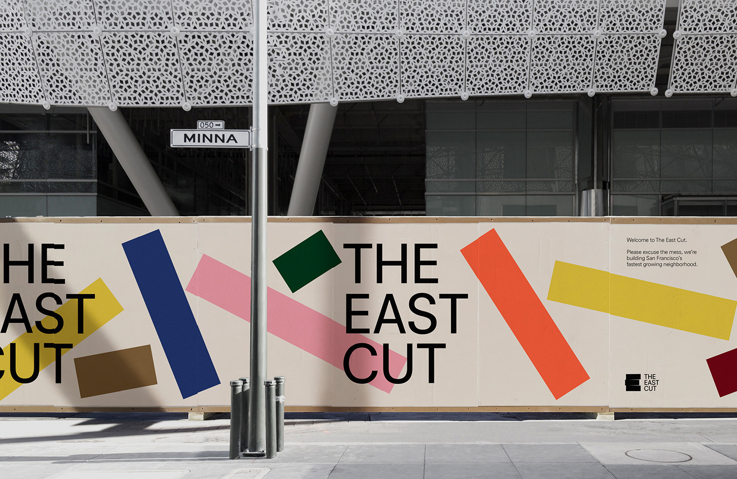
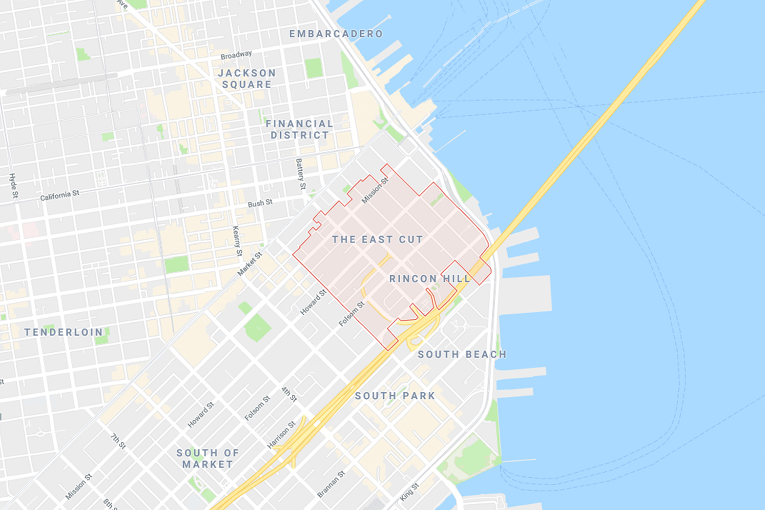
The East Cut unifies the three distinct downtown San Francisco areas of Transbay, Folsom and Rincon Hill into a single and modern metropolitan community. It is a unique an area, now recognised by Google Maps, that contains the newest and largest building in the city but also those that are the oldest and historically rich. Collins worked to develop a name and graphic identity for this new neighbourhood that would resolve and express its historical context, its reinvigoration and modern outlook. This links a variety of print and digital communications. These included posters, business cards, hoardings, banners, signage and website.

Although graphic identity—in its use of form, colour and type—is outwardly modern in its expression, naming is distinctly historical. This draws its inspiration from the Second Street Cut made through Rincon Hill in 1869 which caused the area to become a separate part of the city.
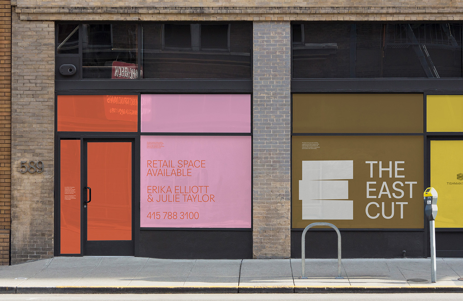
There is little that covers strategy, however, much like dn&co’s work for Broadgate, the direction appears to project a forward outlook to residents, potential residents, retail and corporate interests. You can see some of this in the shop front advertising and the layers of community support online. With this in mind, it expresses, in its continuity across various communications, a unified front and intention to reinvigorate a previously overlooked area for both business and residents alike.
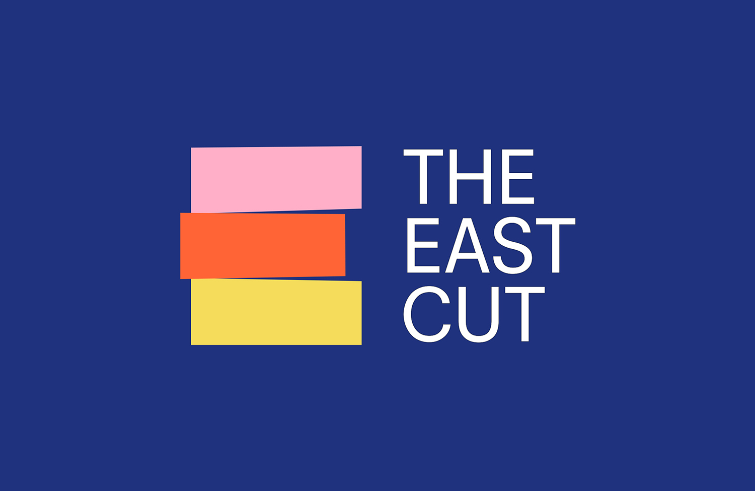
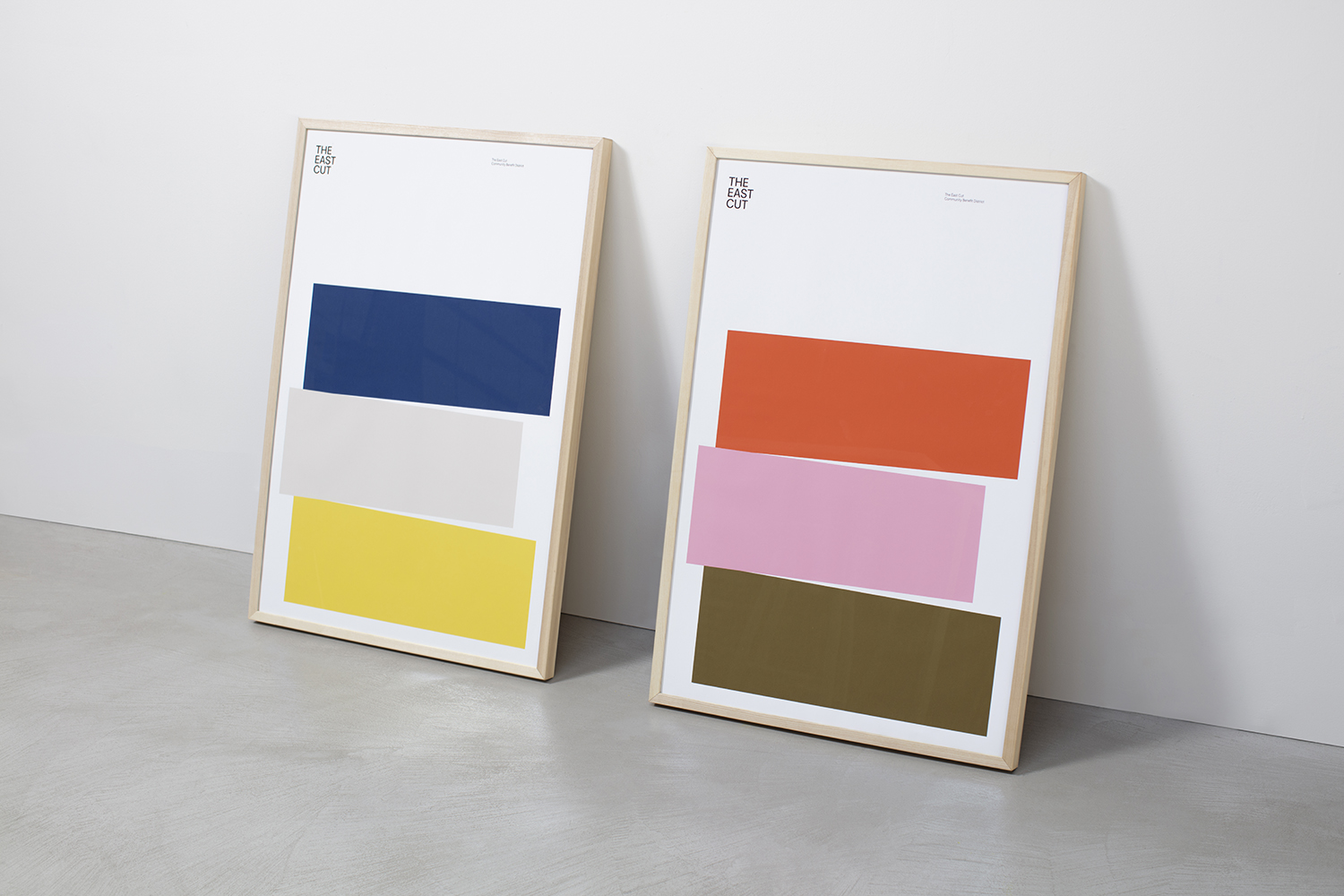
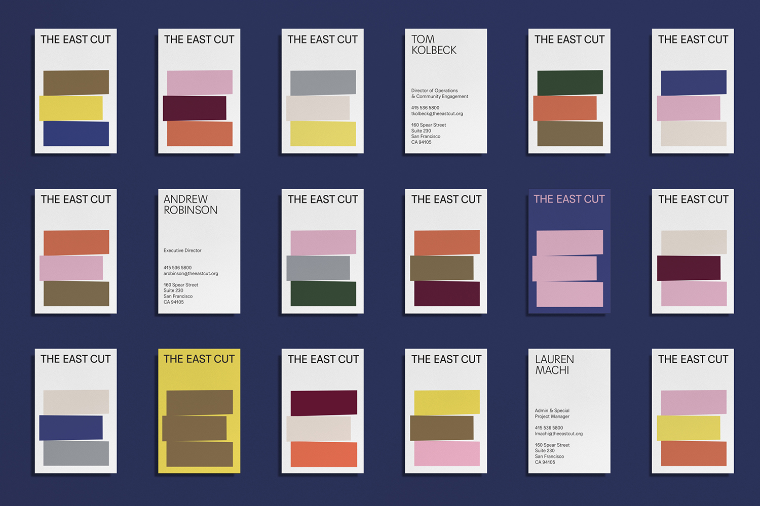
In graphic identity, there is a logo-centricity, but this is built out into a few different ideas. The basic concept is simple, three distinct areas unified, expressed in the arrangement of shape, choice of colour and in the formation of a bold and singular E.
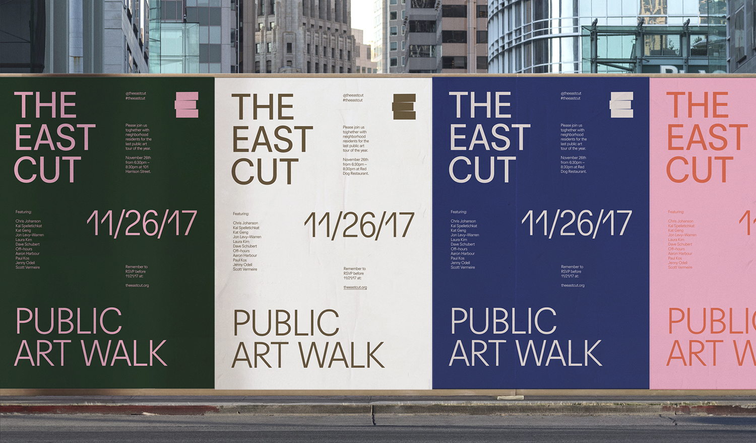
A broad colour palette serves to really push diversity, in people, communities and experiences, and establish some form longevity, the potential to change with the times, rather than get stuck in the moment. In its shape, (just enough to maintain its distinction in a single colour and reduced down) weighting and proportionality across print, and in the immediacy of the blocks across website there is a very prominent sense of the structural, and in this way, ties it to urban redevelopment. Uppercase type shares a similar quality but offers contrast in its proximity to the logo, utilising plenty of space, and in the lightness of its lines.
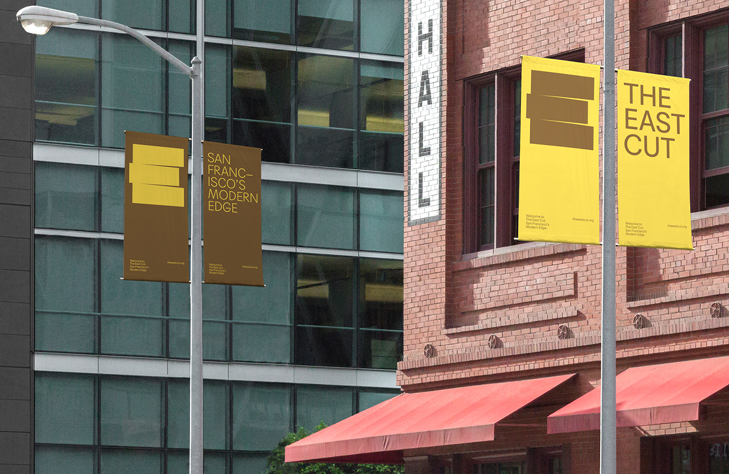
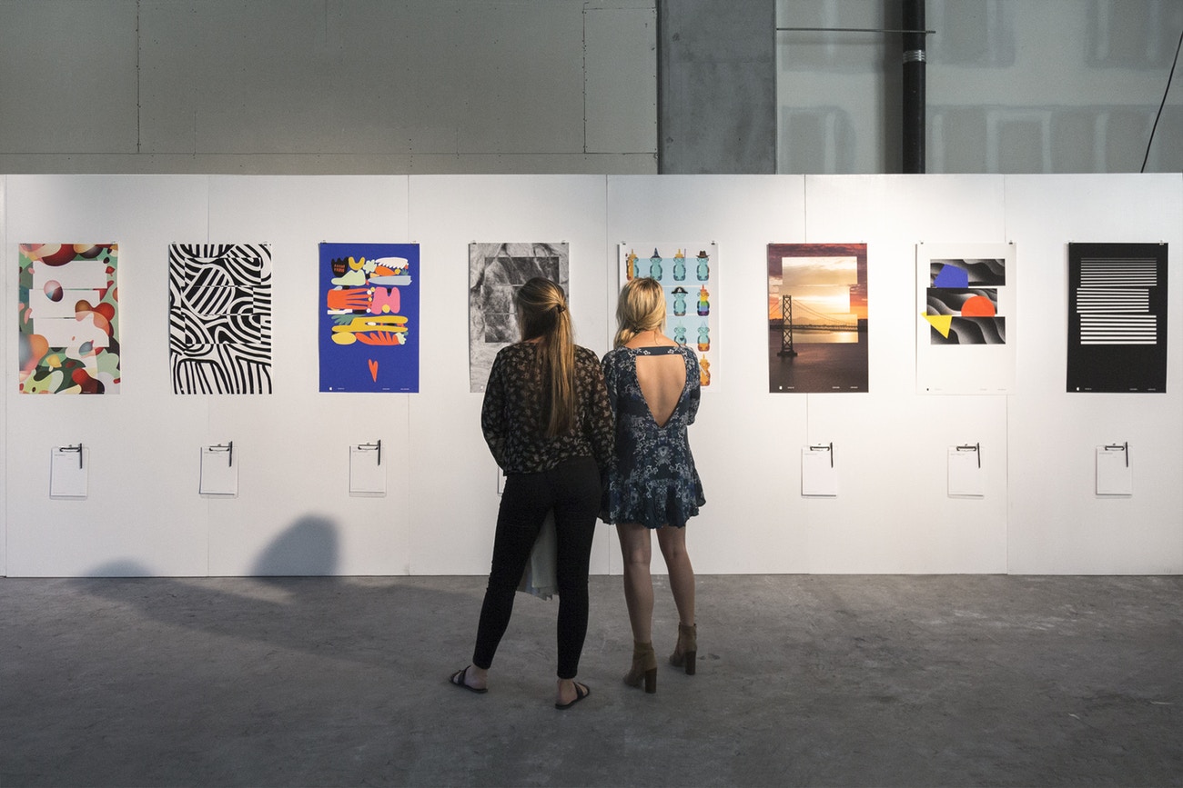
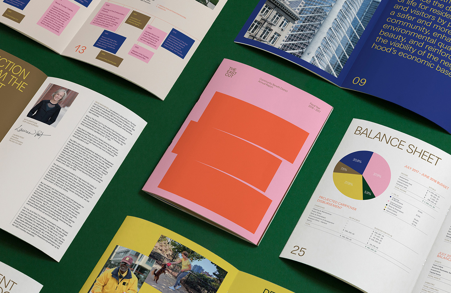
In print there is a clear sense of opportunity, in words, images and infographics. These are presented in a cheerful, accessible and modern way that finds a balance between business and community interests. There is also a cultural component in the rendering of the E as a series of posters by local artists. The weighting of the logo serves as a useful canvas for multiple artistic expressions, or broken apart and given new proportions to appear as playful building blocks across hoarding or as solid colour within the frames of retail opportunities.

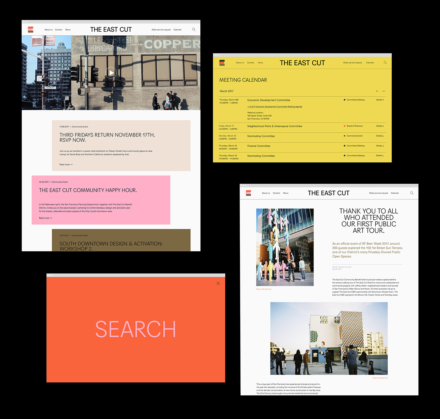
The histrionic component is explored in greater detail online through the feature Our Storied New Neighbourhood, a strategically smart touch that unifies beyond the continuity of visual identity. There are other neat details that build on this. These include an online form for service requests, a community event calendar and the capacity to donate to the homeless. As much as graphic identity is striking and immediate, these functionalities and content are the touches that really help build community and a critical part of area identity. More work by Collins on BP&O.
Design: Collins. Opinion: Richard Baird. Fonts: Agipo.
