BP&O Collections — Brochures No.7
Opinion by Richard Baird Posted 5 June 2018
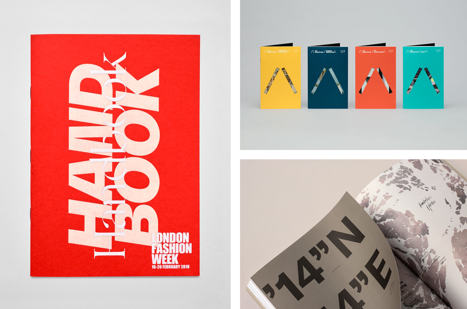
The seventh collection of brochures, annual reports, catalogues and event programmes published on BP&O. These mix layout, material choice and print finish, and between them effectively utilise colour, type, proportion, image, texture and paper contrast to communicate, compel and contribute to a distinctive graphic identity. This selection features uncoated and coated papers, spot colours, blind deboss and die cuts, and includes work by studios Folch, Spy and Toko.
In the spirit of trying to subvert the chronological value-hierarchies of the traditional blog format this post was published as a quick way to browse through BP&O’s content and gain access to older but equally interesting projects through different themes. Further, this is less about optical pyrotechnics, although that is a consideration, but how each of these fulfils a role within a broader system, click each image to read more. This expands upon previous posts under the category BP&O Collections. If you liked this check out more brochures here.
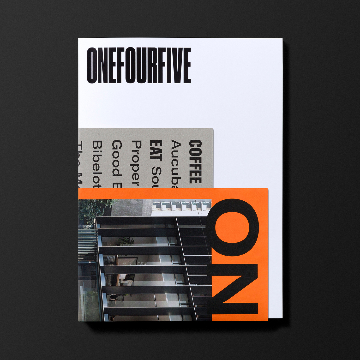
OneFourFive Clarendon by Studio Brave
OneFourFive Clarendon by Studio Brave
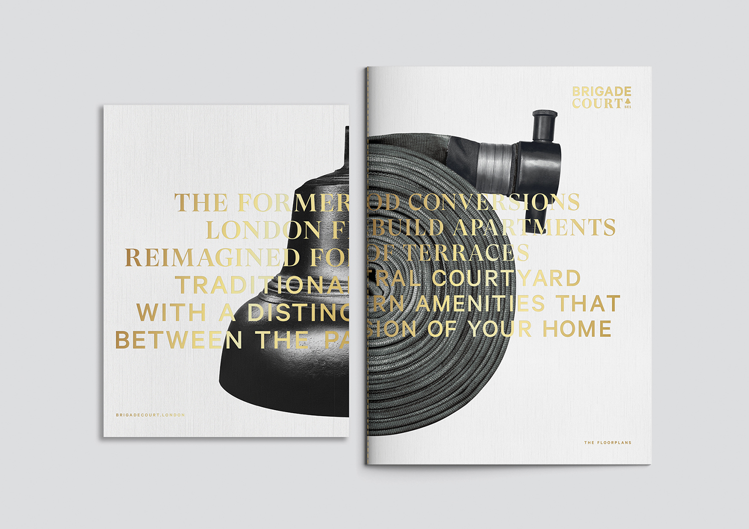
Brigade Court by Jack Renwick Studio
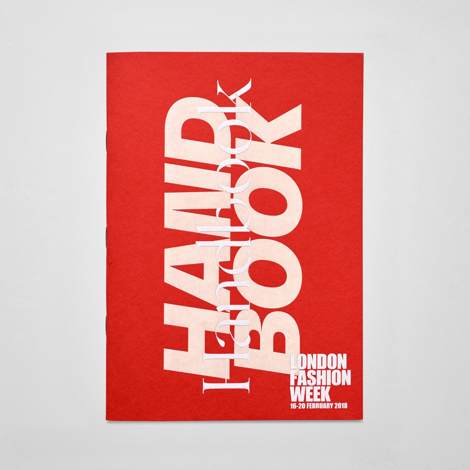
London Fashion Week by Pentagram
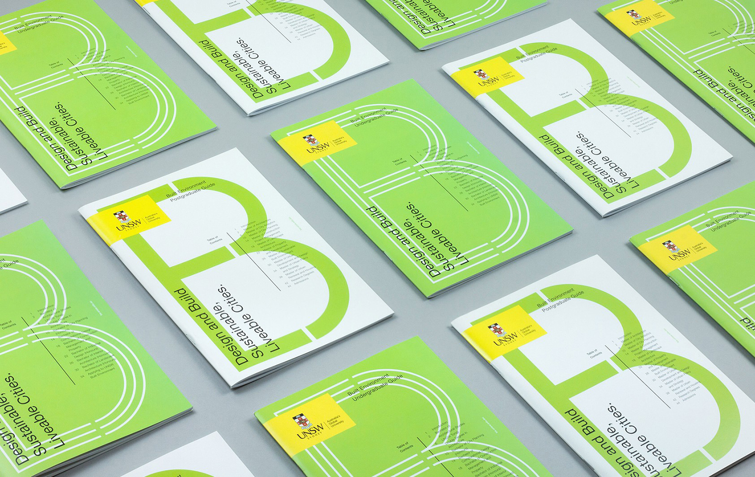
UNSW Built Environment by Toko
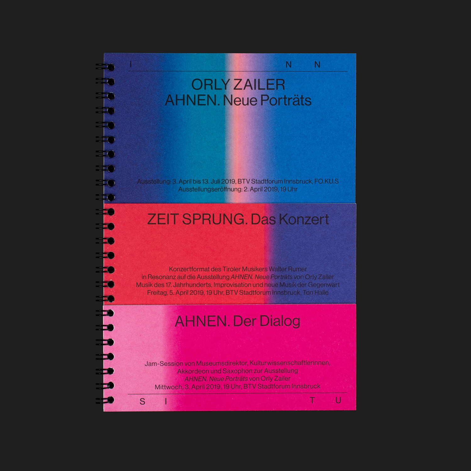
Inn Situ by Studio Mut
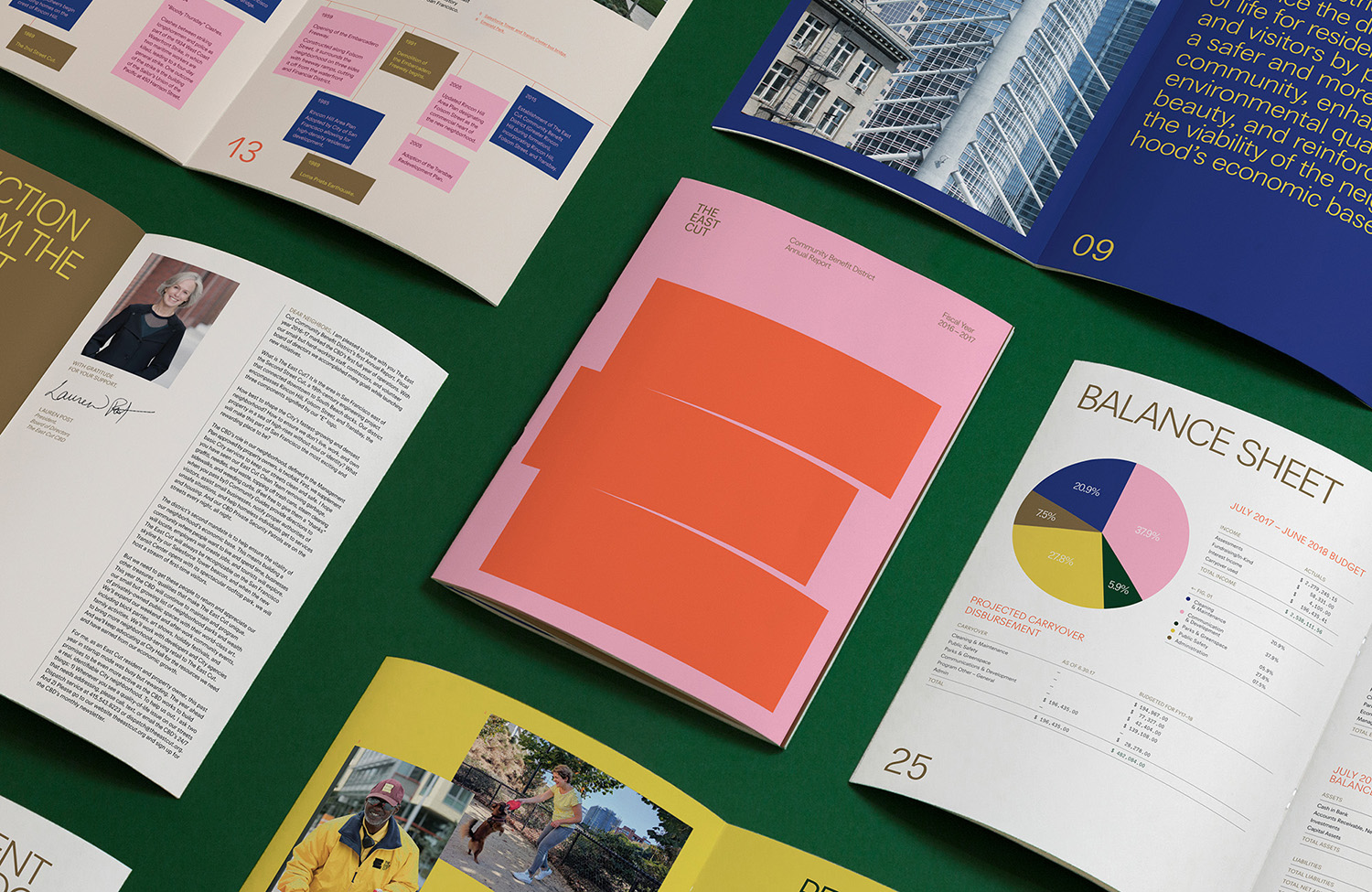
The East Cut by Collins
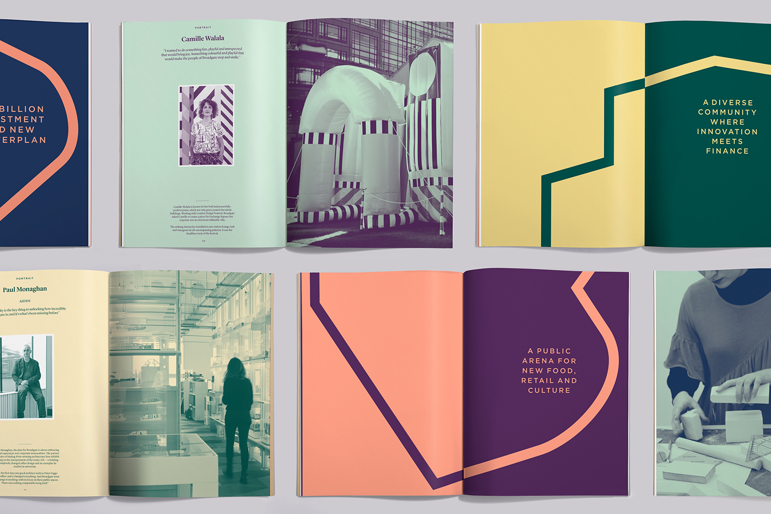
Broadgate by dn&co
CareerTrackers by Garbett
Cult 20 Years, Event & Exhibition by Toko
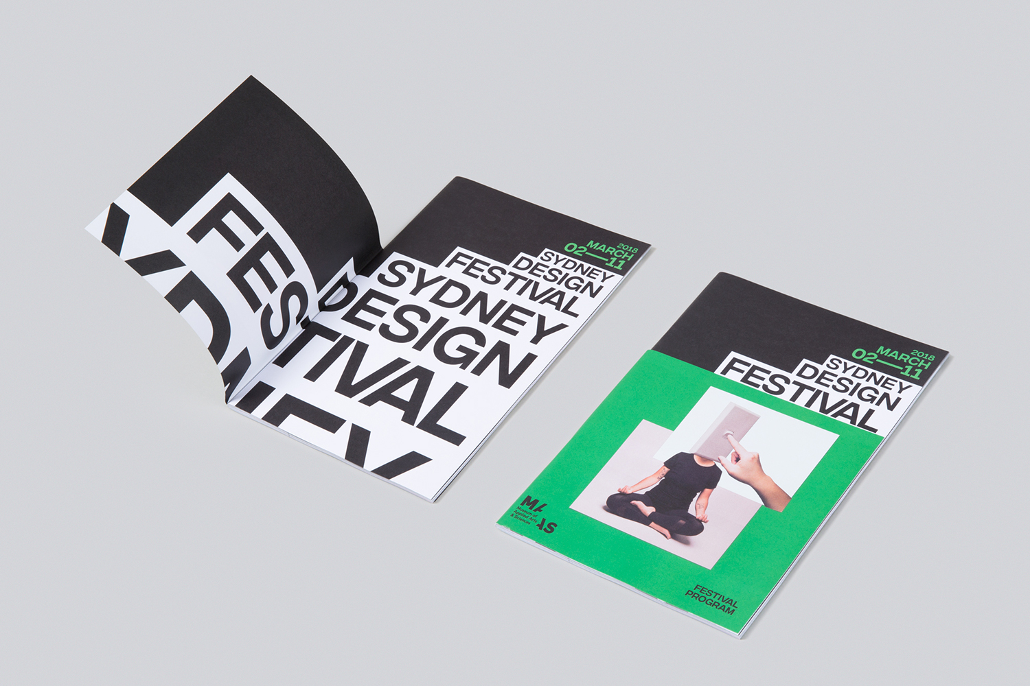
Sydney Design Festival by Re
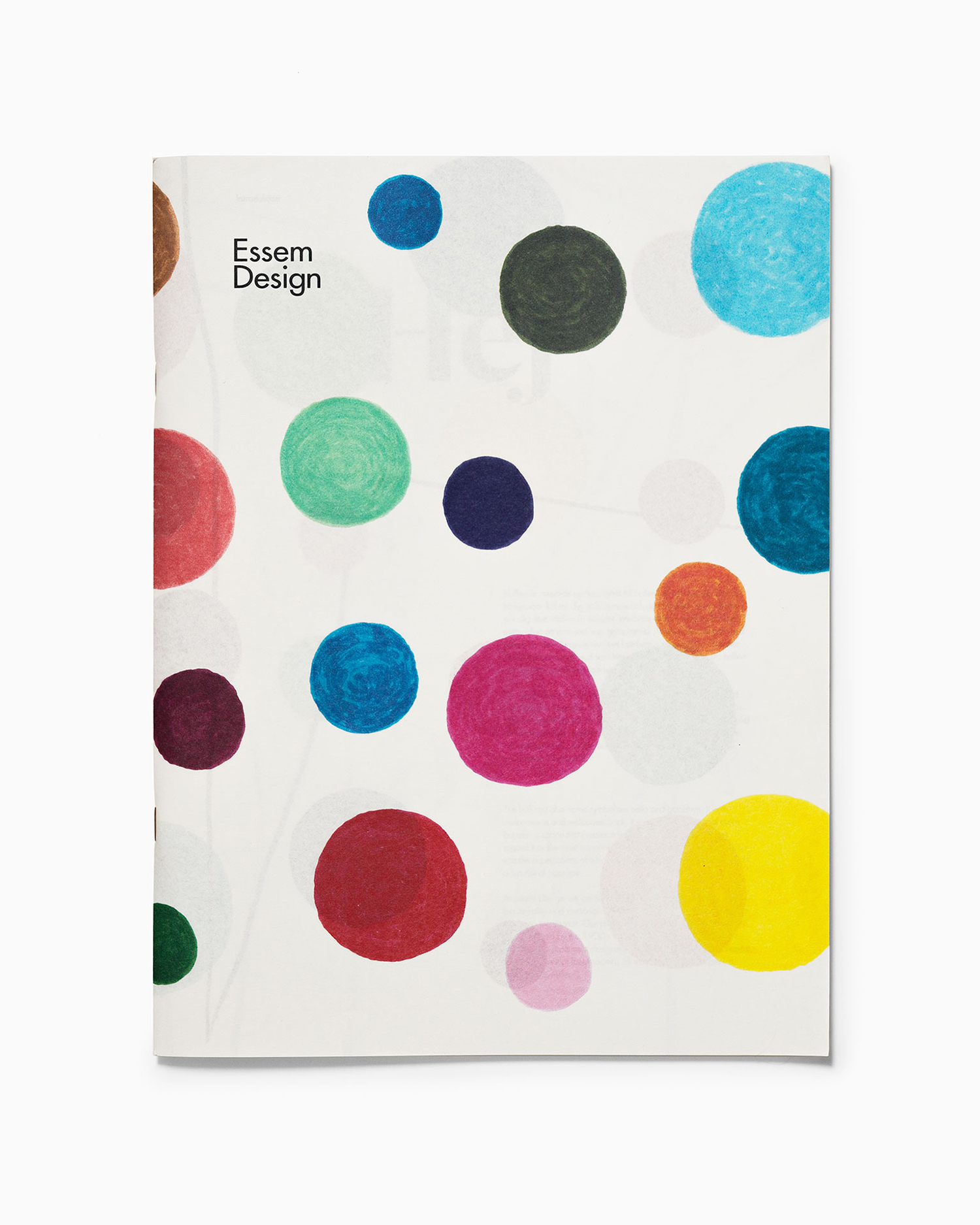
Essem Design Product Catalogue 2018 by Bedow
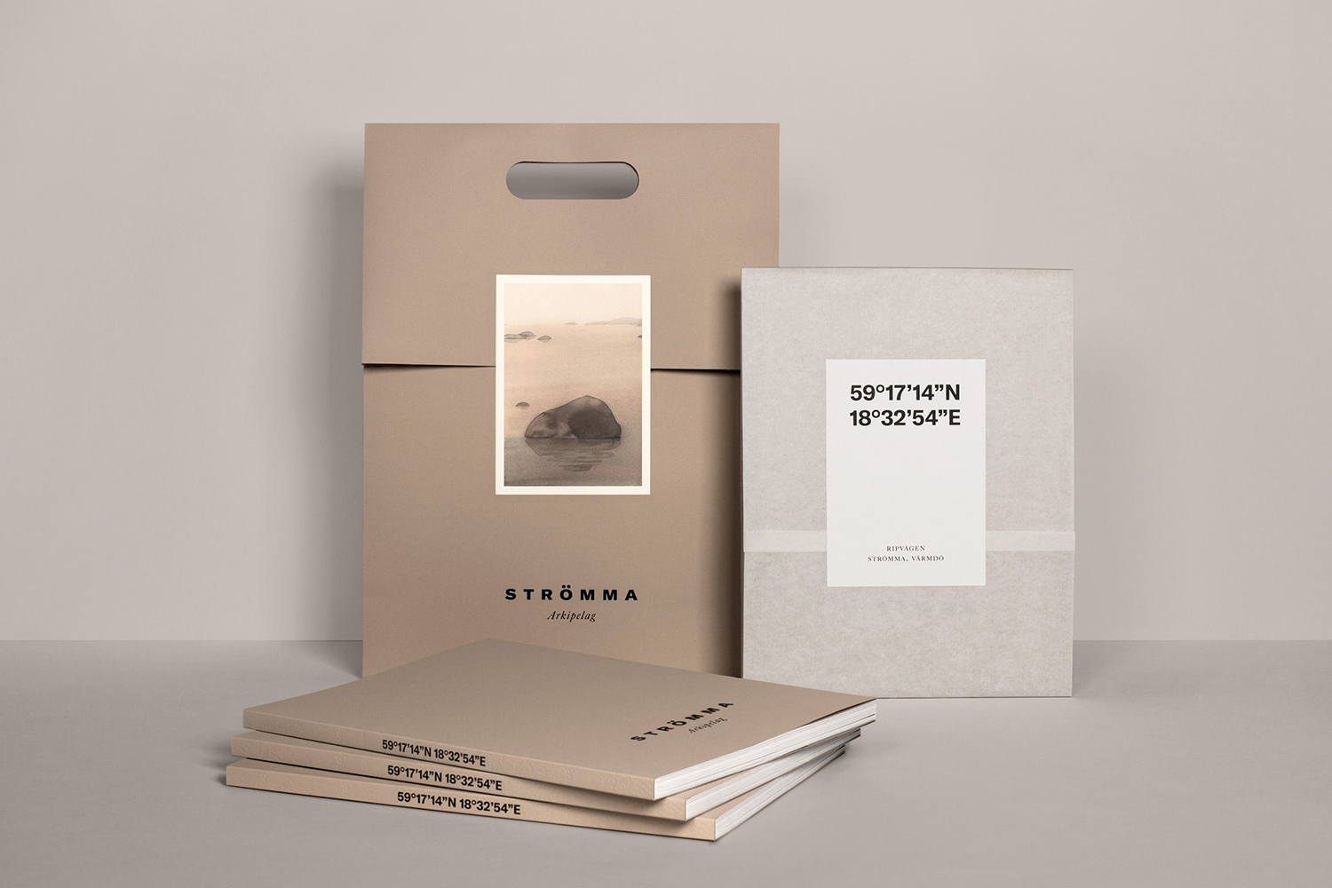
Strömma Arkipelag by 25ah
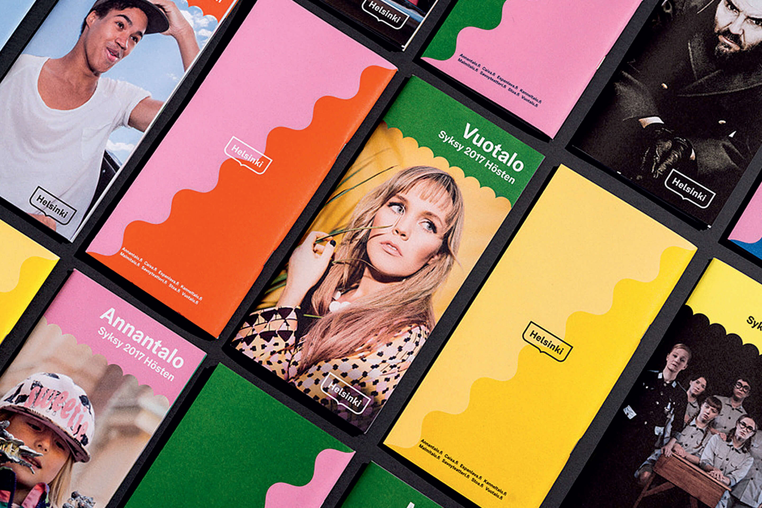
Helsinki by Werklig
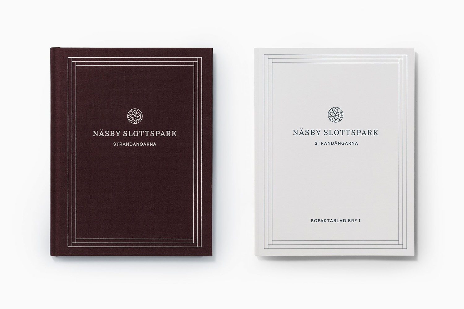
Näsby Slottspark by Bedow
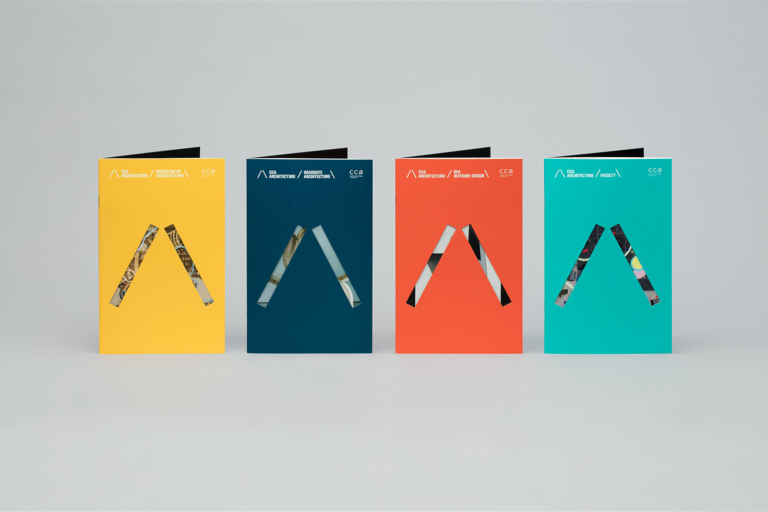
CCA Architecture by Manual
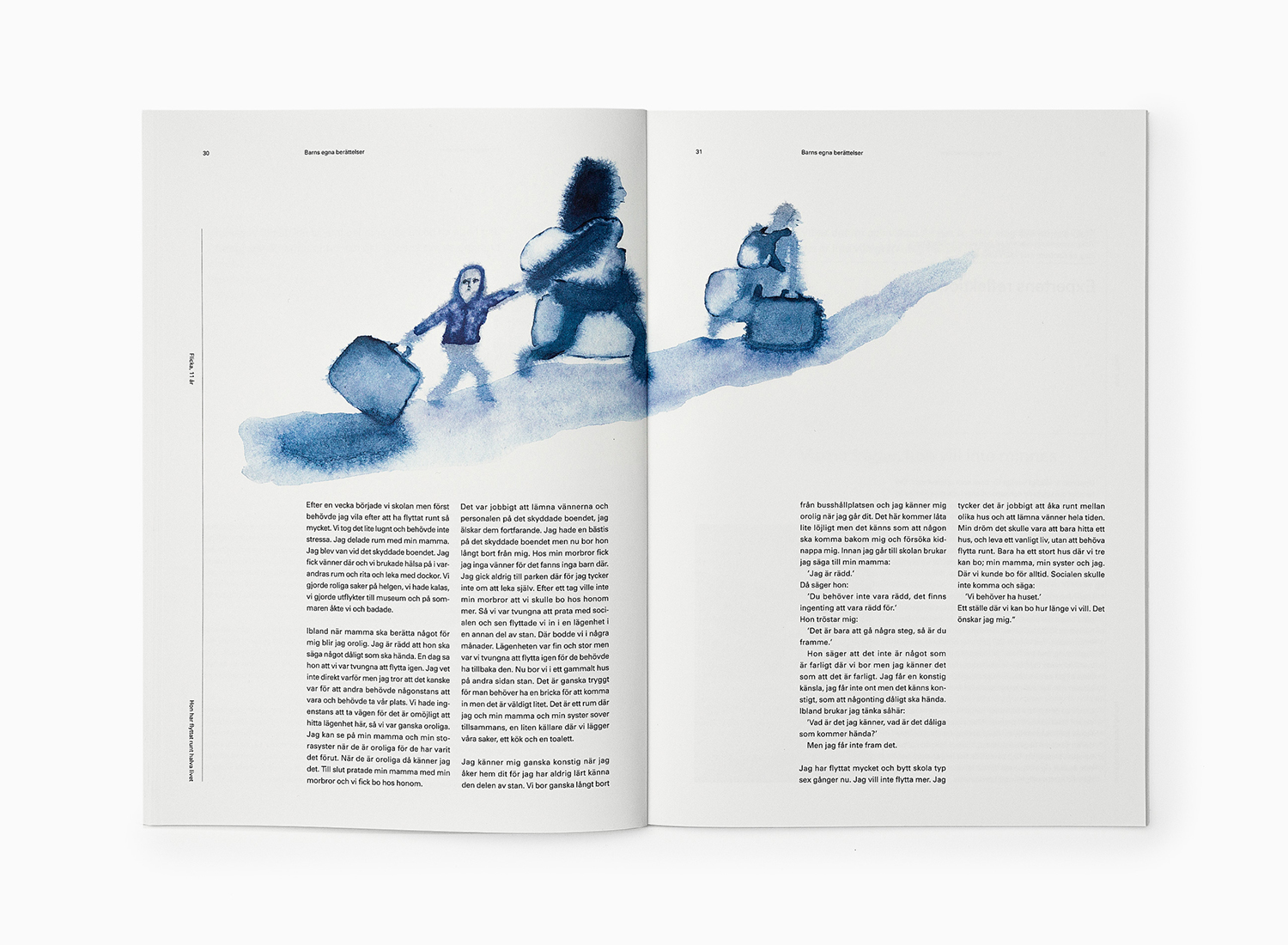
Who Protects Me From Violence? by Bedow
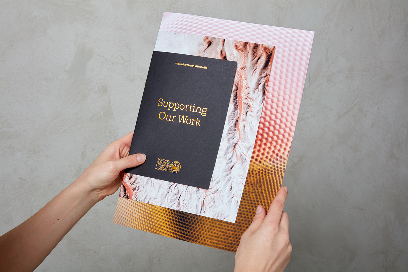
London School of Hygiene & Tropical Medicine by Spy
