Feroz by Mucho
Opinion by Richard Baird Posted 13 June 2018

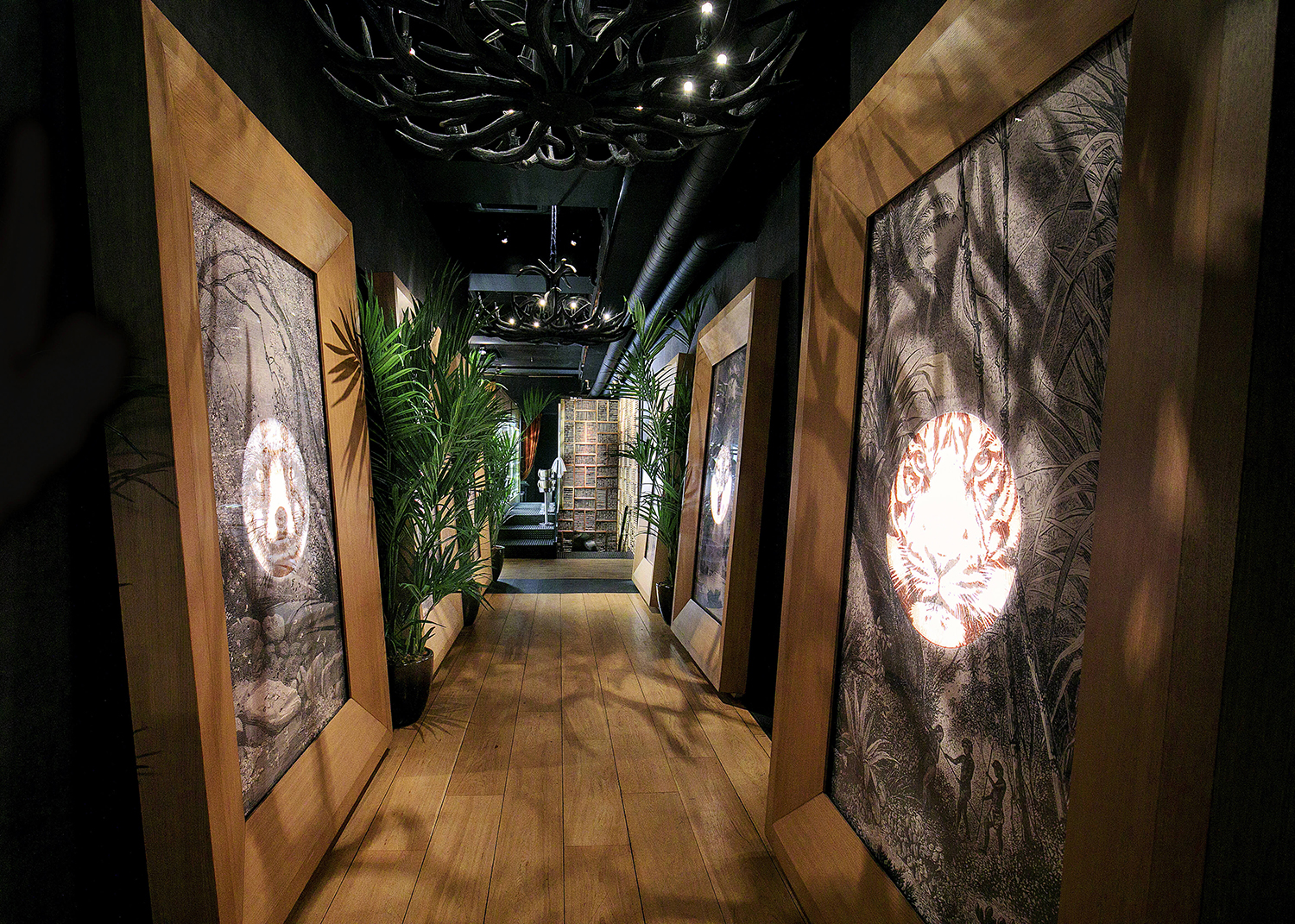
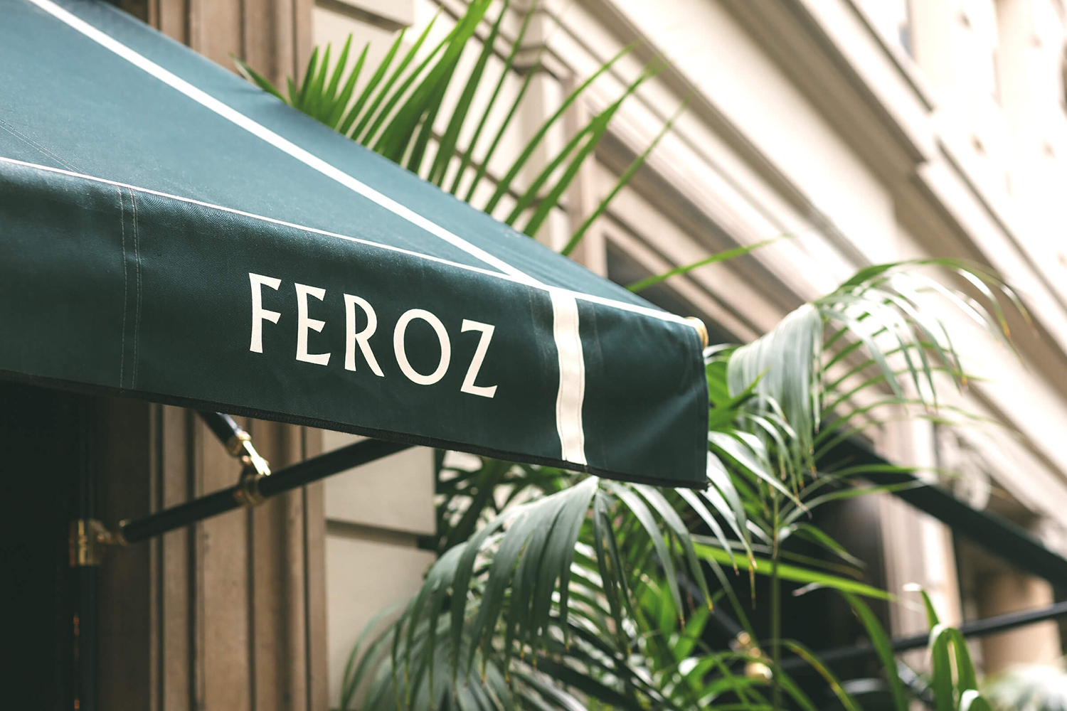
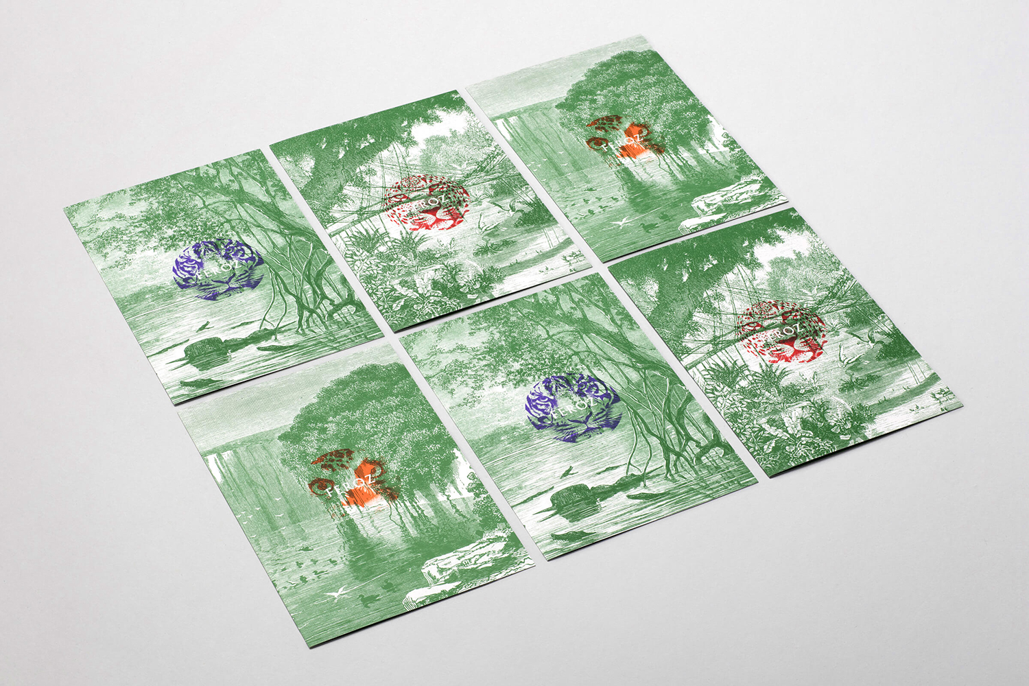
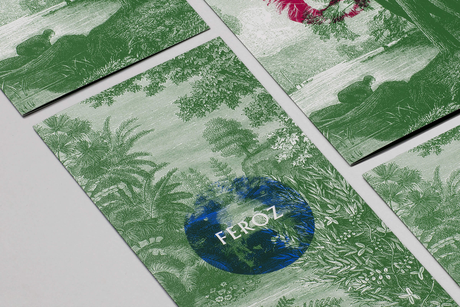
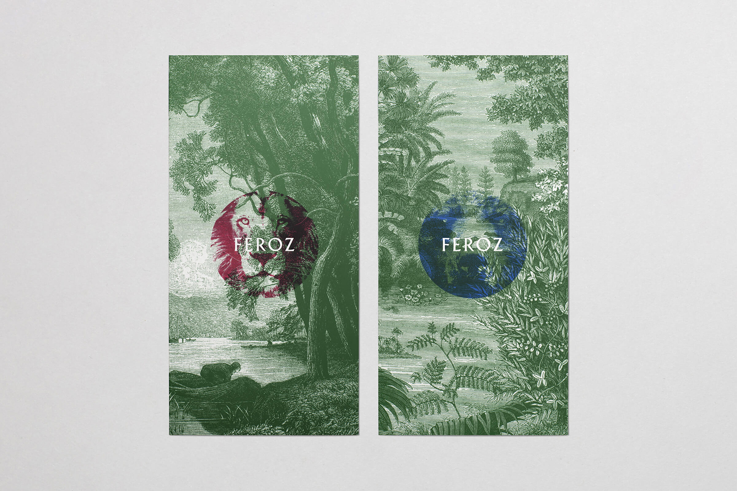
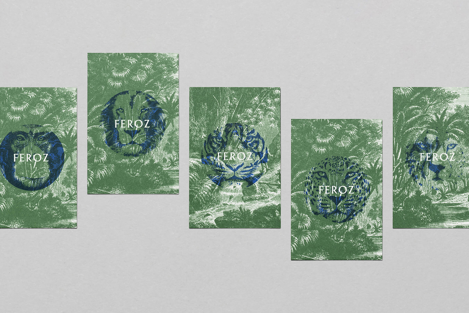
Feroz, located on Barcelona’s Carrer Tuset, is described as being a fashionable destination that transitions from evening restaurant into late-night club. It features a distinctive interior design created by Pablo Peyra Studio. This exists in the grey area between something close to period colonialism, moments of kitsch and modern luxury. It has an undeniable character and specificity, one that is fully committed and is perhaps most successful in its use of foliage, modern upholstered chairs and colour palette of greens and aqua blue. There is here the implication and meeting of an exotic jungle location and civilisation. Design studio Mucho channel this and layer in a mysterious and wild night-time possibility into graphic identity through the juxtaposition of imagery and illustration, contrasting form, colour and overprint. This links stationery, menus and outdoor signage.
Meta–Space and graphic identity weave together to establish a transitional potential. The Ballardian imposition of a wild jungle—in the form of foliage—into a formal and luxurious space, and the recurring imagery of wild animals waiting for the night, play with a tension between etiquette and carnal desire, civilisation and primal behaviour, the movement from restaurant to club. The implication of conventional boundaries between two emotional states and environmental contexts are intentionally diminished, which is where the work, both graphic and material, really finds its strength and vision. The period colonial reference uses a real-world foundation for this intersection, however, this may have been more interesting if elevated in a more fantastical way, think Ballard’s concrete jungle in The Drowned World.
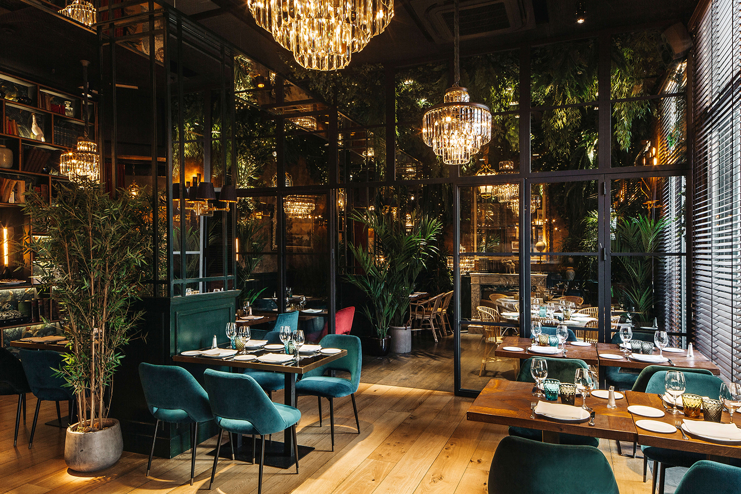
Macro–There is an obvious colonial tone to this. Some might describe it as a modern refinement of an old-world charm. It is definitive in its tone, interesting in its idea, and likely to appeal to a specific group. In certain details such as the faux elephant head, it has the potential to move into parody and undermine some pleasant and sophisticated material detail, shapes, juxtapositions and partitioning. The bluntness of some of these objects, the repetition and excess of luxury symbols like the chandeliers in the bar, perhaps seek to subtly mock rather than ape its reference, to add a knowing wink.
Although graphic identity, in its imagery, visual texture and colour palette shares a lot in common with interior design, it does this with a concise set of graphic assets. These are amplified, much like interior design, by juxtaposition, association and the notion of duality.
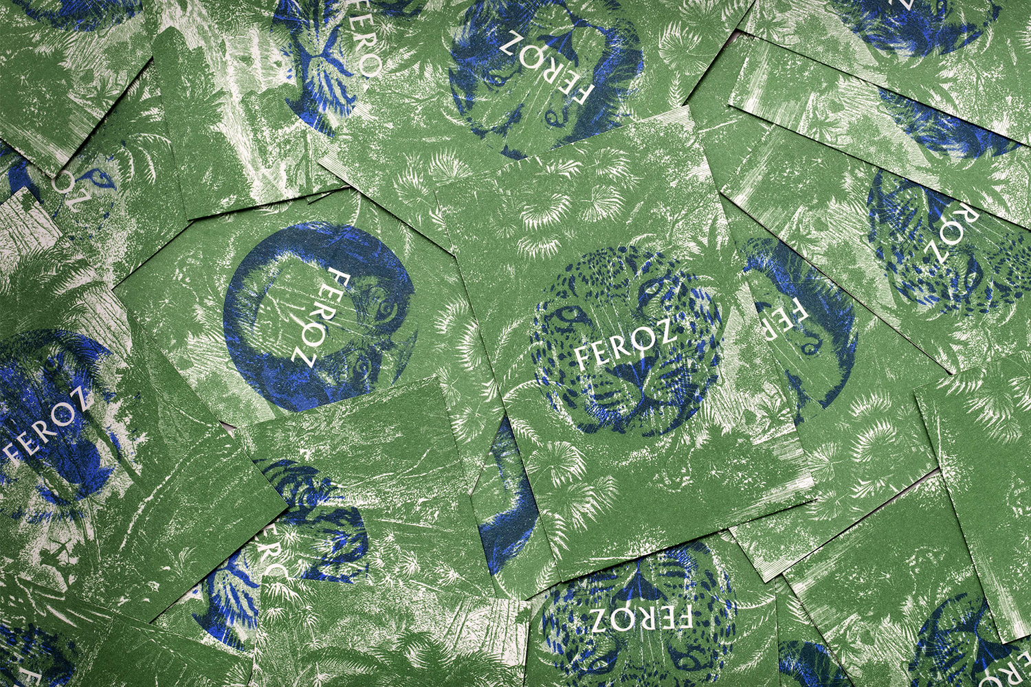
Micro–The clarity and simplicity of Mucho’s graphic identity and communicative intentions for Feroz is its strength within the context of a materially and visually rich context. It has enough of the interior to project this outwards, outside of space, online and in print. And is concise enough to be part of but not drawing anything away from experience.
The cropping of wild animals into disks (a sun/moon symbol) create an intelligible relationship between the passage of time and a change in behaviour. In contrast, the backdrops have something of a quiet and observational quality in content but also a civility of their artistry. This carving establishes a subtle and satisfying link between image and logotype, set in Berthold Wolpe’s Albertus. Colour and image interact and play with the current and the period, much like interior, and are stylistically pleasing with enough variation to keep it interesting. The way these images are blown up, framed and illuminated within interior is a particular intersection of graphic identity and interior design. More work by Mucho on BP&O.
Design: Mucho. Interior: Pablo Peyra Studio. Photography: Vidal Org & Juan Pablo Escobar. Opinion: Richard Baird. Fonts: Albertus.
