Baluna by Grupa by Bunch
Opinion by Richard Baird Posted 9 July 2018
Grupa is an award-winning design studio and manufacturer of handmade furniture and lighting products for home, office and hospitality spaces. Building on over a decade worth of experience Grupa branched out into own brand products in 2012.
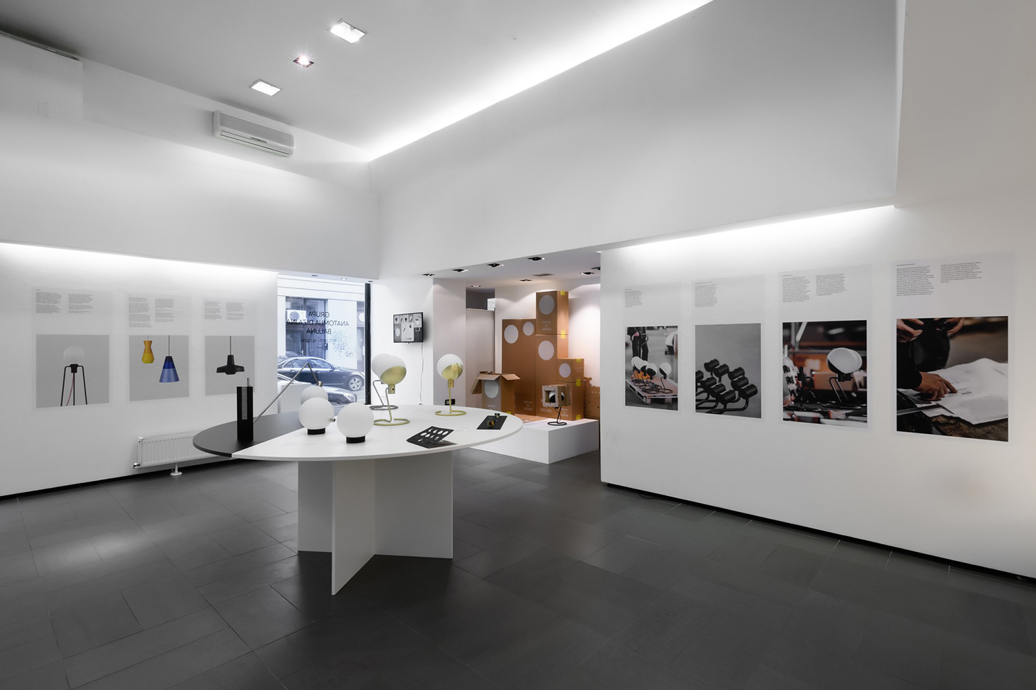
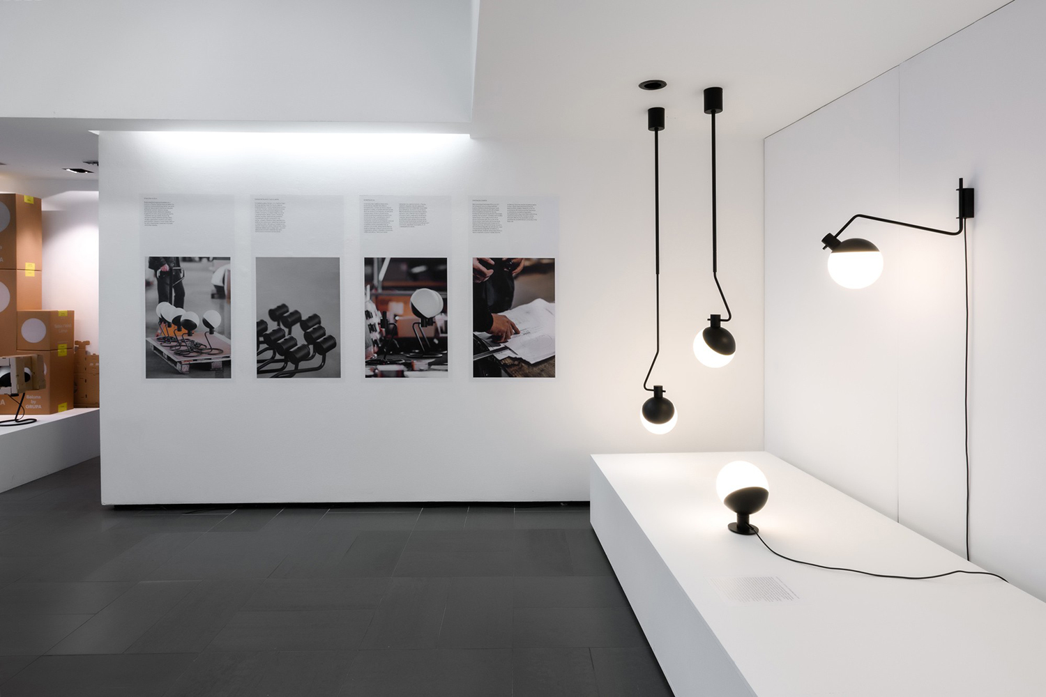
From drawing board to design and development, production, packaging and distribution, the company has developed a total design philosophy and a product range that brings together and expresses everything that inspires the team at Grupa. Their products are distinguished by an innovative and concise material and form language, a clear functionality and a flexibility of situation and movement. Baluna, a free-standing or wall and ceiling-mounted light captures this spirit. Its silent dimmer, blown glass opal diffuser and LED bulb deliver a consistent level of light dispersion while a telescopic bar and 360-degree rotational axis offer swift and broad adjustments.
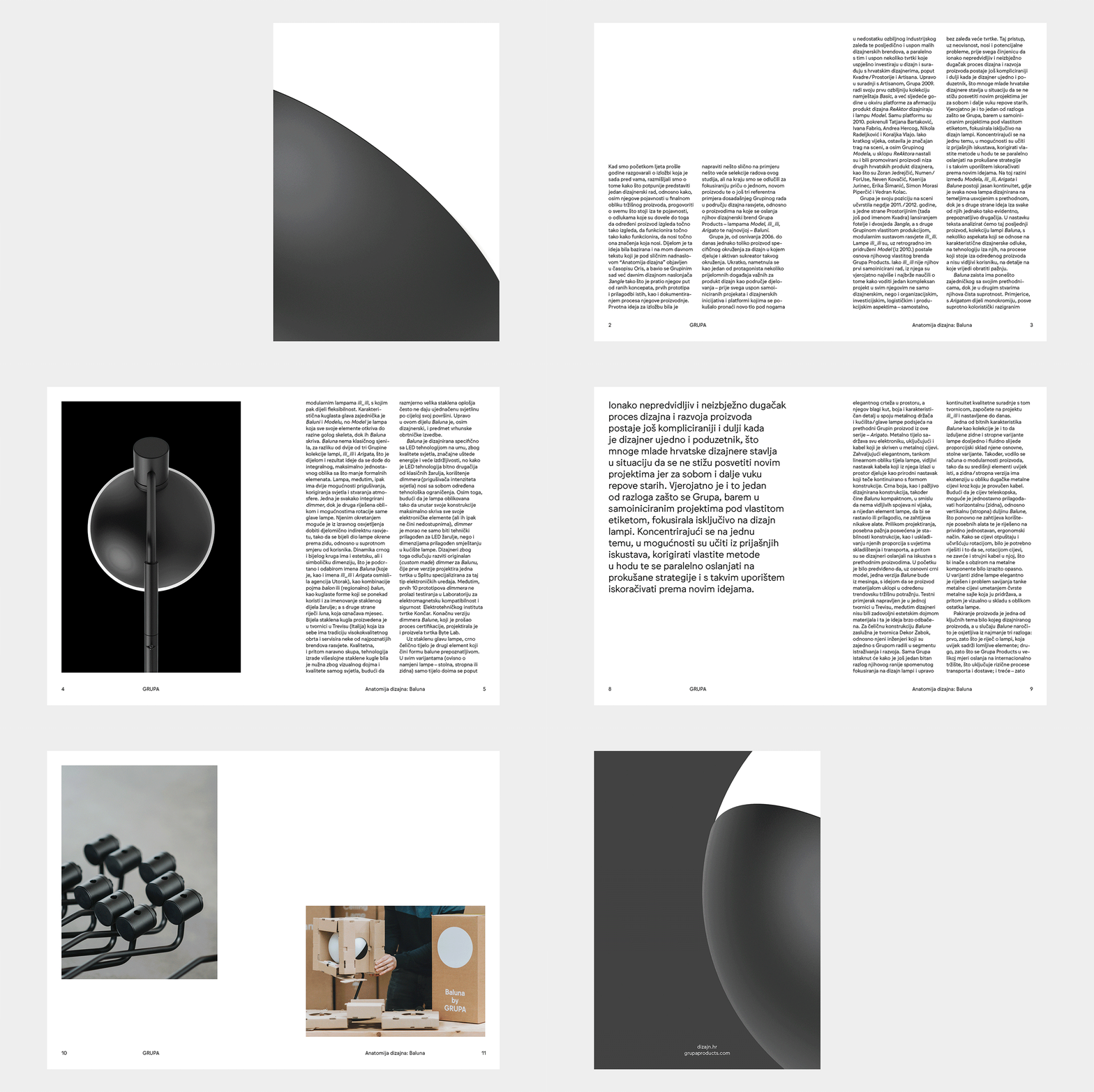
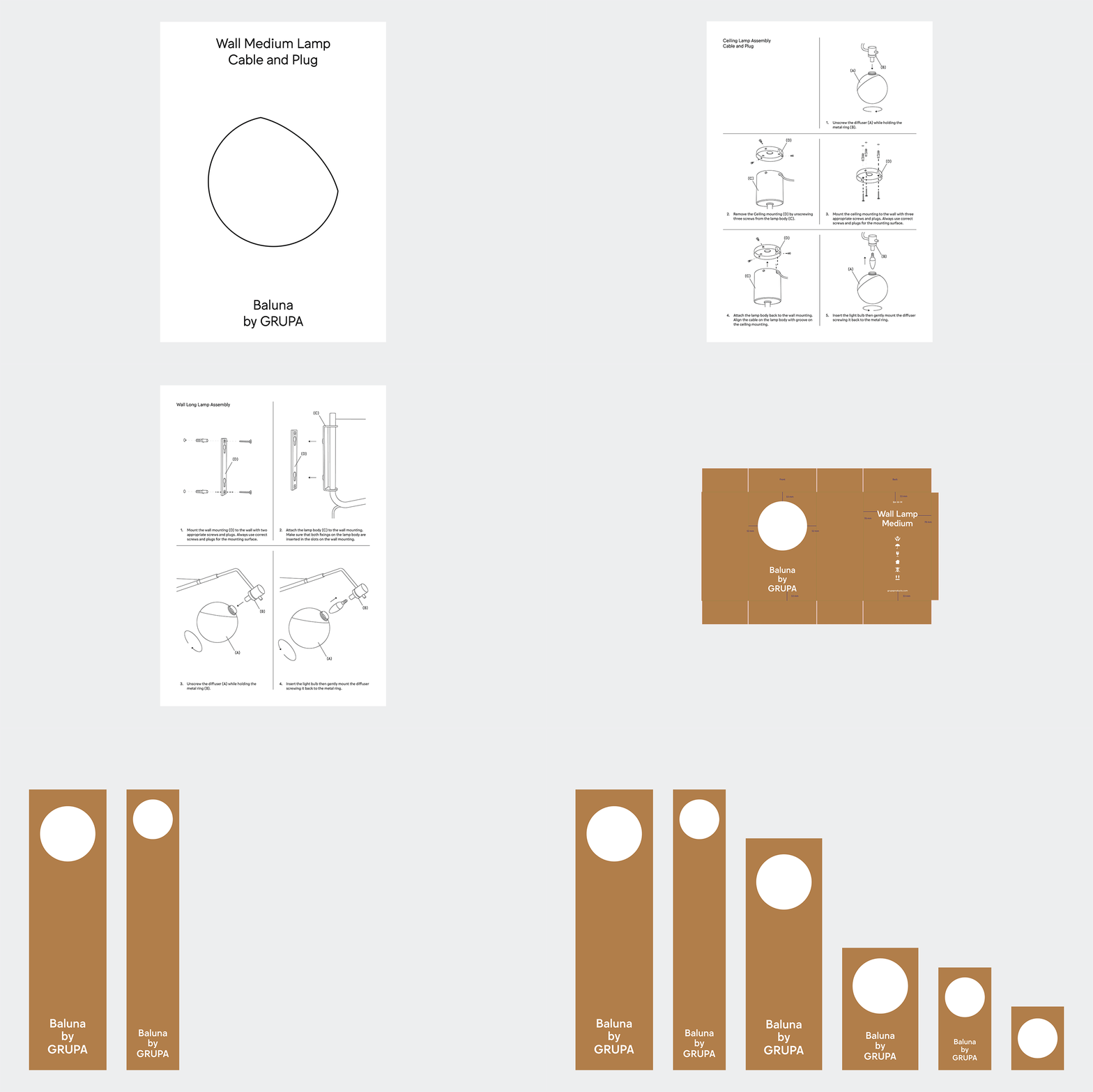
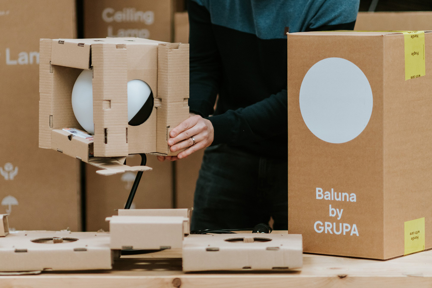
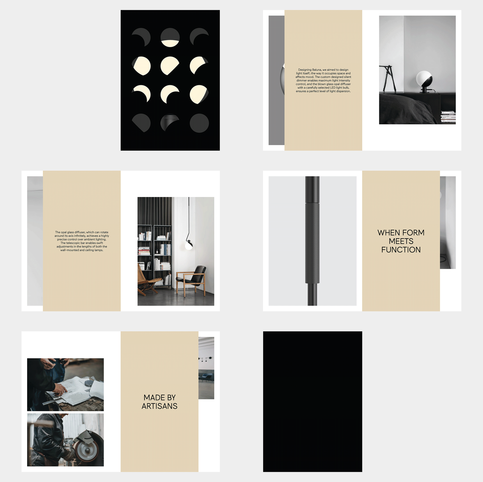
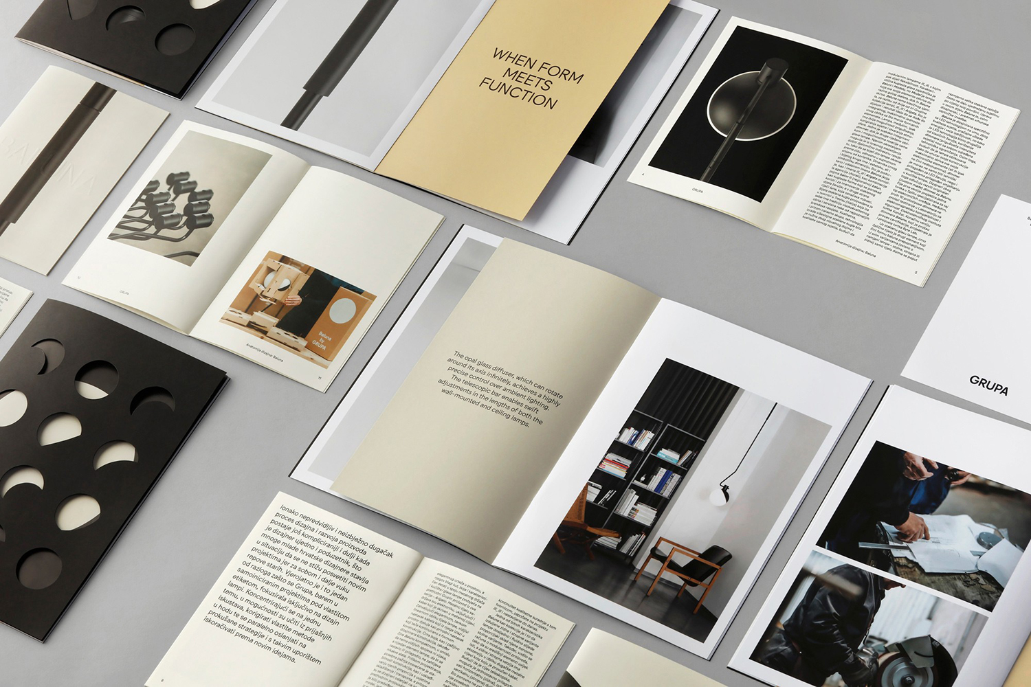
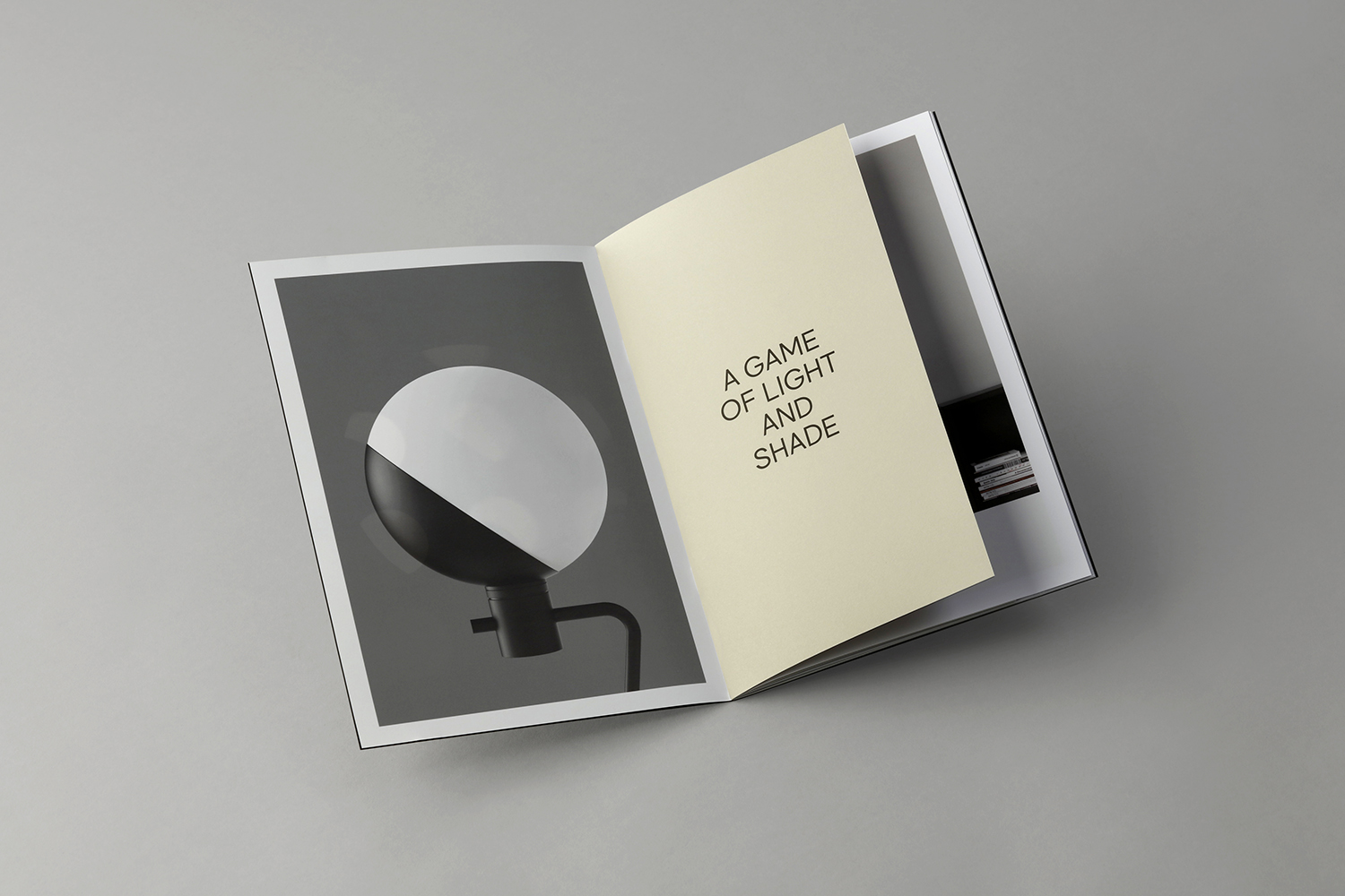
To promote Baluna Grupa worked with graphic design studio Bunch to develop a communications pack and packaging. This takes the distinctive interplay of light and shadow, form and surface, flexibility and utility that characterises the light and develops a distinctive graphic and material expression.
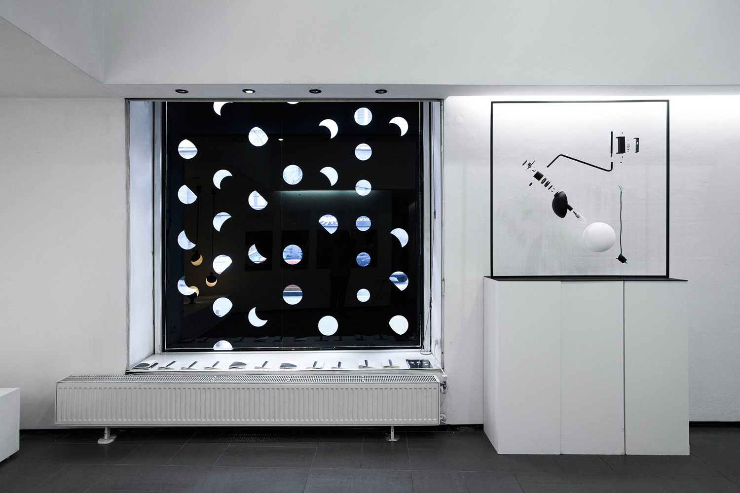
Meta–Baluna’s spherical form, its consistent soft dispersed glow, contrasting shadow-like mount, rotational potential and the way it hangs within space supported by a fine telescoping tube draws the mind to an orrery, to the moon, the lunar cycle and the passage of time. This materialisation and implication of the celestial is a simple and elegant gesture that holds a strong graphic potential, a chance to play with light and shadow, the temporal and, in the allusion to a control over the heavens, a rich intangible value. These ideas are brought out in the motion employed within the promotional video of slow rotation, crescents and eclipses, and in the use of sequential form in print.
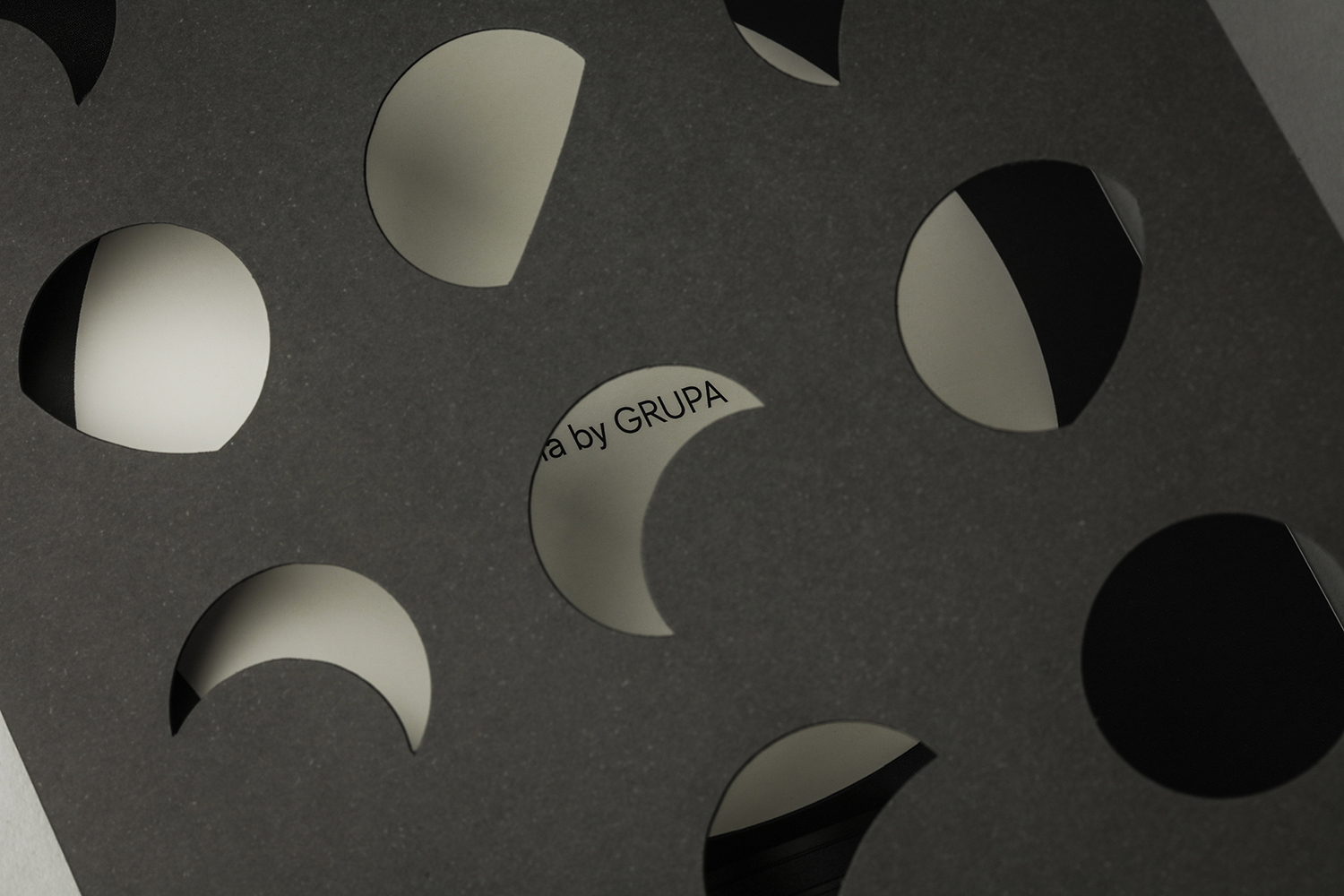
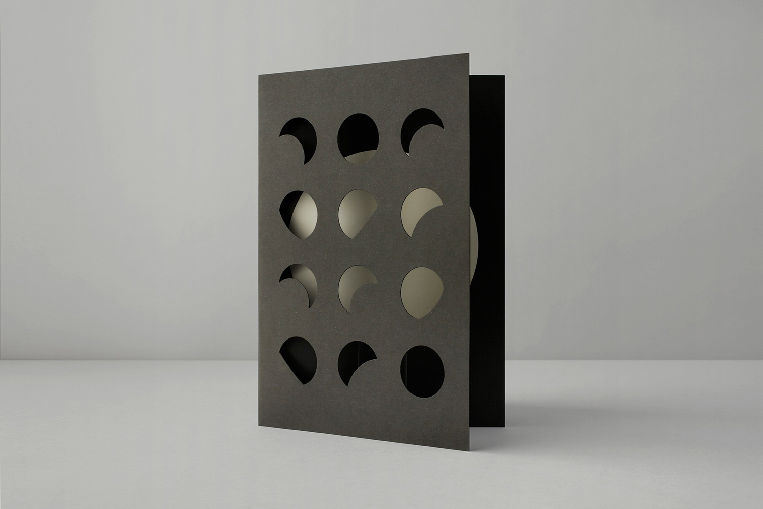
Macro–The forms employed in print—Baluna caught in various phases of rotation—die cut through uncoated paper, are given meaning and distinction within the context of a sequence, touching on the material but also the passage of time, the control over light and the casting of shadow. This also comes through in colour choice, in gradation, blind embossing and screen printing of packaging, while the seamless material transition and handmade quality of Baluna emerge in the cutting, composition and finishing of papers and boards.
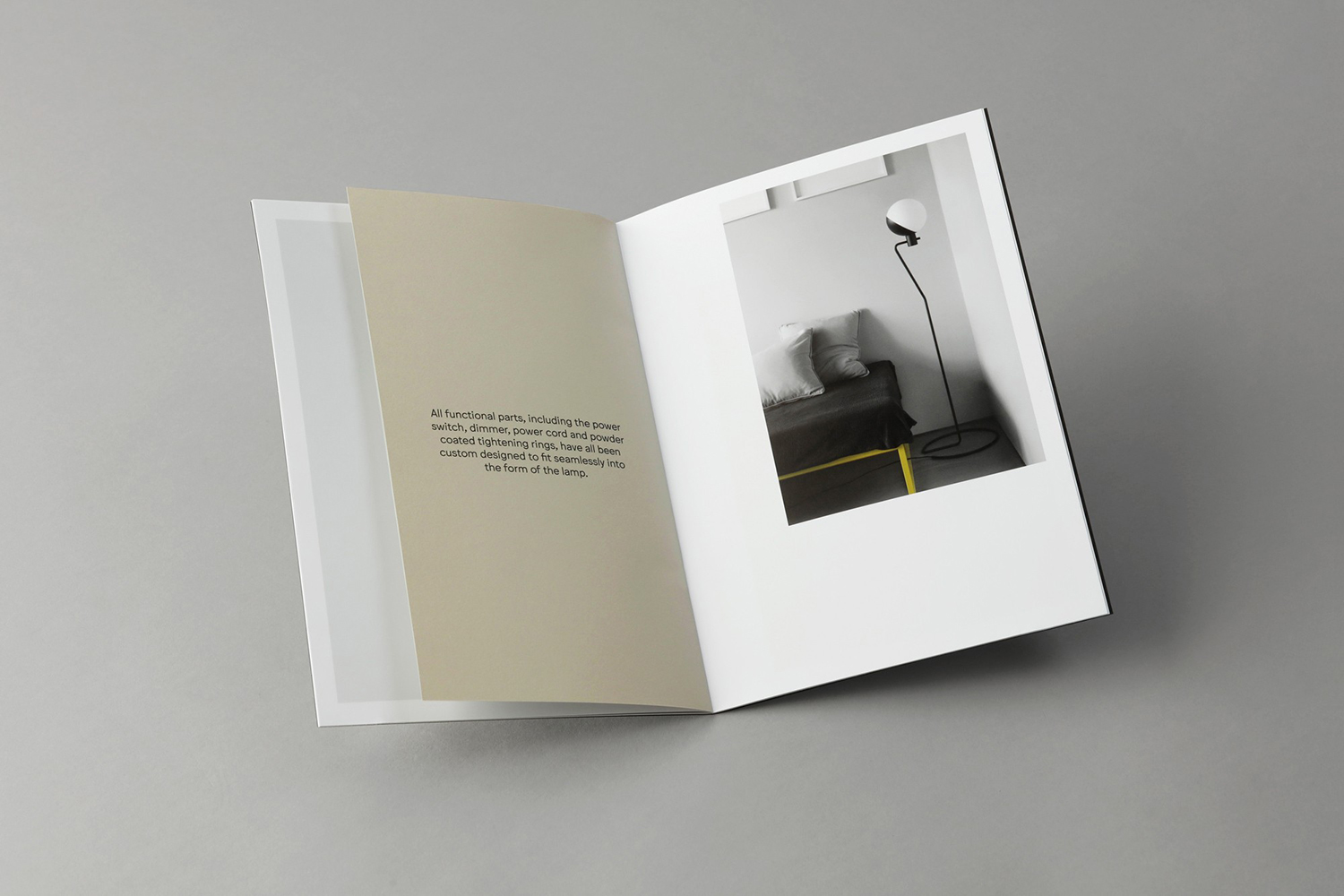
Micro–Where materiality, colour and form language play with the abstract and visceral, typography, image arrangement and layout introduce a sense of utility. These choices touch on an architectural language of usefulness, the systematic and structural. Photography bridges a divide, moving between manufacture and the implication of the large and planetary silhouettes in the cropping of image. This mix of the meta and the literal effectively create counterpoints, two abstracts that build to a rich visual expression. More work by Bunch on BP&O.
Design: Bunch. Opinion: Richard Baird. Fonts: Jungka.
Specifications:
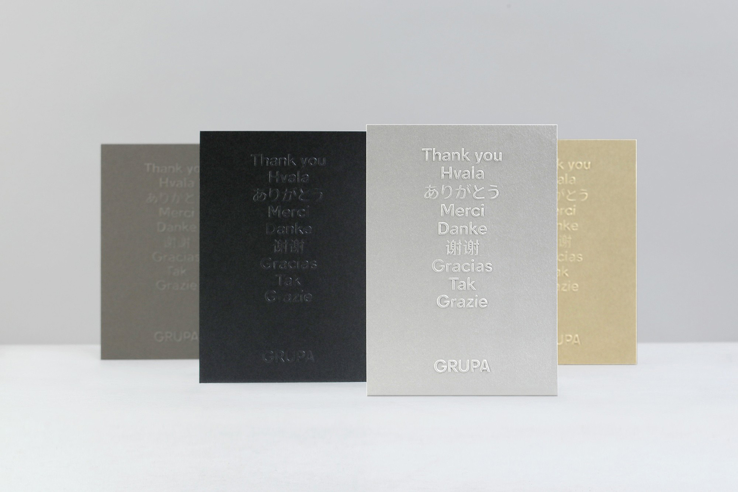
Thank You Cards (Above):
Arjowiggins Keaykolour Sombre Grey
Curious Metallics: Ice Gold, White Gold & Cordenons Notturno
Printed by: Lunch
