Dissabtes MACBA by Hey
Opinion by Richard Baird Posted 26 July 2018
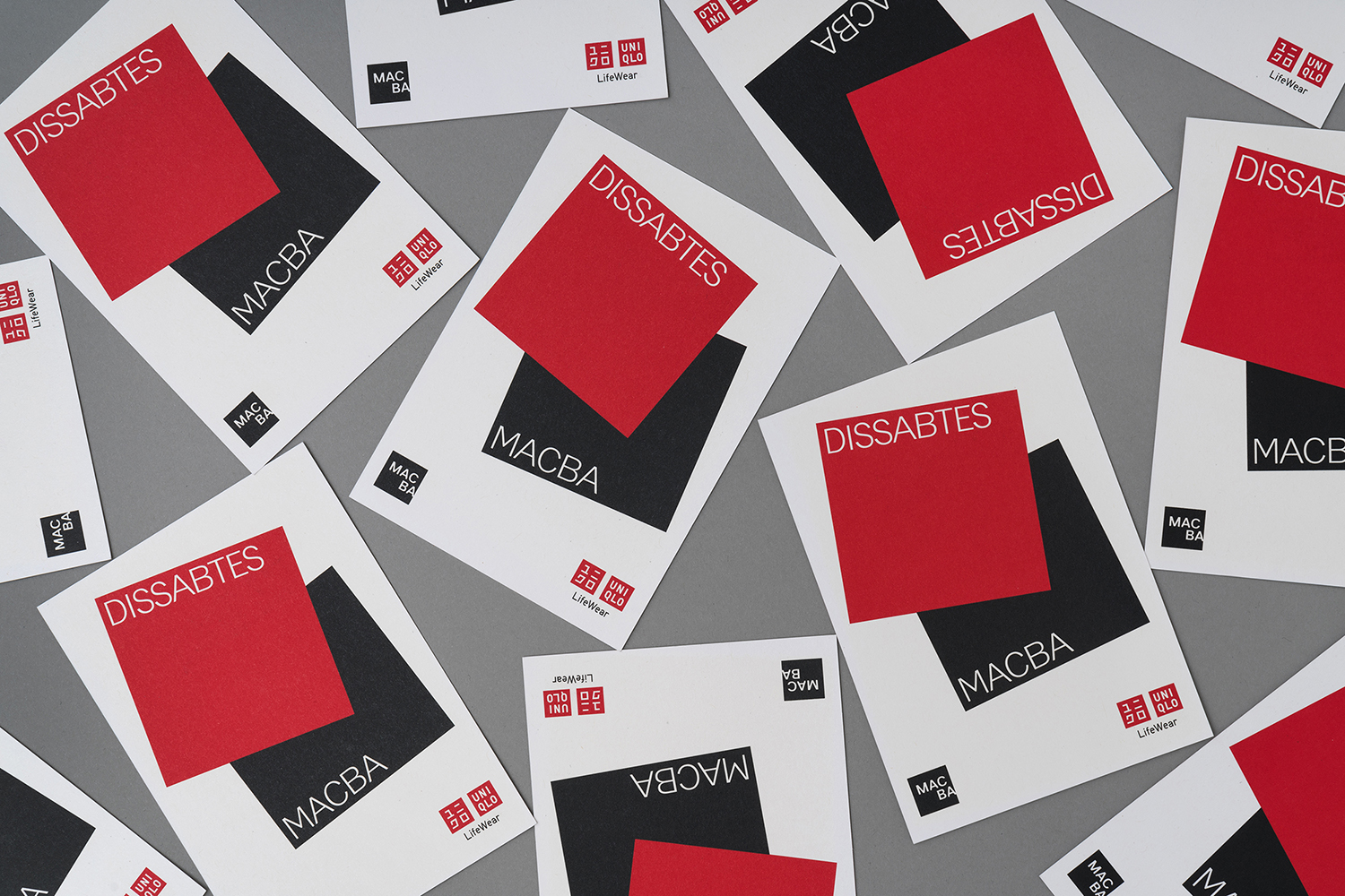
Dissabtes MACBA (“MACBA’s Saturdays”) is a partnership between The Museum of Contemporary Art of Barcelona (MACBA); an iconic architectural symbol and one of the city’s leading cultural institutions, and the Japanese fashion retailer UNIQLO who recently arrived in Barcelona, and due to open its second store this year.
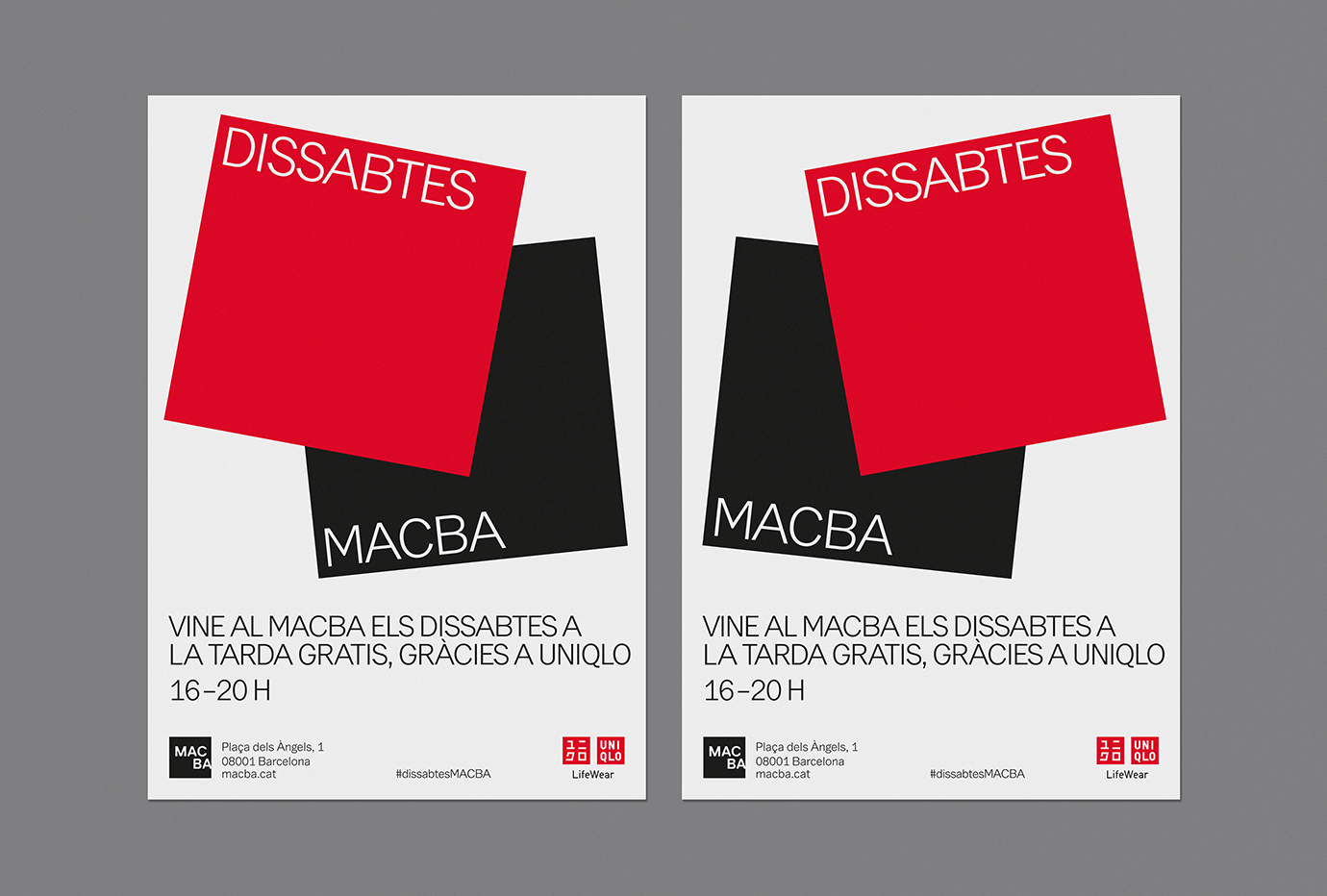
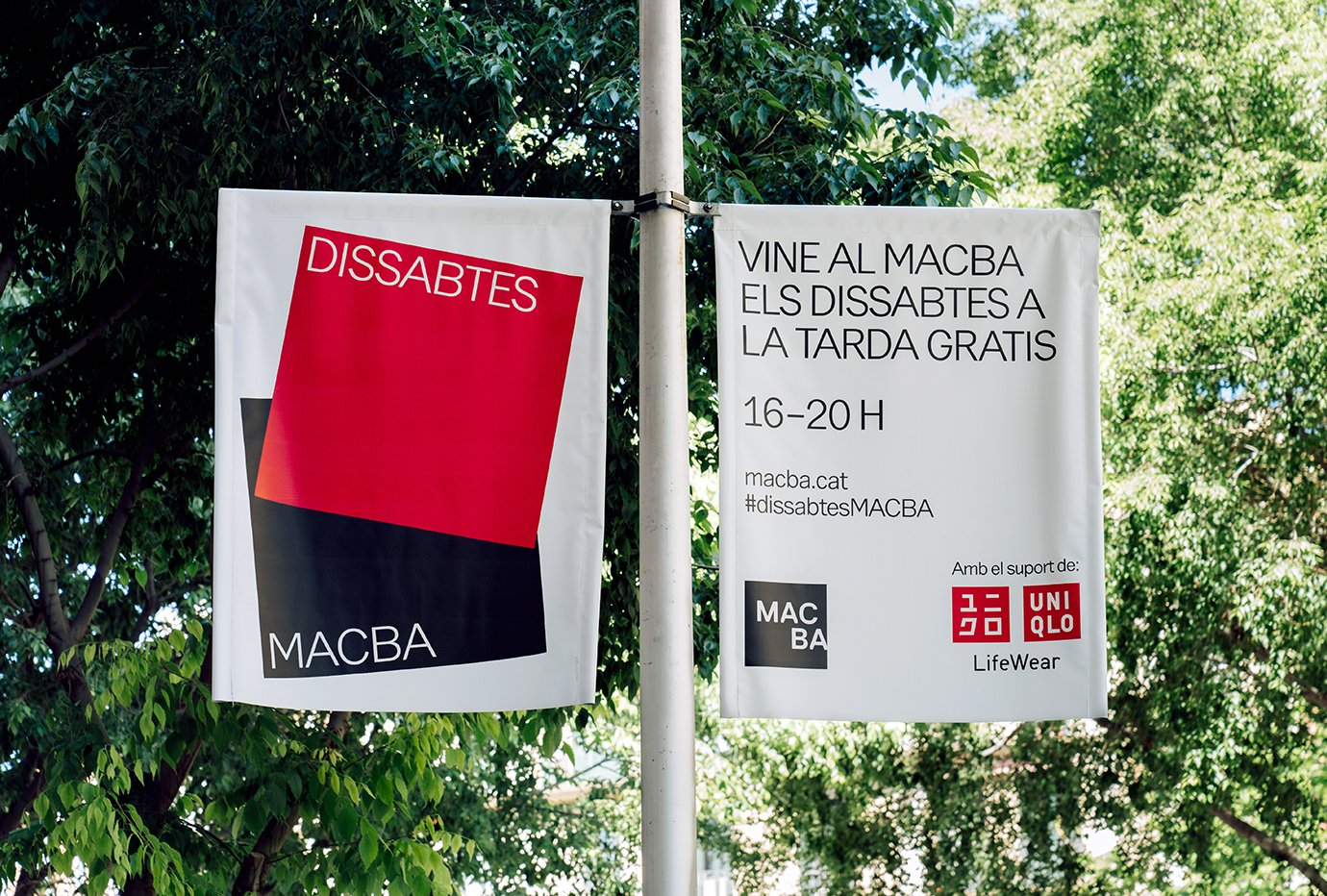
The Dissabtes MACBA initiative offers free entry to the museum every Saturday evening, 4–8pm, and invites visitors to participate in a wide range of differential events and activities that will include workshops, concerts and performances, as well as an opportunity to meet some of the artists who have work on display. To mark the initiative, collaborative spirit, and serving to bring the UNIQLO brand into the local consciousness, Barcelona-based studio Hey was commissioned to create a campaign that represented the close relationship between MACBA and UNIQLO within the city’s centre. This is expressed through both form and colour language, in a striking and singular gesture, elevated by its repetition across a variety of different communicative modes and formats that included posters, banners, bus ads and digital screens throughout the museum.
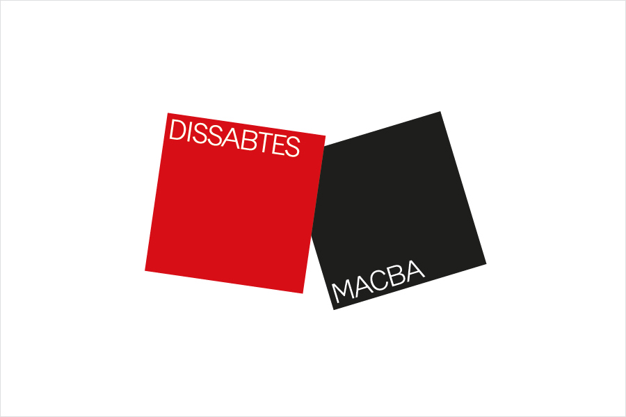
Under the “Dissabtes MACBA” campaign name, created by naming and claiming company Nom-Nam, Hey developed a simple strategic direction that visually expressed and represented the merging of both UNIQLO and MACBA. This is grounded in the essential and foundational values of MACBA, one of which is public-private collaborations as a model to facilitate the development of new projects to bring contemporary art to a wider audience.
The solution is marked by Hey’s observational and opportunistic capacity, to hold true to a conceptual simplicity and graphic immediacy, and deliver it with confidence and consistency, to use repetition and little variation to really drive home the meeting of the two brands.
As a graphic expression, in the use and contrast of two inks, solid colour, void and surrounding white space, in the intersection and proportionality of form, and in the potential of large format posters and banners, the work, at its most fundamental level, serves to really catch the eye.
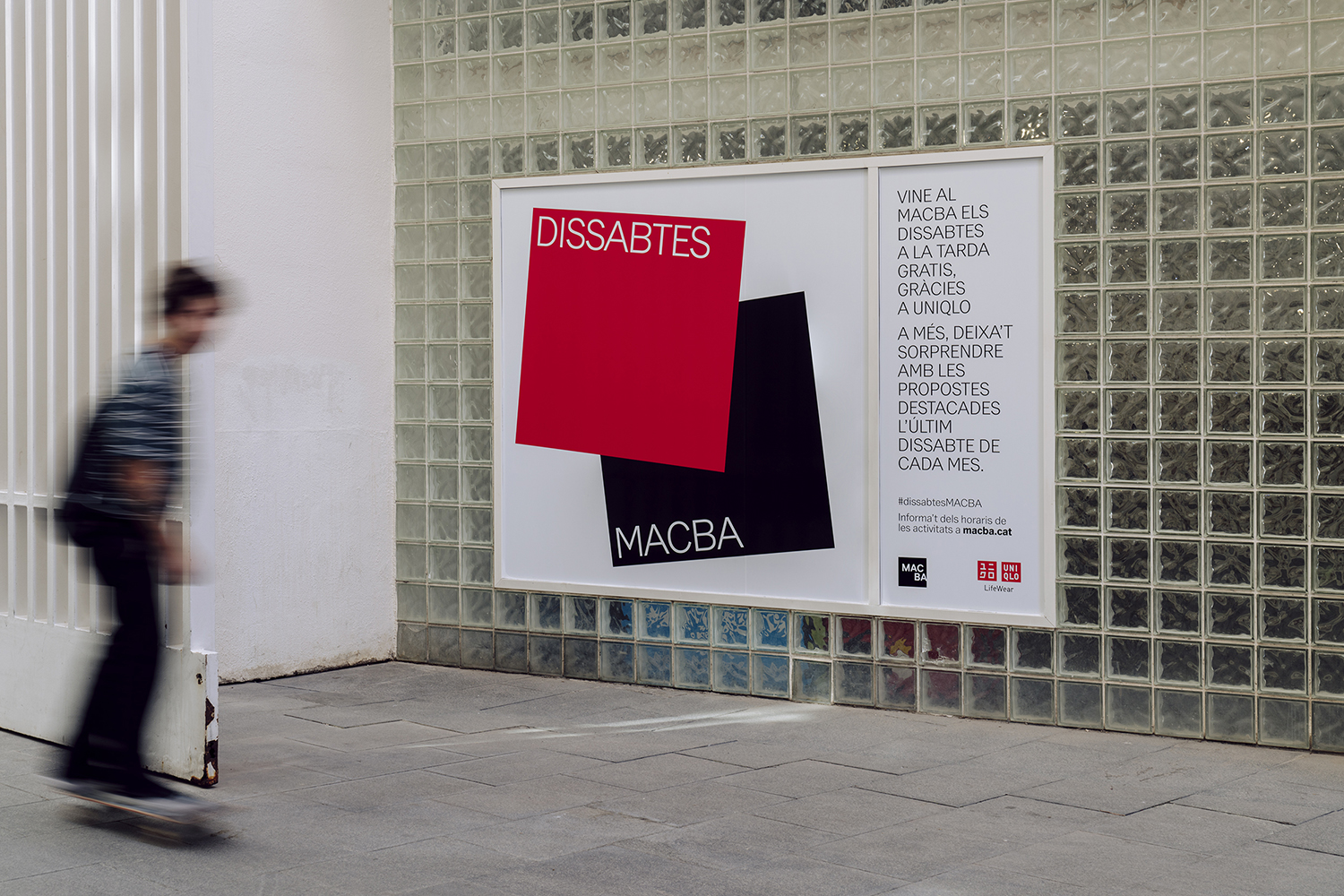
There is a figurative and visual synergy at play here. A satisfaction in the simple observation of a common graphic language of squares and white space that the brand’s both share, but also of a non-verbal associative potential that speaks of architectural structure and democratized space, and the materials and structures of clothing basics for all. There is something interesting in the arrangement and repetition of form, in the choice to place red over black. The allusion might be one of a cover being slid away from a bottomless box to reach into. There is an implied materiality, potential of meaning and creativity from such a simple layout that captures some of the shared philosophies of the two brands, one of which is the desire to create spaces to directly communicate with citizens of Barcelona and use art as a vehicle for expression and social good.

The appearance of both brand’s logos in close proximity serve as tools to decode the initial graphic expression and frees it from being blunt in its messaging. There is a sensitivity to the initiative, in the balancing of cultural and commercial intentions. Many other studios may have been tempted to scale up both logos and have these do a similar thing. Hey’s approach to their work, broadly speaking, their use of form, colour and arrangement, often as single but compelling graphic gestures, feel really well-suited to this project, itself a singular gesture. More work by Hey on BP&O.
Design: Hey. Photography: Enric Badrinas. Opinion: Richard Baird.
