The Best of BP&O — July 2018
Opinion by Richard Baird Posted 31 July 2018
July’s highlights included Paul Belford Ltd’s work for Osofor and Anagrama’s packaging for El Pintor. There were, however, five projects that stood out and have made it into BP&O’s Best Of Series. Between them these typically balance a strong singular concept or an appropriate confluence of ideas with a compelling visual character and clear communicative intention that appropriately play with form, colour, type and layout, as well as material, texture, image and print finish.
BP&O, in this end of month review, tries to recognise both the smart use of small budgets—those that channel spending into the most appropriate assets—and those projects with a broad and holistic quality, establishing a continuity (conceptual and/or visual) across multiple touch points. Many of the projects share a concise aesthetic expression, yet there is nuance and strategic weight to these, so do click through and read more about each of these.
Throughout the month BP&O also continued to expand on its collections series as another way to jump through to older posts on the site. This included Form Language and Type Play.
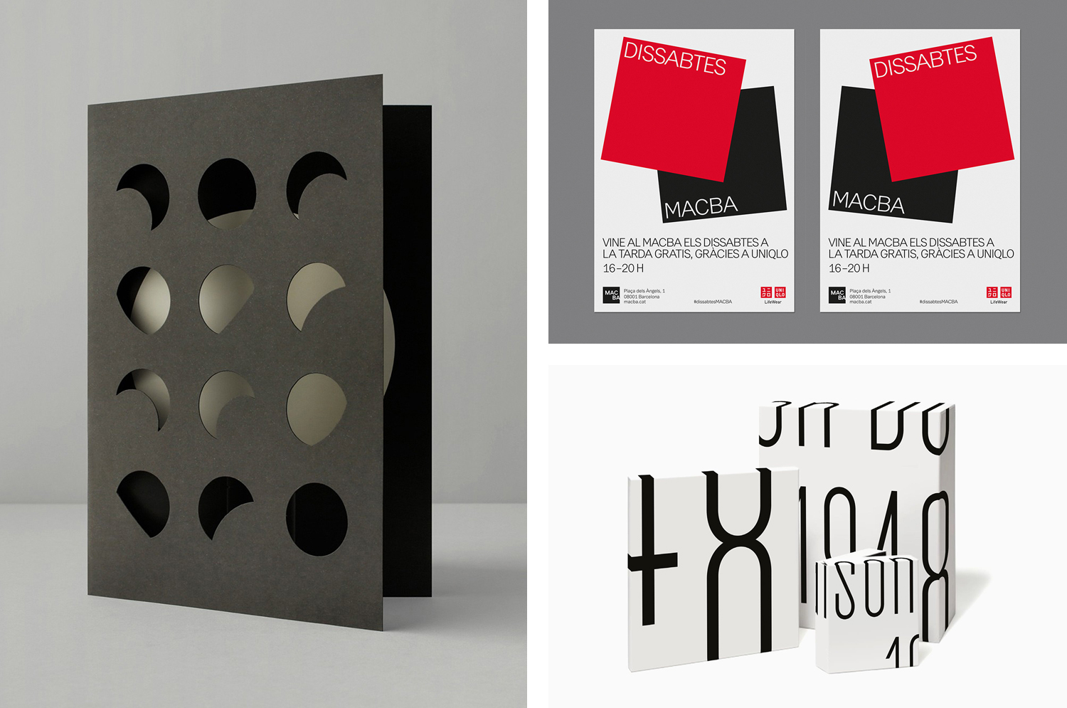
Dissabtes MACBA by Hey

Dissabtes MACBA (“MACBA’s Saturdays”) is a partnership between The Museum of Contemporary Art of Barcelona (MACBA); an iconic architectural symbol and one of the city’s leading cultural institutions, and the Japanese fashion retailer UNIQLO who recently arrived in Barcelona, and due to open its second store this year.
The Dissabtes MACBA initiative offers free entry to the museum every Saturday evening, 4–8pm, and invites visitors to participate in a wide range of differential events and activities that will include workshops, concerts and performances, as well as an opportunity to meet some of the artists who have work on display. To mark the initiative, collaborative spirit, and serving to bring the UNIQLO brand into the local consciousness, Barcelona-based studio Hey was commissioned to create a campaign that represented the close relationship between MACBA and UNIQLO within the city’s centre. This is expressed through both form and colour language, in a striking and singular gesture, elevated by its repetition across a variety of different communicative modes and formats, from posters to bus ads to digital screens throughout the museum.
See more of this project here

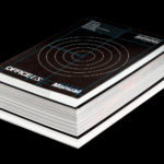
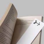
OfficeUS Manual by Pentagram

OfficeUS Manual is a guide to the American architectural workplace over the past century. It is the third book in the OfficeUS series which deals with the development of international US architectural practices, and offers insight into the office life of these over the past 100 years; how they have changed and remained the same. It does this through the compiling and presentation of job listings, timesheets and estimates, work furniture and reception areas, office hours and benefits.
The book is marked by its approach; a balance of criticality, conviviality and deadpan documentation, in its mix of isolated objects, technical drawings and iconography, contemporary reflections by more than fifty architects, artists and writers, and a scope that covers the meta, macro and micro.
The book was edited by Eva Franch, Ana Miljački, Carlos Mínguez Carrasco, Jacob Reidel and Ashley Schafer and published by Lars Müller Publishers. It is a paperback measuring 160 × 240mm, made up of 288 pages featuring 461 illustrations and was designed by Pentagram partner Natasha Jen and team.
See more of this project here
Baluna by Grupa by Bunch

Grupa is an award-winning design studio and manufacturer of handmade furniture and lighting products for home, office and hospitality spaces. Building on over a decade worth of experience Grupa branched out into own brand products in 2012.
From drawing board to design and development, production, packaging and distribution, the company has developed a total design philosophy and a product range that brings together and expresses everything that inspires the team at Grupa. Their products are distinguished by an innovative and concise material and form language, a clear functionality and a flexibility of situation and movement. Baluna, a free-standing or wall and ceiling-mounted light captures this spirit. Its silent dimmer, blown glass opal diffuser and LED bulb deliver a consistent level of light dispersion while a telescopic bar and 360-degree rotational axis offer swift and broad adjustments.
To promote Baluna Grupa worked with graphic design studio Bunch to develop a communications pack and packaging. This takes the distinctive interplay of light and shadow, form and surface, flexibility and utility that characterises the light and develops a distinctive graphic and material expression.
See more of this project here
Maison De Greef 1848 by Base Design

Maison De Greef 1848 is a high-end luxury jewellery brand, expert watchmaker and retailer that opened its first shop in 1848 at 24 Rue au Beurr, Brussels. Shortly after De Greef became the official clockmaker for the Belgian National Railway Company and then the supplier of pocket watches for the Belgian Navy.
The brand has built an enduring legacy and weathered many changes over its 170-year life. It remains a family business and is in the hands of its seventh generation. This new generation worked with Base Design to rethink the clichés of the market and develop a new graphic identity. This is characterised by a bold simplicity of type and in words, a contrast of colour and a conviviality of image, and included stationery, packaging, bags and website design.
See more of this project here
Arper 2018 by Clase bcn

Arper is an Italian furniture company producing chairs, tables and furnishings for community, work and home spaces. They seek an elegant resolution of function, form and finish which is founded on a total design philosophy that covers design, production and long-term impact. Arper commissioned Spanish studio Clase bcn to develop and design a new on and offline graphic identity for all their 2018 communications and promotional materials. These included catalogues, notebooks, press packs and tote bags, and were complemented by distinctive art direction and newsprint. These draw on and add to the essential forms and colours of Arper’s Salone del Mobile stand designed by MAIO Architects.
See more of this project here