Repair by Studio Round
Opinion by Richard Baird Posted 15 August 2018
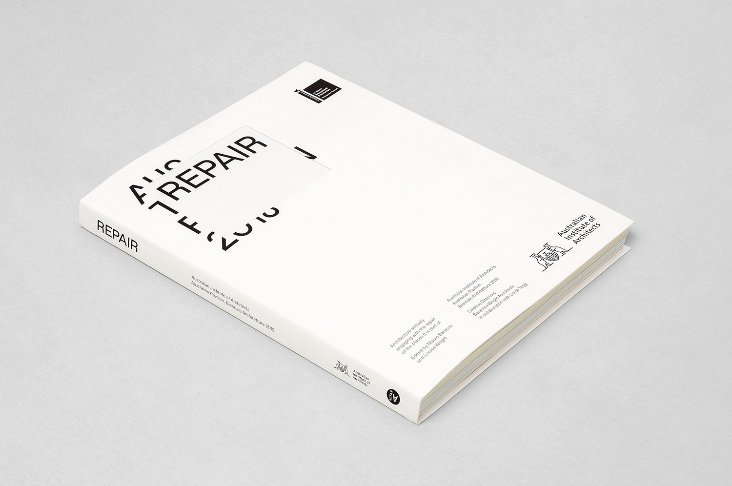
Under the title Freespace the 16th International Architecture Exhibition, Biennale Architettura 2018 in Venice, asked international participants to “encourage reviewing ways of thinking, new ways of seeing the world, of inventing solutions where architecture provides for the well being and dignity of each citizen on this fragile planet”.
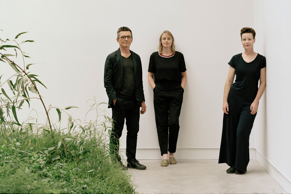
The response from Australia; a pavilion titled Repair and a collaboration between the Australian Institute of Architects, Creative directors Louise Wright and Mauro Baracco of Baracco+Wright, and artist Linda Tegg, investigates the relationship between architects and their use of land.
The pavilion brings to material reality a belief held by Wright and Baracco that architecture should actively engage in the ecological repair of place and that this action will in-turn catalyse other types of social, economic and cultural repair.
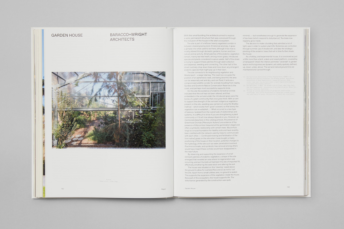
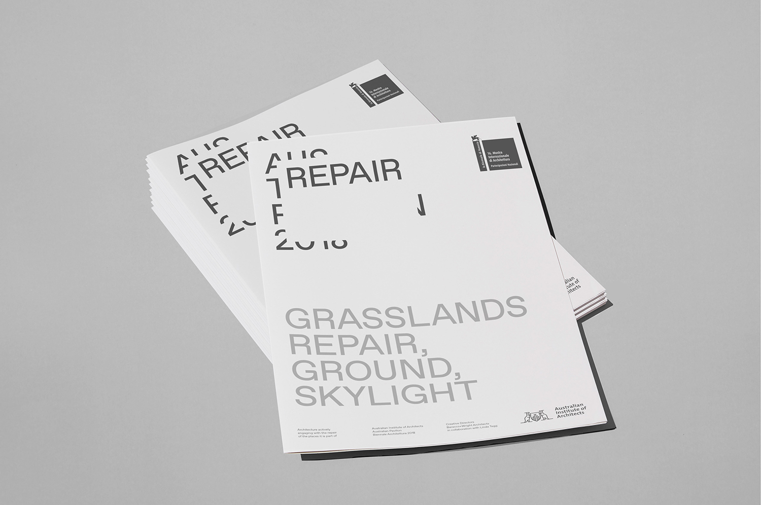
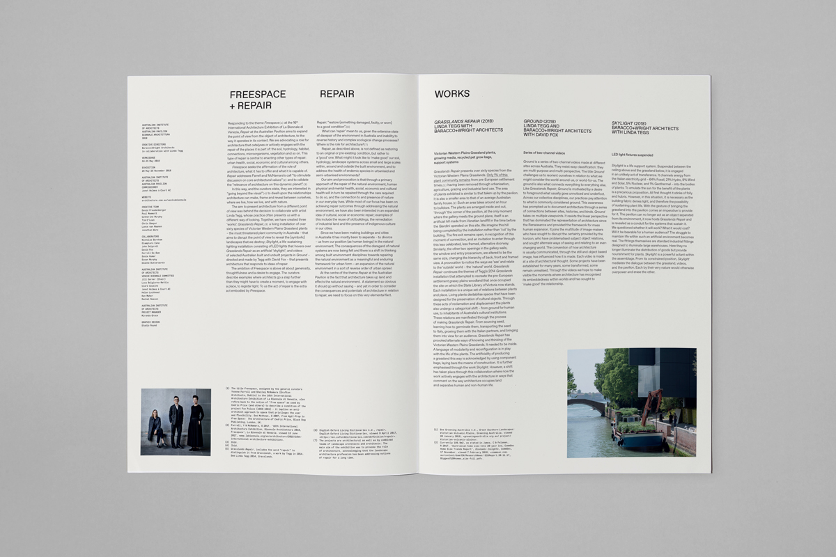
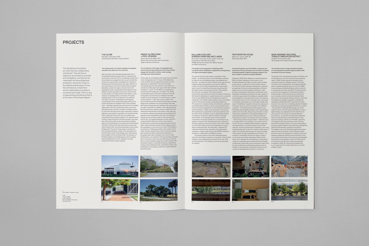
Working with the Australian Institute of Architects and Baracco+Wright, Melbourne-based Studio Round developed a graphic identity for Repair. This is included a graphic and material design language that connects catalogue, newsprint and website about the pavilion and its concept.
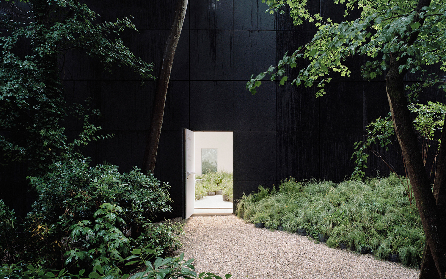
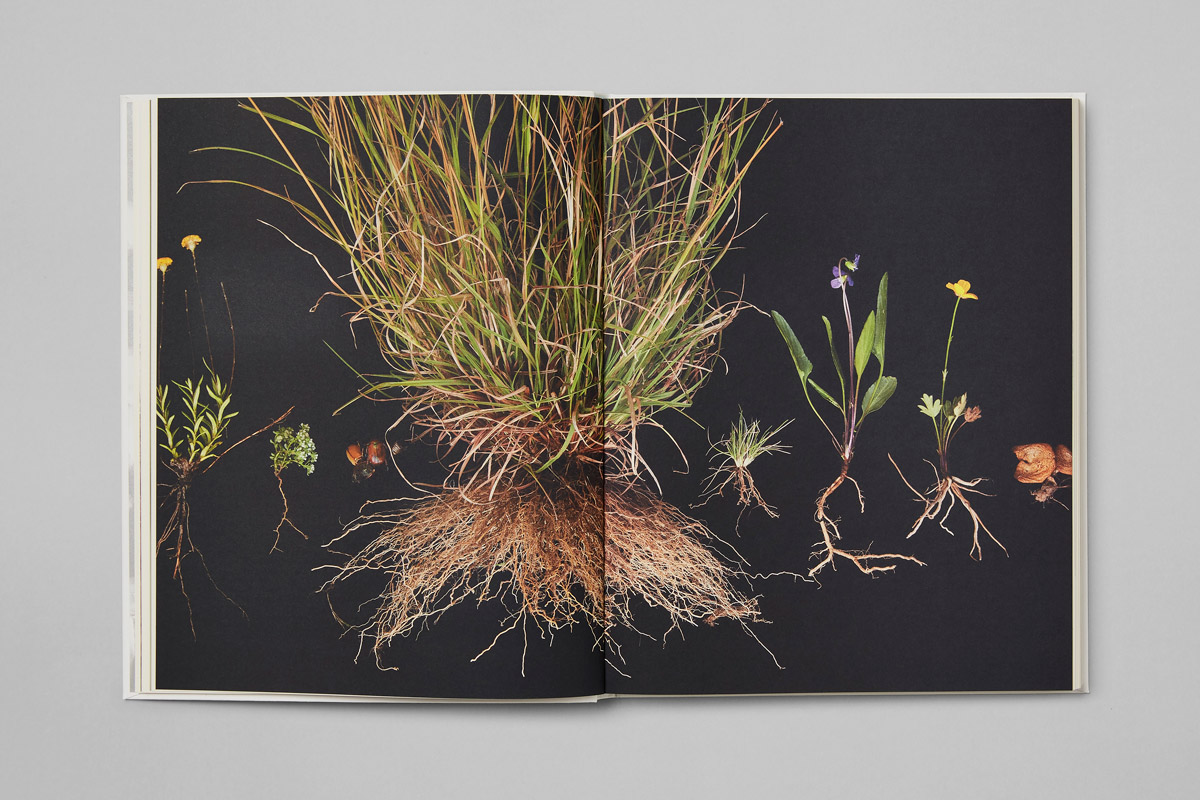
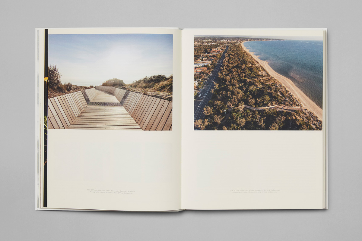
Repair presents a living, breathing installation of many of the undervalued and threatened plant species from Western Plains Victorian Grasslands. It pairs this with a 2-channel video documentation of Australian built environmental projects that address the exhibit’s key concerns.
The pavilion is marked by its contrasts. Its acute juxtapositions. The meeting of the natural environment and the built structure, a threshold between dark and light, ignorance and illumination. These are brought into sharp focus through the use of framing and the creation of clear boundaries; the transition from the outside in and vice versa, amplified by black exterior structure and white interior.
The architecture; in its surface and finish, draws out the colour, shape and texture of trees and grasses, capturing their beauty and idiosyncracies (there’s over a thousand on display) and deliver a visual immediacy to the work (nature is given a gallery context) before the sub-contextural commentary begins to manifest itself.
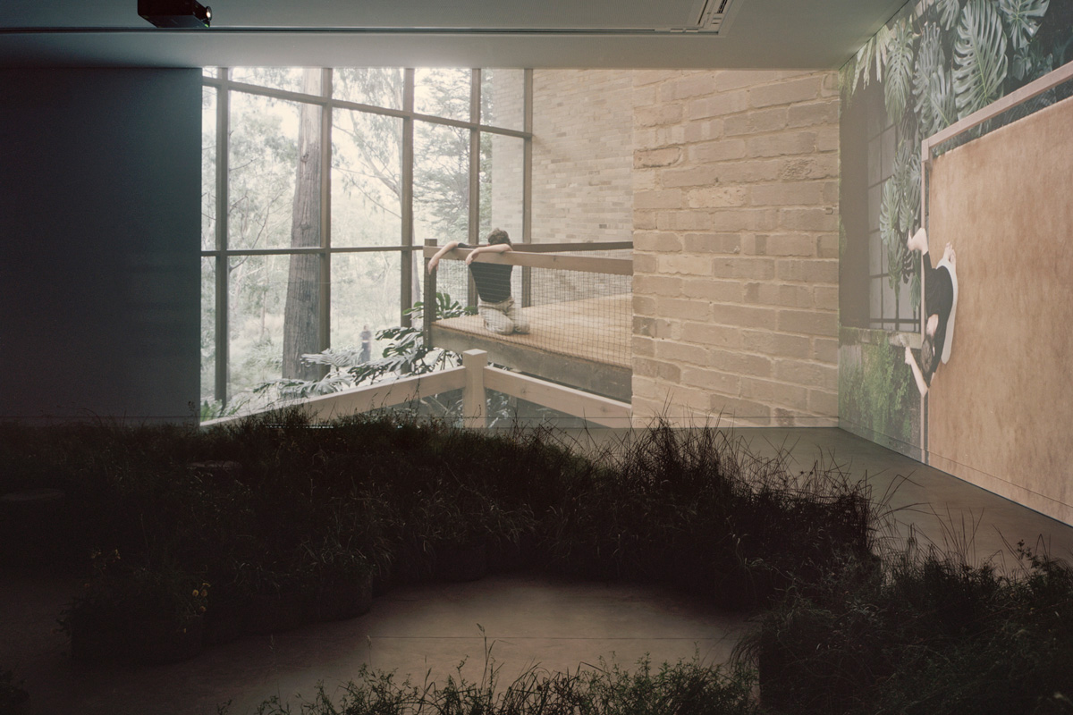
Inside, nature imposes itself on the precise surfaces of a manufactured structure. This imposition, the absence of a synthesis, appears as a stark provocation. Video projections, however, display what appears to be the antithesis of this; projects where the natural and made intersect and synergise.There is a dialogue here. Together, structure and video raise an awareness and reflect on a contemporary condition, yet also follows through with a proposition, how we might move forward.
Highlights include the artificial lighting of a facsimile of a wild landscape. It recontextualises the natural environment, displaces it and lights it unnaturally, consistently, unlike the outside’s irregularity of light provided by the sun and clouds, the passage of time and variance of the seasons. As such, there is an unnatural preservation implied, the implication of the hermetically sealed, a prolonged yet finite existence. The box of the pavilion heightens this proposition and dialogue between structure and space by inverting it.
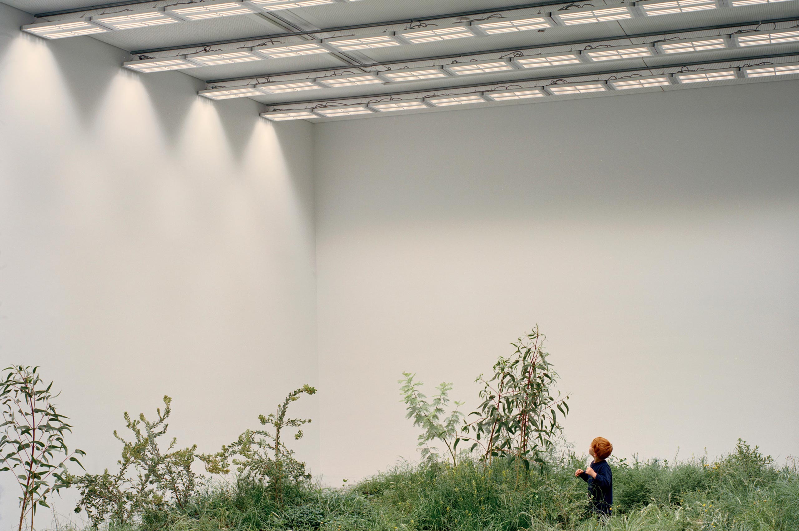
There is something hugely provocative in the image of a child playing amongst a threatened species of grass, staring up at a sky of neon tubes and the infinite white yet boundaries of a box. This calls to mind the domes of Silent Running, nature held in suspension within the void of space, waiting to be recalled.

Although BP&O would typically focus on the visual identity portion of a project, a critical understanding of the pavilion is essential to the appreciation of the simplicity of graphic gesture, particularly as there have been a few recent projects employing a similar technique.
The initial static impression is the interplay between structure and space. In motion there is the allusion to the hollowing out and the reconfiguration of space, and finally, through proportionality in print, in the space created within type and the ratio of photographs, make a critical connection between implied structure and the natural landscape throughout the catalogue. Just like the 2 channel video installation, these images bring to light a proposition, the synthesis of architectural structure and natural environment, not imposition or destruction.
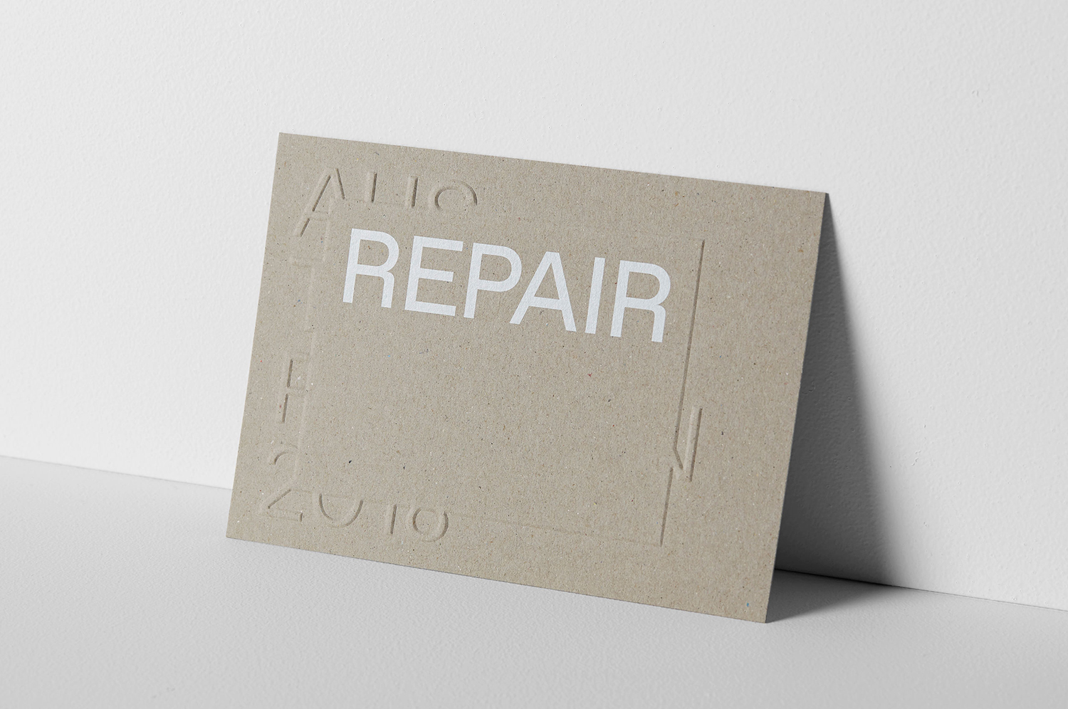
Type serves as a figurative gesture. Its letterforms and consistent line weights, geometry, some of this made immediate in the quirks of the R and Y, as well as breaks in words and stacked arrangement set an architectural tone. Invitations work in additional detail. The implication of layers (the form language of framing, containing and repairing), as well as light and shade, natural materials and environmental consideration, emerge through the blind embossing of a mixed-fibre / reclaimed substrate.

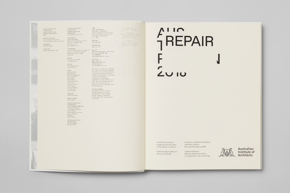
The pavilion and the biennial have a critical relationship with time. Where brand identity typically seeks longevity, the pavilion’s identity exists within a clearly defined (and thus understandable and manageable) moment in time and is a distillation and projection of a central idea. And in this way, it feels thoughtful and compelling. In its abstraction, yet graphic and material thoughtfullness intrigues ahead of the pavilion, and is the recipient of meaning and further value following experience or further reading. More work by Studio Round on BP&O.
