BP&O Collections — Best Awards Finalists 2018
Opinion by Richard Baird Posted 14 August 2018

The Best Awards is an annual celebration of interactive, graphic, product and spacial design work from New Zealand and Australia, run by The Designer’s Institute. This year’s event will take place on Saturday 22nd September at Auckland’s Viaduct Events Centre where winning studios will be awarded a Gold Pin for best in category, a Supreme Pin for best in discipline or a Purple Pin for those considered to have raised the bar of design.
Other awards include The John Britten Black Pin, which will be given to an individual for their leadership, vision and achievements nationally and internationally, and The Designer’s Institute of New Zealand Black Pin for Outstanding Achievement. This will be awarded to a member who has made a lasting and valuable contribution to the design profession and design culture in New Zealand. The judges for each category can be seen here.
To coincide with the publication of the finalists BP&O looks back at those projects reviewed on the site and up for awards in September. Finalists include Re, Akin, Studio South, Garbett and Richards Partners.
Edition by South, New Zealand

Edition is a new property development by LEP Construction. It will be located in Parnell, a suburb of Auckland, New Zealand, and made up of 18 luxury apartments designed by architects Monk Mackenzie with a eye for flexible space and changing natural light. Edition will make the most of a sloping site, feature three levels cantilevered above ground and create what are described as “view shafts” from street right through to the harbour beyond. This modern structure, and sensitivity to its context, is complimented by a luxury interior design, created by Bureauxe, of both contrast and continuity, in materials, surface textures, colour and form.
Graphic design studio South were commissioned to create a visual identity for Edition that would assist the real estate team in presenting the project to potential buyers, and help, in conjunction with the building’s distinctive structural and interior design plans, elevations and renderings, to distinguish Edition within a crowded luxury apartment market.
With the intention of capturing the essence of the building, and informed by the spacial, visual and material language of Monk Mackenzie, South created a brand identity of light and reflection, moments of contrast and correlation, and a recurring rectangular motif. This links a variety of marketing materials that included brochure and brochure sleeve, sales book and box, invitation, floorpans, buyer gift and business cards.
See more of this project here

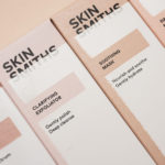
Skinsmiths by Akin, New Zealand

Ki Sunscreen was developed by national skincare clinic Caci to protect against the harsh New Zealand sun, and the skin damage and premature ageing that UVA and UVB rays can cause. This is been expanded into a larger and broader range of skin treatments and renamed Skinsmiths. The range is made from the latest generation of ingredients proven to protect and those that help to control oils and maintain a matt finish. This balance of clinical effectiveness and cosmetic mindfulness is expressed by its graphic identity, created by Auckland studio Akin, in the meeting of a bold black logotype and in the material interaction and contrast between uncoated paper and distinctive glossy print finish.
See more of this project here
Culprit by Studio South, New Zealand

Culprit is a bar and restaurant located on Auckland’s Wyndham Street. It has a menu made from ingredients supplied by local New Zealand producers, growers and farmers, and is inspired founder’s Kyle Street & Jordan MacDonald’s travels across the United States and Europe.
Culprit has a modern interior design in a converted loft space created by Kirsty Mitchell. This is characterised by large exposed beams and brick walls, solid wood tables and strip lights suspended from the ceiling and mounted, at irregular angles, on walls.
Culprit’s visual identity, created by Studio South, is described as being dark and moody. This intended to visually articulate something of the restaurant’s menu and service, which sees diners presented with trays and trolleys, and as a way to compliment Kirsty Mitchell’s interior design. This links menus, tap heads, posters, signage and website.
See more of this project here
Soto by Richards Partners, New Zealand

Southside Group and Colliers International worked with New Zealand based studio Richards Partners to develop a graphic identity for their new property development, located in between Auckland’s Meadowbank and Remuera, which is made up of 58 ‘Residences’ and 7 exclusive ‘Pavilions’ designed by architects Monk Mackenzie and Hare Interiors.
The Soto name and graphic identity designed by Richards Partners functions as a way to tell a story of ‘mindful apartment living’ and expresses the unique material qualities of the residencies and pavilions. This is aimed at market downsizing from traditional homes, and is described as a combination of Japanese zen elements with a focus on an elegant materiality. This connects property brochures, material sample packs, advertising, website, display suite and signage.
See more of this project here
Verso Architecture+Interiors by Studio South, New Zealand

Verso is a small Auckland-based architecture and interiors business working within the residential and commercial sectors. Drawing on the oppositional nature of name and using a mix of simple typographical form, high-quality materials and print finish Studio South developed a new visual identity for Verso that is described as being both sophisticated and playful, whilst effectively working in some universal architectural principles. This links a variety of printed assets that included stationery, business cards, notepad and signage, with website soon to launch.
See more of this project here
Sydney Design Festival by Re, Australia

Sydney Design Festival has been running for 20 years, making it one of the oldest design festivals in the world. It provides its visitors with an opportunity to understand design practice in all its forms, to bring to light problem, process and response, and to foster a closer connection with the designers and businesses helping to shape our collective futures. With a change in dates, moving the festival from September to March, placing amongst a busy cultural calendar, the festival worked with Re to develop a graphic identity that would allow it to stand out and announce its new Autumn arrival across a variety of digital and printed communications. These included a responsive website, event programs, flags, posters, flyers, invitations and environmental graphics.
See more of this project here
The Conference Company by Studio South, New Zealand

The Conference Company (TCC) specialises in the design, organisation and execution of large-scale conferences throughout New Zealand and Australia. They also apply this expertise to award ceremonies under the name The Awards Company. It is a strategically interesting delineation yet a straightforward naming practice. Expressing what either company does was clearly not an issue, however, in a fast moving industry, where innovation is essential, the graphic identities of The Conference Company and The Awards Company had grown tired. With this in mind, TCC founder Jan Tonkin commissioned Studio South to help define company values, understand future ambitions and explore how to position them as innovative thinkers and leaders in their field. The result is a new logotype, pattern, colour palette and governing system that both defines and unites both companies under a distinct new visual language. This links stationery, print communications, posters, name badges and signage.
See more of this project here
CareerTrackers by Garbett, Australia
CareerTrackers is an Australian nation-wide charitable organisation that addresses Indigenous disadvantage by developing professional career pathways, internship programs and links with private sector employers for Indigenous university students. It does this through a model adapted from an African-American internship program which has a proven legacy of 45 years. This is based on an approach that sees students intern with sponsoring companies with the intention of converting them into full-time employees following their university degree.
Sydney-based studio Garbett worked with CareerTrackers to develop a visual identity for the organisation’s report and Gala Awards evening which included banners, information cards and awards. These are united by a striking and modern yet referential coalescence of form and multi-colour, and an element of the structural.
See more of this project here
Meg’s Tailoring by Studio South, New Zealand

Meg’s is a tailoring service, established by Megan Kenny, that began as a single store on Garfield Street in 1995. Meg’s now has two locations in Auckland, New Zealand, provides a broad range of services; from hems to full garment design, and works on large projects with high-end designers and labels such as Hugo Boss, Prada and Gucci, and on smaller jobs from High Street drop-ins.
Megan Kenny has worked in Sydney and London, has decades of experience in dressmaking, fashion and interior design, and has built a team of tailors, seamstresses, designers and machinists, many of whom she has trained herself. Megan and her team are passionate and respectful and pride themselves on their attention to detail and customer care.
With the intention of better communicating the team’s ongoing ambition to deliver quality work and exceptional service, Megan worked with Auckland-based Studio South to evolve Meg’s brand identity and re-introduce it to the market in a fresh and contemporary way. This was achieved through universal motif and colour palette, the materiality of uncoated papers and glossy finishes, and a modern restraint. Alongside digital presence and art direction, Studio South also provided Meg’s Tailoring with a variety of printed assets, these included branded t-shirts and carrier bags, signage, decals and business cards.
See more of this project here