The Conference Company by Studio South
Opinion by Richard Baird Posted 17 August 2018

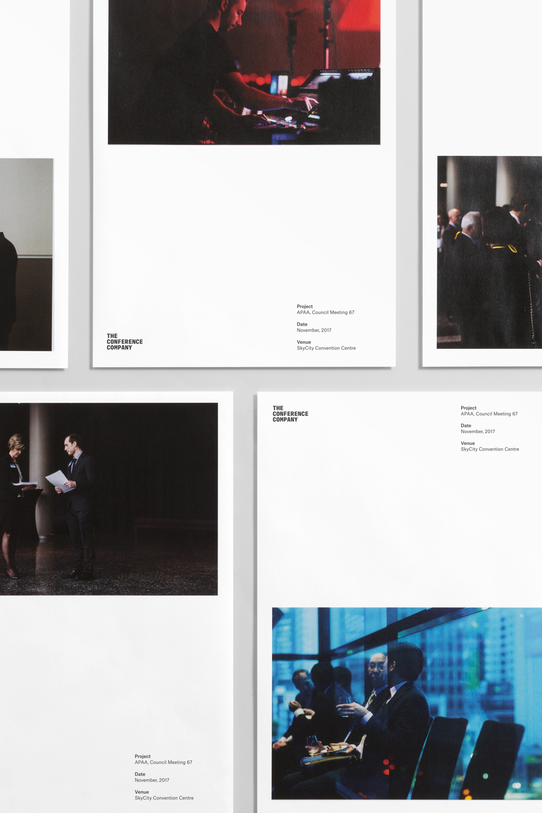
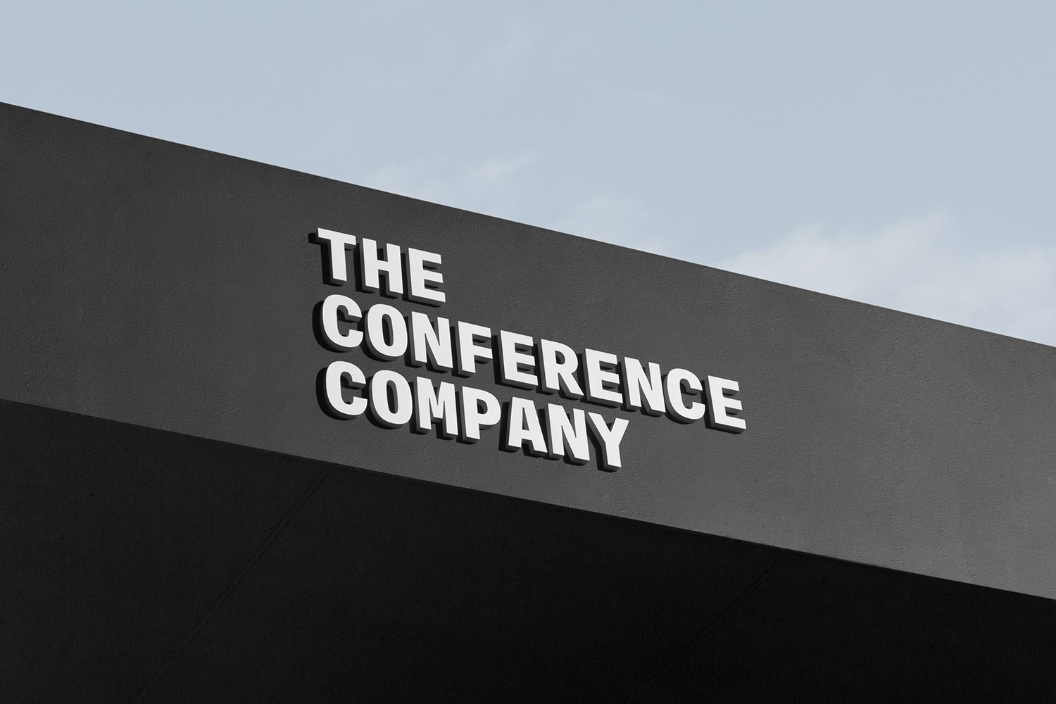
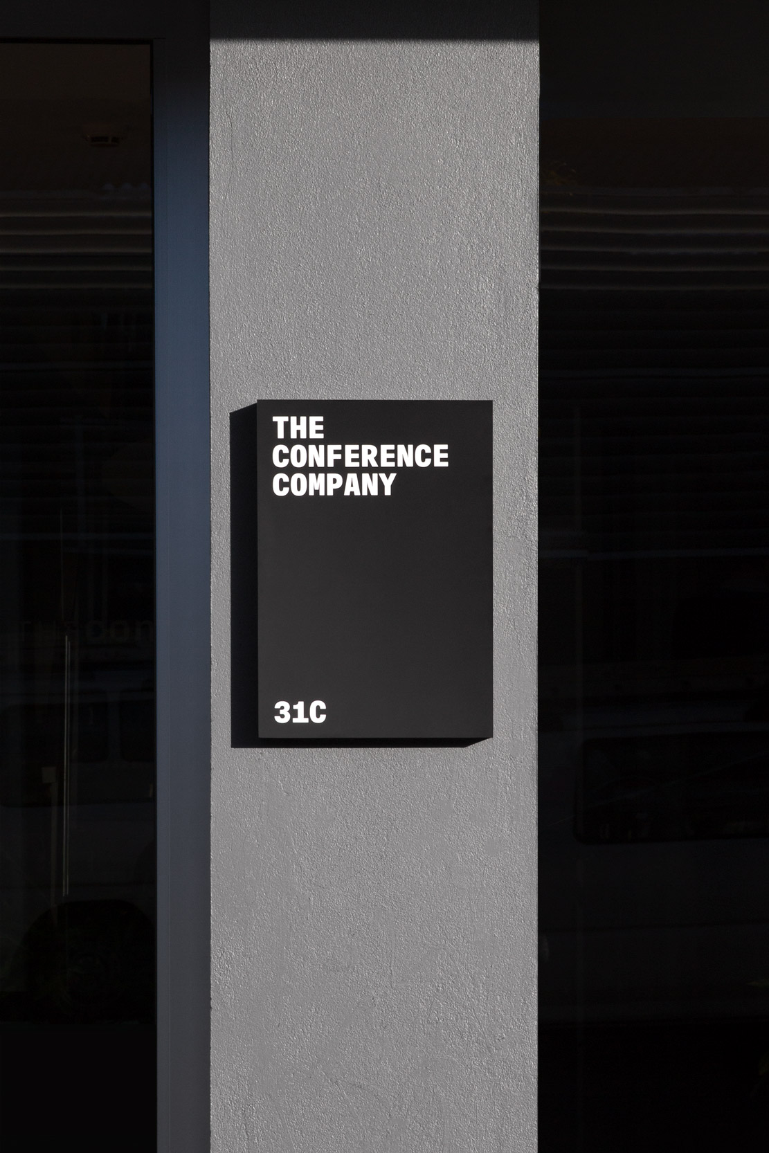
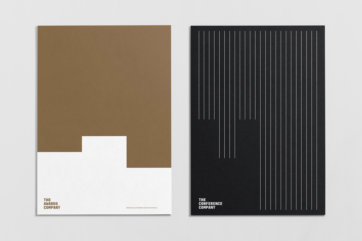
The Conference Company (TCC) specialises in the design, organisation and execution of large-scale conferences throughout New Zealand and Australia. They also apply this expertise to award ceremonies under the trading name The Awards Company. It is a strategically interesting delineation yet a straightforward naming practice. Expressing what either company does was clearly not an issue, however, in a fast moving industry, where innovation is essential, the graphic identities of The Conference Company and The Awards Company had grown tired. With this in mind, TCC founder Jan Tonkin commissioned Studio South to help clarify the values of each company, understand and crystalise future ambitions and explore how to use these insights to position them as innovative thinkers and leaders within their field. The result is a new logotype, pattern, colour palette and governing system that both defines and unites both companies under a distinct new visual language. This links stationery, print communications, posters, name badges and signage.
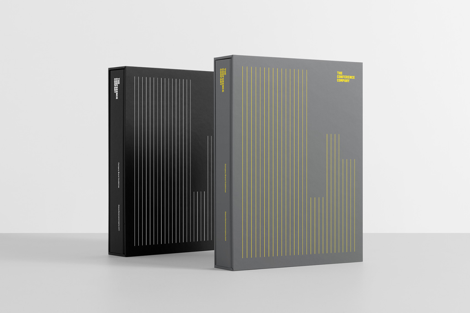
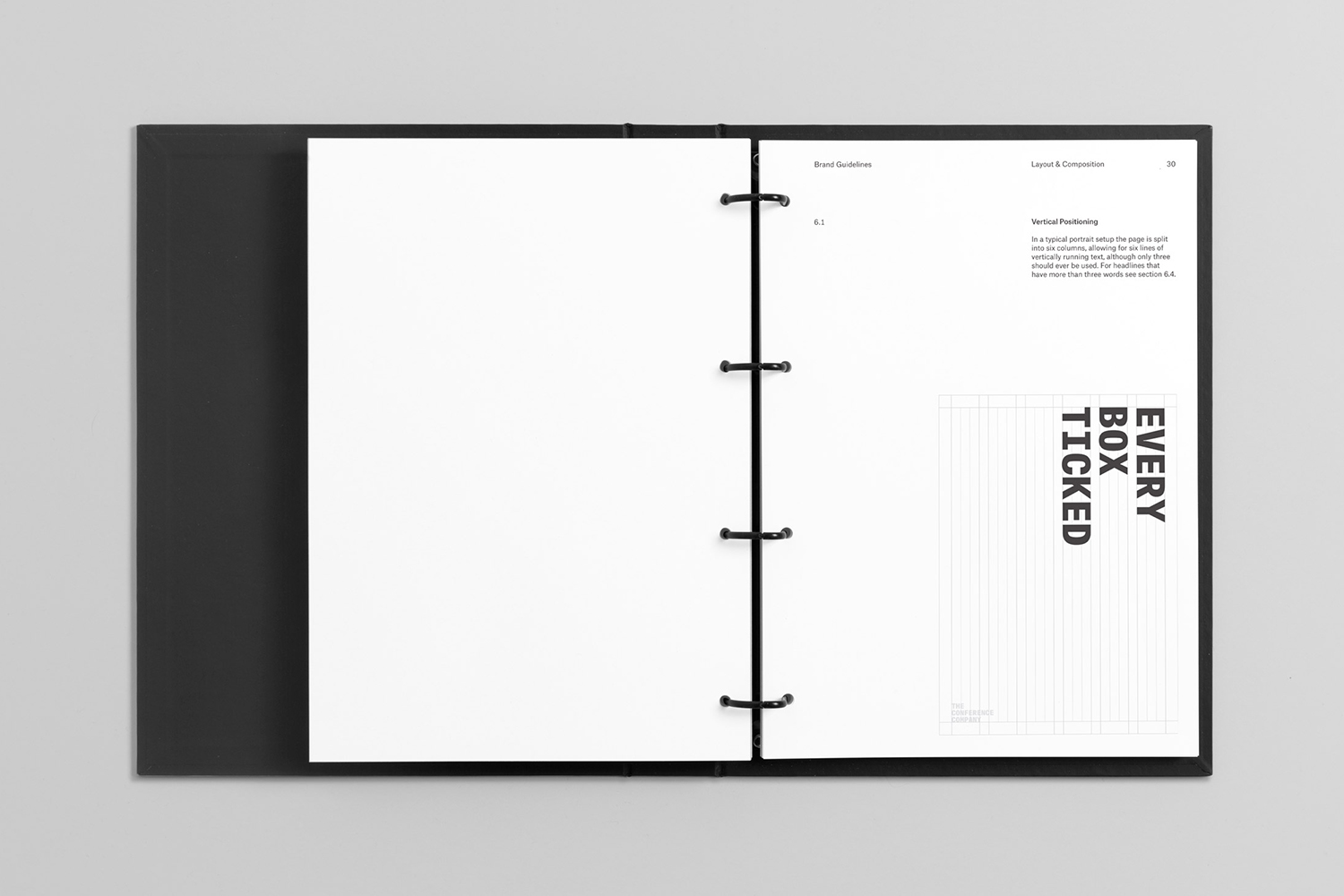
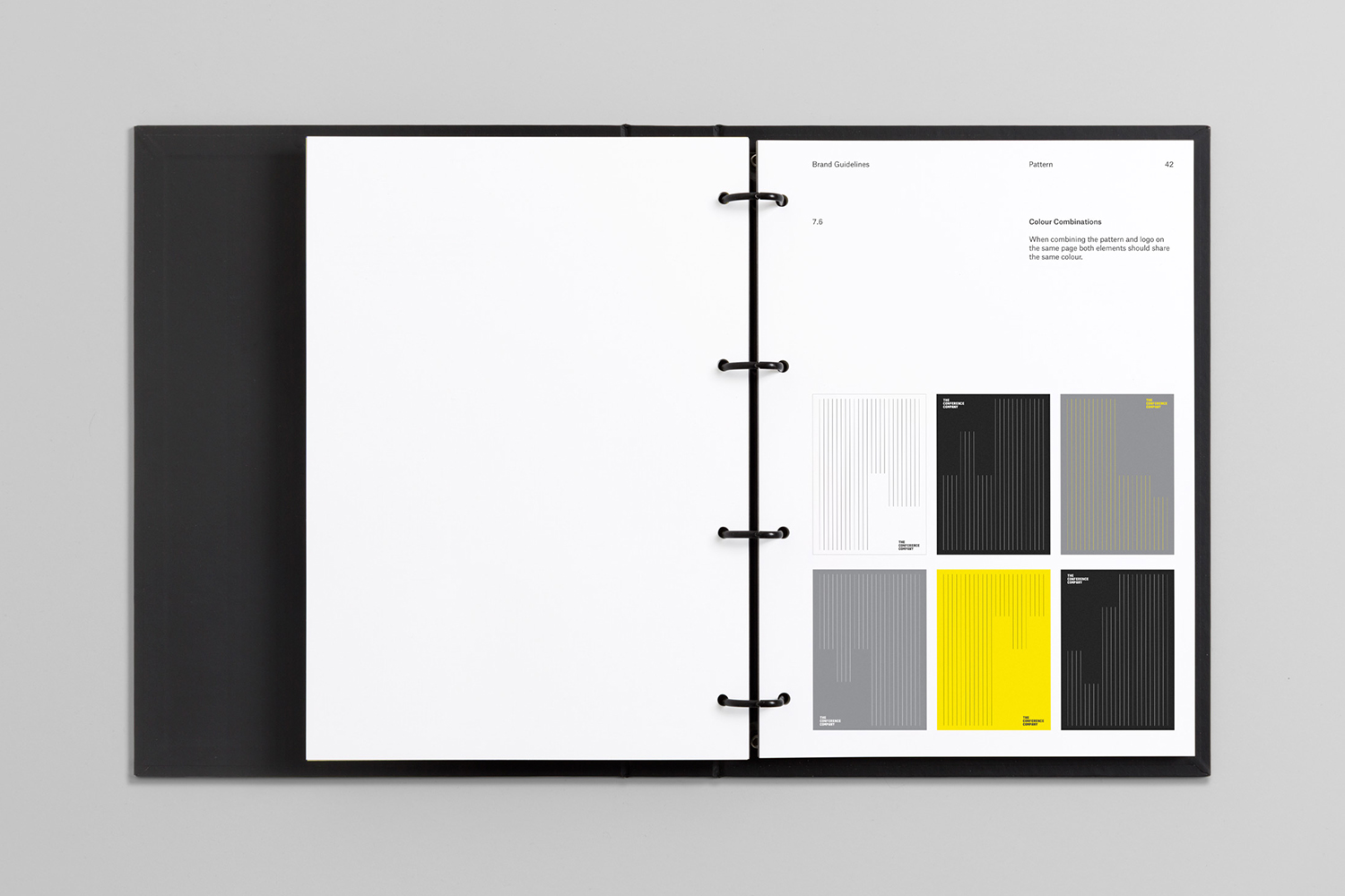
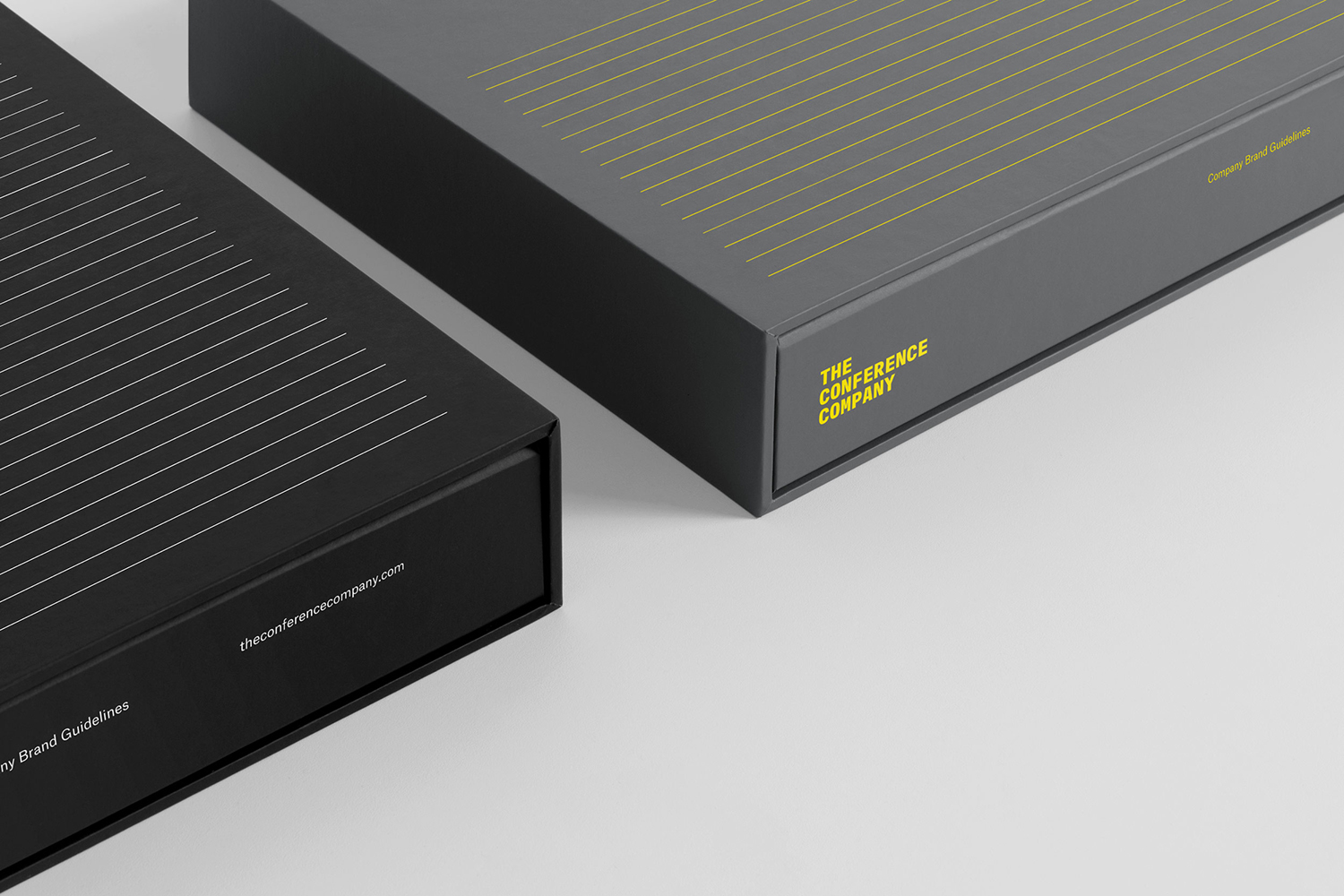
The central message that TCC sought to communicate was a bespoke and individualised service practice, an absence of template approaches and the extensive time given to get to know clients as they mentored and guided them through each stage of the process. This journey differentiates the company from their competitors and manifests itself within the form language of the ruled page, a space to begin to define objectives and jot down ideas. This was developed into a dynamic pattern, adapting to context, and given a strong structural quality in its arrangement and in the interplay of positive and negative space. This interplay is dictated by the three line and staggered nature of the logotype.
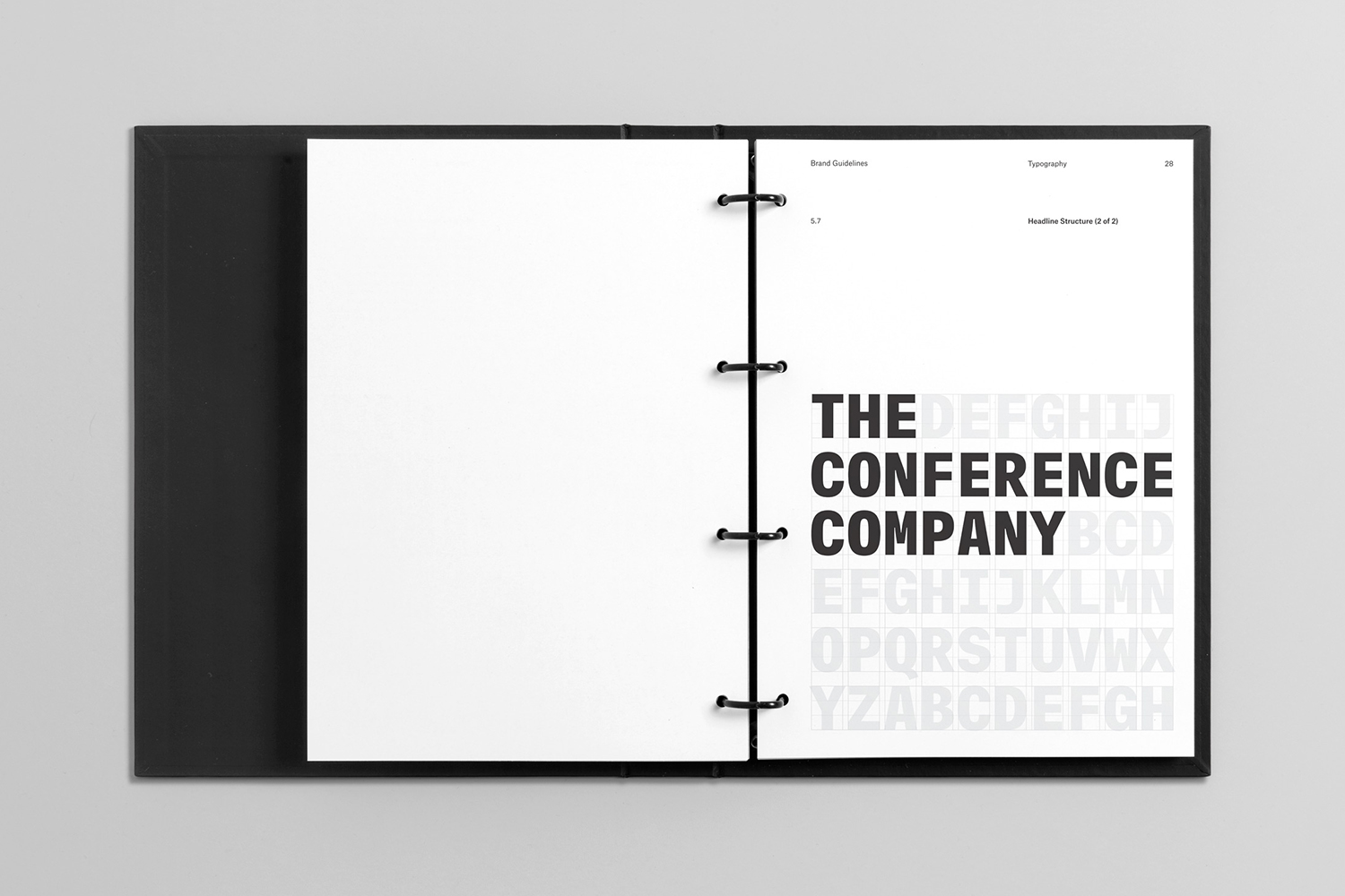
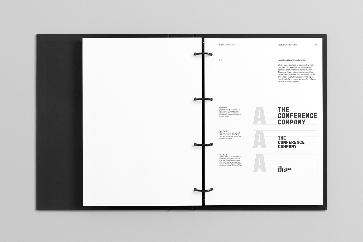
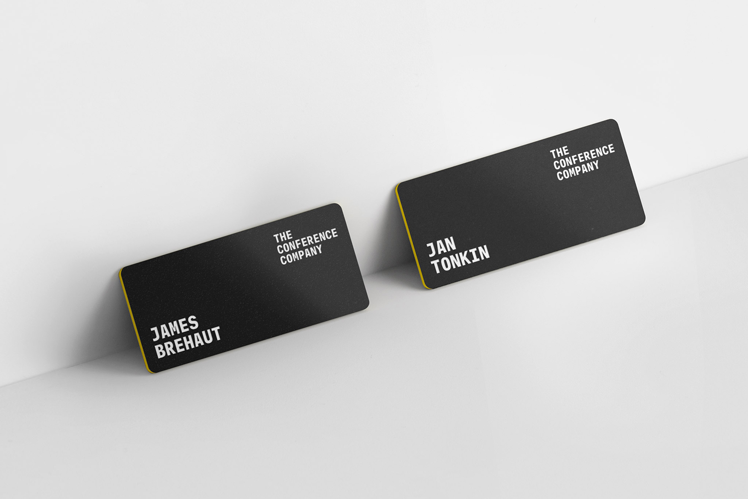
The monospaced characters of Atlas Typewriter seek to reinforce the theme of the written word, to build on the ruled page, however, this choice feels distinctly more mechanical than that. The systematic nature of type is apparent in its adherence to an unwavering commitment to width and space, where designers seek to create flow, and in its optical irregularities. This is, perhaps, contrary to the individualised service practice offered by TCC but is tempered by words and the contextual responsiveness of the graphic identity as a whole. In a consistency of weight and space, a clear visual and conceptual relationship between pattern and type is formed. The yellow edges of the badges are a neat continuation of theme of lines, while the proportionality of type is a satisfying nod to large-scale events.
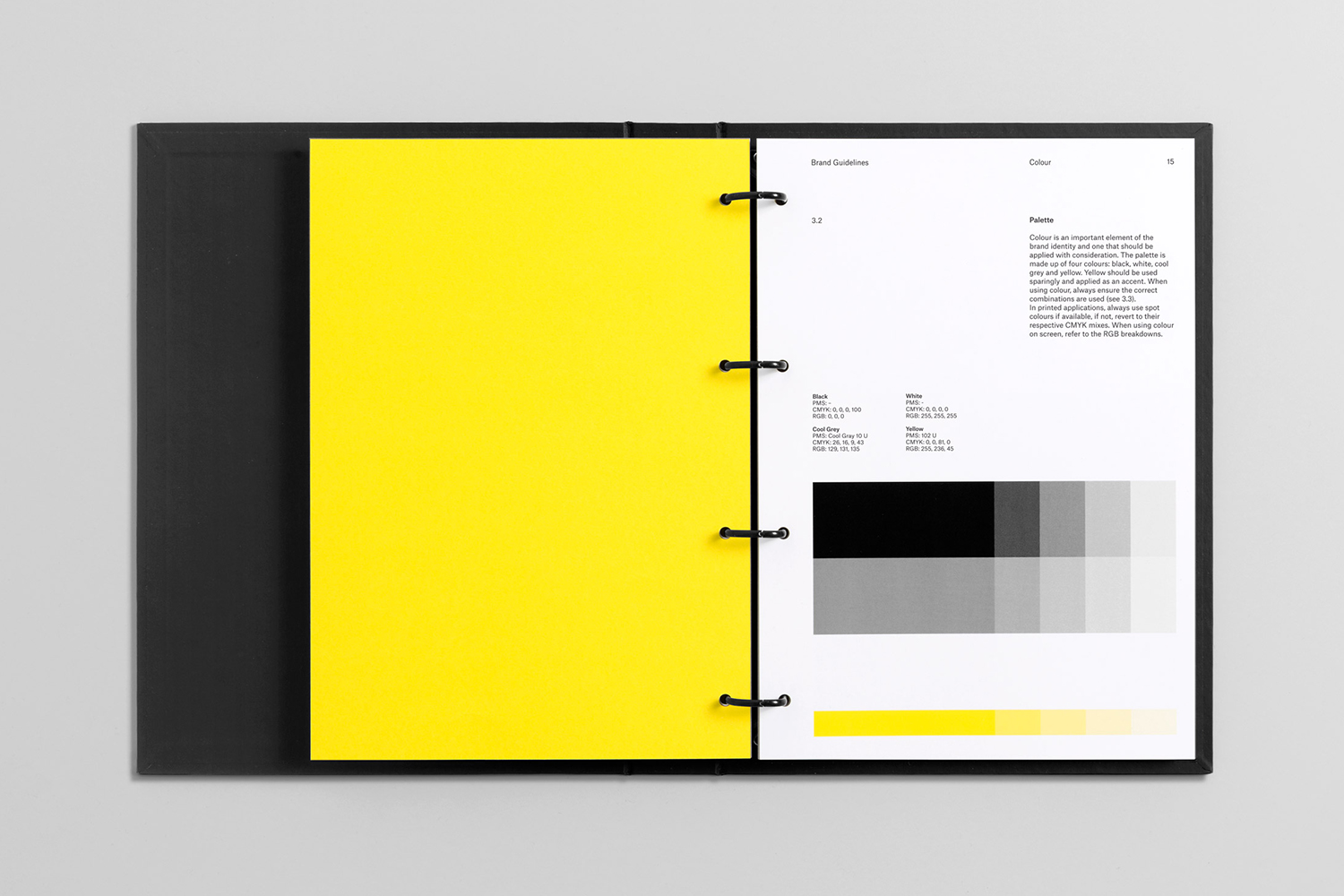
A colour palette of grey and yellow, black and white goes all in on the industriousness of managing large-scale events. It clearly borrows from a well-established visual language of construction, building from the ground up. Visually, just like naming, there is an immediacy in the use of eye-catching high contrast colour combinations, and pleasant interplay between negative and positive space, colour blocking and fine lines which change weight depending on context.
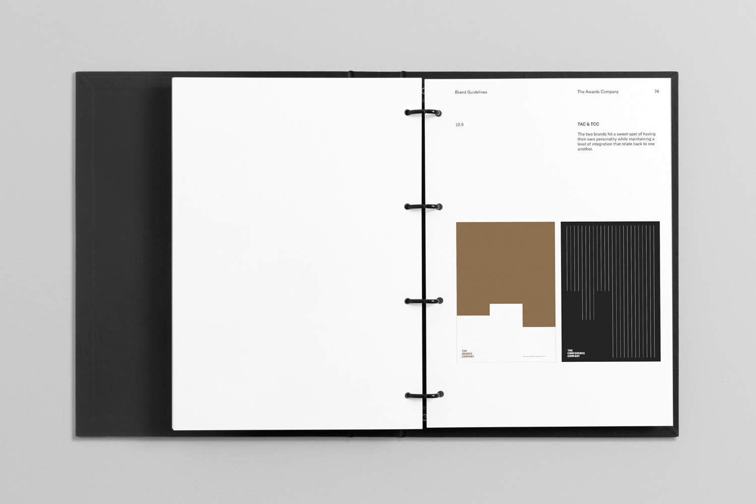
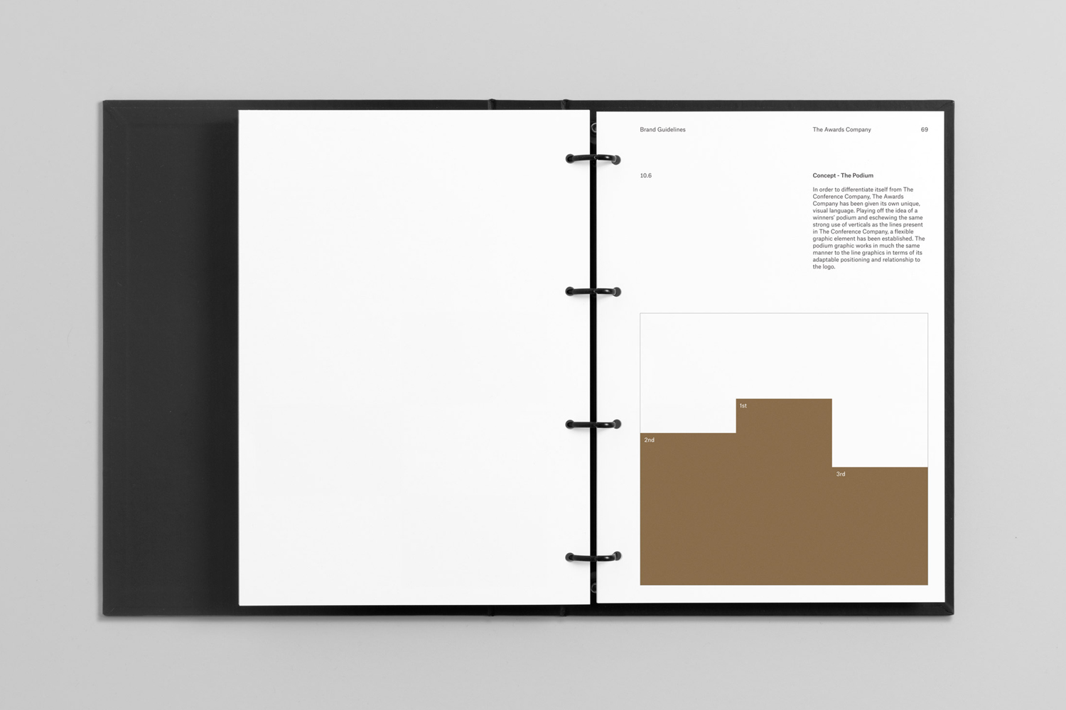
The interplay of positive and negative space begins to really work when deployed across the visual langue of The Awards Company, becoming a podium-like gesture without feeling trite. This is furthered by the use of a copper metallic ink. There is a strategic question of delineating between these two services, whether a shared graphic influence is necessary. Should one client move from one service to the next, this may be reassuring, and the podium, depending on its usage, may offer a small smile in the mind moment without undermining the essential pragmatics at the heart of what the company does.
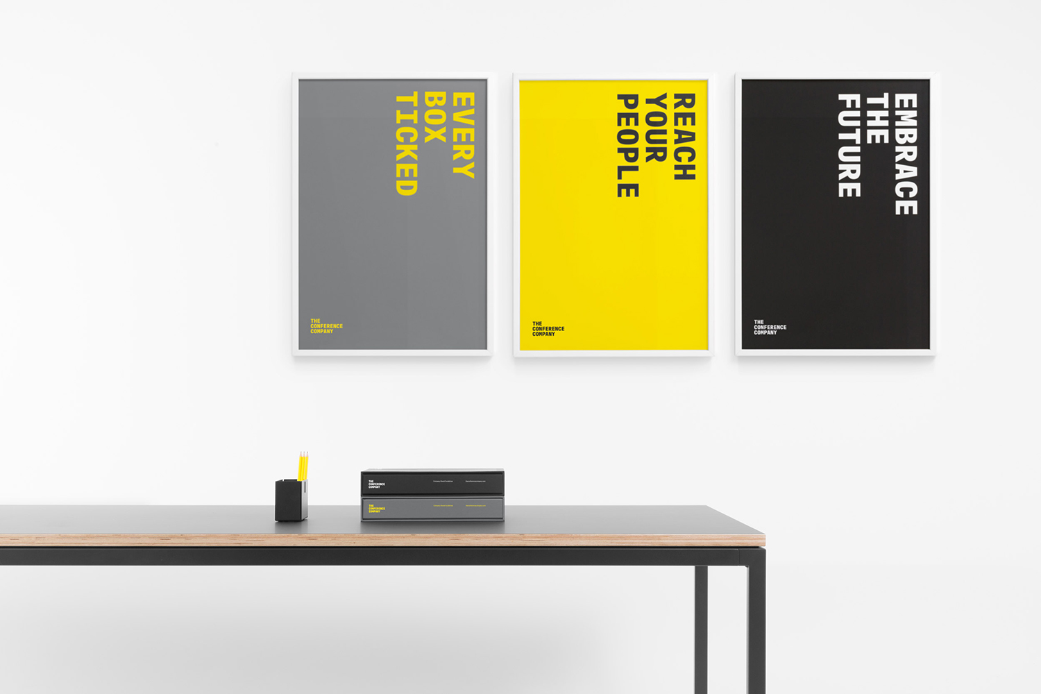
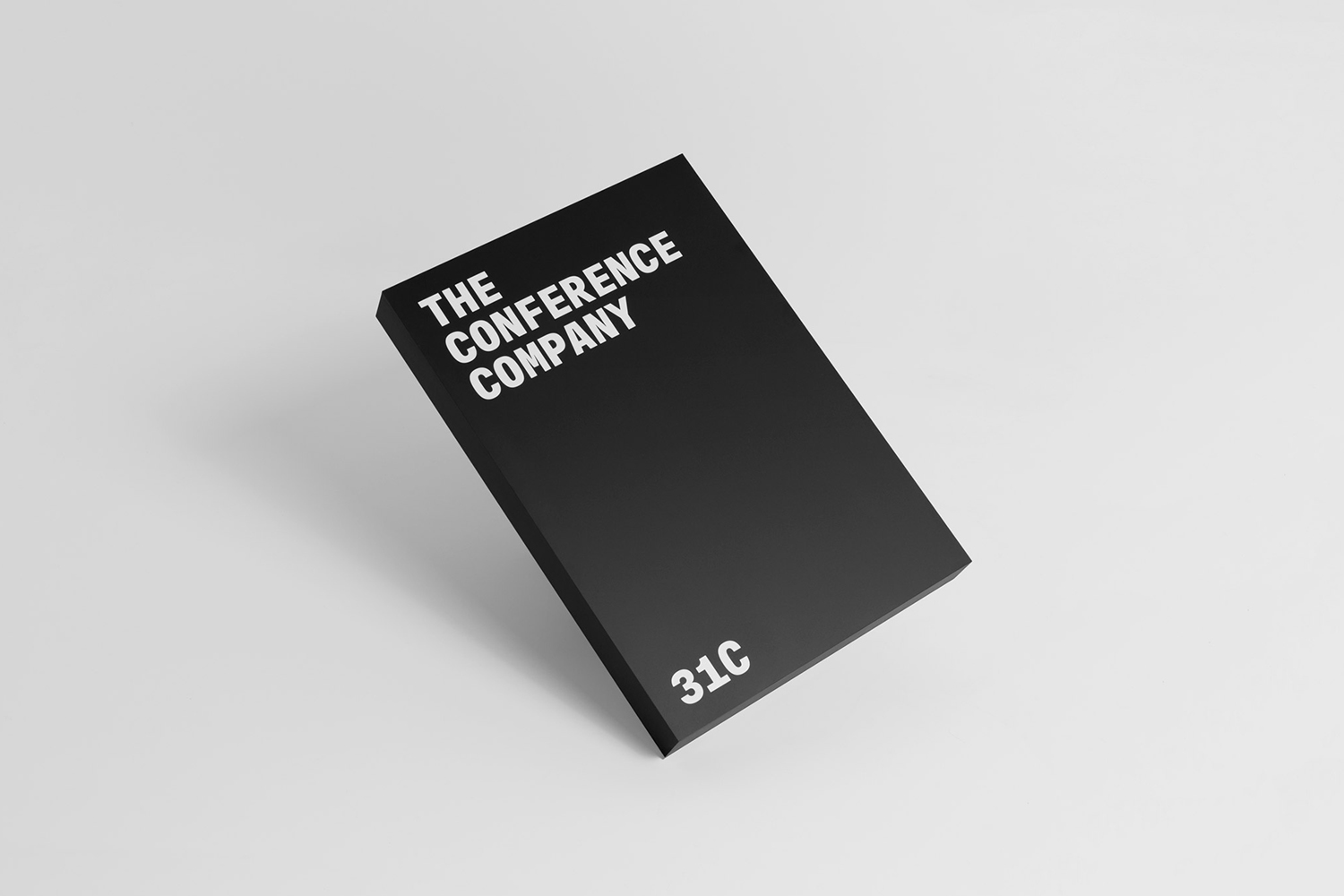
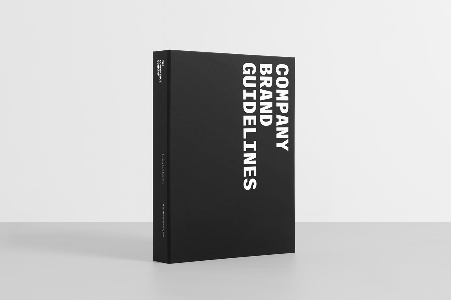
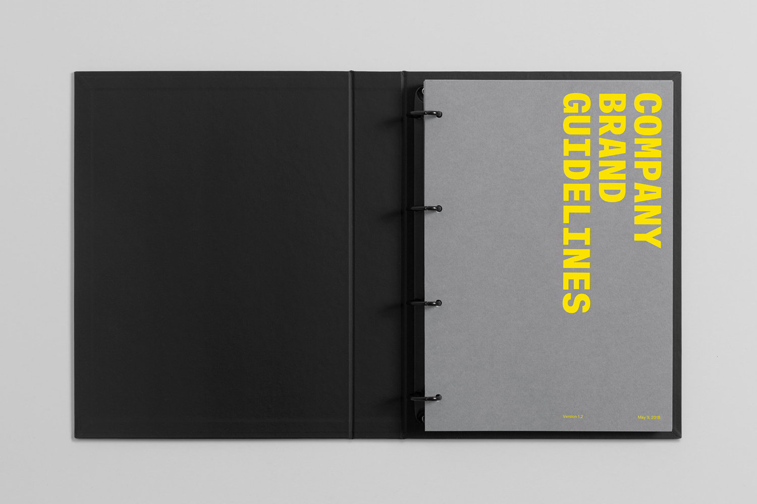
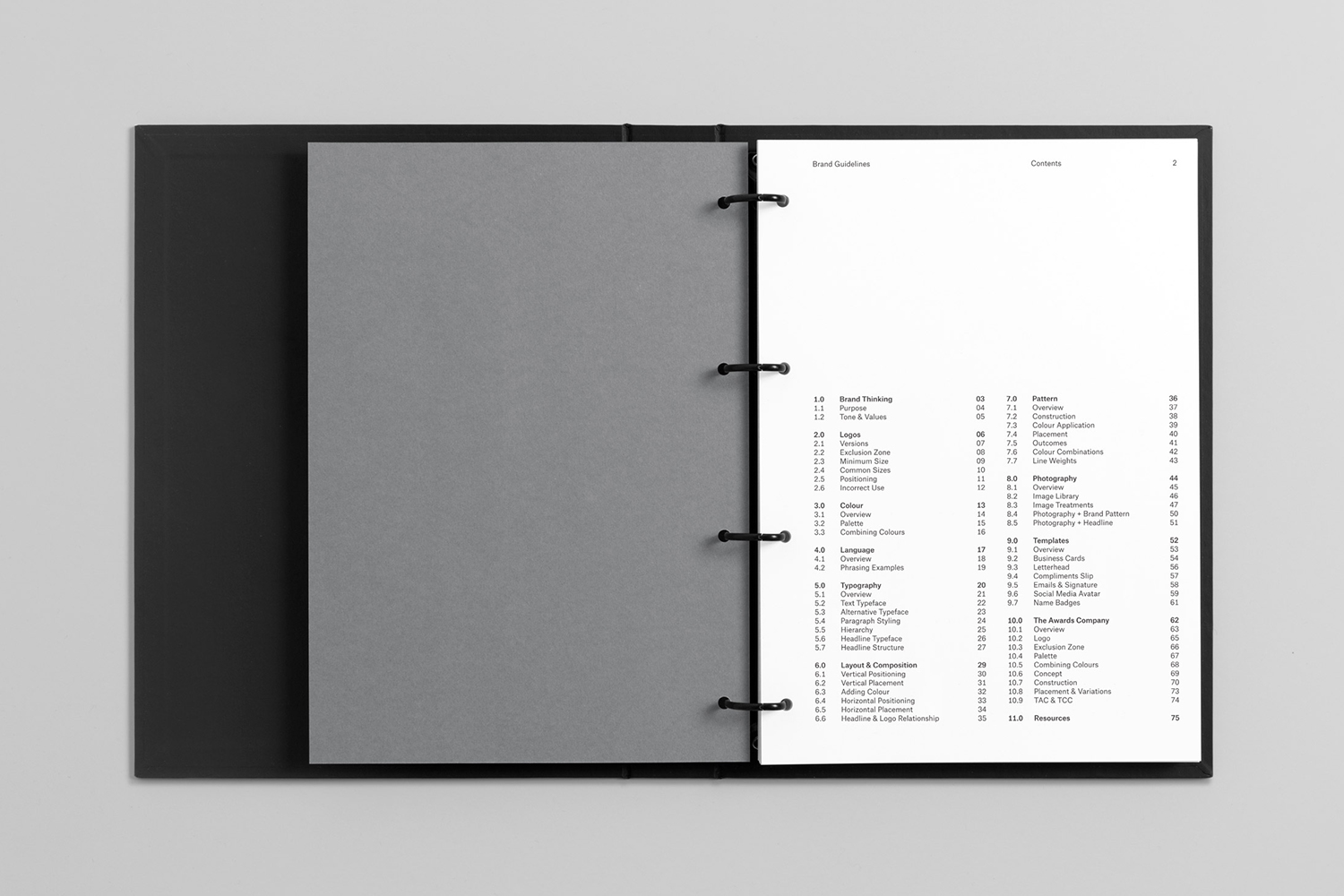
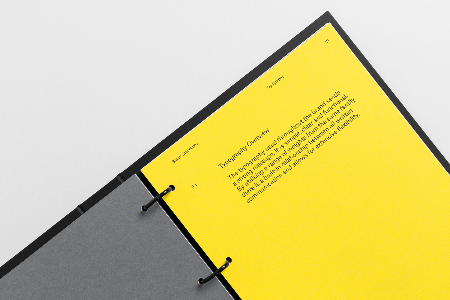
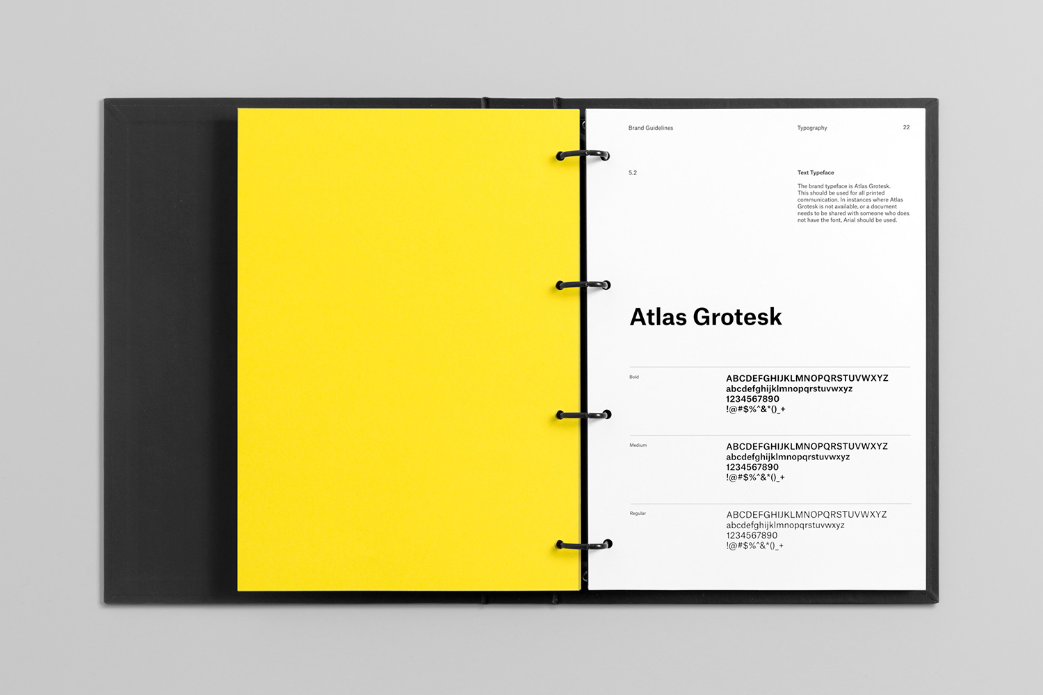
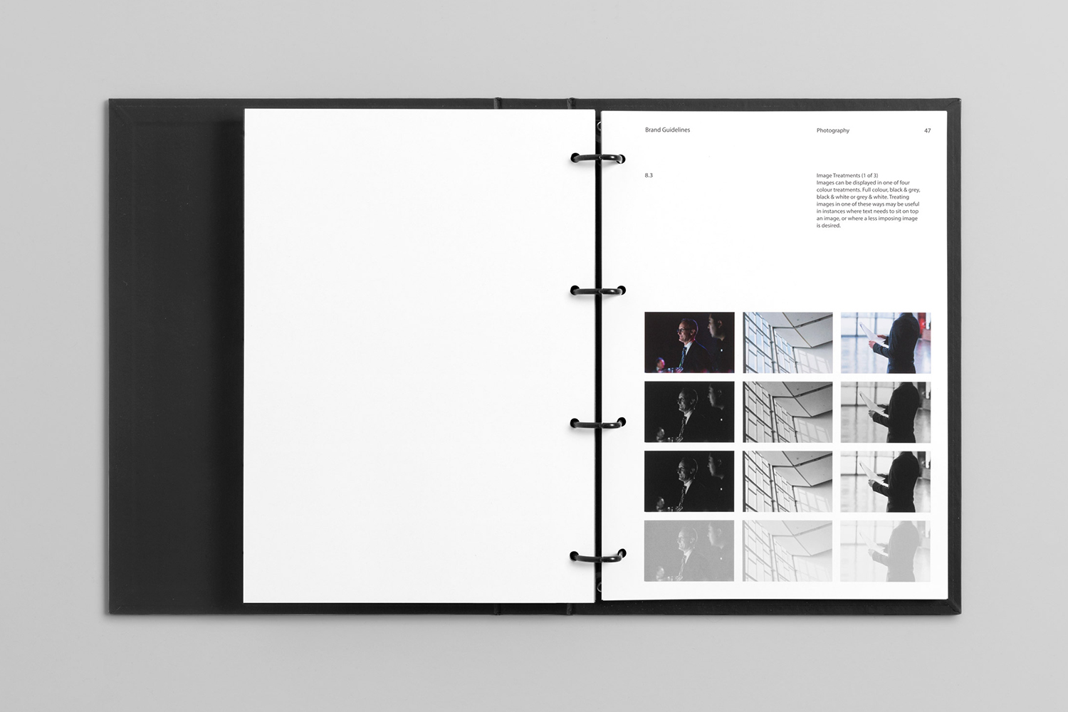
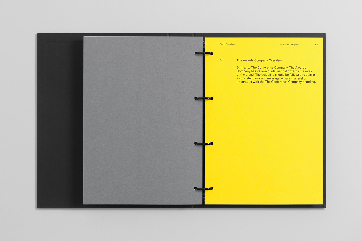
Although hidden from clients, brand guidelines, which spans 11 sections and covers everything from the brand’s values through to print specifications and templates, clearly formalise the system and furthers this materially to a staff of 35 in a robust build and weight, and in the clarity of its layout.
Graphic identity does not feel as tight online with additional type choices, stock-like business imagery and less clearly defined copywriting undermining the clarity and immediacy of what was laid out by Studio South.
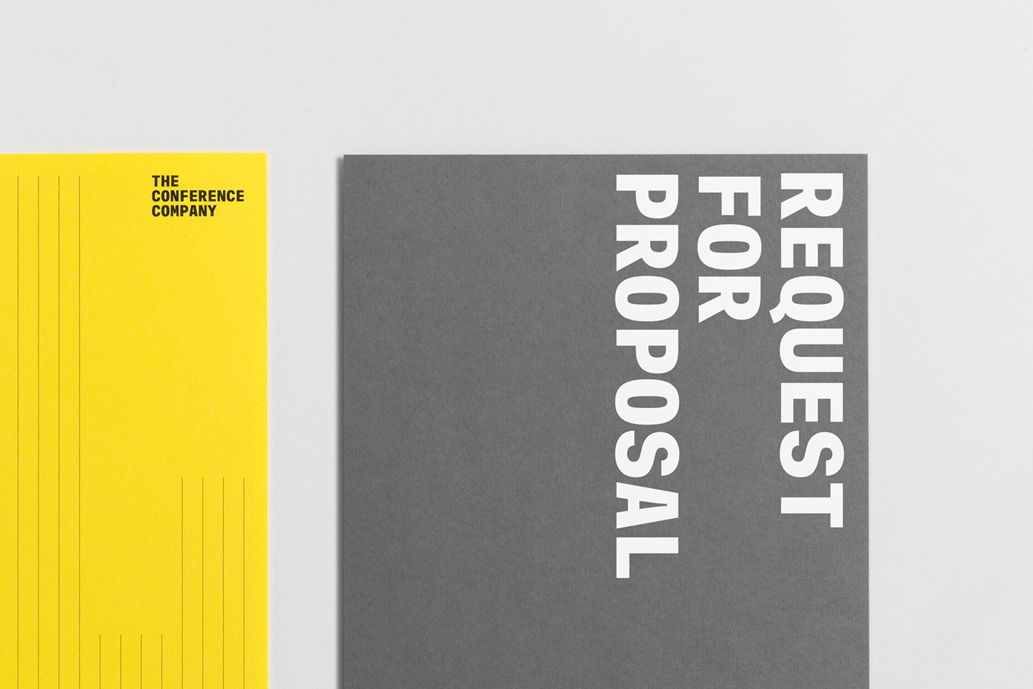
The visual language of flexibility, professionalism, large-scale delivery, industriousness and organisational capacity all come through in the simple confluence of type, pattern and colour. The potential of the pattern to adapt to different contexts in weight and arrangement subtly alludes to the nature of a contextual sensitivity and dynamic potential. The work is also distinctive and neatly developed as a cheerful graphic expression for The Awards Company. More work by Studio South on BP&O.
Design: Studio South. Opinion: Richard Baird. Fonts: Atlas Typewriter.
