LogoArchive Issue 2
Opinion by Richard Baird Posted 31 August 2018
LogoArchive Issue 1 was conceived, designed and sent to the printers for quotation within a day. It was inspired by a panel discussion that took place the day before at Somerset House as part of the exhibition Print! Tearing It Up. In the momentum of its design and production (undertaken by WithPrint) LogoArchive seeks an immediate connection between the agency of its creator and material object.
LogoArchive is founded on an enthusiasm for a well-crafted symbol; a convivial metaphor, a communicative immediacy and smart use of form language. However, in print, it was never conceived as a document with a singular intention; the simple documentation of symbols, rather a delivery mode in which to build a story and share thoughts.
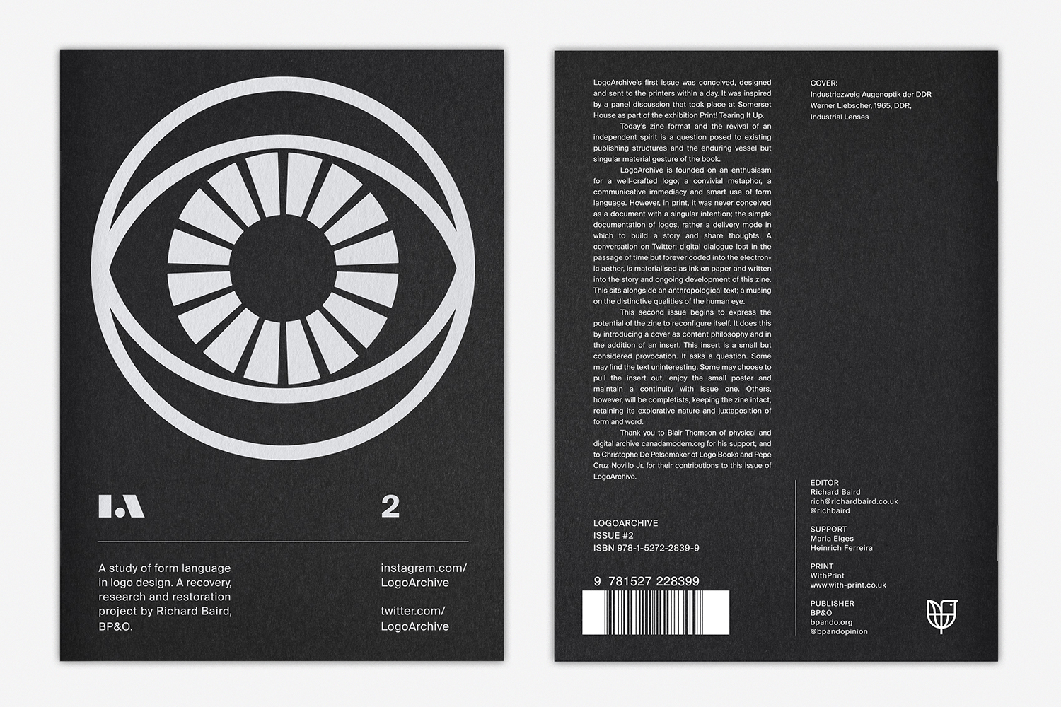
Issue 2 begins to explore the potential of the zine to reconfigure itself over time. It does this by introducing a cover as content philosophy and in the addition of an insert. A conversation on Twitter; digital dialogue lost in the passage of time but forever coded into the electronic aether, is materialised as ink on paper and written into the story of the zine. This sits alongside an anthropological text; a musing on the distinctive qualities of the human eye, the theme of Issue 2.
This article, in a break from convention, has two interwoven parts; the familiar format looks at the micro (the graphic and the material), while inset italics explores the meta. These can be read independently or sequentially, and intend to bring an intangible layer to the zine.
LogoArchive Zines are available to order from LogoArchive.Shop.
Discover more about logo design at LogoArchive’s Logo Histories.
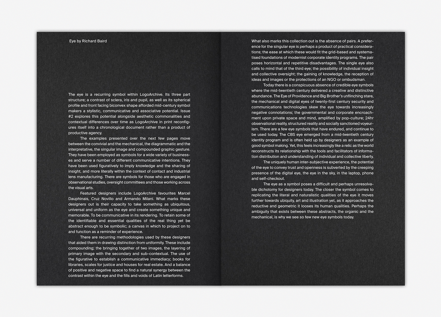
LogoArchive Issue 2 begins as Issue 1 with a design-centric text that focuses on the stylistic qualities and form language of the symbols held within the document and raises questions of the potency and associative potential (negative and positive) of eye as a symbol today. Its formatting continues to be informed by the texts currently being read by myself. Here, the close cropping top and bottom alludes to the theme of time and continuity, as though the text was cut from a single sheet. The influence of architectural form is present in the justification of text, in the absence of paragraphs and the voids of insets. This introductory text will be dedicated to design writing and typographical play and offers a counter-point to the symbology and form language throughout the document.
There is an initial tension between the finite material economy of the printed page and the infinite space of the digital world. LogoArchive is a response to this and proposes that they share a critical and essential relationship, not tension. They are, together, a total project, two abstracts. Further, as a total project, LogoArchive proposes a question to existing publishing structures. What can we do with the space between print and online content, the intangible value in the movement between two experiences?
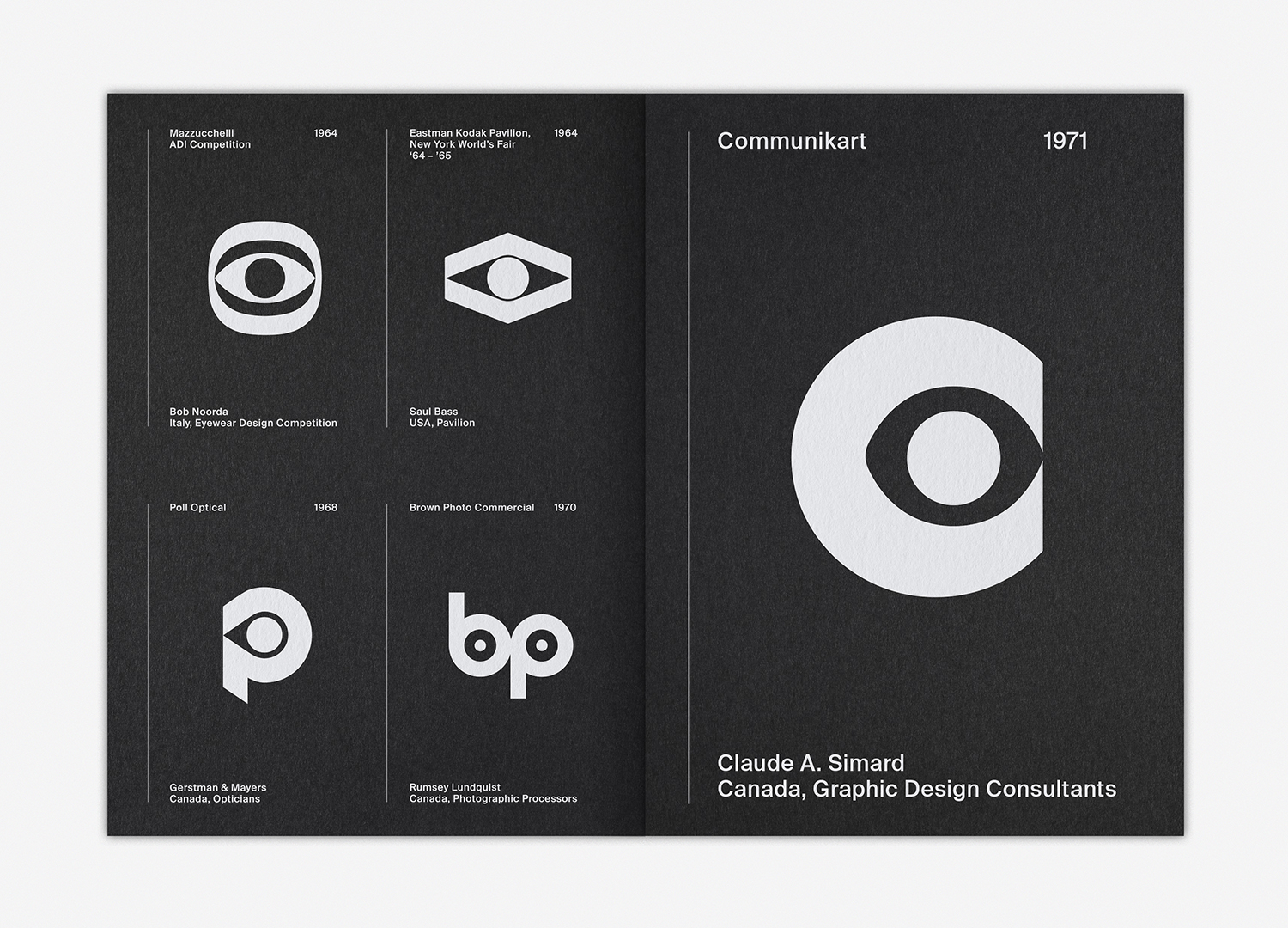
The layout of LogoArchive intends to use two ideas in dialogue with one another informed by the cheerful animal symbols of Issue 1. The first reference is that of the storybook; a response to the often blunt and convivial metaphors employed by mid-century logo designers. The second is archival; an articulation of the practice of recovery and documentation. These serve to not only divide content but bring to light the two components of LogoArchive; an appreciation of individual form language and a collective value. This is the foundational structure of LogoArchive and will remain intact and establish a continuity, alongside cover, between each new addition. Further, the zine is now arranged chronologically, however, in the selection of symbols uses pairings to be playful or call out commonalities and differences in technique and context.
Both Instagram and zine share a temporal quality, an essential chronology and continuum. Both can be degraded and destroyed, just in different ways and at different paces. Instagram can be switched off at any moment. The zine, however, in its physical existence, volume and distribution which makes it harder to destroy, questions legacy within the context of digital publishing, the relationship with and differences between follower and reader, passive consumption and meaningful engagement, digital diffusion and a material object.
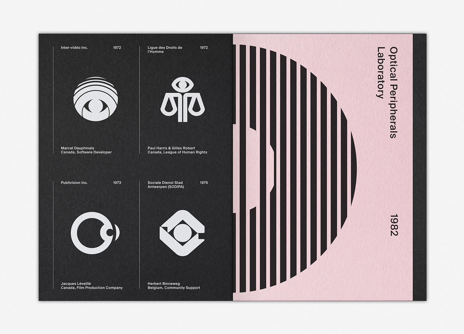
LogoArchive as an Instagram project offers a historical counterpoint to BP&O, which focuses exclusively on the latest in graphic identity design systems. It is also an opportunity to connect more tangibly with readers. In the release of Issue 2, the two zines together begin to explore the potential of individual object (each one is slightly different) and total project (change within an observable continuity).
Infinite digital space is embraced in a broad curatorial remit; an appreciation of form language. The finite space of print seeks to tighten this curatorial remit. In this transition and transformation, LogoArchive becomes a very personal piece of work, the corporate agenda is reconfigured into self-expression, the symbols chosen speak to me, while also being bound by a theme which is explored in a micro and meta way through complimentary texts.
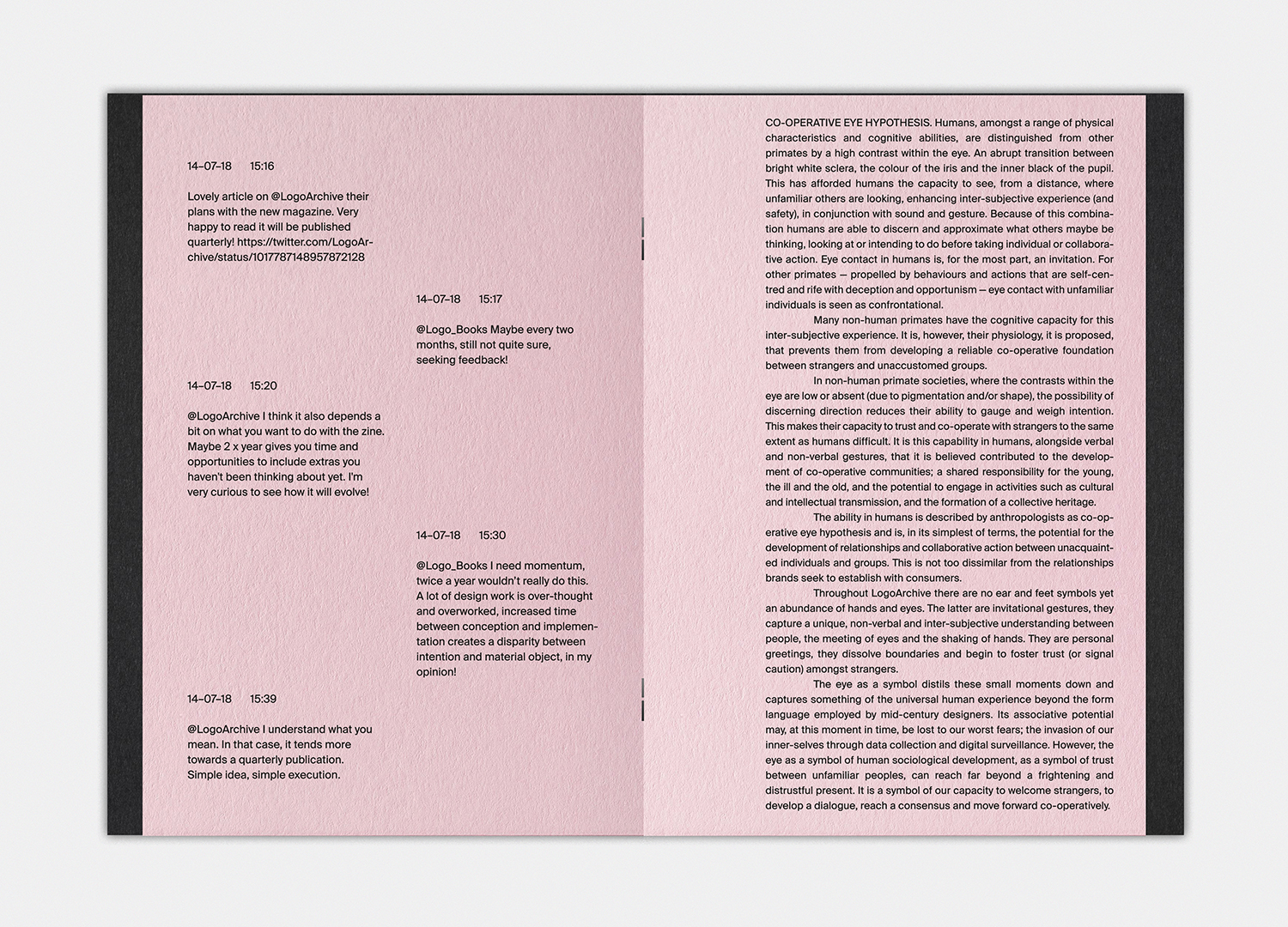
LogoArchive Issue 2 begins to explore the potential of the zine to reconfigure itself. The insert is a small but considered proposition. It asks a question. Some may find the text uninteresting an exploration of the human eye from an anthropological perspective. Some may choose to pull the insert out, enjoy the small poster and maintain a continuity with issue one. Others, however, will be completists, keeping the zine intact, retaining its explorative nature and juxtaposition of form and word.
LogoArchive’s digital origins are acknowledged in colour (the opposite of typical logo books), but also its new material manifestation through high quality uncoated paper choices, the building up of ink, the provocation to pull something out of the document, in its binding, design craft, its ability to move between hands, and impose itself on physical spaces.
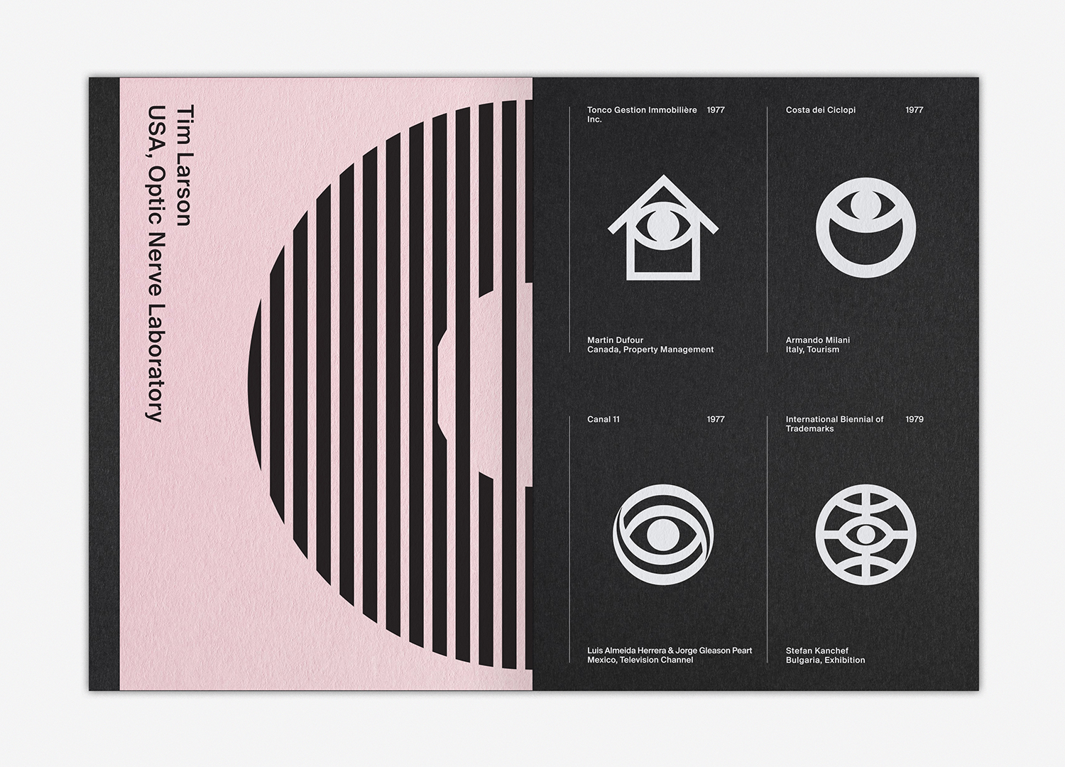
The zine intends to develop a story, convey a philosophy and share ideas in a way an Instagram account simply cannot. Instagram is not built for essays. Instagram conditions users into binary and immediate momentary responses. Symbols and their striking stylistic qualities and presentation use this observation to catch the eye with the intention of building a following and transforming some of these into an engaged readership. LogoArchive online is an observation, LogoArchive in print is a proposition. The texts aren’t long, but they’re designed to function as a tool and Spieleraum in which readers may synthesise their own ideas, to be provoked into making their own connections.
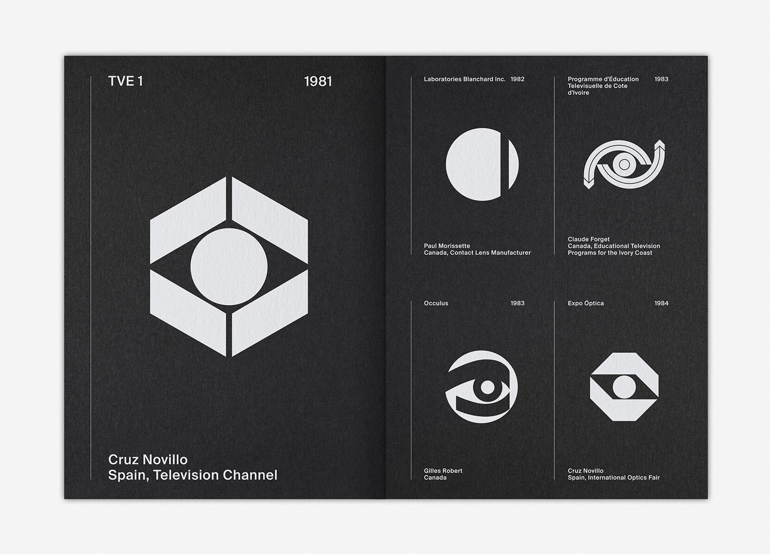
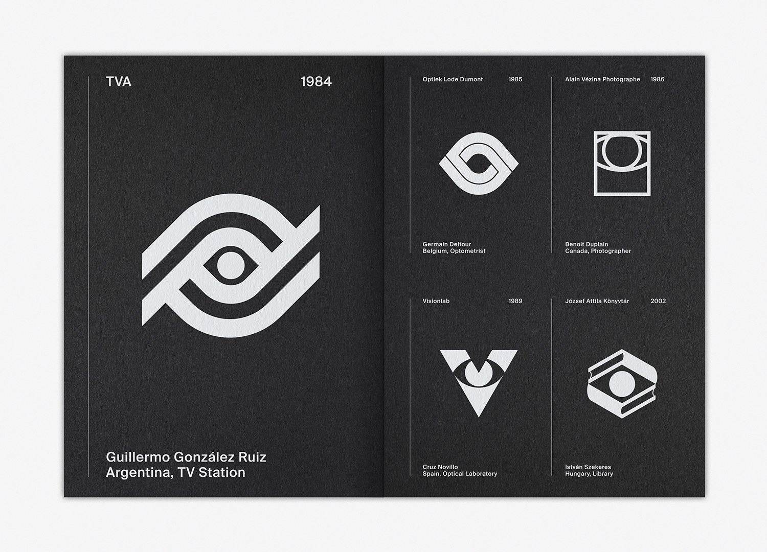
Each cover, in its graphic immediacy, calls out a theme, rather than using titles, it employs the form language of its content. This second issues features eyes and will be followed up with symbols related to science, the international, momentum and direction. LogoArchive also intends to run special collaborative issues, distinguished by different coloured paper stocks, arrangement and content of text and the intentions of guest curators.
LogoArchive Zines are available to order from LogoArchive.Shop.

