MacGuffin Magazine. No.6
Opinion by Richard Baird Posted 16 October 2018
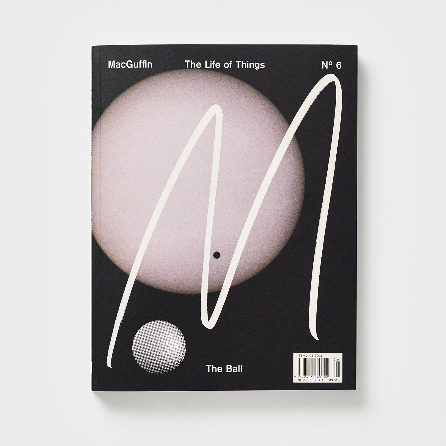
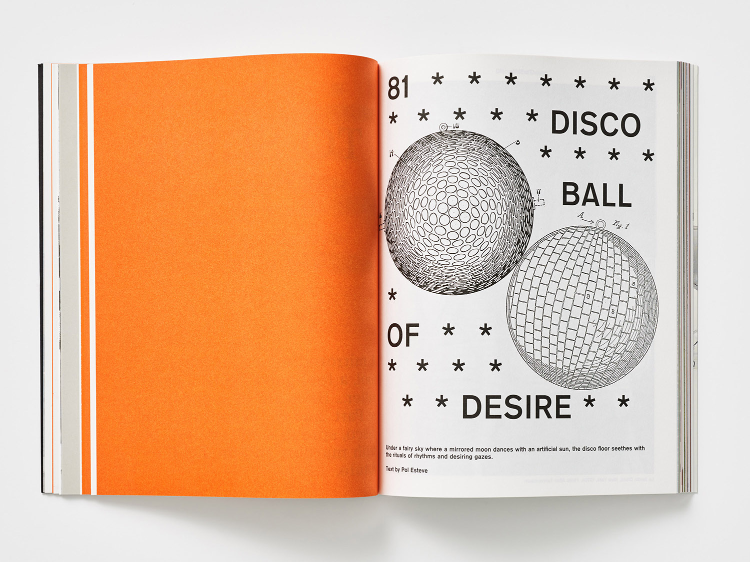
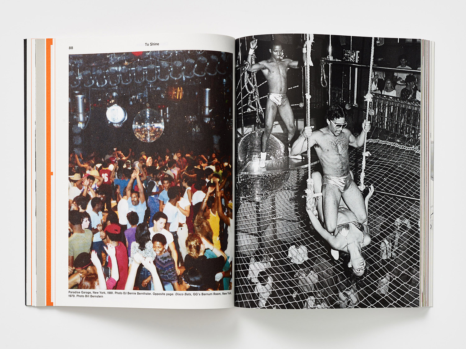
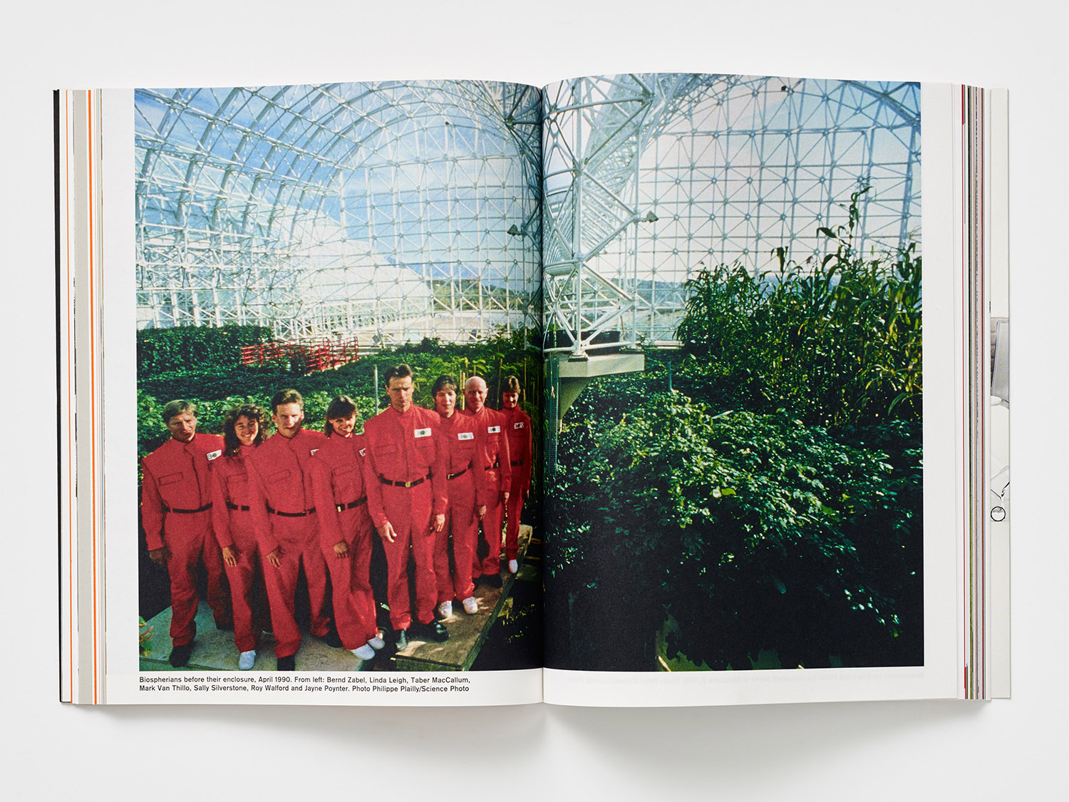
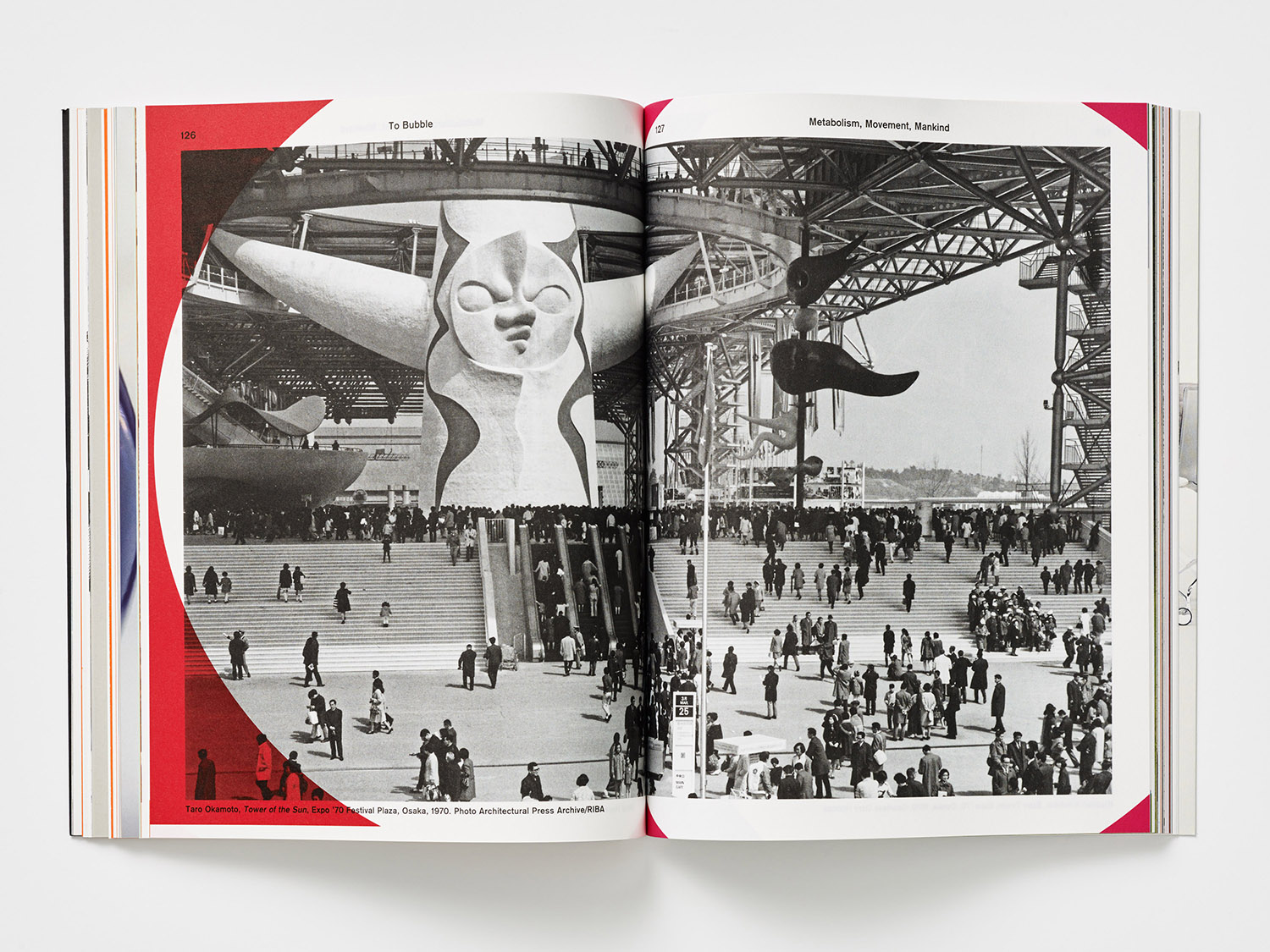
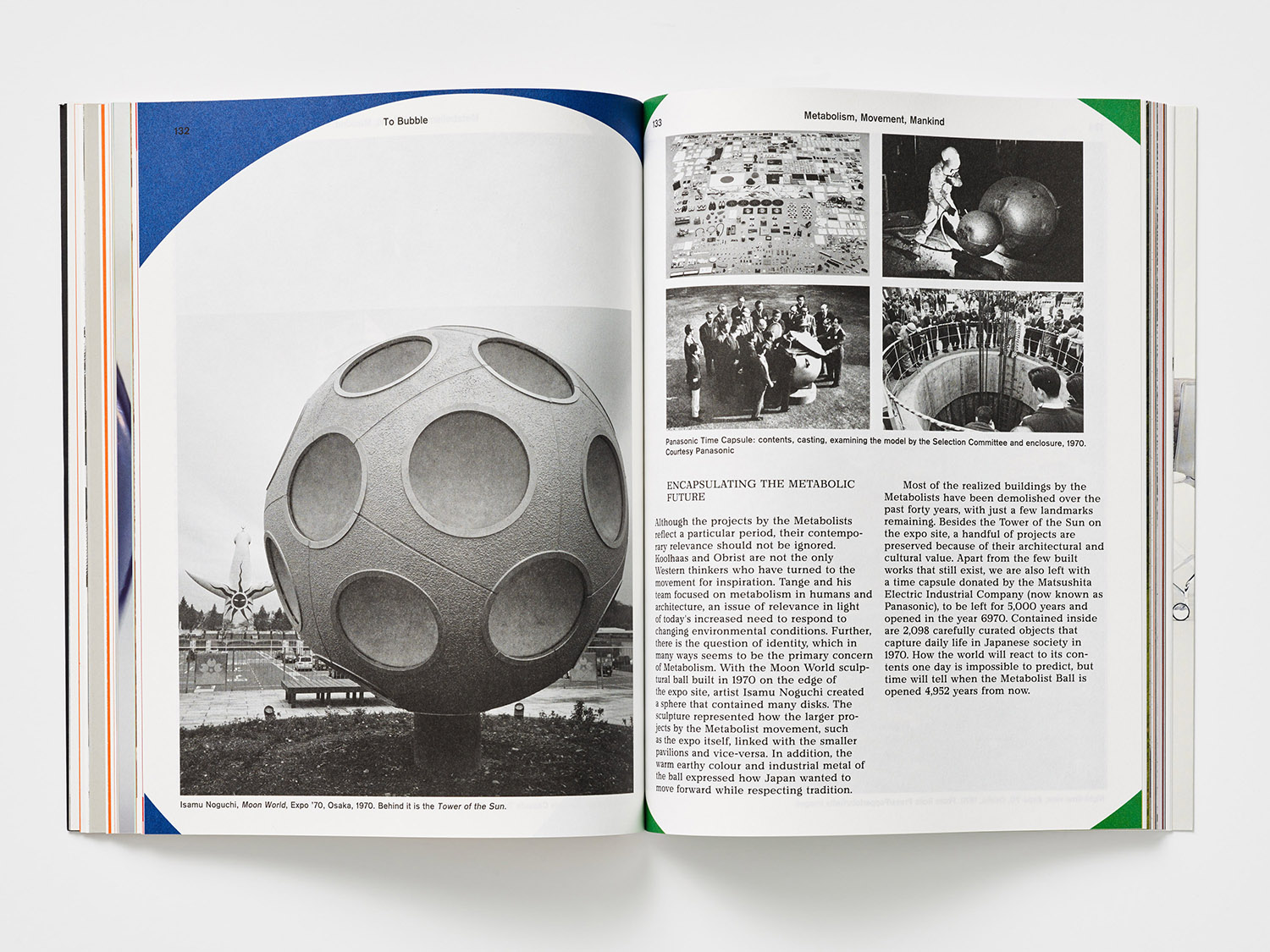
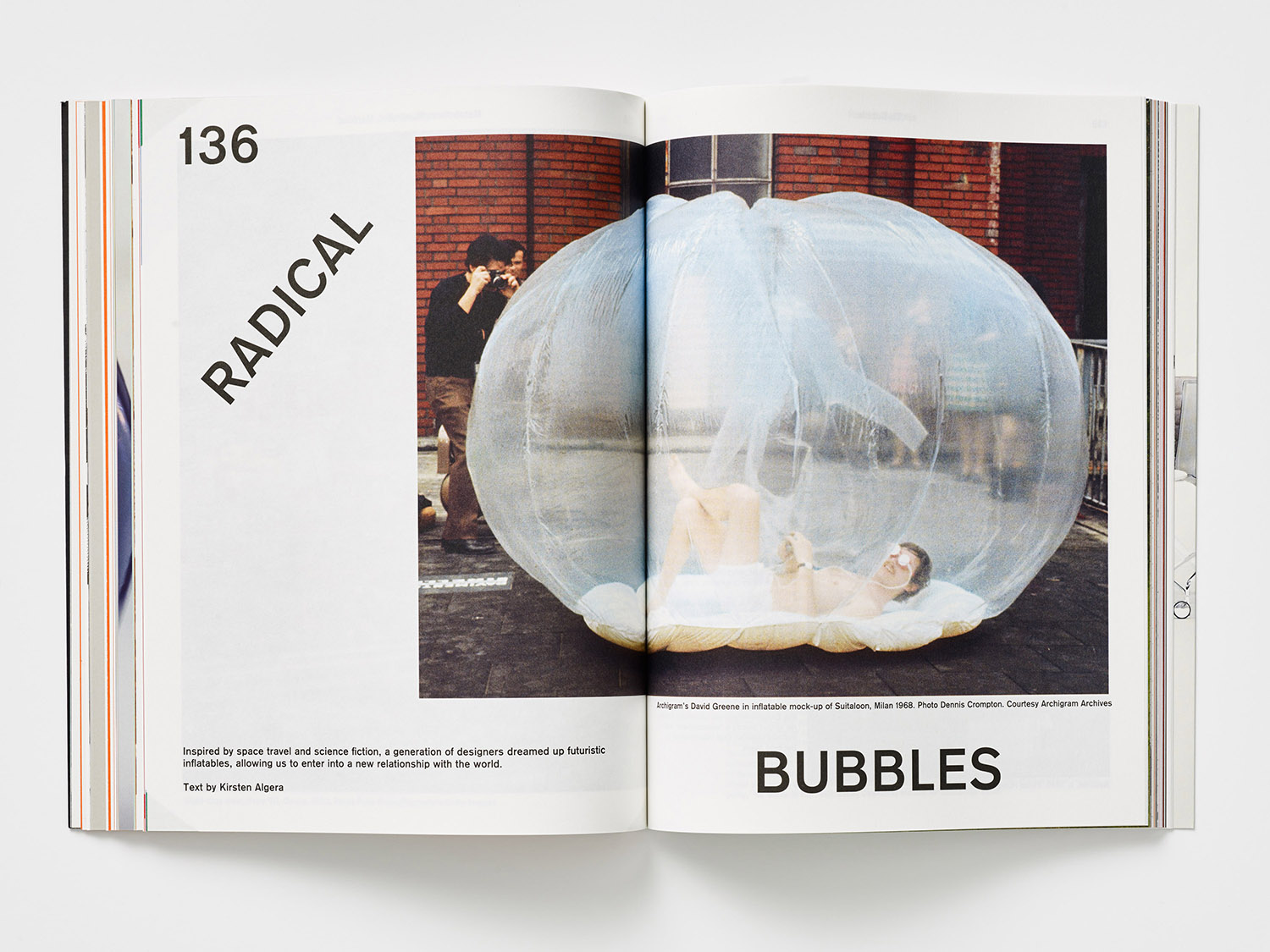
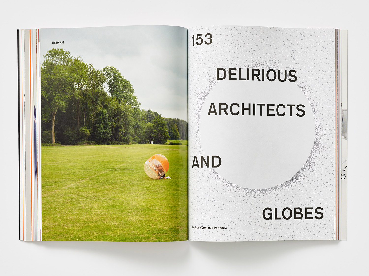
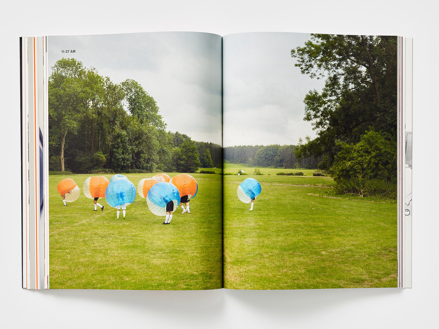
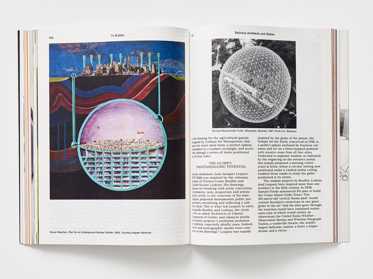
MacGuffin is a biannual design, art and crafts magazine that commissions stories on, around or jumping off from ordinary things, uncovering personal and curious relationships with the objects that surround us. Issues 1 to 5 explored The Bed, The Window, The Robe, The Sink and The Cabinet. The Ball, MacGuffin Magazine No.6 Autumn/Winter 2018, the one BP&O has its hands-on, takes a look those related to the spherical; from the ballpoint pen to the disco ball, Harvey Ball (the designer of the smiley face), to the Biosphere and the sphere as the building block in which to shape a Japanese future.
The magazine mixes writing styles and lengths with documentary and cinematic stills, still life and artworks, the diagrammatic, illustrative and iconographic. Featured writers include Danish artist Nicolai Howalt, graphic designer Paul Gangloff and Real Review’s Jack Self who reflects on Bisosphere 2, an eco-futurist experiment.
MacGuffin, in its content, manages to draw beauty from the banal, the hidden and the utilitarian, elevating the every using a plethora of interesting and revealing philosophical, historical and socio-cultural insights. These moves from the micro, macro and abstract, viewed through an architectural or art and design lens. There is, occasionally, a form of meta-criticism at play which is a nice observation on the spherical type element of the Selectric Typewriter, nicknamed the golf ball, doing the hitting, rather than being hit. However, the publication largely leans towards the simple joy of revealing the idiosyncrasies and legacies of the commonplace or the overlooked. The spirit of this is expressed graphically, typographically and materially by editors Kirsten Algera and Ernst van der Hoeven working with Dutch Designer Sandra Kassenaar. MacGuffin Magazine No.6 is 210 x 218mm, 232 pages and features five Pantone inks. It is supported by adverts, these come in the form of a fold-out cover, back page and the first five pages. It costs 14GBP / 16EUR / 20USD, and is also available as a yearly subscription.
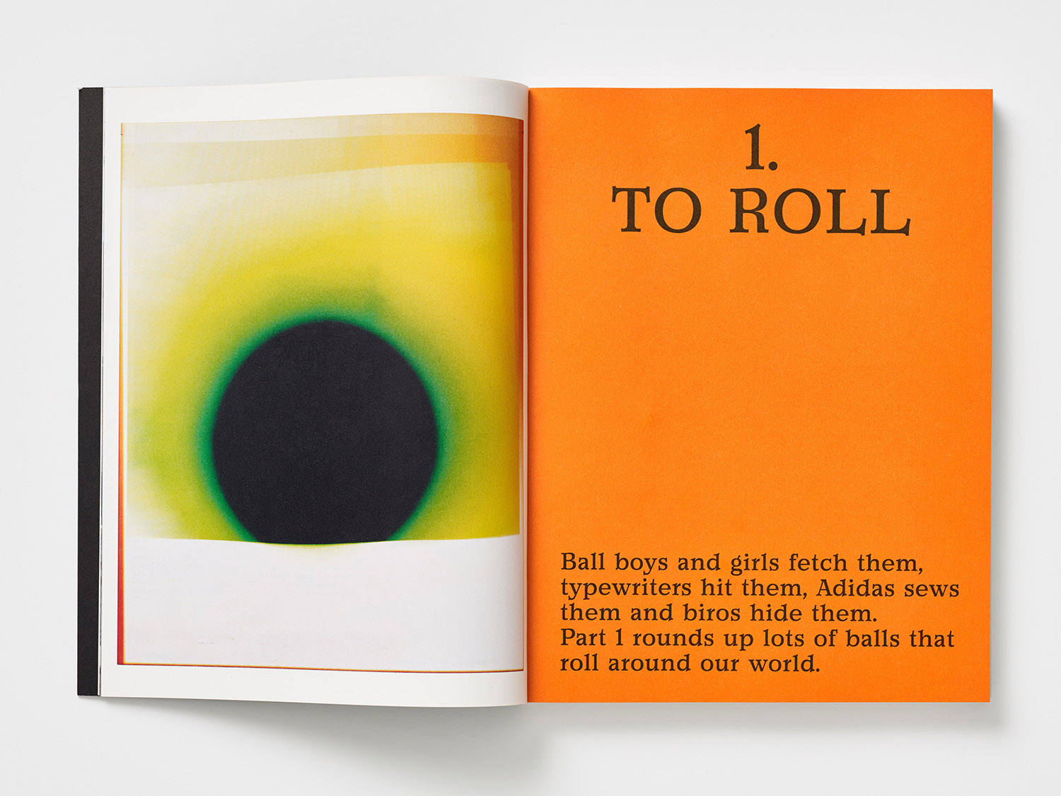
MacGuffin, by way of its content, seeks to add an informational texture to its readership’s daily lives by bringing to light the unusual stories behind a wide variety of ideas entered into by way of a familiar object. As with many new independent publications, and throughout the Kickstarted niche publishing landscape, the form of MacGuffin Magazine has what might be described as an enhanced materiality, that is to say, it operates as a magazine distributing ideas, and as a appealing object to be photographed and shared online, or posted to a blog.
This enhanced materiality is initially present in the relationship between size, volume and weight of the magazine, a little lighter than its size and volume would suggest, and in the application of a glossy UV varnish over matt surface. This continues inside in the back and forth between the lighter uncoated paper stock and those that are heavier and glossier. In these transitions, the magazine evokes a sense of the historical; the glossy periodical and the academic journal, yet, in their collation, feel very much an expression of the now.
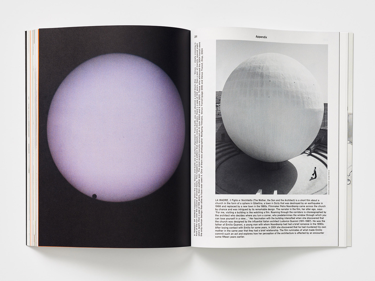
The cover of MacGuffin No.6 seeks to provoke curiosity through an interplay between the familiar; a golf ball, and the abstract; a smooth and proportionately much larger sphere, connected by the implication of a shadow cast. This initial abstraction, the connection formed through shadow, and the revelation that, in fact, the larger is an image of the shadow of Venus crossing the surface of the sun, speaks to the scope of the magazine.
There is an architecture to type and arrangement of type across the cover, a material language in the juxtaposition of the uncoated and a glossy UV, and a form language in the intersection of cosmic geometry and the hand-drawn and irregular. More abstracts and spaces between. It is a cover that could perhaps be easily dismissed, its graphic impact is subtle. A golf ball is intentionally very specific, it is immediate and familiar. You may or may not be interested in golf. It relies on an inquiring mind open to reading the page in its totality (graphic, material and typographic design), and recognising the dialogue between image, graphic gesture, text, material and finish.
Of course, the graphic qualities of the magazine (and those material details that can withstand the object-image transition) also serve as modes in which the magazine may travel online, seek its audience and economic viability, and reach its potential through reviews and the movement of object by way of conversation, sharing and showing. It has a lot in common with Migrant Journal which also employs an enhanced materiality to migrate the magazine, although this is far less provocative and politically charged.
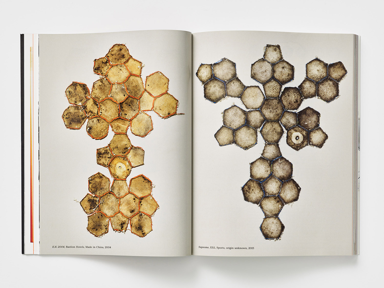
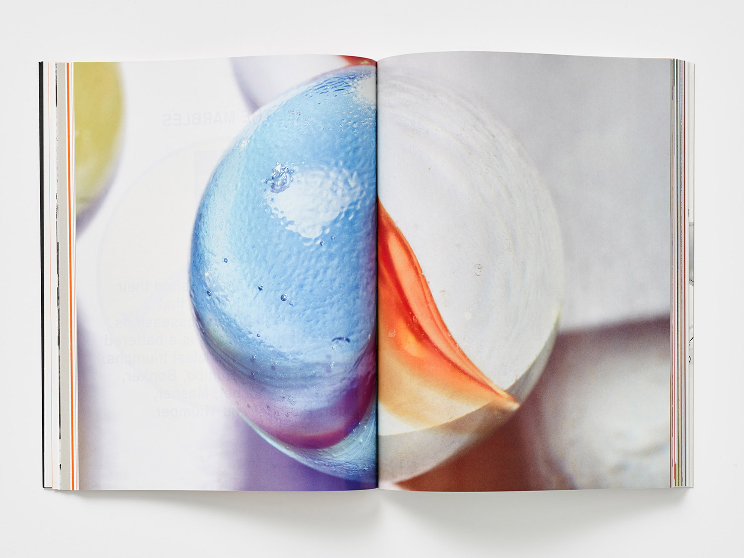
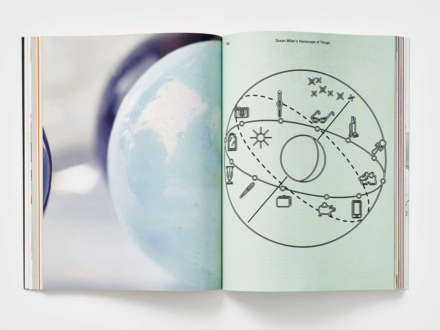
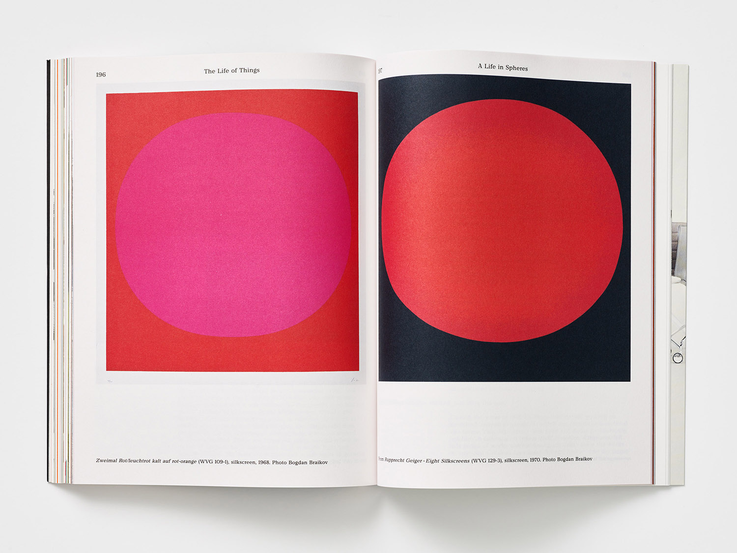
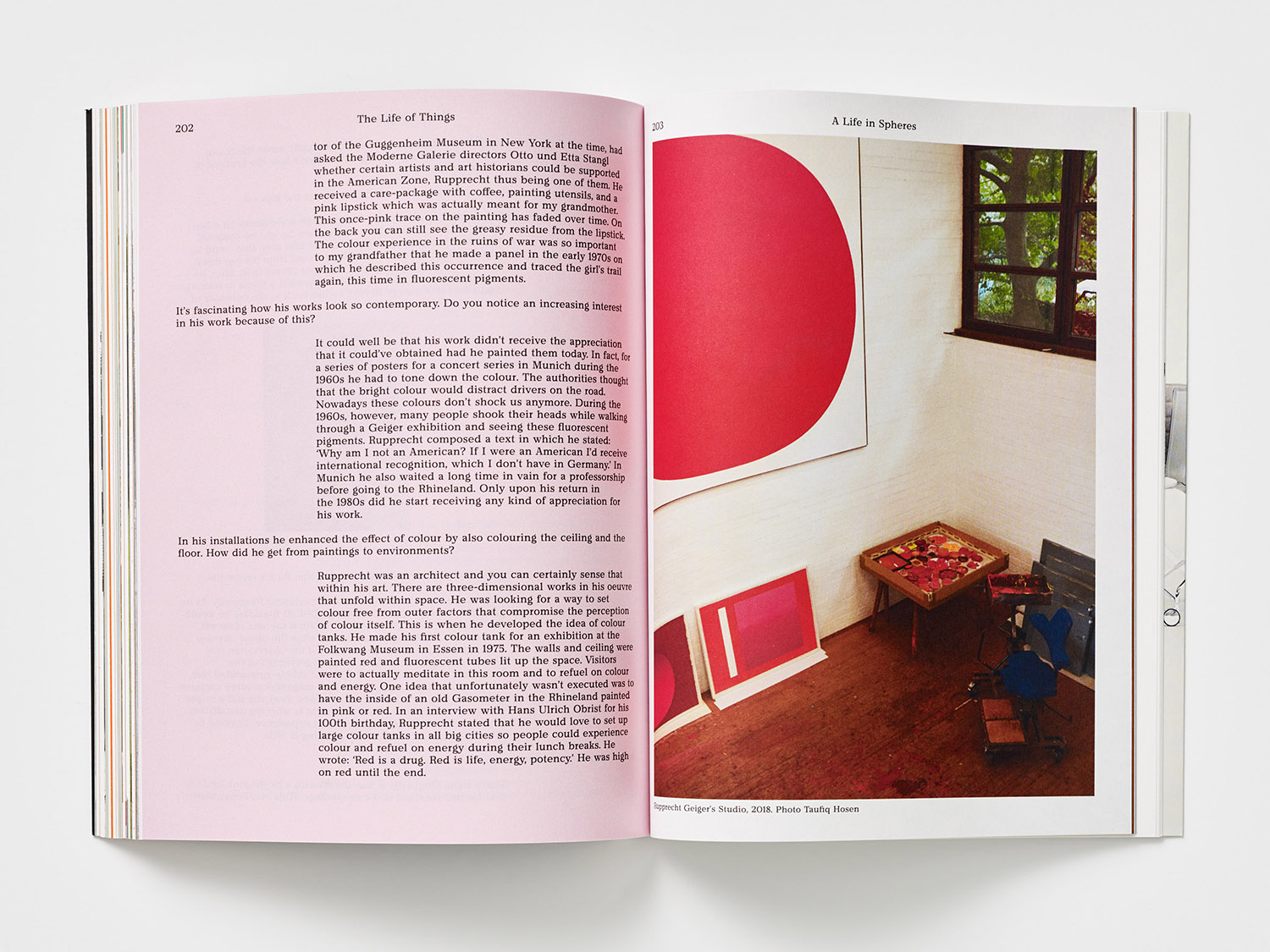
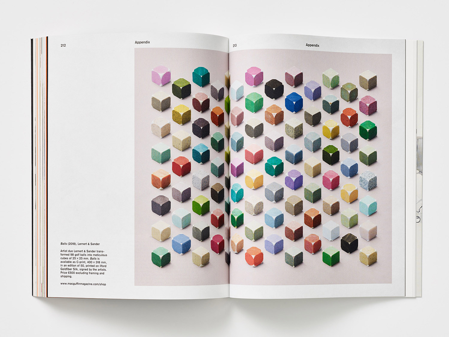
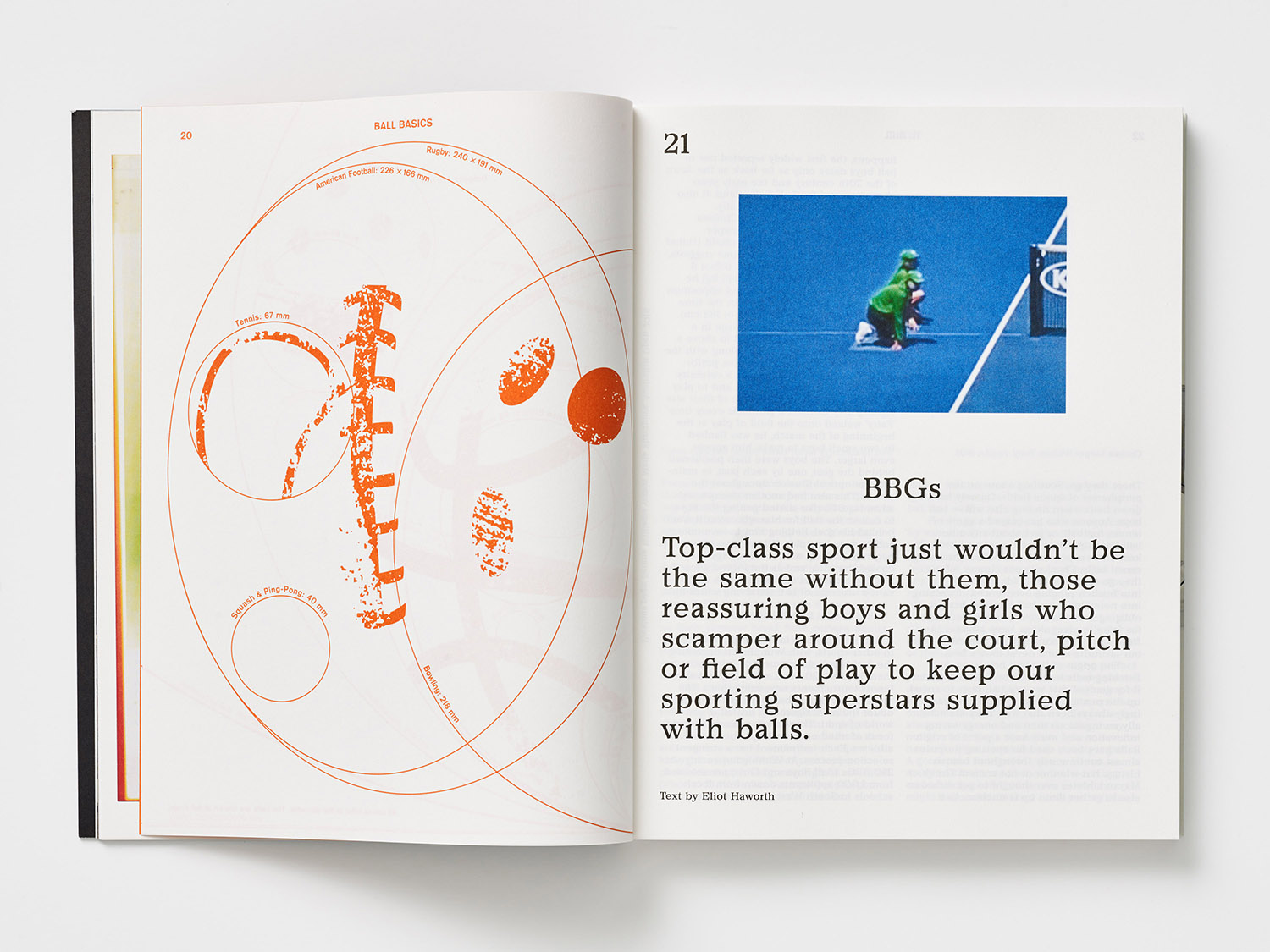
There are moments where the editorial remit is direct yet beautifully presented, particularly in the literal deconstruction of the football into a tapestry of geometric panels seen from the inside, shot by Mathijs Labadie and art directed by MacGuffin. Beauty and a material joy is a critical part of the magazine. Pantone orange, macro-photography of marbles and artworks of Rupprecht Geige bring a warmth and offer a contrast to larger blocks of text.
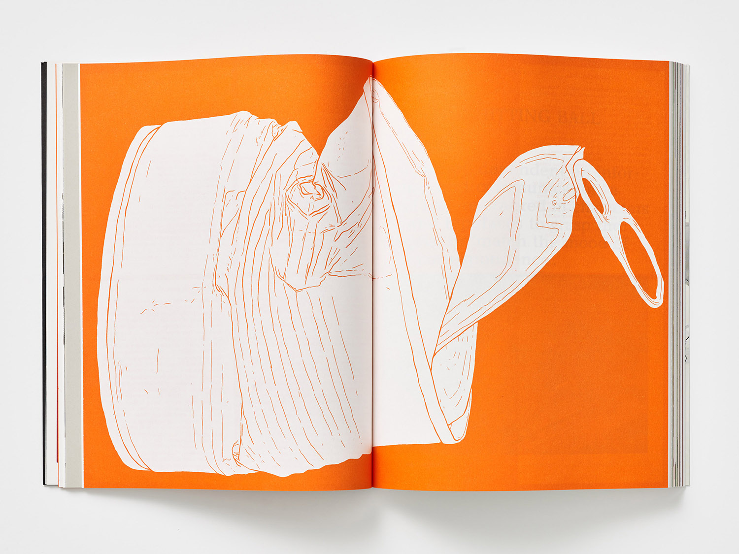
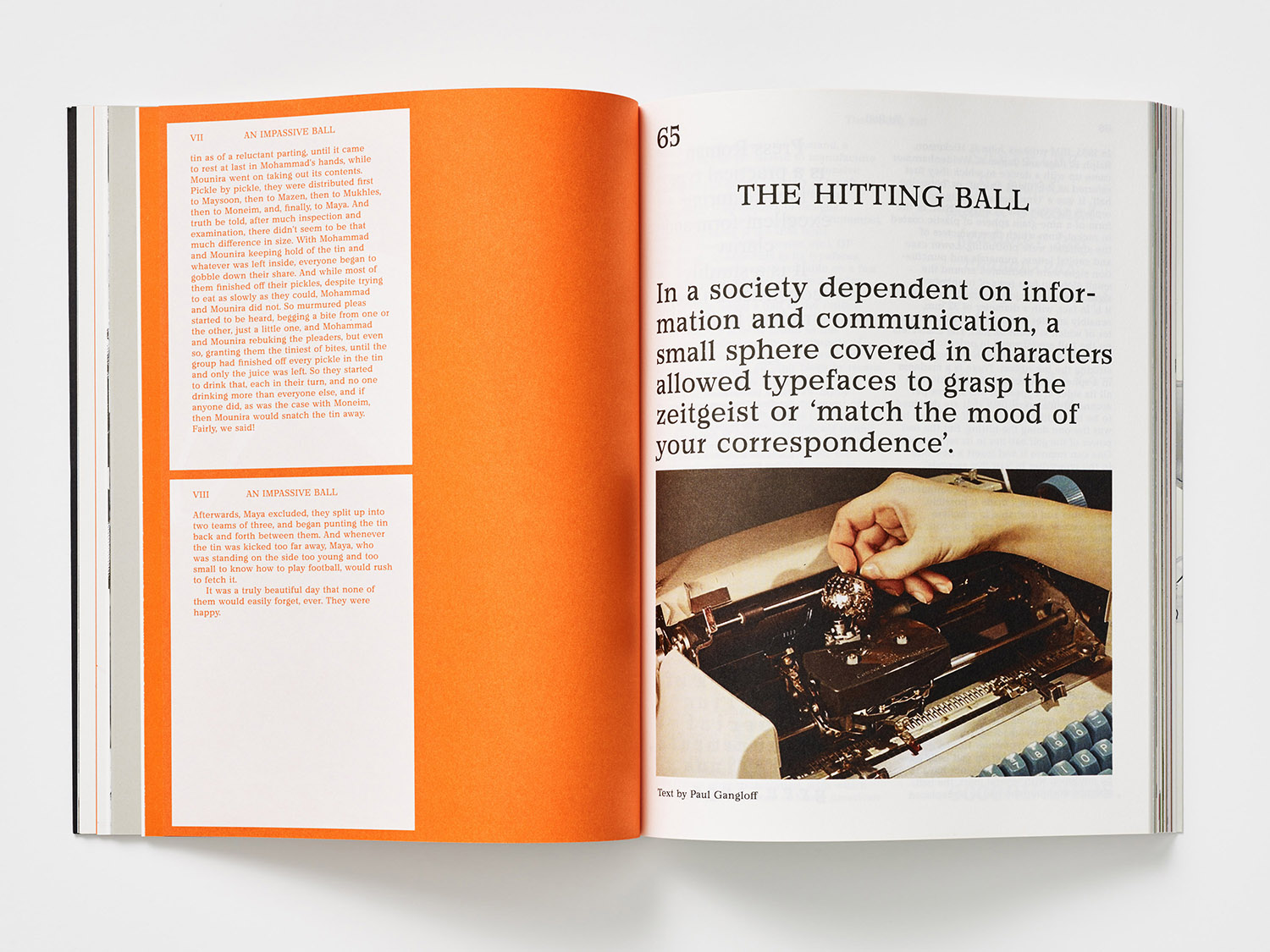
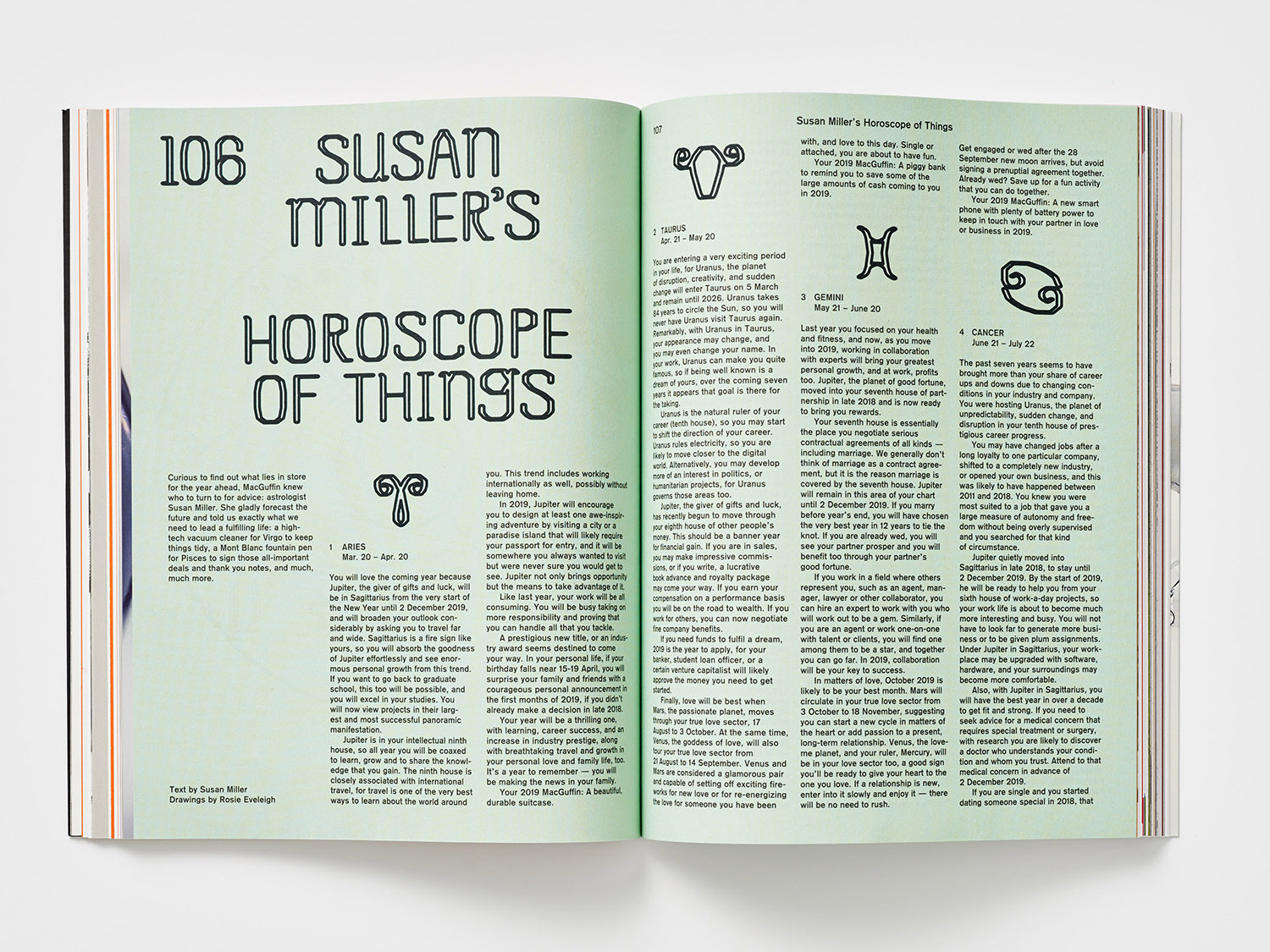
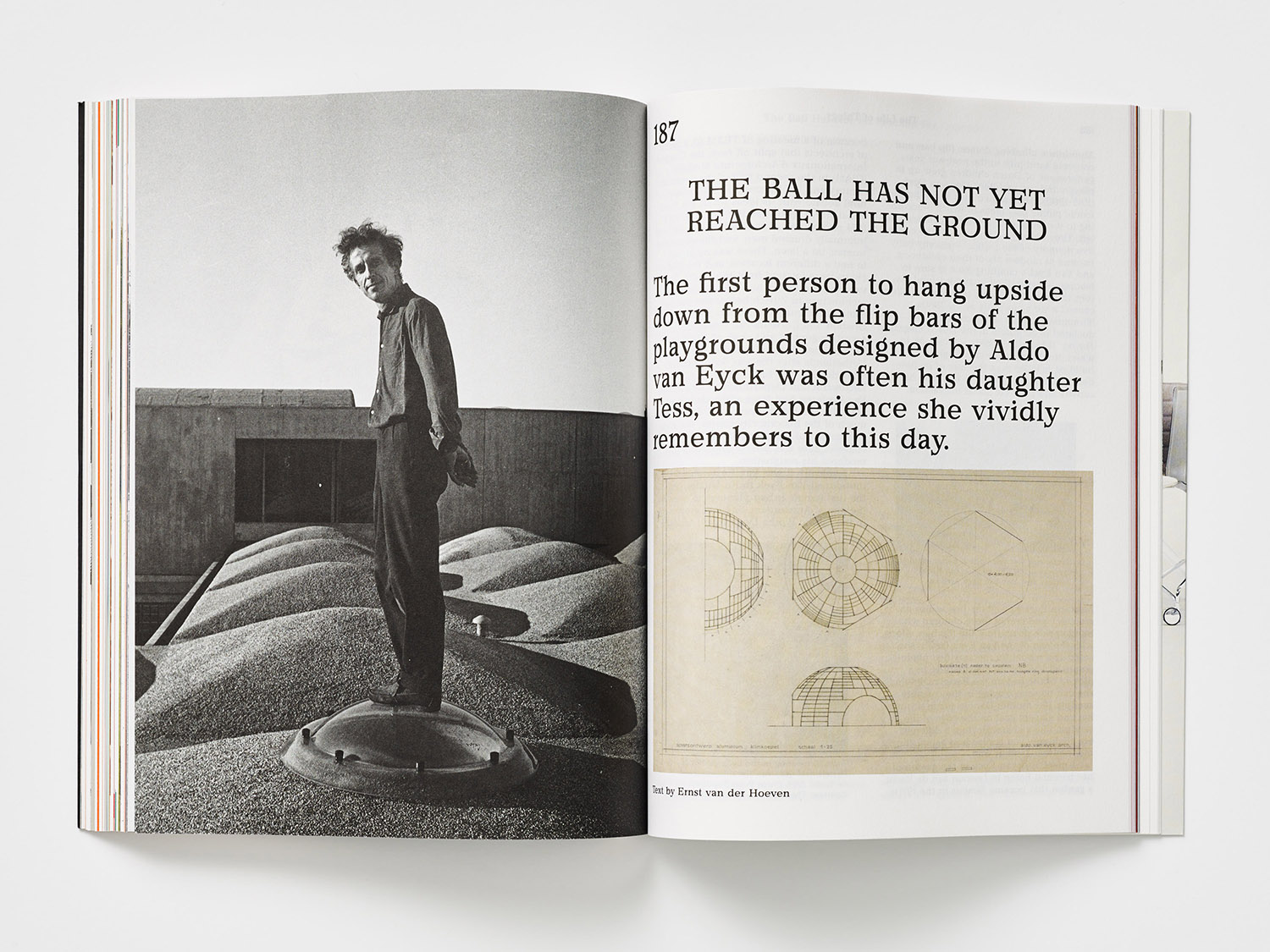
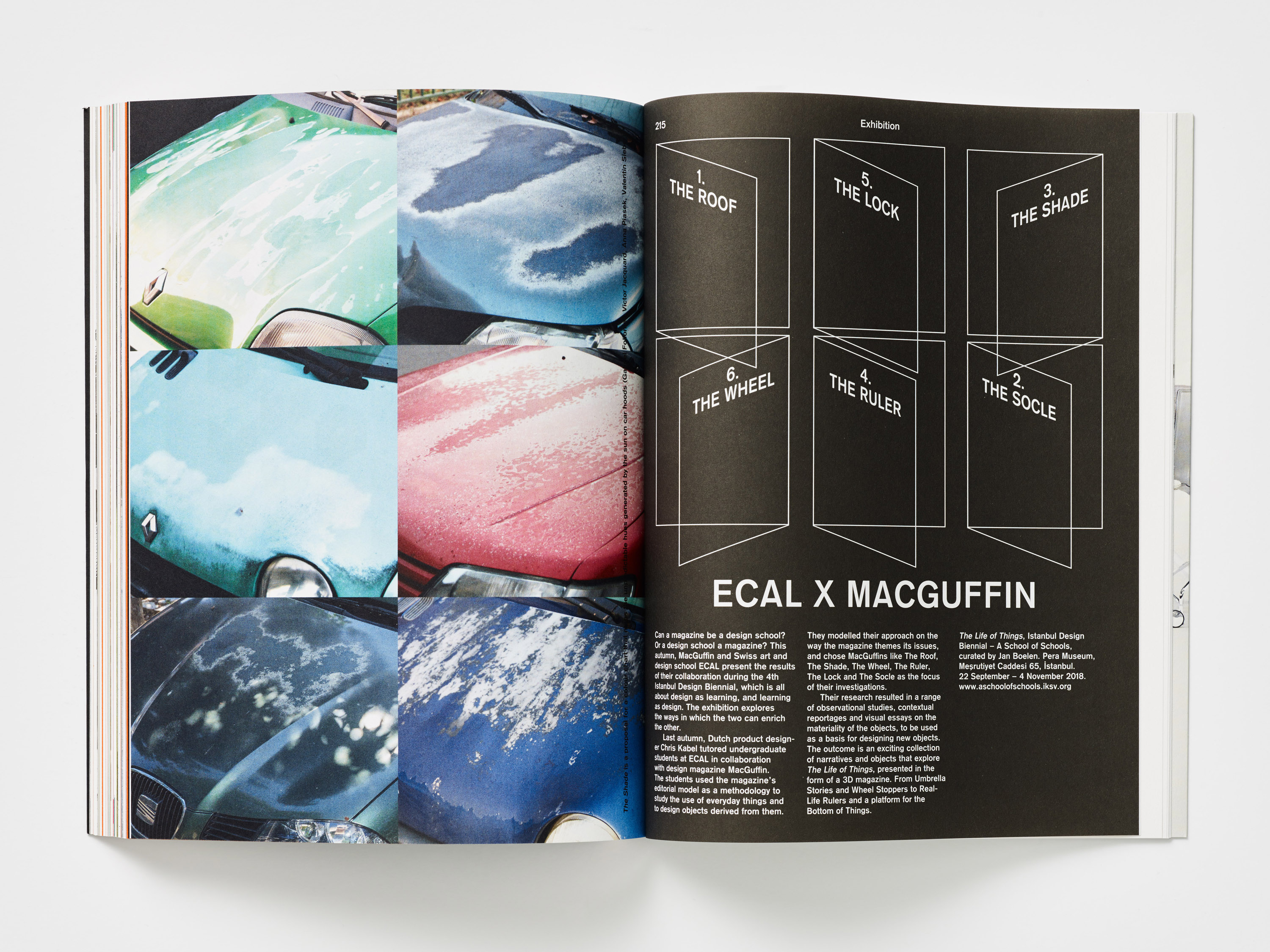
Proportionality and framing of type serve to break up pages. Occasionally, these appear as though they have been appropriated from historical periodicals, blown up, lending many of the texts a journalistic credibility, establishing a continuity between individual texts and giving the magazine a strong visual character throughout. This is built on through tinted imagery, archival imagery, typesetting and some of the colours used as backgrounds.
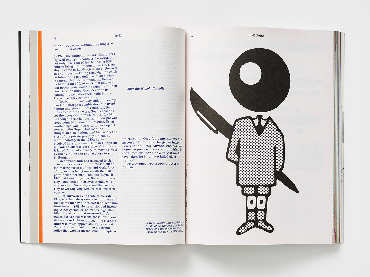
Form, texture and weight, typography, colour and layout clearly display a sensitivity to the notion of paratext. There is a sensitivity to solid colour, space and type as form. Often quirky and personal stories told through an arts and crafts lens, and those that are historical or centered around the built environment are elevated by letterforms, an evident typographical and graphic response to content. An interplay of the arts and crafts, and Swiss modernity. There are occasions where type, content and glossy surfaces give the impression of a place in time. Although much of this is subtle, perhaps less codified as it might be, but with room to capture the spirit of a piece, rather than be literal reading and association with just one article. The sans-serif is not reserved for architectural pieces or solely for captions or Colophon, nor the serif tied exclusively to arts and crafts pieces. In this sense, the magazine feels like a total piece of work, a collection of stories linked by theme, that the approach, the lens in which it seeks to view this (art, design, craft, the micro and the meta), is a collective endeavor, not disparate disciplines. That each discipline contributes to the total project, wrestled into existence collaboratively. There is a lot of variety. Plenty to discover. It is materially and graphically intriguing, thoughtful, and well-priced for the extent of its editorial.
Design: Kirsten Algera, Ernst van der Hoeven & Sandra Kassenaar. Opinion: Richard Baird.
