Senja Cosmetics by Werklig
Opinion by Richard Baird Posted 26 November 2018
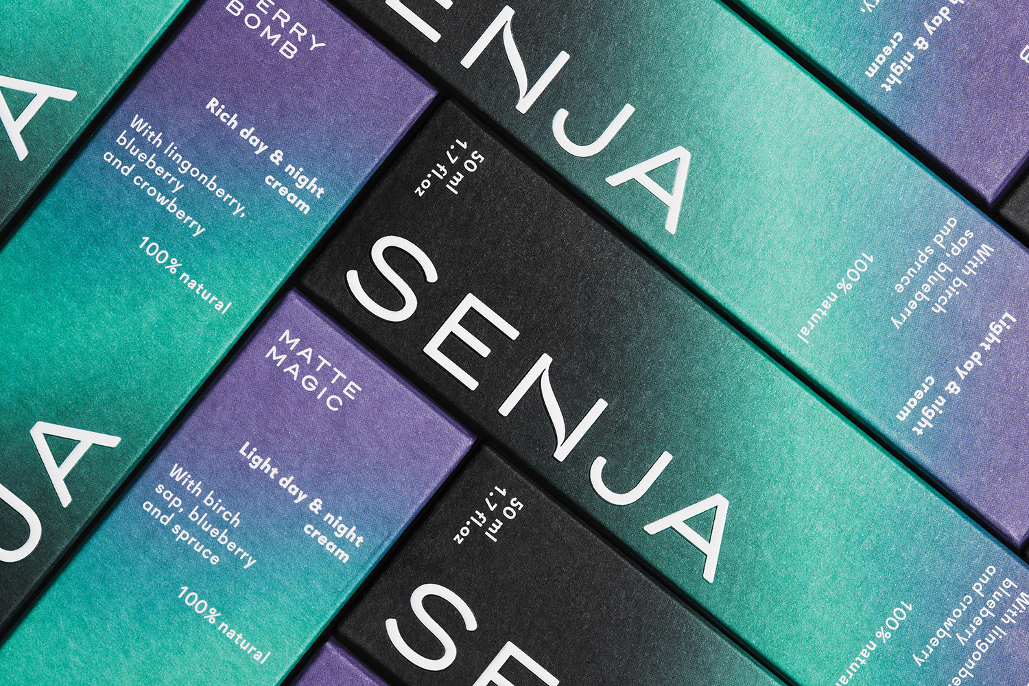
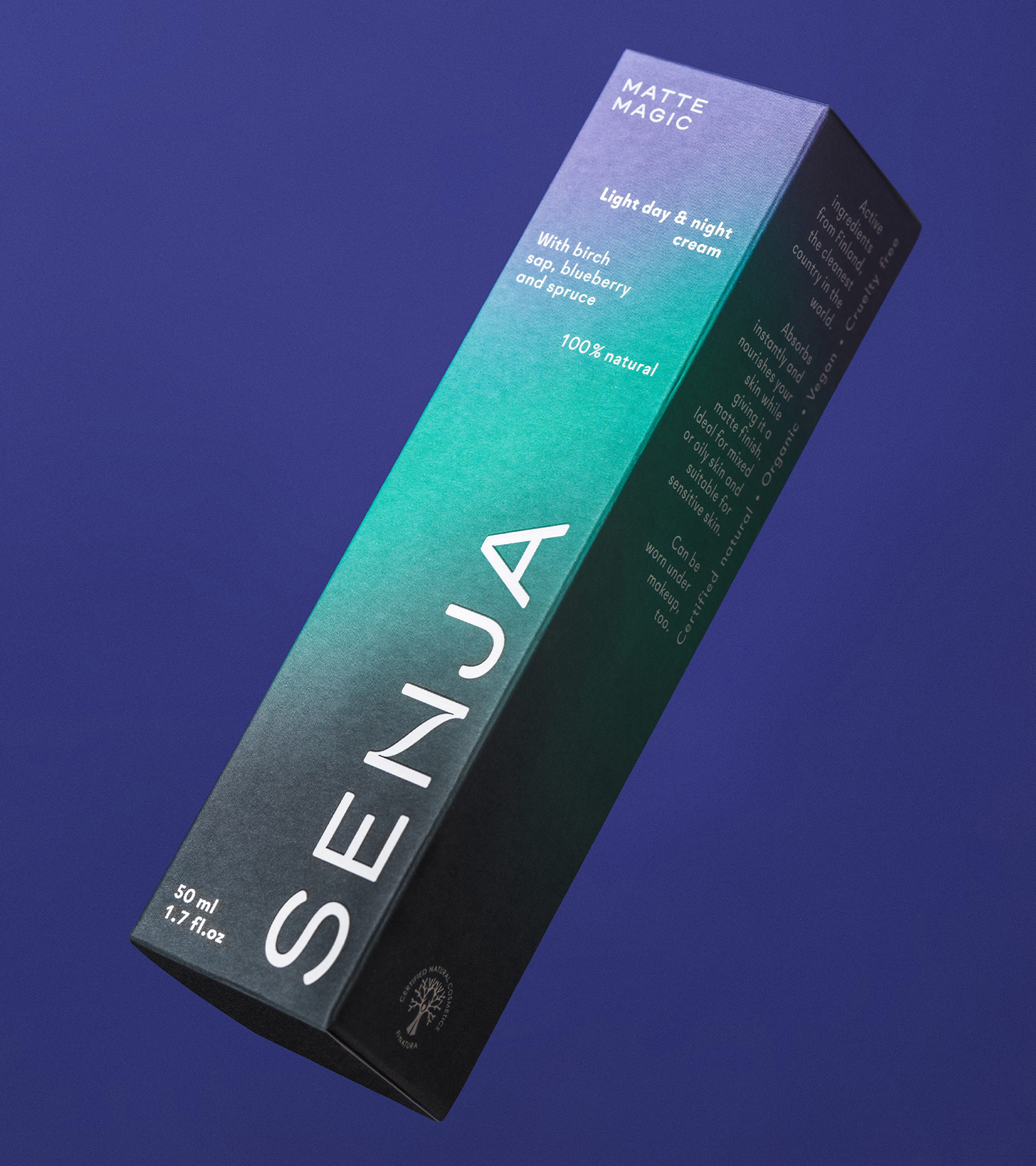
Senja is a Scandinavian premium cosmetics brand, founded by Senja Parkkinen, with a range of toners, cleansing foams and oils made from active natural ingredients all manufactured in Finland. With a desire to communicate an all-natural and contemporary positioning and capture the fresh air and harsh environmental conditions that produced many of these ingredients, the brand worked with Werklig to develop a new visual identity that would extend across packaging and printed communications. This is made up of a distinctive black, green and purple gradient, the simple letterforms of a custom logotype and a series of nature-inspired still life sculptures.
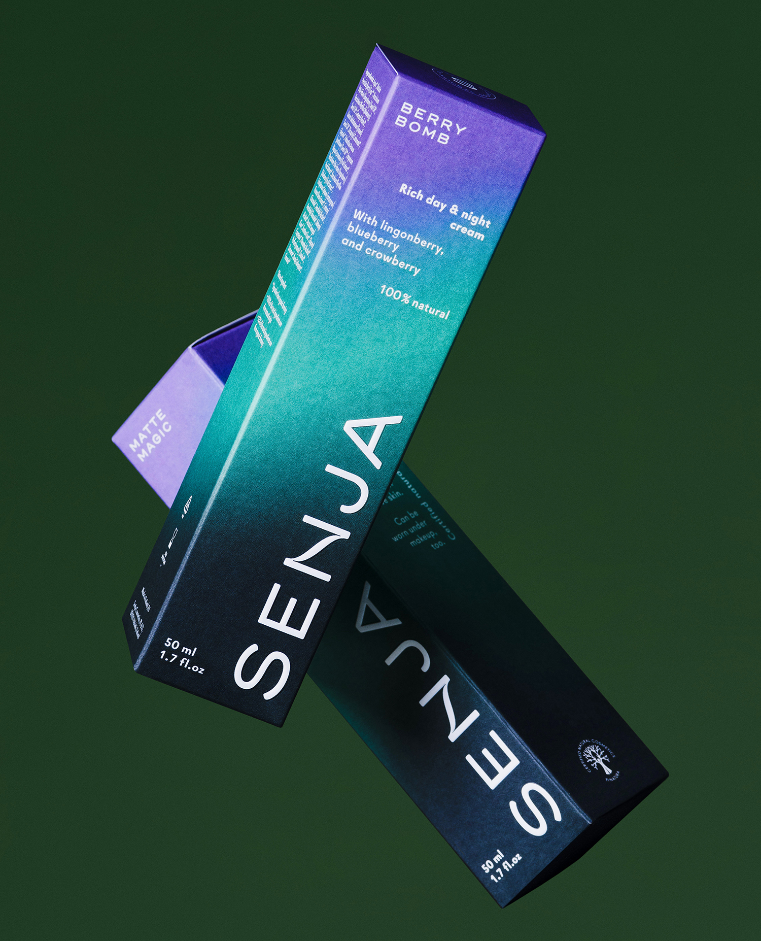
Werklig’s approach embraces a regionality, one that is likely to conjure up romantic imagery and feelings within the minds of an international market. This regionality manifests itself by way of a gradient inspired by Aurora Borealis. This speaks not only of the origins of the brand, but of gentle transitions, beauty and something of the movement from light to dark that perhaps finds communicative value in the day and night time nature of the creams.

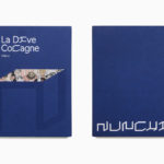
Still life; a series of nature-inspired sculptures, carefully balanced, are the highlight, finding a comfortable intersection between artistic craft, natural environment and ingredients. These touch upon different parts of Finland, from the forests of the east and the moorlands of Lapland to the archipelago and plains of the west.
The Senja wordmark is contemporary in its simplicity and application, soft in a way that sits comfortably within the cosmetics market with a distinctive N set at its centre, a smooth transition between vertical strokes.
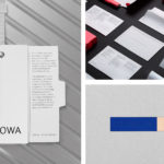
Each of these details, from the gradient to wordmark to still life, is marked by not just the initial visual pleasure and distinction, but the subcontextual communicative drivers; the Nordic environment, craft, a careful balance, environmental synergy, and natural ingredients, as well as the quality of their execution. Although these do appear online, the website lacks the elegance and simplicity of some of the printed communications, particularly the balance of colour blocking, type and image that appear across the postcards.
Design: Werklig. Opinion: Richard Baird.