Fredrik Værslev As I Imagine Him by Zak Group
Opinion by Richard Baird Posted 28 November 2018
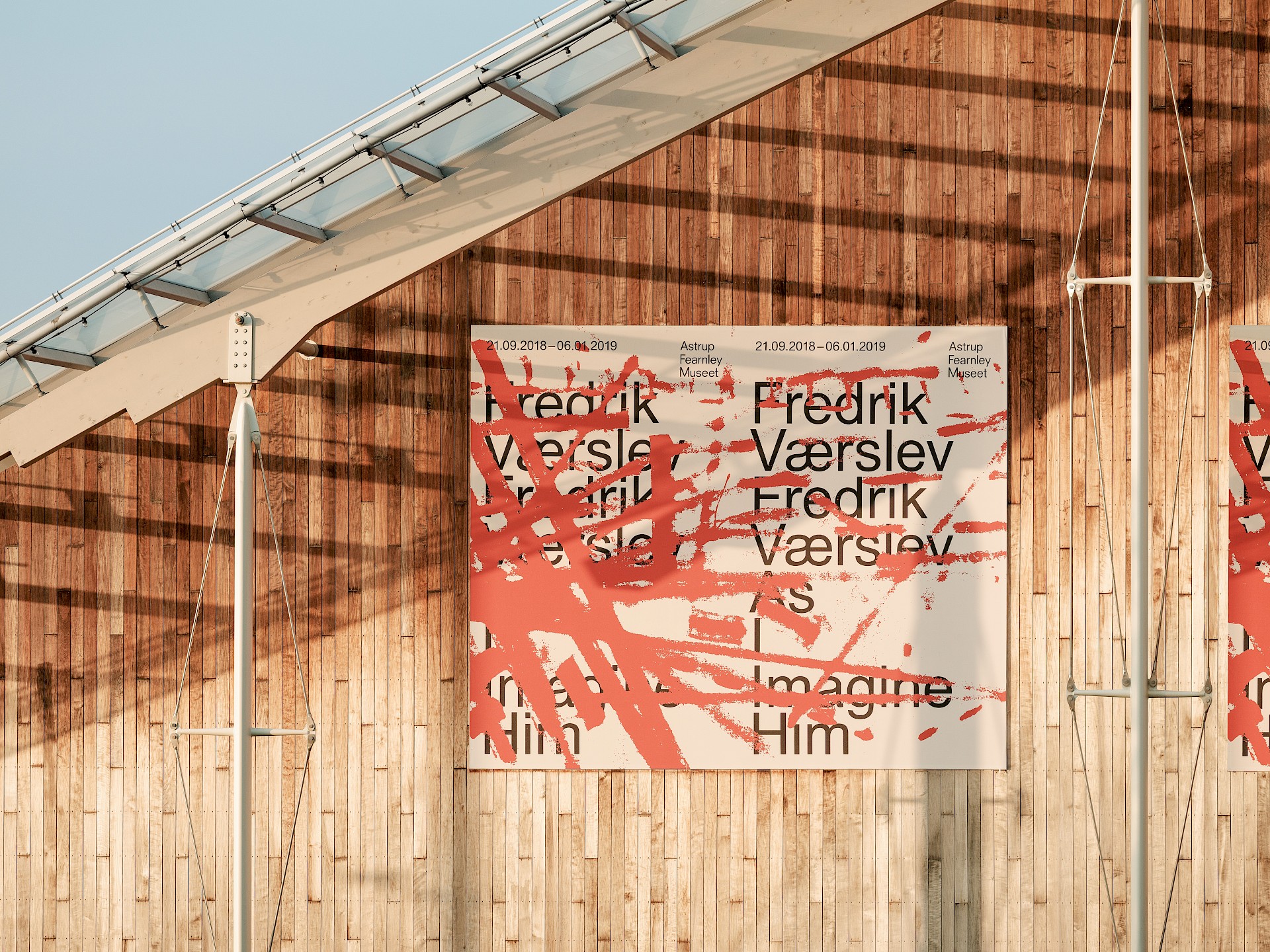
Fredrik Værslev as I Imagine Him is an exhibition of work by Norwegian contemporary artist Fredrik Værslev produced over the last decade. The exhibition runs from September 2018 to January 2019 at Astrup Fearnley Museet in Oslo. Through a focus on process, modes of abstraction and representation, motions between the painterly and the architectural and in the use of untraditional tools such as trolley wheels and defective cans of spray paint, Værslev explores different ways in which paintings can be perceived.
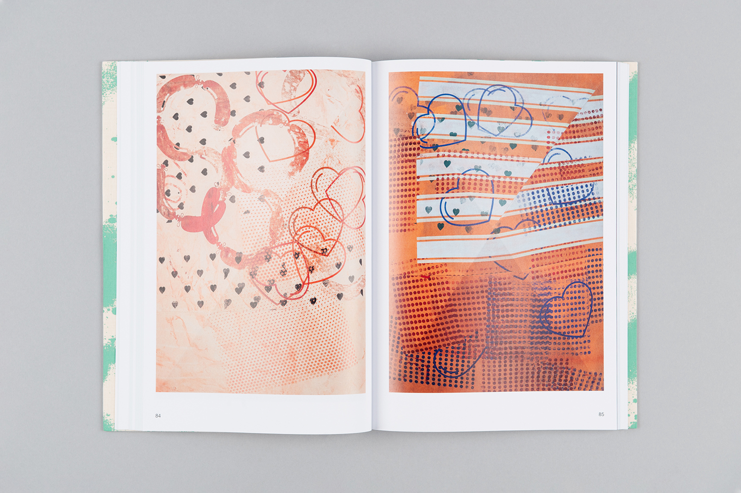
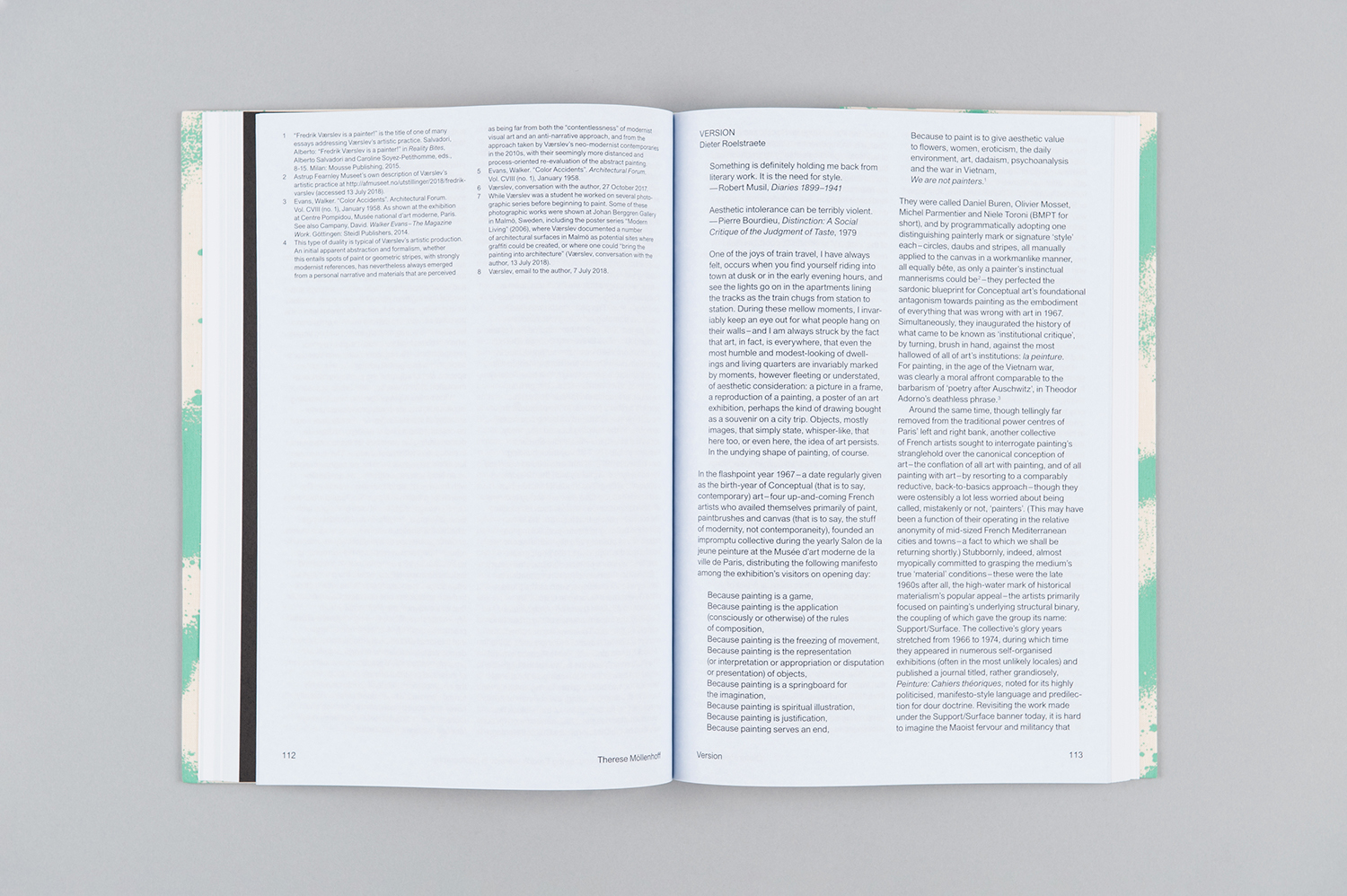
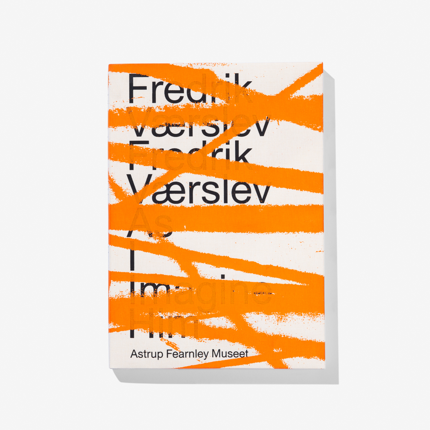
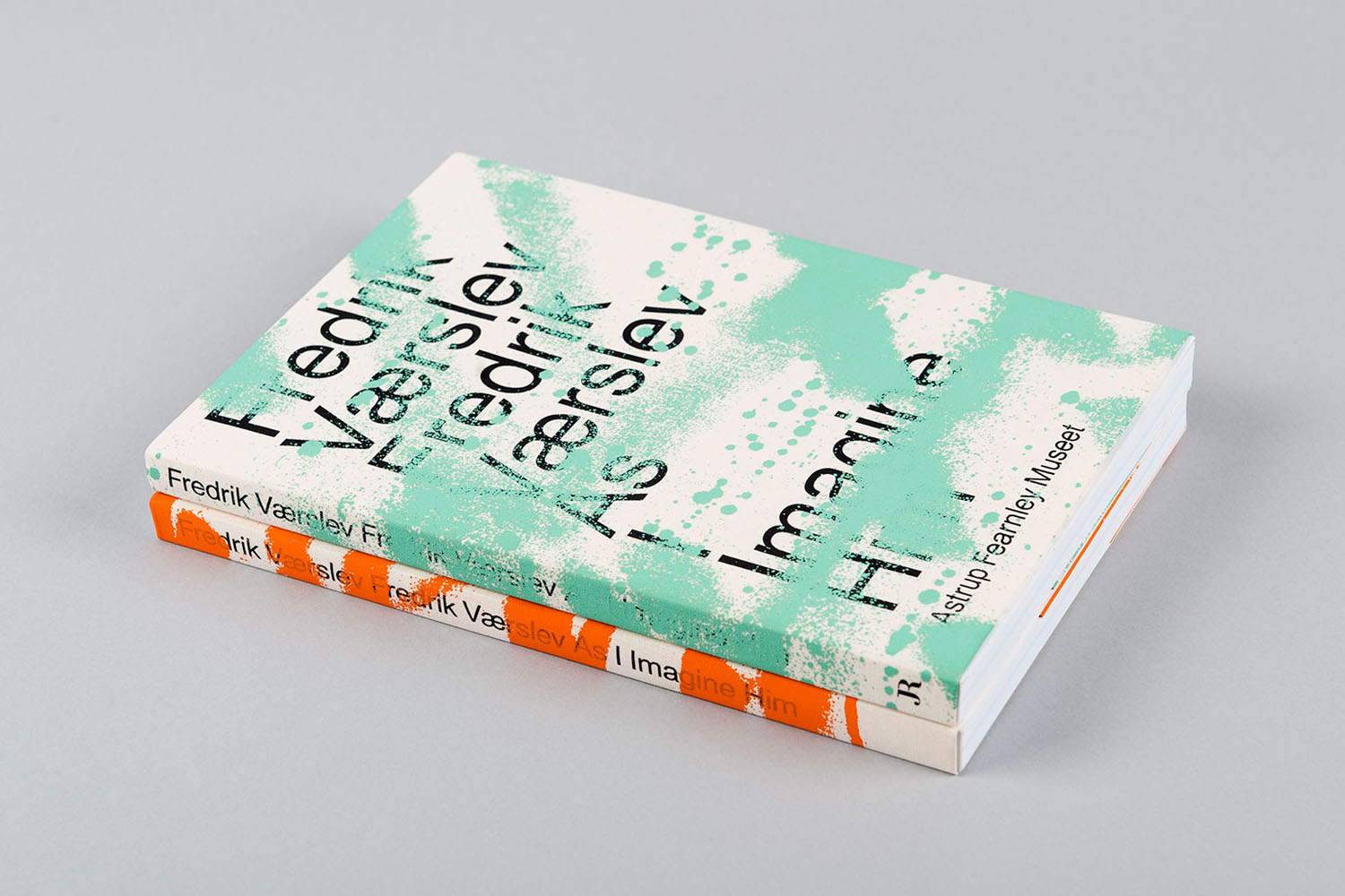
Zak Group, as part of their continuing collaboration with Astrup Fearnley Museet, worked with Fredrik Værslev on the exhibition’s campaign and accompanying catalogue. Drawing on the modernist references of some of the artworks, and the unusual techniques of painting Zak Group developed a visual identity that explores creative agency and creative imposition on the rational. This can be seen in the use of type and graphic gesture, colour and texture and the implication of layers. Alongside reproductions of the artist’s works the catalogue also contains texts by Peter J. Amdam, Therese Möllenhoff and Dieter Roelstraete amongst others. The catalogue comes in two editions, English and Norwegian, differentiated by colour across their covers.
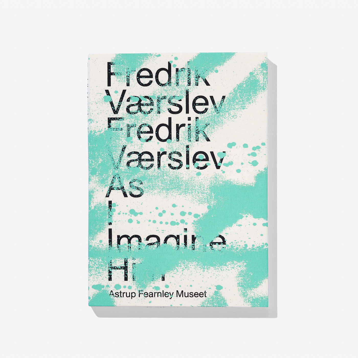
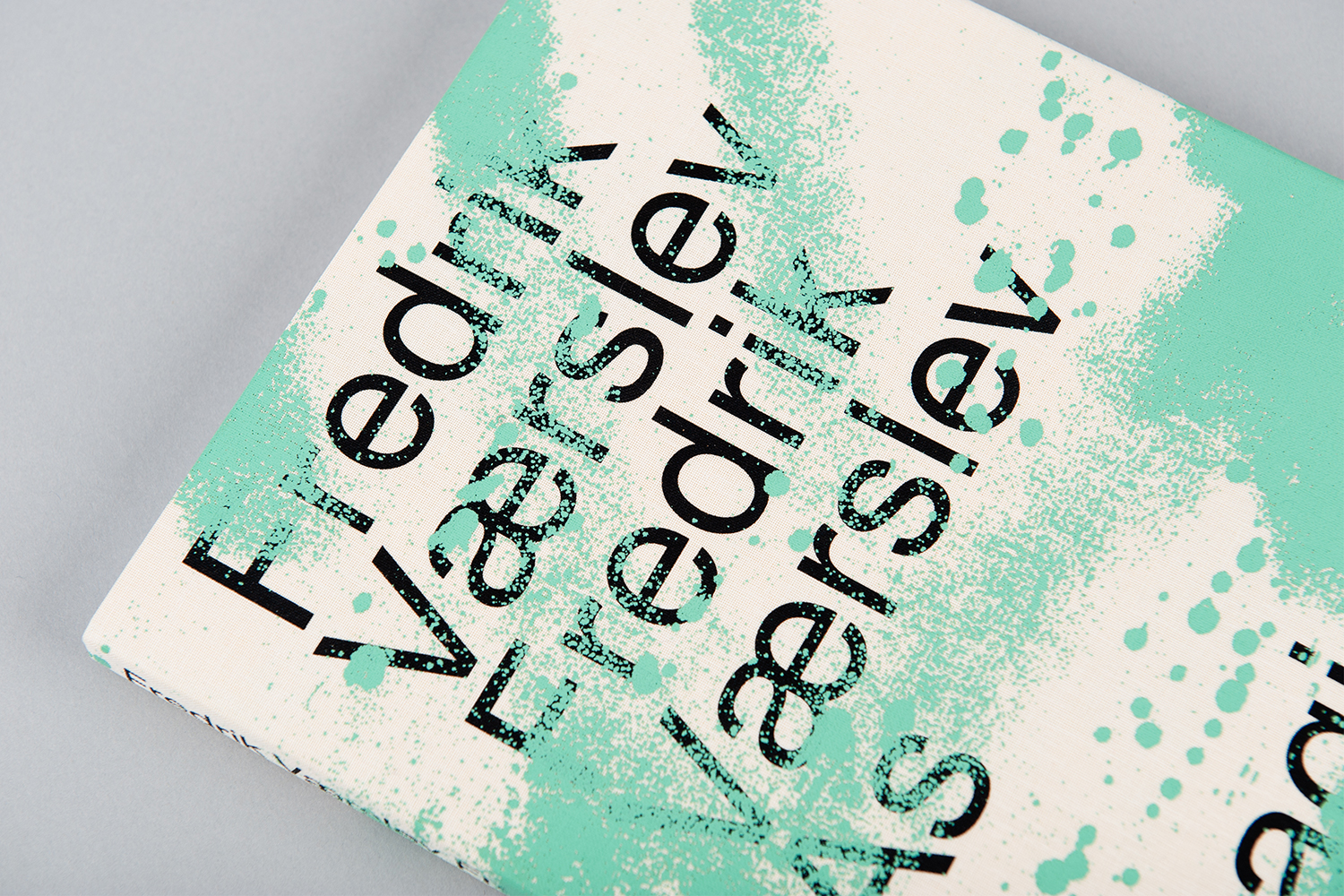
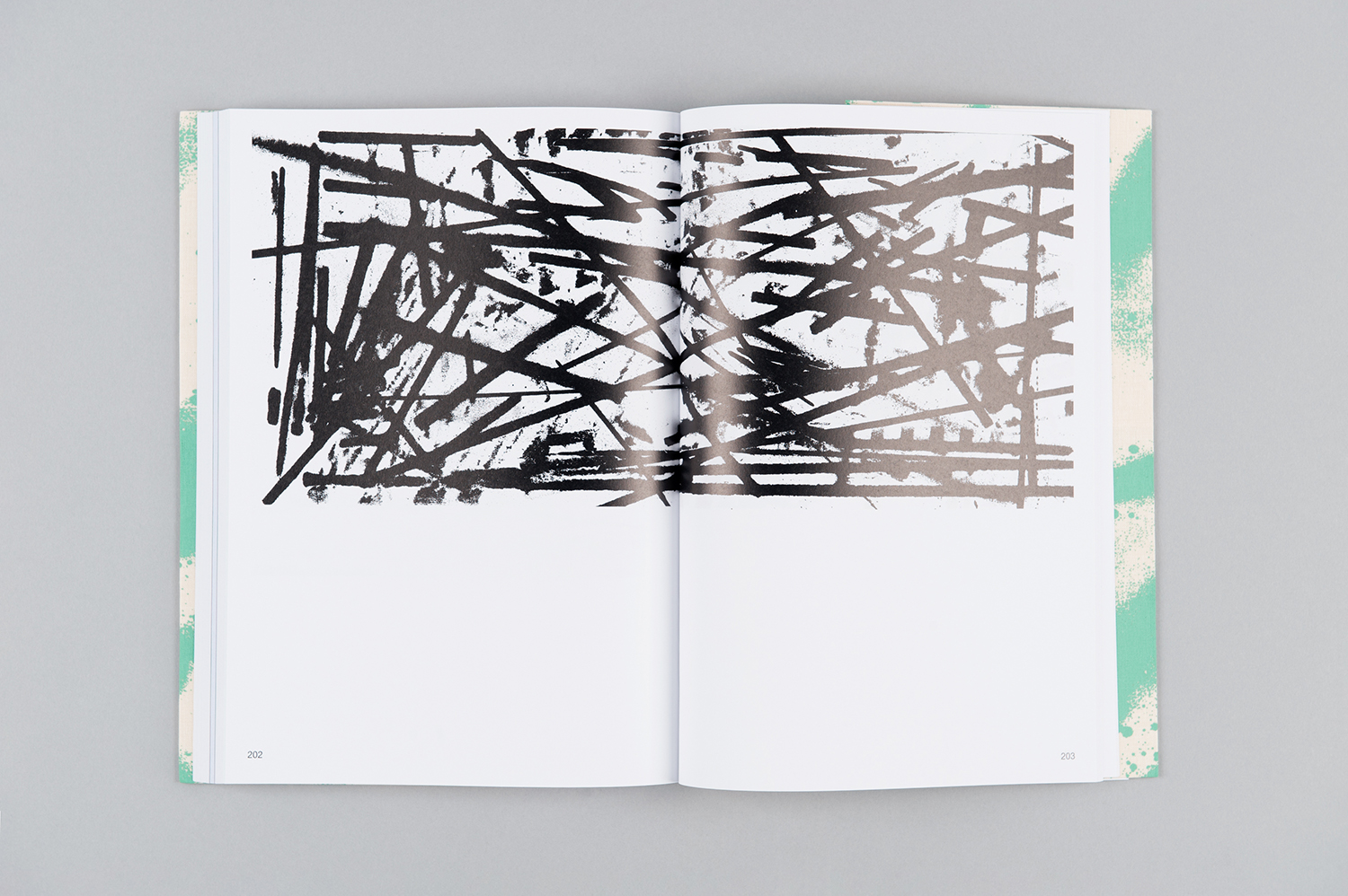
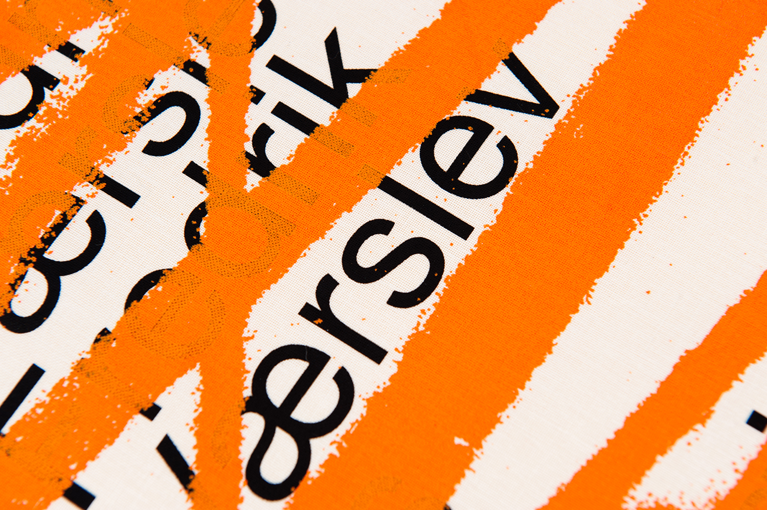
The dialogue formed between a modernistic rationalism and the imposition of artistic gesture is immediate and visually striking. The subversion of “formal” concerns such as legibility and communicative hierarchy and the elevation of form and colour creates a strong focus on layers, emphasising process, finds a synergy with Fredrik Værslev’s work. That the graphic gesture was pulled digitally from existing analogue artwork; lines painted by way of shopping trolley wheels on raw linen see the catalogue connected directly to the exhibition, just as individual canvases within space become a singular artwork. This is also explored in the range of campaign imagery and production of tote bags created by the artist and designed to acquire the patina of time and use, then mounted as artwork at home.
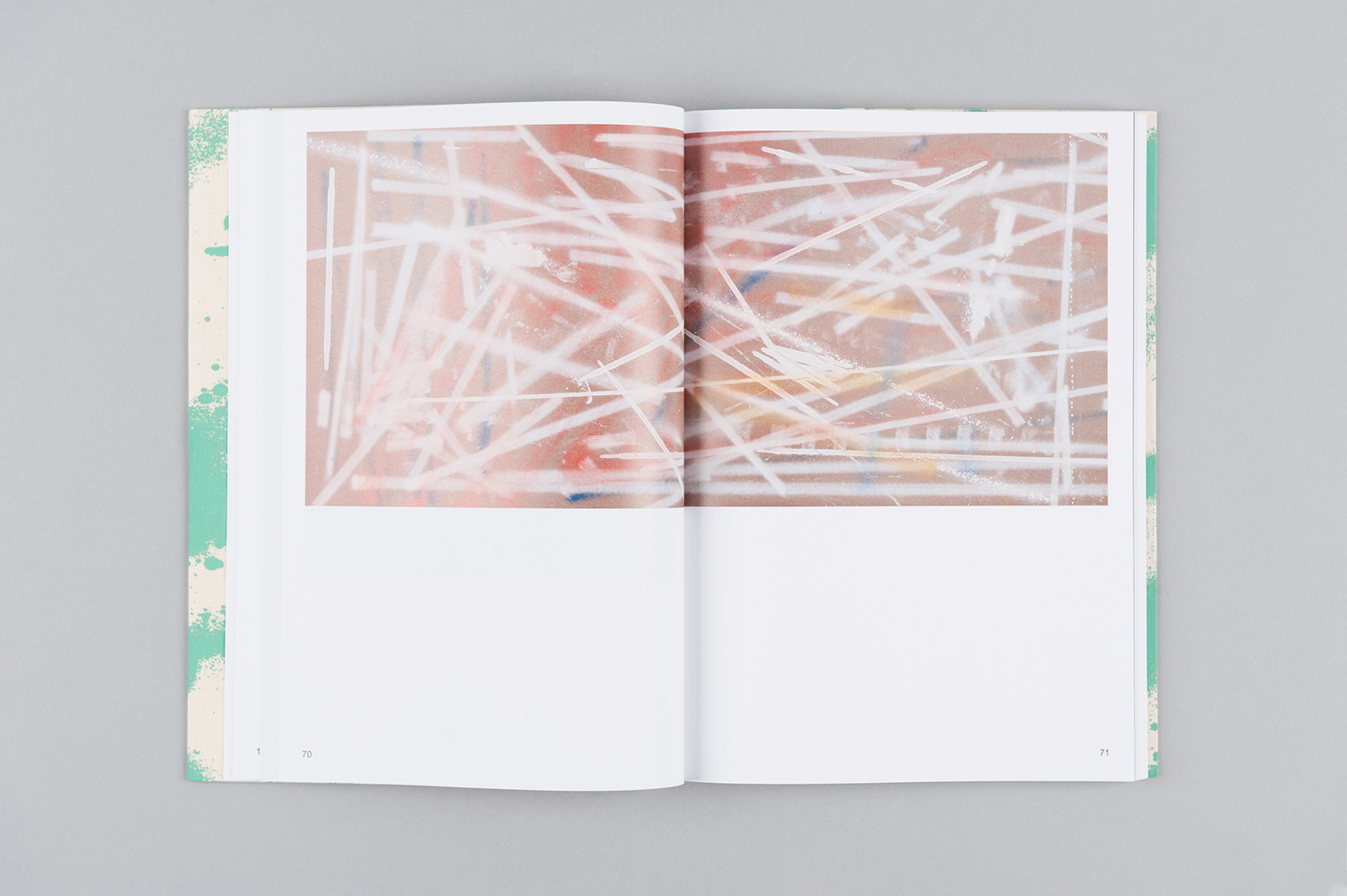
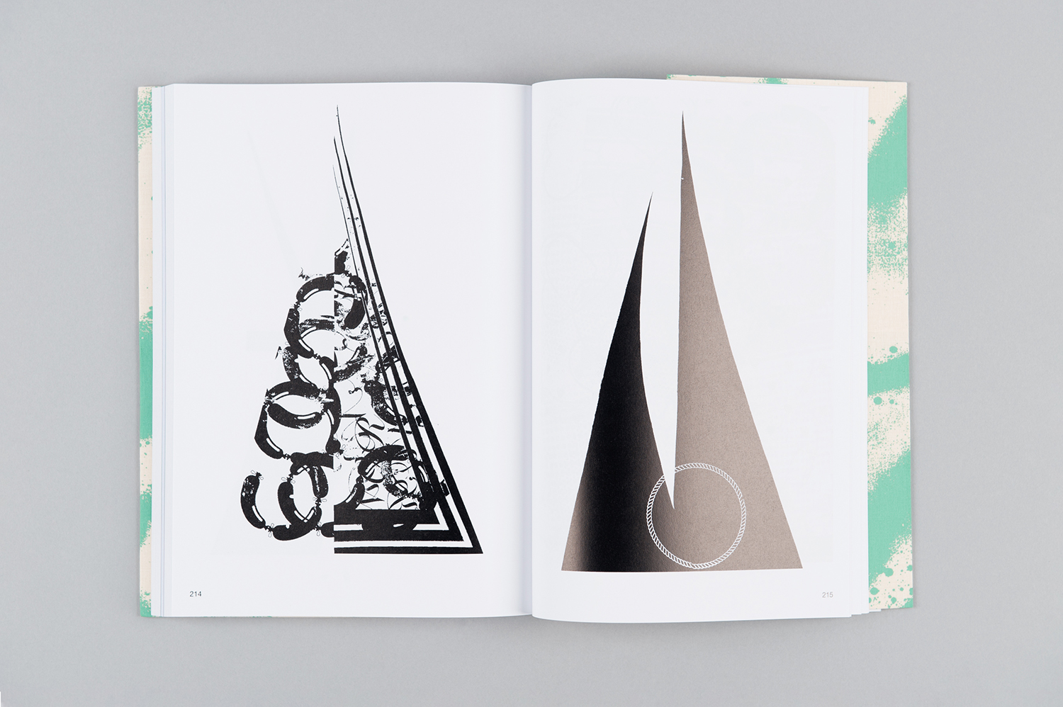
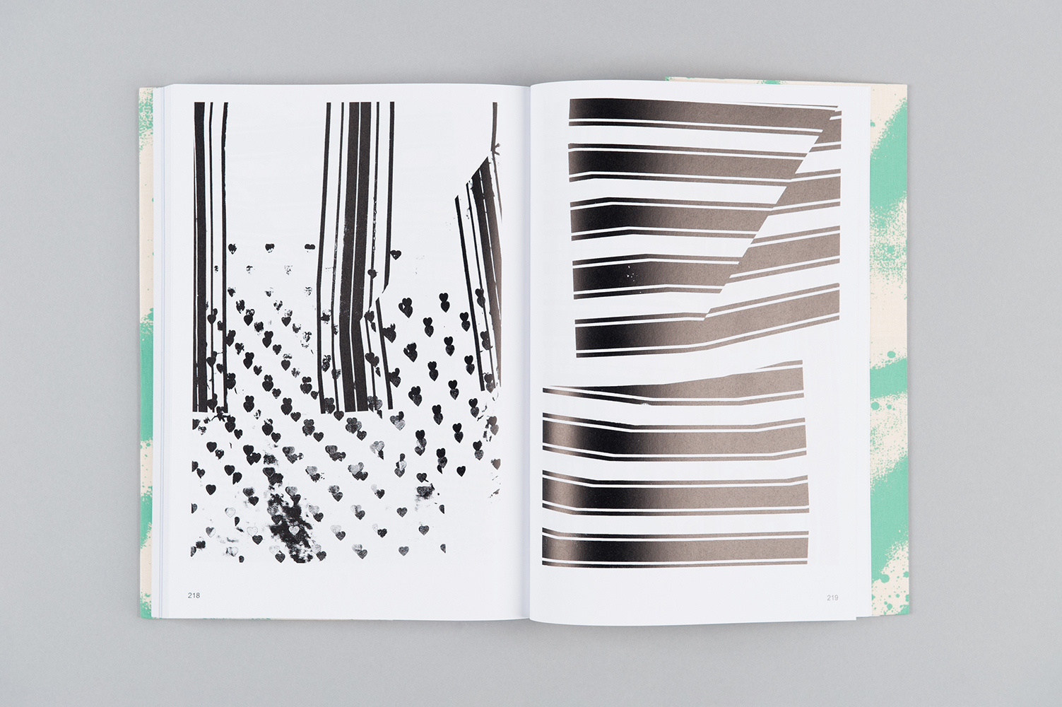
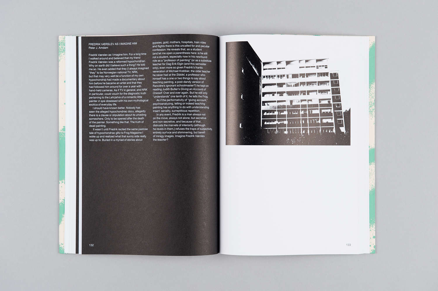
Inside, the catalogue leans towards the more rational in typographical shape, typesetting, space and image. It also features a couple of neat ideas that explore form, texture and layers by way of a section of colour plates, a central section of texts printed on coarse uncoated paper and a black-and-white visual index that reduces the works to their elemental forms and painterly gestures. This interplay of different substrates—the linen cover is a critical part of this—and the dialogue formed between full-colour reproductions and those that focus on form, creates thresholds and relationships, and a backwards and forwards through the layers of pages.
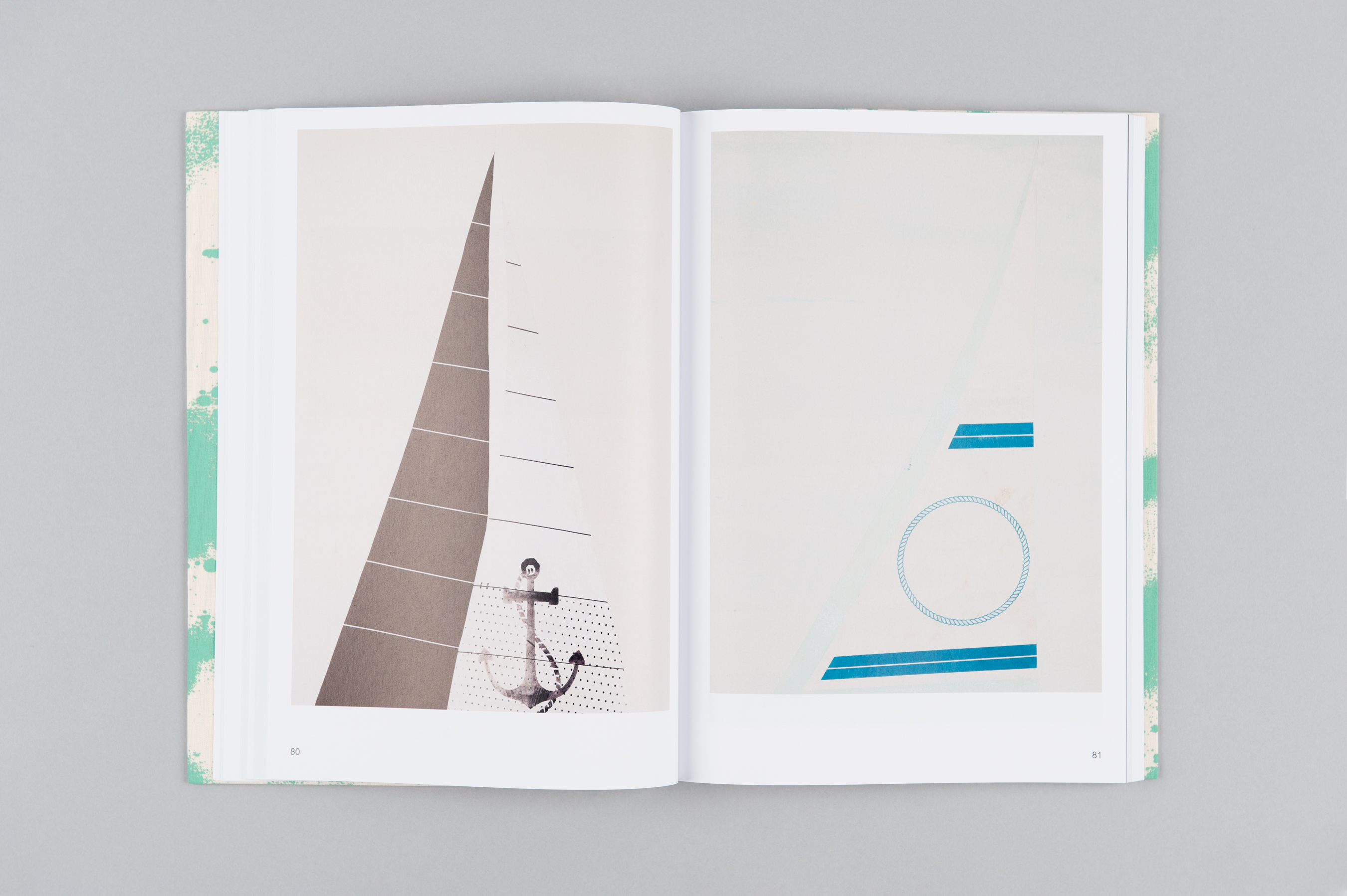
The catalogue is both part of and then a residual fragment of an exhibition. The cover is a beautiful graphic gesture, critically bound to the work on display, but also drawing people to it and facilitating its migration outside of exhibition. Inside, through arrangement and texture, colour and form, image and texts, develops the themes of the artworks through the format and potential of the bound book. More work by Zak Group on BP&O.
Design: Zak Group. Opinion: Richard Baird.
