Outline by Studio South
Opinion by Richard Baird Posted 3 December 2018
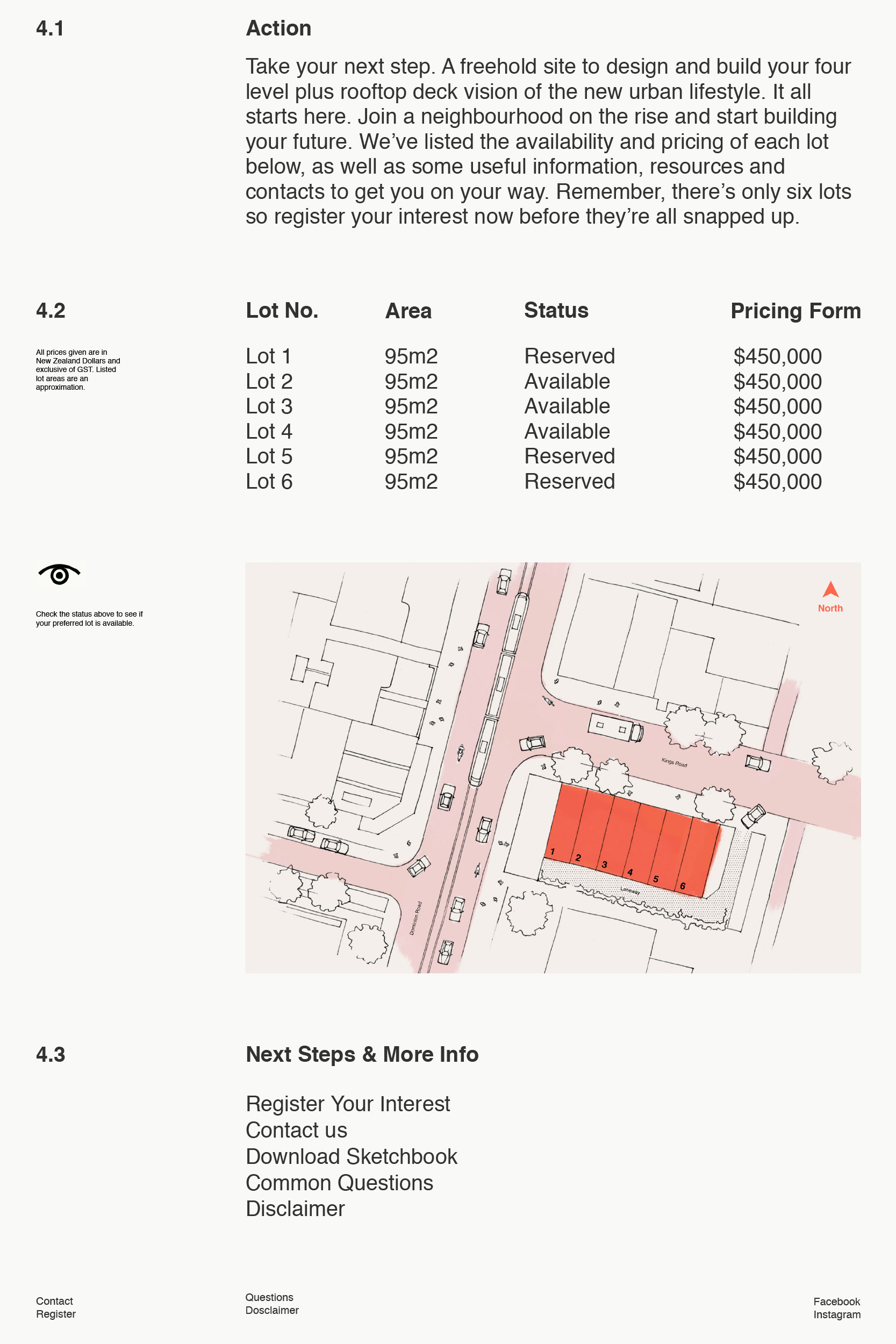
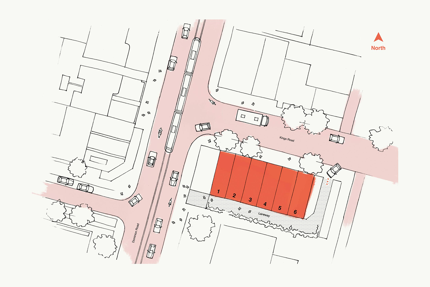
Outline is a six lot freehold property development opportunity from Fearon Hay Architects located on Kings Road on the border of Mount Eden and Mount Roskill in a culturally and historically rich neighbourhood in Auckland. Each lot is 95m2 with the capacity to build four levels and include a roof living space totalling 300m2 of floor area. Studio South worked with Fearon Hay Architects to develop a visual identity for Outline.
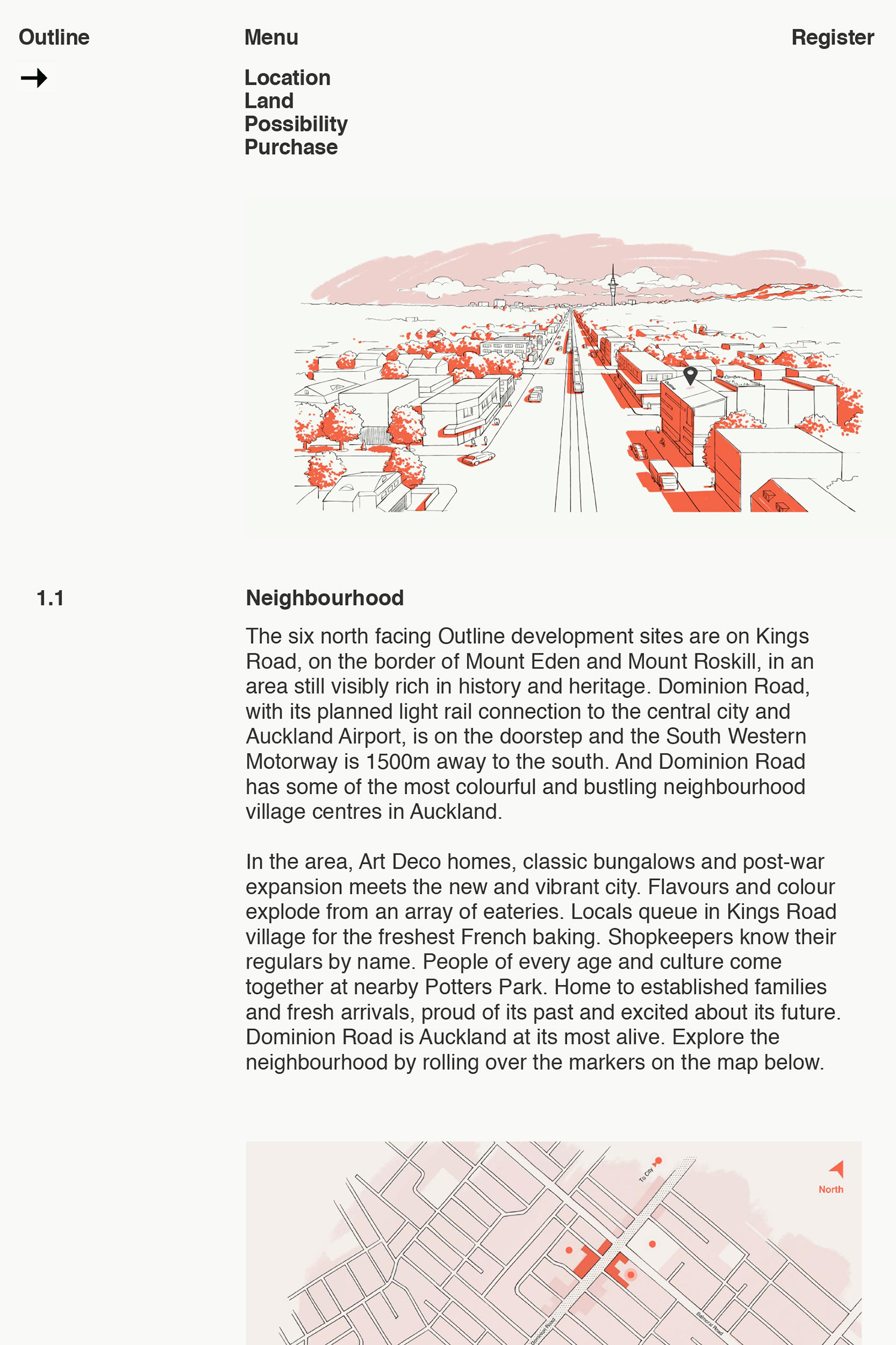
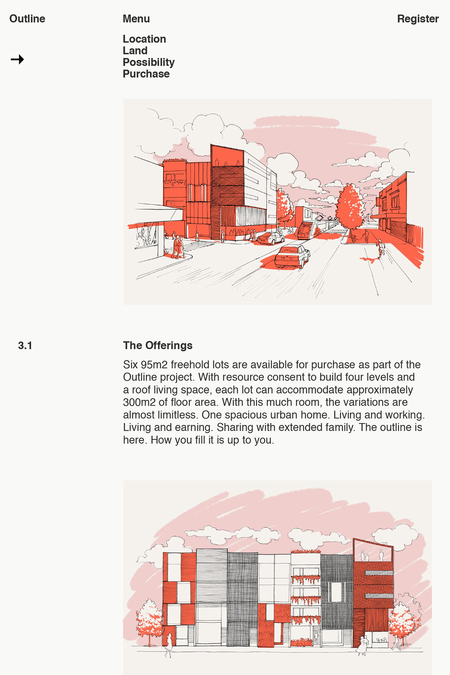
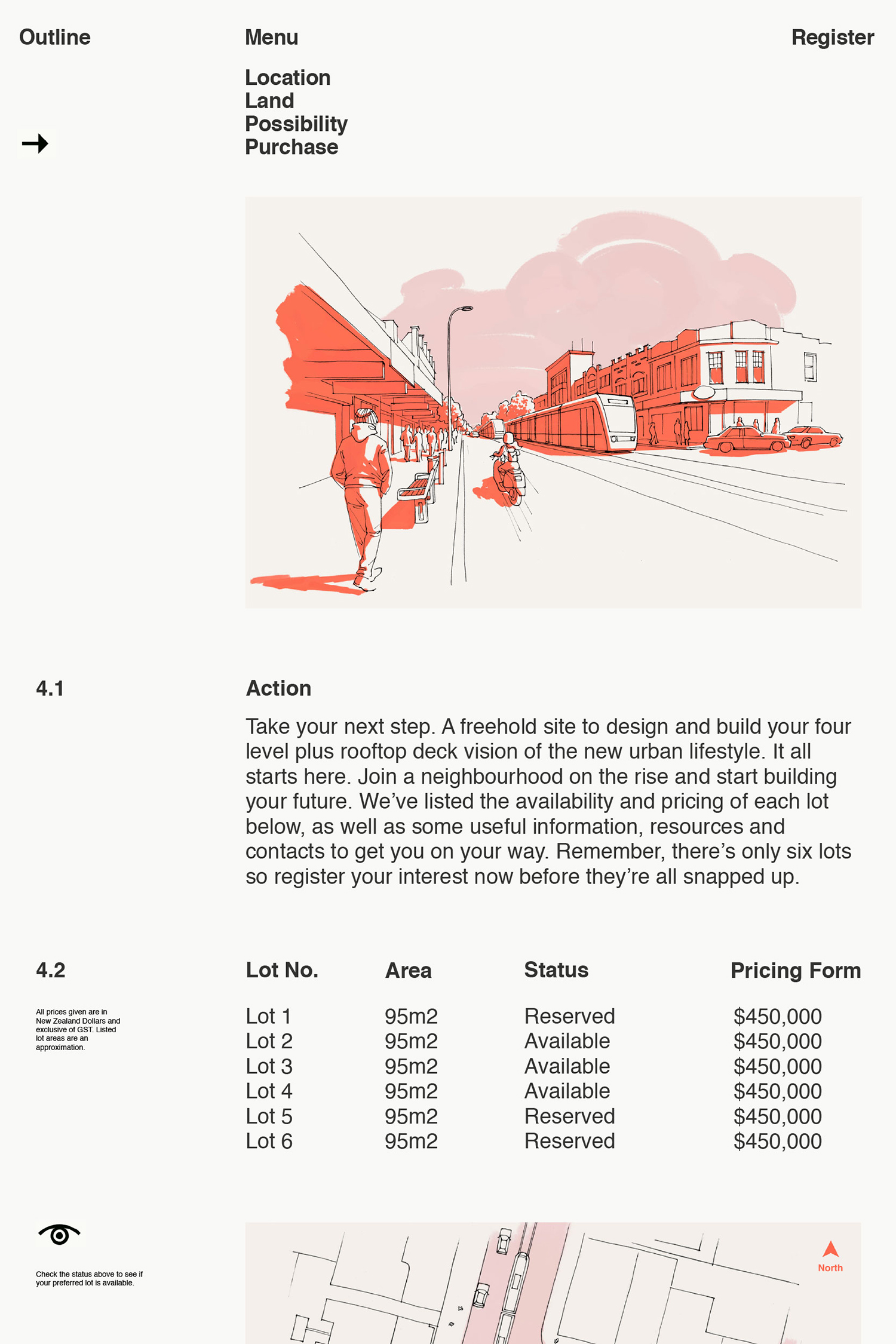
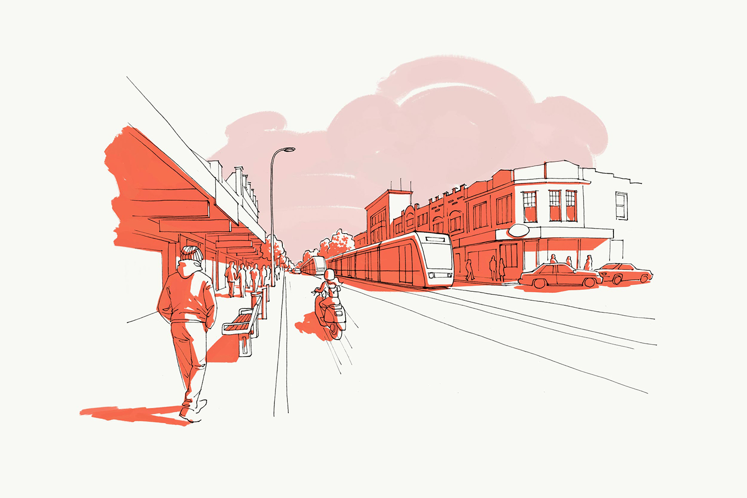
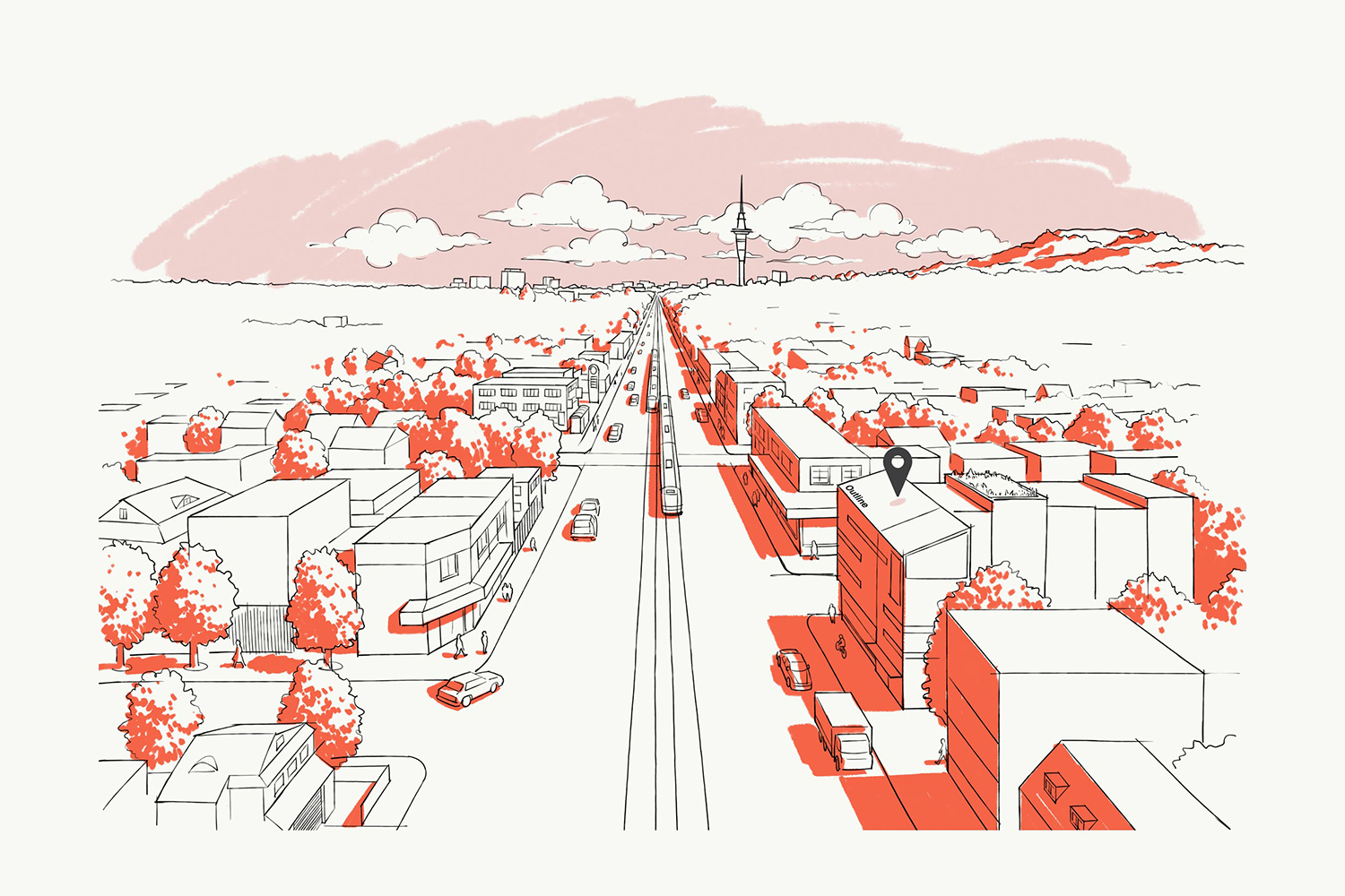
Absent architecture, positioning focuses on the unlimited potential of each lot, with a language that speaks to families and those individuals and couples looking for modern and adaptable living and working spaces. This is achieved through a distinct series of illustrations and simple graphic gesture that runs across website and brochure design. The Outline project, while focusing on selling the lot and planning permissions, also seeks to facilitate, or at least ease, the way to design and build through connections to partners.

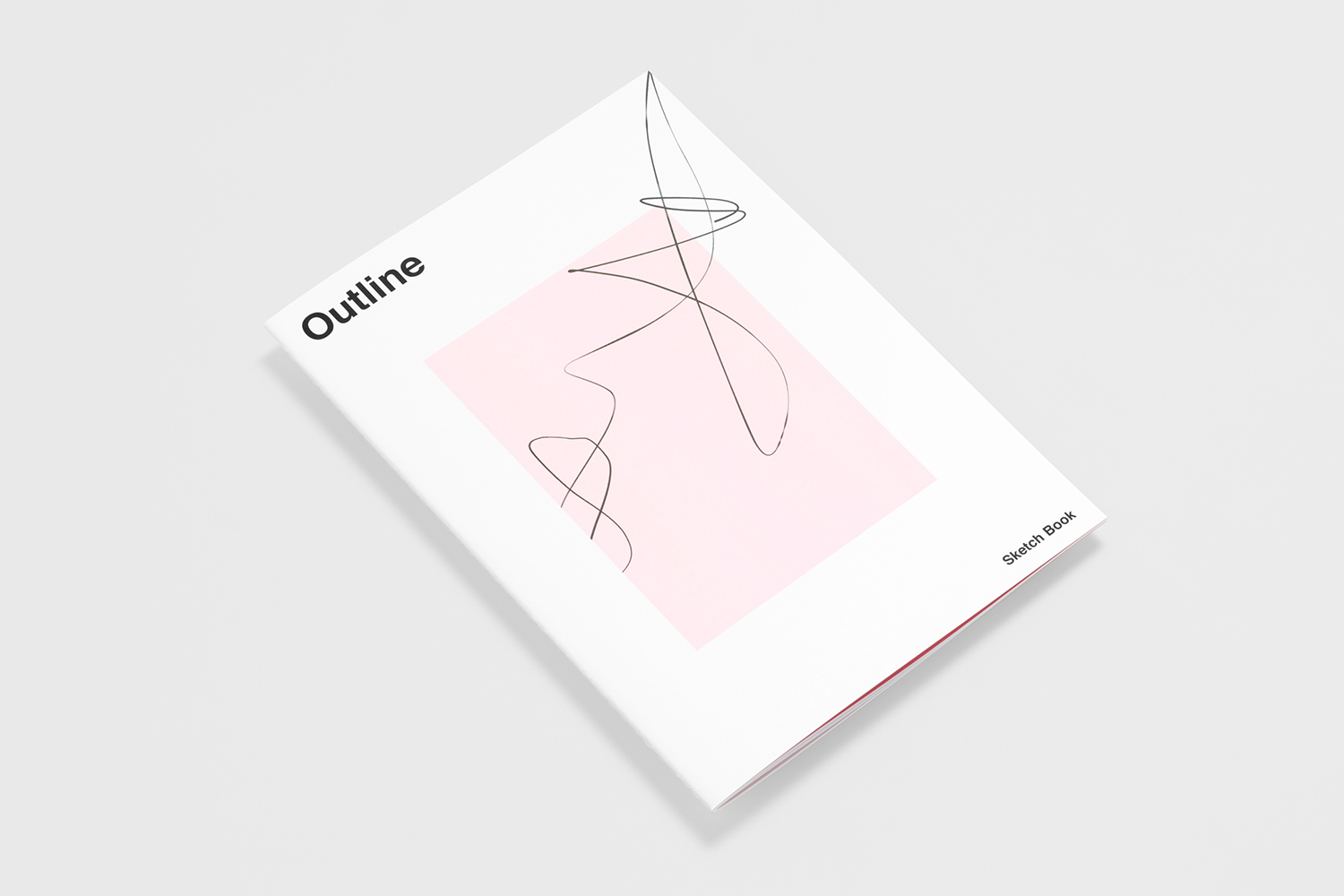
Studio South’s approach is built from the premise (and promise) of “potential”. This is expressed through naming, the visual language of a blank canvas and the first lines of an architectural sketch, a series of illustrative impressions and in the choice of language. Most of this is implicit, however, brochure as sketchbook and the graphic gesture of its cover, applied as a dynamic line across the website, is far more explicit yet avoids the gimmicky.
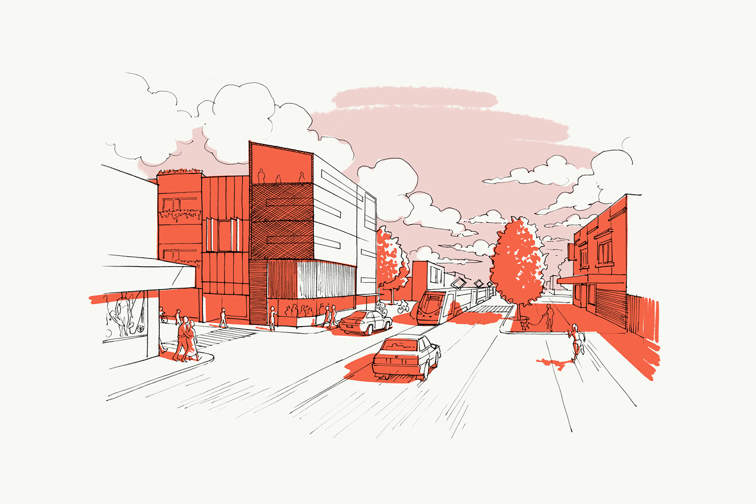
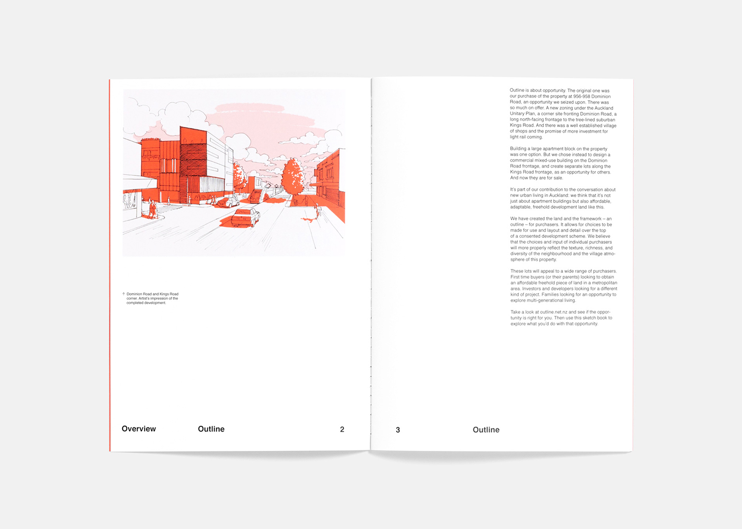
The stylistic qualities of visual identity are aimed clearly at those individuals and families seeking to construct their ideal living space, rather than those wanting to invest in land or to build and sell, although this is touched upon online and not off the table. This can be understood in the character and almost unfinished quality of a series of illustrations. There is a clear continuity throughout by way of a dynamic perspective and loose but professional hand, and the personable warmth of pencil and red pen.
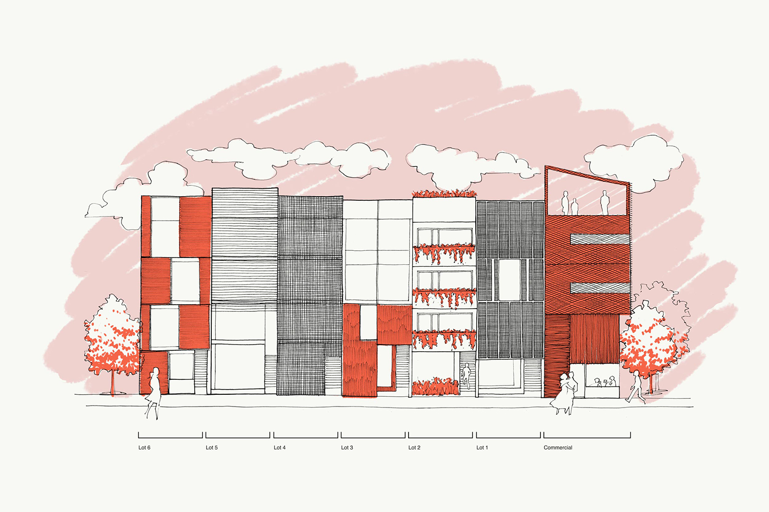
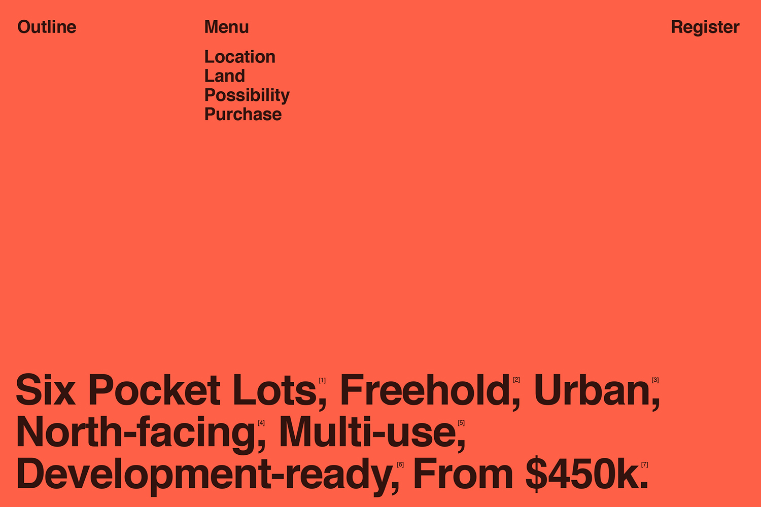
Identity emerges in the juxtaposition of a rational approach to typography (Neue Haas Grotesk) and layouts, the motion and hand-drawn gesture and colour of illustration, and the opportunity implied by space rather than a striking logo or logotype.
This is a limited opportunity of six lots, likely to have a short lifespan (only four lots remain) thus visual identity is very much of the moment, developed with the intention of framing a future aspirational lifestyle with enough room to accommodate the imagination of a buyer.
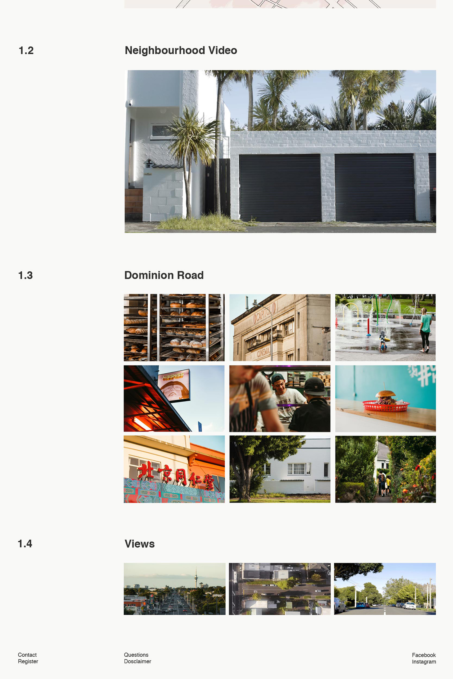
Visual identity is clear in its target market and leans into this stylistically, focusing on lifestyle opportunity over investment. This is then placed within the context of a culturally and historically rich area by way of video and photography. Although this is perhaps absent a strong sense of art direction it serves its purpose and well-shot.

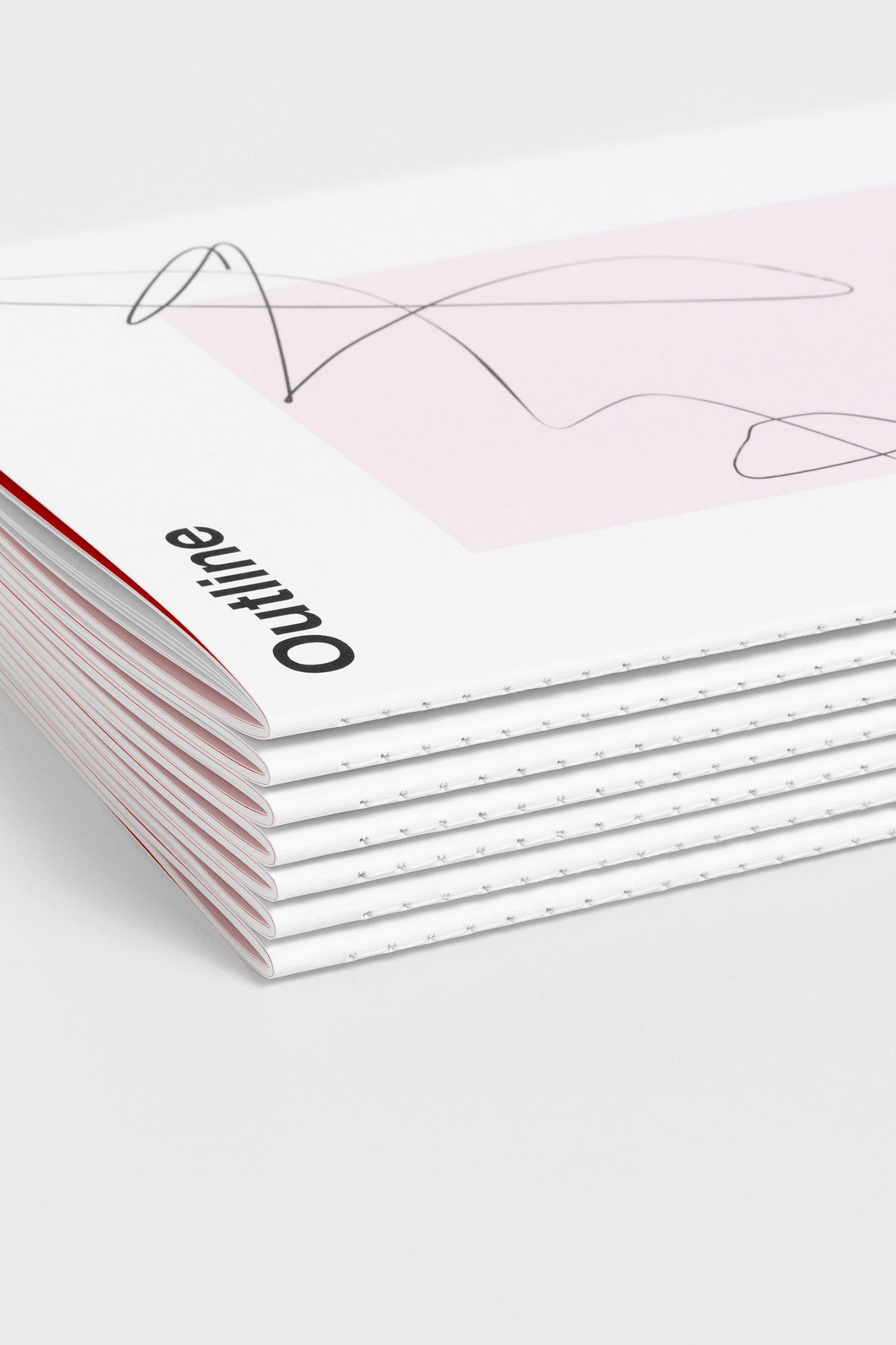
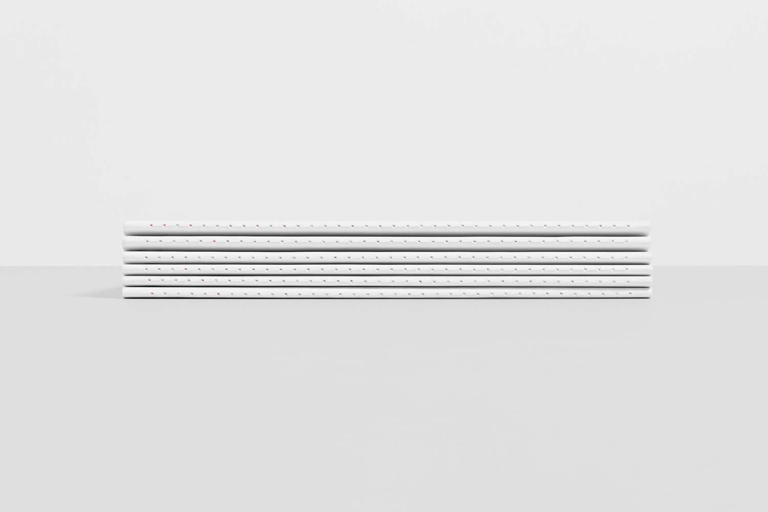
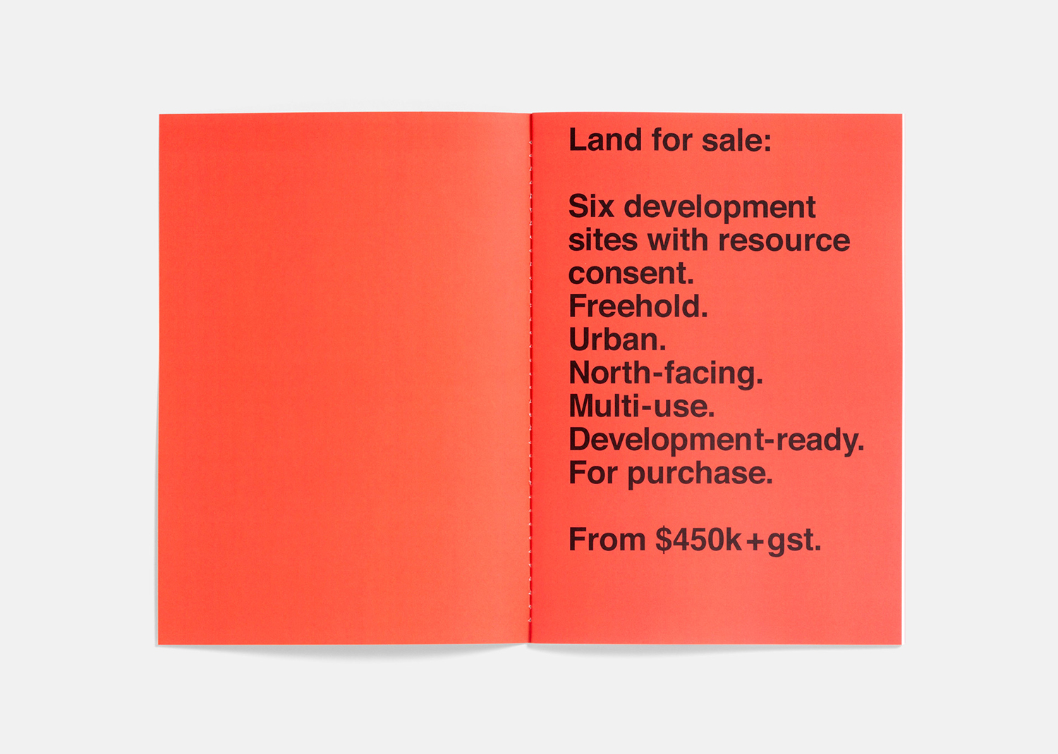
A stitch-bound brochure which features a sketch expand outside of a box across the cover, free space that invites note-taking and a series of shells in which to draw is a playful take on the sketchbook. These choices feel rooted in drawing out a feeling of potential rather than actually facilitating the artistic freehand of a potential buyer. The interplay of space, type (Neue Haas Grotesk), typesetting and solid colour employ a modernist aesthetic that feels current. This functions well as a passive frame for imagery and as neutral mode of communication.
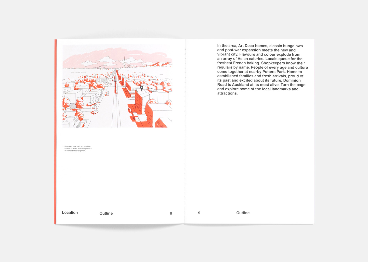
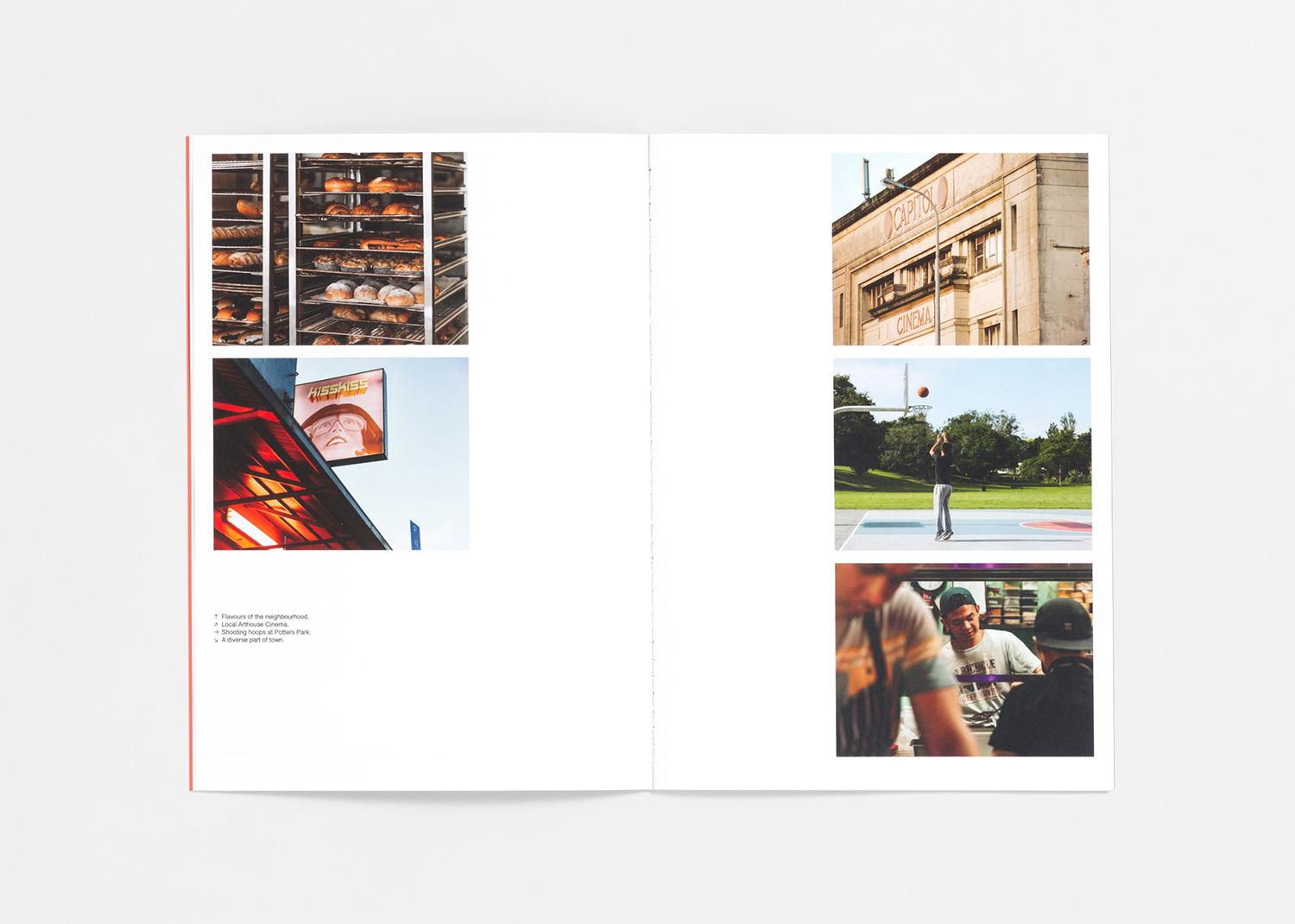
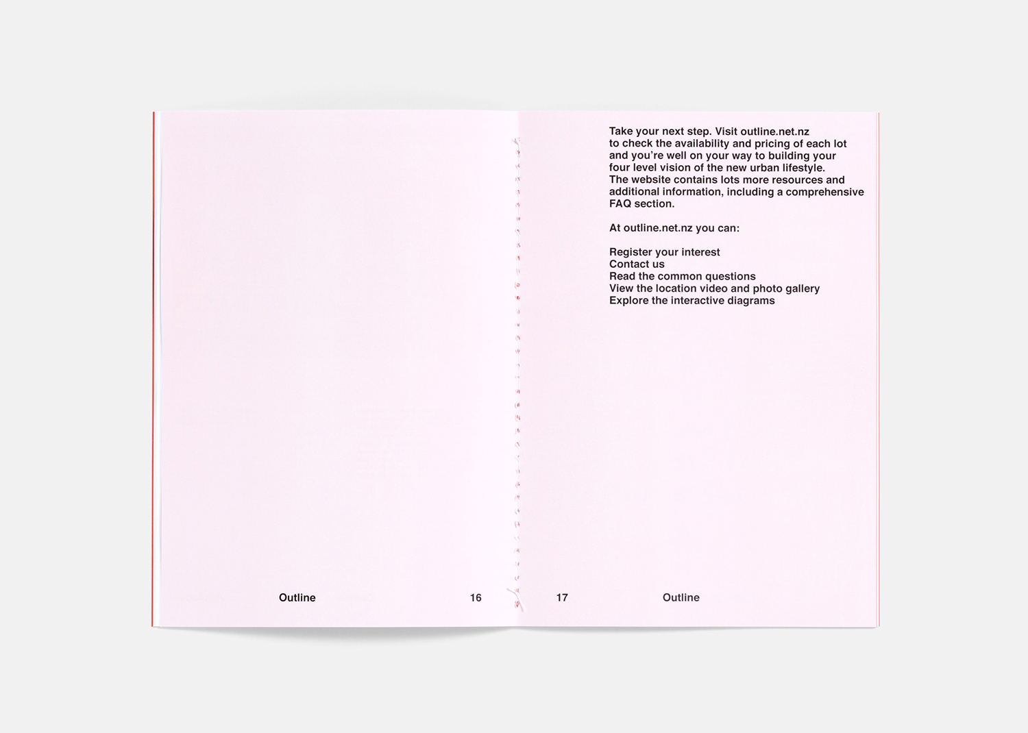
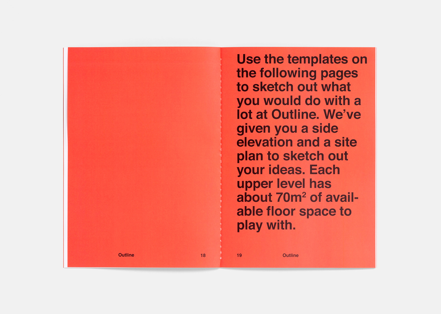
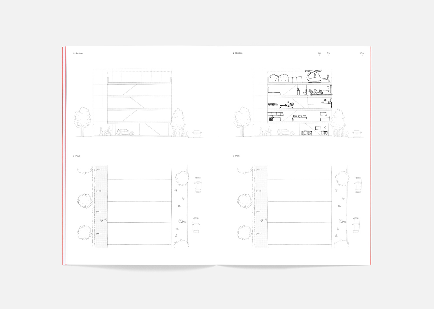
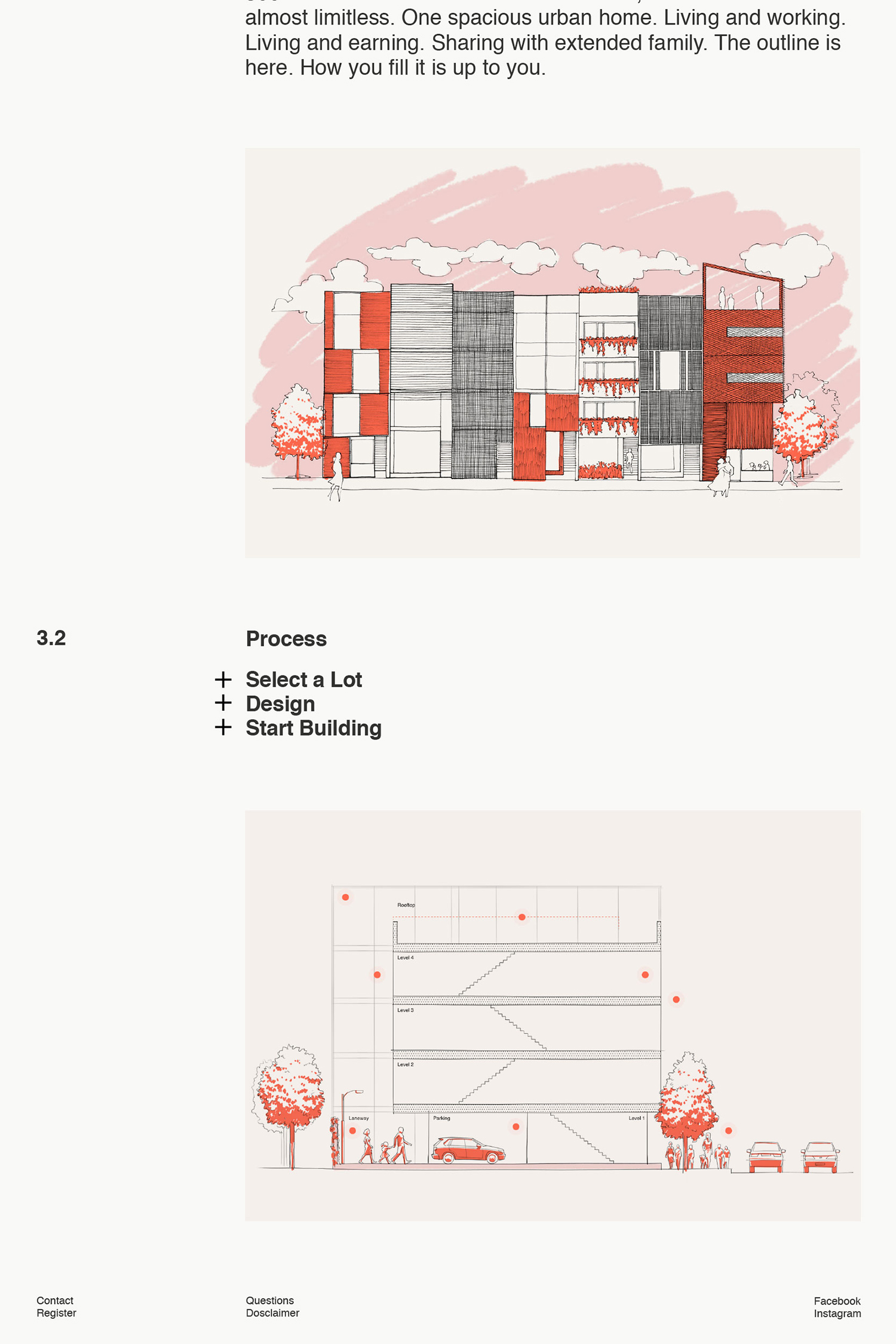
The interactive components online and plenty of illustration seeks to make the journey from lot to home appear frictionless, breaking down space, place and technical information into digestible rollovers. A blank canvas has the potential to be perceived as overwhelming or liberating. Illustration can impose on or augment imagination. This delivers on the latter in both cases.
It is not unusual to see such an illustrative within the property market, however, in colour, continuity of style and extent, as part of name and alongside the booklet, language and the functionality of the website, as a complete project with limited life, this feels distinctive and compelling. More work by Studio South on BP&O.
Design: Studio South. Opinion: Richard Baird. Fonts: Neue Haas Grotesk.
