Brilliant by The Studio
Opinion by Richard Baird Posted 4 December 2018
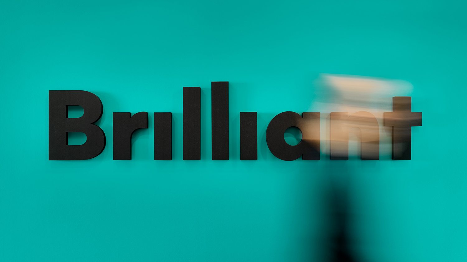
Swedish employee engagement consultancy Netsurvey and Bright, experts in customer surveys, have been merged and rebranded as Brilliant by The Studio. This merger and rebranding intended to create a new platform capable of encapsulating the skills and corporate cultures of both companies and develop a visual expression that people from each could identify with and stand behind.
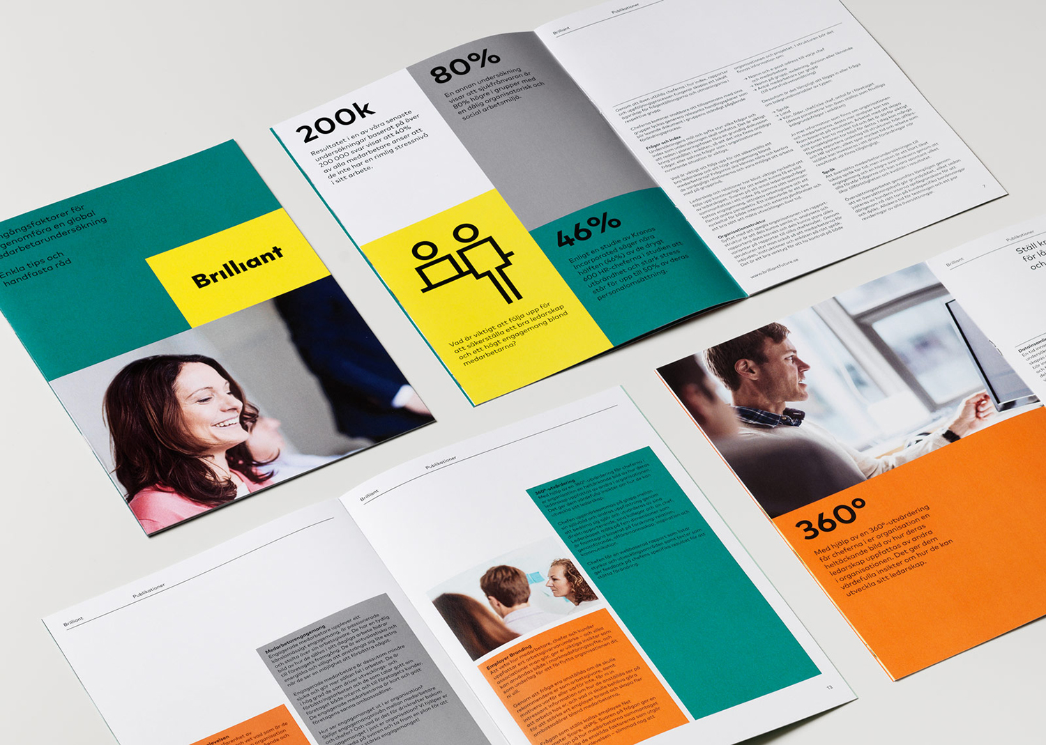
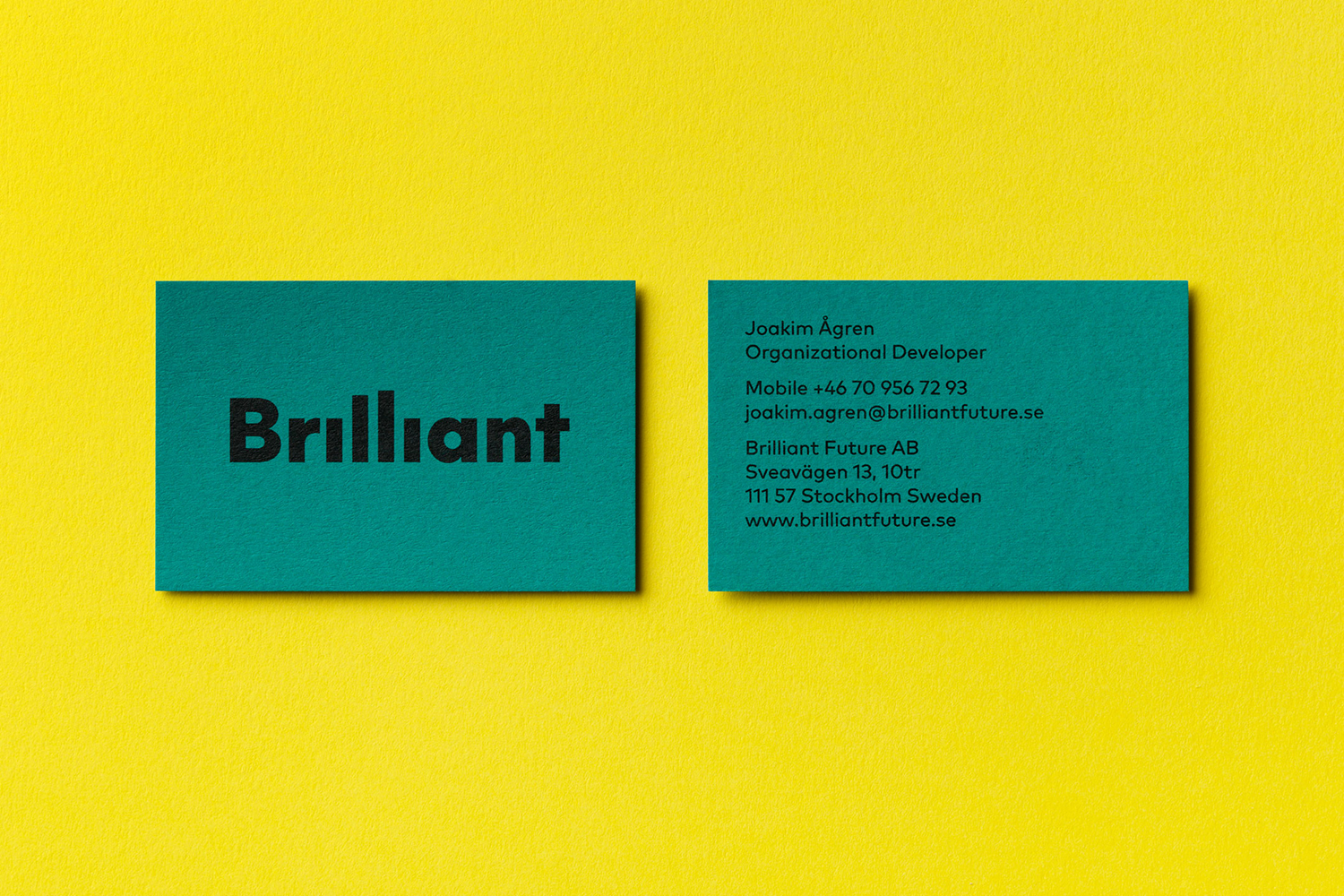
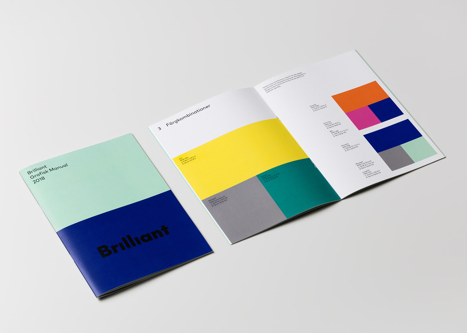
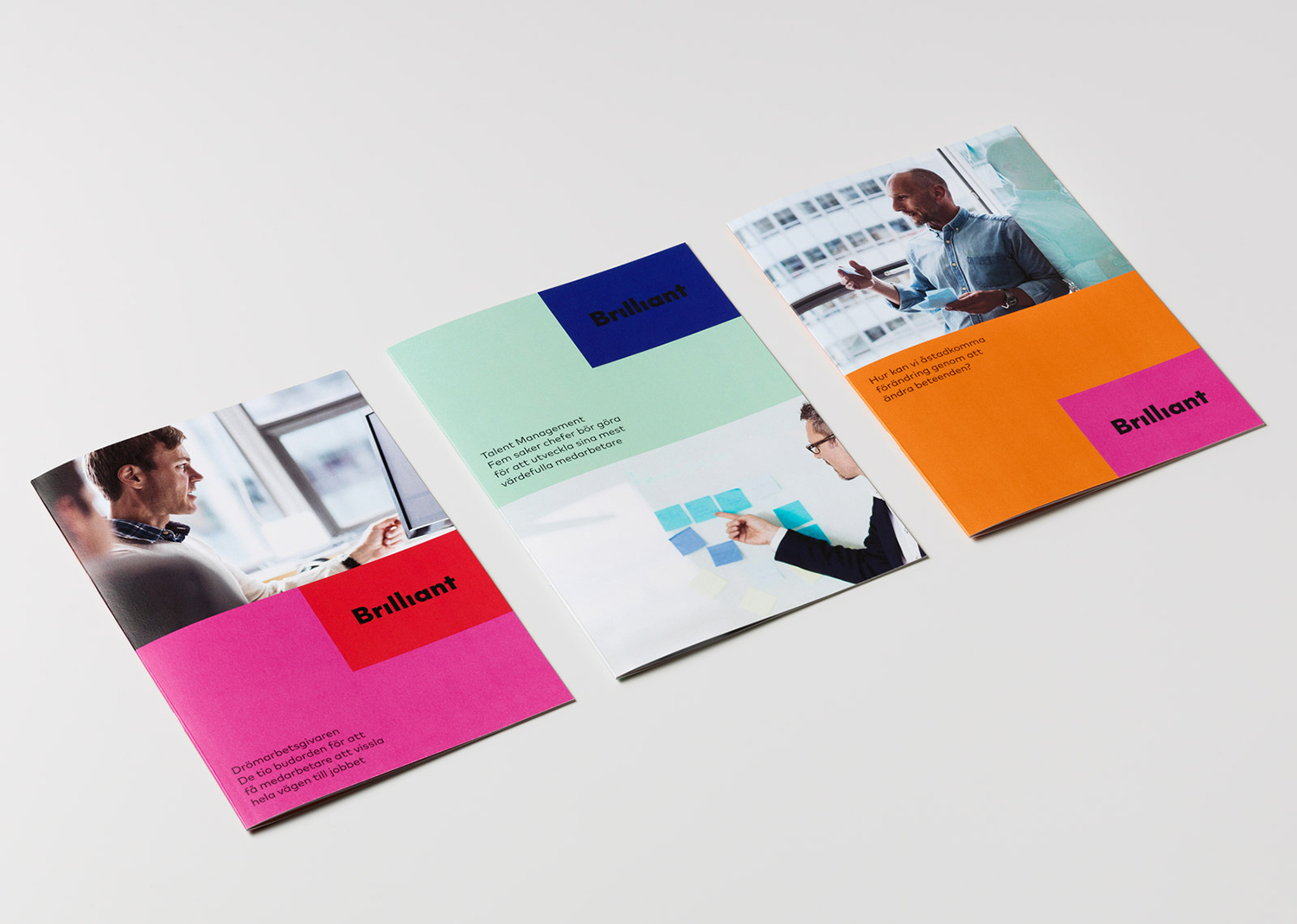
In the same spirit as The Studio’s visual identity design for Netsurvey, reviewed on BP&O back in 2015, the direction for B2B company Brilliant, shuns a corporate austerity in favour of a concept based around “Serious Playfulness”. This manifests itself in the form of a dynamic logotype and extensive pictogram set, a vivid colour palette and bold typography (Markbook) with an immediacy and friendly quality. These choices link business cards, folders, envelopes, correspondence cards, signage and website.
Recognising that Bright and Netsurvey shared similar corporate cultures, ones that balance professionalism, engagement and expertise with a warmth, laughter and a joyfulness The Studio applied a similar visual language to Brilliant. They positioned it as the antithesis of an austere B2B organisation through colour and visual play, immediately differentiating it and acknowledging that business is conducted between individuals, even within the context of a corporate environment. With the growing design sensitivity and visual intelligence of today’s consumer, the notion that they may respond to this when they are at work is certainly not unfounded, yet demands a synergy with an experience that is genuinely personable and professional.
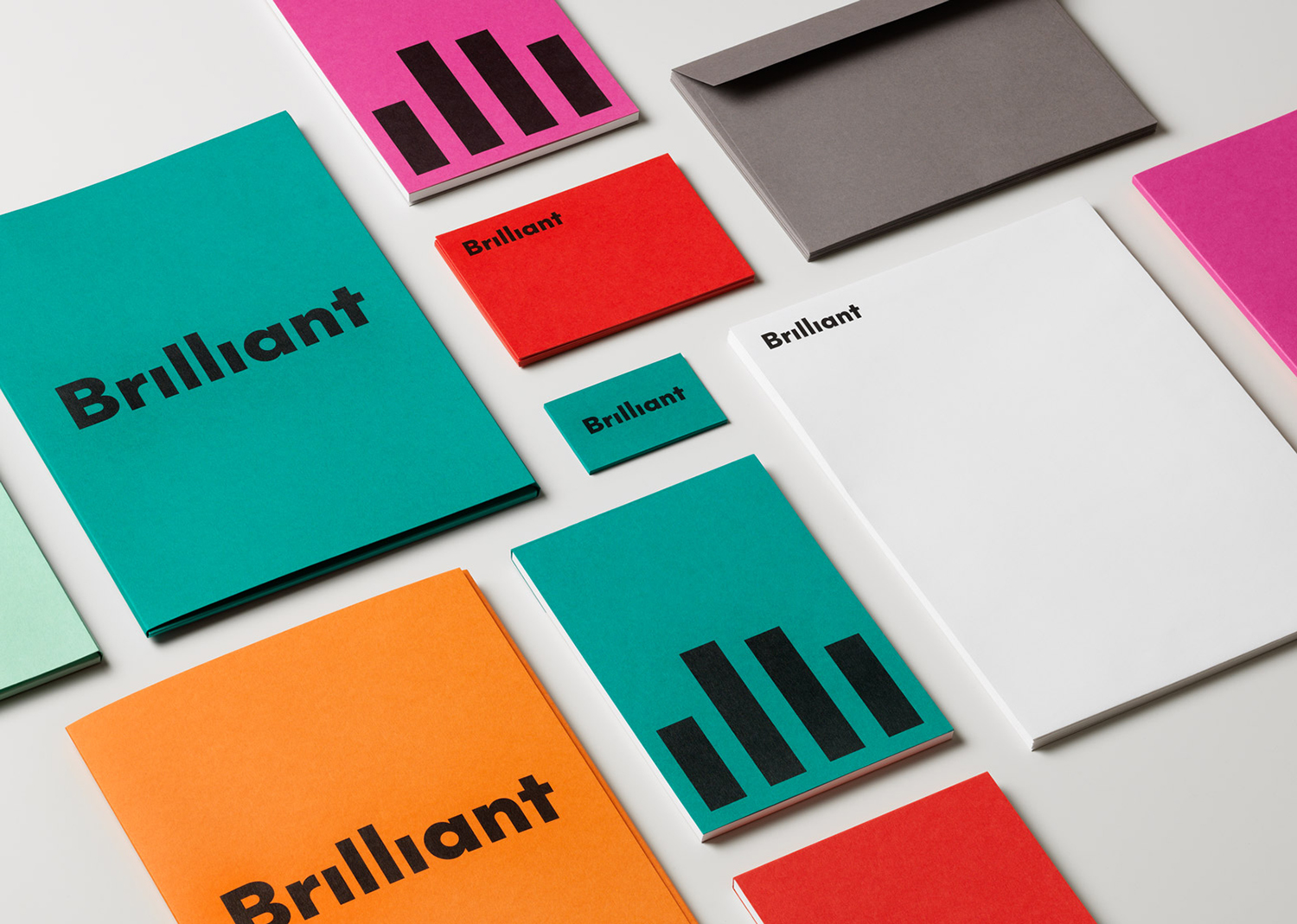
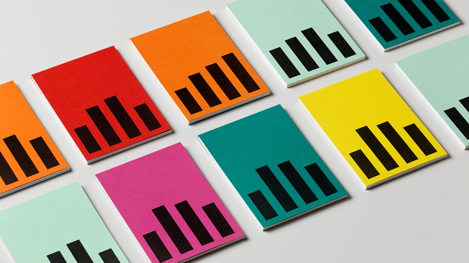
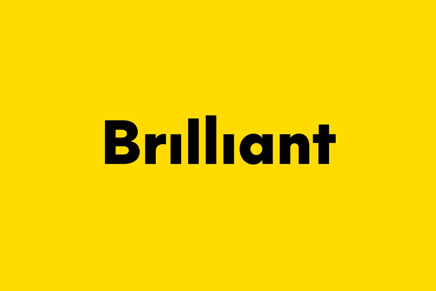
The work is marked by its visual immediacy. Type, colour, logotype, pictograms and moments of motion are absent nuance but clear and direct in their mix of play and professionalism. The logotype is a neat observation and visual trick; a smile in the mind and direct use of form language with the context of surveys. The absence of the tittles really emphasises the idea. Its application, as a logotype and as a bar chart motif is straightforward and alongside colour establishes a strong and unwavering continuity. Repetition and proportionality reinforce the basic conceptual premise, there is little in the way of communicative variation but the colour blocking does bring something of a contrast and character to the familiar corporate imagery of the brochures.
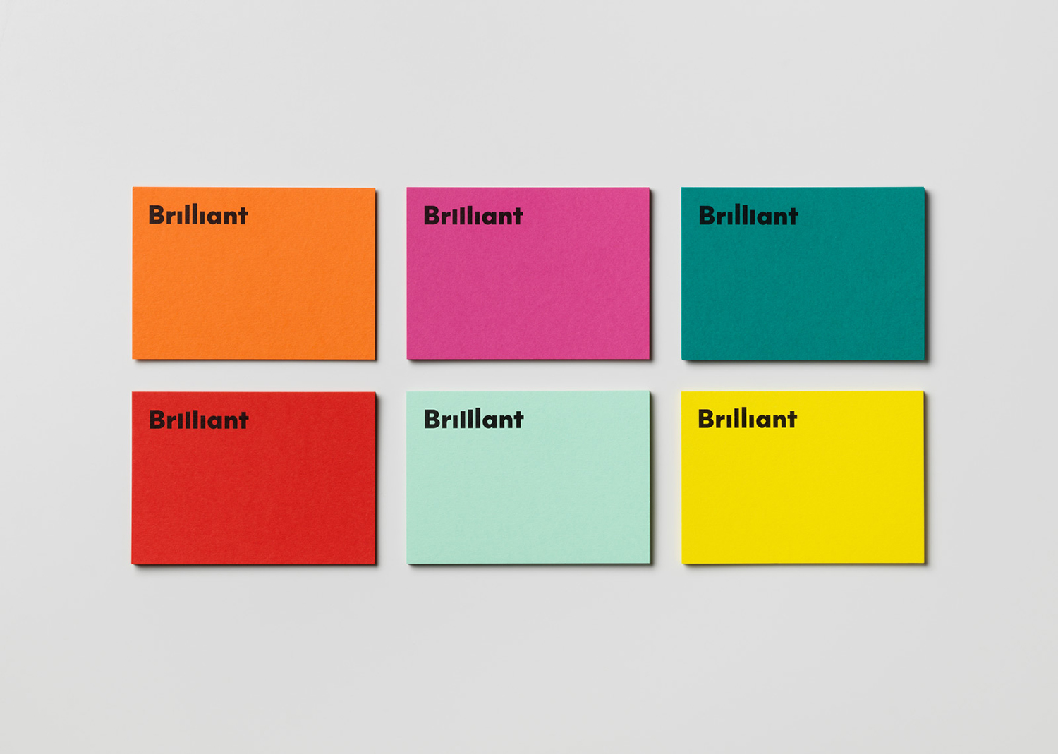
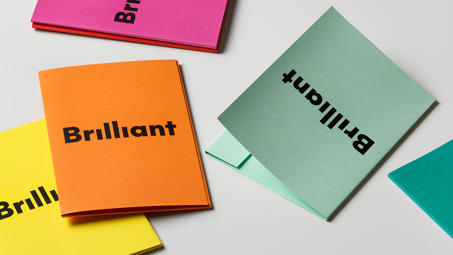

So, with “Serious Playfulness” as a base, The Studio developed a graphic identity that bursts with vivid colors, bold and friendly typography, lively animations and a pictogram set comprising more than 50 unique icons. It is fun, warm, welcoming – but has a serious undertone, and is never gimmicky or silly. It was instantly loved by staff and customers alike and provided the perfect start of the Bright/Netsurvey marriage.
Design: The Studio. Opinion: Richard Baird. Fonts: Markbook.
