New York Architecture Book Fair by Pentagram
Opinion by Richard Baird Posted 5 December 2018
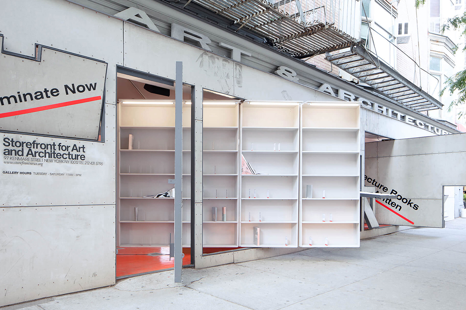
Storefront for Art and Architecture is an independent not-for-profit art and architecture organisation, located in New York’s Soho, dedicated to advancing architecture, art and design. To further this remit the organisation developed the New York Architecture Book Fair, an event and platform that brings together authors, designers, publishers, critics and readers to consider, through a programme of discussion, installation and pop-ups, which publications have driven architectural and design discourse forward through their insight and contemporary relevance. This took place at the Storefront for Art and Architecture and at local bookstores throughout the city in June.
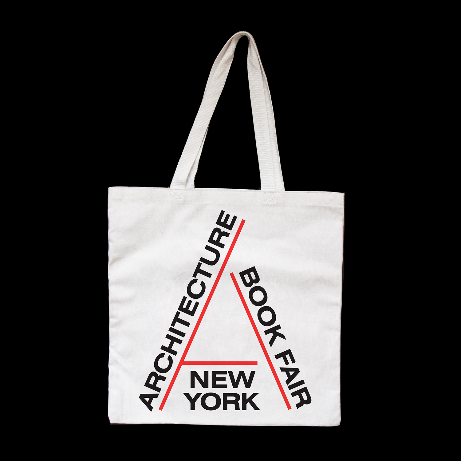
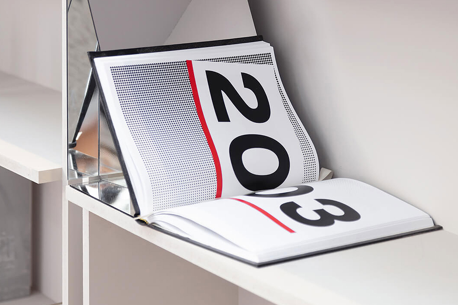
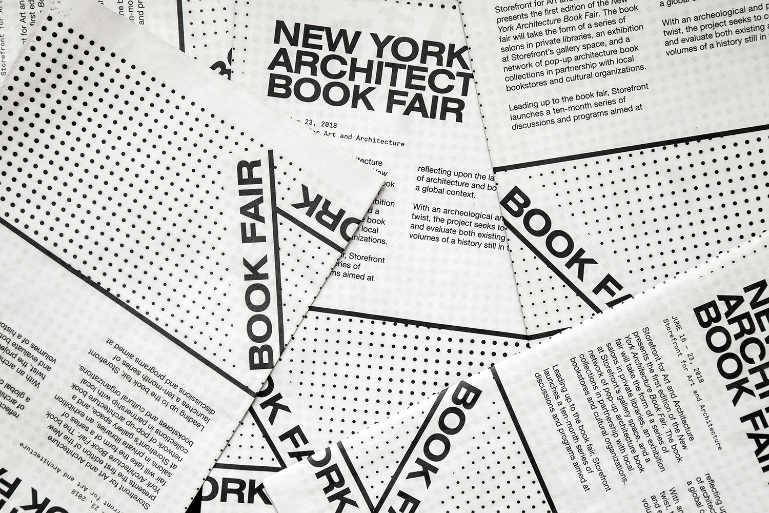
Pentagram partner Natasha Jen and team led the design and development of the visual identity for the first edition of the New York Architecture Book Fair. This is built around a form language that makes a connection between the spine of a book and the side elevation of a building plan but also explores the liminal space between the printed book and architecture structure, and the material and digital space the visual identity needed to exist within. This links a variety of communication materials for the event, these included motion graphics and data visualizations, book design, tote bags and signage.
The initial and immediate visual language is one of the structural, clearly expressed in the arrangement and structural integrity of type, the real-world physics this adheres too, and in the way this is developed in the stacking effect within some of the motion graphics. The red catches the eye, forms a frame or baseline of continuity, while the extended sans-serif reinforces this with an impact and robustness. The architectural continues in the placement of text within the context of the storefront which sees graphic and structure interact, with the graphic responding as if constrained by physical space.

The relationship between the spine, and by extension, the architecture of the book, and architectural structure is a little abstract, implied rather than explicit, however, the space and the materiality of the printed page and the space of structure is explored to great effect and with satisfying variety elsewhere.
Highlights include the implication of space and materiality in the layering of text and in the motion of a peel. The crossover between the halftone of single colour image and the grid of an architectural plan, the way the grid and halftone through density plays with light and shade, and how stacking establishes a communicative hierarchy.
As the event explores a contemporary relevance of design and architectural publications, so does identity in the continuities and blurred boundaries between printed and digital space, a balance between printed materials and digital window, their associated visual language, demarcated space and migrational potential.
The threshold is dissolved and the lines blurred as the digital square of Instagram posts mix imagery and effects that reference the material; peels, stacking with a real-world spatial constraint and a halftone with onscreen motion, sequencing of imagery and layers of information. These are immediate and distinct, both in print online. There is something of an interesting question raised with regards how books travel online.
There is a pleasant tension between the rational (grids and structure) and the post-modern (irregular placement and real-world spatial logic) of type in print and online. From this the visual identity gains from both the systematic and the freedom and opportunity that comes with appearing to break from this.
The result is a deceptively simple concept. It is immediate in its initial reading, yet there are a number of further ideas to it that lend the work a visual variety and thoughtfulness throughout. More work by Pentagram on BP&O.
Design: Pentagram. Partner in Charge: Natasha Jen. Opinion: Richard Baird.