Shakespeare In The Park 2019 by Pentagram
Opinion by Richard Baird Posted 25 June 2019
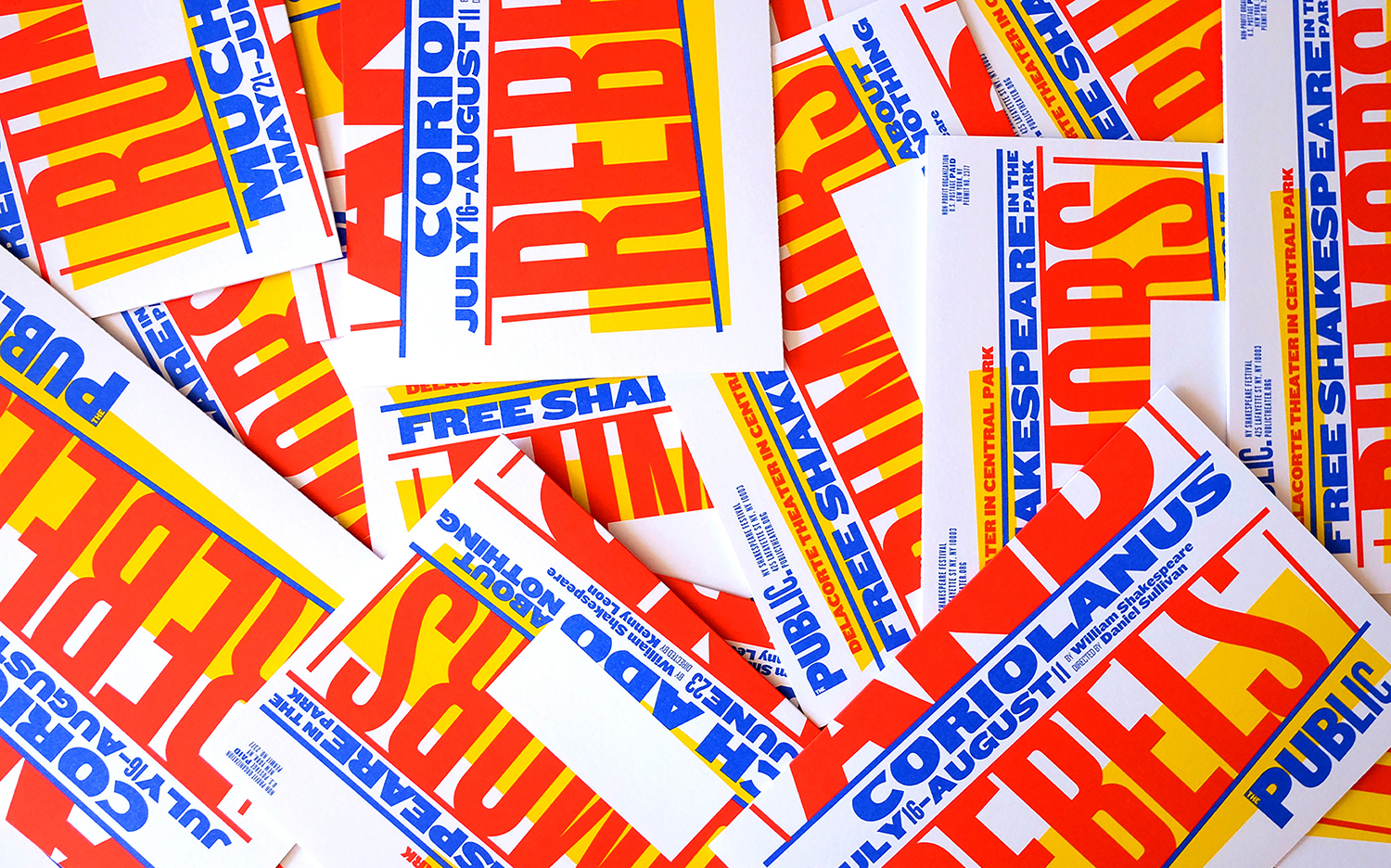
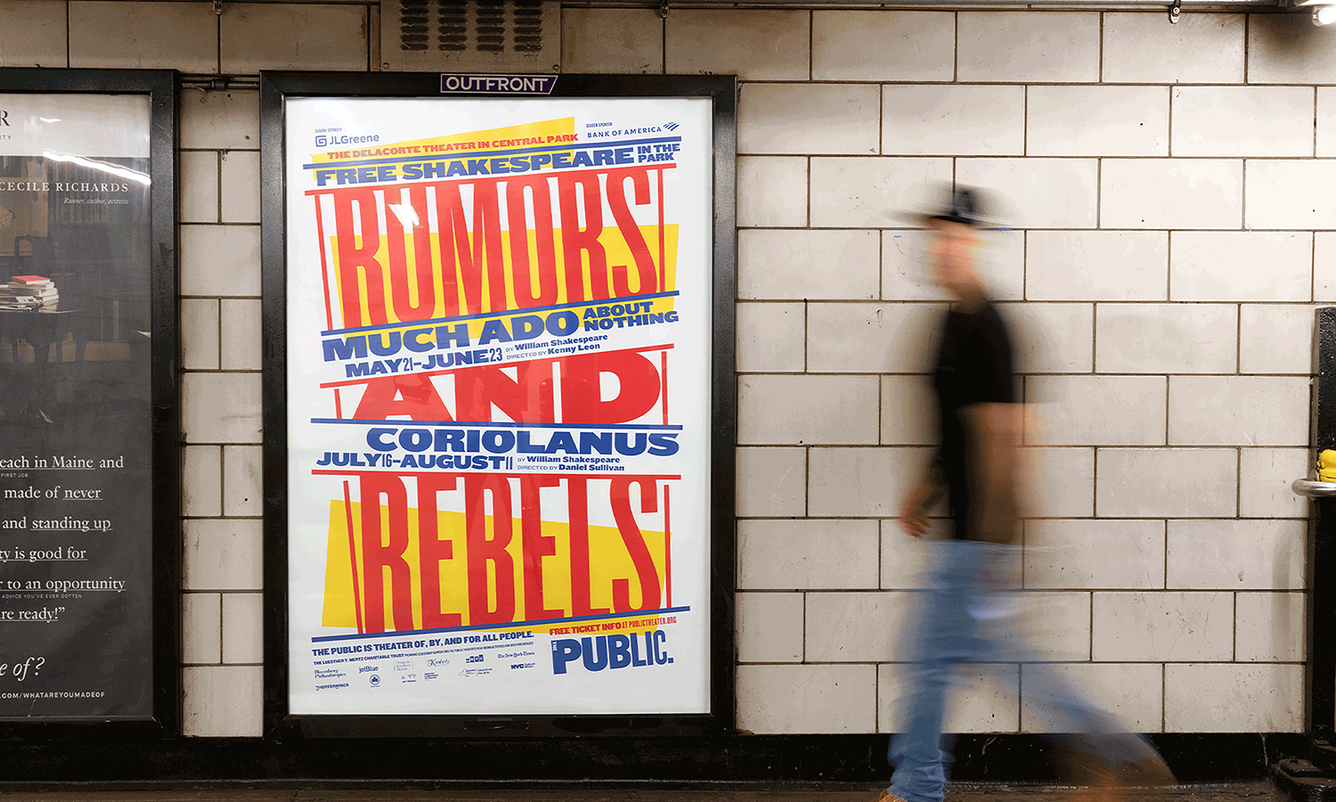
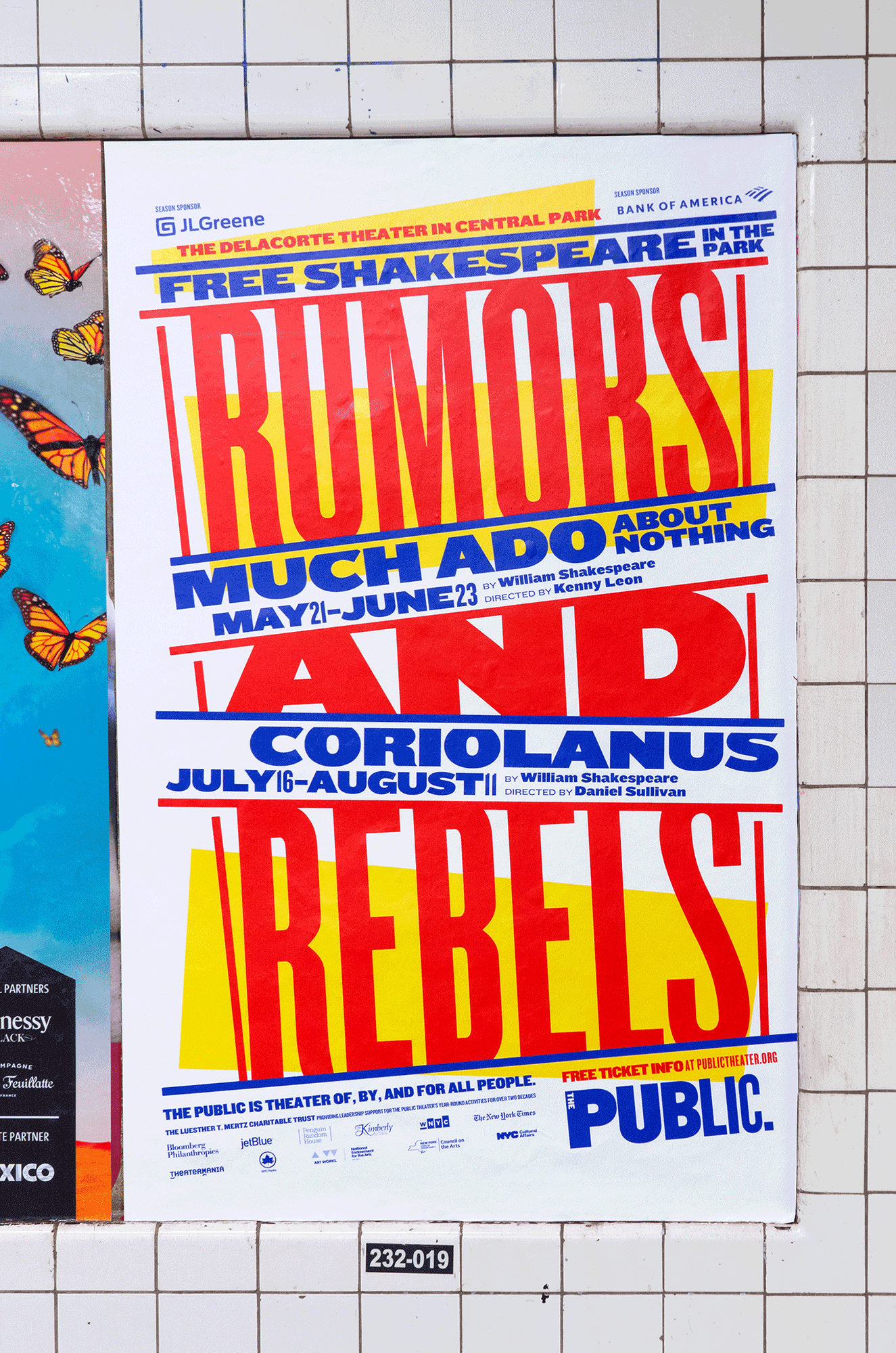
Shakespeare In The Park is an annual event and duo of free performances presented by New York’s The Public that takes place at the Delacorte Theater in Central Park in May and June. 2019 saw performances of Much Ado About Nothing and Coriolanus under the theme “Rumours and Rebels”.
The event was promoted through a city-wide campaign developed by Pentagram’s Paula Scher and team, with assets such as signage being designed and deployed by The Public’s in-house team. This furthers the enduring and evolving identity Paula Scher designed for the theatre in 1994, revised 2005 and again in 2008.
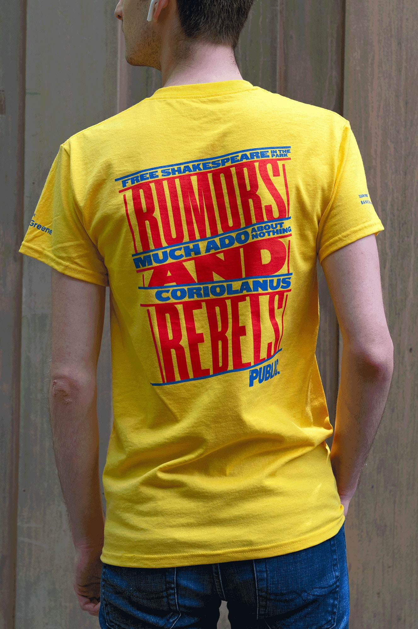
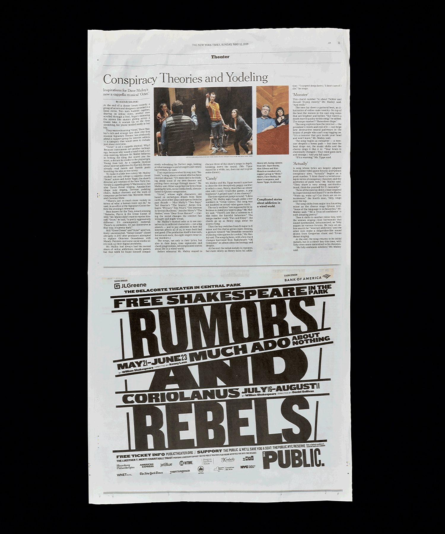
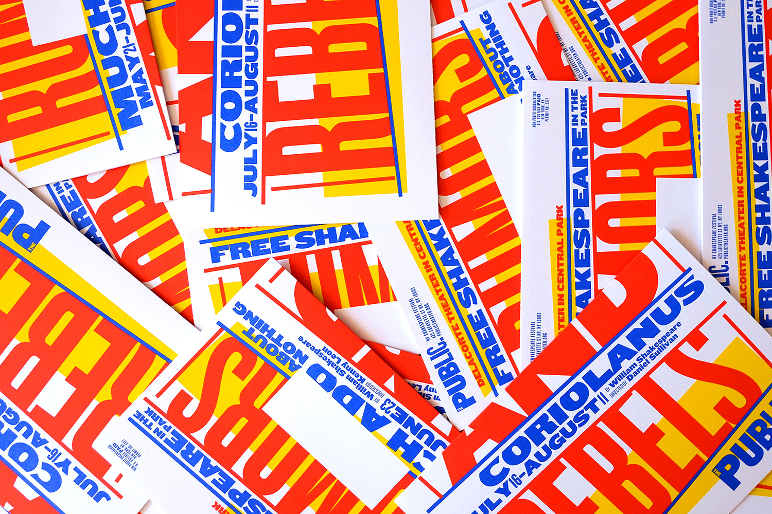
There remains a continuity in the impact, immediacy and dynamic qualities of previous campaigns whilst working in a new colour palette of red, blue and yellow, and an angled approach to type. This links signage, static and dynamic posters and billboards, t-shirts and newspaper advertising. The work done for the event will go on to form the basis of communications for The Public’s 2019–2020 season.
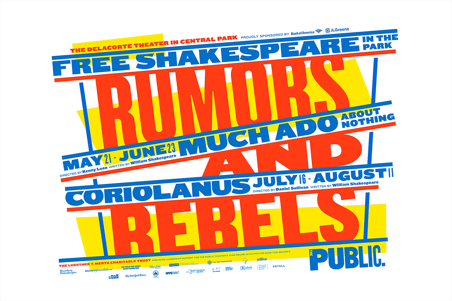
The need for both a consistent and recognisable brand expression and compelling seasonal campaigns that evolve and reignite interest is an ongoing challenge and a central part of the theatre experience. A fast-Paced city life of continual change, visual abundance and the pressures of engagement as well as a graphic landscape of imitation (both reverential and duplicitous in intention) impose themselves and trigger a unique city-specific agency. Few theatres have managed to explore the potential of its visual communications quite like The Public. Time and place, and what could now be described as a form of authorship from Paula Scher, creates a unique space for experimentation and continual reconfiguration.
2019 marks the 25th year of Paula Scher and The Public’s collaboration on seasonal campaigns. This began with the design of the theatre’s graphic identity back in 1994. These campaigns, over this period, have become an essential part of the New York landscape. Even in the digital age, these continue to be printed and then proliferated, with the graphic and the architectural, to some degree, becoming synergetic, part of the total city experience for many people.
Although this post focuses on the 2019 campaign and the graphic language for the 2019–2020 season, consideration must be given to time and place, and its role within a continuum, in dialogue with what came before and what it might mean a year from now in relationship to future seasons.
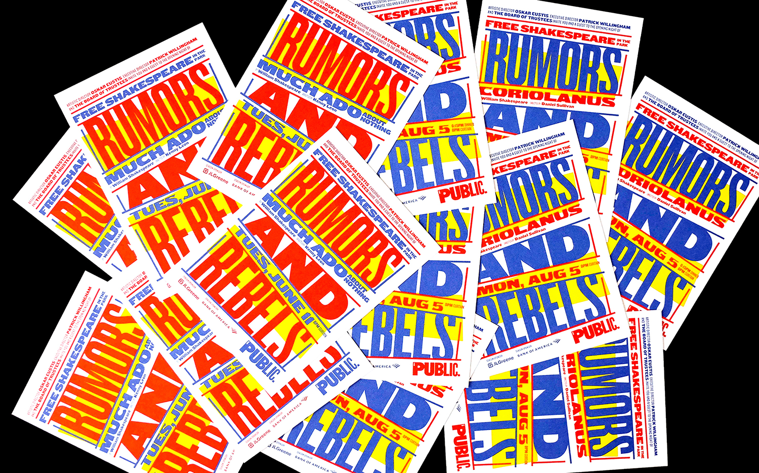
As part of an ongoing and evolving story, authored by a singular studio, a campaign is a useful tool in which to continually develop a conversation. Although the graphic language of The Public is distinct and thoughtful, the theme of each season provides an interesting foundation in which to build on, often using Shakespeare to touch on the present.”Rumours and Rebels” feels fitting for today, and as such, may infuse the work with a long term cultural value, particularly in the extent of its reach across a city such as New York. The graphic language flows from this, blending the structural qualities you might associate with staging, the oddity and heightened reality/absurdity of the circus and its own visual language across posters.
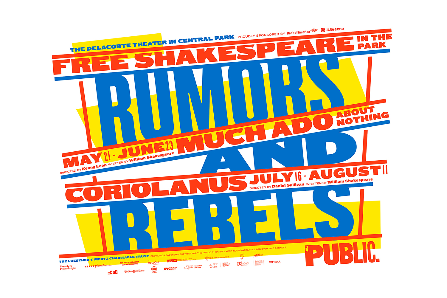
The dynamic qualities of type, the interplay of different weights, the use of condensed and extended styles make for an eye-catching visual immediacy. Where The Public logotype is characterised by its gradual move between letter weight and width here there is a juxtaposition, a duality that works well with two plays and the two-part nature of the 2019 theme and continues to get a lot out Knockout. Colour further delineates between the two productions. The black ink of the newspaper ad is a highlight and a great example of the power of form, arrangement and contextual subversion.
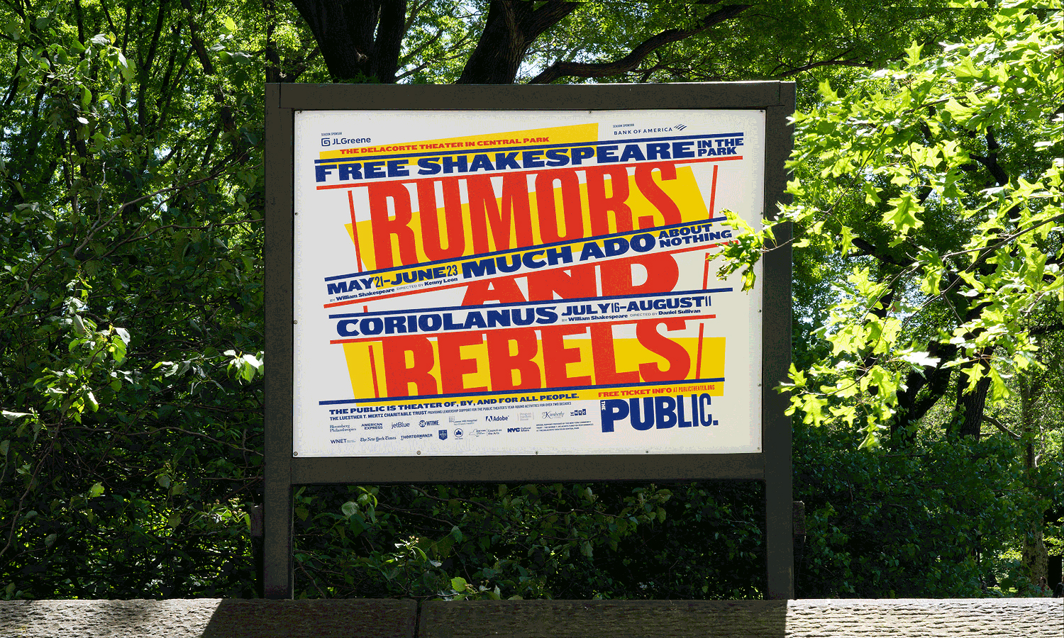
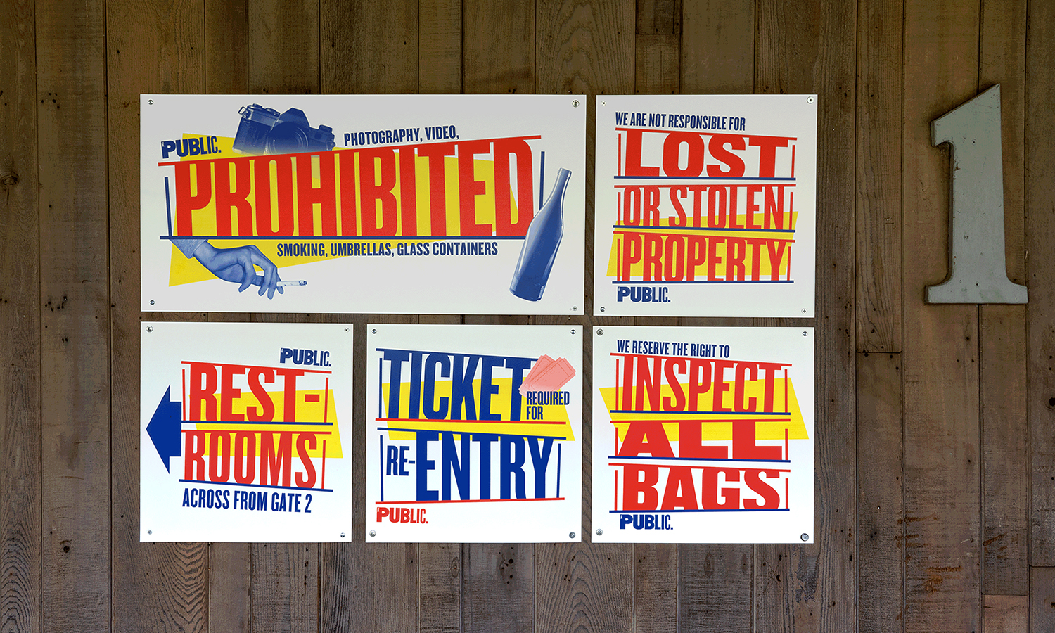
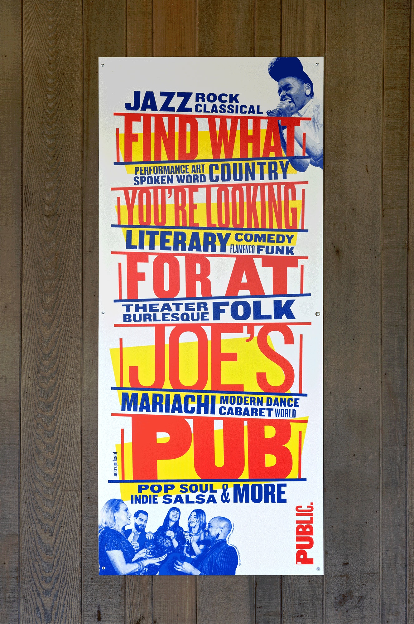
Signage shows some range in the structure of type and the addition of imagery and iconography. These are full of character. Size, weight, colour and proportionality of type draw the eye to critical words. Without being on site at the time, it is difficult to get a true sense of functionality, but within the context of parkland, form and colour stand out and convey a spirit of fun.
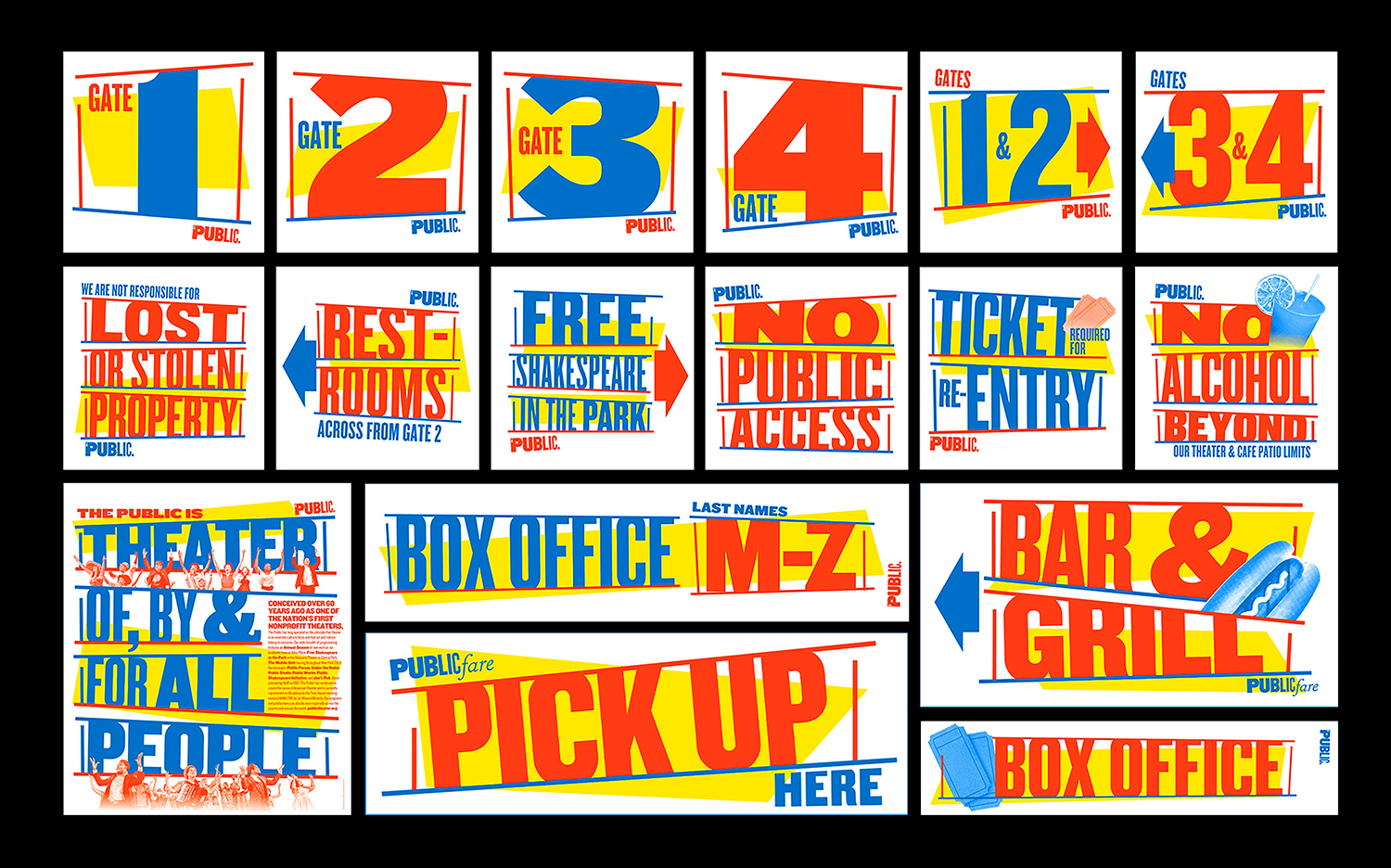
Where the theme could have easily had a dissenting and negative connotation, particularly today; one of opposition (rebels) and miss information (rumours), a colour palette referencing circus posters, bubble gum and Wonder Bread introduces joy and the warmth of nostalgia. This is where it really works, it is of now and thus works as part of a long series of campaigns, however, remains optimistic and cheerful, functioning to bring a variety of people to Shakespeare’s enduring stories. More work by Pentagram on BP&O.
Design. Pentagram. Partner In Charge: Paula Scher. Project Team: Emily Atwood . From Public Theatre: Tammy Shell, Katie Hodge, Gina Roi, Ze Wang, Christian Martin & Rusty Van Riper. Opinion: Richard Baird. Fonts: Knockout.
