LogoArchive ExtraSpecial Issue – Canada Modern (Signed)
Opinion by Richard Baird Posted 5 August 2019
")
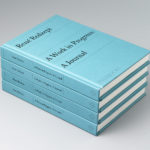
Following its third release, LogoArchive mixed things up with an Extra Issue in collaboration with Canada Modern. Designed and edited by Blair Thomson, and documenting the forms and colour of Canada’s modernist symbols, this issue was distinguished from the series by its Colorplan Bright Red and full-colour gatefold Chrolomux insert dedicated to the work of Gottschalk+Ash for outdoor advertising company Claude Neon. The ExtraIssue was limited to 600 copies, with 50 of these being an ExtraSpecial edition signed by the designers Stuart Ash, Glenn Fretz and Burton Kramer.
Order LogoArchive zines here.
And subscribe to Logo Histories here.

Channelling the spirit of fanzines, pamphleteering of the past and with an independent spirit, LogoArchive seeks to surprise and delight within the context and practice of mid-century logo archival, reconfiguring itself with each new issue. The distinctive smaller format of a booklet provides ample license to experiment and collaborate with other like-minded archives. One such resource is Canada Modern, a digital and physical archive of Canadian graphic design from 1960—1985 and launched in 2018.![]()

")
Canada Modern shines a light on works that, until now, have only been held by institutions or private collectors, or in the private archives of the designers themselves. A key part of the success of Canada Modern is down to the relationships that its creator Blair Thomson has built with many of the leading figures from the period. Designers including Stuart Ash, Burton Kramer and Raymond Bellemare have all generously shared their time and resources with the project, as have the colleagues and families of those that are no longer with us.
")
Canada Modern is a unique and priceless archive of a distinct national and cultural identity. LogoArchive and publisher BP&O are delighted to have been able to hand over this ExtraIssue and ExtraSpecial Issue to Blair. The integrity of his practice and sensitivity to design, we hope you will agree, is evident throughout.
About Canada Modern
Canada Modern is an archive of modernist Canadian graphic design focused on the period 1960—1985. It was conceived and produced by Canadian creative director Blair Thomson in 2017 and is the culmination of a long-held ambition to curate a comprehensive national cache, whilst simultaneously addressing the absence of any such resource on a singular thread.
Canada Modern is an ongoing and collaborative endeavour driven by the passion of Blair Thomson, supported by designers and publishers. To help share the story and the unique archive that is Canada Modern Blair welcomes the opportunity to speak about the project. If you’d like to request an interview, please send an e-mail to Blair Thomson.
Designer / Editor: Blair Thomson
canadamodern.org
@canadamodern
@believeindesign
")
Computer Arts Q&A
What is the LogoArchive Extra Issue, how did it come about, and why should lovers and practitioners of graphic design get a copy?
LogoArchive began as an Instagram account back in 2015 and was then materialised as a zine in July last year. It was inspired by a panel discussion at Somerset House as part of the exhibition Print! The first issue was conceived, designed and sent to the printers the following day. The LogoArchive Extra Issue is the first collaborative release, with the format being handed over to Canada Modern / Blair Thomson to showcase and shine a light on the modernist symbols of Canada. As a zine, as a beautifully constructed booklet, as part of an ongoing series it offers an alternative way to discover symbols of the past. It is not a utility like a logo book. The zine intends to honour the time and care given to each symbol by being highly selective where there is an abundance and applying the same care to their presentation, graphically and materially. Blair was the perfect choice to design and edit this edition, his passion and dedication to documenting the graphic work of Canada is evident throughout Canada Modern and this special release.
What’s your involvement in it, and what’s Blair’s/Canada Modern?
LogoArchive was realised as an ongoing project by myself with the intention of exploring the potential of the self-assigned brief and the designer as author and producer, as well as the relationship between the digital and the material, and how the material migrates online.
The distinctive format of the booklet; its intersection of gridded arrangement and the disruption and surprise of an ever-changing insert offers ample space in which to experiment and collaborate with other like minded archives. One such resource is Canada Modern – canadamodern.org a digital and physical archive of Canadian graphic design from 1960—1985. This was launched in 2018 by Blair Thomson, Creative Director of Believe In. Blair designed, edited and print managed the issue, which was published by BP&O.
In what way is LogoArchive inspired by zines and pamphleteering of the past?
Three central notions link it to the zines and pamphleteering of the past. Immediacy–the capacity to have an idea and execute it quickly without too much intervention, a truth to concept. Independence–due to commercial pressures it is harder to maintain a single editorial voice, agency and intention. A smaller booklet within a continuum presents a unique opportunity to tell a story and to evolve without worrying too much about increasing reach. Finally, a return to the niche–where other graphic design publications have had to broaden their editorial remits to sustain themselves, a low volume light booklet can have a surprising specificity, distinction and appeal.
How many iterations have been released so far, how many do you want to release, and what is the scope of the project?
I’ve released three numbered issues (Animals, Eyes & Science) and one Extra Issue (Canada Modern). I conceived of it as a limited release with, ideally, ten issues of 600 with each one shaped by the learnings of the previous issue, or the evolving interests, readings or meetings that happen between.
What is important about such ‘small scale’, limited run releases for creatives? Why do they never go out of fashion?
Online forum culture of the early internet and fanzines or pamphleteering pre-internet connected people who shared niche interests, and material artefact of a time, place and worldview, and functioned as valued tools (and documentation) of intellectual, political and cultural transmission. That desire to feel connected to like-minded individuals is an essential human experience, it goes beyond just the creative industry, (although materiality and presentation is squarely aimed at designers). However, the niche, because of our interconnected and increasingly online world, is quickly tested by the mainstream, or intentionally developed to market it. What remains is the notion of the “first to know”. The numbered series plays to this, as well as the intrinsic need for people to complete and collect. Further, limited runs are, for me, an expression of, alongside a carefully considered materiality, a cultural preciousness and value. This is a response to the challenges of the internet; algorithmic economies, potential social capital and design as content.
")