One Wellington St Kilda by Studio Ongarato
Opinion by Richard Baird Posted 22 October 2019

One Wellington, a partnership between LAS Group and Qualitas, is a new property development located in the Melbourne suburb of St Kilda, not far from eclectic Fitzroy Street. The building’s architecture—designed by KPDO and comprised of 181 apartments across two buildings of 26 and 10 floors—features flowing curves inspired by its bayside location, highly-customisable interior options and unobstructed sky views. One Wellington is described as dramatic architectural expression on the skyline and an entry statement into St Kilda from the north.
Building on the highly-customisable and luxurious interior designs of KPDO, Studio Ongarato developed a visual identity and campaign directed towards a specific mindset and that draws on the multi-faceted sub-cultures of the area rather than a target market profile. This manifests itself, unusually, in a shifting tone throughout printed communications, moving from the sophisticated to the youthful, and from serious to humorous using photography, type, illustration and photography. Through this approach, Studio Ongarato’s campaign invites prospective residents to live ‘A life less ordinary’.
The One Wellington campaign identity is made up of a hardcover book, softcover booklets, posters, postcards and multi-format cards. Each unveils authentic stories from unexpected perspectives using a variety of creative techniques.

‘A life less ordinary’ forms a useful centre point from which all visual and material gestures flow. These are diverse in their creative approaches and tones. Some touch upon the architecture, such as the brochure book cover. Others employ gestures that are mood-orientated such as the illustrative of Alice Tye and the photographic work of Derek Henderson and James Tolich. And there are those that narrativise the surrounding area, weaving together a rich visual tapestry of people, places, situations and styles unique to the area. The thresholds between interior options, exterior architecture and the experiential and histrionics of the surrounding area are effectively diminished.
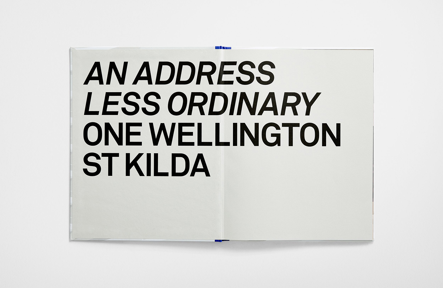
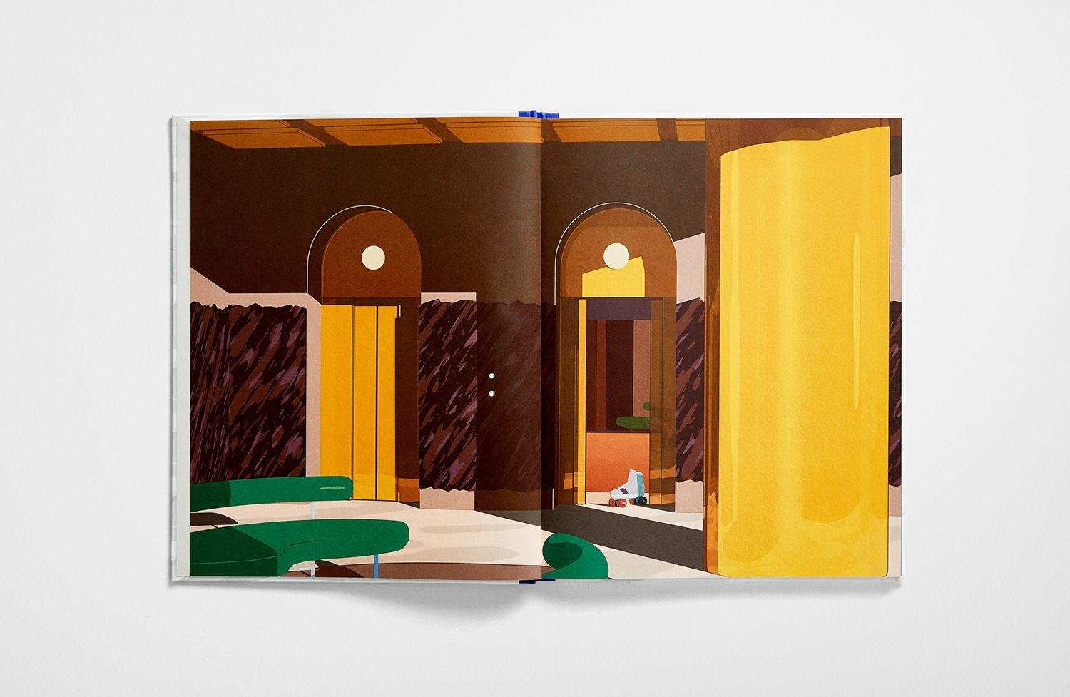
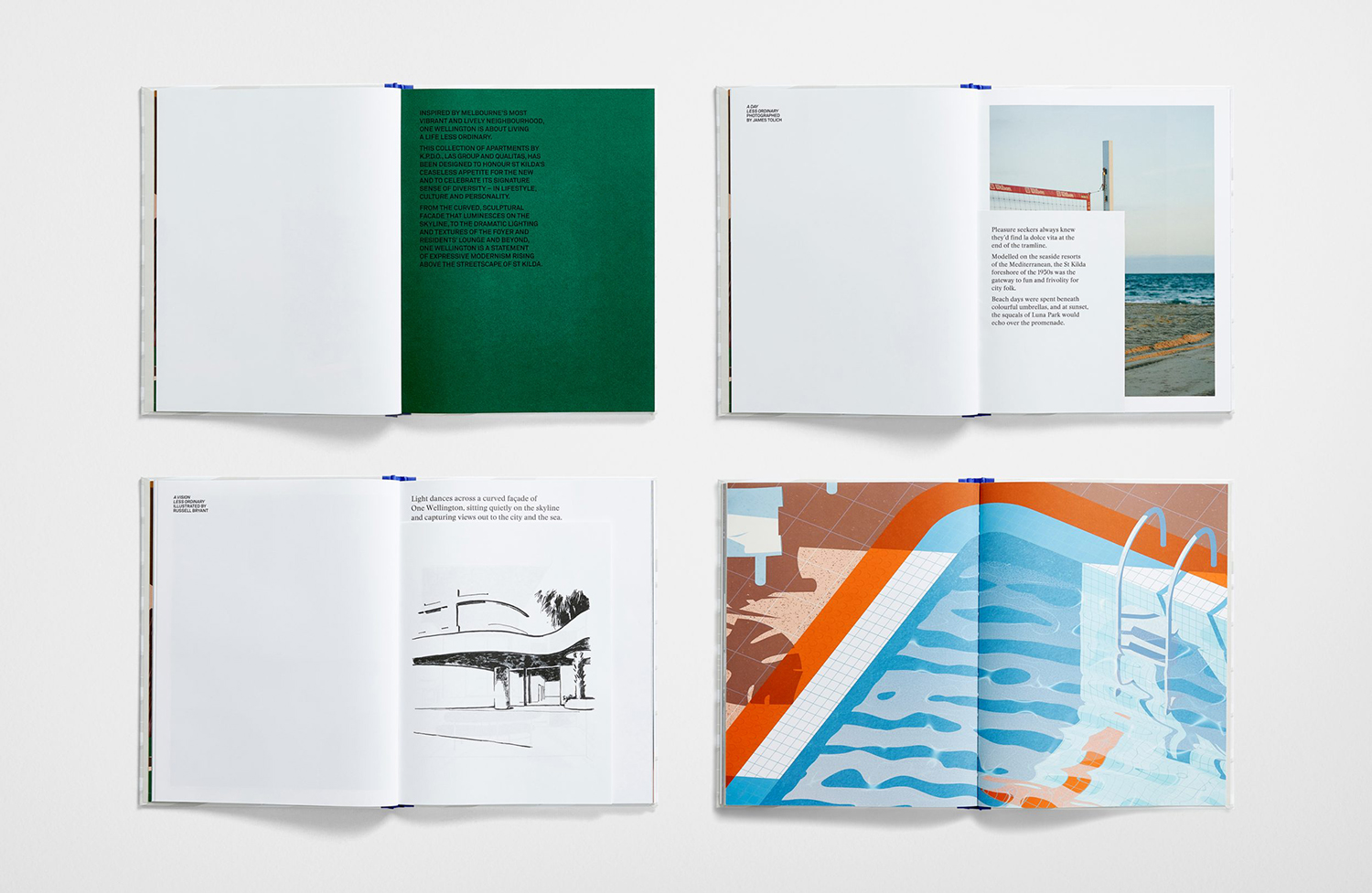
Pages of large type, full bleed imagery, solid panels of colour, different illustrative styles and the use of inserts that see image intersected and narrated with words establish an exceptionally broad visual language where you might only expect to see one or two. The inserts are a particularly nice detail, offering either a story within a story or augmenting, exemplifying or contrasting with the pages the sit over.
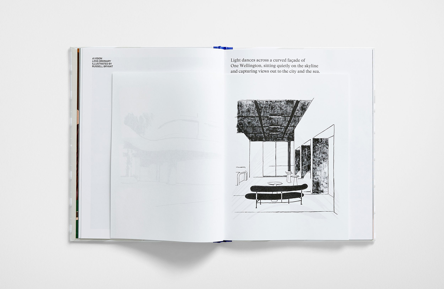
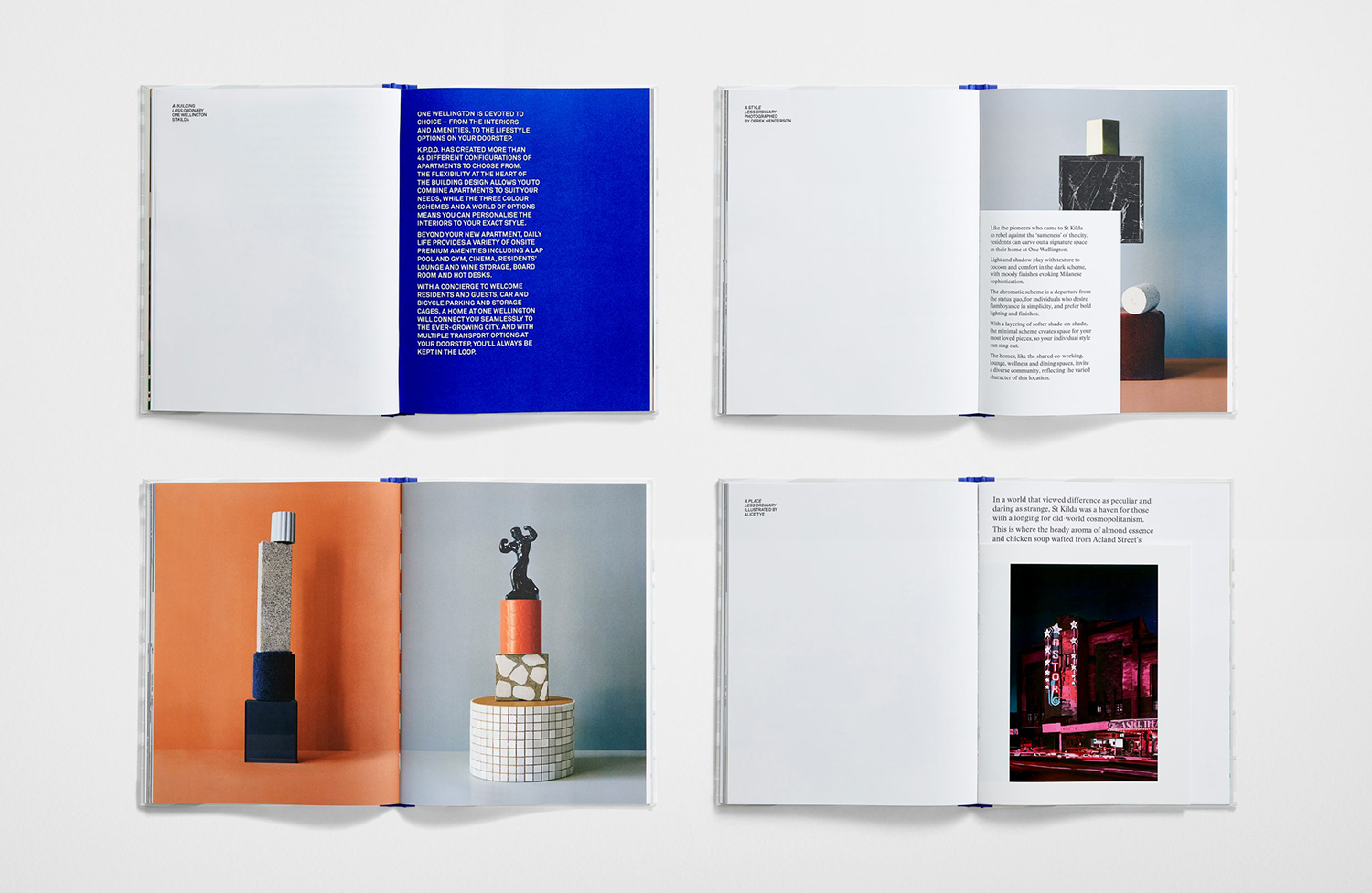
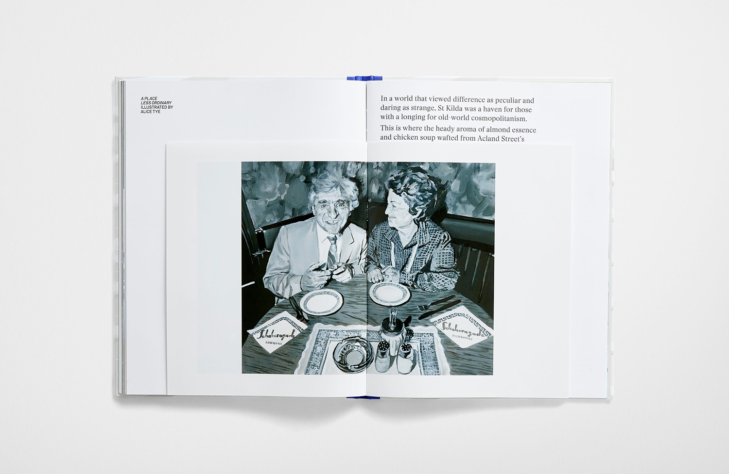
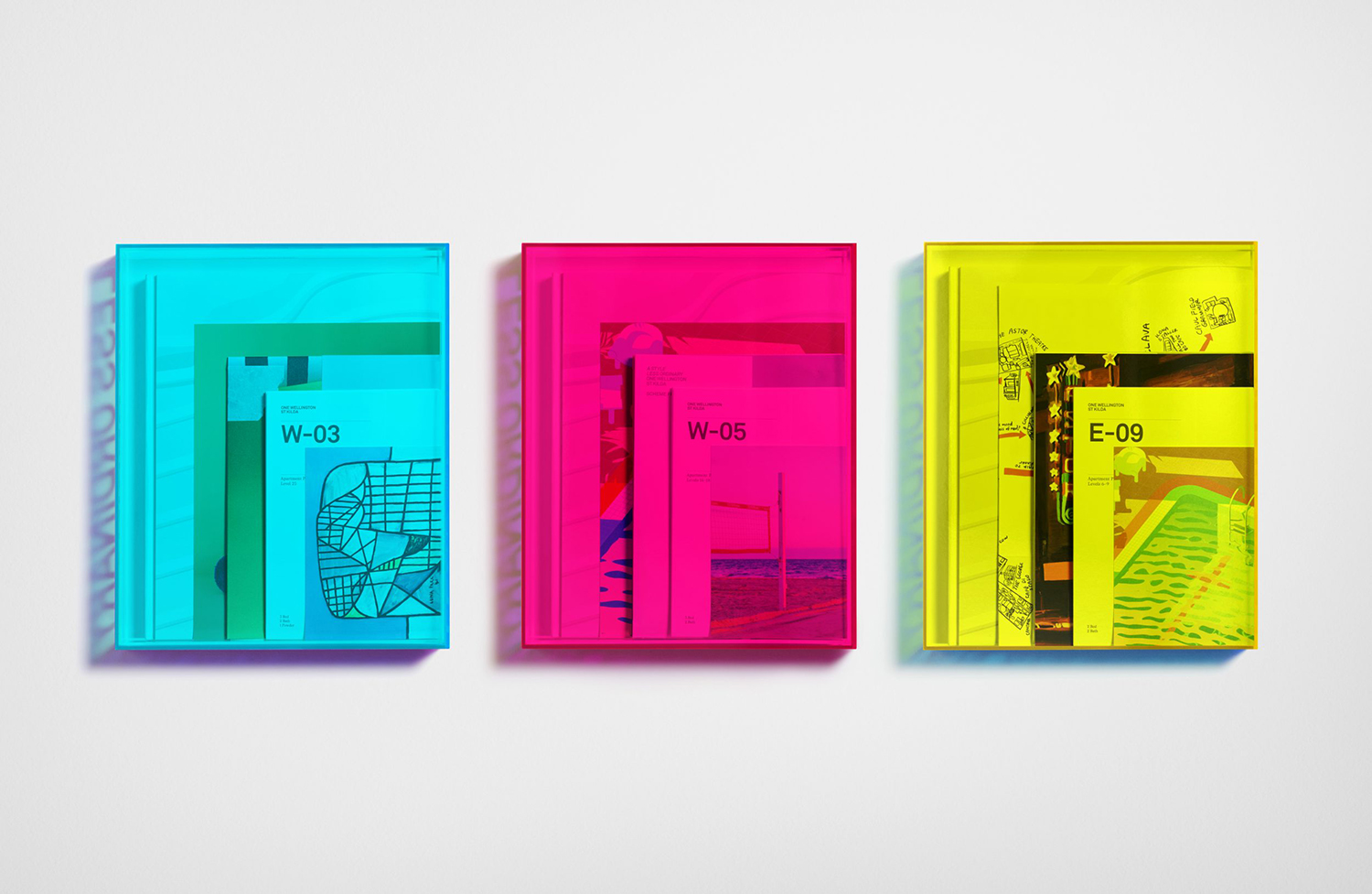
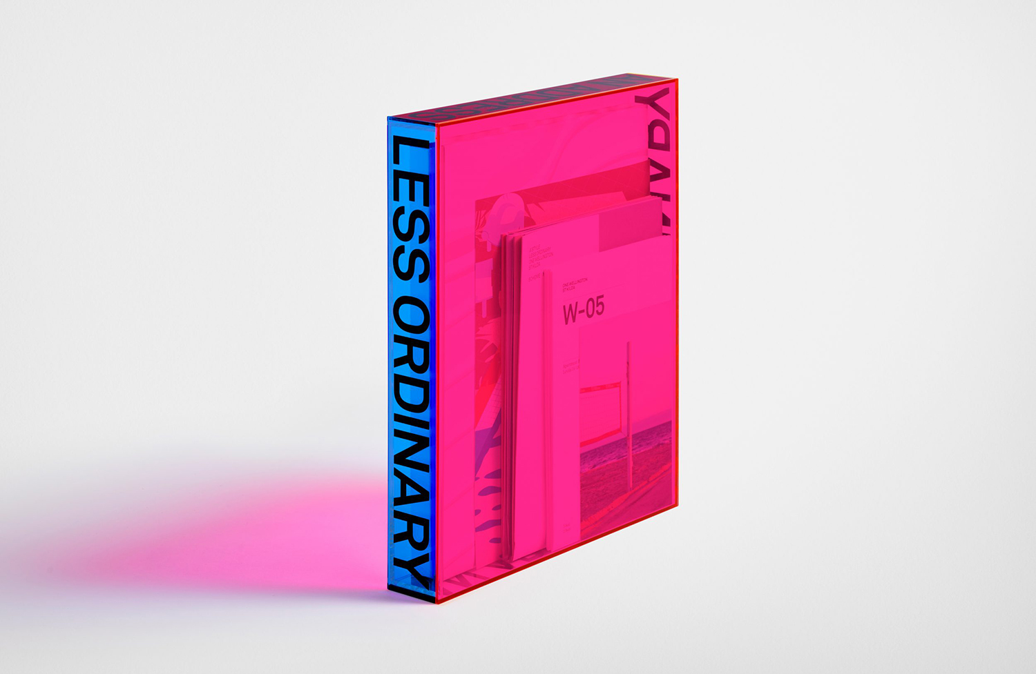
The collateral box is perhaps the most provocative and eye-catching element. It is a bols singular gesture with an immediate wow factor that collates and presents different sized documents. The visual language of artist portfolios and loosely collated boxed artistic references come to mind and folds in well with a series of strong statements and different artistic visions throughout the materials qithin, those that reflect the different places, people, situations, styles and choices that make up One Wellington.
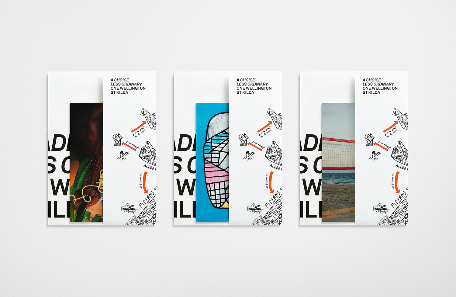
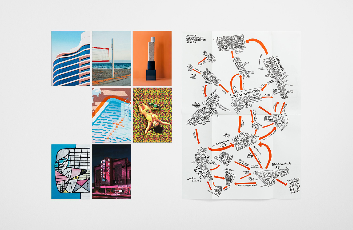
Supportive materials include a deconstructed map that seeks to encourage holders to navigate the surrounding area by lifestyle rather than geography. Postcards set within the folded map bring some of these to life by way of illustration, art or photography. Highlights include property images by French illustrator Geoffroy de Crecy, remnants of the area’s resort past captured by photographer James Tolich and the still life imagery of Derek Henderson (collaborating with Still Life Stylist and Set Designer Alicia Sciberras) that capture the material pallets from different locations within the development and the options for each apartment.
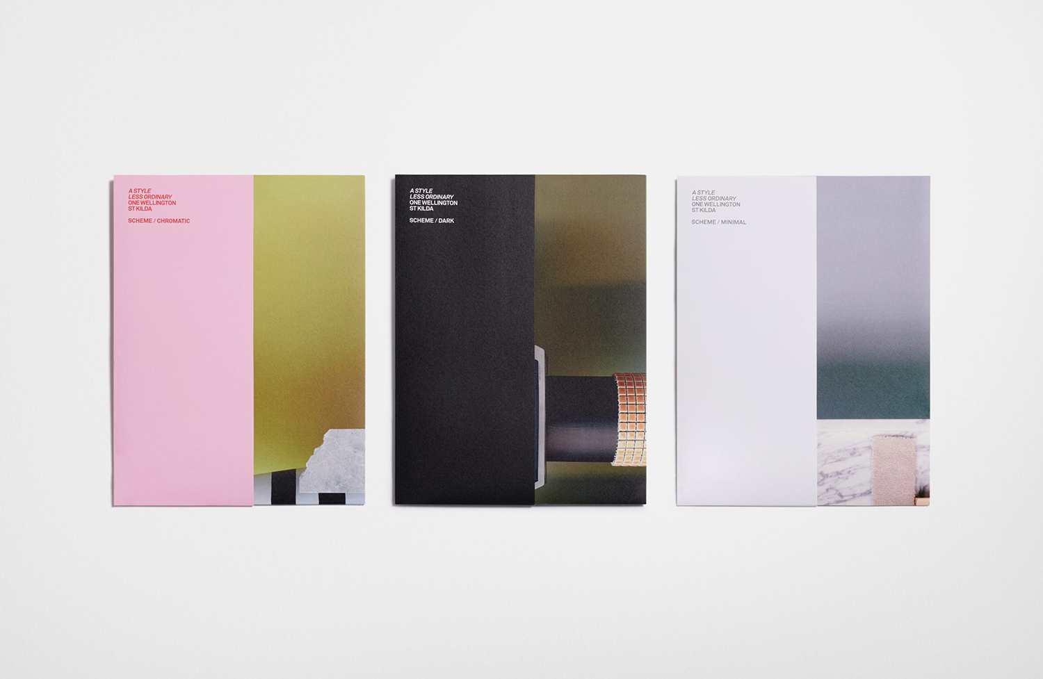
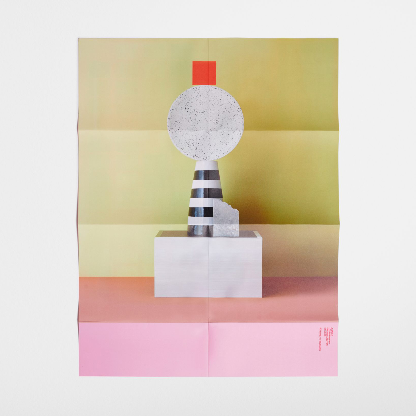

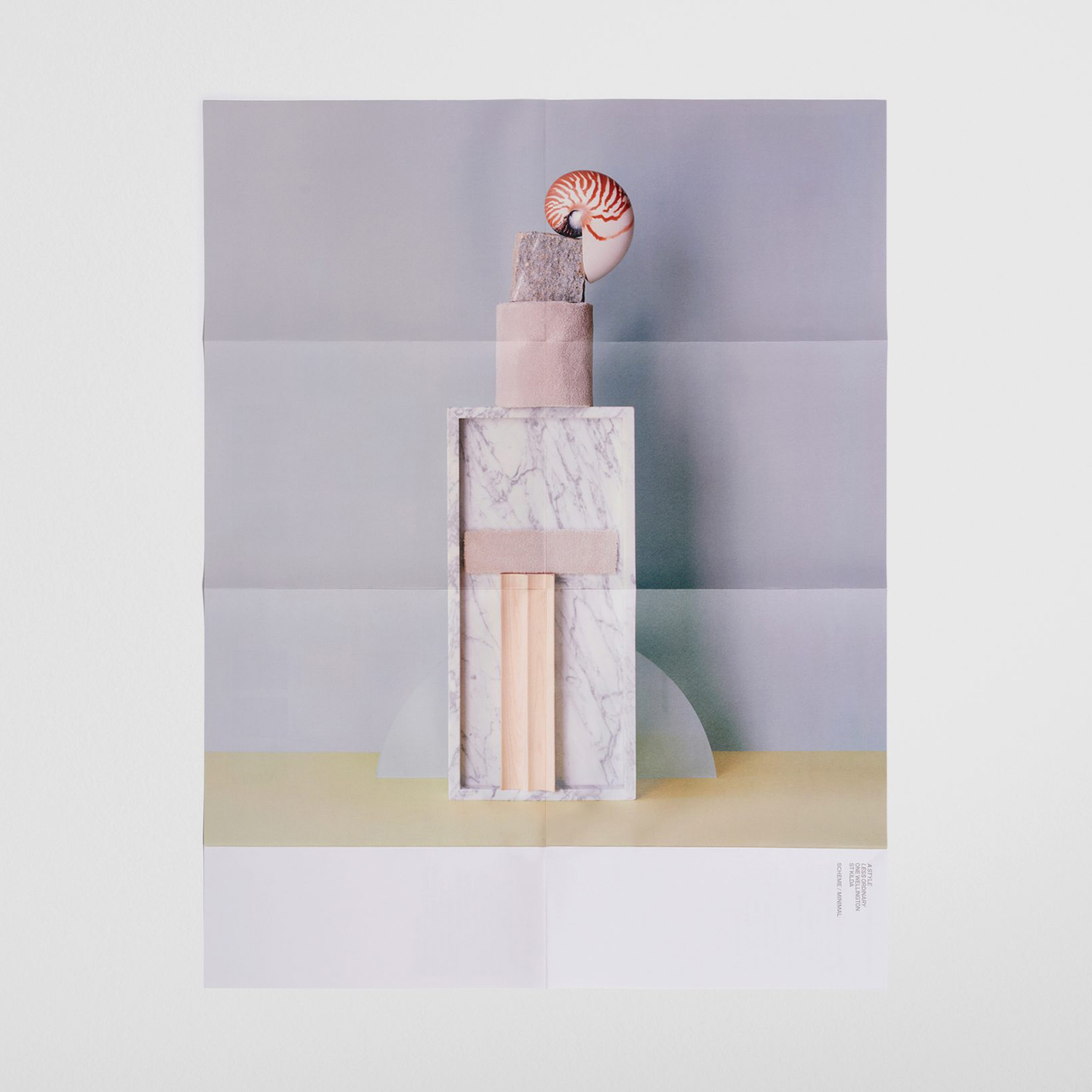
Different booklet sizes and visual approaches that seamlessly move between inside and out, from architecture to story to community serve to structure a graphic abundance and bring to life the positioning statement ‘A life less ordinary’. Collating this diversity within a singular, youthful and dramatic gesture, a brightly coloured perspex box, is unexpected, using colour, surface and form to make a strong initial impression. The box alone, in its volume is indicative of abundance, its transparency, and the use of different proportioned documents furthers this, with colour and type effectively leading the mind towards a vibrant art and culture scene. More from Studio Ongarato on BP&O.
