Lookbooks by Studio Lowrie
Opinion by Richard Baird Posted 6 November 2019

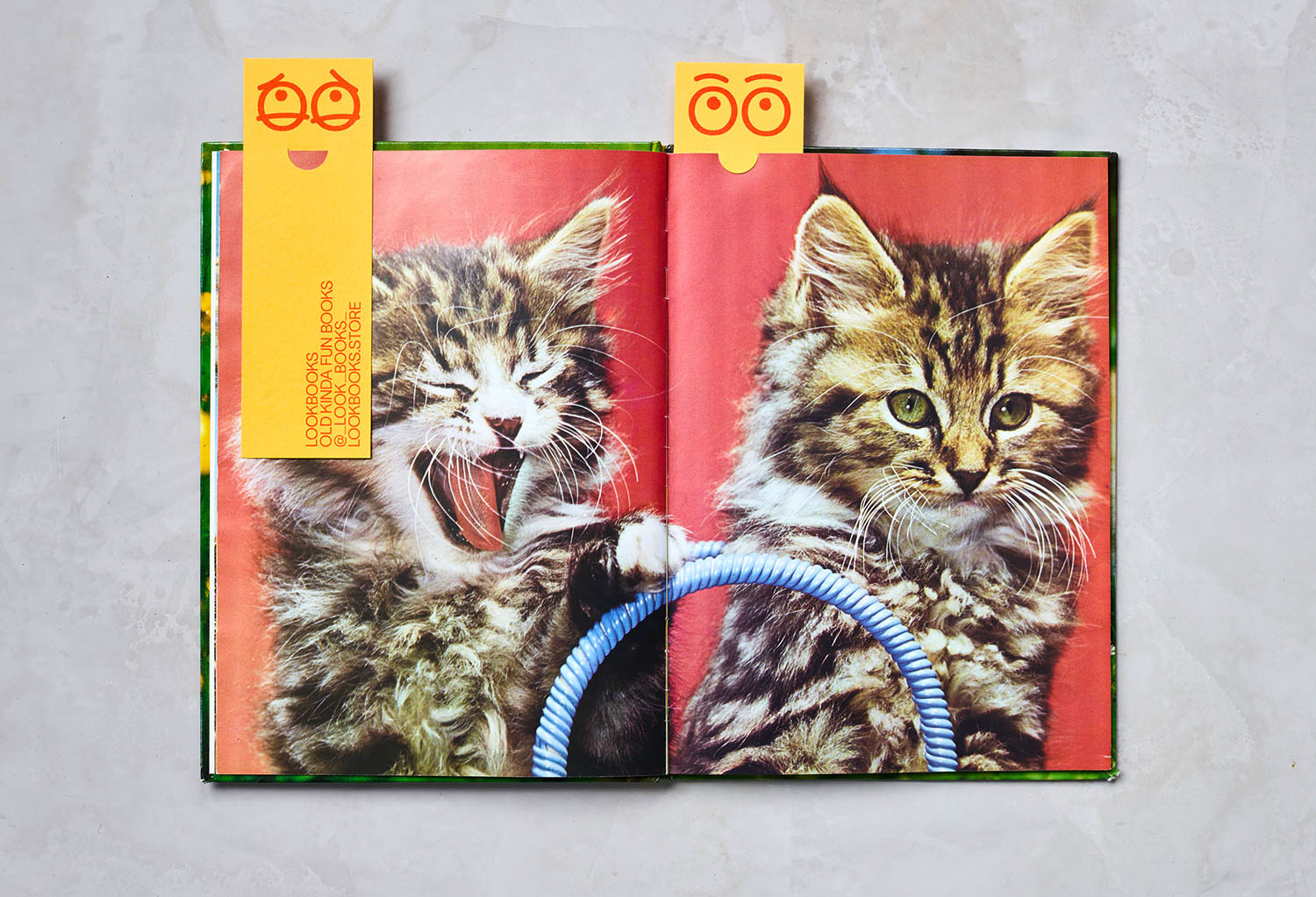
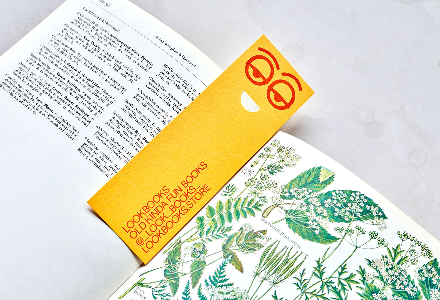
Lookbooks is an online bookstore that specialises in fun and quirky publications of the past. Recent acquisitions include Old Bohemian and Moravian Jewish Cemeteries by Petr Ehl, Arno Parik & Jiri Fiedler, 1991 and 101 Cake Design by Mary Ford, 1987. There is a cultural value to many of these, reflecting a time and particular niche interest, and how these niche interests were shared pre-internet. The bookstore’s brand identity, however, clearly positions this as a cheerful tongue-in-cheek activity with a cheerful lightness of tone in the logo, which doubles down on the double O pairings within the name to create expressionful graphic gestures. But, it is the bookmarks that really stand out. I simple little die-cut trick, in conjunction with book pages, gives a nose to the eyes. A smart idea by London-based Studio Lowrie.
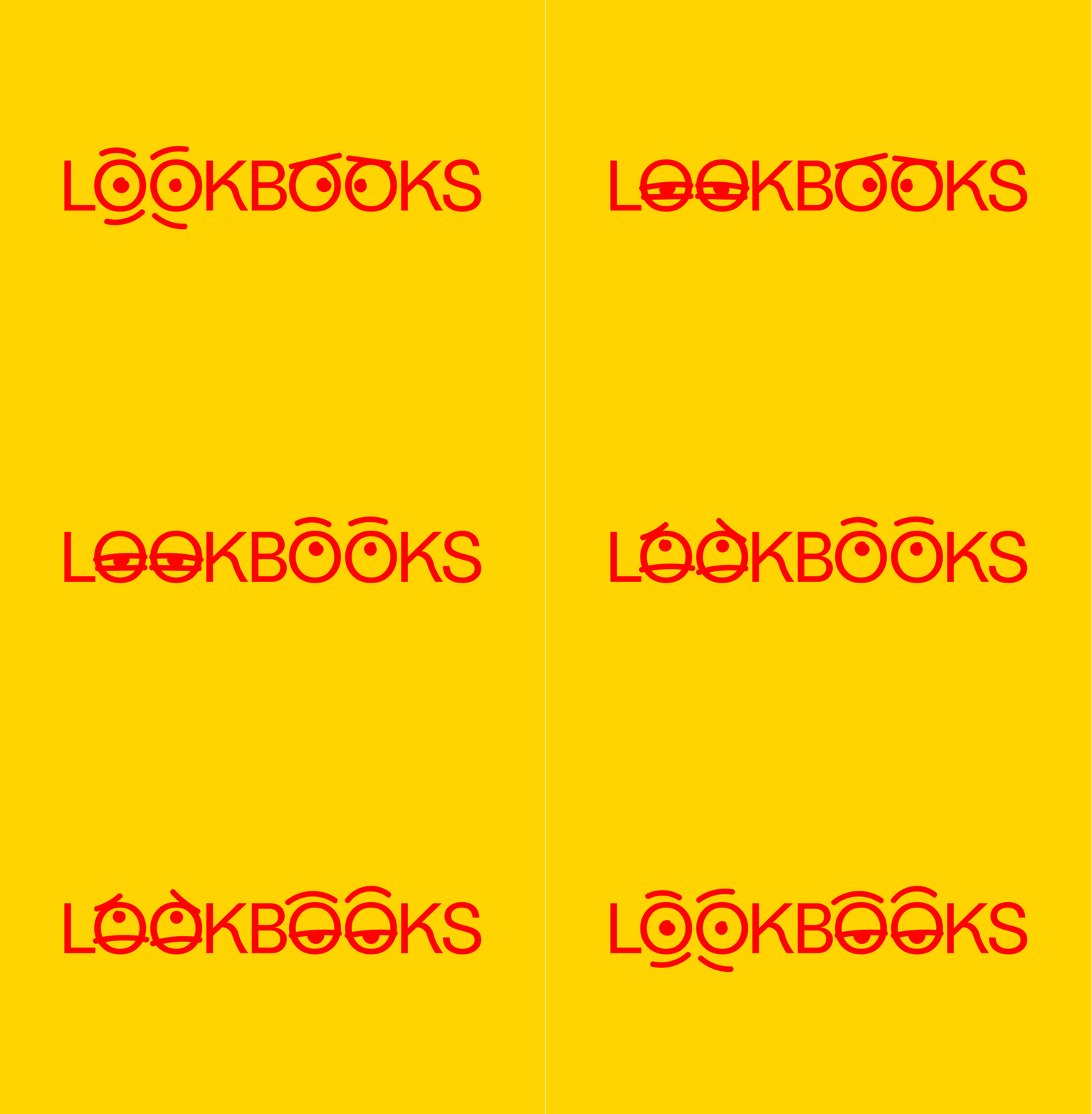
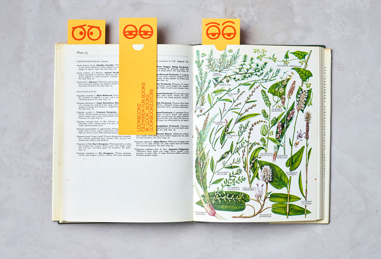
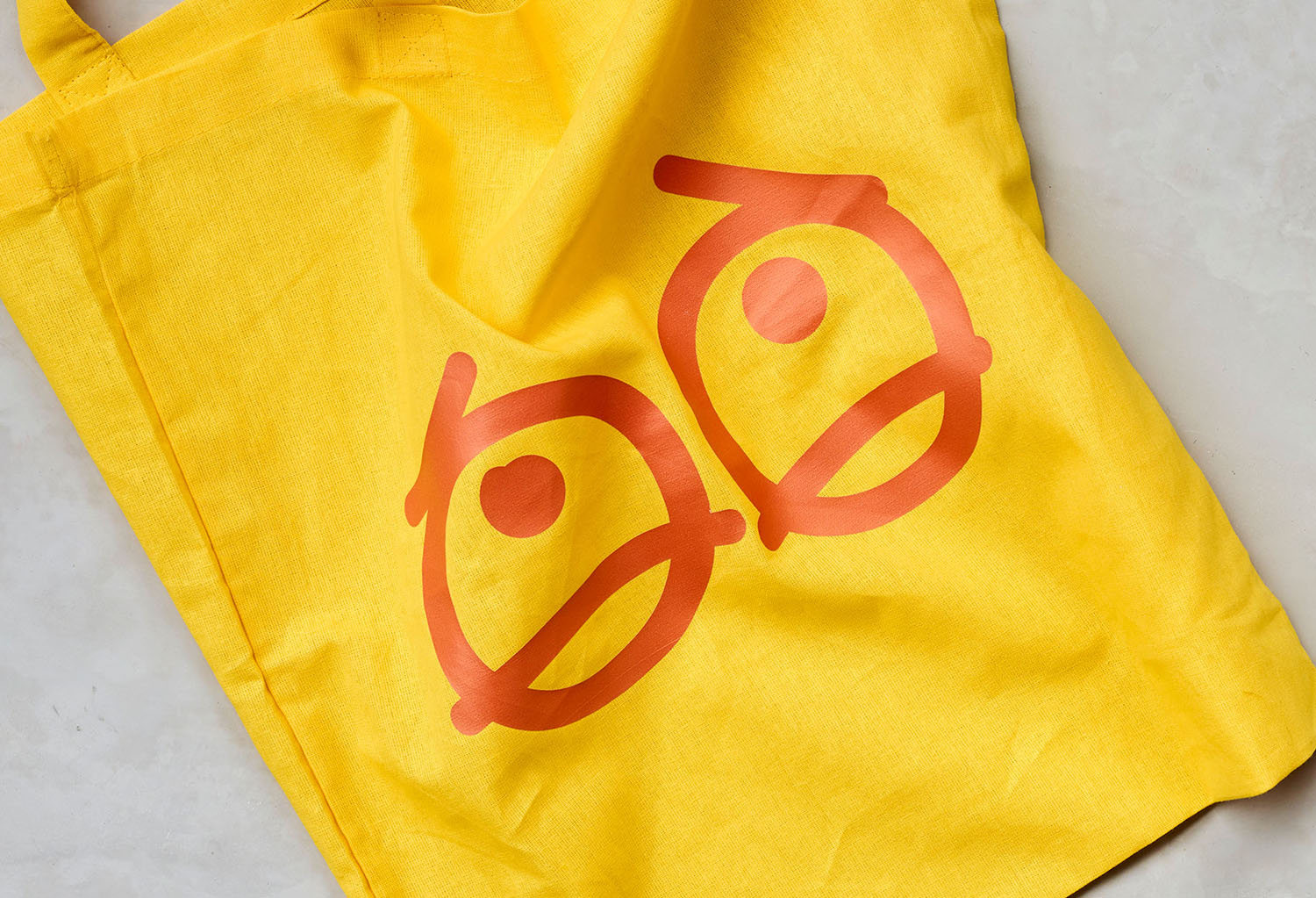
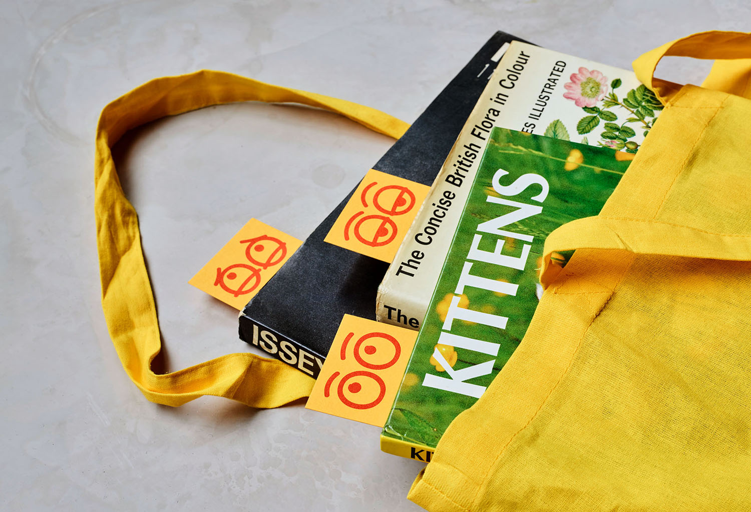
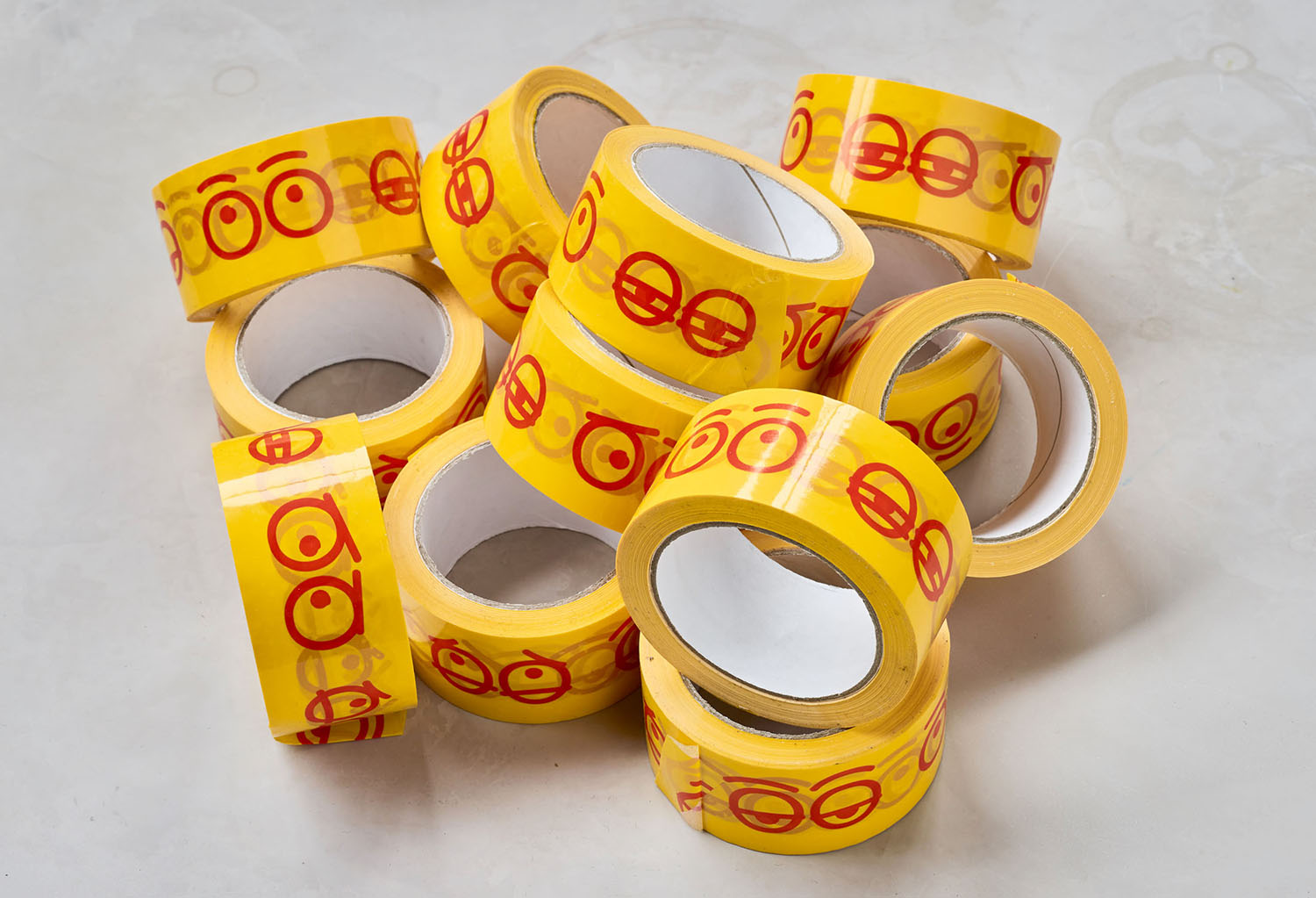
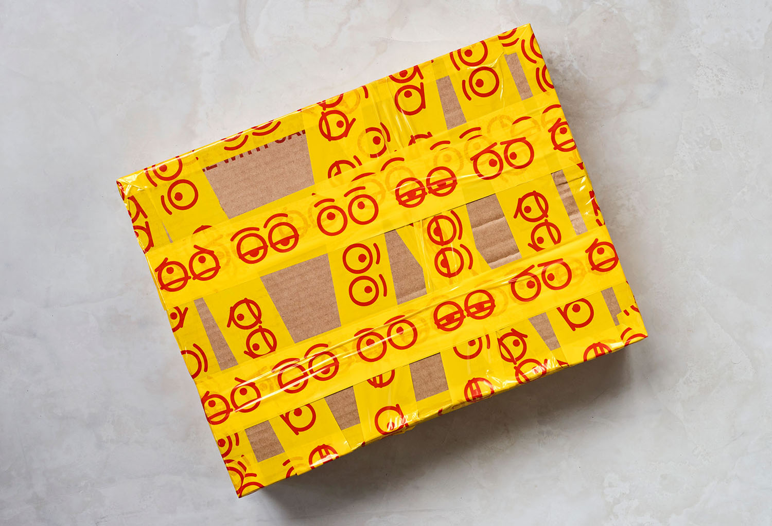
While there is a playfulness to the visual identity, the approach to illustrating the eyes, conveying some of the perplexing, fun, curious and droll nature of some of the titles in the store is beautifully done and lends the project a thoughtful visual range. The eyes become something of a narrative motif running across the box tape, and a striking and eye-catching gesture across the tote bag. These are supported by a warm and inviting colour palette.
