Maria Sole Ferragamo by Lundgren+Lindqvist
Opinion by Richard Baird Posted 13 November 2019

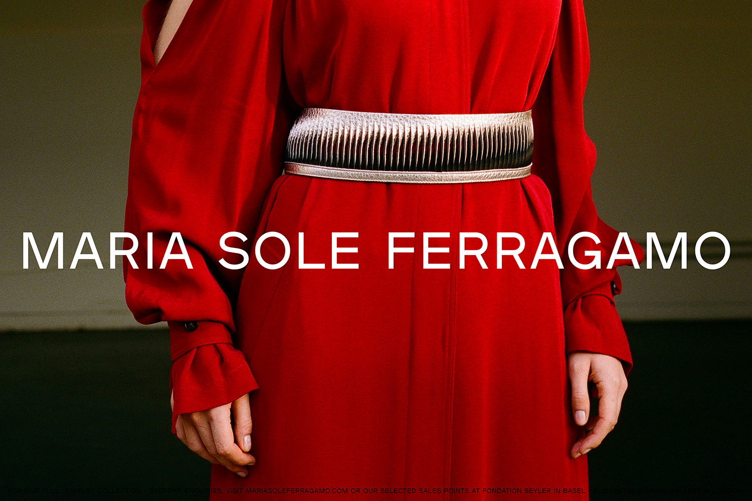
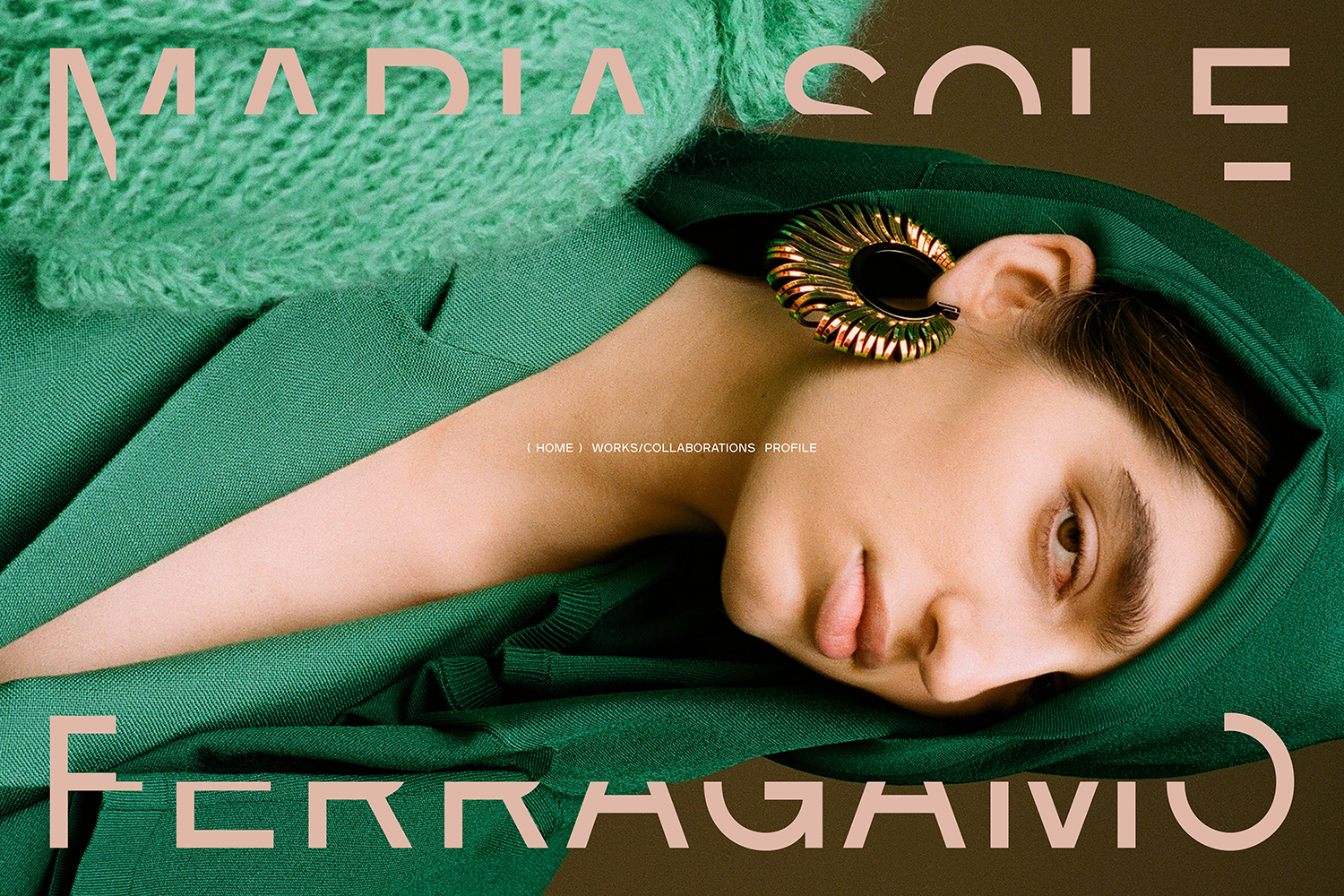
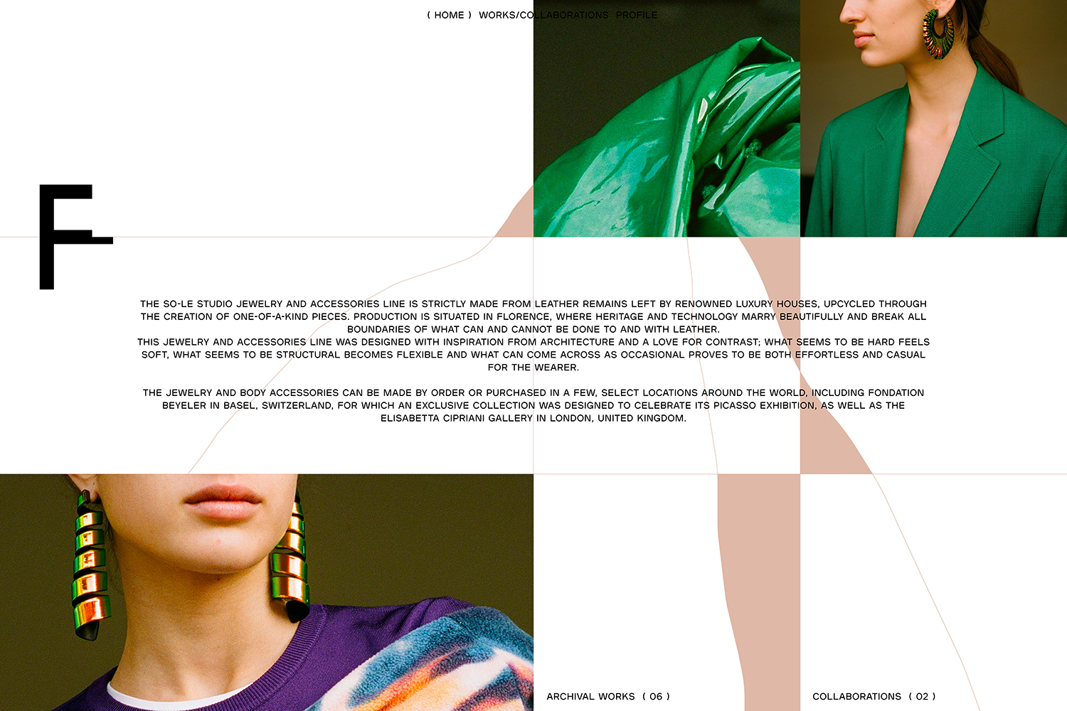
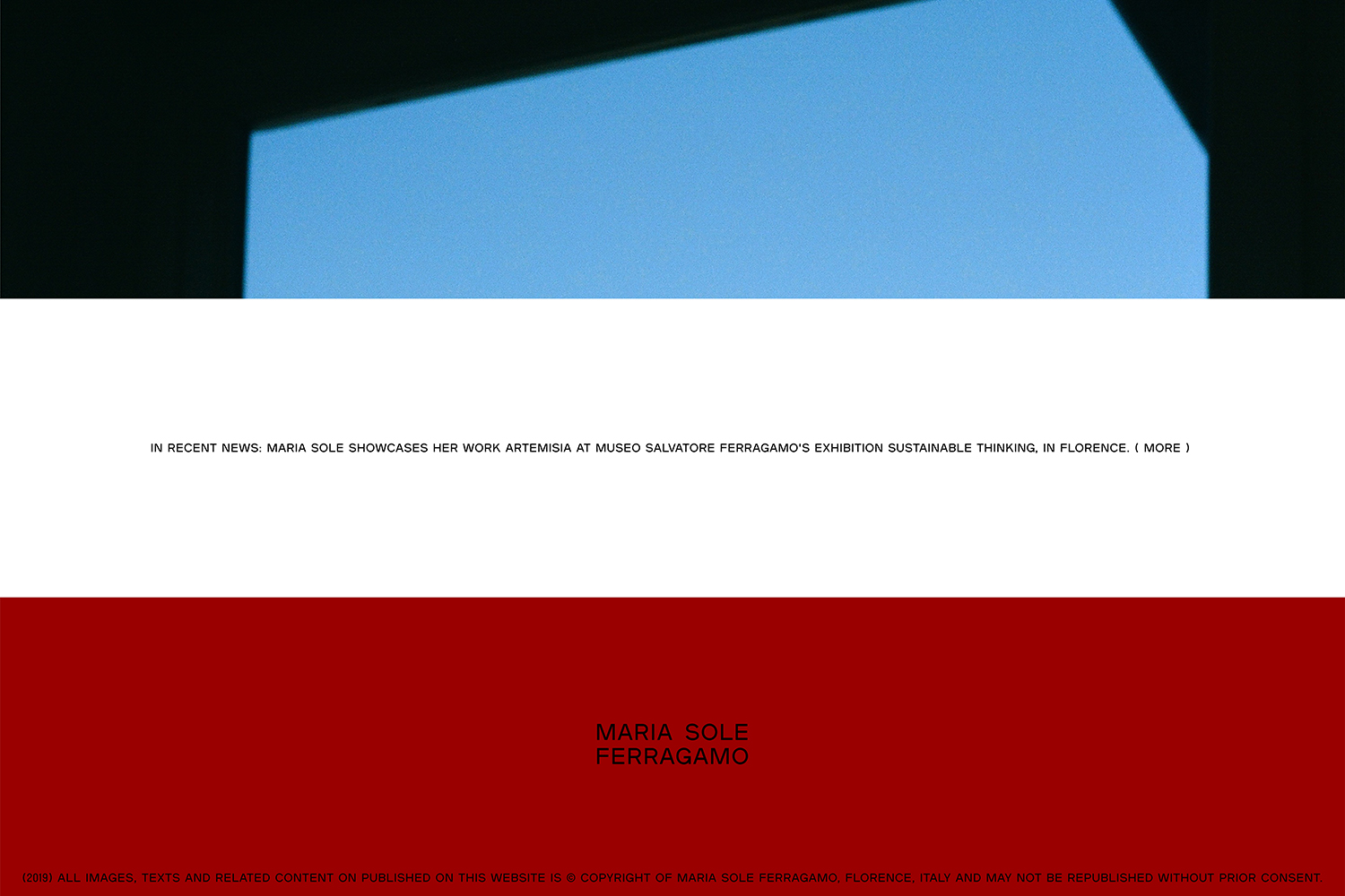
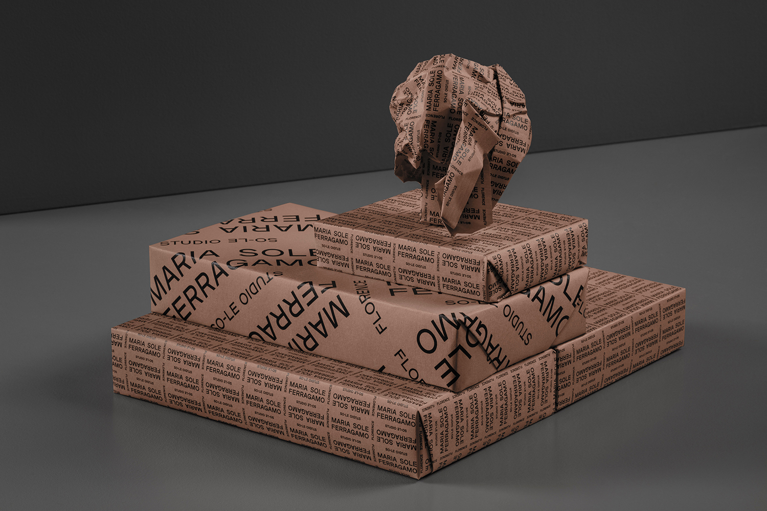
Maria Sole Ferragamo is one-of-a-kind jewellery designer using up-cycled premium leather; remnants of the Italian fashion industry. She has a degree in architecture at Politecnico, Milan and another in jewellery design from Central Saint Martins, London. This intersection of fashion and architecture can be seen throughout the designer’s collection and has gone on to inform the design of her visual identity by Lundgren+Lindqvist. This is made up of a flexible logotype which comes in a compact form, split up on two lines, and a horizontally oriented version. For the former, a series of secondary level logotypes were designed, incorporating ‘So-Le Studio’ and ‘Florence/Firenze’ as well as additional secondary level information. The logotypes are woven together into a visual tapestry of type, running over and along the edges of boxes, and intersecting or framing images online.
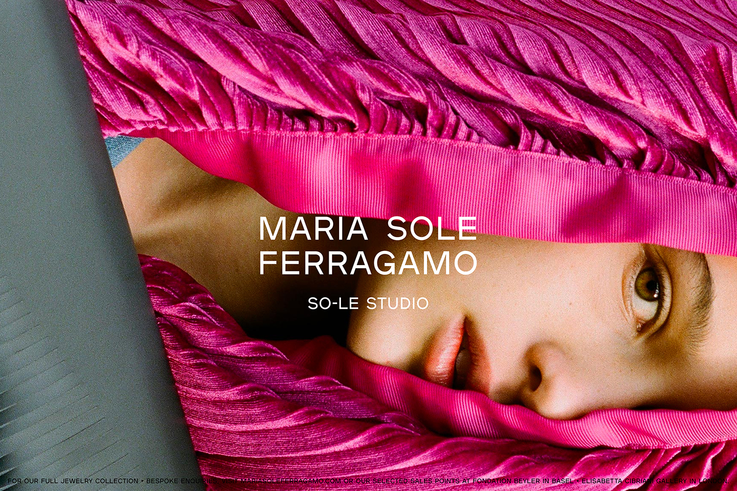
The work undoubtably channels the high-fashion visual language of the sans-serif. Some have called this “blandification” others see it as making the most of powerful fashion house names, performing a subservient role to the more evocative and narrativised visual language of photoshoots and elaborately choreographed and staged catwalk shows. For those brands with less of a presence and legacy, it is unsurprising to see them adopting similar approaches, a gesture of aspiration. Without the name, without the legacy and without the narrative of a sophisticated shoot or show, these brands need to work harder to engage, to work in a secondary subtextual layer that conveys something of their philosophy (positioning). Here, this emerges from the designer’s background, the intersection of a fashion and architectural educational background. This can be seen in some of the forms of the designer’s work–often referred to as wearable architecture–and understanding of material lifecycle as an up-cycler.
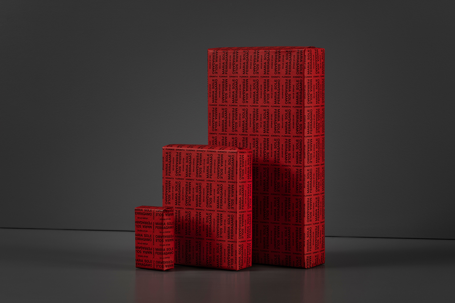
Lundgren+Lindqvist channel a high fashion visual language through the lens of the architect, making the theme of structure evident and prominent through grid, repetition and modularity. The wrapping makes the reference abundantly clear but pushes the familiar enough into the realm of the architectural to give it the necessary difference and memorability. Further, and as an abridge to the designer’s exploration of the endless possibilities of up-cycling materials, the suggestion of a continuous stream of type, flowing across surfaces in three dimensional space, feels like an elegant gesture, giving further conceptual weight to the sans-serif. This sans-serif, to an untrained eye, is neutral, yet there is enough in the way of letter shape and the relationship between letters to support the concept alongside product photography, and a couple of other cues such as layering, and a graphic interpetration of the architectural notion of volume and void by way of positive and negative space online. More work by Lundgren+Lindqvist on BP&O.
