MoMA by Order
Opinion by Richard Baird Posted 2 January 2020
The MoMA logotype, set in Franklin Gothic No. 2 and designed by Ivan Chermayeff, is an icon, and has been part of the New York urban landscape and international museum graphic vernacular since its creation in 1964. With evolving communicative needs and channels, the MoMA logotype was made a central graphic device as part of a new visual identity launched in 2009. Created by Pentagram and MoMA’s Creative Director for Graphics and Advertising Julia Hoffmann, this flexible visual identity was developed to bring a systematised and cohesive programme to print, web and environmental applications.
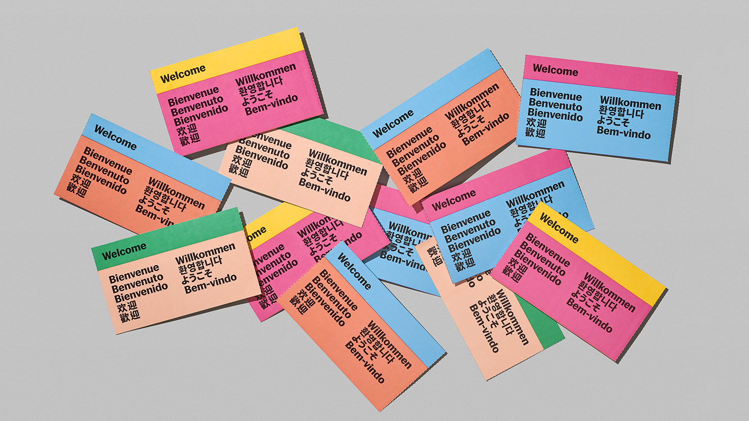
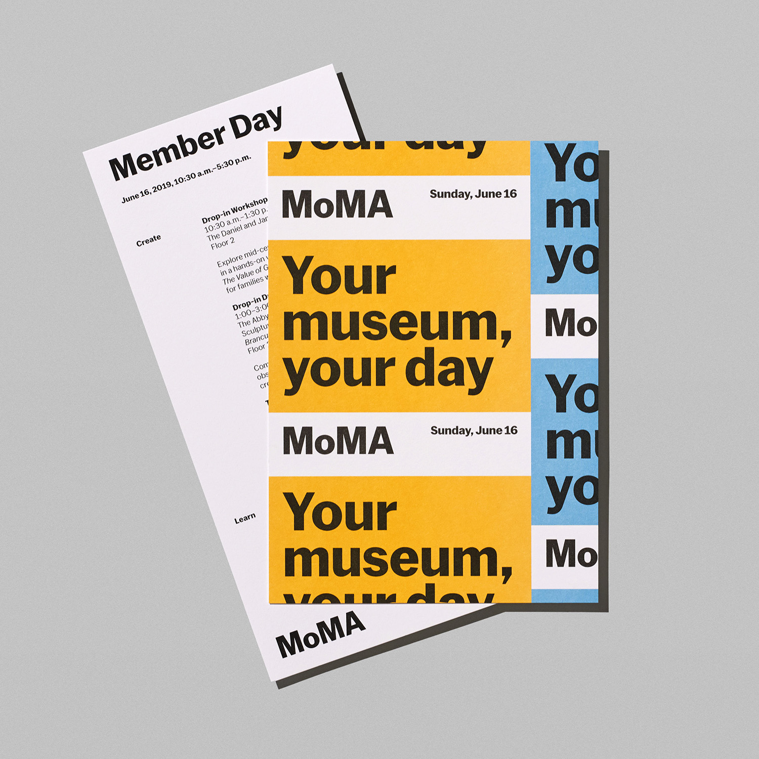
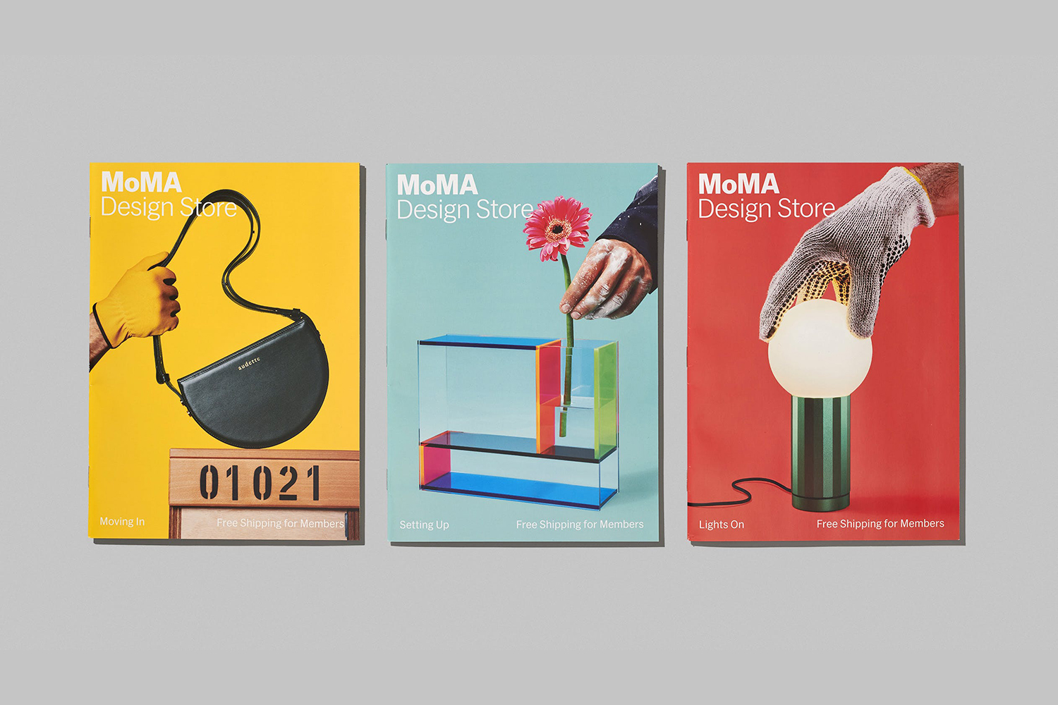
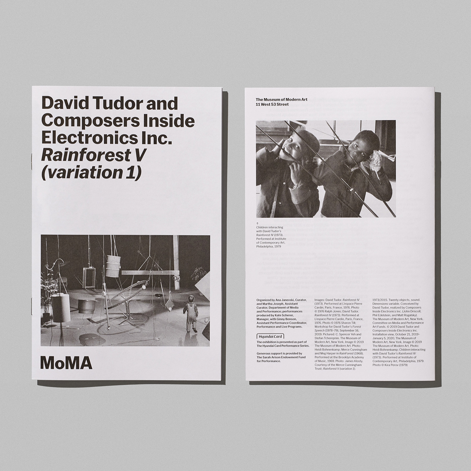
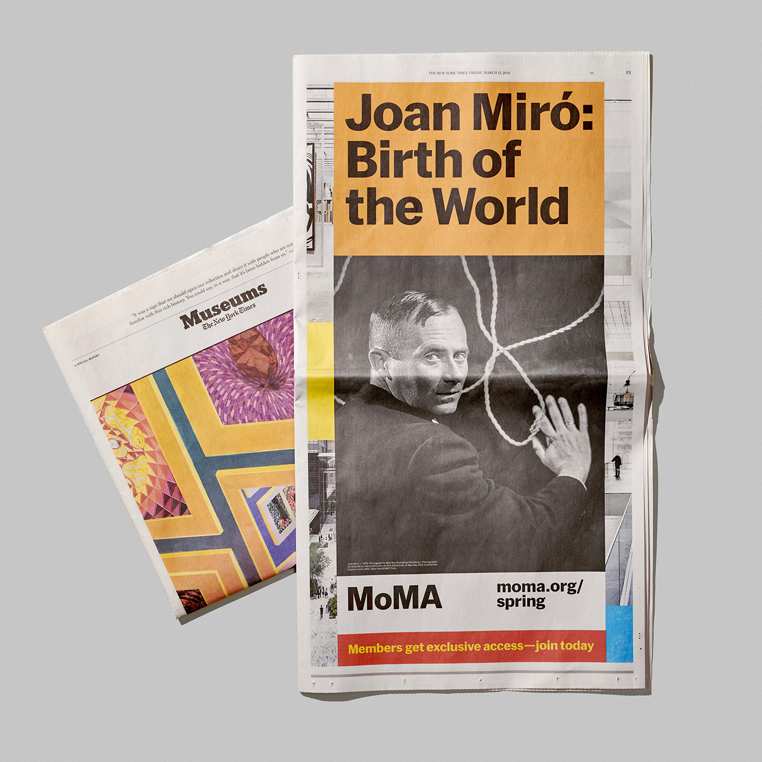
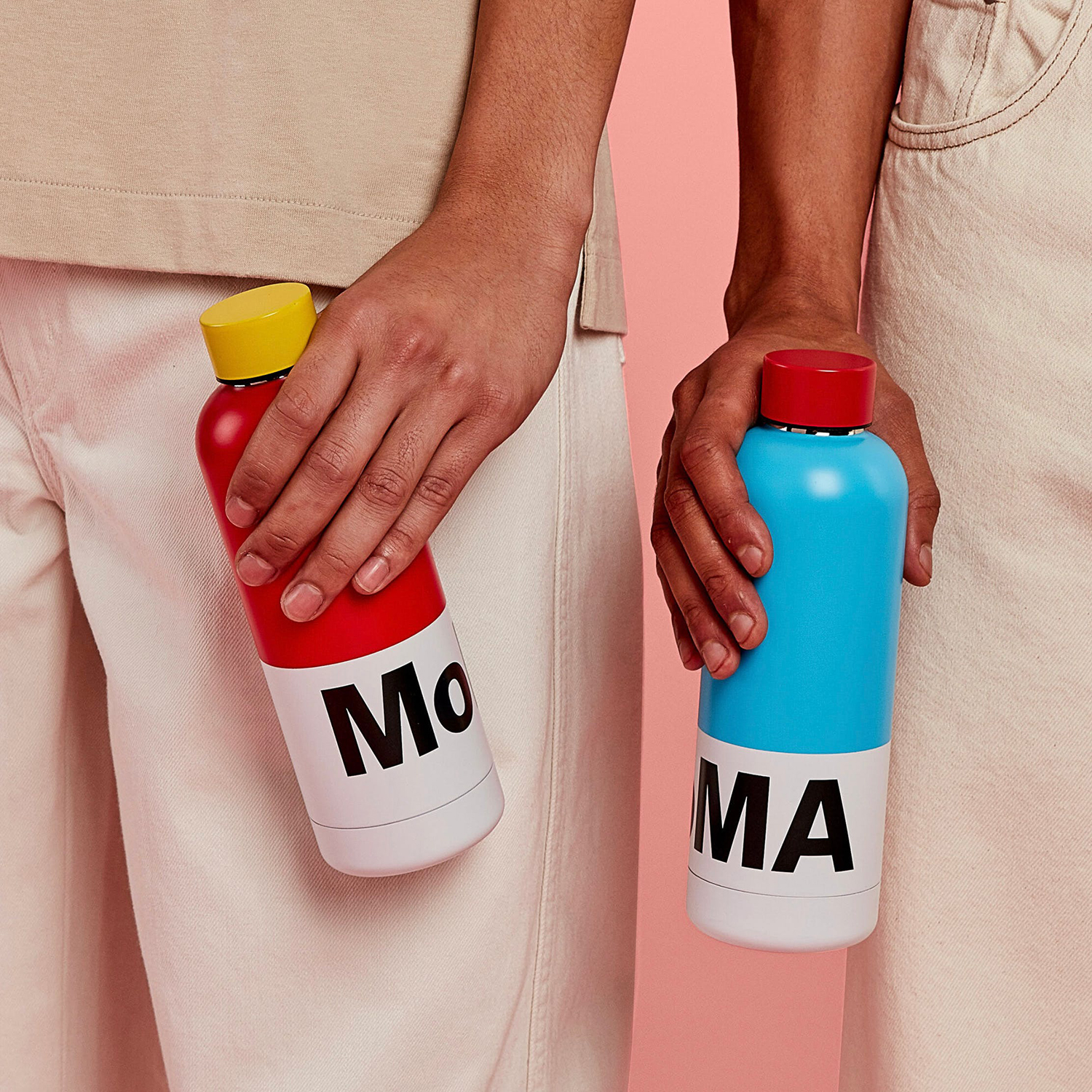
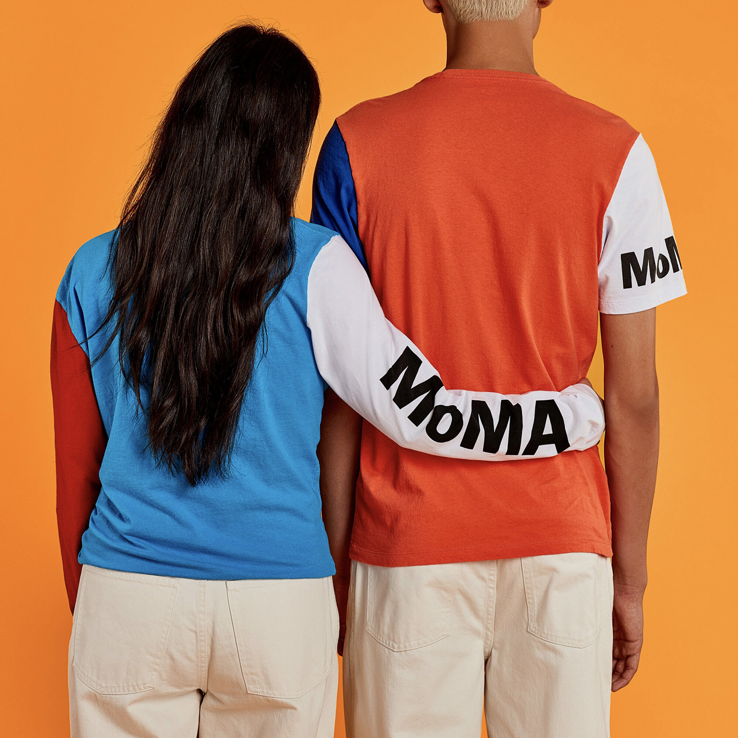
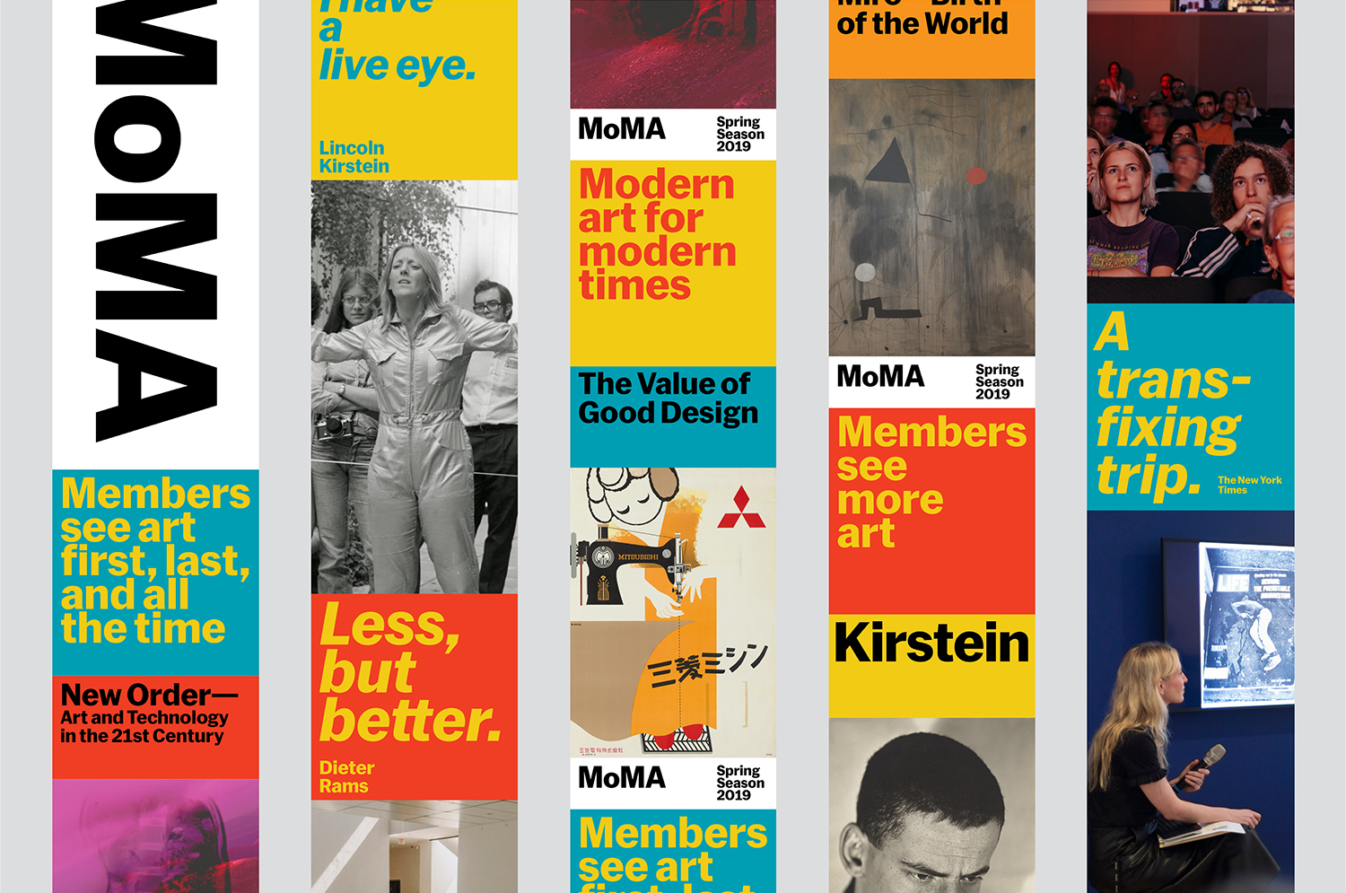
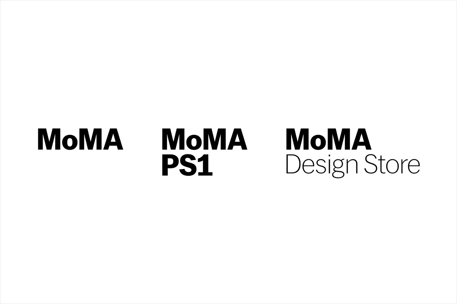
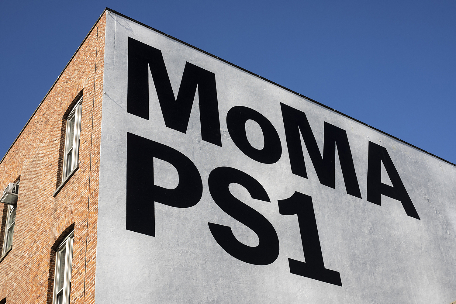
In 2019, MoMA expanded its 53rd Street location, adding 40,000 sq. ft. of new gallery space. This will showcase more of its collection with the intention of better representing and balancing a diversity of backgrounds, periods, media, and geographies, with a performative quality at the heart of its galleries. Just as in 2009, new approaches to communication; moving from exhibition-focused campaigns to a seasonal approach, required a revision to the MoMA visual identity to coincide with its expansion. New York-based Order reviewed and then defined what they described as a more modular, adaptable, and scalable design system for the museum’s communications, alongside the recommendation of a seasonal approach. This included updating the PS1 and Design Store logos, adding these as brand extensions of MoMA’s singular institutional mark. All additional applications were then designed and produced in house by the MoMA Design Studio, these included newsprint advertising, design store catalogue covers, member’s day programmes, banners, map and tickets.
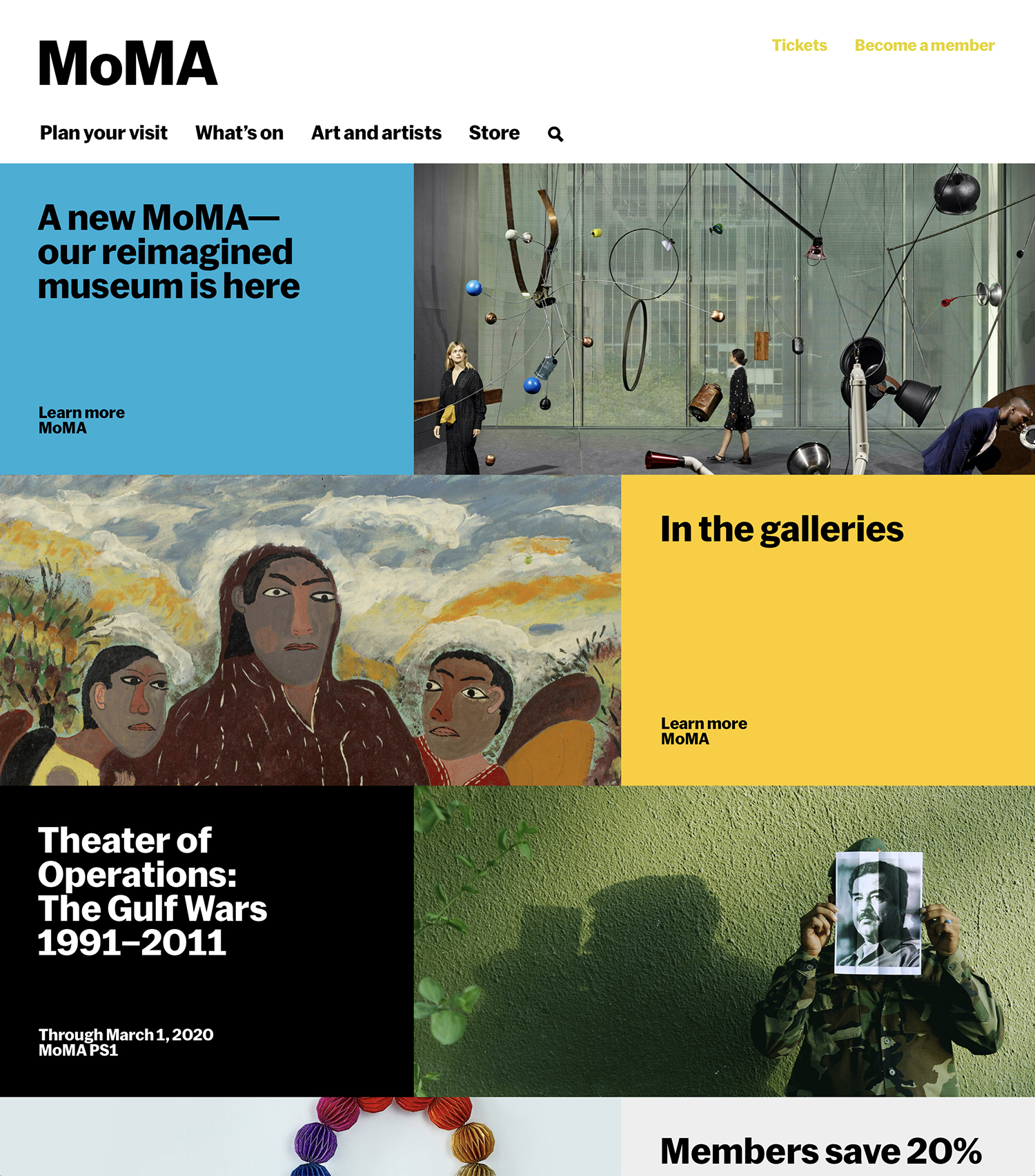
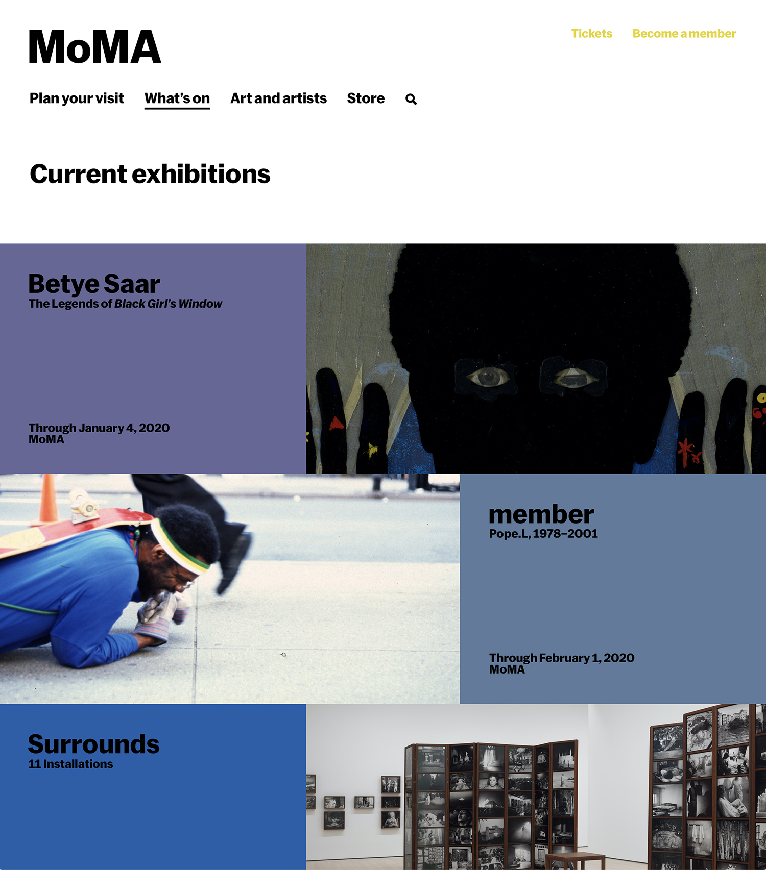
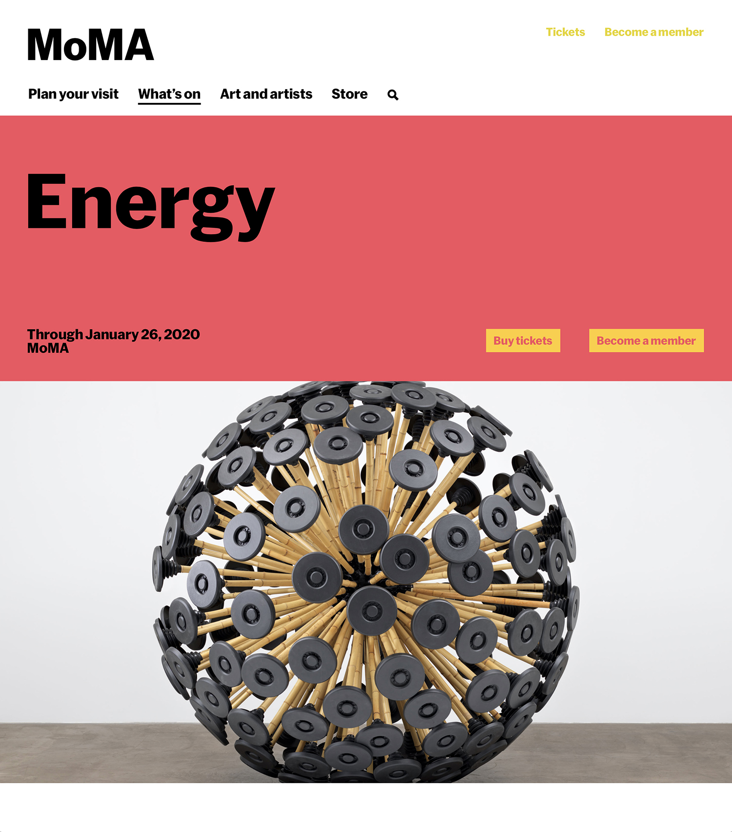
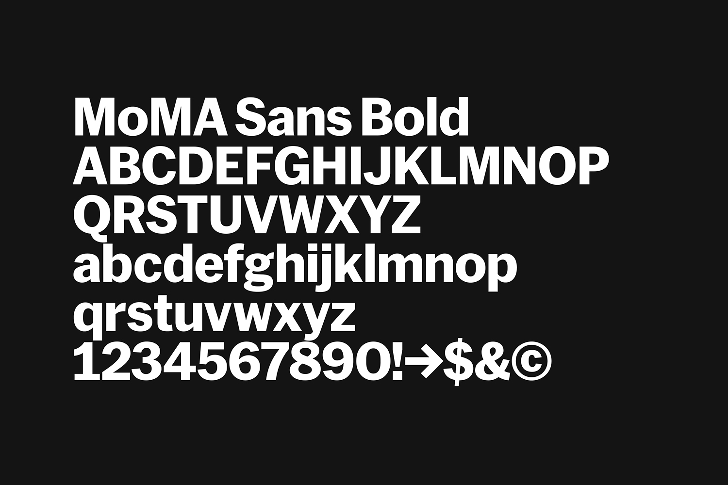
The new MoMa visual identity builds on what has come before, developing MoMA Sans and the MoMA logo, whose updated versions were drawn by Christian Schwartz at Commercial Type in 2017, and furthering the modularity of Pentagram’s work from 2009. This similarly plays with contrasts between strong modern colour blocking and imagery from MoMA’s collection whilst introducing new motions on screen and bringing the bold weight of MoMA Sans into primary applications as an identifier when the logotype is absent.
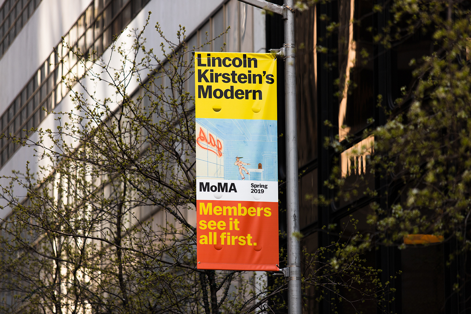
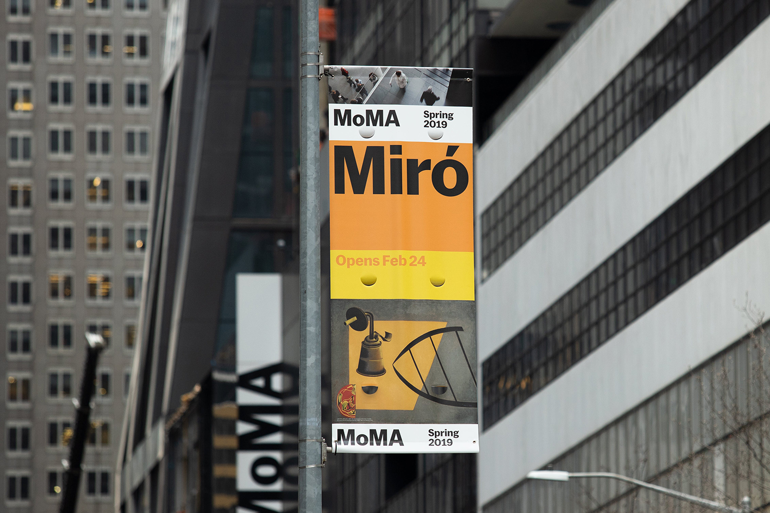
It is a strong new direction, but the continuity is clear in the presence of an evident modularity system. Of course, visual identity systems are inherently programmatic, however, some are less prominent in their modularity than others. New contexts and digital-first thinking has pushed the MoMA visual identity from the grids and guides of editorial and print publishing into a dynamic feed of colour, image, type and motion. This motion is central to its new character and structure, sweeping up and swiping left as you would on screen. Print applications, while static, share the same visual language and immediacy due the prominence and proportionality of type and colour. Colour serves to reinforce a new seasonal approach, and a sense of the current with the flexibility to be adjusted over time.
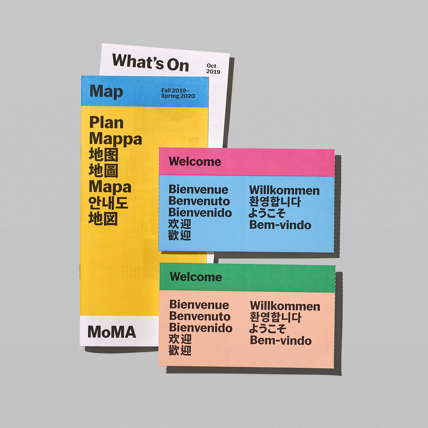
The grid, the rationalised, and the programmatic systems of the mid-century endure. Colour reproduction and typographical nuance may have moved forward iteratively (type has come a long way in the continuities between different languages, particularly for international institutions), the jump to mobile screens has had a profound effect, reshaping the relationship between person and visual identity. NYC-based motion design studio PepRally developed an approach to movement across all touchpoints, you can read more about this here. Here, there is both a joy and utility in motion and the transition between things. Details such as the cropping of text, image and boxes in print serve to bring tension and interest to static pieces of communication. There are times when this is absent, dialled right down for the Design Store catalogue covers, but type and art direction of imagery keep these from diverging from the system too much.
Design: Order. Additional Applications: MoMA Design Studio. Motion Design: PepRally Project Photography: Mari Juliano (MoMA), Leif Huron (MoMA Design Store).
