Leapling Films by F37
Opinion by Richard Baird Posted 5 August 2020
Leapling Films is a Manchester-based independent production company founded by ‘leap year baby Chris Lane’. For those that don’t know, this included myself until an hour ago, the word ‘Leapling’ is used to describe somebody who was born on the 29th February. Chris is a member of The Production Guild. His work has been seen by millions of people worldwide, and his credits as a Producer include the short films A Father’s Day and Inertia. The former was screened at 160 film festivals and received 4 million views online, and the other won Best Drama Short at Out On Film which made it eligible for the 2022 Academy Awards. Amazing.
Leapling is a great name, and a bit of a gift for a designer. You could imagine any number of things, well, maybe just one, but the treatments could have been quite different. Luckily, the project landed in the capable hands of Manchester-based studio F37 who are, perhaps, based known for their type work and collaboration through F37 Foundry. Here, the studio, headed by Creative Director Rick Banks, shows that it is as good with the graphic as it is with the typographic, and throws in a nice bit of motion design.
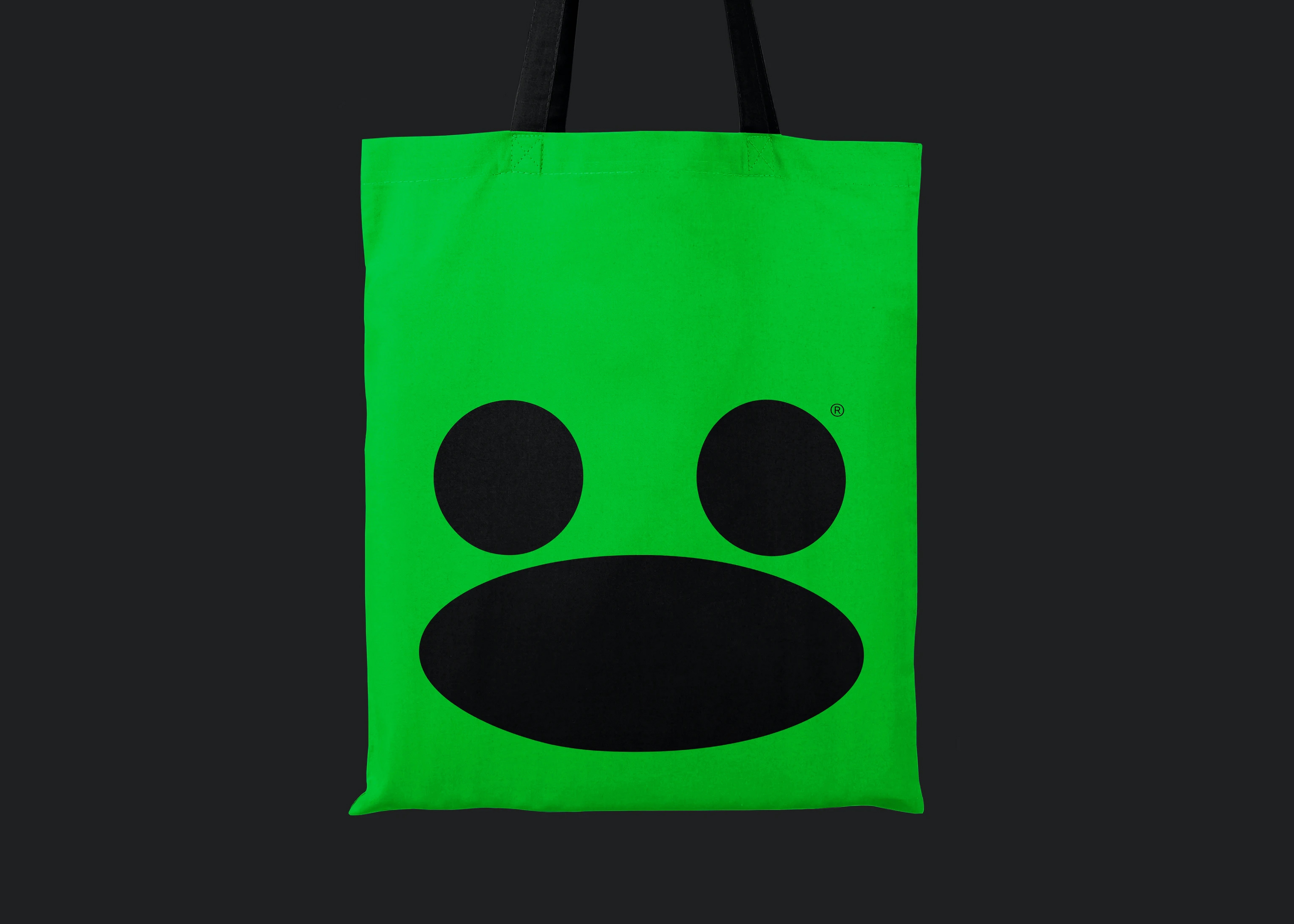
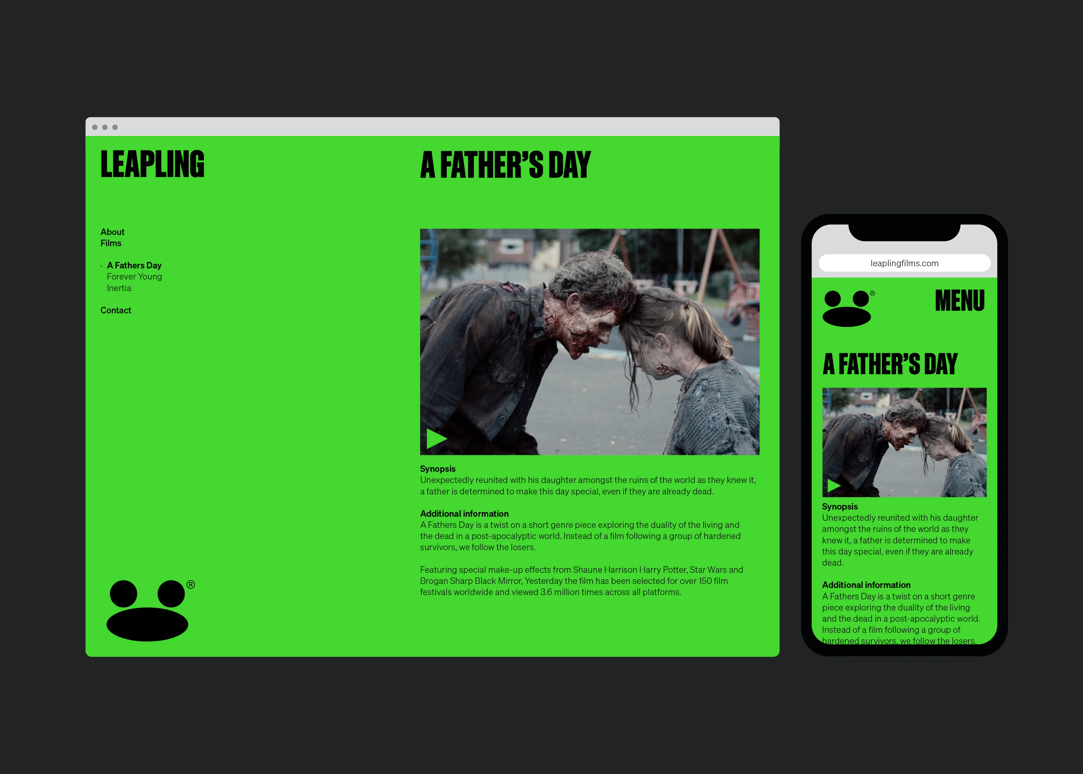
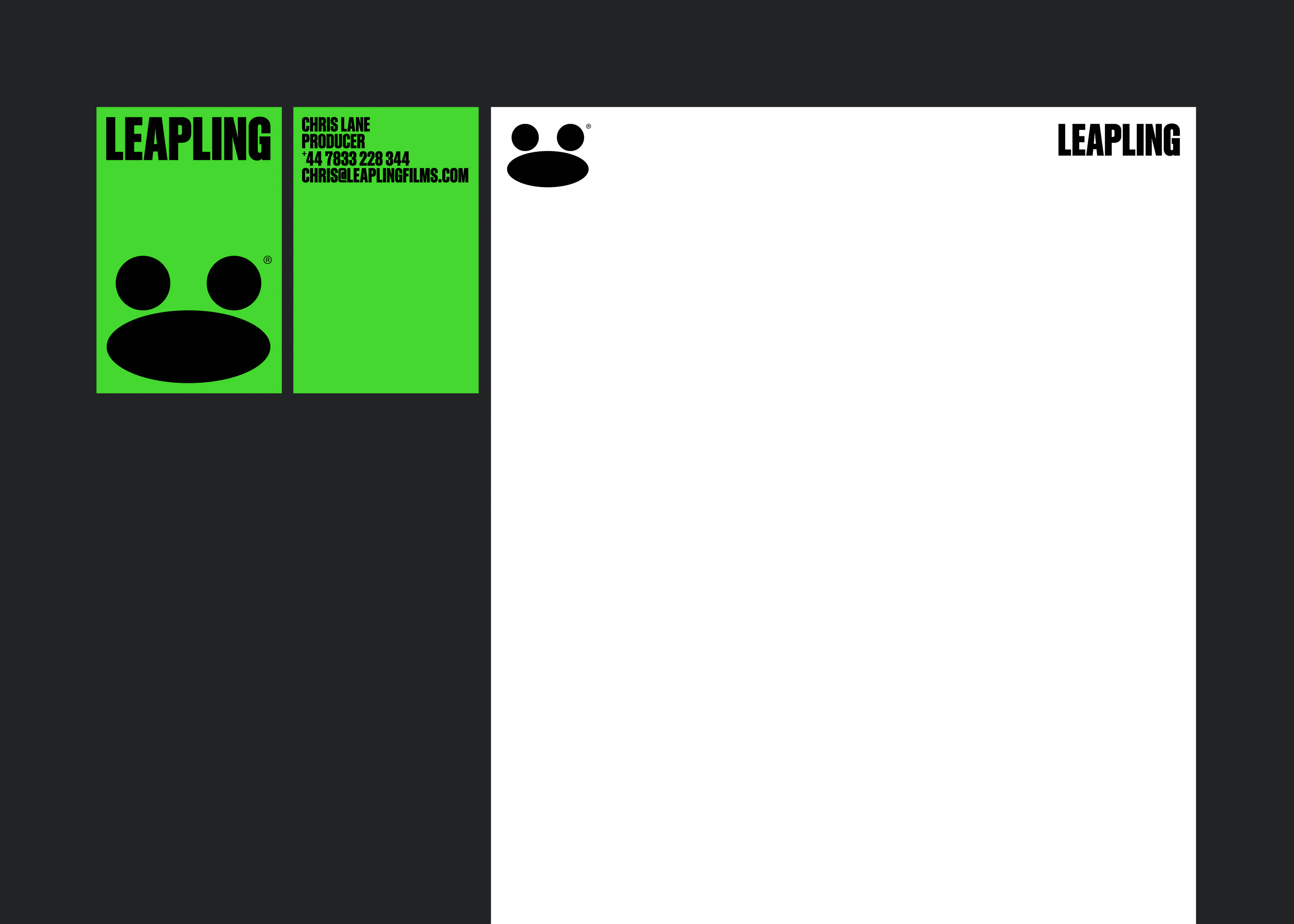
BP&O was really founded on a love of a good logo, along the way, as I picked up a bit more experience in both writing and design practice, I expanded this to cover brand identity and a bit of strategy. At some point, I forgot about the power of a decent logo (we’ve tried to bring this back with the new BP&O Logo Gallery), a distinguishing colour palette and some impactful type. This project is just that. A confluence of three elements, and a simple conceptual conceit drawn from the birthday of Leapling Film’s founder Chris. These link website, tote bag, box tape and business cards.
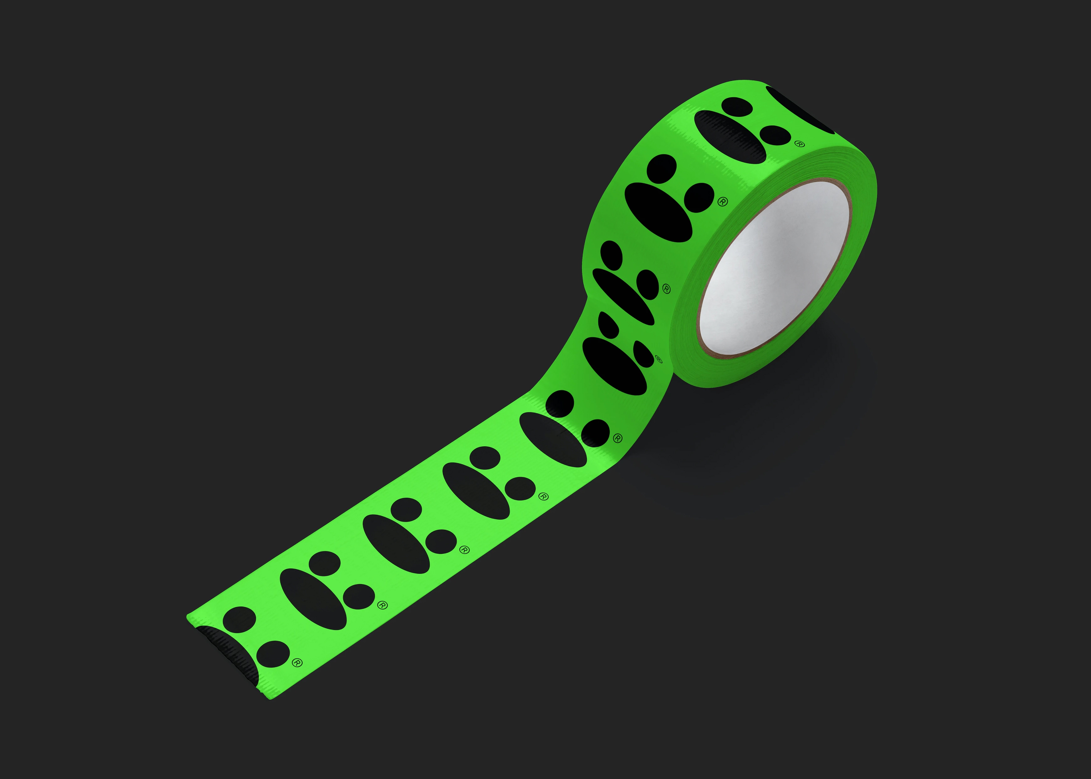
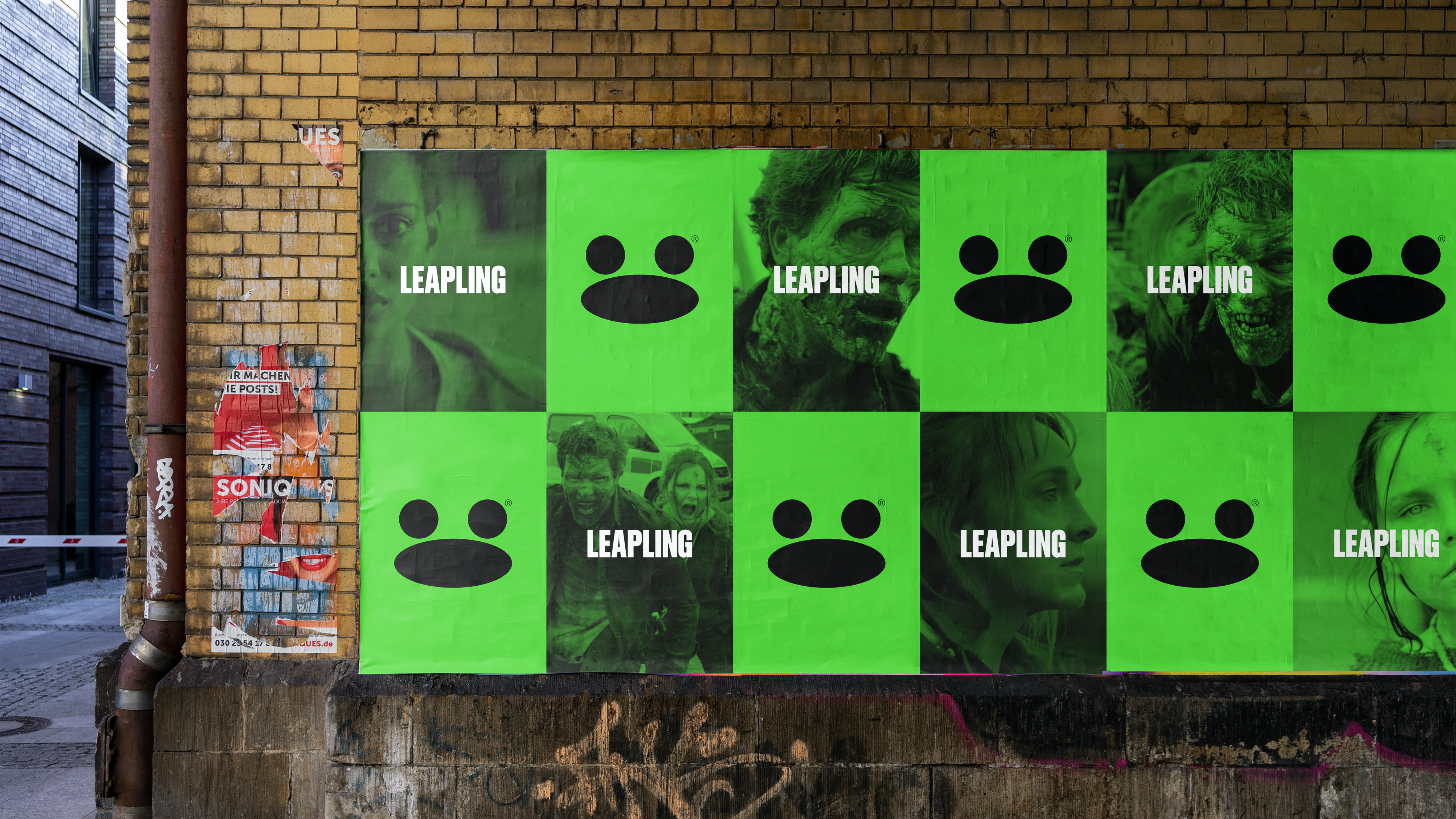
A leap year, a frog, it’s straightforward. What really works is the complete commitment to not working it up too much. There is a suggestion (in the D&AD submission, it was shortlisted) that it also references a film camera. I don’t see it, do I need to? No, not really. It’s cute, distinctive and the animation completely sells it. The green is an obvious choice, however, that brighter neon shade, really sends the mind towards chroma key, more commonly referred to as green screen. Leapling focus on telling stories set in the regions. The suggestion is that it’s all on-location, so the green screen might be a bit of ‘leap’ on my part, love it nonetheless. Applications are straightforward, scaled up or down, the logo holds up and delivers a bit of joy when perhaps you weren’t expecting it. Well done F37.
