LogoArchive – Akogare 憧れ by Hugh Miller
Opinion by Richard Baird Posted 10 December 2020
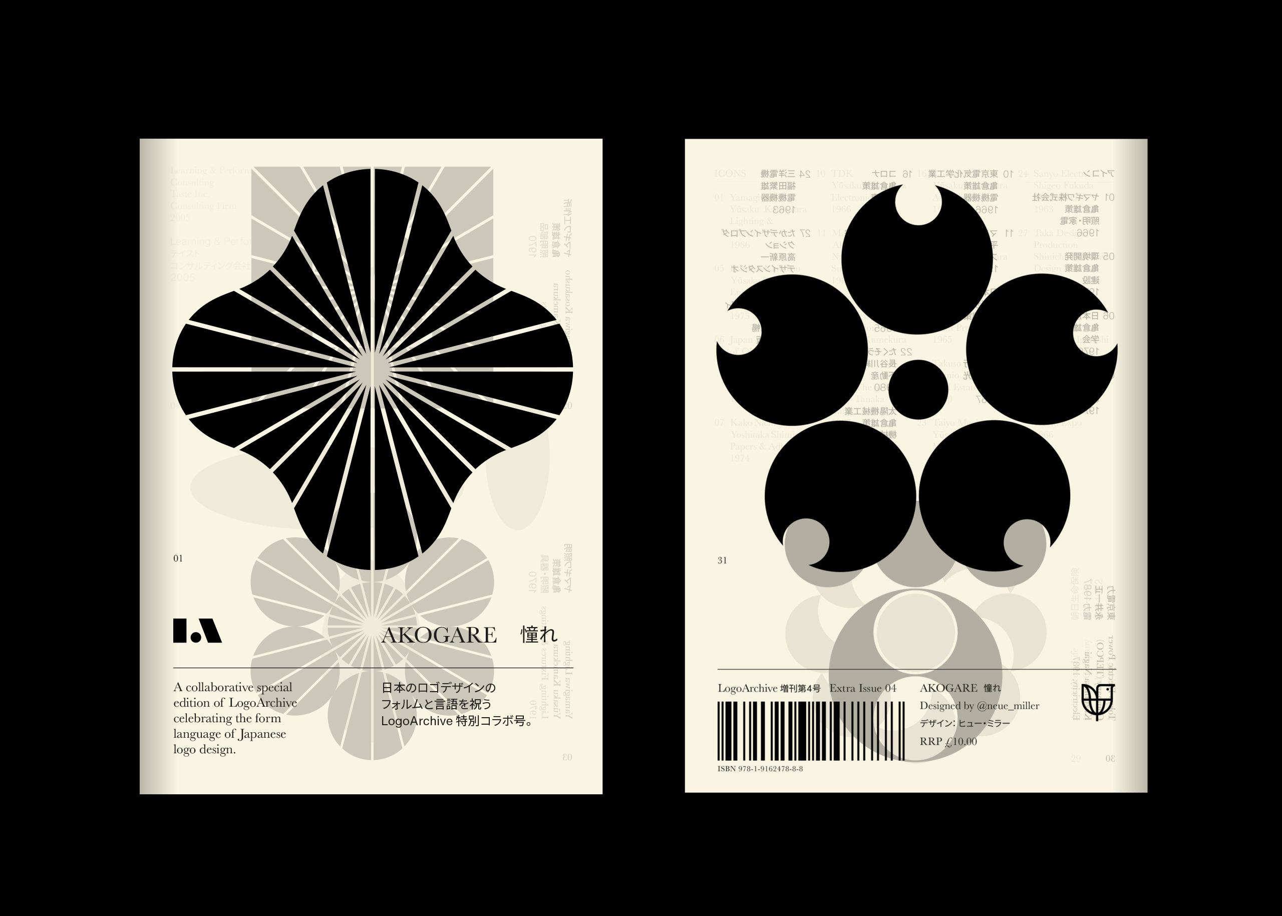
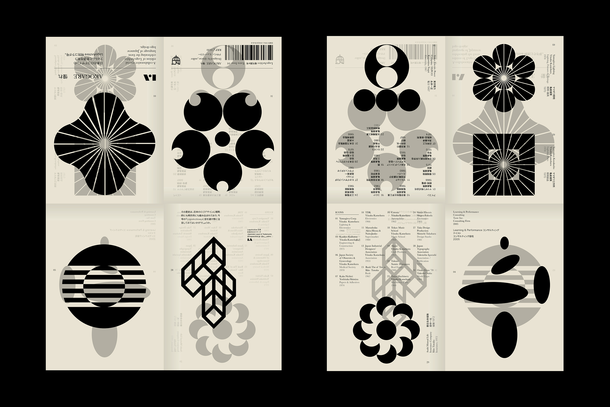
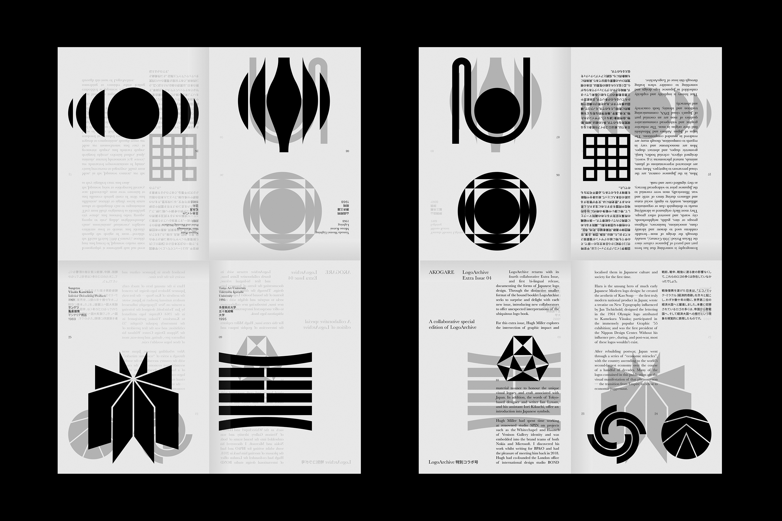
LogoArchive returns with its fourth collaborative Extra Issue and first bi-lingual release, documenting the forms of Japanese logo design. Through the distinctive smaller format of the bound booklet LogoArchive seeks to surprise and delight with each new issue, introducing new collaborators to offer unexpected interpretations of the ubiquitous logo book. For this Extra Issue, Hugh Miller orchestrates graphic impact and material nuance to honour the unique visual legacy and craft associated with Japan. In addition, the words of Tokyo-based designer and writer Ian Lynam, and his assistant Iori Kikuchi, offer an introduction into Japanese symbols.
Order LogoArchive zines here.
And subscribe to Logo Histories here.
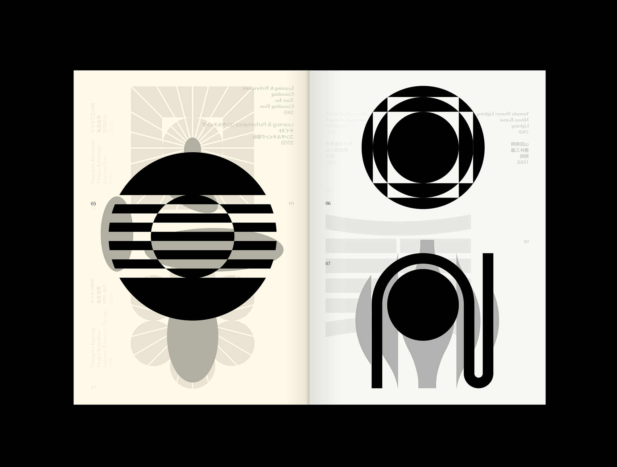
Hugh Miller had spent time working at renowned studio SPIN on projects such as the Whitechapel and Haunch of Venison Gallery identity and was embedded into the brand teams of both Nokia and Microsoft. I discovered his work whilst writing for BP&O and had the pleasure of meeting him back in 2018. Hugh had co-founded the London office of international design studio BOND and, under his direction, had produced a string of projects that wove together elegant ideas, visual sophistication and material subtlety. When it came to the design of this Extra Issue, which required cultural insight and a sensitive and delicate hand, Hugh was an obvious choice, and a pleasure to work with. His insightful and creative approach honours the craft and care of the logos presented in this issue of LogoArchive.
Akogare 憧れ
Akogare, like many Japanese words, is loaded with cultural nuance, and is difficult to translate directly to English. The LogoArchive booklet affords us the chance to better express this through more than just words, to use the culminate effect of words, logos, paper, process and assembly to better express its meaning.
As a starting point, and as I put the idea to Hugh, Akogare could be understood to a Western audience as a deep feeling of respect and admiration one may feel for someone they greatly look up to. Usually this is someone who is far more talented. This feeling of akogare is tinged with the understanding of one’s own shortcomings and the knowledge that that same level of talent is unattainable, and this is where the feelings of yearning or longing can come in. This perhaps best describes the feelings evoked when working on this LogoArchive Extra Issue. The zine seeks to make concrete abstract concepts, and attempts to evoke a similar feeling in its readers as they unfold the booklet.
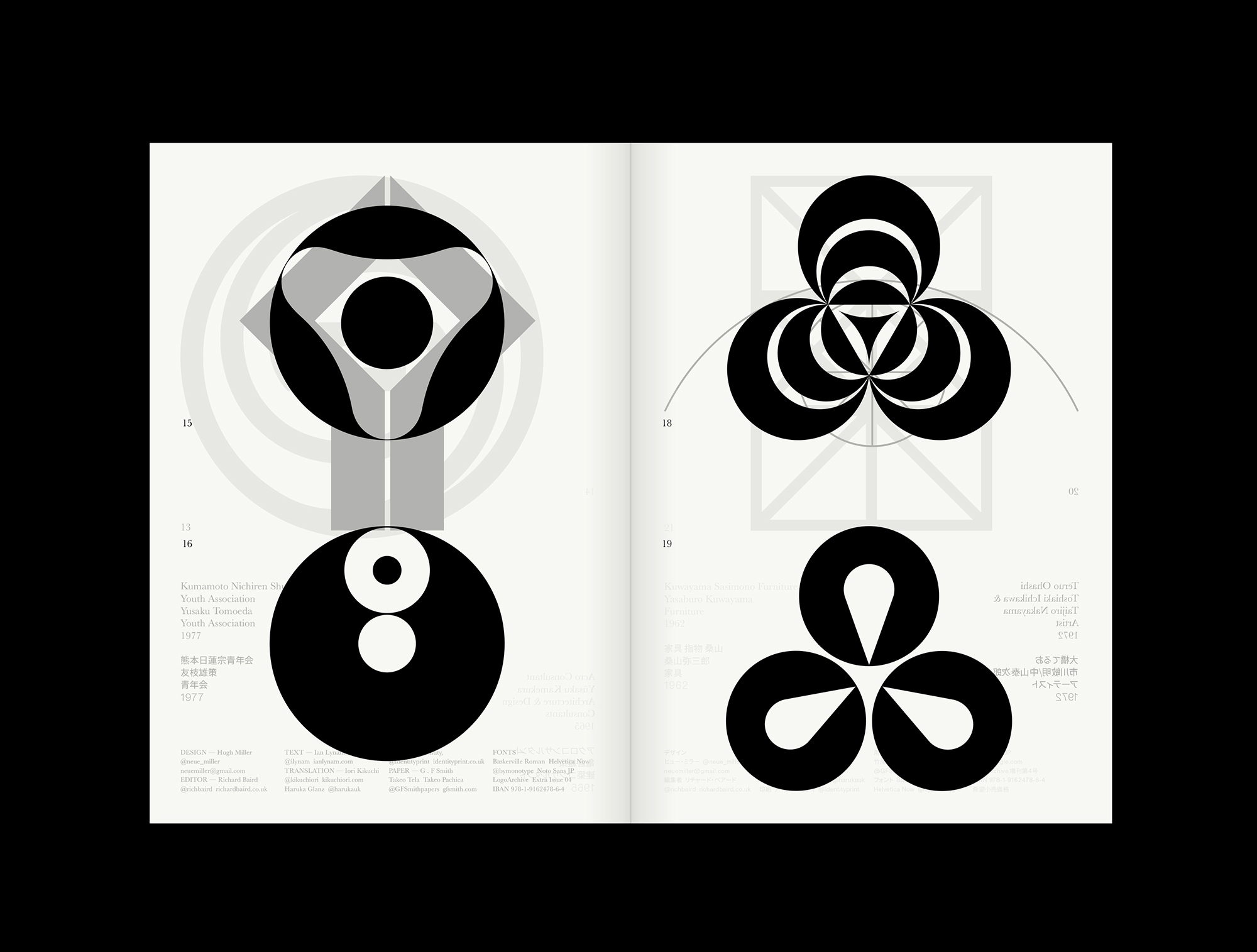
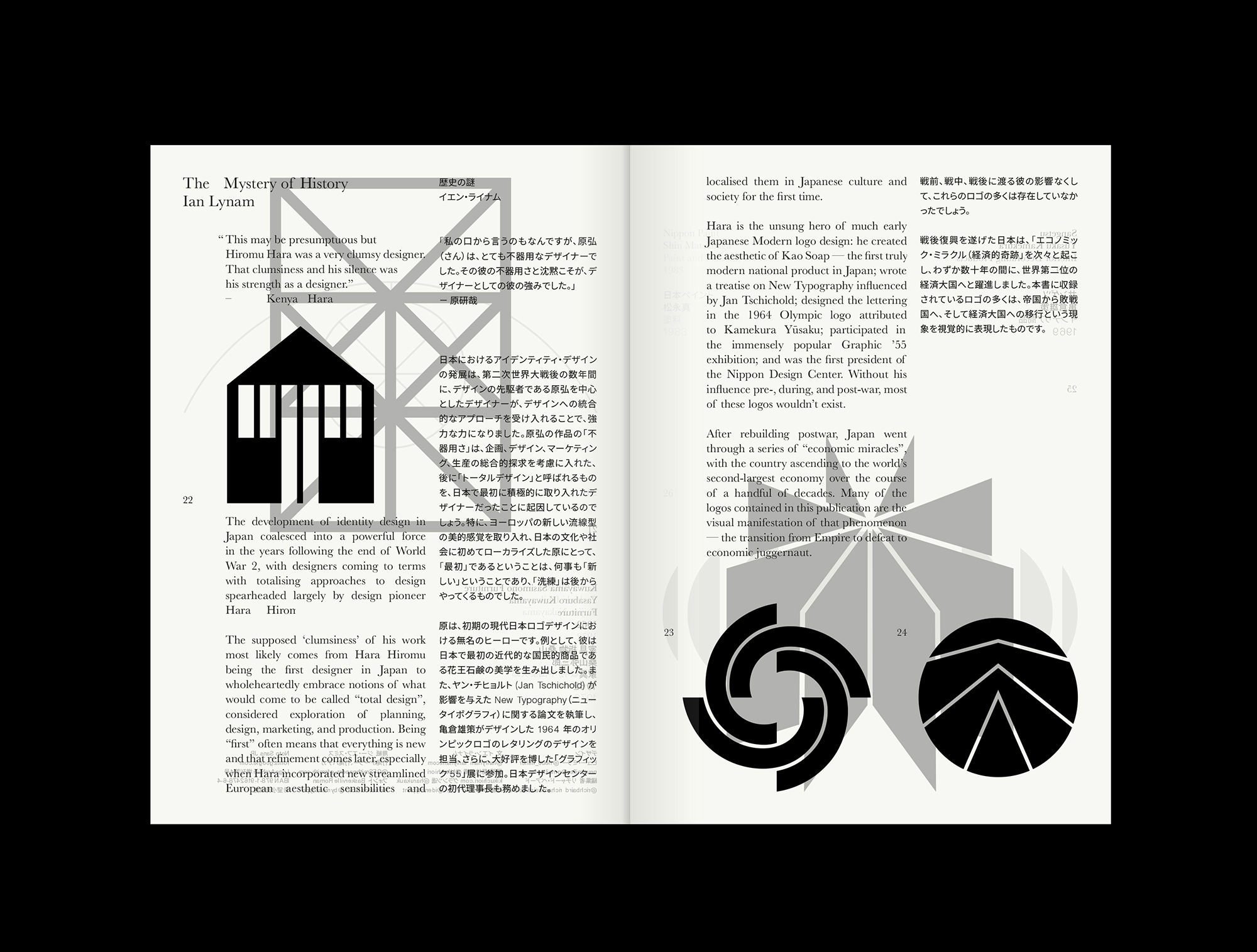
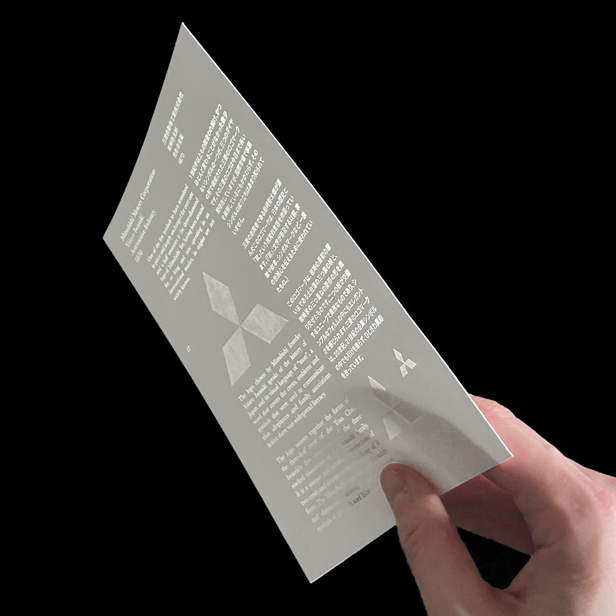
The zine is more than just its material manifestation, but a platform to talk about a few different ideas and across a number of different spaces, be that a talk, small exhibition or a social post, article, meeting or Zoom chat. In this way, and like many of the LogoArchive zine projects, it is a super-narrative. I will be building on this over the coming months. As a small lead into some of these ideas, commonalities and culture can be understood in reading Ian’s text on “mon” and the overlapping of symbols using a light 80gsm paper. Themes such as nature, light and a delicateness can be understood in the heat embossed Pachica insert, and the generating of atmosphere and Katachi can be sensed in the textures and unfolding of the document.![]()

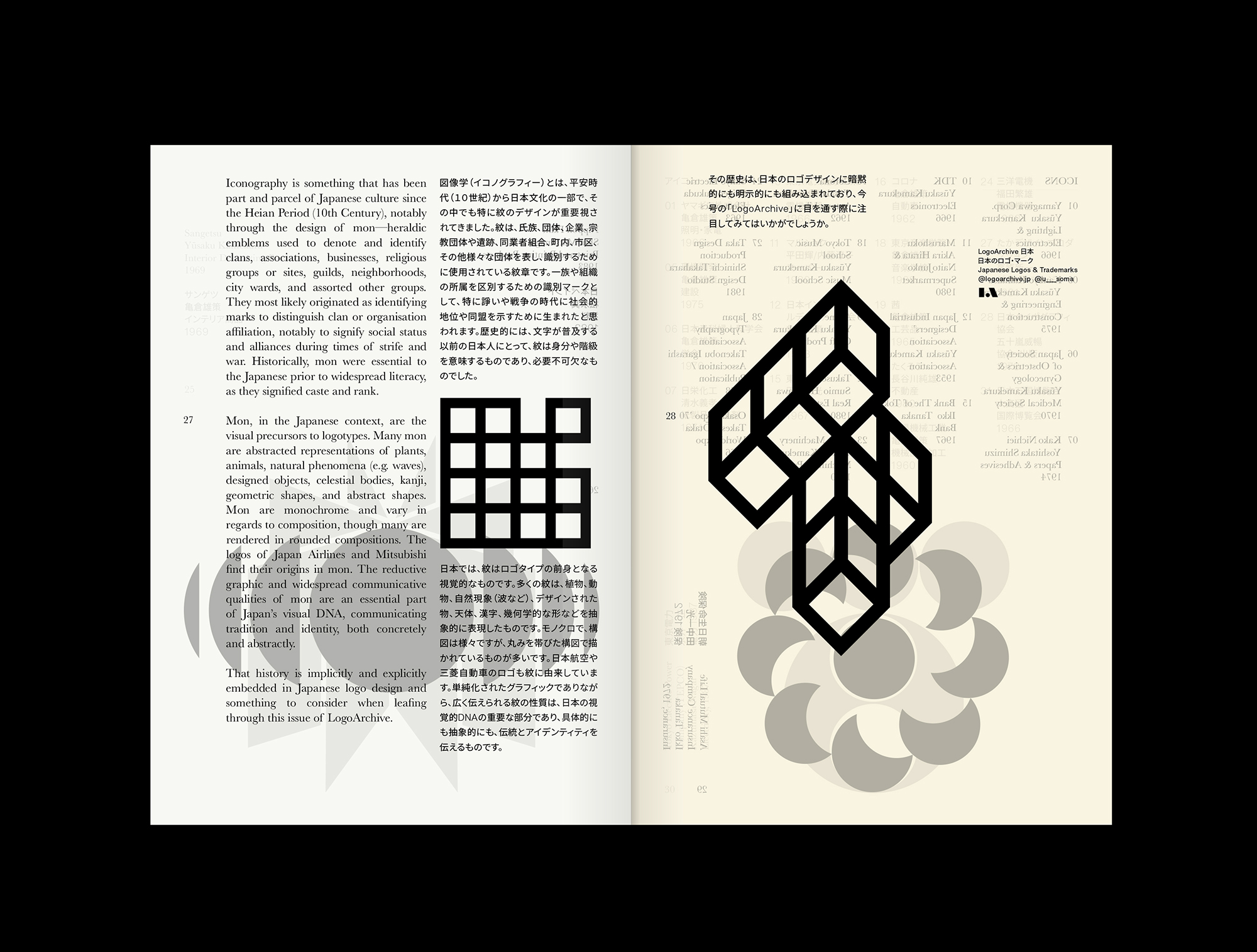
Design: Hugh Miller, Project: Richard Baird, Publisher: BP&O, Print: Identity Print. Paper: G.F Smith. Booklet: Format: 24pp A5 Booklet, Takeo Tela Ivory & White, Litho Black, Loose, x3 A3 folded sheets. Insert: Format: 2pp, Takeo Pachika, Heat Embossed (x2). Discover more about logo design at LogoArchive’s Logo Histories.
