Piedmont Art Walk by Mucho
Opinion by Eleanor Robertson Posted 22 March 2022
Piedmont is a small city in California named after the European region in the shadow of the Alps (from the Italian piemonte, meaning ‘foothill’). Surrounded on all sides by Oakland, the neighbourhood has a population of roughly 10,000 people and an active charity scene. This includes the Piedmont Arts Fund, a nonprofit group that promotes and supports visual and performing arts in schools.
Now in its second year, the fund’s Piedmont Art Walk is an annual event celebrating the rich diversity of local arts and the work of school art programmes. Pavements, gardens and front lawns across the city are transformed into walkable outdoor exhibits for one day each spring, attracting families and art-lovers from near and far, and raising donations for art supplies, books and materials.
This post includes Extended Insights for BP&O Plus members.
Find out more and sign-up here.
In 2021 the San Francisco office of international agency Mucho was invited to develop a new visual identity to reflect the community-orientated nature of the project. The existing logo set a low bar, combining an uninviting military stencil typeface with a medley of default sans serifs. But the success of Mucho’s development is both aesthetic and commercial – in May it generated a huge boost in participants, volunteers and visitors, who ultimately contributed $17,500 for Piedmont public schools.
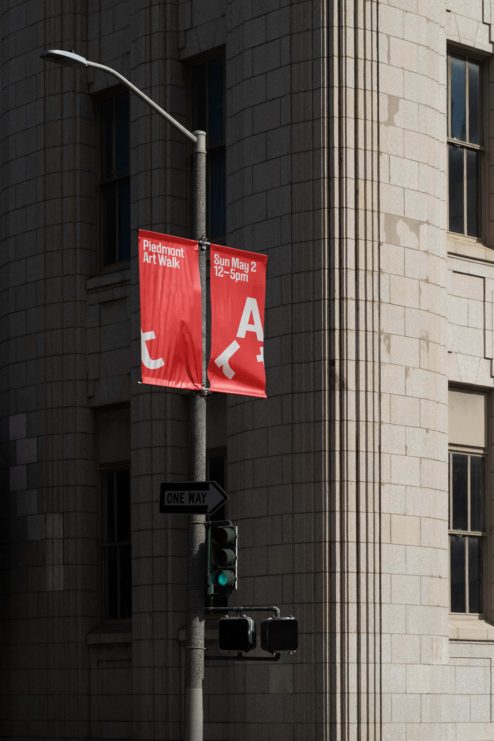
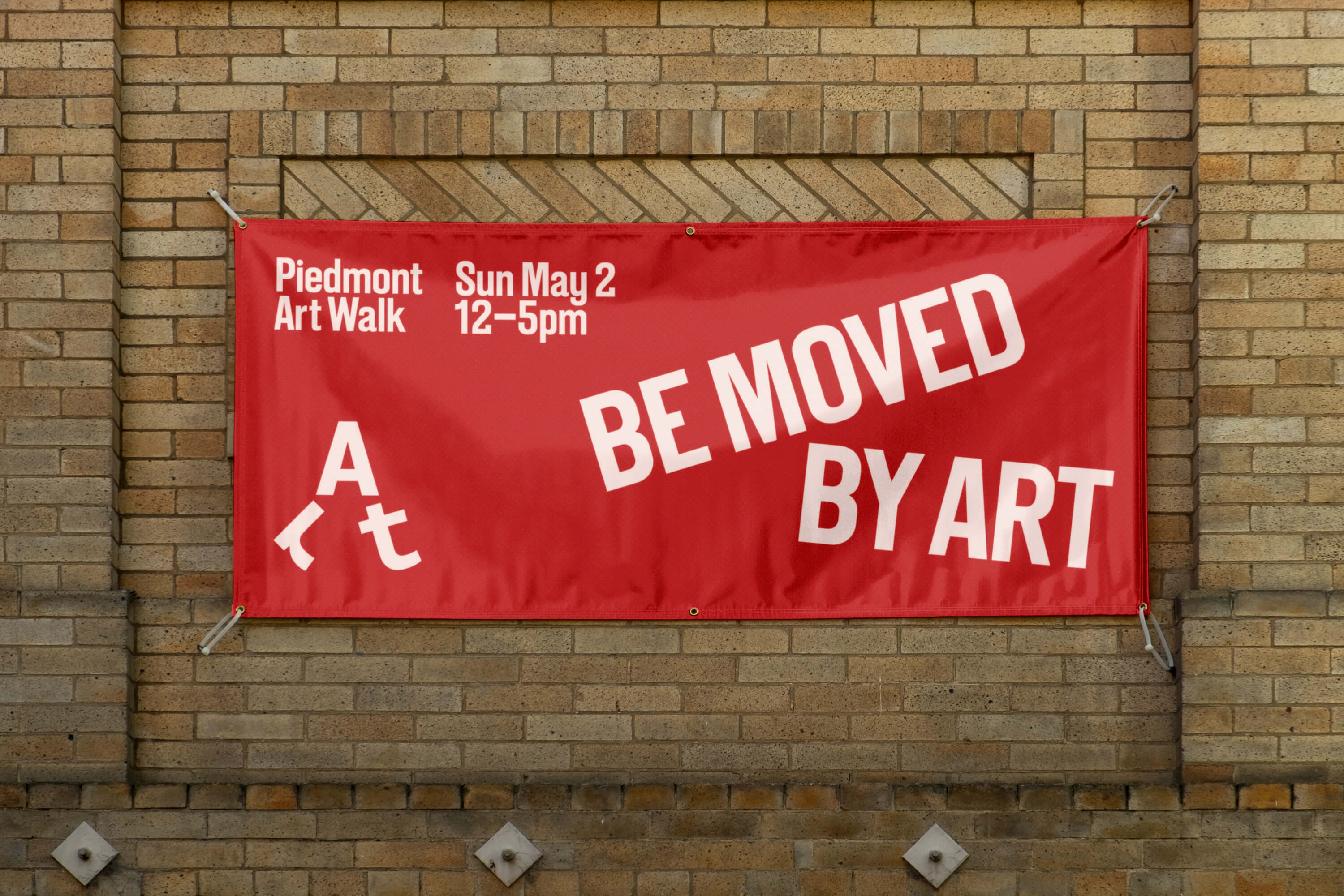
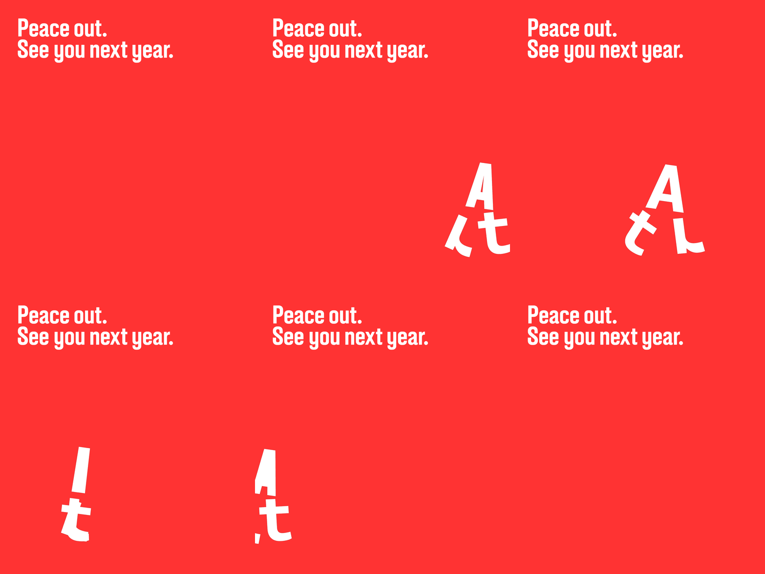
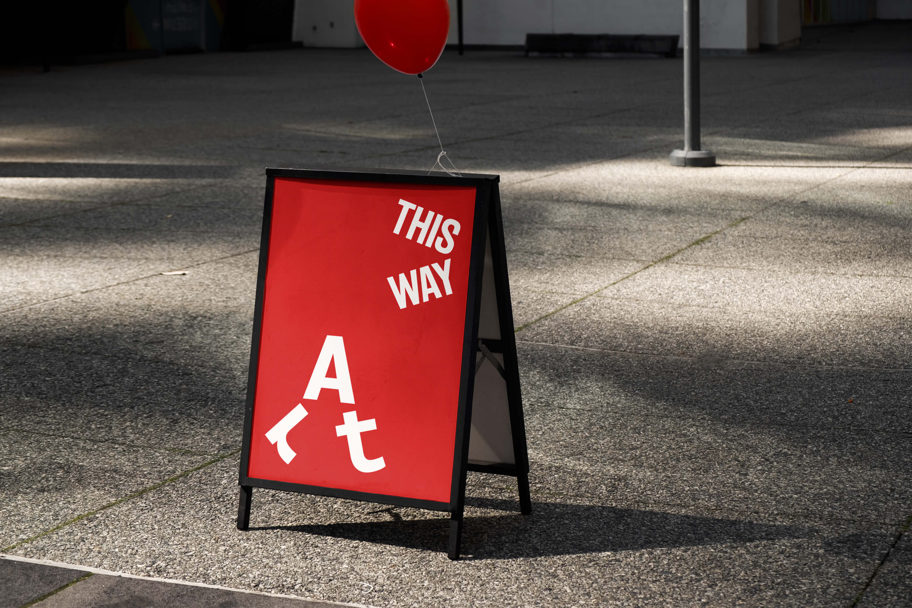
The logo is fun, memorable and family-friendly, transforming the word ‘art’ into a walking character that serves as a recognisable mark across city-wide locations and marketing collateral. It is carefully executed so that the stem of the ‘t’ extends from the stroke of the ‘A’ and the swinging terminals of the ‘t’ and ‘r’ rest on the same baseline. Despite the rotations and reflections, sentence case ensures readability for all ages (it helps that ‘art’ is a three-letter word). This is then supported by A2 Gothic throughout.
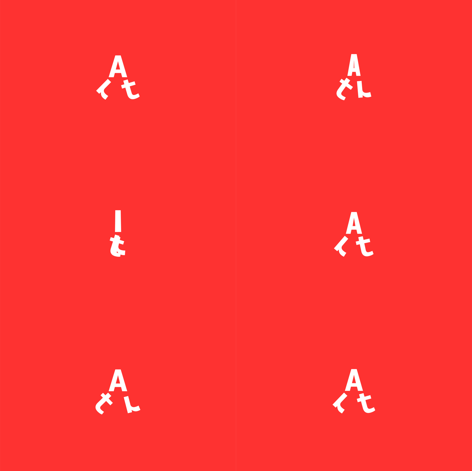
It works big, it works small, but it is most charming when it is animated, walking along with the community and interacting with the work of local artists. The logo’s lively jaunt changes speed and direction depending on its environment, creating comic moments – it struggles to keep pace with a spinning pottery wheel, marches with determination through a field of painted poppies, and slowly moonwalks out of the final frame (‘Peace out. See you next year.’).
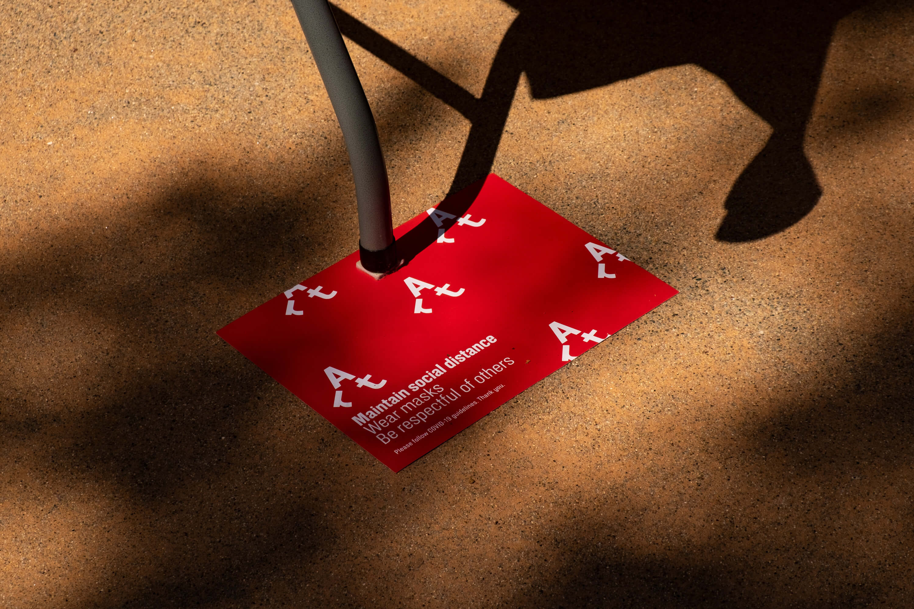
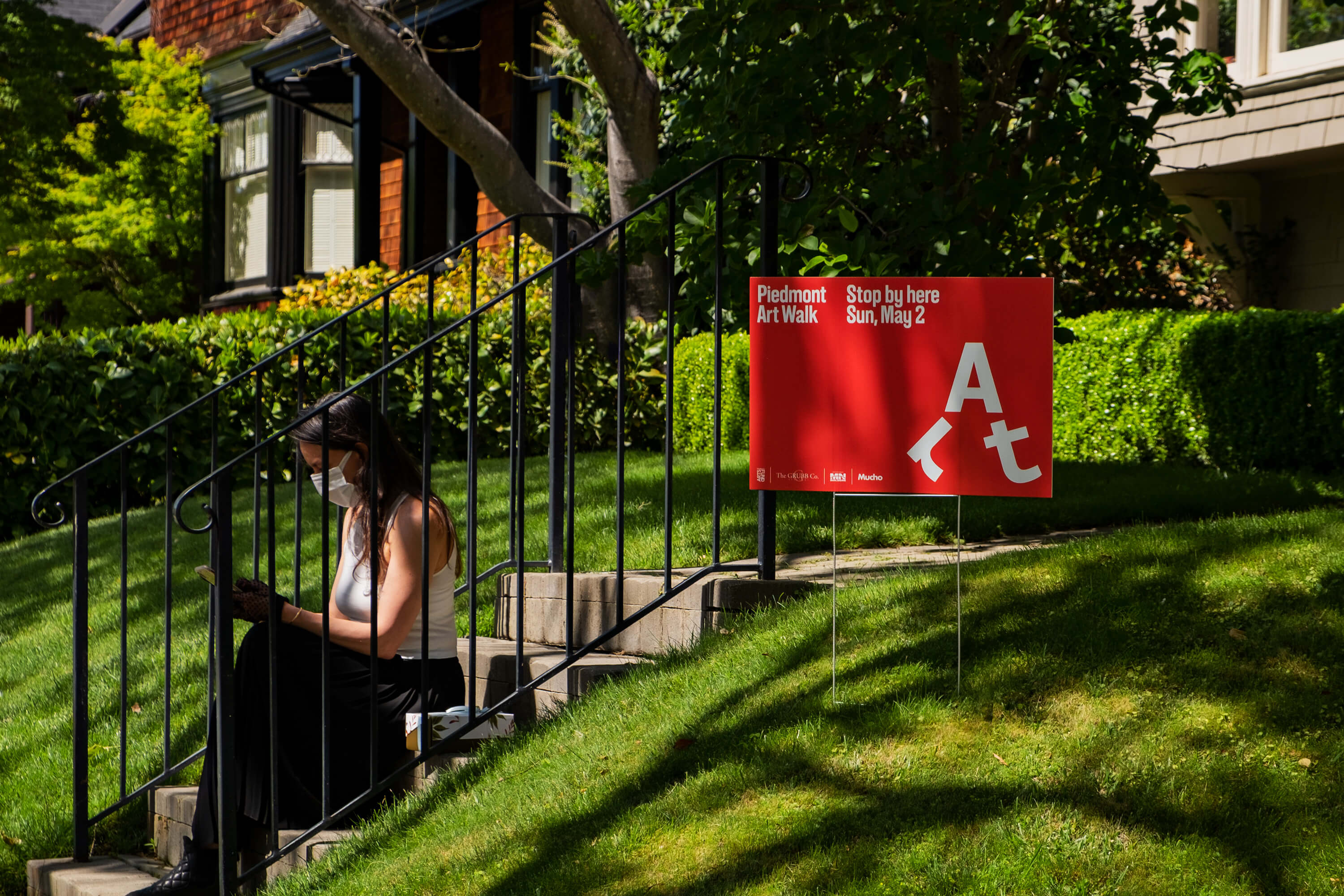
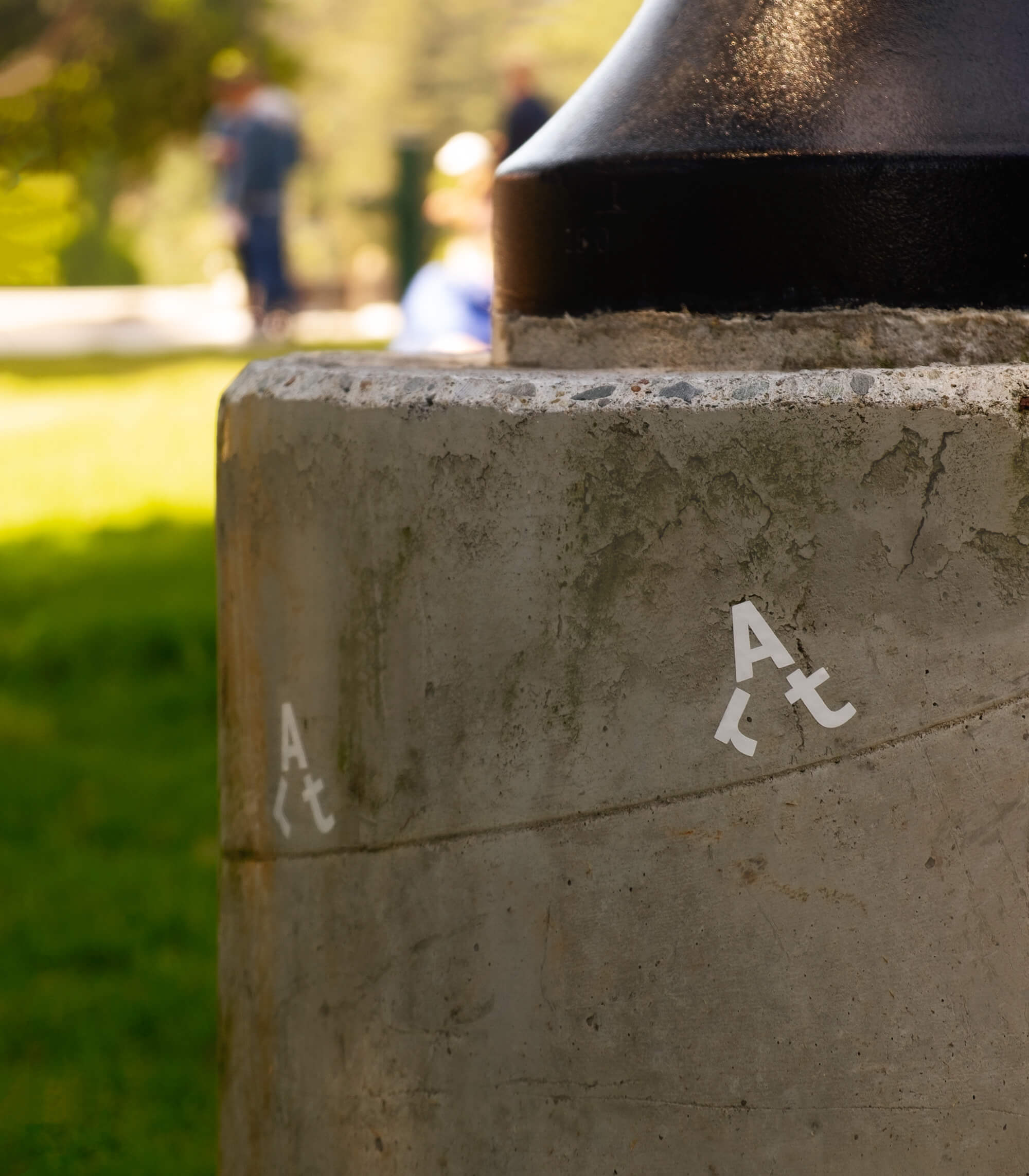
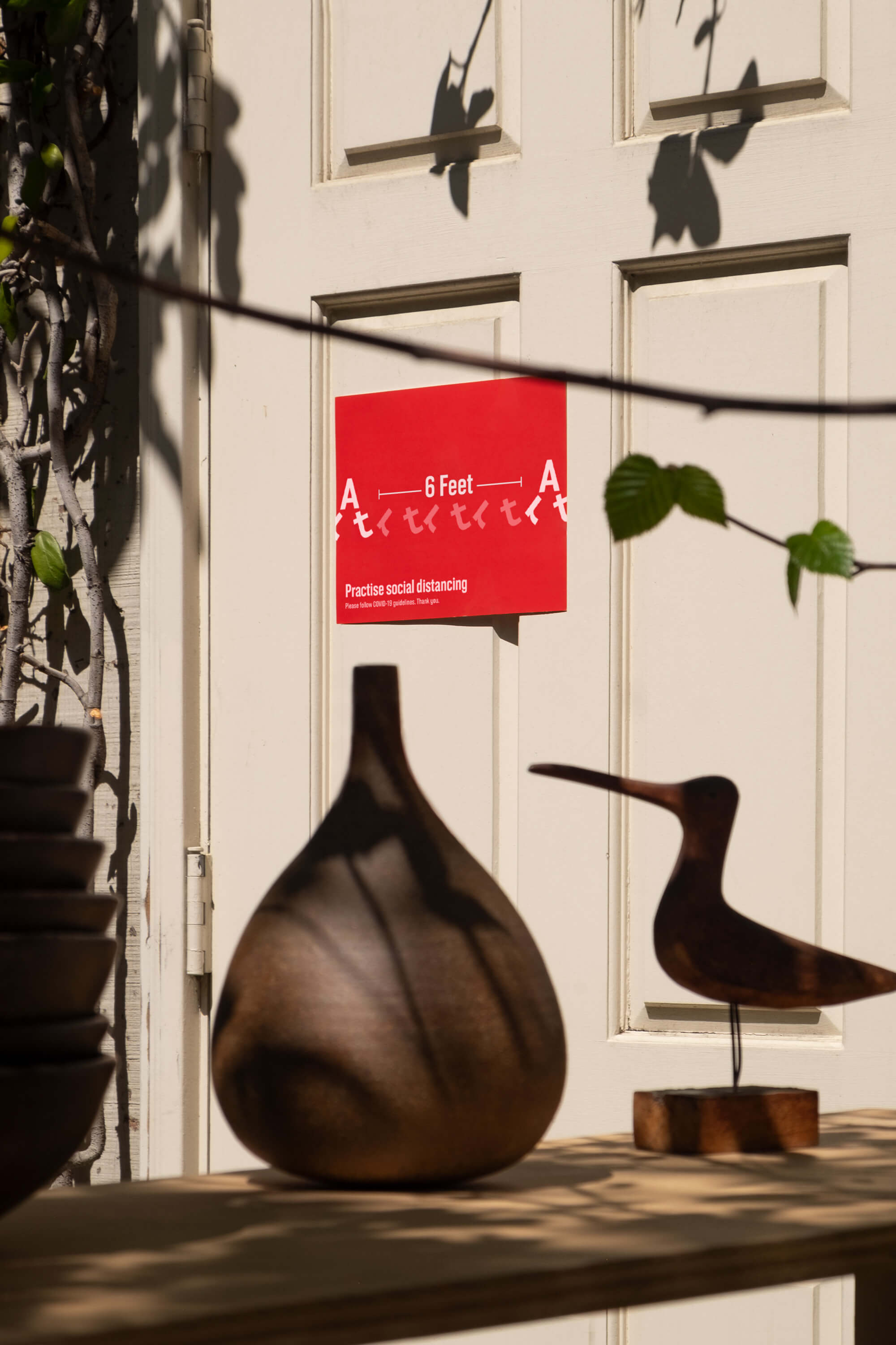
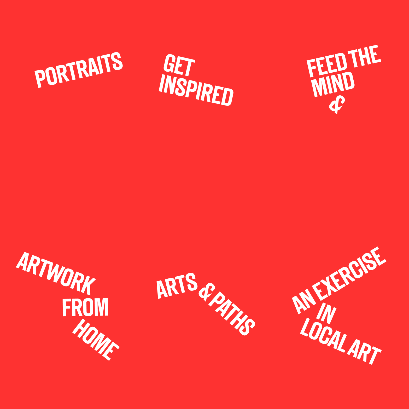
The ‘art’ symbol is supported by a wordmark set in A2-Type’s A2 Gothic, which – despite its bold, condensed structure – packs personality and warmth. The same typeface is used throughout the identity in two weights, providing versatility without complexity. Expressive applications include ‘pathways’ of playful copy lines (‘get inspired and perspired’, ‘an exercise in local art’, ‘portraits and landscapes’) and creative social-distancing signs, which demonstrate the recommended space in ‘six feet’ taken from the logo.
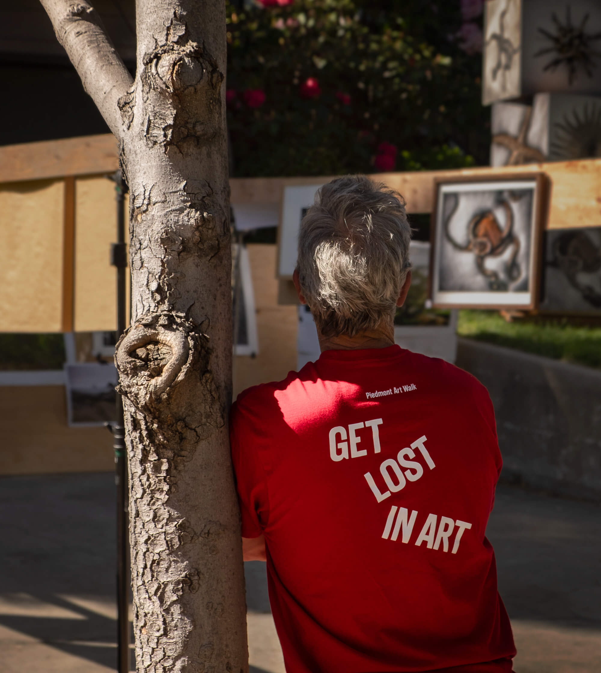
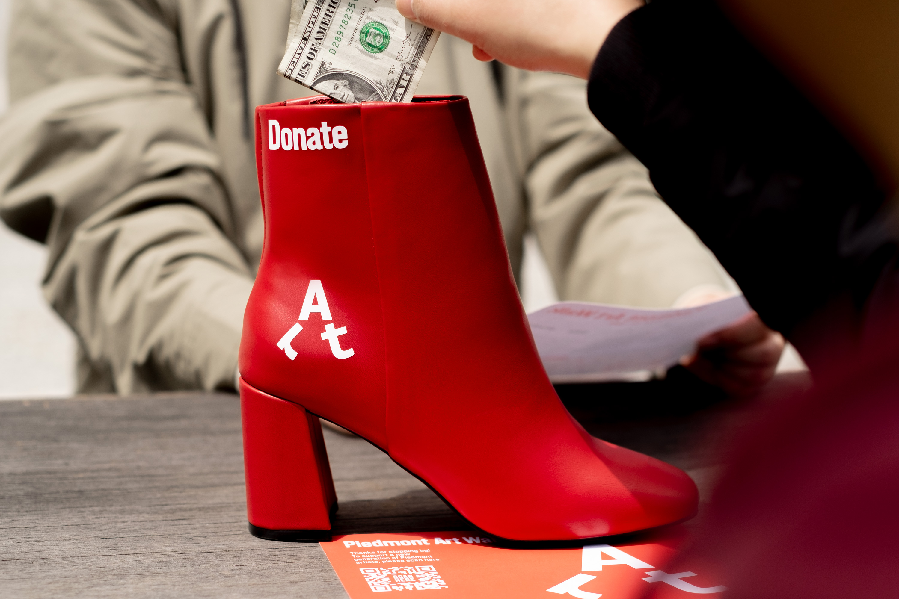
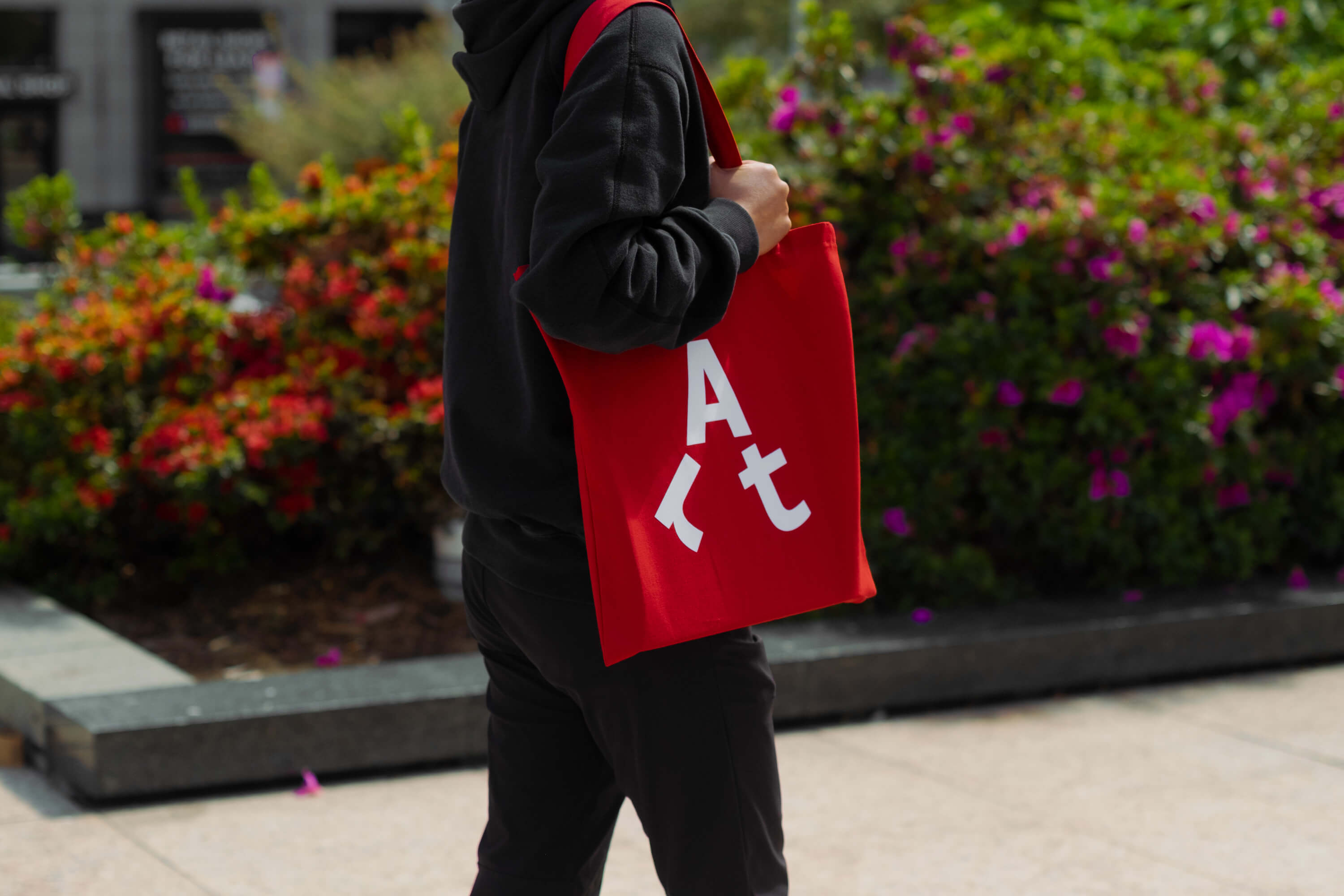
The brand is also unified by an uncluttered red and white palette, which joyfully ties together signage, staff uniforms and merchandise. The traditional collection box is replaced with a witty red boot, and red lollipops are handed to children as rewards. Red is often associated with art and design (The National Gallery and The Met both use the colour in their branding), but it is also a functional, eye-catching choice – its conspicuous consistency builds awareness and familiarity.
The sum of these elements is a confident, energetic brand that feels welcoming, accessible and unpretentious. It’s a long way from the exclusivity of Frieze Art Fair or Art Basel, emphasising activity and discovery. A stamp card challenge generates the excitement of a treasure hunt while the humble red balloon – used to flag participating venues – creates a sense of celebration.
The real beauty of Mucho’s identity for Piedmont Art Walk, however, is the simplicity of its architecture: the logo is suitable for any context, the type-led approach is straight-forward, the copywriting is minimal and the colour system is clear. The details have been considered, and the result is a toolkit of parts that the charity can adapt for years to come – no stress. This is a pragmatic and resourceful approach to design that prioritises the charity’s needs and challenges. It is an act of generosity that will help bring art to everyone.
