Kininvie by Here Design
Opinion by Richard Baird Posted 24 March 2022

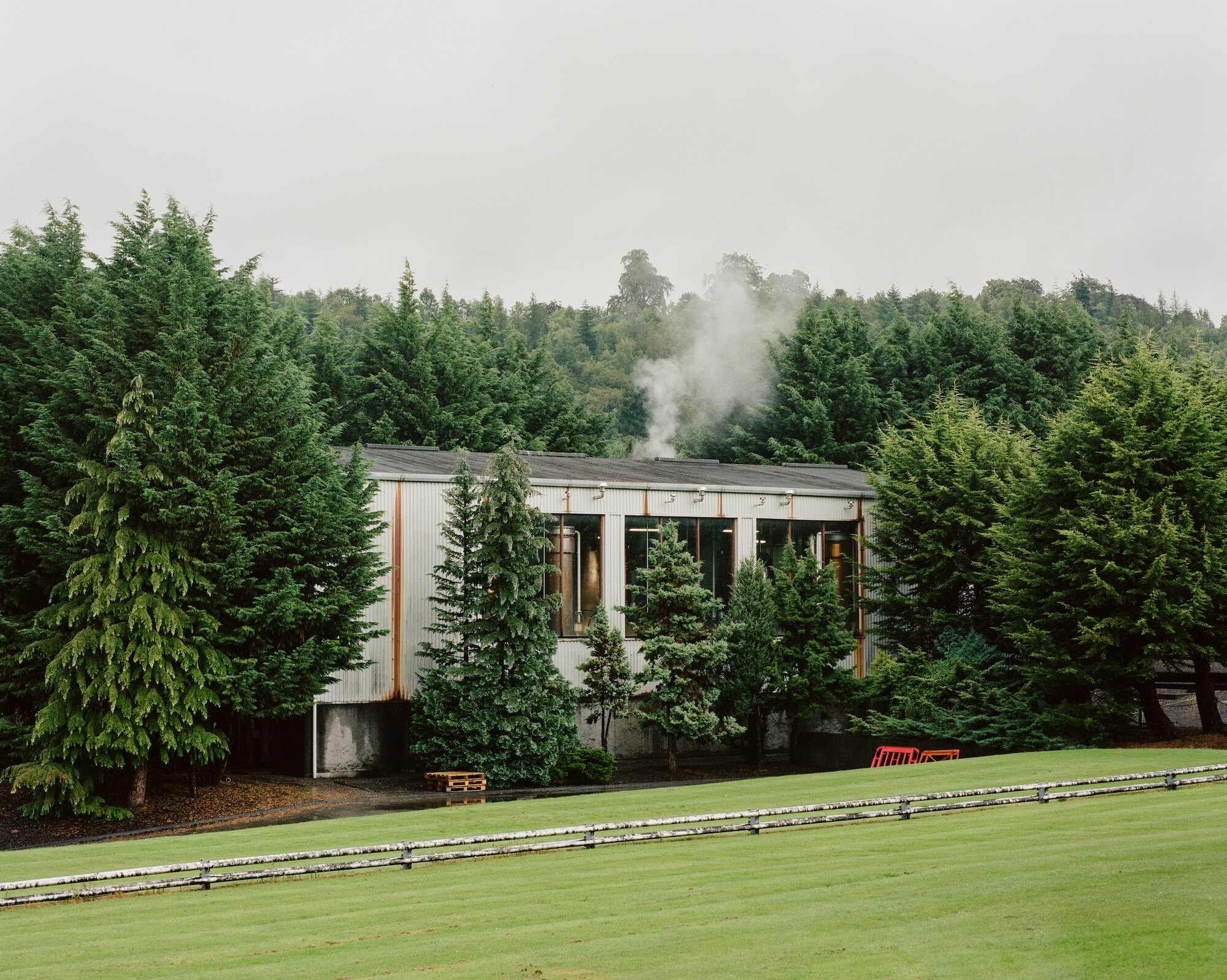
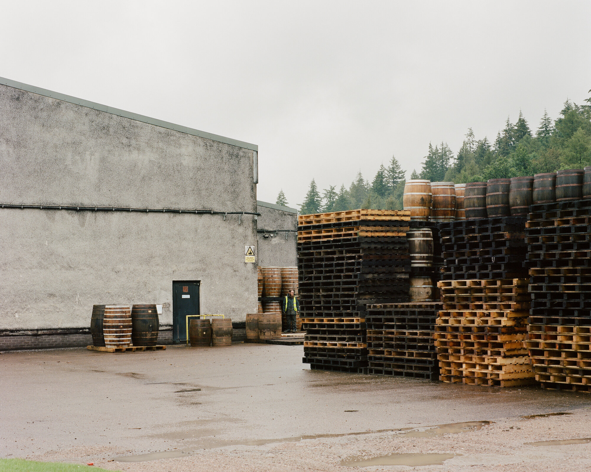
The Kininvie distillery was established in 1990 as a third home for William Grant & Sons – it was initially built to relieve pressure on stock at neighbouring sites in Dufftown. Kininvie Works is a more recent development, created as an innovation arm to develop new recipes and processes. As such it is liberated from the rules and regulations that bind other distilleries and driven by experimentation rather than commercial agenda.
While Kininvie’s focus is on process not product, in 2019 the distillery decided to release three of its experimental whiskies through e-commerce channels (another experiment perhaps). The product range includes a triple-distilled single malt, a single grain, and a single distillery blend, each a rejection of the usual traditions of distillation, in its own way.
This post includes Extended Insights for BP&O Plus members.
Find out more and sign-up here.

Here Design was tasked to create a brand and packaging for these experiments to reflect the distillery’s belief that ‘every part of the process is an opportunity’ through design. The logo stands out for its simplicity in the world of Scotch – ‘no Scottish stags, no rolling hills’, just paired back Helvetic contained within a simple black band. It’s industrially practical and efficient, with the default aesthetic of a Dymo label.
The product naming continues to develop this narrative, which each whisky named by a code referring to the distillery (KV), the spirit type (SM, SG, SB respectively), and the batch number. This unconventional system lends itself to the e-commerce market, where names are less crucial than in a bar or restaurant setting where recall would prove challenging.


Packaging for products sold purely through e-commerce comes with its own set of both changes and benefits. The narrow bottle structure has an integrity that is suited to post, but as Chris White notes in his Edinburgh Whisky Blog, the hip flask shape does summon unfortunate associations with ‘those who partake in drinking whisky out of brown paper bags on park benches’.
Nevertheless, it’s a unique silhouette in the whisky world, again demonstrating a brand that’s not afraid to be unorthodox. The deliberately default shape also realises a statement from the Kininvie manifesto – ‘the bottle is just a container’ – by keeping attention on the liquid within. It’s an approach driven by function over form and results in a robust fit-for-purpose impression.

An advantage of packaging for e-commerce is that it is not burdened by the need to stand out on shelf, or next to competitors, which often allows for exciting and unconventional design results. Here has made use of this opportunity by creating a label that reveals more with each glance. In the supermarket where products must communicate quickly, it would seem busy, but here it serves to capture the effort and attention that goes into every bottle.
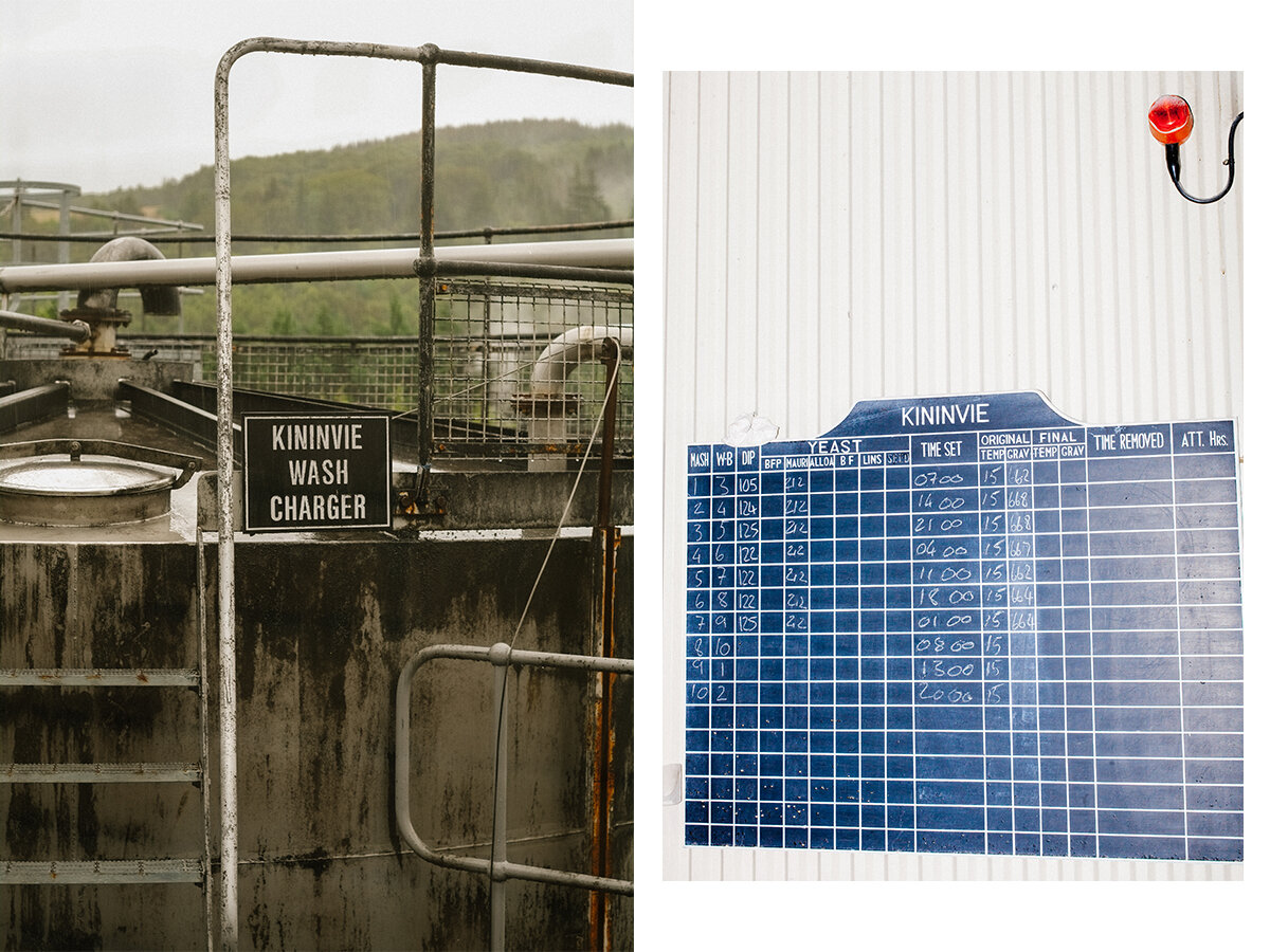
Unlike other whiskies, Kininvie’s story is not told in nose, tasting notes and finish but in objectives, experimental trials, variables and observations. On pack, ‘the hand, the mind, the eye of the distillery crew and their process, their theories, their experiments are what you’ll learn about’ with each bottle offering a glimpse into the scientific process.

It’s a design challenge to create a label that looks so effortless, appearing utterly utilitarian, and yet with the craft and detail needed to give the bottle the premium feel this product deserves. Muted pastel colours create a sophisticated feel when partnered with Helvetica and a vibrant accent of mono-spaced Carson-esque grunge (a Dafont gem called ‘Merchant Copy’, or ‘Customer Copy’ when licensed). This is used for variable information, such as the unique batch code and experimental raw data, which makes the design ever-changing, reflecting the unconstrained nature of the distillery.
The colourful labels contrast with the secondary packaging, which is stripped back, minimal and paired with a diagram of a mash tun. The purity of the outer packaging heroes the product and amplifies its clarity while details of the process add layers to the story as it is unboxed. In this scientific experiment, the whisky is the report and proof of process. On top of all of this, the packaging is 100% recyclable, proving we don’t need to sacrifice on beauty to make things better for the planet.

Pack photography continues to reflect the brand ethos of functionality, with direct front-on product shots set against an off-white background. In several key visuals, Here Design has chosen to include ‘behind the scenes’ workings of the photoshoot, again reinforcing the importance of process and production.
Whisky is a category steeped in signifiers, stories and contextual codes which are all rejected in the packaging created by Here Design. The studio has captured Kininvie’s driving force of experimentation and passion for process, and the result is as beautiful and pleasing to the design world as it is to the whisky world – which is not, by any means, an easy thing to succeed in doing.