Sitko Pizza Co. by Werklig
Opinion by Richard Baird Posted 14 June 2022
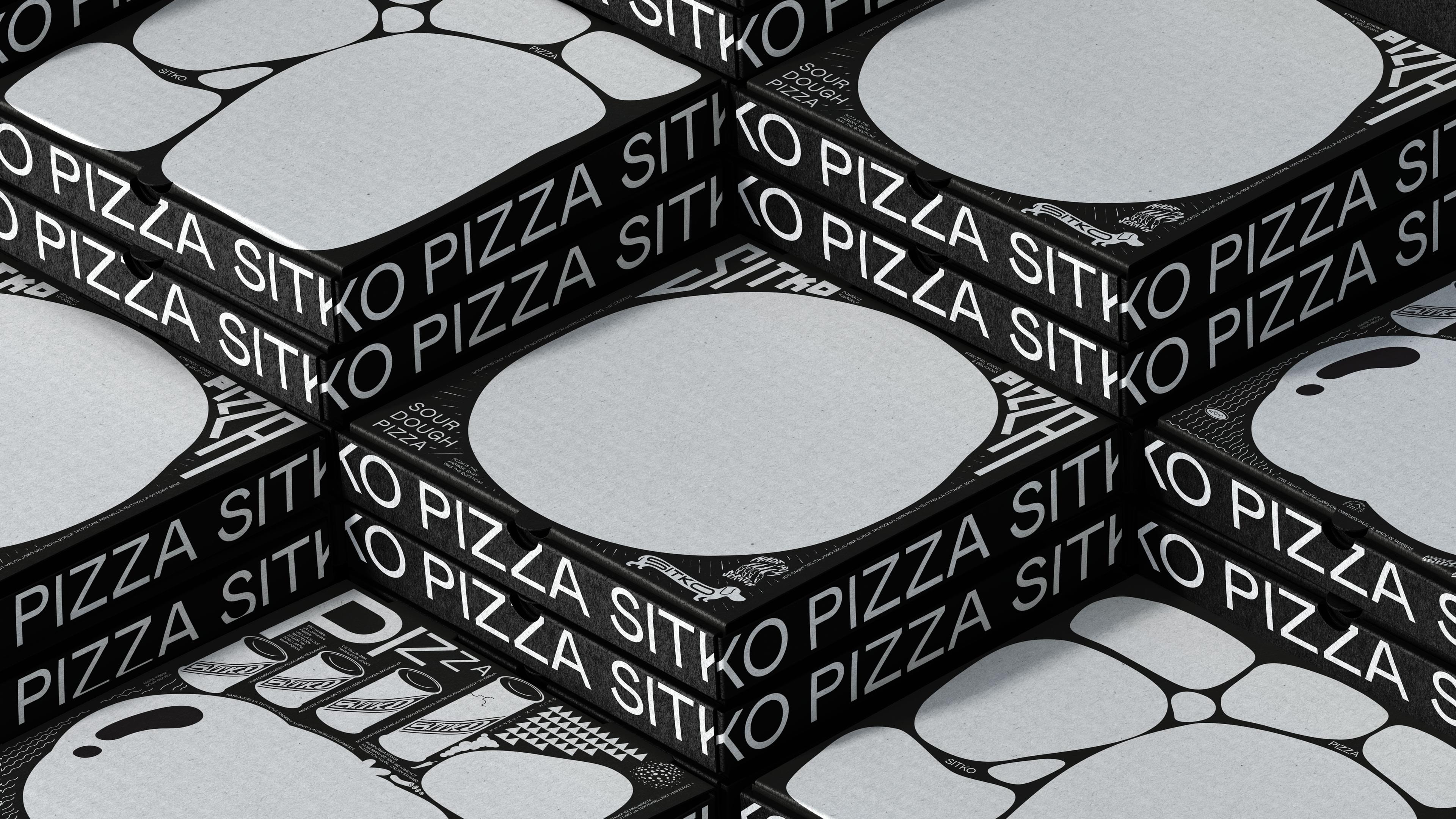
Pizza making is a lot like brand identity design. It has many potential configurations: it can be generic or wildly individual, but fundamentally, it’s systematic, a framework of organised elements. It is a base that holds a variety of communicative assets and techniques (the toppings, if you will). Appeal is determined by how well this is orchestrated, and how well it draws in or accommodates individual interests and requirements, and culminates in a sense of identity or flavour.
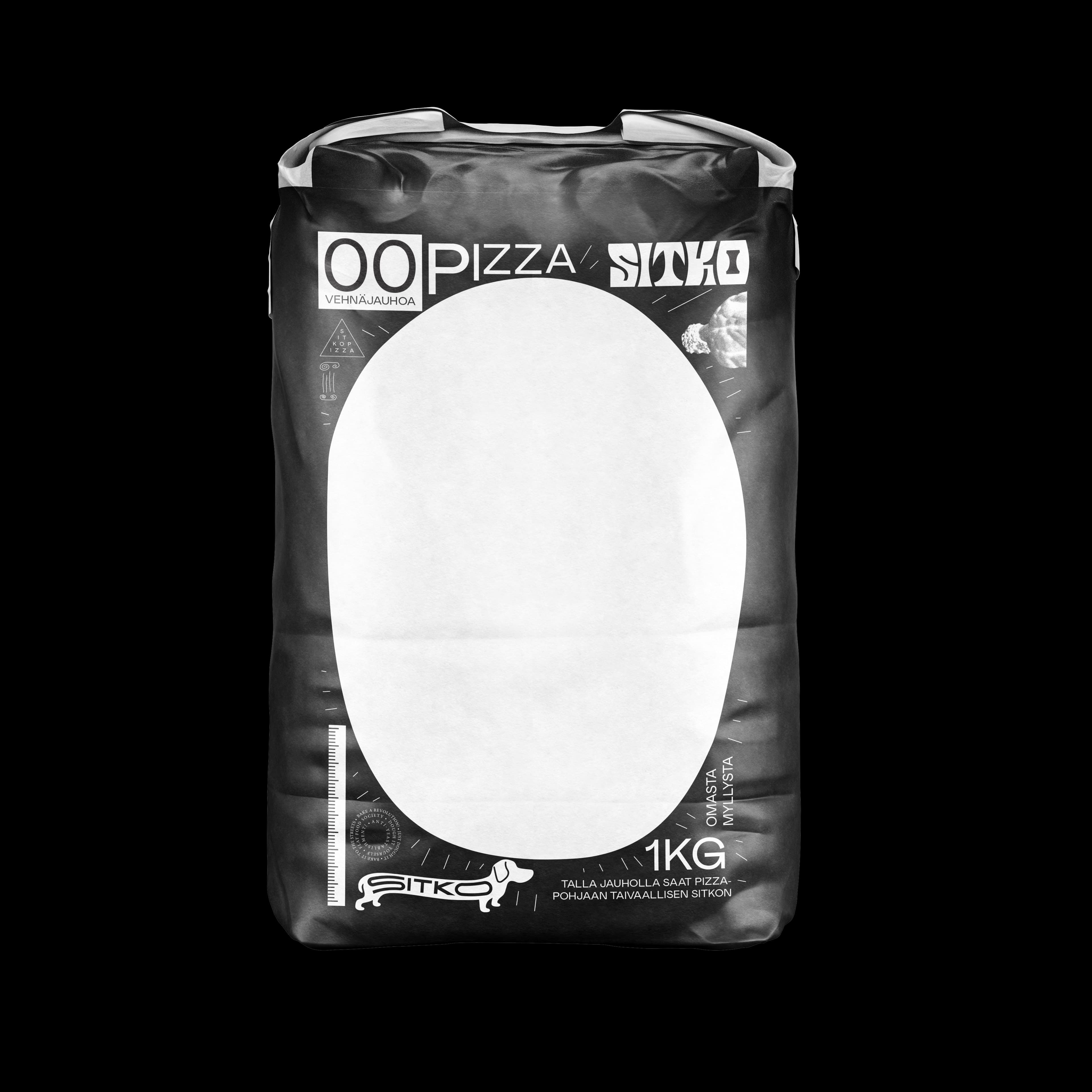
This is, perhaps, the best way to view Werklig’s strategic brand identity for Finnish sourdough pizza company Sitko. The brief was to ‘sprinkle on some punk rock’, which the studio interpreted as an exciting starting point to get lost in a variety of (sub)cultures – not just punk rock, but but an underground world of individual expression.
This post includes Extended Insights for BP&O Plus members.
Find out more and sign-up here.
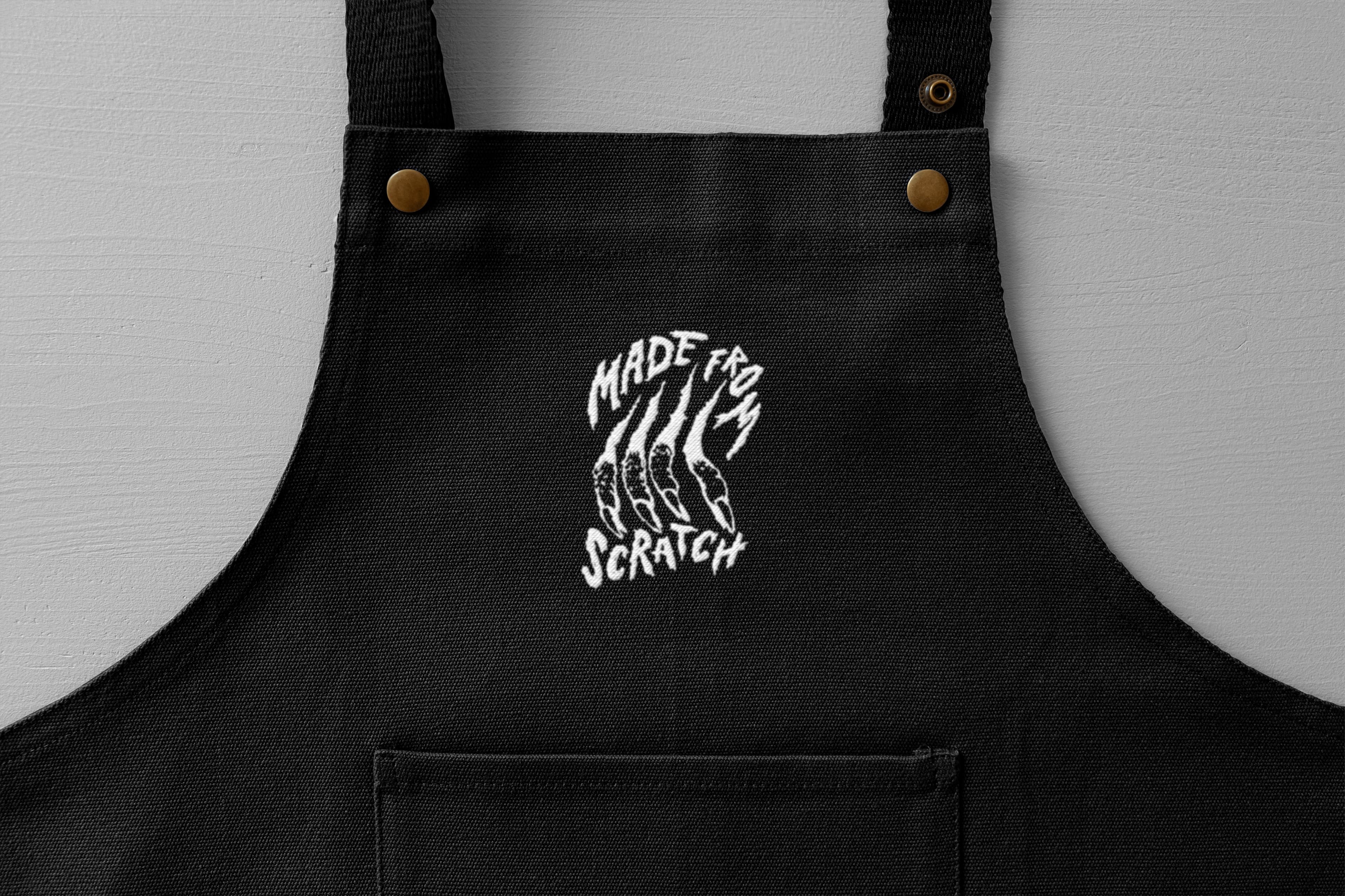
It would be easy to draw upon these genres to create a default ‘counter-cool’ aesthetic, but in this case the design cues are deeply rooted in the founder’s own background as a graffiti artist and created afresh by the Werklig design team, with its own connections to the scene. The allusions are far too numerous, abstract and sub-sub-culture for this reviewer to identify – but that is where the work’s strength lies. Like pizza, there’s something for everyone, no matter how strange or unconventional that may be.
This is the topping. It could have been a cacophony of disparate references – diversity with no foundational thinking – but this is where the strategic aspect, our base, comes in. Principally, this comes down to the product, which is sourdough and the cultures that produce it. The biological culture of the dough and the subcultures that connect Sitko’s founder to Werklig somehow wrangle everything together.
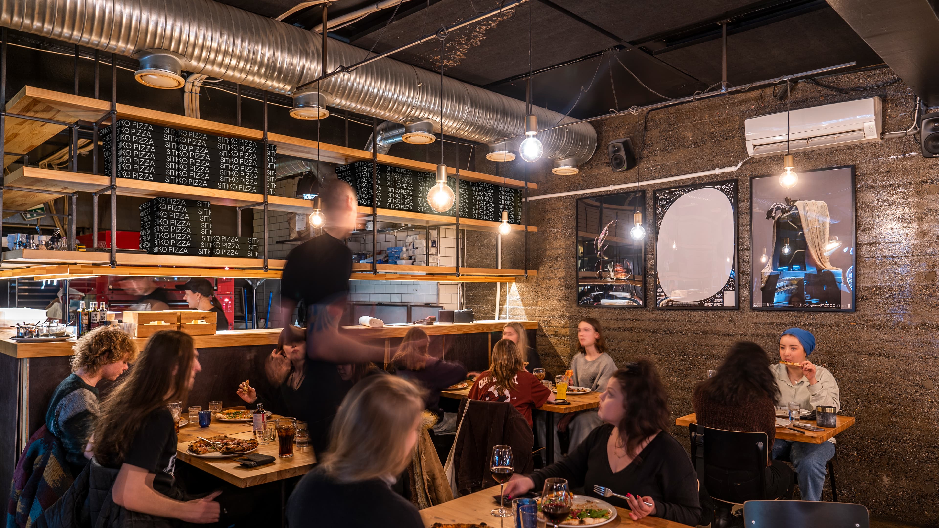
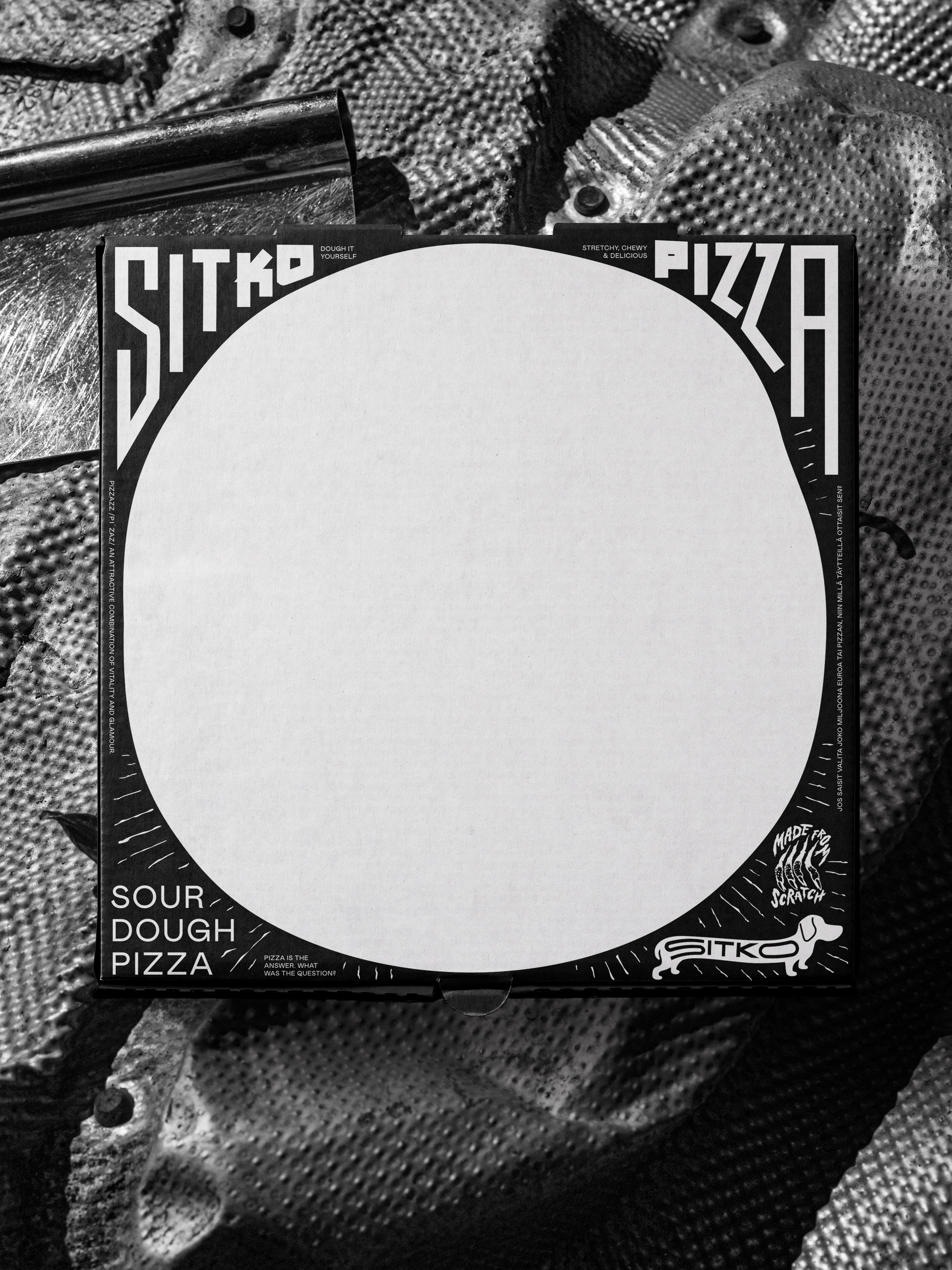
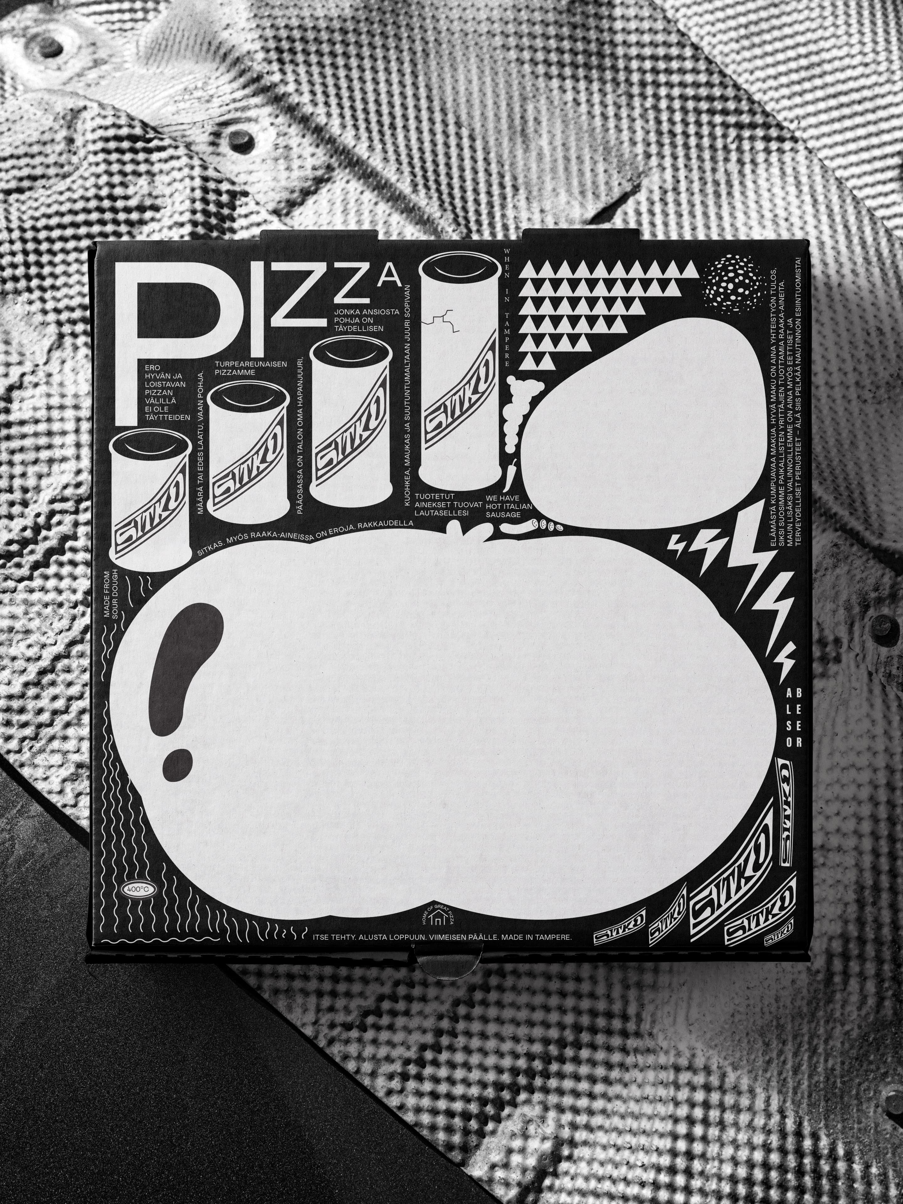
The approach delivers visual intrigue by contrasting bold organic dough-like forms and smaller details up close. The immediately eye-catching, instant visual language of pizza making (through dough stretching) is sprinkled with subculture references – diverse, abstract, familiar, and everything in between – to create a dynamic interplay that draws you in.
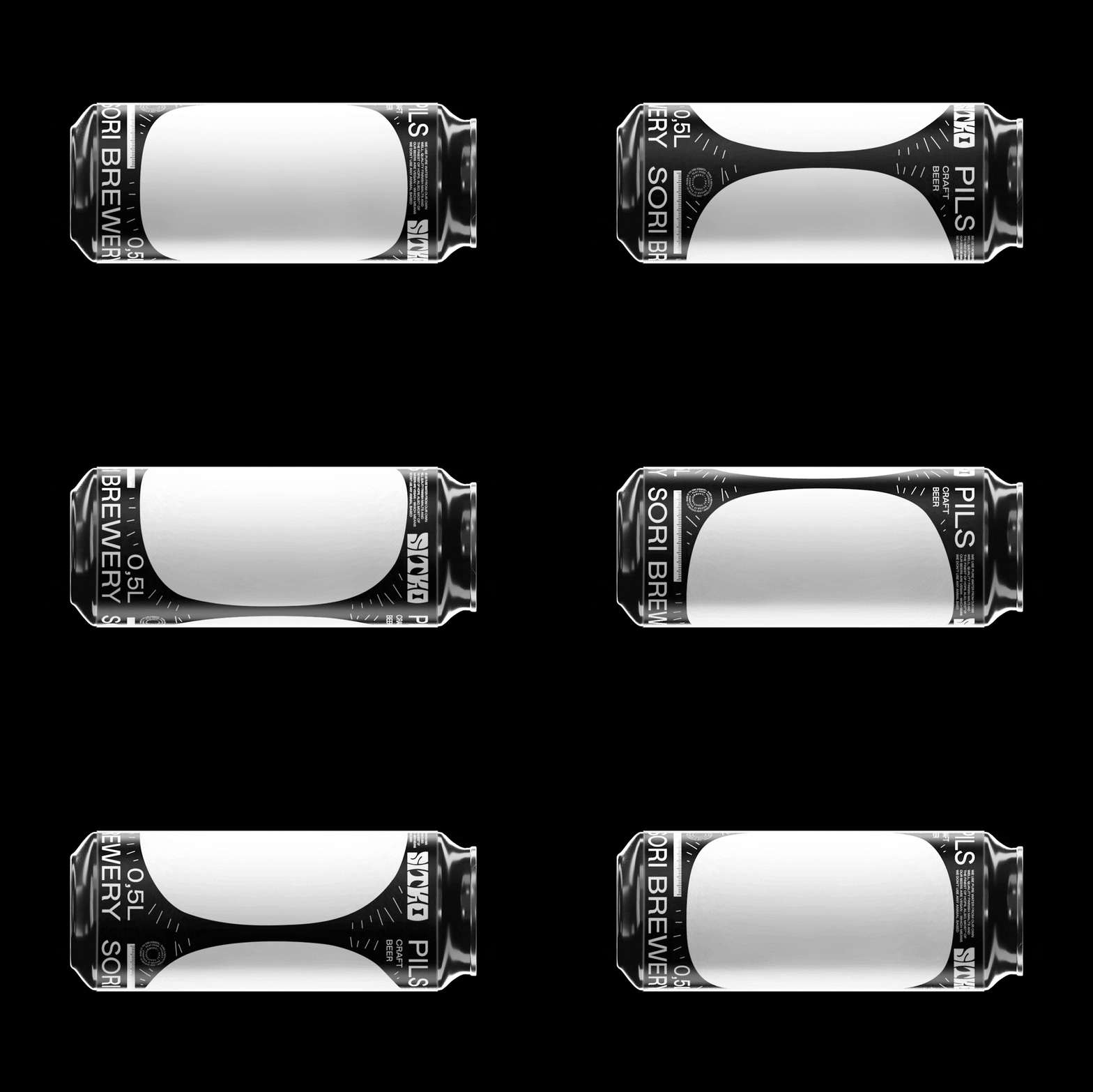
As with craft beer cans, the pizza box becomes an artistic canvas to further the principle idea of art, culture and pizza making colliding to create something distinct and new. It has always been a surface for pizza brands to play with, but often simply as vehicle for a one dimensional tone. From practical structure to art canvas and then Instagram post makes an impressive series of leaps that, now looking at it all, seem obvious.

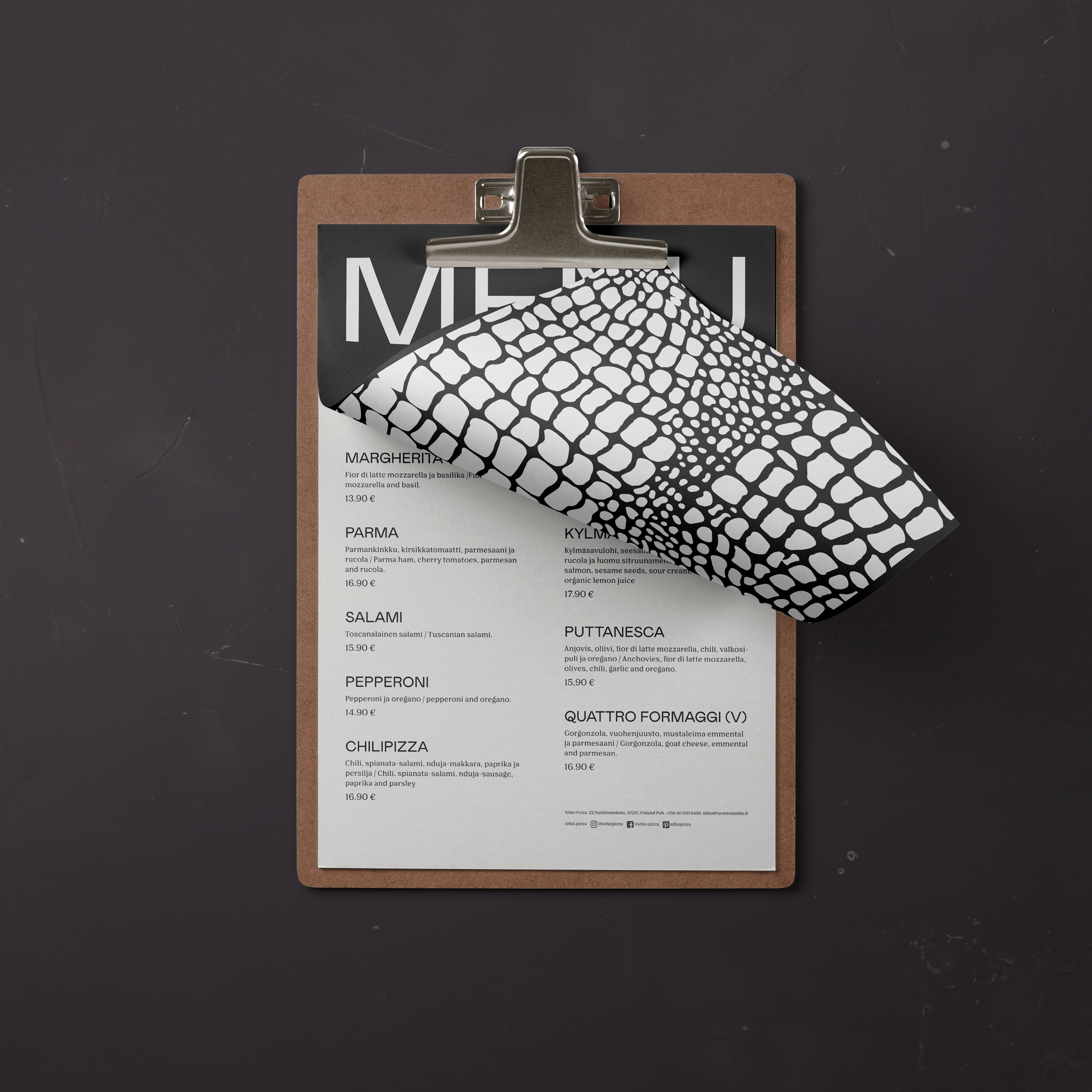
While Werklig have used a variety of graphic and print techniques, the project really gets going in motion. The website introduces playfully elements, such as dough that stretches as you scroll, an extending sausage dog, looping illustration, crocodile and zebra-like patterns, alongside Mabry and Nib from Colophon and repeated text.
The website itself feels like it’s drawing on graphic design subculture – a response by a younger generation to the formalised and consistent rules of branding from the 2010s and emerging web technologies. But it’s important to note that none of this feels like pastiche or appropriation. It’s deeper, more abstract, less mainstream.
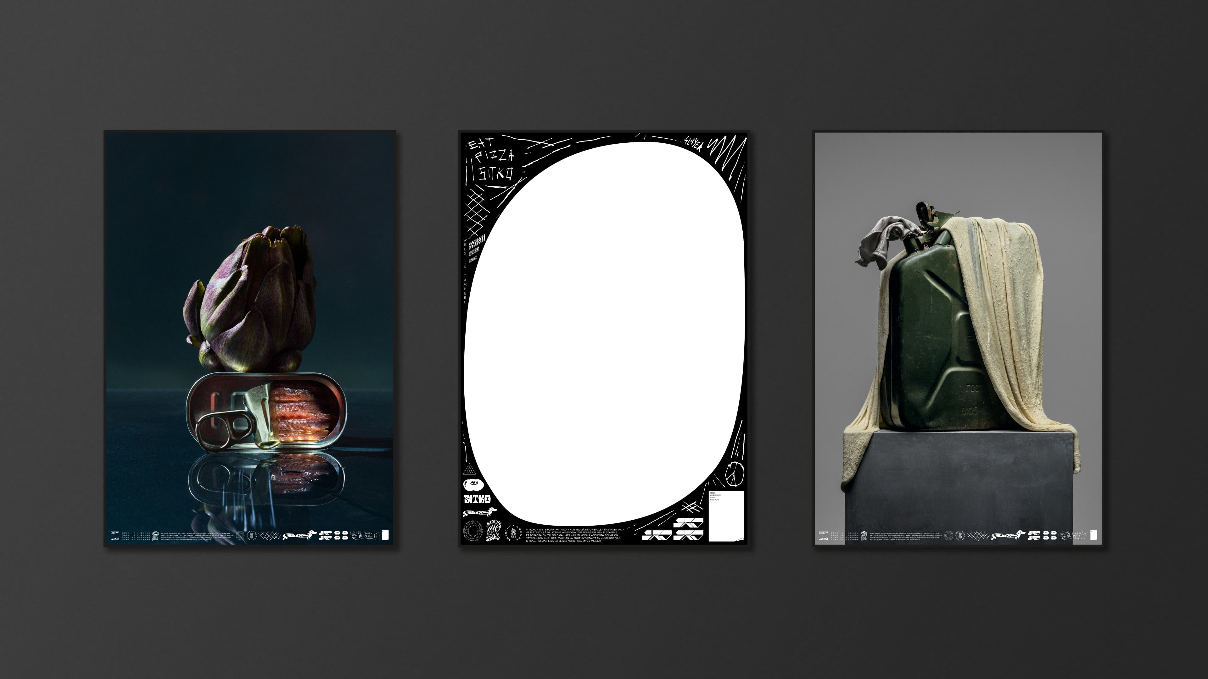
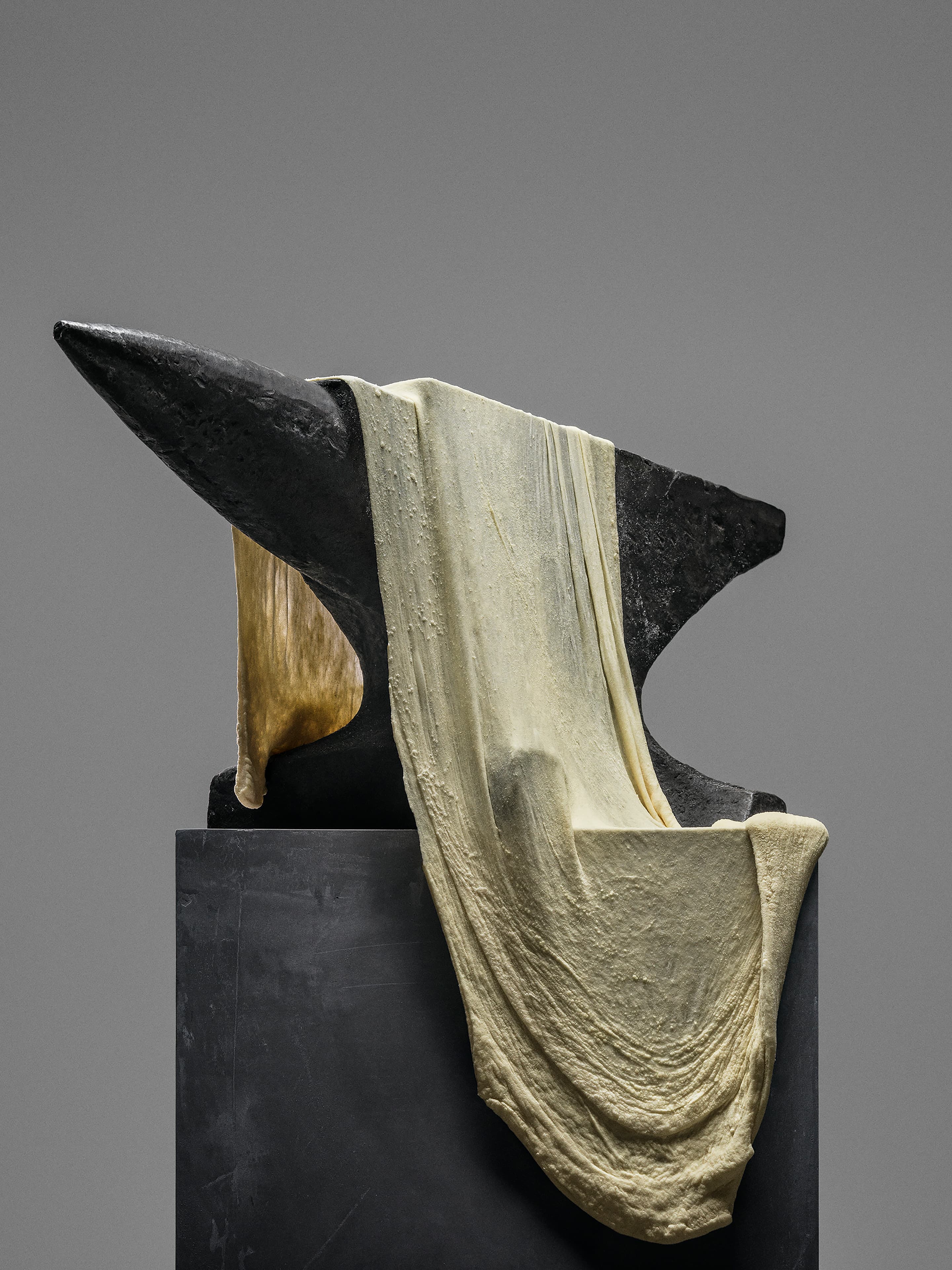
It’s a lot to orchestrate, but Werklig push it further, with copywriting that pulls in song lyrics from lesser-known bands. However, perhaps the most unexpected part of the project is the photography. It is far from your run-of-the-mill pizzeria imagery thanks to Tuukka Koski, a photographer friend of Sitko founder Henry, who brings the weird.
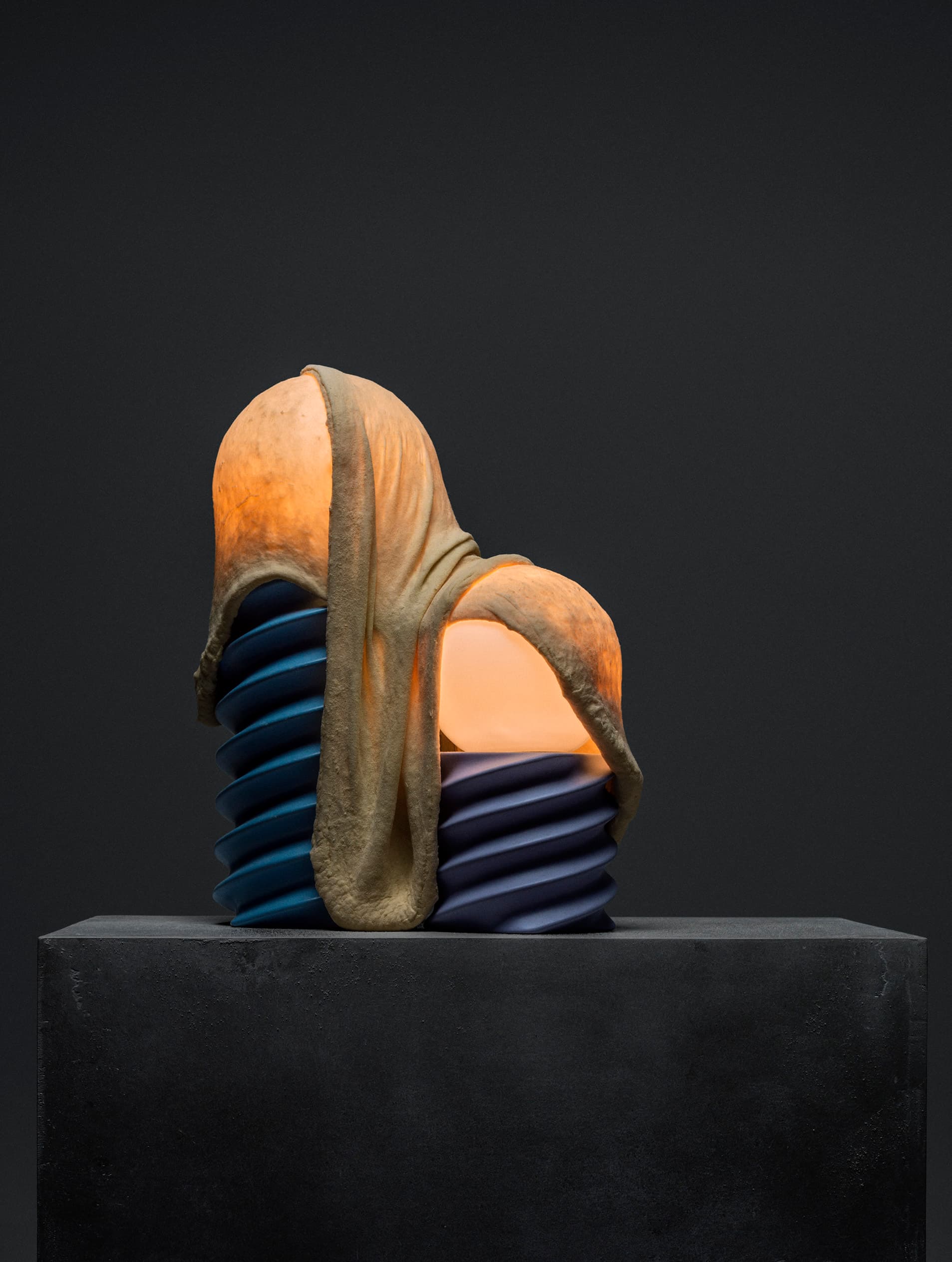
For me: the dough, draped across various items, takes on a fleshy texture – something from left-field filmmaker Cronenberg’s movies. And this is where it works. Some will see Cronenberg, where others will see the melting clock of Dali. It’s just about being appetising, it’s about communicating something far more imaginative and artful that build brand and facilitates future activities.

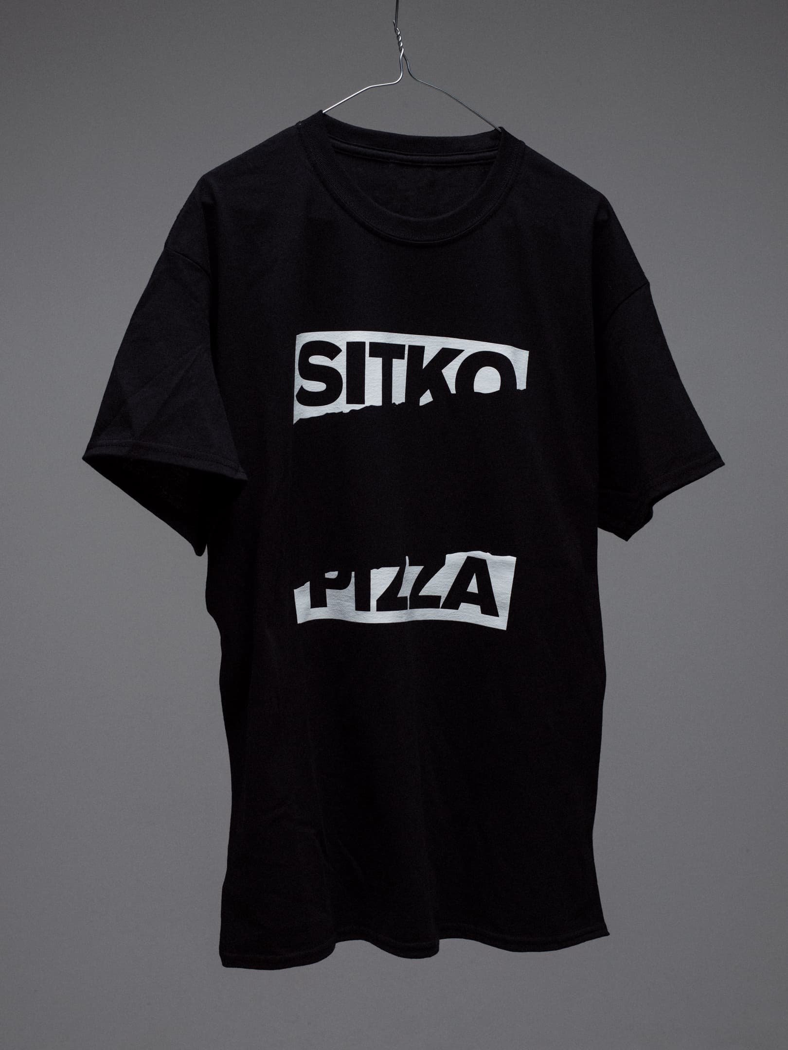
The ‘punk’ allusion is an interesting one. It isn’t pastiche – it doesn’t draw directly on, for example, the mainstream aesthetic of 70s British punk rock (epitomised by The Sex Pistols and ransom letters made from newsprint). Rather, it is a deep dive into a variety of sub-culture influences that all share the same individual drive to create, to leave their unique mark, by doing things on their own terms and using whatever means available.
This sort of project makes for good blog and social content. It brings in the awards. But often, little is made of the strategic starting point – where does all of this graphic immediacy and appeal flow from? Is it grounded in an idea? Is it built to grow and last? Ideas matter and Sitko finds its strength in the central idea of (sub)culture and the range in which this has been delightfully expressed.
It is rare to see this intersectionality and commitment to go deep, to reference the peripheral, and to trust that someone will understand something, feel a bit more connected to what it is that is being sold. This is why this project deserves a closer look.
