Ghia Non-Alcoholic Aperitif by Perron-Roettinger
Opinion by Eleanor Robertson Posted 23 June 2022
In case you’ve missed it, low and no-alcohol drinks are a thing. With over 20% of adults in the UK claiming to be teetotal, abstinence is cool: Brewdog is now Punk AF (that’s ‘alcohol free’), Thomson & Scott’s Noughty is (fairly) nice, and Seedlip is sexy. This sobriety revolution is driven, in part, by the mindfully sceptical Gen Z, turned off by marketing and on by brands that are as beautiful inside as they look on the label. Design trends are as varied as today’s drinking habits – minimalist to maximalist, retro to modern, bright to muted – but taste and ethics matter.
Ghia’s range of non-alcoholic aperitifs was launched by Glossier alumnus Melanie Masarin, who wanted to bring more ‘intention’ to drinking culture and foster ‘togetherness and spirit to drinking non-alc’ beverages. Because Ghia is here ‘for a good time and a long time’, the brand is ‘clear eyed and high minded’. On the high-minded front, that means no non-biodegradable or recyclable materials and checkout opt-ins for eco-packaging and carbon-neutral shipping. These days, however, that might not be enough – and so Ghia suggest ‘upcyclabled’ afterlives for its bottles, such as vases.
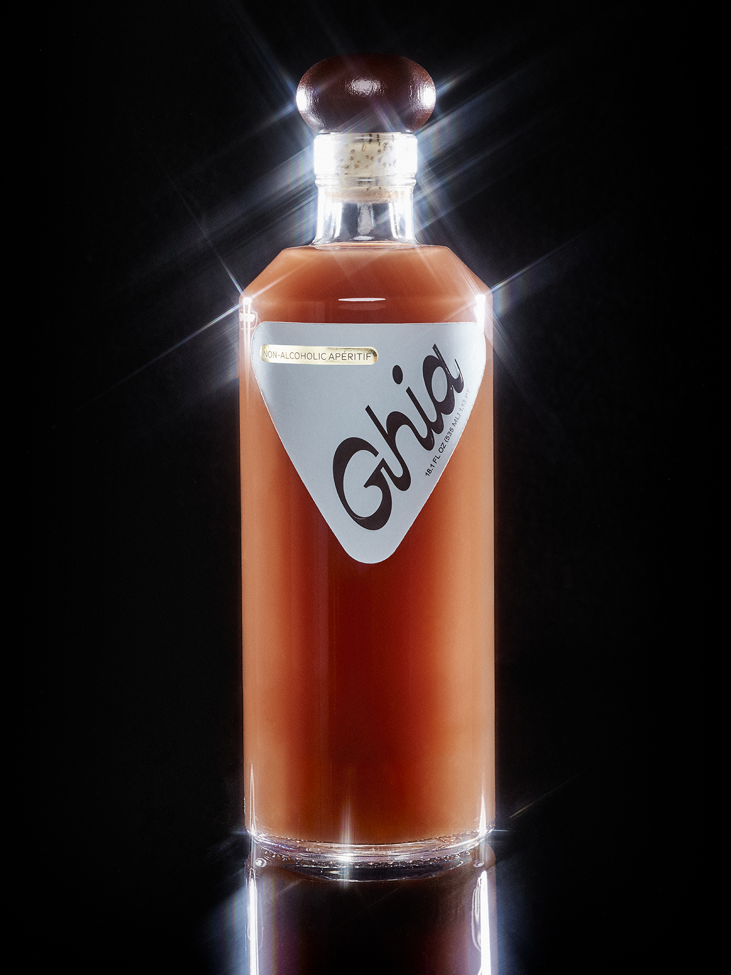
In terms of taste, Ghia is inspired by the Mediterranean tradition, blending botanical extracts from orange peel and elderflower (with yuzu bringing an Asian element), but the star ingredients are natural ‘nervines’ (herbs that support the nervous system) such as lemon balm, rosemary, ginger and gentian root. Many of these ingredients are native to the Mediterranean and the flavour profile is distinctly bright and bitter, a bit like a negroni or amaro. We are told: ‘We wanted to make a drink that would take you to this place without numbing the night; a drink you’d remember in the morning.’
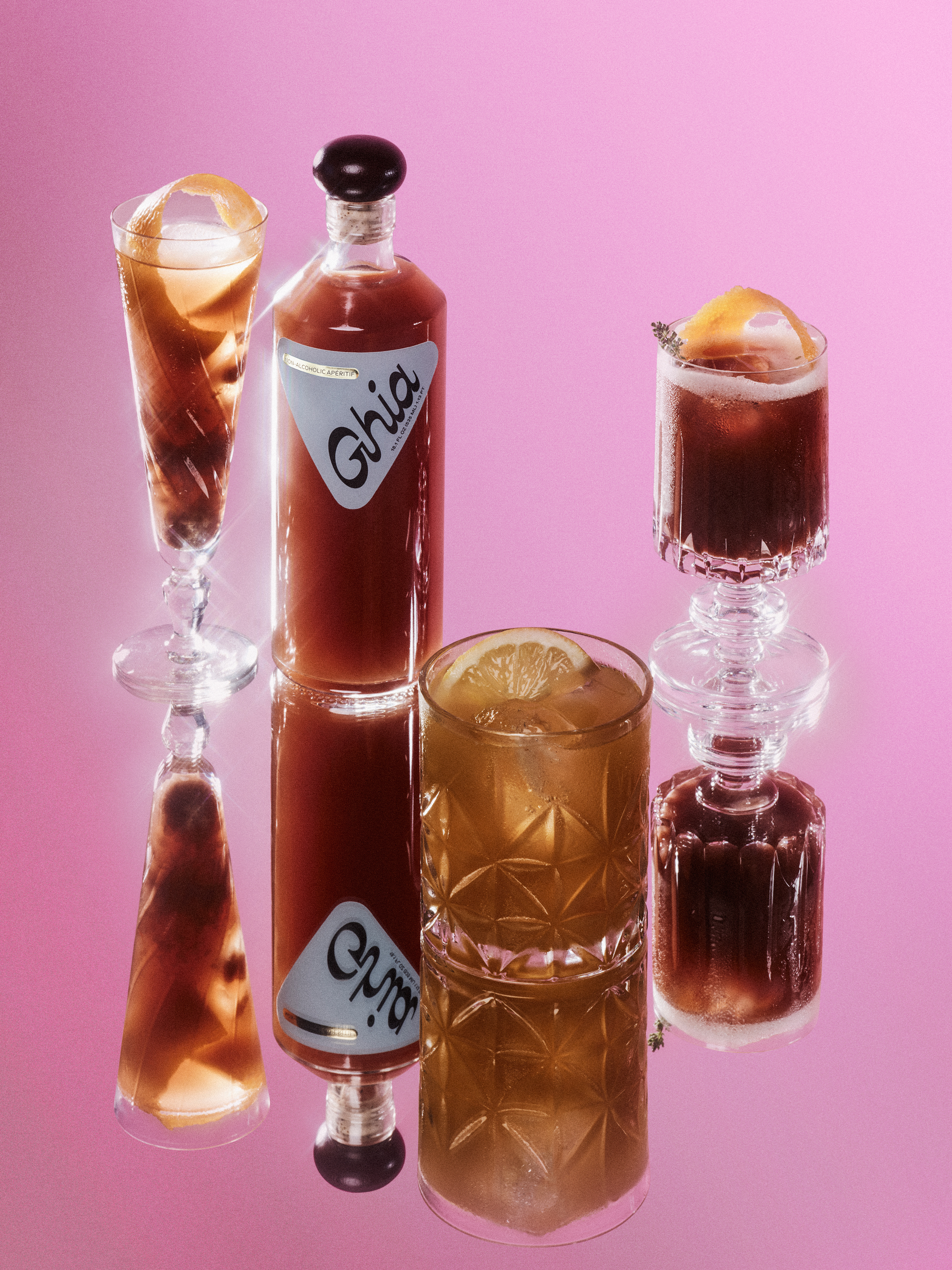
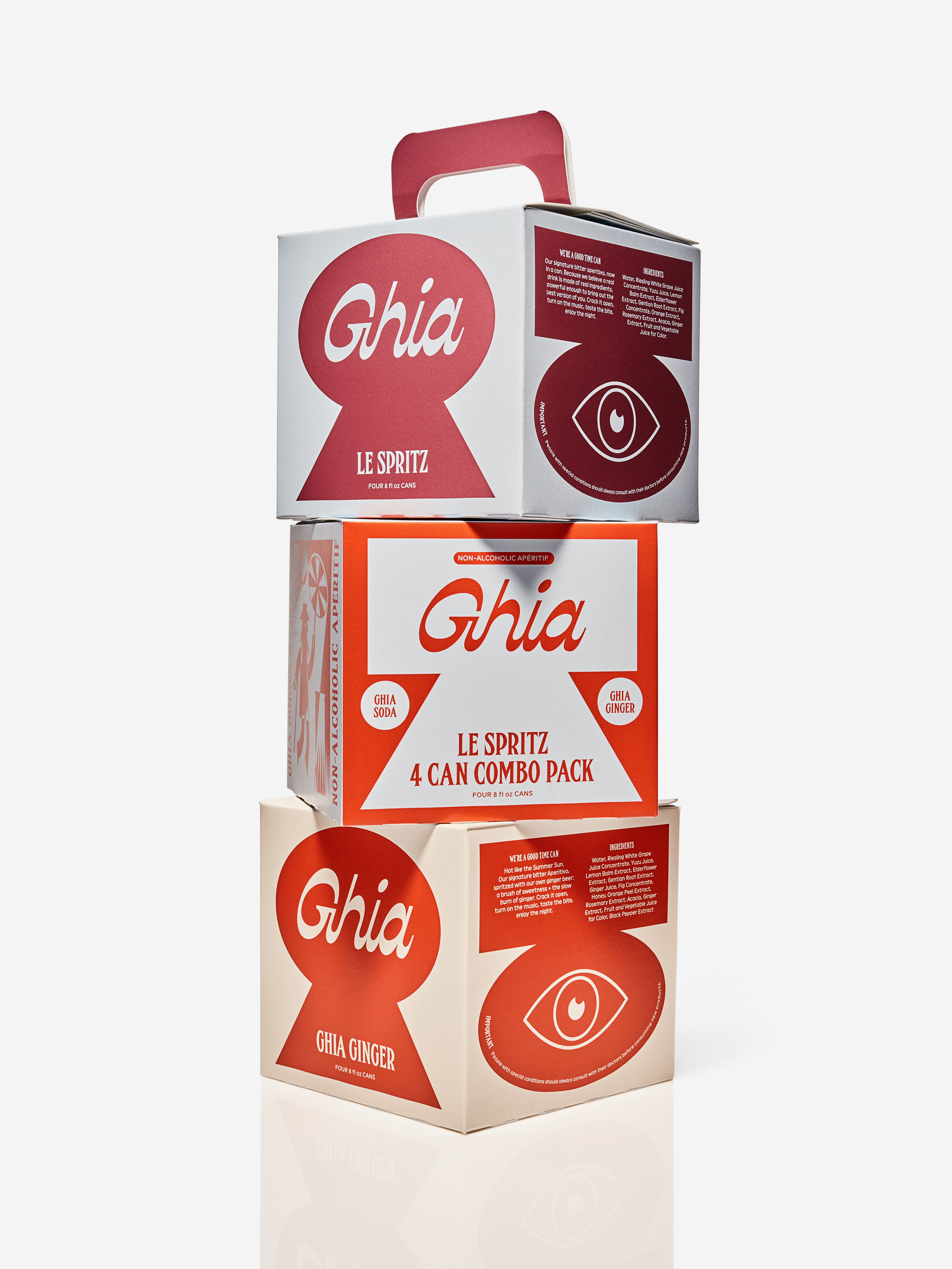
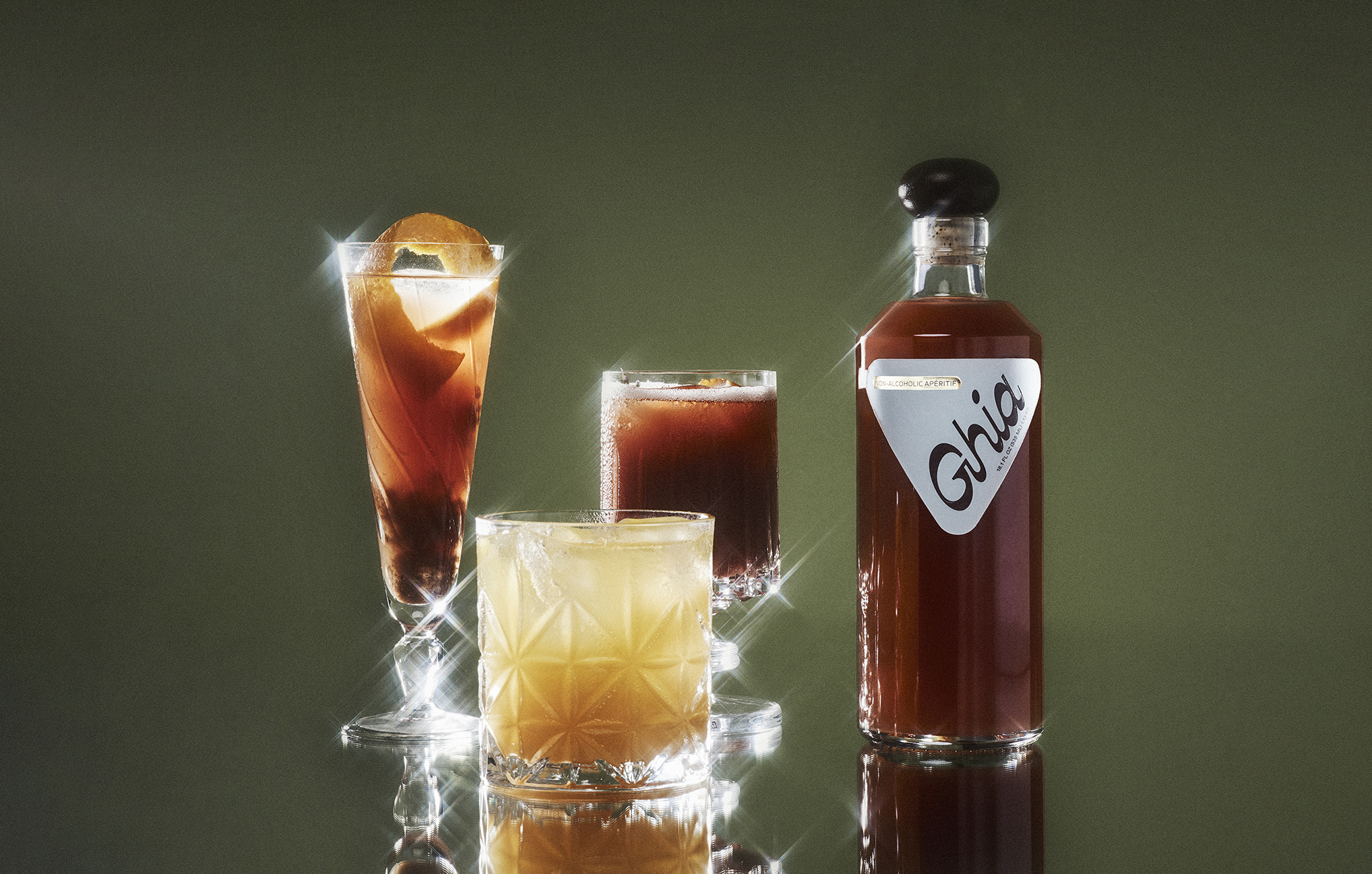
While Masarin understands the recipe expectations (tasty, no caffeine, no artificial flavours, no added sugars), she also knows the importance of branding. Which is why Perron-Roettinger were brought on board to create a bottle and label ‘inspired by classic hospitality signage and Mediterranean aperitif brands’. The brief was to create something friendly and timeless, with ‘a nod to the irreverence of postmodern Italian design, but with a modern mentality’.
The studio drew upon a variety of influences including European car emblems, Euro-disco and hand-painted signage. ‘We asked ourselves, does this need to feel like a nonalcoholic aperitif? What if this feels and looks like 1960s to 1980s Italian furniture, or even an experimental architecture cult?’ the designers explain. ‘A Brancusi sculpture, a Judy Chicago painting? Something you’d maybe find in the south of France?’
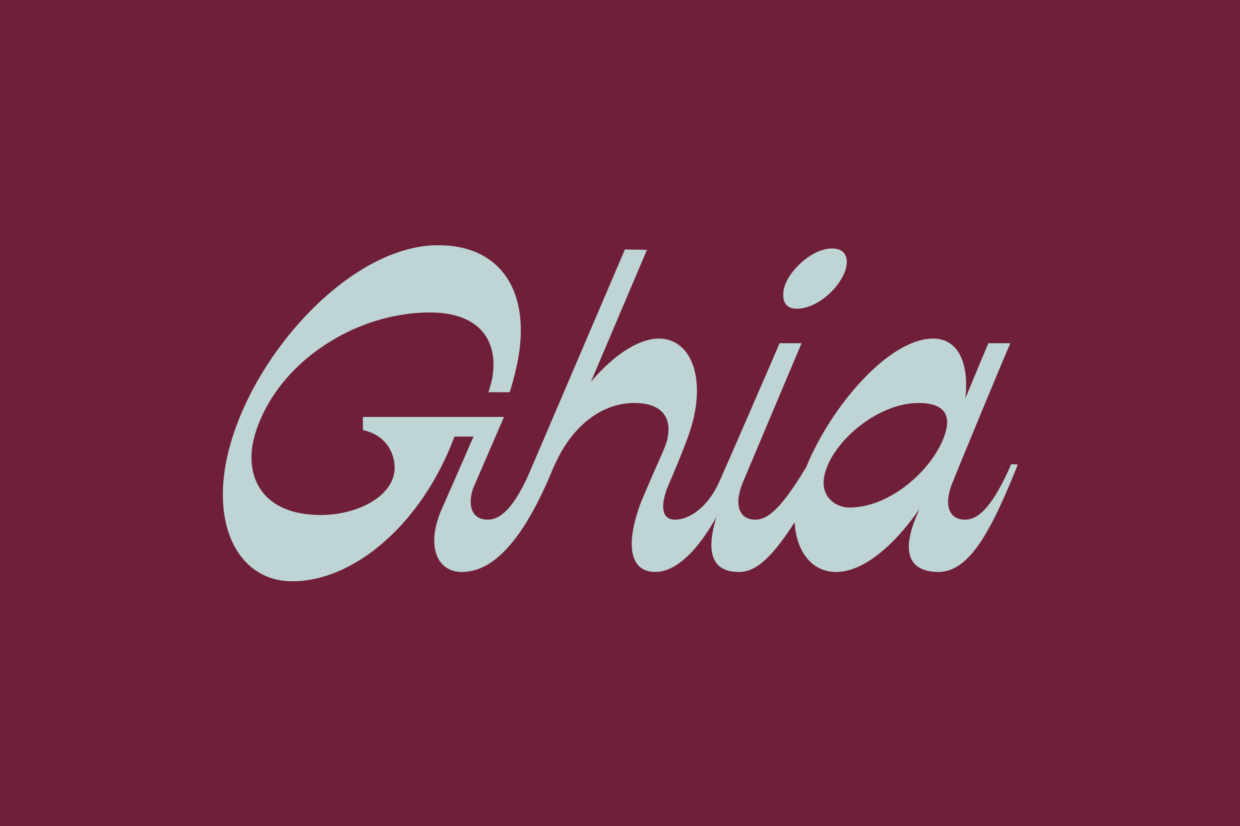
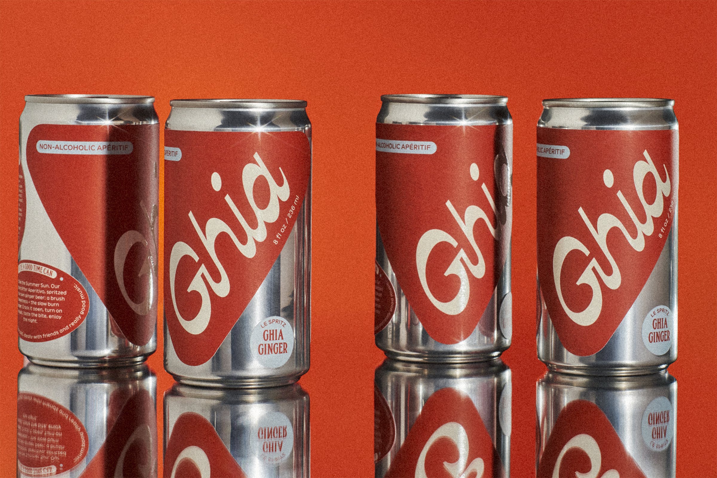
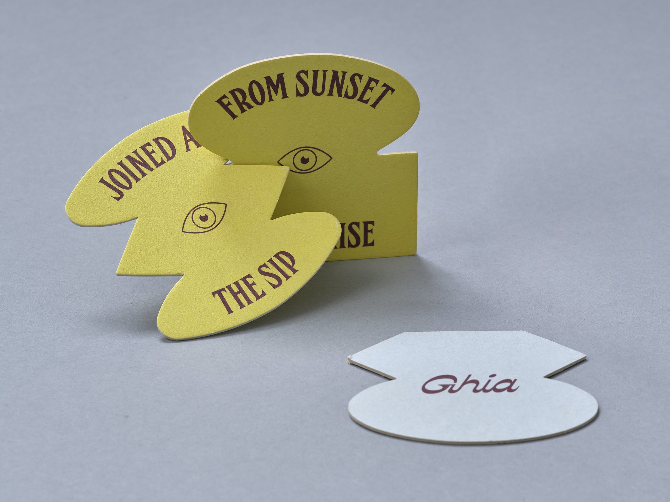
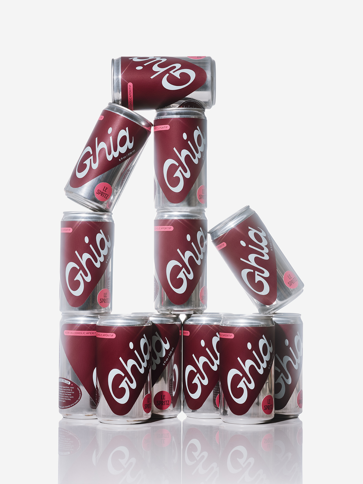
The packaging flirts with maximalist design and has a whimsical vintage touch. It oozes sophistication in a light-hearted way that makes you long for old-school Italian resort towns. The chic script logo is ‘Italian’ in style; inspired by Caslon’s early nineteenth-century experiments with fat fat stresses (thins becomes thicks and thicks become thins), typographic norms are turned on their heads. The wordmark slashes across a rounded triangular label in a way that feels sumptuously extravagant.
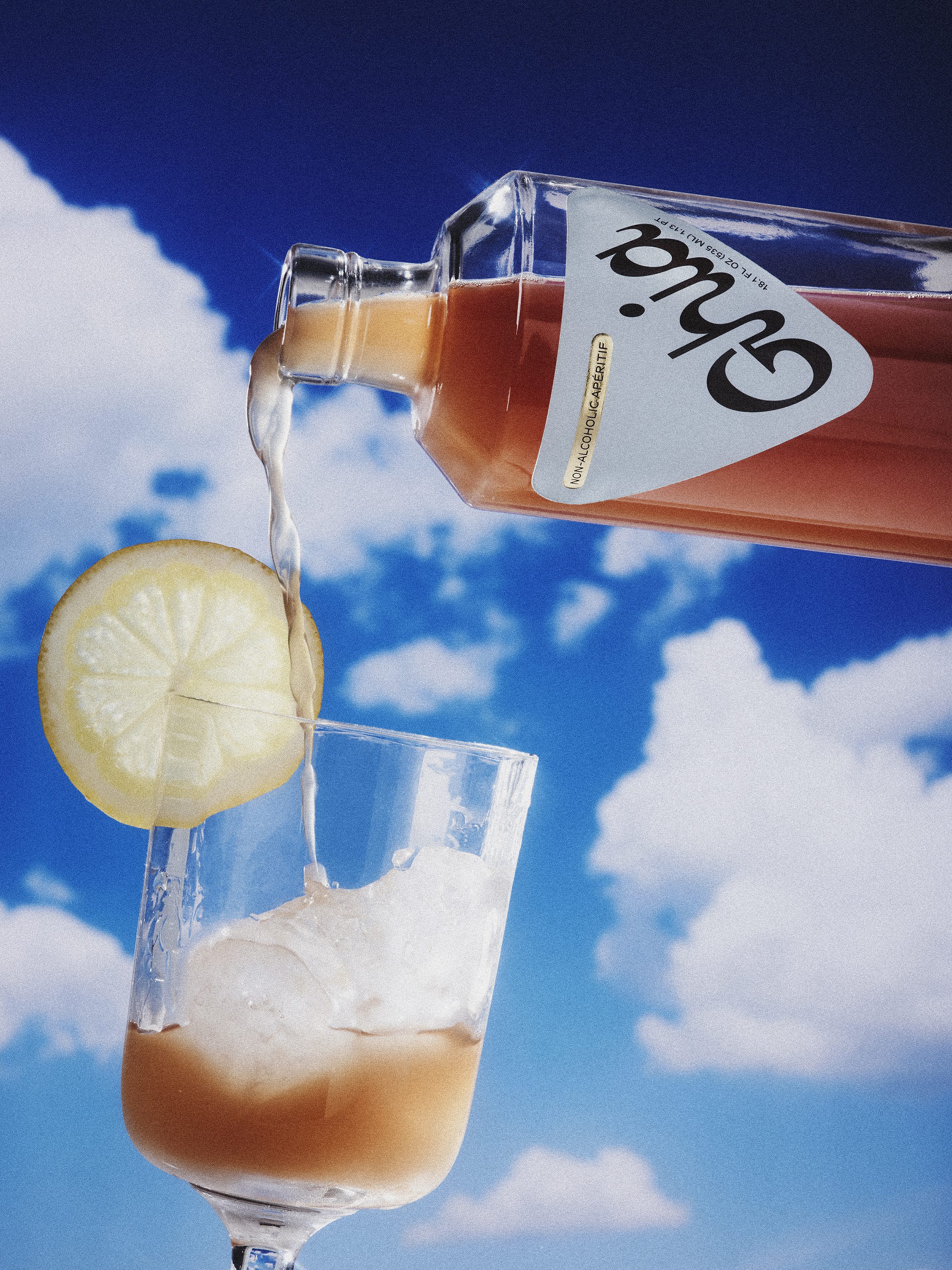
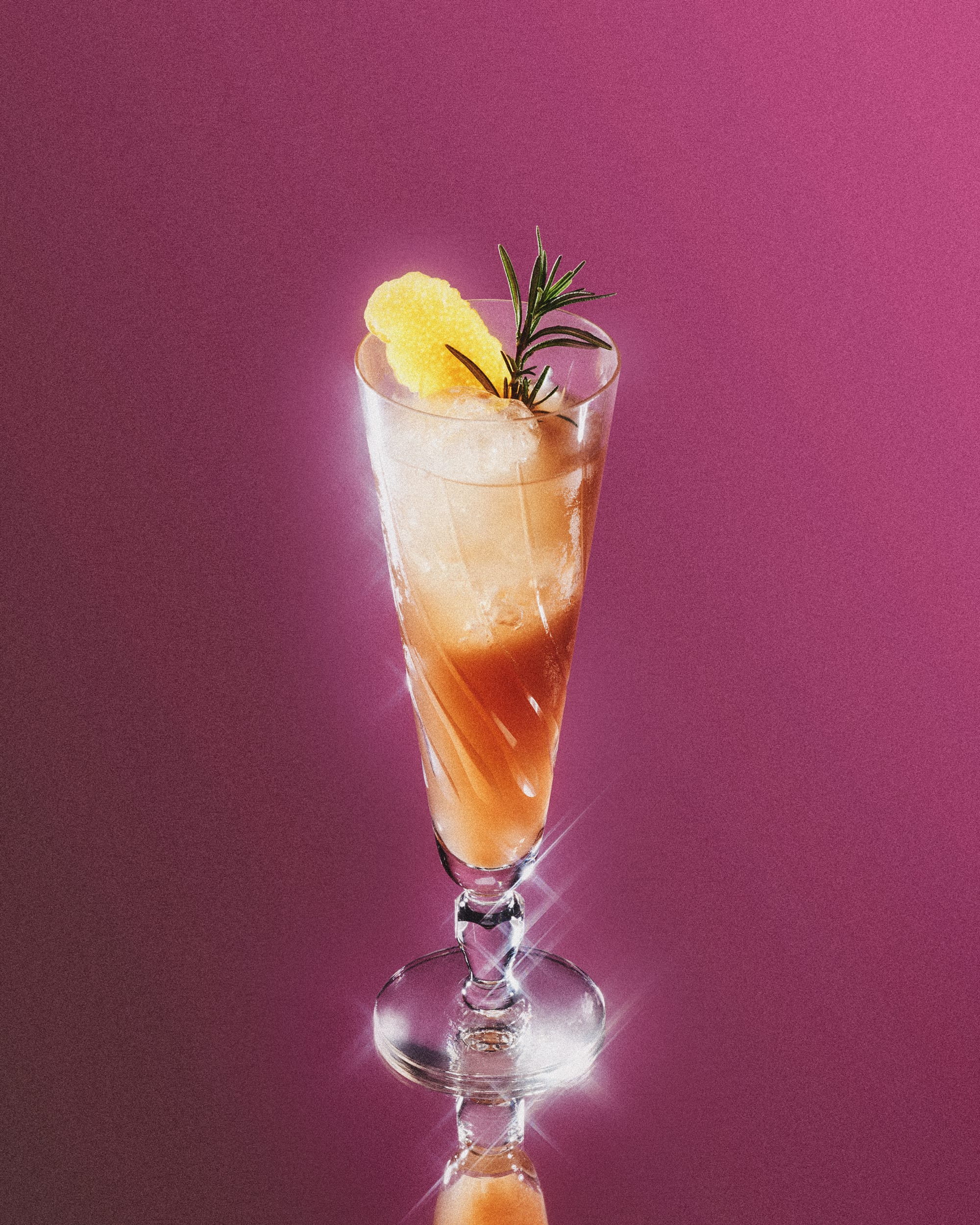
Funk? Classic? High camp? Like many Italian amari (Campari, Montenegro, Averna), Ghia is beautifully distinctive and typographically rich. But unlike these historic brands, Ghia is digitally fluent with a contemporary high-fashion aesthetic. The bulbous wooden stopper is category-defying – it looks expensive and creates a signature silhouette; the art direction adopts an iconic starry filter that influencers will covet; the copy has a punchy, persuasive personality.
It’s unlikely that the #ad team had to work too hard to enlist the likes of Priyanka Chopra, Antoni Porowski, Jessica Alba and Jen Atkin as advocates. While too many alcohol-free beverages position themselves as less fun alternatives to spirits, Ghia offers joie de vivre. And whether you’re in the midst of Dry January, Sober October, the worst hangover of your life (‘I’m never drinking again!’) or a more conscious lifestyle choice, this bottle is hard to scroll past.
