Drinks Packaging
3TEMP by Studio NARI
If you had to guess what 3TEMP is and does, it’s hard to imagine many people would come up with the right answer: with no prior knowledge of the company, it sounds like the sort of thing a half-arsed episode of Black Mirror could come up with – some kind of temping agency but everyone is actually AI, or perhaps...
Xochi by Kinoto Studio
Another day, another soft drink with a wild new angle: in the last year or so we’ve undoubtedly seen some impressive entrances to the category, from the shouty Yaté yerba maté to ‘braincare beverage’ Rolus to London-brewed water kefir brand Agua de Madre, to the unhinged Y2K lunacy of Fhirst. Now, meet Xochi, a prebiotic agave soda made with 100%...
Phoenix Organics by Marx Design
It’s a tale as old as time: a once beloved brand – a pioneering brand even, the first of its kind or category – that gets rather lost over the years, muddled in a confusion of sub-brands and spin-offs. Such brands often fall victim to a sort of design by committee – and rarely intentionally: as companies grow and expand...
Yum Bun by How&How
Arguably London’s street food scene has become less a ‘scene’, more a network of long queues sprawling their way across the capital faster than you can say ‘SEVEN pounds! For some strawberries!’ From Borough to Barbican’s Whitecross Street, Spitalfields to Southbank, Camden to Covent Garden; the menus are global, the prices hefty, the hype palpable, and the branding overwhelmingly forgettable....
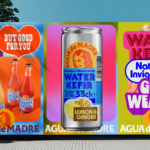
Agua de Madre by Chris Chapman
It seems you can’t move for well-designed, wellness-adjacent alcohol-free drinks brands right now. In the past couple of months alone we’ve covered a nightlife inspired Yerba Maté that went hard on Big Drink NRG and Rolus, a new botanically enhanced entry into the (apparently) burgeoning ‘braincare beverage’ category. Making it a hat-trick is London-brewed water kefir brand Agua de Madre’s...
Rolus by Re
Back in the early 00s – the era when arguably Hollyoaks was at its zenith, and bellybutton piercings their most bejeweled – Botox was gradually emerging from the hushed clinics of Harley Street and LA to become part of common parlance. As such, brands cottoned on to the word’s ‘eternal youth’ connotations: I distinctly remember a shampoo ad promising that...
Hip Pop by Robot Food
Running a design blog sharpens your eye for category conventions. Stick with it long enough, though, and you’ll start to see those conventions unravel. What once felt fixed begins to flex. This creates a challenge for writing about design: you’re constantly assessing the landscape, but that landscape is always shifting. Take minimalism, for example. Once the dominant aesthetic of the...
Yaté by Herefor
Long gone are the days when ‘energy drink’ connoted unwashed teenage gamers, amped up Twitch streamers, hungover/still going city boys on the Tube, or 2-4-1 deals on vodka Red Bull in sticky-floored suburban student nightclubs. Like many things – such as reading books, going for a walk, or having a bath – the energy drink sphere has now collided with...
Eager by Ragged Edge
The visual ‘territories’ of design and the strategic routes of marketing and advertising run in cycles, parallel to consumer culture. Ideas that fall by the wayside one decade are rediscovered, remixed or recycled in another. Challenger brands grow, take on the established and are either acquired, expire or, sometimes, find a sweet spot for growth that allows them to remain true...
Pursue Hard Seltzer by OlssønBarbieri
New products, new markets and new consumer groups generate new aesthetics – or, at least, you would hope so. Too often, style migrates from one category to another, or the identity of a sub-culture (visually speaking), is exploited in a commercial context. This is where ‘authenticity’ emerges, to support genuine origin credentials, or to mask the appropriation with narrative context....
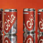
Ghia Non-Alcoholic Aperitif by Perron-Roettinger
In case you’ve missed it, low and no-alcohol drinks are a thing. With over 20% of adults in the UK claiming to be teetotal, abstinence is cool: Brewdog is now Punk AF (that’s ‘alcohol free’), Thomson & Scott’s Noughty is (fairly) nice, and Seedlip is sexy. This sobriety revolution is driven, in part, by the mindfully sceptical Gen Z, turned...
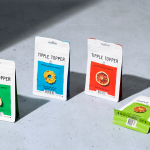
Tipple Topper by Marx Design
The pandemic catalysed the at-home market for a whole host of products. Paired with social isolation, it’s no wonder that one of the markets to benefit would be alcohol. Just like coffee, dried flowers and cleaning products, alcohol was packed down into letterbox-sized parcels and sent through the post. Mail-order cocktails have been a somewhat surprising development. The drama, theatre...