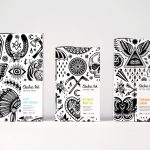
Script Logotypes
OlssønBarbieri rewrites the rulebook on ‘formality’ in its melodrama-infused Theaterbaren identity
Oslo’s Nationaltheatret (simply translated to English as National Theatre) first opened its doors more than a century ago in 1899, and has since come to not only reflect, but actively shape cultural identity in Norway. Having staged everything from more traditional Norwegian dramas from the likes of Henrik Ibsen to experimental contemporary works, the building itself is also a marriage...
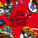
The Dinner Ladies by Universal Favourite
‘Dinner ladies’ doesn’t have the most glamorous connotations in England – depending on your experience at school, it likely conjures up memories of scoops of greying, tepid mash-adjacent slop unceremoniously plopped onto a plate; something to do with turkey dinosaurs; a troop of formidable but visibly jaded people responsible for making every school smell like on-the-turn cottage pie from around...

Tigre by Triboro
LES Tigre – not to be confused with seminal electroclash/riot grrrl combo Le Tigre – is a cocktail lounge in Manhattan’s Lower East Side area, which opened at the end of last year and apparently combines ‘sophistication and refinement in drink, sound and ambiance’ with an entrance that boasts ‘an original graffiti-worn door’. So far, so hip, amirite? It all...

Kindred Black by Ania et Lucie
There has always been something borderline magical about the fields of beauty, makeup and skincare – a hint of esoteric or mystical knowledge. When it comes to visual storytelling, this association offers plenty of rich inspiration, along with established style signifiers that are easy to follow. Nods to old-school apothecaries abound in the likes of Typology Paris and Le Labo,...
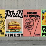
Phil’s Finest by Gander
It’s a moot point now that the last few years have seen an explosion in all things vegan and ‘plant-based’ (a term arguably used lightly, when you consider the ingredients in many no-meat, no-dairy, no-animal product alternatives). There’s vegan cheese that actually tastes nice, there’s mushroom and hemp ‘magic mince’, even vegan tuna. I’m writing this while eating a vegan...
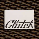
Clutch Automotive by Parker Studio
From à la mode Lick paint to gramable Aokka coffee, everything comes in a tin these days. The rise of metal packaging solutions in food and beverages, healthcare, household and consumer is expected to accelerate by 3.1% year-on-year from 2021 to 2030, driven by the demand for sustainable alternatives to plastic and lightweight substitutes for glass. Aesthetically speaking, the tin...
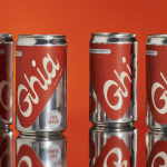
Ghia Non-Alcoholic Aperitif by Perron-Roettinger
In case you’ve missed it, low and no-alcohol drinks are a thing. With over 20% of adults in the UK claiming to be teetotal, abstinence is cool: Brewdog is now Punk AF (that’s ‘alcohol free’), Thomson & Scott’s Noughty is (fairly) nice, and Seedlip is sexy. This sobriety revolution is driven, in part, by the mindfully sceptical Gen Z, turned...
Electric Ink by Robot Food
With the rise in the popularity of tattoos and the lack of credible long-term care products, Leeds-based design studio Robot Food formulated, branded and packaged Electric Ink, a tattoo care range for the mainstream market. The range includes a serum that enhances colour, an oil that delivers a freshly-inked look, and a daily moisturiser. Each feature distinctive packaging design that draws on...
Sardine by Here Design
Sardine is a restaurant, located on London’s Micawber Street, with a simple menu of rustic, Southern French and Mediterranean-inspired dishes cooked over a wood fire. It features an interior design of bent wood chairs, open kitchen, steel and light wood table tops and a brand identity created by Here Design. This adds a touch of a mediterranean colour to interior through menus and tile detail, while also linking other assets such...
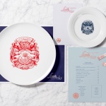
Little Italy by Here Design
Little Italy is a restaurant, gelateria and pizzeria located in the Jordanian capital of Amman. The restaurant features a distinctive, period and European-inspired interior of stained wood, glossy white tiles, concrete floor, vintage glass light shades, wood panelling and exposed I beams, brought together with a modern balance and lovely sense of form and contrast. This continues through to the restaurant’s brand identity, developed by London based Here Design, in...
Sauvage by Triboro
Sauvage is a Brooklyn-based cafe and cocktail bar from Joshua Boissy and Krystof Zizka, the duo behind Maison Premiere. It is described as being reflective of the staple establishments of New York and Paris, and has a menu of French-accented American dishes. This is also reflected throughout its interior design, a mix of mosaic flooring, brass rimmed circular tables, bent wood furniture,...
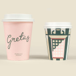
Gretas by 25AH
Gretas is a café set within the Haymarket, a hotel located at the heart of Stockholm, Sweden. The building was formerly home to a famous department store that dates back to the early 20th century and was the place where actress Greta Garbo was discovered while working at one of the concessions. 25AH, the Scandinavian graphic design studio behind Haymarket’s own brand identity, as well as Paul’s, a restaurant also situated...