Pursue Hard Seltzer by OlssønBarbieri
Opinion by Richard Baird Posted 19 July 2022
New products, new markets and new consumer groups generate new aesthetics – or, at least, you would hope so. Too often, style migrates from one category to another, or the identity of a sub-culture (visually speaking), is exploited in a commercial context. This is where ‘authenticity’ emerges, to support genuine origin credentials, or to mask the appropriation with narrative context. It’s not enough to have a ‘style’ – the world of ideas behind it must be expressed in interesting ways, and in different contexts. To stand out, designers and studios have to work in a cross-disciplinary manner.
Design craft across illustration, visual identity, typography, structural design and motion graphics has seen significant improvements through specialisation (often coming from passionate self-taught designers). However, what really stands out today, is the sourcing of, collaboration with, and application of all these disciplines. Corralling these together in a coherent, cross-platform experience is what sets studios apart in an industry full of incredibly capable independent designers. The work of OlssønBarbieri for Pursue Hard Seltzer is a great example of this orchestration.
This post includes Extended Insights for BP&O Plus members.
Find out more and sign-up here.
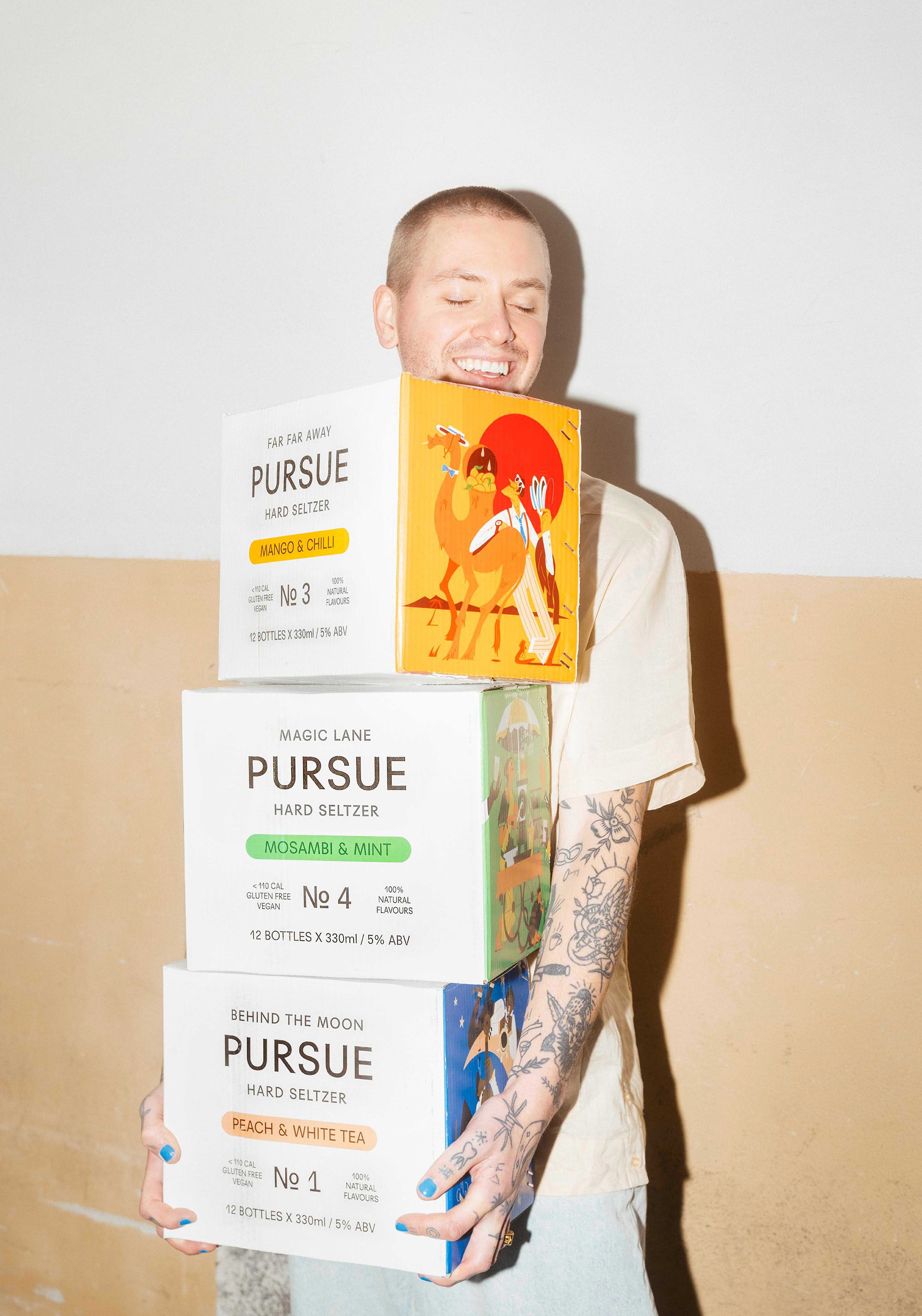
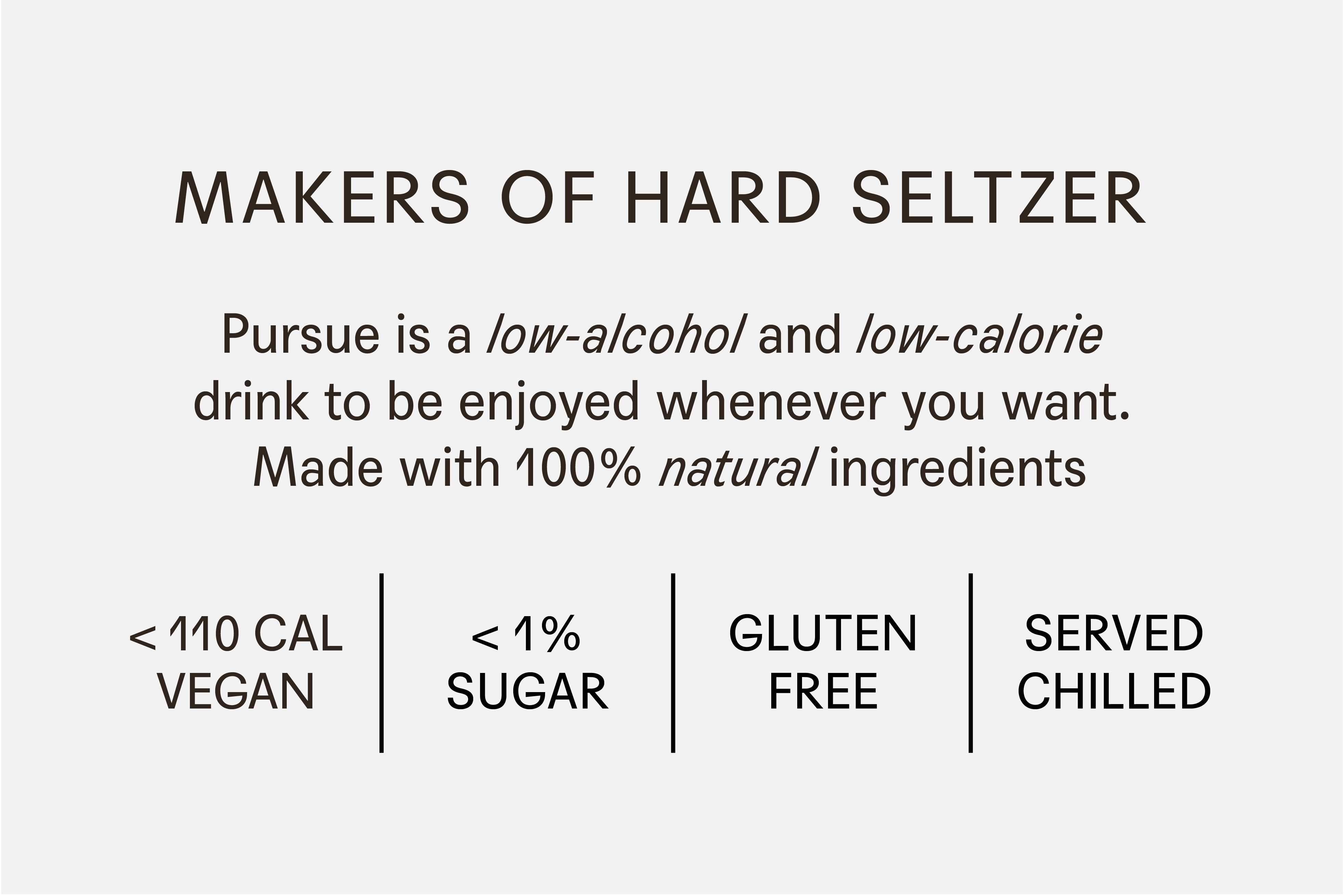
As noted by OlssønBarbieri, hard seltzer – a relatively new market – saw significant growth throughout 2021. This is expected to see a 31.4% growth by 2028. That’s the context, and opportunity. Hard seltzers are unsurprisingly popular with their low-alcohol, low-calorie, gluten-free and guilt-free promise. Just as craft beers before, both creativity and convention have been applied to this emerging category. Both tropes and cliches have been deployed – some effective and well-reasoned, others opportunistic and the product of short-term thinking. Pursue, led by Anish Reddy, a fourth-generation entrepreneur from Chennai, has sought out its own space, delivering a fruit-infused sparkling drink that conjures up summers past for the Indian market.
The context is as fascinating as the result. Soda – like beer in the Czech Republic – was favoured over water, in part due to infrastructure issues and the lack of clean drinking water. Before Mumbai completed its modern waterworks in the late 19th century, soda offered a reliable (read: safe) alternative to drinking water. A colonial opportunism was also at play, with British chemist Henry Rogers setting up India’s first ‘aerated water’ factory in 1837 to serve expats living in Mumbi. This kick-started a broader interest and uptake. With this in mind, the nostalgia and Western aesthetic sensitivity associated with soda in India is understandable. Alongside hot summers, cool drinks, and the local organic flavours of the region, this has been channelled into Pursue’s brand identity and packaging design.
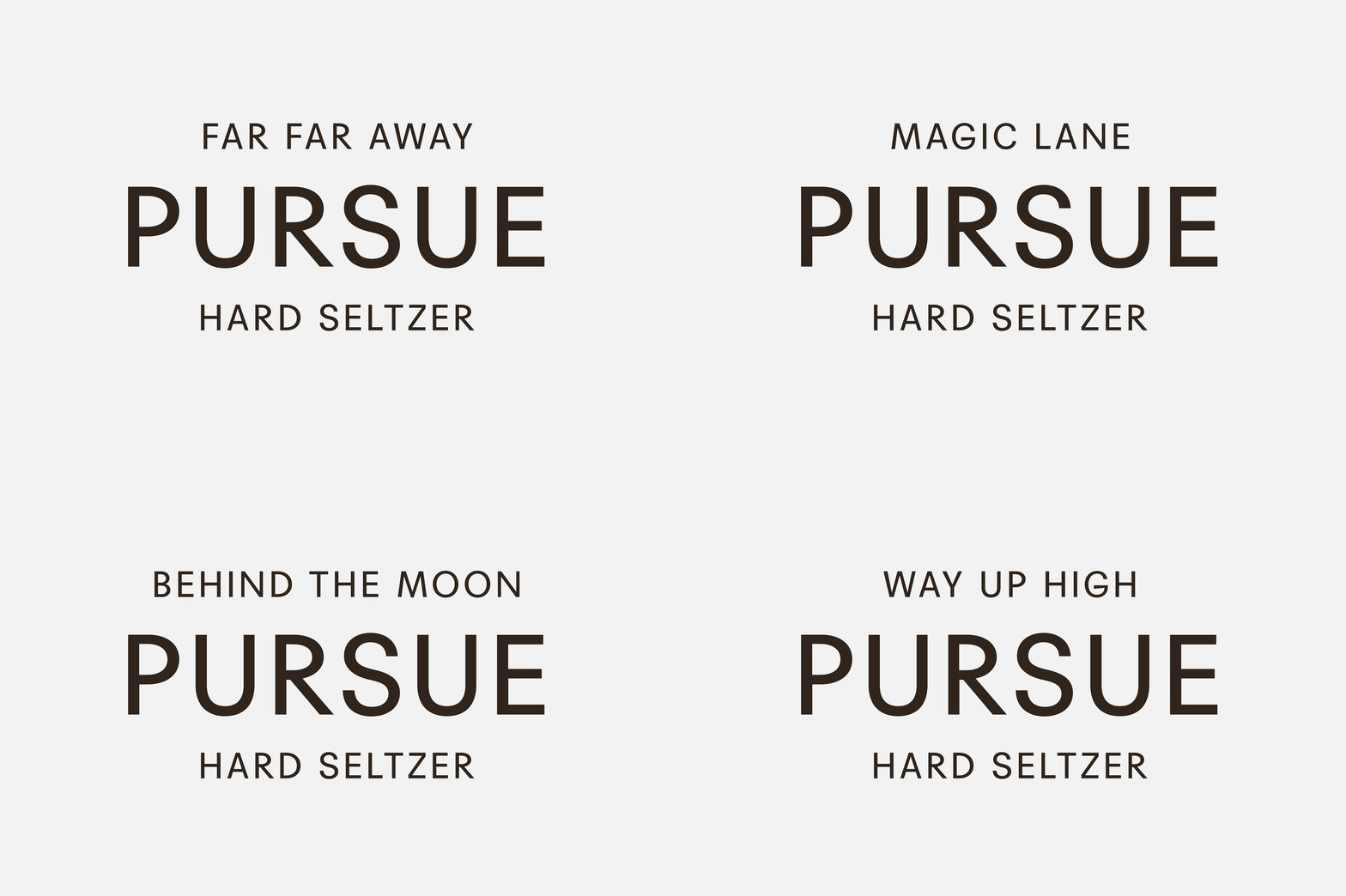
The challenge of writing about a piece of work like this is researching and understanding the conditions of the market. Indeed, the appeal to a Western audience of designers is evident in the project’s popularity with US and European blogs. But it’s these conditions that drew this writer in – and specifically, the similarities between the origins of soda in India and beer in the Czech Republic, having lived there and enjoyed the country’s culture. Without this, the initial impression would have been that this was a Western product for the Western market. On reading that it was for the Indian market, it seemed necessary to dig deeper to make sense of it, hence the historical background.
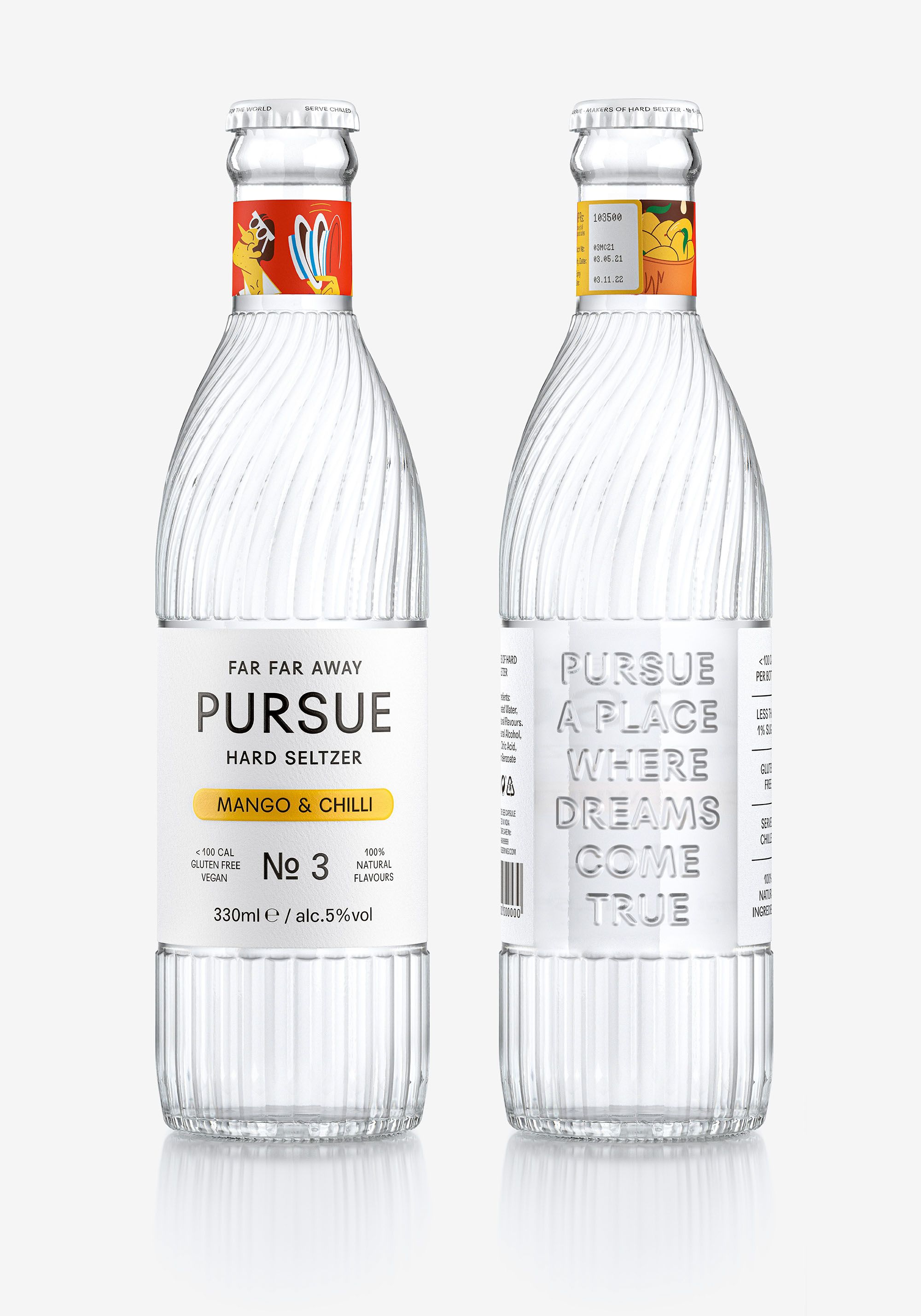
The sentimentality and nostalgia that runs through the structural design becomes a wonderful historical starting point. It’s very much rooted in what might be described as ‘simpler times’ and ‘small joys’ – the antithesis of today’s dreary news.
The ‘pursuit of’ or return to ‘the innocence, abandon and joy of youth and that unique, unrivalled sensation of your first soda pop on a radiant summer’s day’ becomes the driving force behind the design. This isn’t a heritage brand, but it seeks to situate a particular market into a romanticised time and place; whether this existed or not is beside the point, the brand conjures a youthful dream that feels more intrinsic rather than extrinsic. Much of the copywriting supports this with lines such as ‘pursue your inner child’ and ‘pursue the rhythm’, with illustration that provides some convivial situations and a narrative thread.
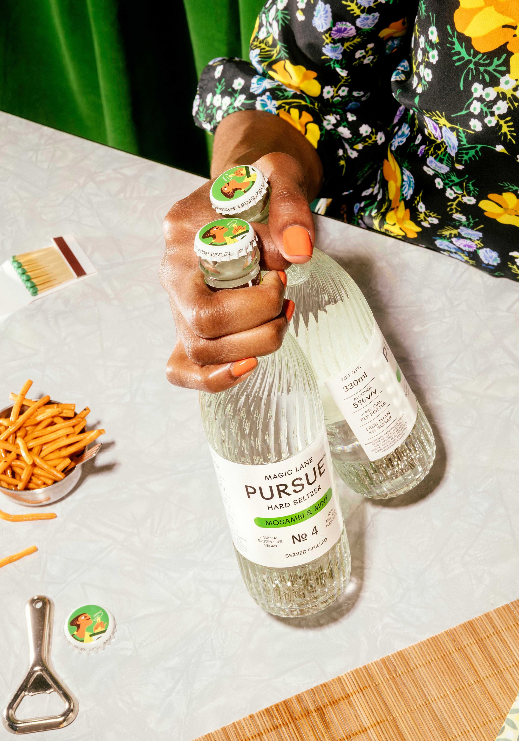
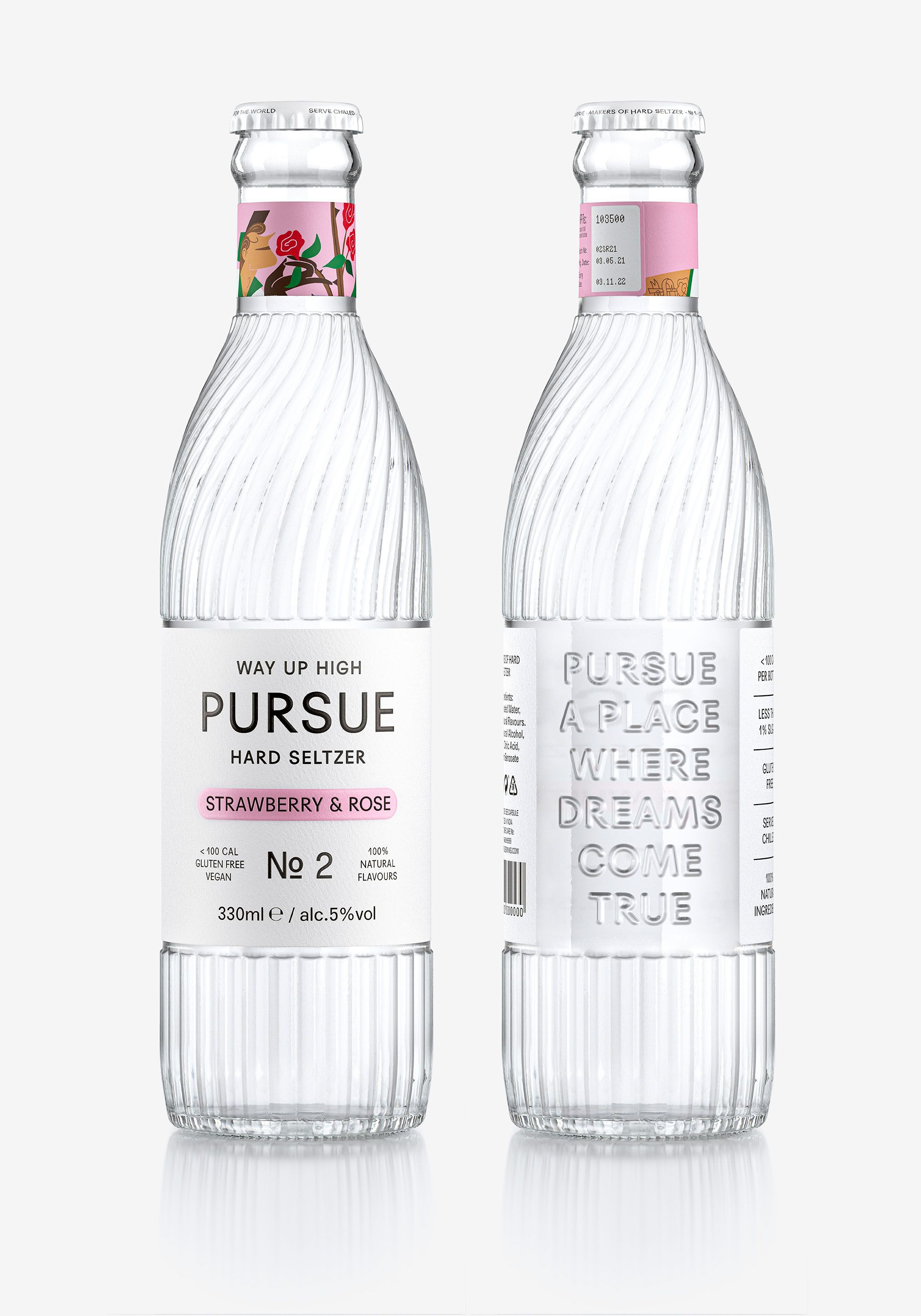
There is an interesting intersectionality at play. On the one hand a historical material reference to soda of the past is made with structural design. This is brought to life through typographic relief, overall silhouette and a twisting pattern that calls to mind Indian architectural heritage. On the other, bright colourful illustration that feels far more recent conjures up the summer heat and a dual context in which to situate the drink and the drinker. This also forms a narrative structure alongside copywriting.
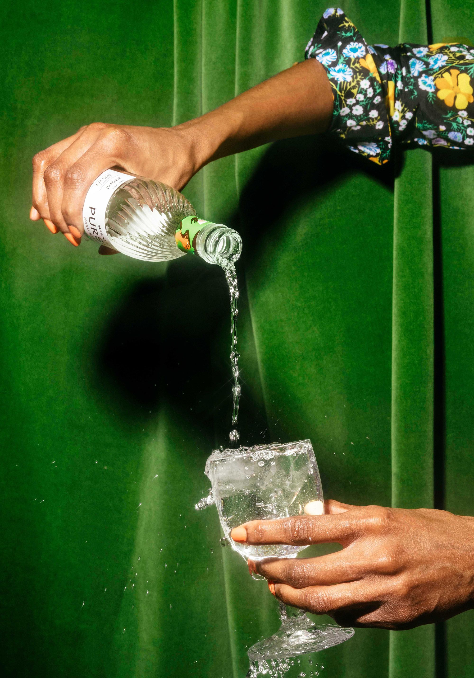
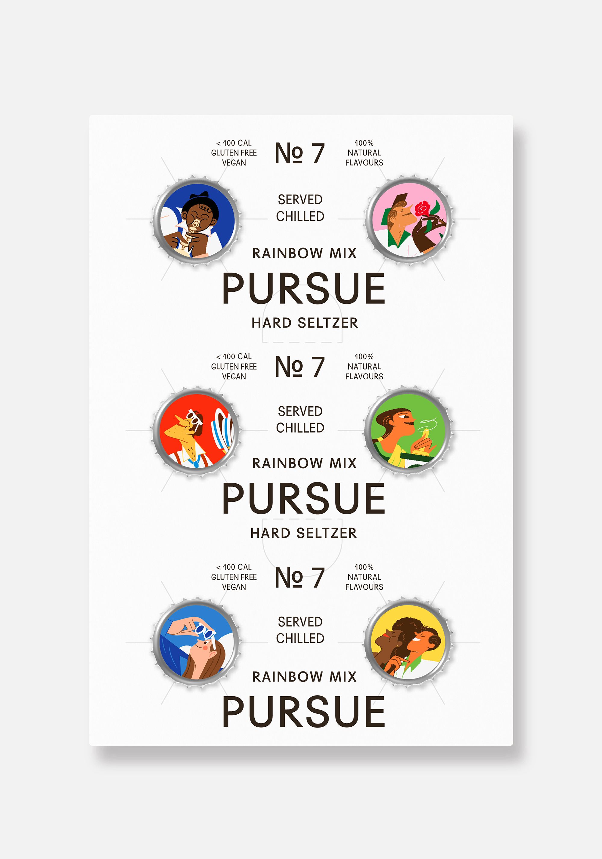
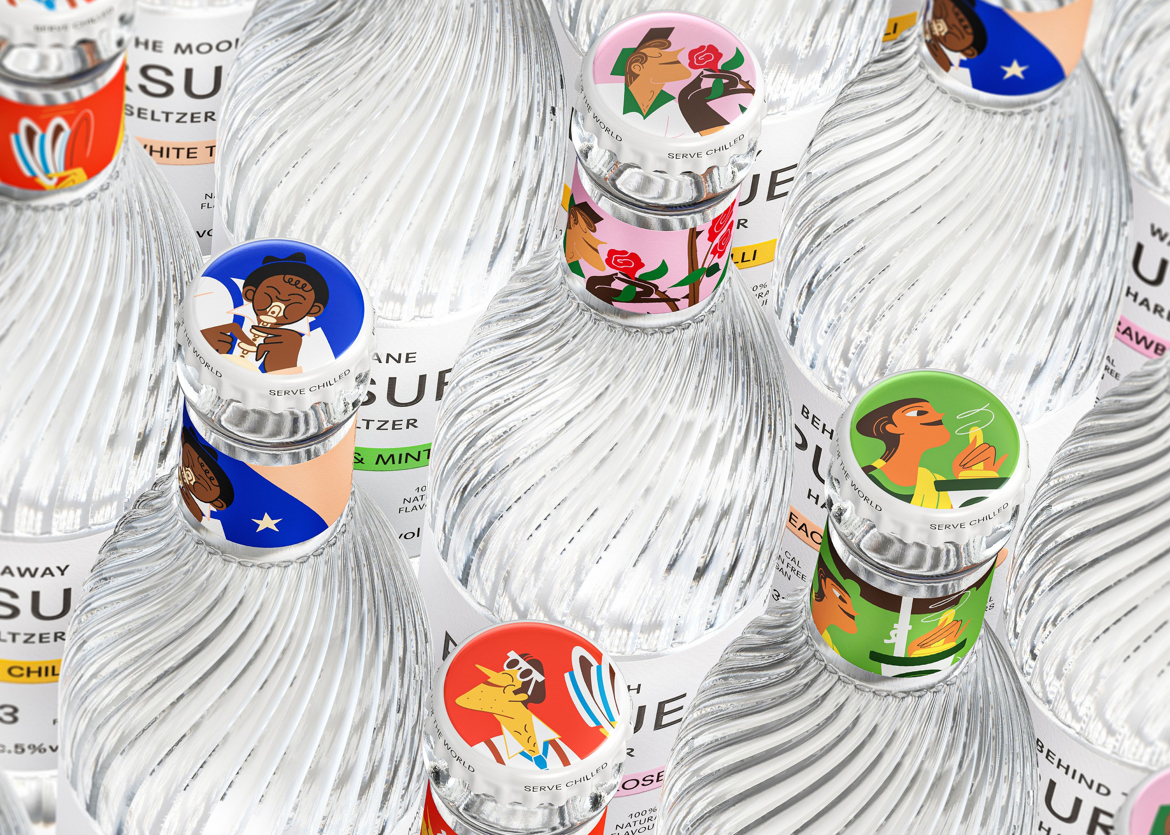
The illustrations are wonderfully realised, diverse and unusually applied across the neck and caps. These make for distinctive details within the context of the typographic restraint and white coverage of the main labels – colour functions to link the two. Typography similarly connects and fleshes out aspects of the past and present, with a modernity that was emerging during the same time soda came into being. The effect of these different elements weaves together contemporary expectations of quality and nostalgic cues, but avoids appearing like a soft drink.
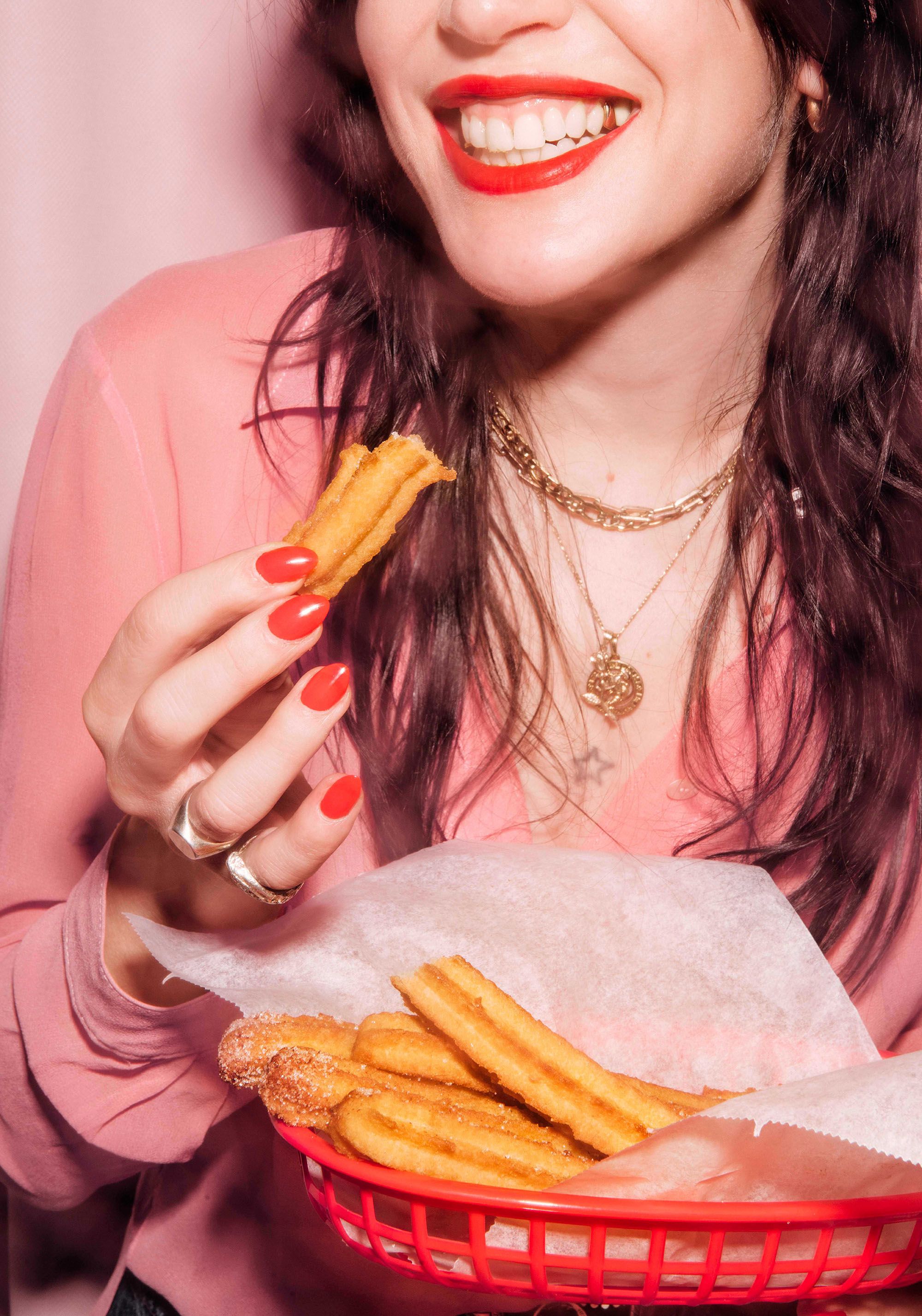
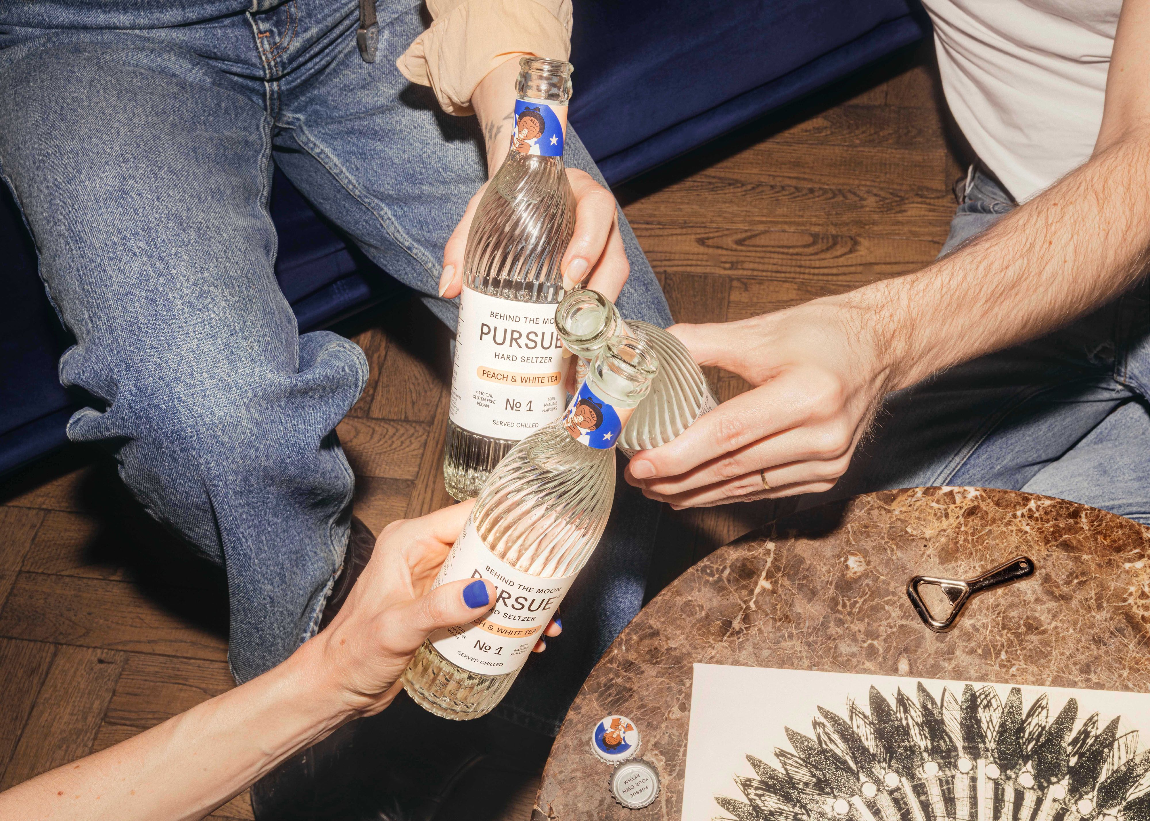
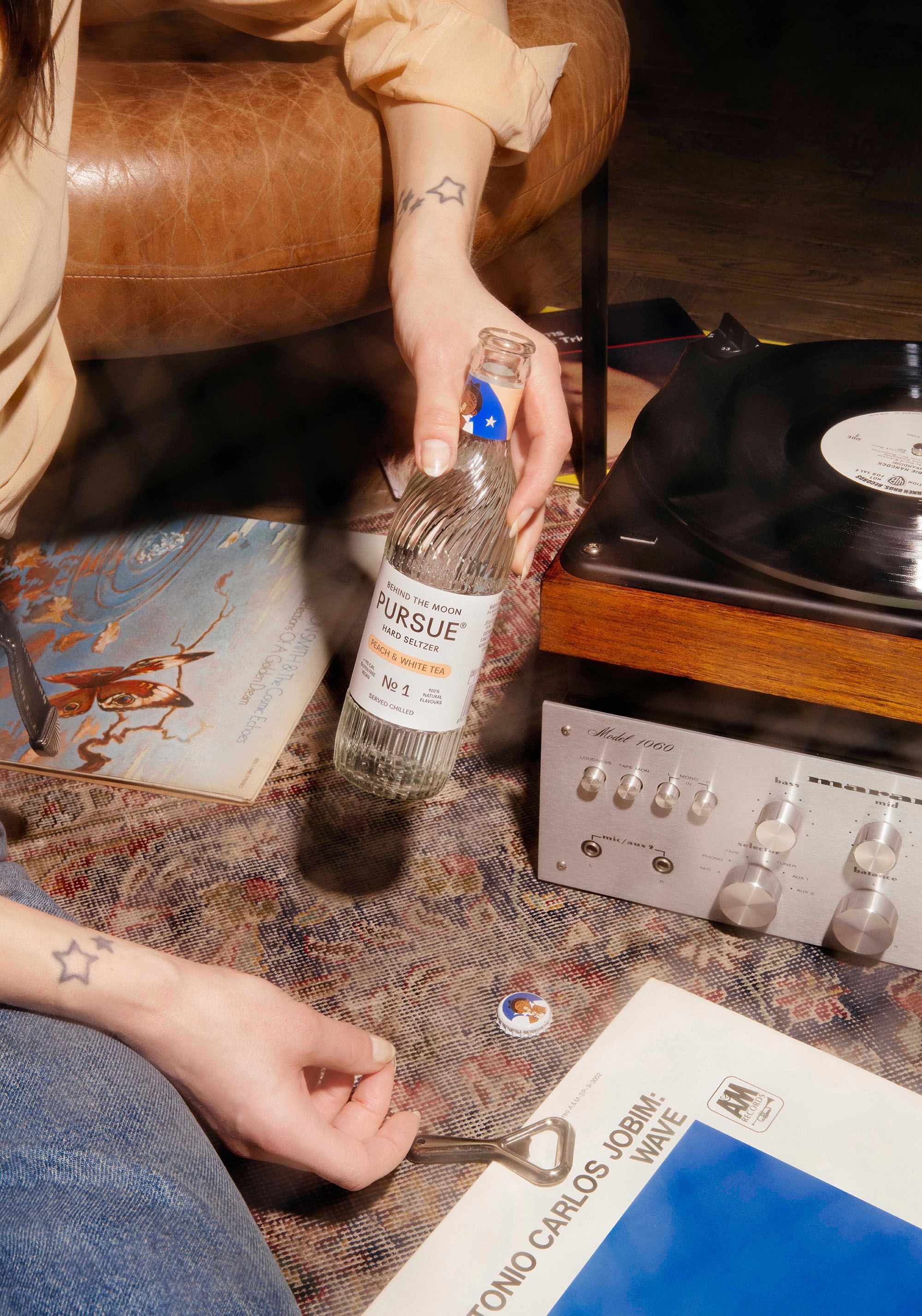
The illustrations offer a portal into a world of heat and soda-heaven, with art direction folding in an upwardly-mobile lifestyle sensibility that many can buy into. This mix of distinctive bottle, narrativised images, photography and copywriting all plays out incredibly well online, giving the brand room to mix things up and remain interesting and present. All of this gets projected at a distinctive and ownable bottle that can accumulate association, wherever that many come from.
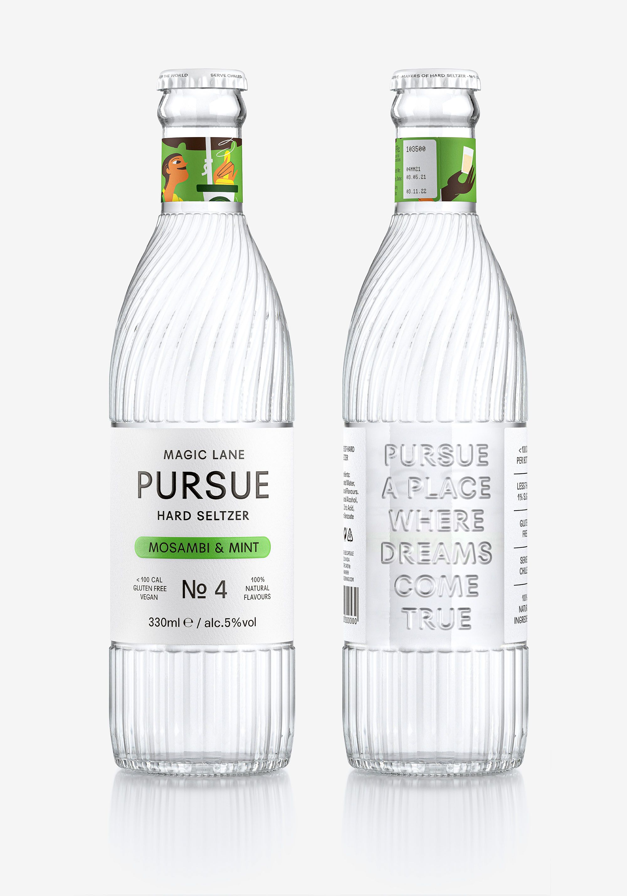
Pursue is comprised of many elements, past and present. Every effort has been made to construct a rich and romantic world of visual, material and verbal components (including a Spotify playlist). The brand seeks to situate people in a time and plays, and plays with dreams of pursuing thins long forgotten. These are used in places and formats that matter to the target market and can be projected on to a bottle that, through contemporary interpretation of historical references, seeks a timelessness and traceable authenticity.
