Skateyogi by Order
Opinion by Richard Baird Posted 8 November 2022
The skateboarding learning curve is really defined by the individual. There are lessons (passed down or shared online), but much of it is practice (and patience). Further, and perhaps more importantly, skateboarding is expressive, it’s fused with personal style. Timeless tricks are given an individual twist that keep it evolving and competitive.
Iconic skateboarding brands have grown out of the sub-culture. Take Palace in the UK and Supreme in the US (I’ve queued outside both). These have brought many more in with hype, hyperbole and collaboration with fashion brands such as Louis Vuitton and Gucci. Although considered an ‘outsider’ sport it really has had a profound impact.
This post includes Extended Insights for BP&O Plus members.
Find out more and sign-up here.
With the introduction of skateboarding to the Olympics in 2020, and the success (and medalling!) of young female athletes such as Sky Brown (who has a huge social following), there’s been a bigger cross-generational, cross-gender, cross-cultural explosion in interest. It’s not mainstream, but it’s certainly engaged a lot more people.
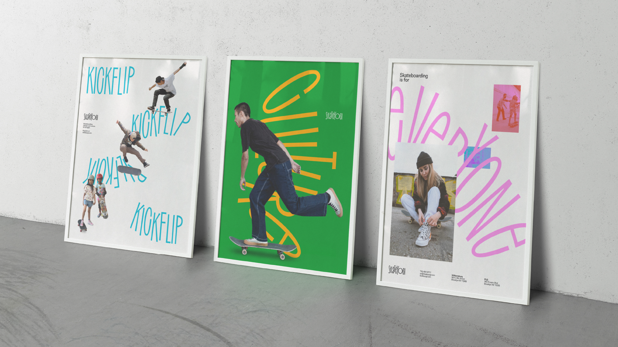
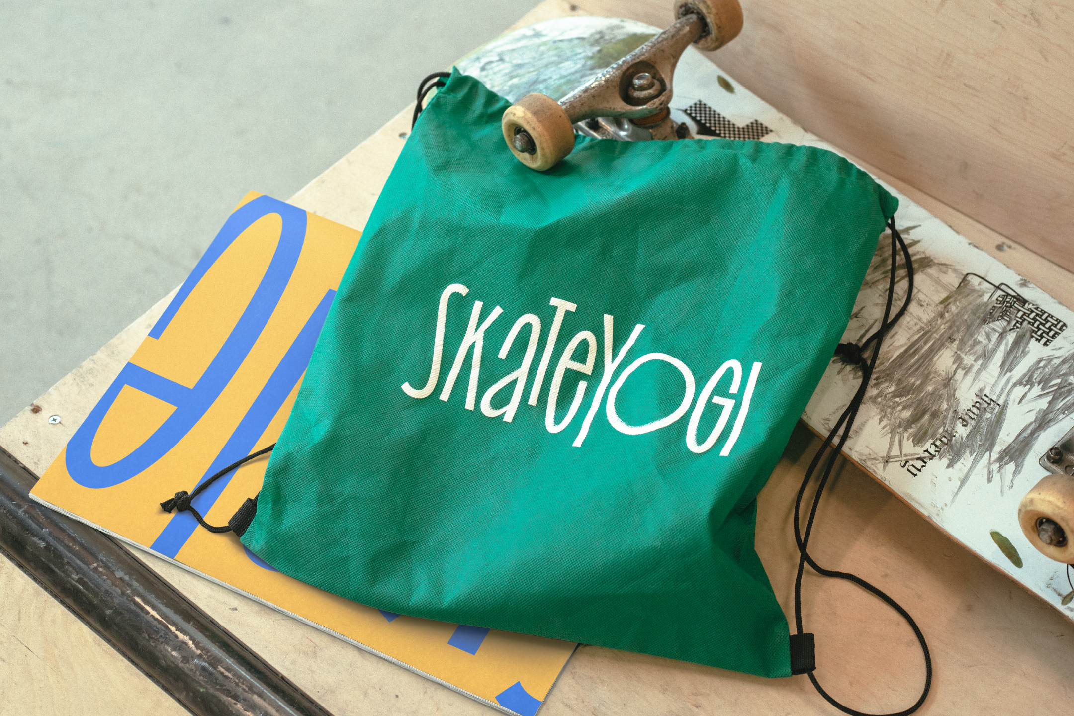
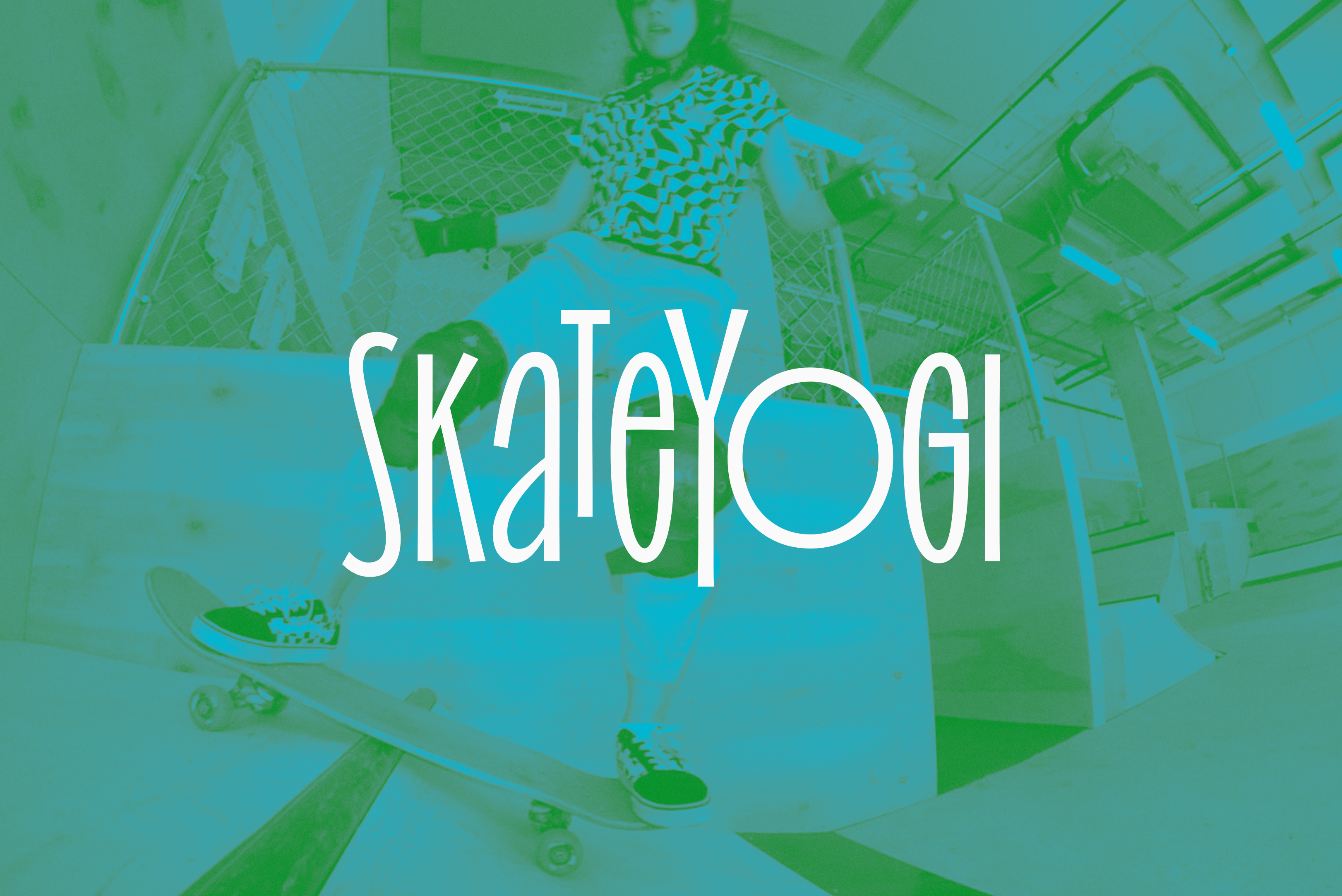
Enter Skateyogi, a Brooklyn-based skateboarding school that provides camps, classes and lessons to all age groups. To coincide with the opening of their new Williamsburg location, New York design studio Order developed a lively typographic brand identity that takes its inspiration from the movement and expression found in skateboarding.
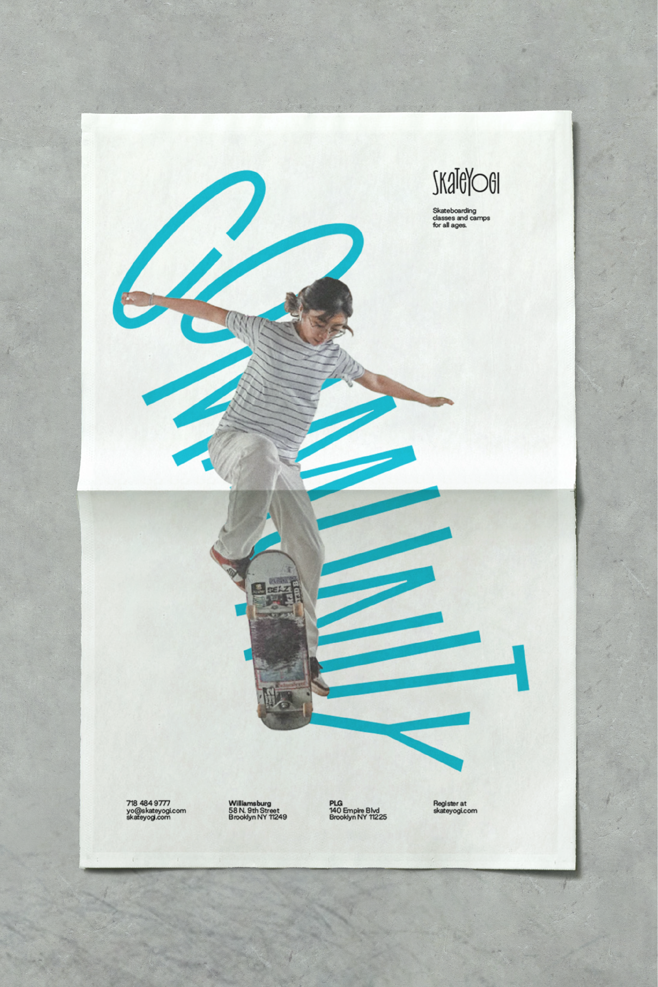
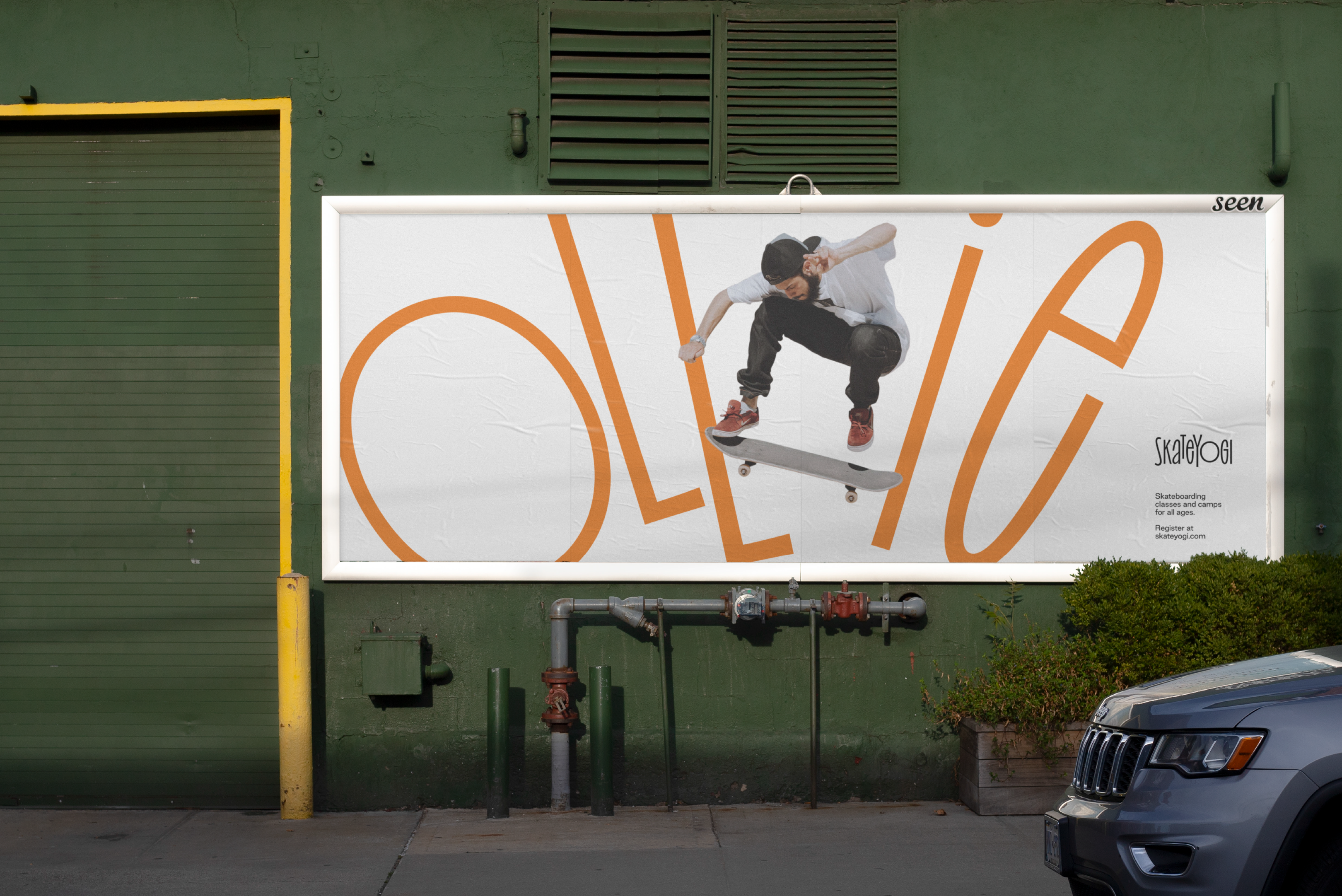
A typographic identity, one that is able to appear to shift and flex, makes complete sense and is beautifully brought to life by Order. Type jumps, twists, flexes, expands and condenses, just like a rider and, calls to mind the simple pencil sketches made by Wassily Kandinsky of ballerina Gret Palucca. Order goes on to elaborate on the idea, saying that by “using phrases and trick names” they were able to express, with character, both “Skateyogi’s values and the process of learning”. Type and language synergise, conveying visual movement and an ideological movement towards inclusion.
It’s worth noting, that this isn’t behaviours in the in the vein of San Francisco Symphony by Collins or North Sea Jazz Festival by Studio Dumbar, rather a series of tracked typographic gestures that appear in place, rather than flexing between different positions through coding or processing. In this way, assets are fixed (but diverse), capable of retaining all of the character in print, gaining more in motion on screen and easier to apply as a brand asset across different mediums.
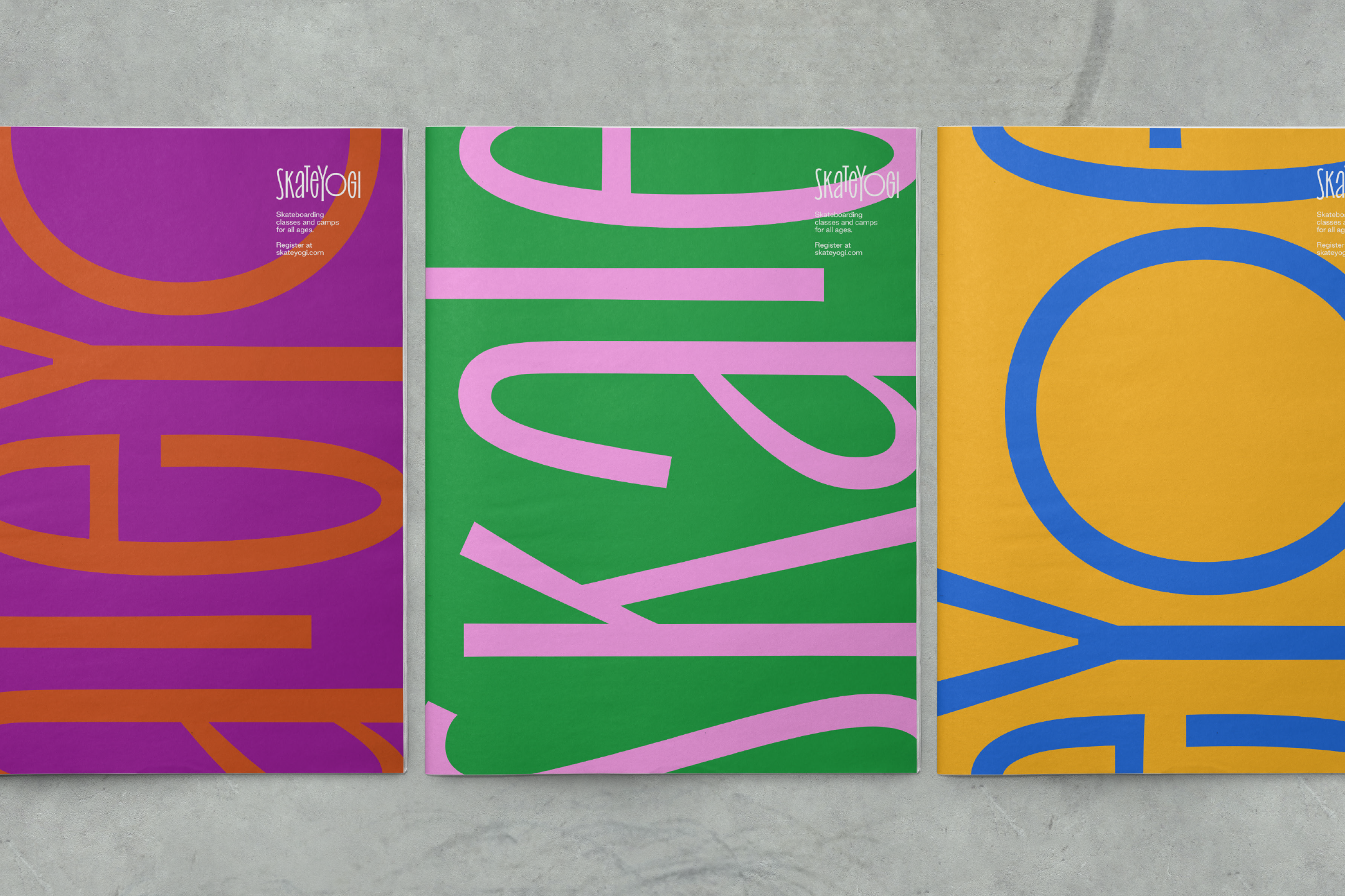
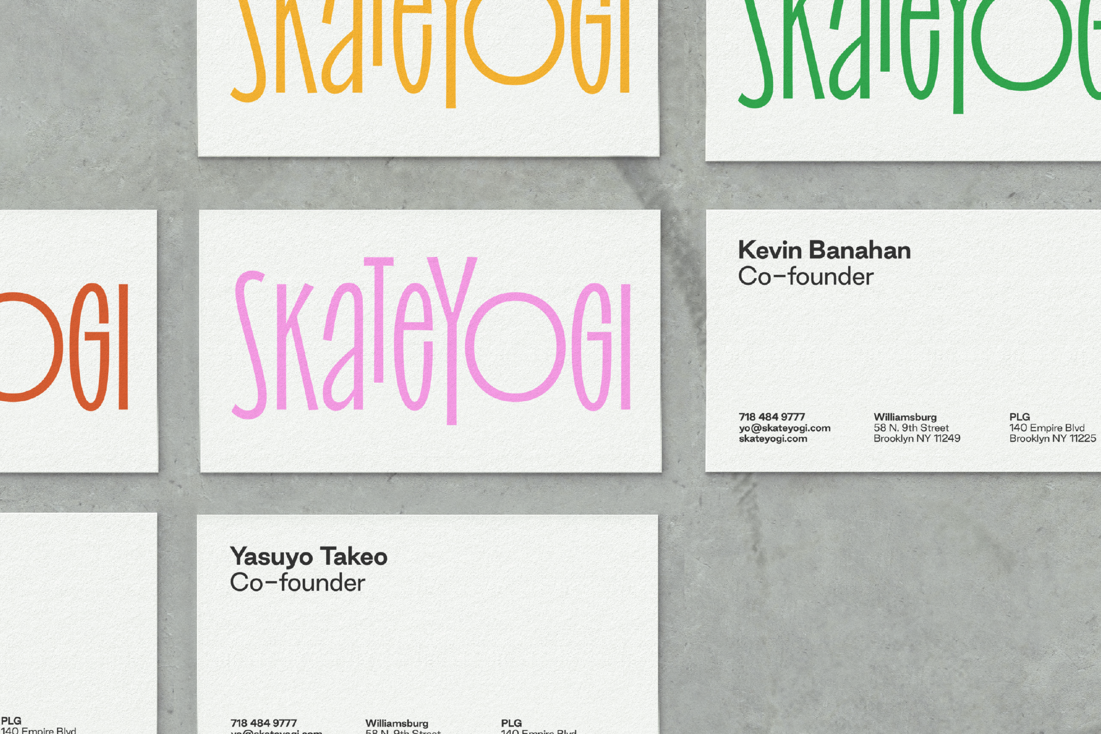
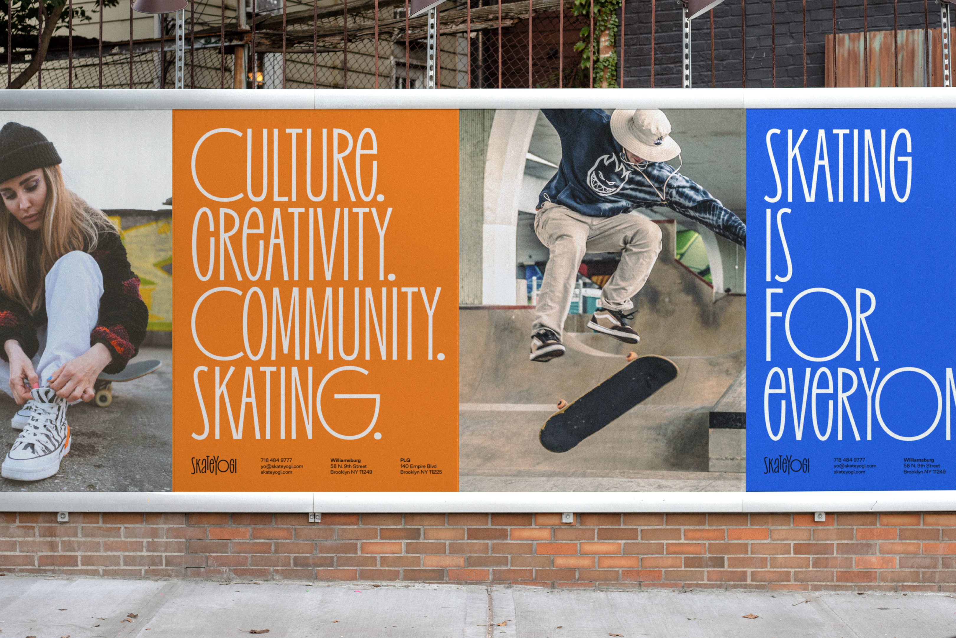
Colour reinforces the invitiational nature of the brand, welcoming all to skatebording. Sure,’diverse colour palette equals diversity of community’ is what it is, but it’s tried, tested and universal in its visual language. The quality and distinction here is in the specific hues, in their pairings, and of course, in conjunction with type and animation. It all coalesces into a cheerful, distinctive and cross-medium visual identity that has a refinement and clarity of concept. It’s not going to appeal to a generation of Palace and Supreme fans, or those whose outside identity is embedded in the sub-culture, but it’s not meant to, it’s for everyone else.
