Baseline by Garbett
Opinion by Richard Baird Posted 10 November 2022
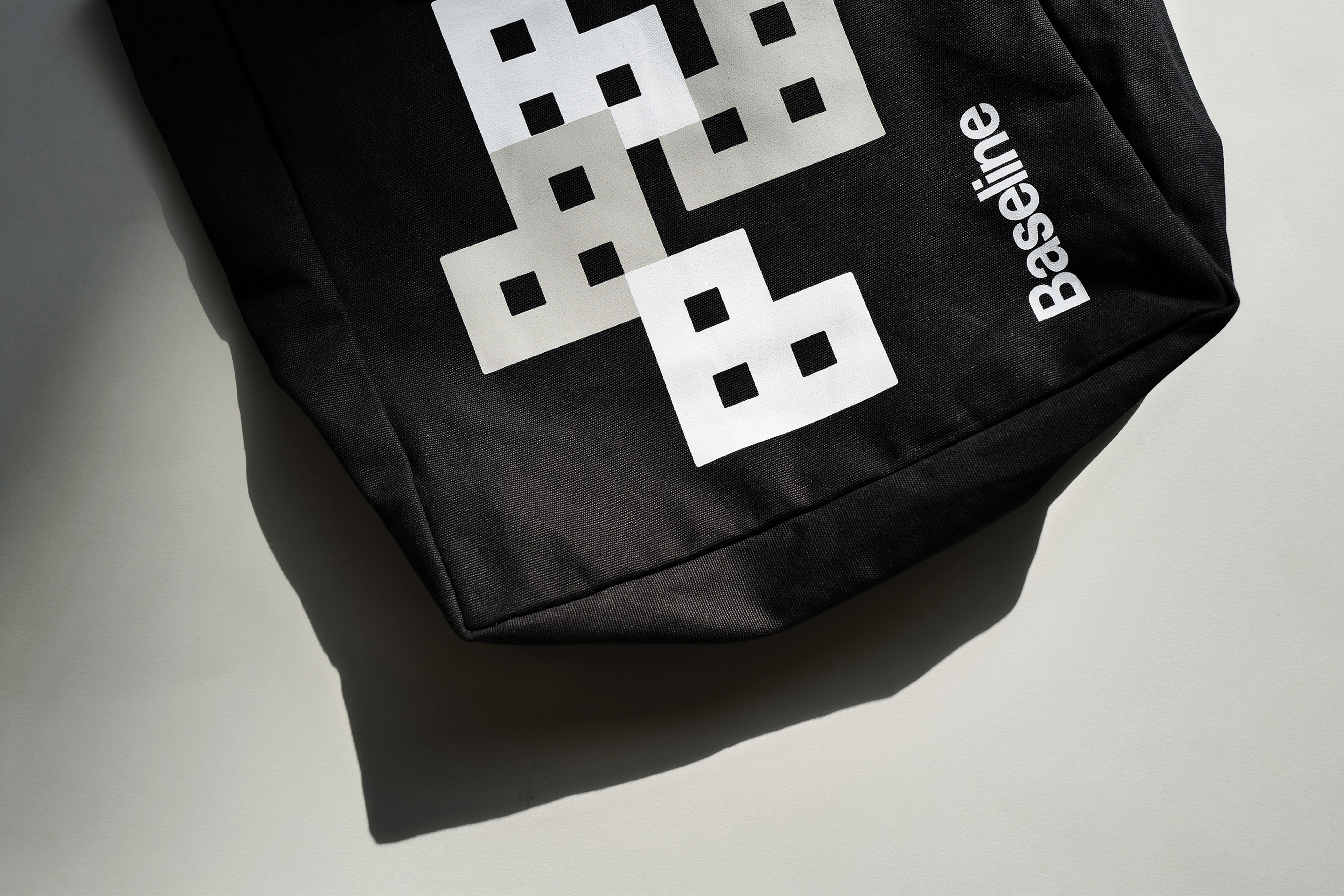
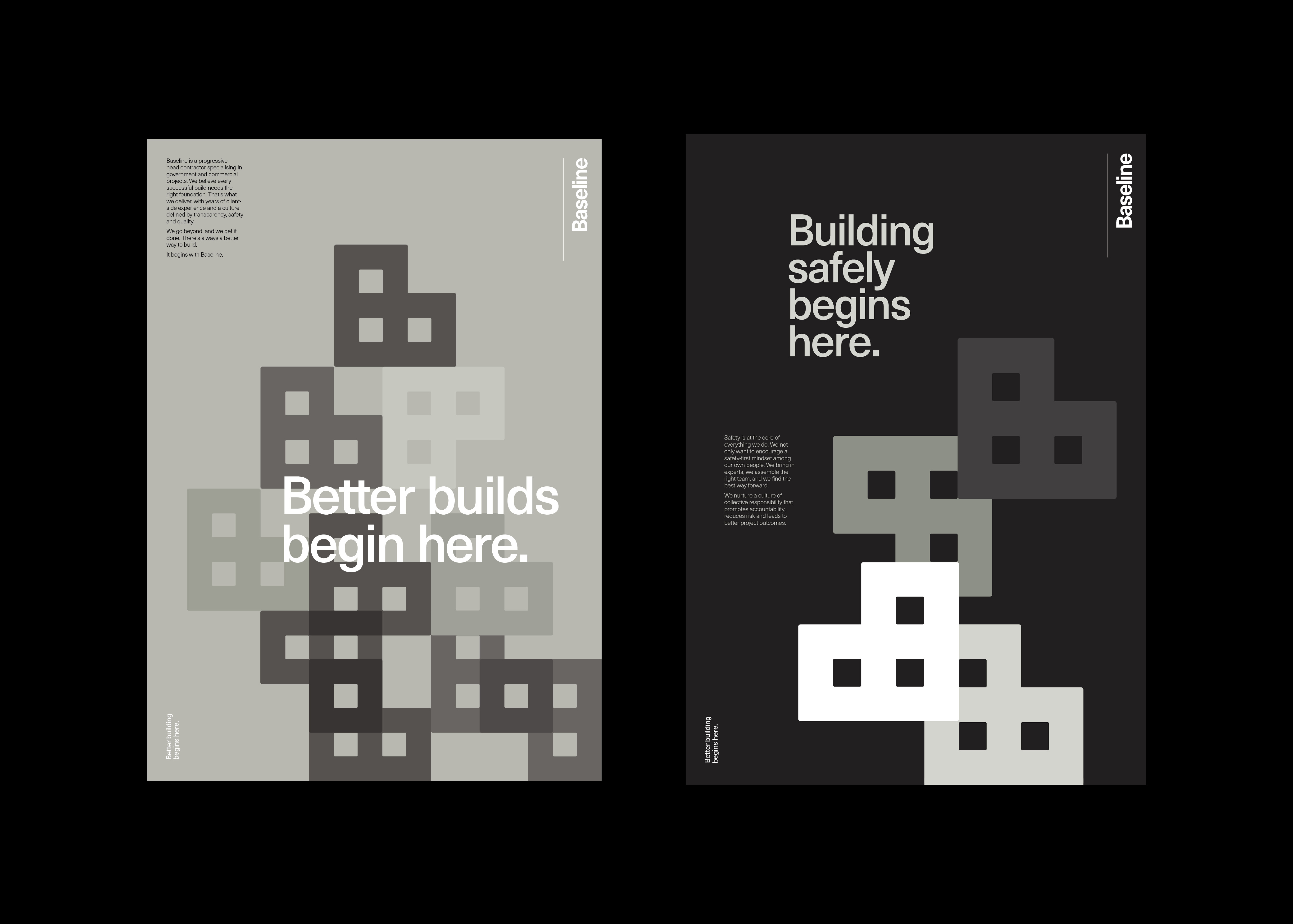
‘There’s better ways to build’ is Baseline’s opening gambit on its landing page. And Surrey Hills-based Garbett worked with the government and commercial builder to bring this and its core values of simplicity, precision, clarity and transparency to life. ‘Every successful build needs the right foundation’. This notion is expressed through a single unit that expands and grows into a dynamic system of blocks, not quite a floor plan nor a skyline, and injecting a bit of character into what is typically an austere industry.
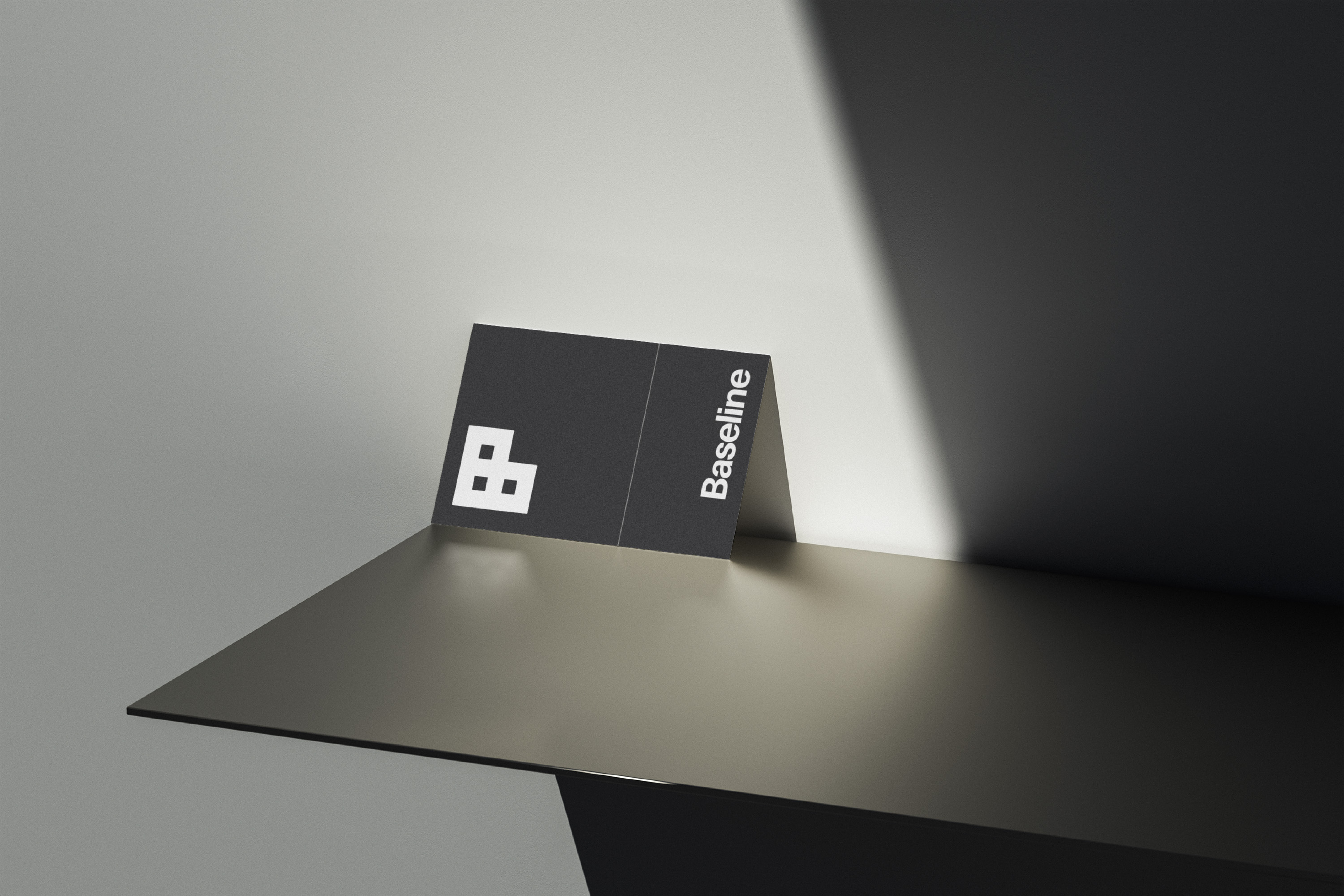
There’s always a risk that a simple, logo-centric identity like this runs out of stream, say on page 15 of a brochure. Where do you go after the patterns? This is a challenge a rather influential studio owner would often pose to me and the team I was in. Context is key here. Firstly, Baseline, and I’m drawing on a bit of experience here, is unlikely to be running a fifteen page brochure or need to develop an outdoor campaign. The likely extent of business communications is a website, business listings, quoting and invoicing, perhaps a bit of outreach, word of mouth and business cards. Search similar contractors in the area, or nationally, and Baseline clearly stands out as professional and reliable, simple because it presents itself and its information in a way that respects people’s need for straightforward navigation.
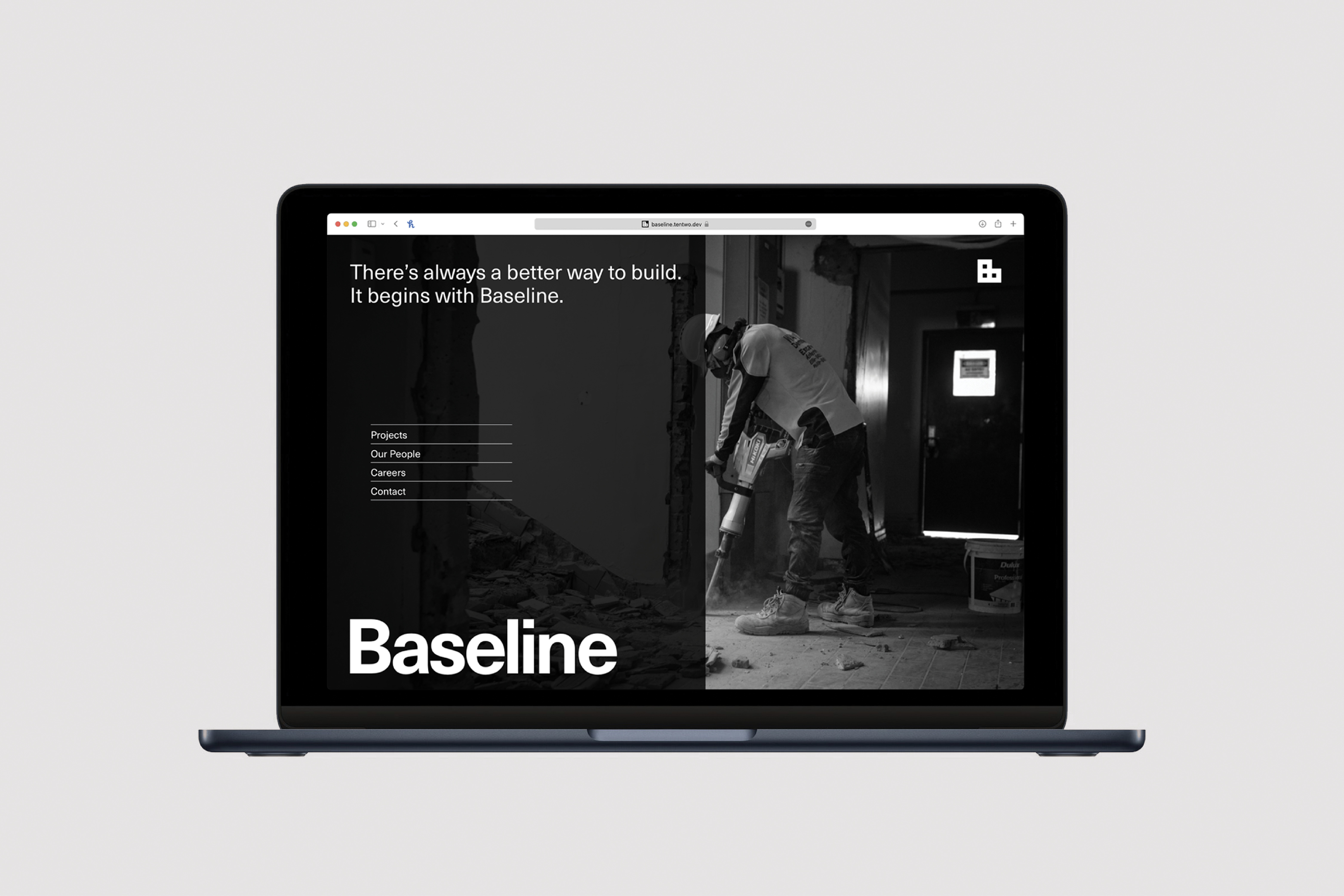
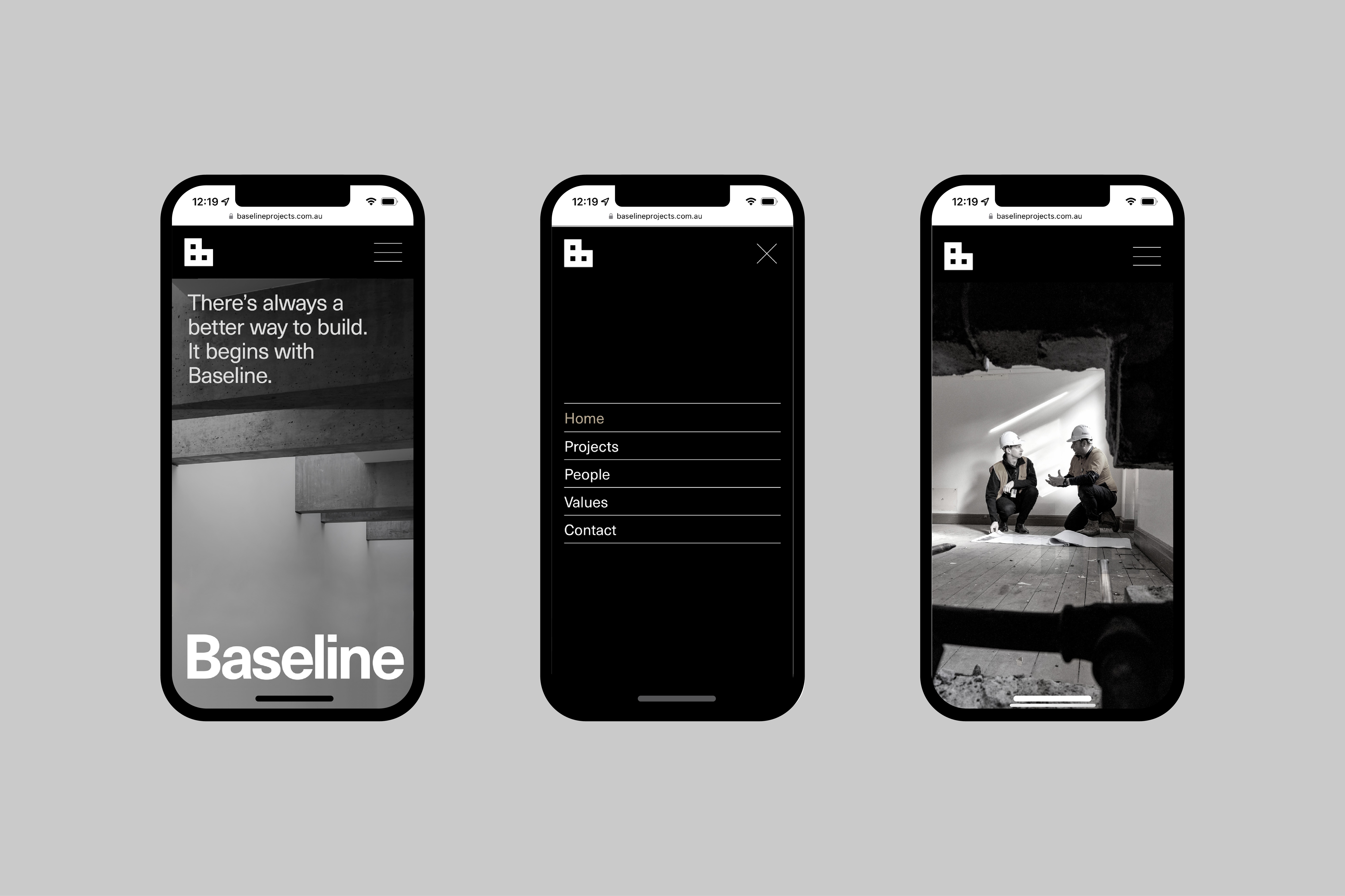
The top line is the visual work is precise and well-executed. These projects usually fall down when it comes to web design (trust me, it happens a lot, I’ve seen some great case studies, but one click away, and you really see how it really plays out, or doesn’t). However, not true for Garbett. They’ve taken care of that too. Neue Haas Unica is a workhorse, says no-fuss reliable and well-constructed. It holds up well on both desktop and mobile. it’s not overflowing with character, but it doesn’t need to, it does the job, as I’m sure Baseline does. The key lines and black and white photography, in conjunction with type conjures up something of the Swiss style of the mid-century modernists but with a contemporary responsiveness, and the people give it all a bit of warmth, even when it monochrome. And that’s before we’ve got to the playful use of blocks and their animation. And again, context here is important, this is a firm dealing with both commercial and governmental projects. It needs to exist within a tight liminal space between the two. So let’s look at the more ‘commercial’ side.
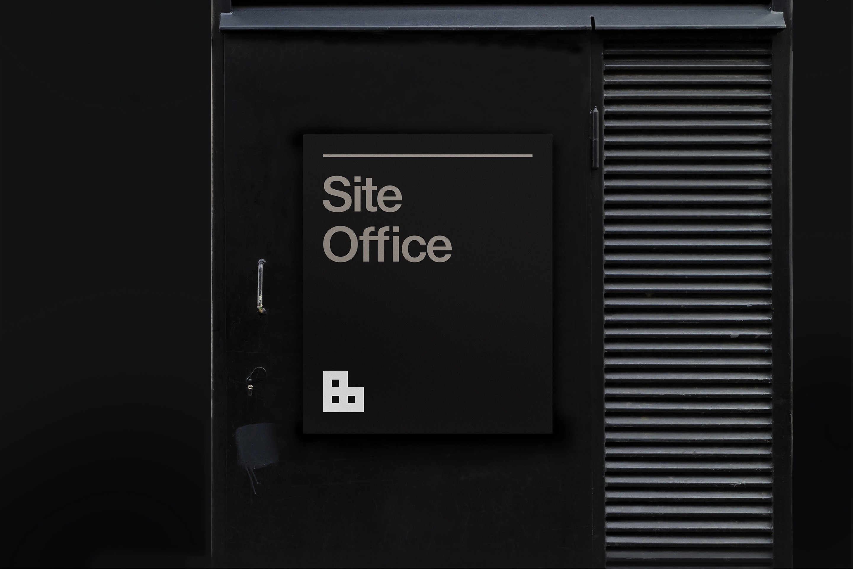
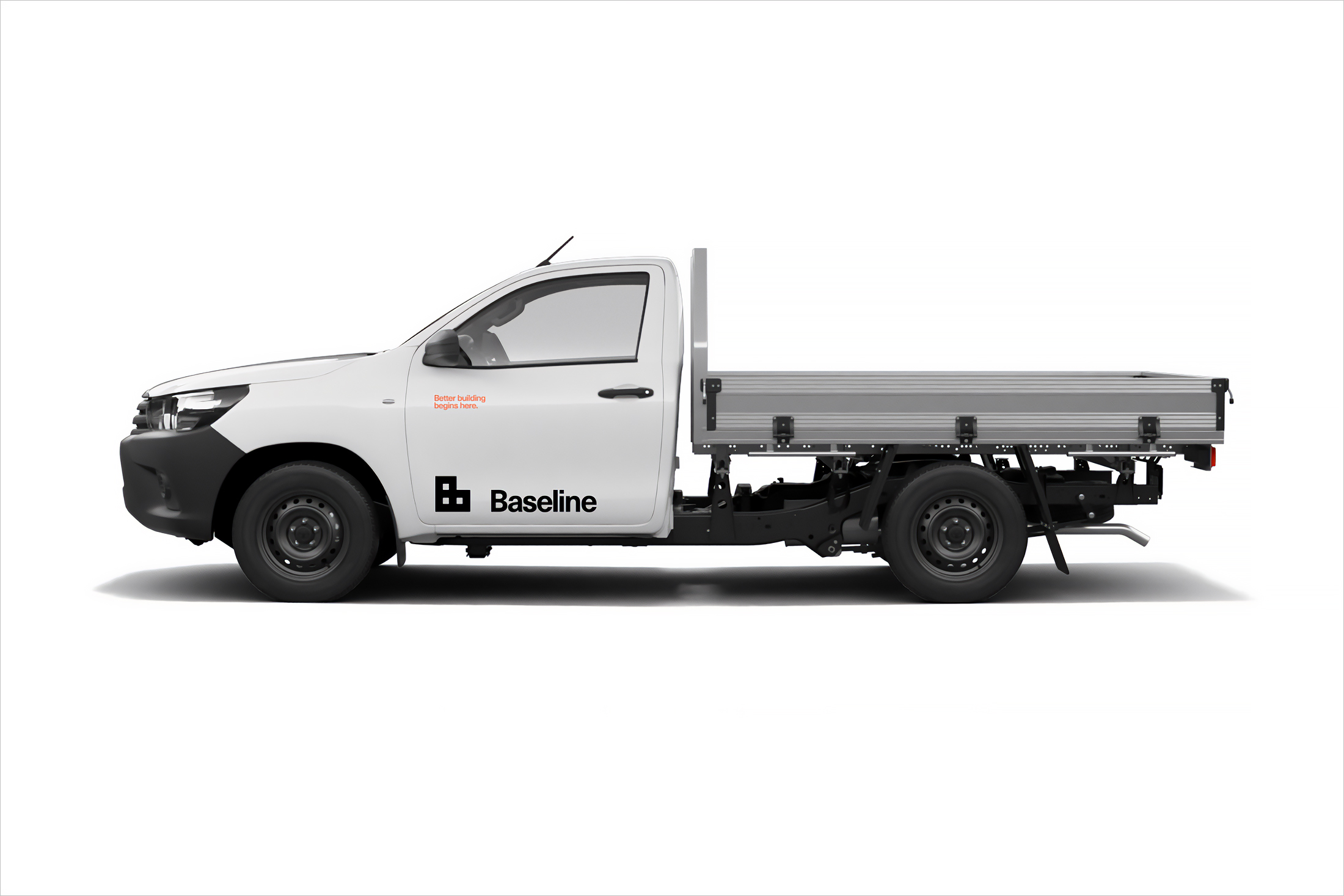
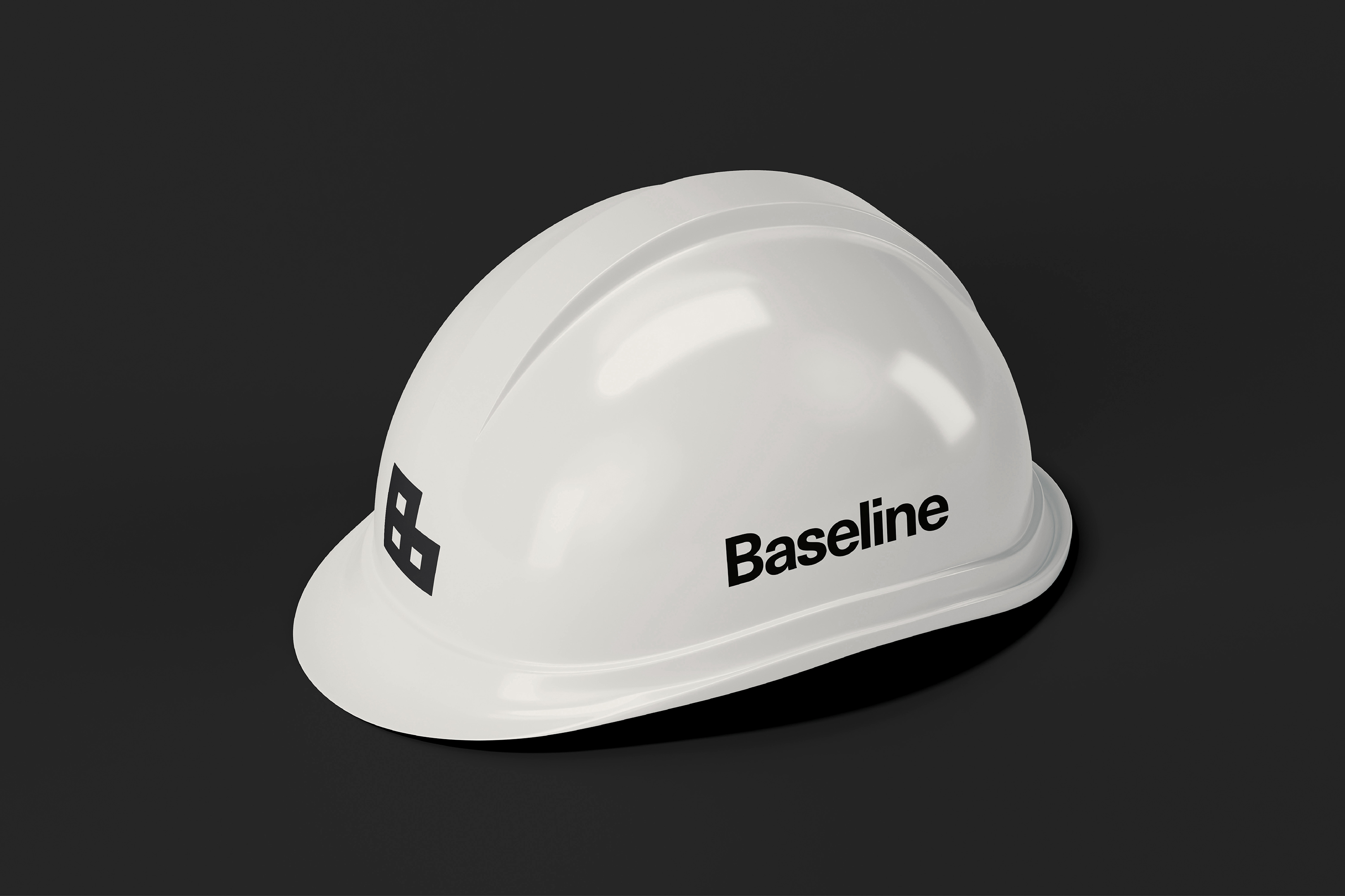
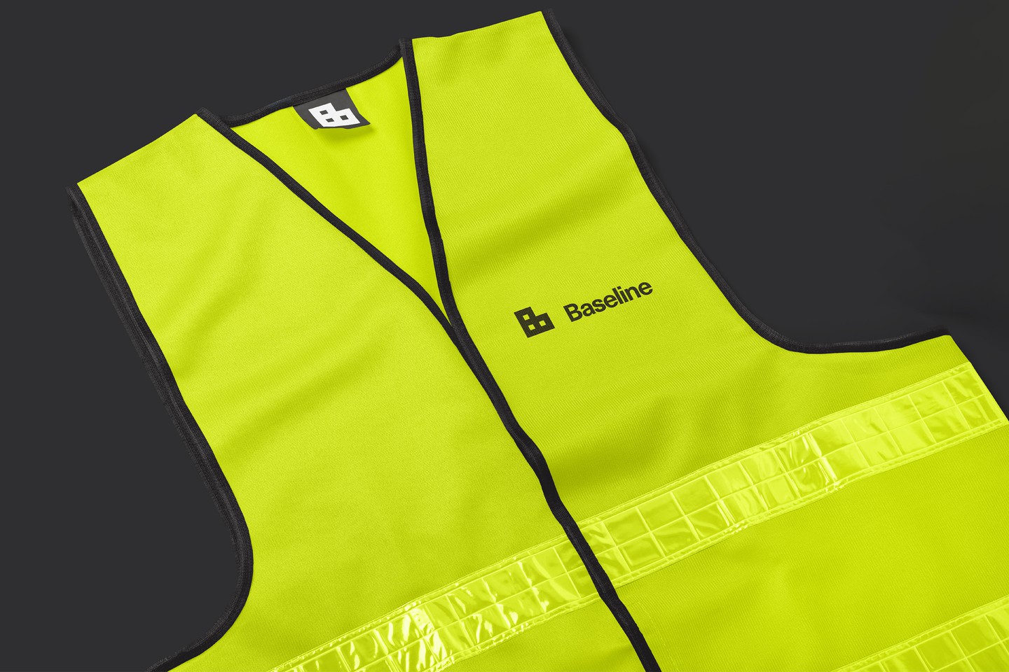
Sure, there is a simple ‘B’ and an ‘L that expresses, with immediacy, that sense of a urban skyline, floor plans and frameworks. It’s universal. Maybe it’s been done before, maybe not. What matters is what they’ve done with it. It works well as a static form but gains more as it is used as a brand building block in which to construct a multiplicity of visual elements. These, however, are not literally buildings, more of a playful opportunity akin to lego. Through this, and in the behaviour of motion, Garbett injects a bit more joy and commerciality into what could have been austere. This all helps with attribution and recollection, as does repeating it without fuss across business cards, hard hats and high vis.
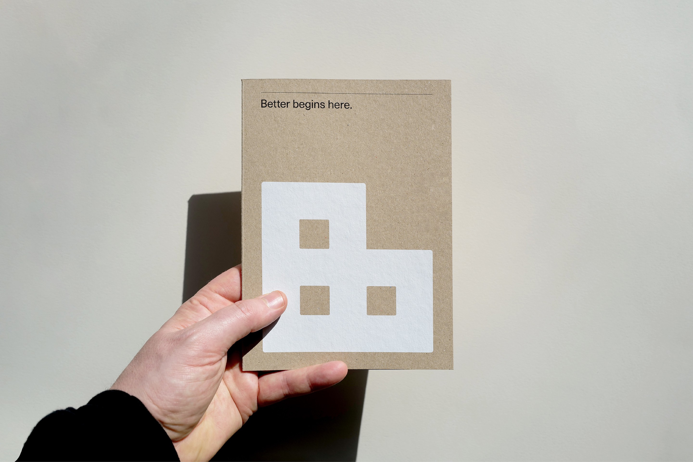
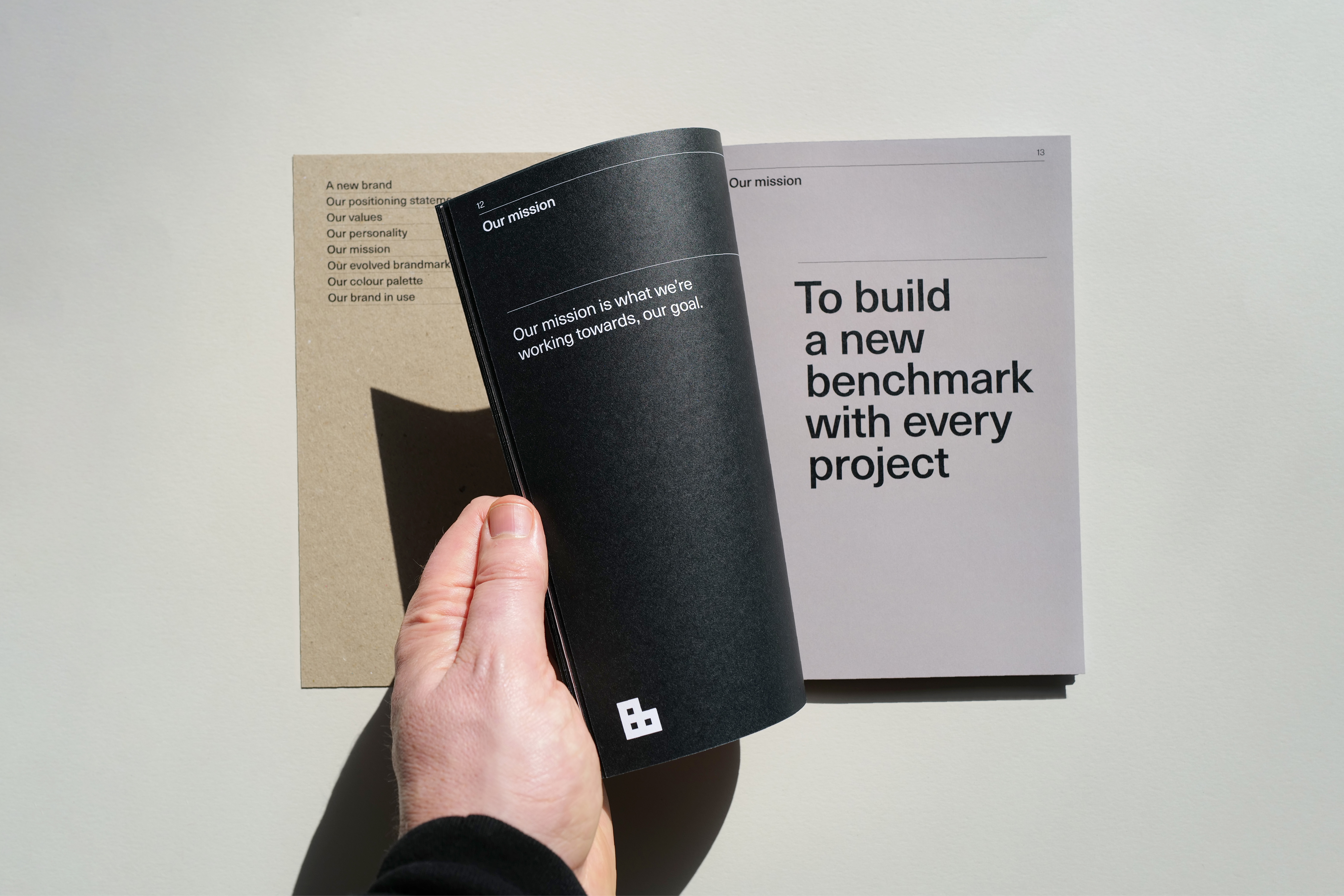
It’s not Bovis-from-the-70s-surprising but it’s elegant in its own way, concise in its realisation with a little bit of extra joy in the use of motion, patterning and application. Sure, the safety posters feel more like an award entry rather than something designed to function on site or in the office, put it certainly sets a potential direction for the client should they want to explore or develop the identity further and across other contexts. For all the criticism levelled at awards mock-ups, are we not, as designers, in the business of inspiring clients to go one step further?
Editor’s note: Garbett got in touch with photos of the safety posters, in situ, at Baseline! Brilliant!
