Fork & Good by Mother Design
Opinion by Richard Baird Posted 19 January 2023
There’s nothing more human than food says Nyati Gupta, CEO and Co-founder Fork & Good. However, the first place people in more temperate regions will feel the effect of climate change will be on their plate. ‘To be able to eat your favourite dishes without the environmental impact, that would be the dream’. Although vegetarianism and veganism have made it to the mainstream, much of society remains thoroughly in love with meat.
Cultivated meat at scale–maintaining the familiar taste, texture and flavour whilst reducing carbon emissions and land use–is seen as a realistic option, yet it lives in a category that, at present, is described as being ‘notional’. Although laboratories and restaurants have experimented with high-priced cultivated meat, barriers such as cost-effectiveness, scalability and cultural skepticism have kept lab-grown products from gaining traction.
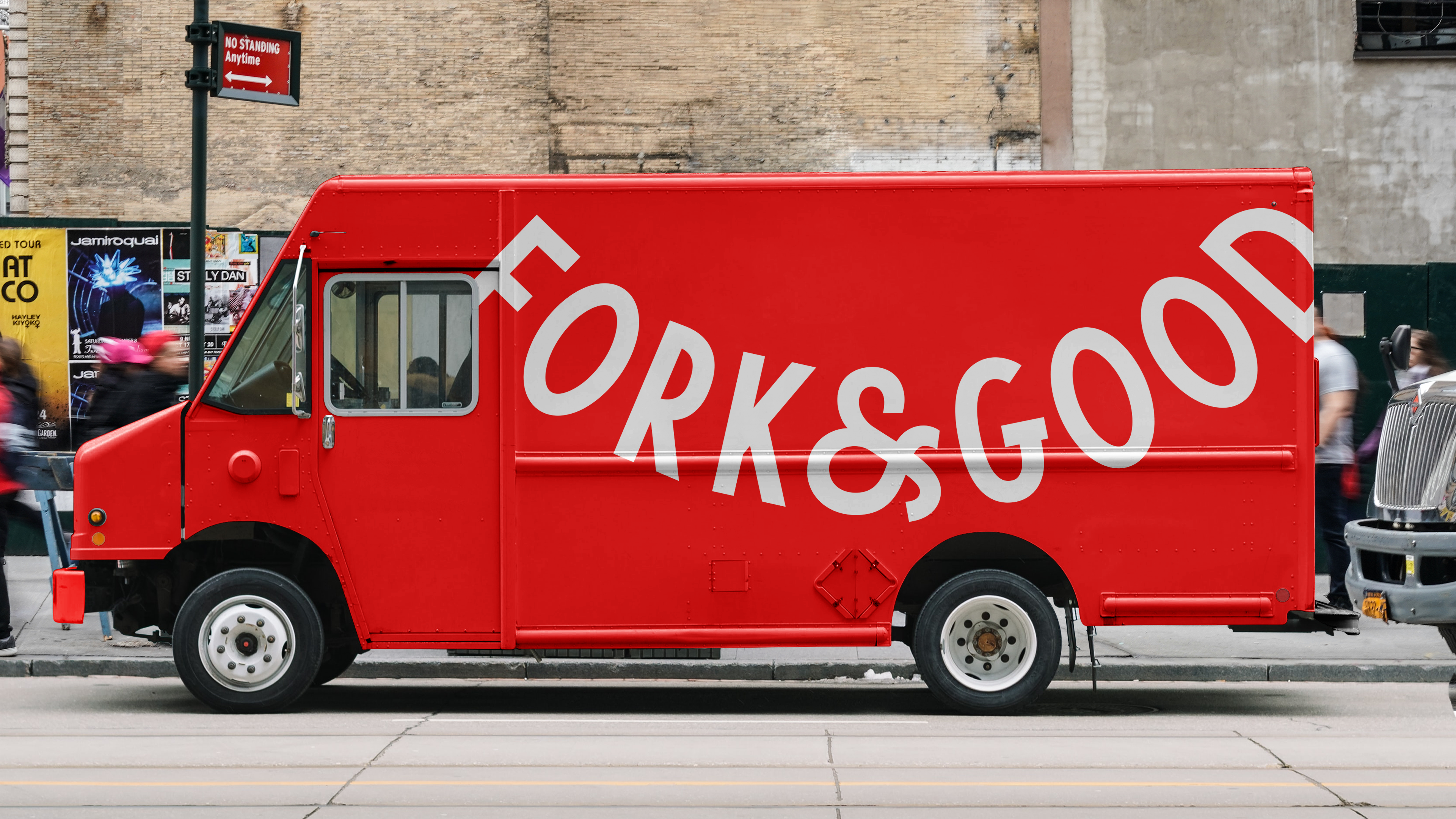
While the ambition is big, compared to other technologies, the cultural shift taking place is moving at a glacial pace. Fork & Good takes an incremental approach towards that much bigger goal, with an initial product of ground pork—the most widely consumed animal protein—sold through partnership food trucks and fast-casual restaurants.
As Mother Design, working in partnership with strategic agency FNDR, rightly point out, few people’s mouths water for sustainability and science. The leap here is repositioning a ‘sustainable science company’ as a nutritious, affordable and delicious food company.
There’s a number of different aspects to this. The company, despite its repositioning, is a science/tech business and needs to attract new talent. It also needs to have an outward facing public image, the PR side of the brand, that can communicate to a wider audience the work it’s doing and the potential of the emerging industry. Finally, it needs to appeal to the fast-casual and street food businesses looking to create conscientious new versions of universal classics. Meatballs, dumplings, and tacos, for example. Science, tech, PR and fast casual food. It’s a lot, but the outcome makes sense.
The visual language is not too dissimilar from that of a friendly tech brand or a good quality street food venders, Oji (reviewed Aug. 2020) and DF/Mexico (reviewed Sep. 2014) come to mind. In fact, it’s far closer to a street food vender than a raw meat producer. This was my initial impression when first seeing the work and that’s no bad thing. All any brand can ask for, and particularly something genuinely disruptive and culturally uncomfortable with ideological and political dimensions, is to ask for consideration. If borrowing a few visual cues is what’s needed, to ease transition, so be it. The brand appears friendly and trustworthy, not overly virtuous or indignant at the current state of things, and that’s a good point of difference, a change in the conversation.
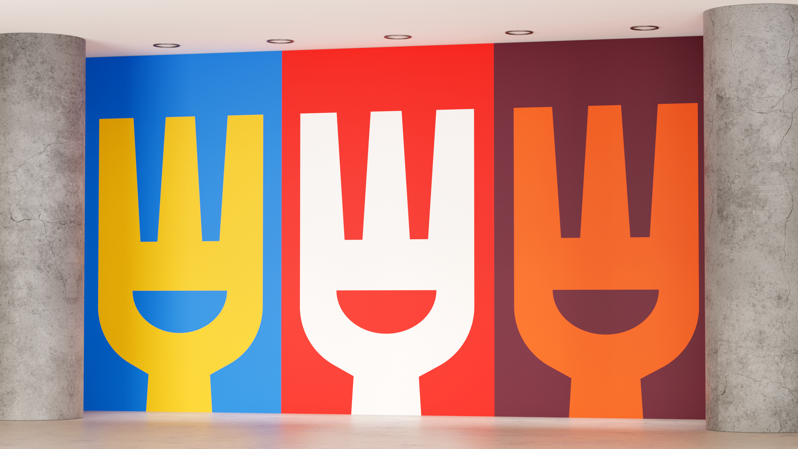
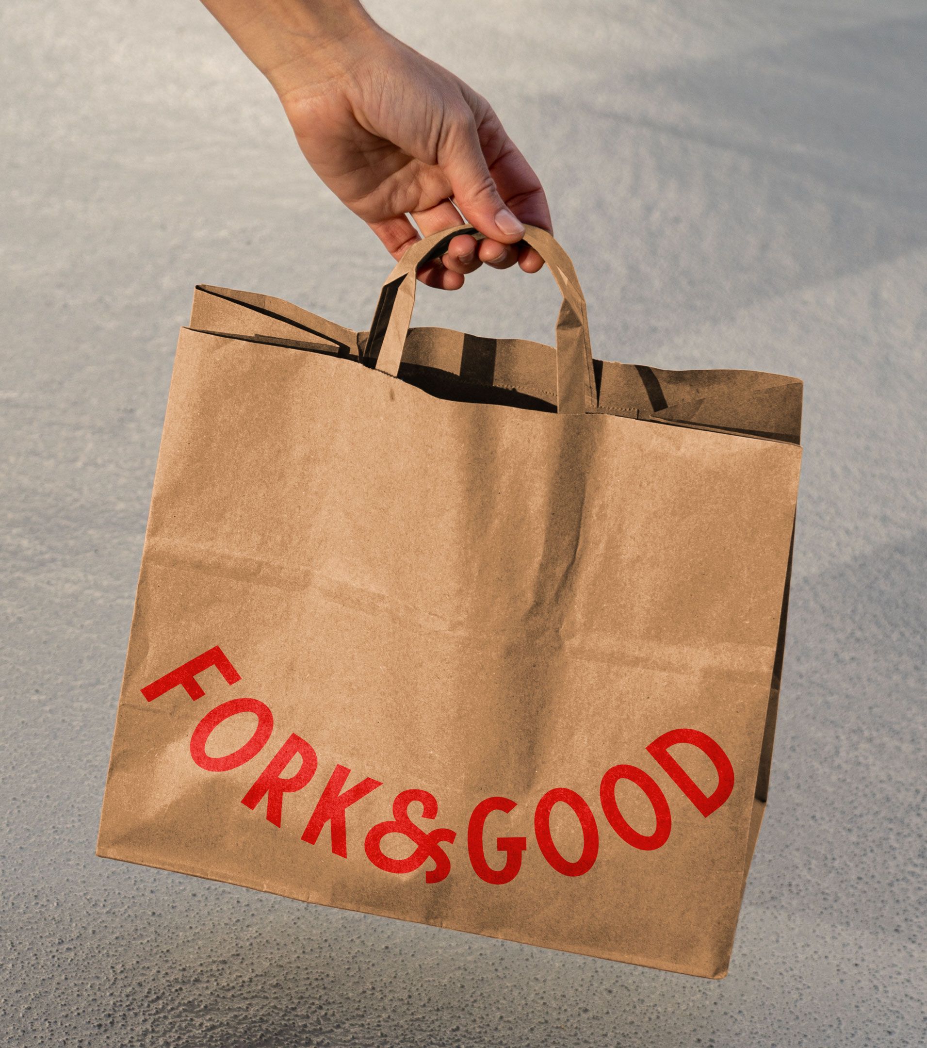
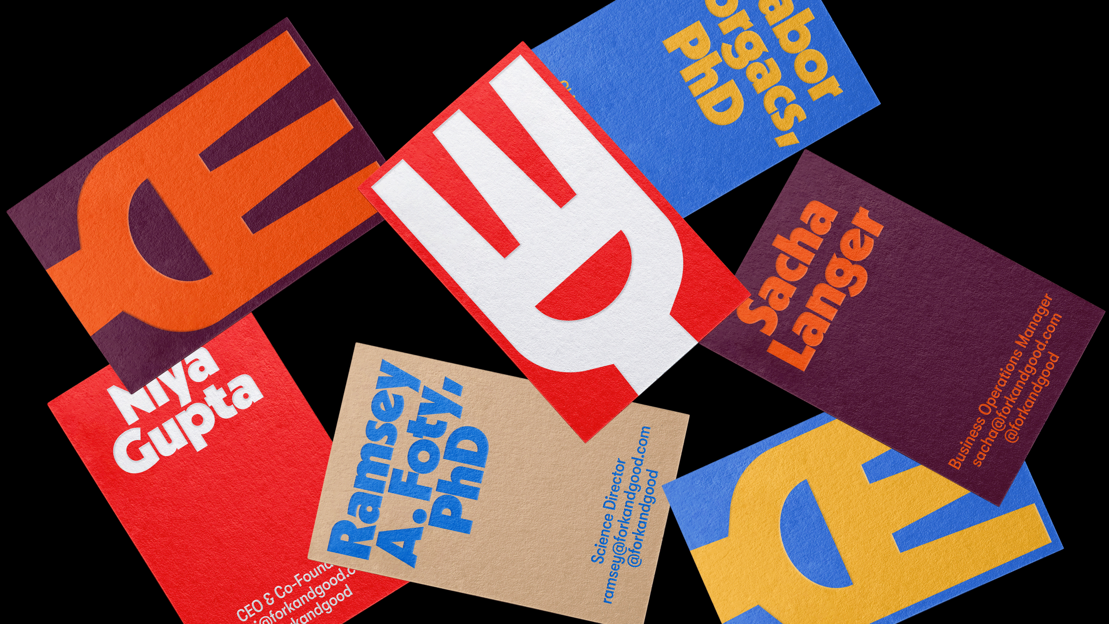
Studying brands with mass appeal, Mother Design developed a visual identity that found an intersection between the graphic languages of fast food, street food and quality meat, taking their inspiration from traditional butcher shop signage. The curvature of the logotype, for example. This appears as both bowl and smile, and has been developed into a system that brings together appealing food photography (the outcome, not the raw ingredient) with a bold use of colour and simple striking forms.
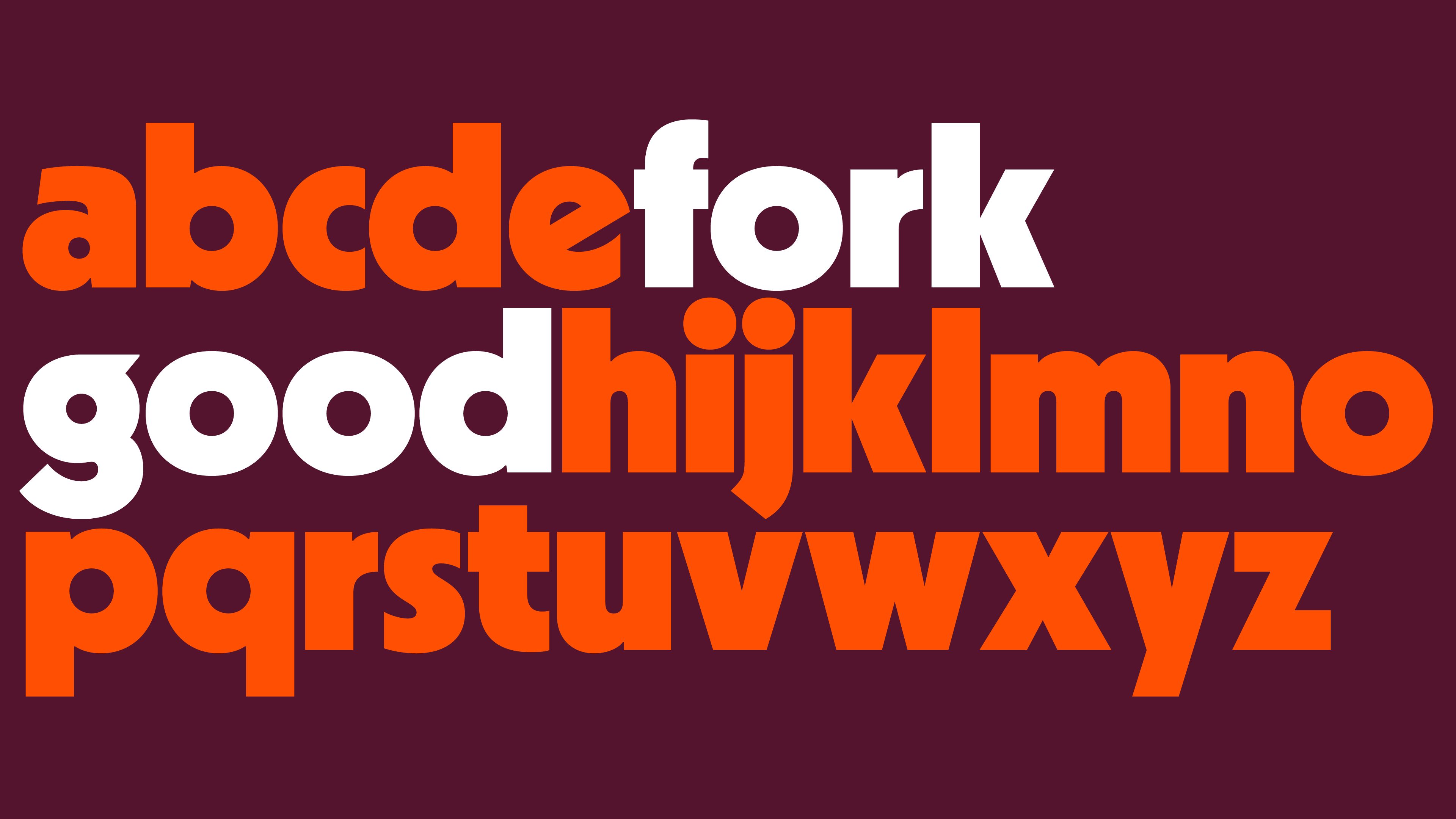
The curves of the bowl are then reflected throughout the playful forms of Radion. Bold and filling and full of character. The condensed sans-serif that accompanies it, Grilli Type’s GT Walsheim, which is lighter in weight and used as a secondary typeface and within the logotype offers a nice counter, really emphasising the weight and impact of the other. From empty to stuffed. Simple.
The smile also plays out as a dynamic fork-like character with the negative space of the fork becoming expressive eyes, (or chopsticks above a bowl). It’s a nice touch that suggests the universality of the product and certainly sends the brand down the road towards being somewhat consumer facing in its campaign to make its product more acceptable, even if it is restaurants and food trucks buying in the raw ingredient. With names like bright red, cool dijon, deep eggplant, the intention of the colour palette is clear, to evoke flavour, to appear distinct and appealing.
There’s still a lot of hurdles to overcome, and this new positioning seeks to do a lot, to connect with a few different groups, however Fork & Good put their best foot forward, with Mother Design providing a clearer and more distinctive image in which to begin to shift perceptions towards.
Get more with BP&O Plus
Read Extended Insights, start bookmarking, switch between light/dark modes, article and Gallery Views and support our writers. Subscribe here.
