Designed by Mother Design
Fhirst by Mother Design
We’ve arrived at a point where the idea of ‘y2k’ as an aesthetic has stretched beyond ‘trend’ or ‘cycle’ and morphed into an entity almost entirely devoid of the temporal placemarker its name suggests. Having been repeated ad nauseum, ‘y2k’ is no longer about a visual/cultural moment and/or collection of moments around 25 years back. Instead, it’s become a Burroughs...
Reveri by Mother
There’s no denying the proliferation of all things that the more curmudgeonly crowds might deem ‘woowoo’ over recent years. Crystals, gong baths, singing bowls, silent retreats, tarot et al were once firmly languishing on the fringes of society, and are now de rigeur among the Stoke Newington set and TikTok classes alike. This rise in self-help-led esotericism has run concurrently...
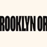
Brooklyn Org by Mother and Mother Design
Mother New York and Mother Design (Fhirst, Brooklyn Org, Peerspace) have overseen the rebirth of Brooklyn Community Foundation as the commandingly named Brooklyn Org. The sea change arose from a desire to distance the organisation from ‘notions of traditional philanthropy, seen largely today as elitist, dysfunctional, and detached’. If that sounds like a solution to a problem that shouldn’t exist...
Fork & Good by Mother Design
There’s nothing more human than food says Nyati Gupta, CEO and Co-founder Fork & Good. However, the first place people in more temperate regions will feel the effect of climate change will be on their plate. ‘To be able to eat your favourite dishes without the environmental impact, that would be the dream’. Although vegetarianism and veganism have made it to...
Peerspace by Mother Design
Straight up, I’ll admit that I struggle to resist a condensed sans typeface set in uppercase. I’ll also confess that I’ve spent the last hour (no lie), trying to identify this one… Helvetica? Hell no. Railroad Gothic? The wrong track. Söhne? Sö not. Must be Knockout? Another blow. For Druk’s sake is it Druk? Well, whatever it is, it’s neatly...
AIGA Design Conference by Mother Design
The American Institute of Graphic Arts (AIGA) is a professional design organisation with a membership that covers all forms of visual communication, from graphic design, typography and interaction to branding, motion graphics and environmental design. As well as supporting a community of over 25,000 nationwide members, advancing design as a professional craft, strategic advantage and vital cultural force, AIGA organises two...

30 Park Place New York by Mother Design
30 Park Place is a private residence with 82 floors and 157 apartments created by the internationally renowned luxury hotel and resort management chain Four Seasons. Located in Tribeca, New York, the residences are described as having breathtaking views, soaring ceilings, multiple exposures, and warm details, as well as five-star hotel level services and amenities that include swimming pool, fitness centre, private dinning experience and...