Tugg by Kurppa Hosk
Opinion by Kinda Savarino Posted 23 February 2023
The hamburger is an American icon. It conjures associations with all-American diners and drive-thrus, backyard cookouts and family gatherings; American values, such as entrepreneurship, as well as less positive attributes of Western countries, like obesity. The burger’s visual identity is inseparable from its history and has been solidified time and time again as the big fast food franchises conquered the global market and influenced the independents.
Rejecting the bold typography and retro colourways of American culture that have long dominated the industry, Swedish design agency Kurppa Hosk aimed to give hamburger chain Tugg an outfit that breaks with traditional tropes. Their focus was to create a brand identity with ‘more soul, more dynamism, and more of all, more representation of global cultures’ – a restaurant to welcome everyone.
This post includes Extended Insights for BP&O Plus members.
Find out more and sign-up here.
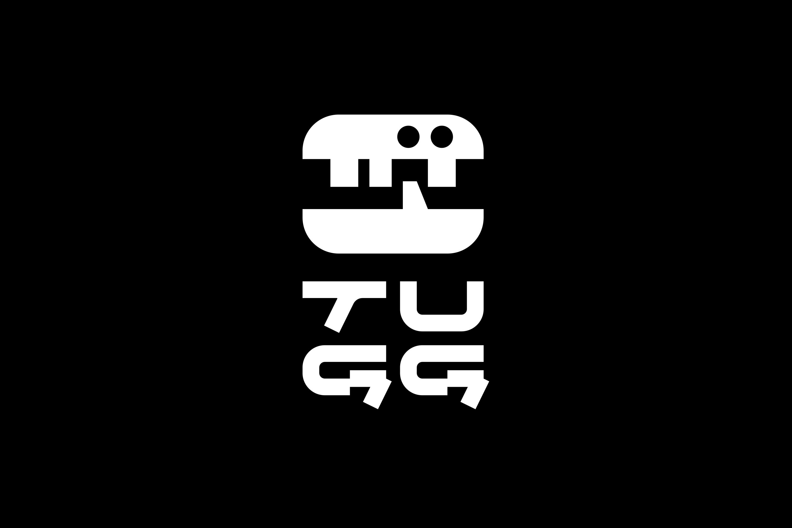
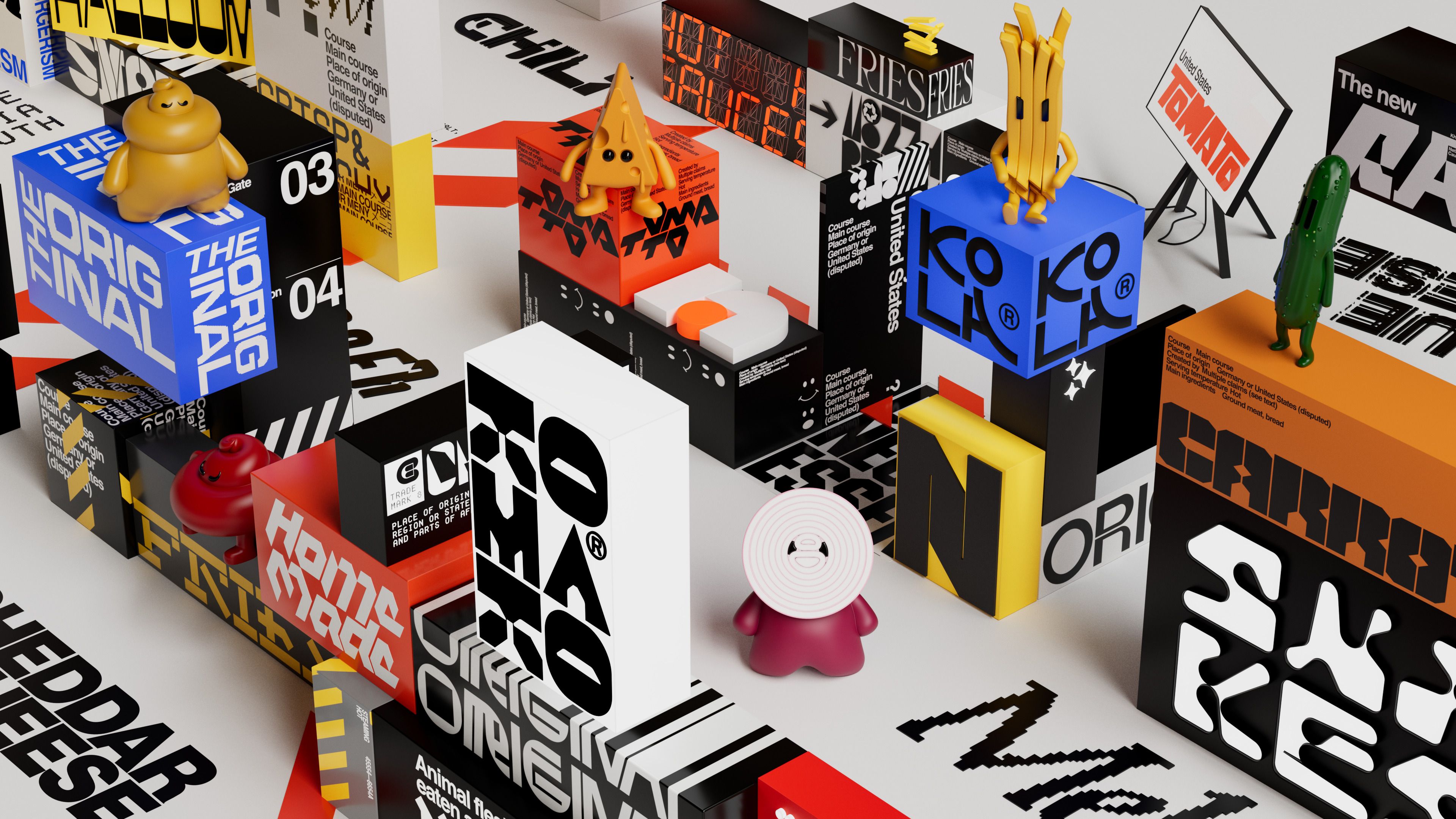
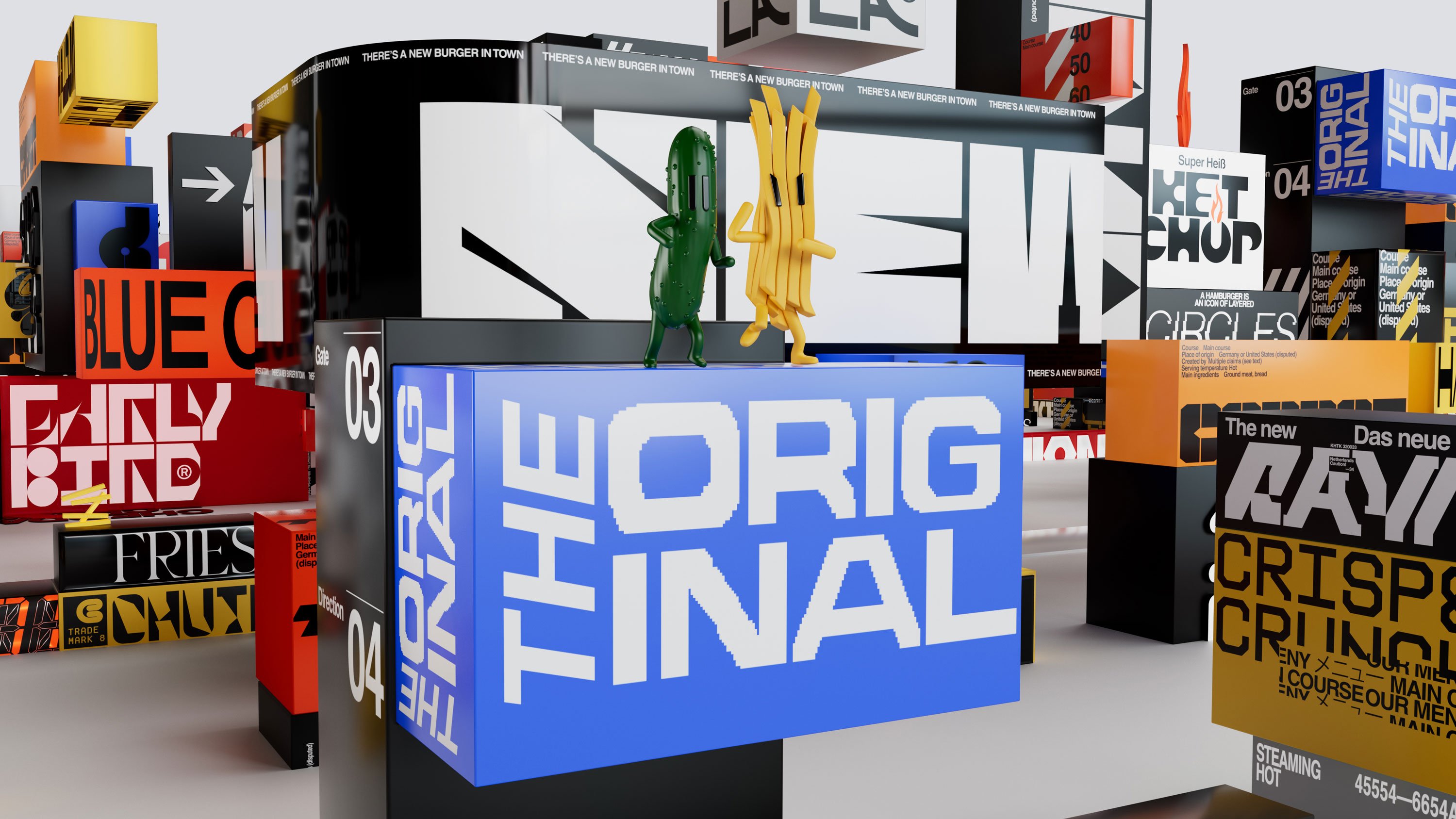
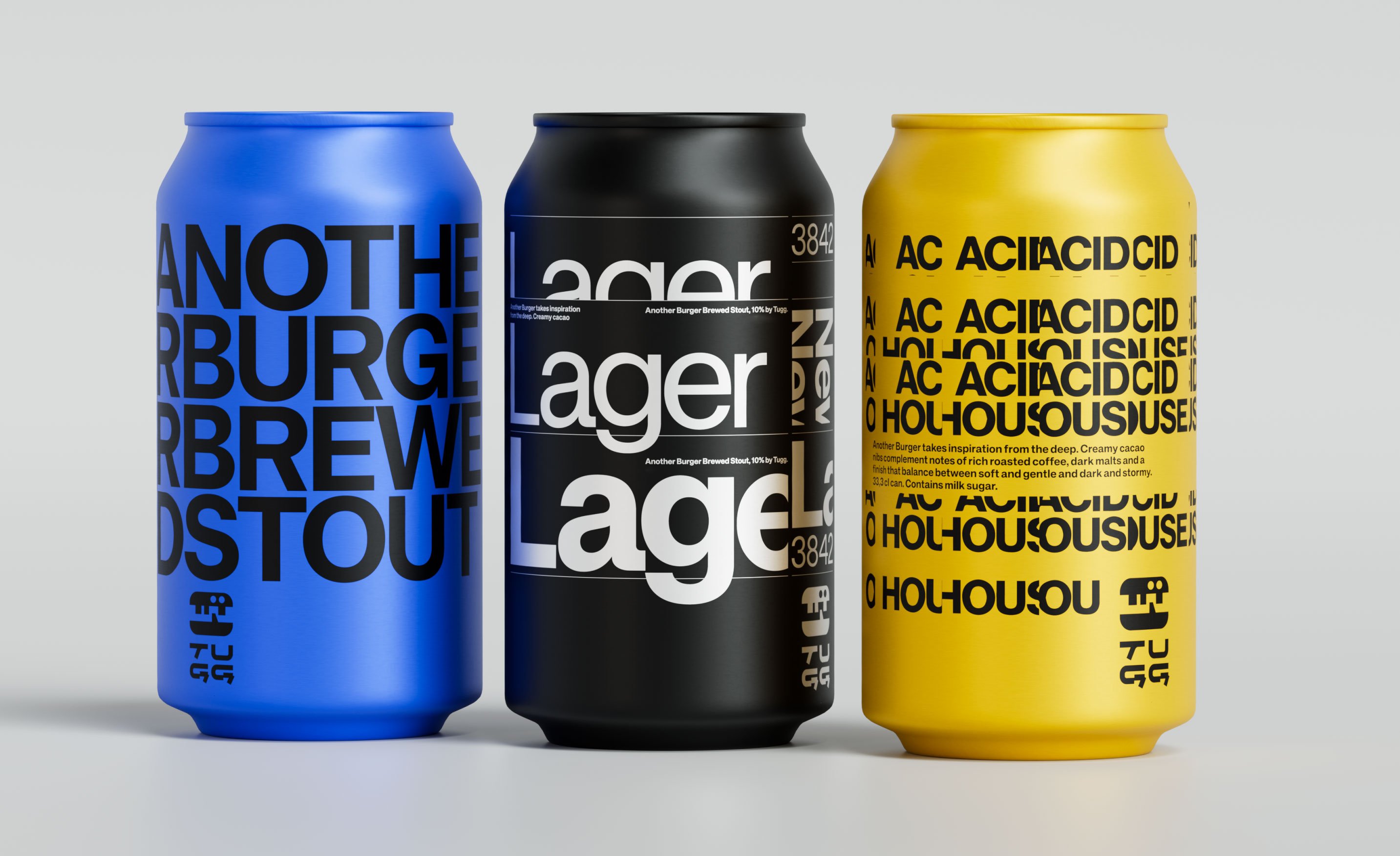
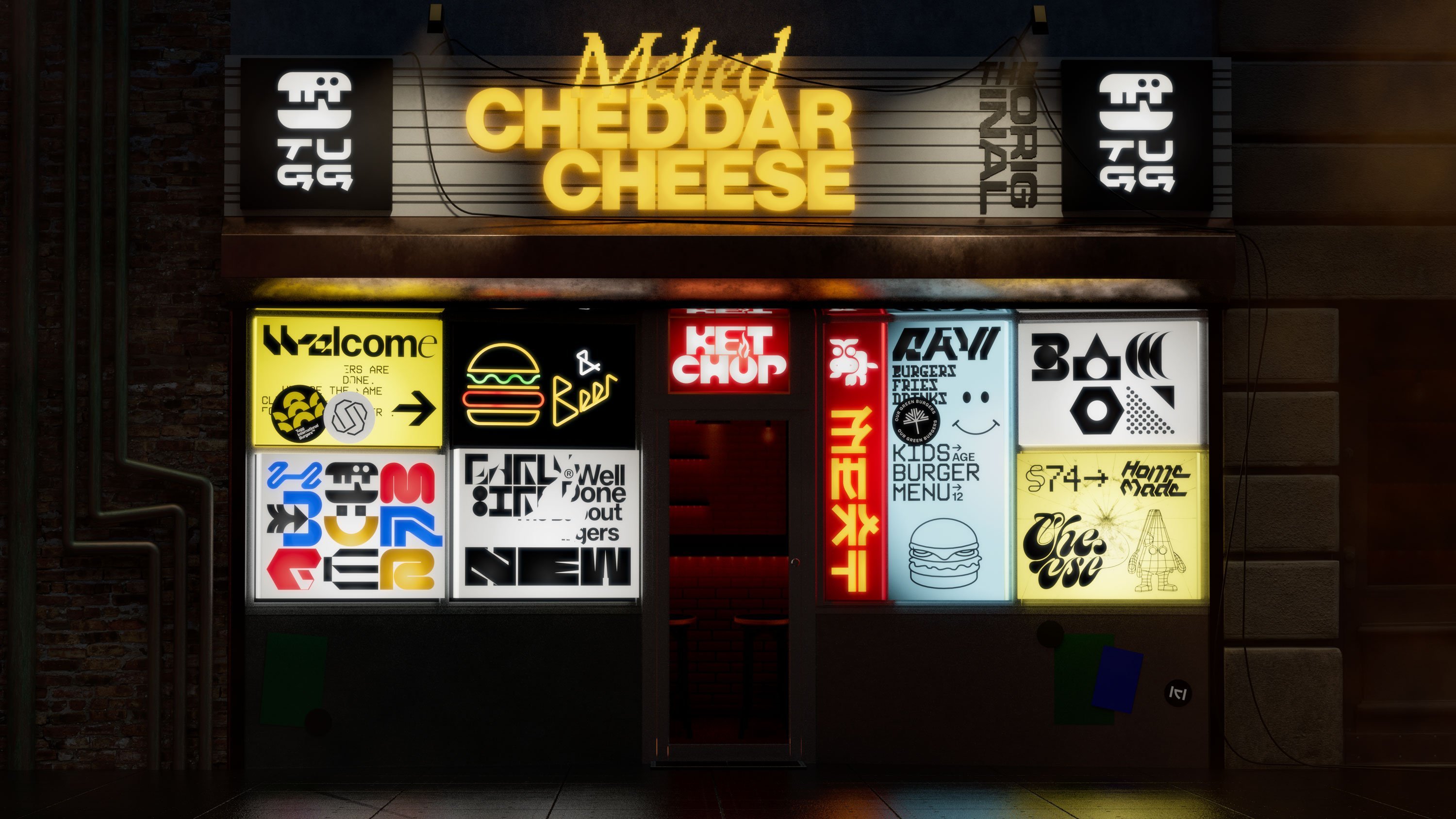
On one level, the multicultural target audience is represented through the sheer quantity and variety of typefaces in Tugg’s brand kit. Each font nods to different alphabets and letterforms rooted in non-English languages. This system brings the burger into a new world – one that feels more diverse, but also more playful and energetic.
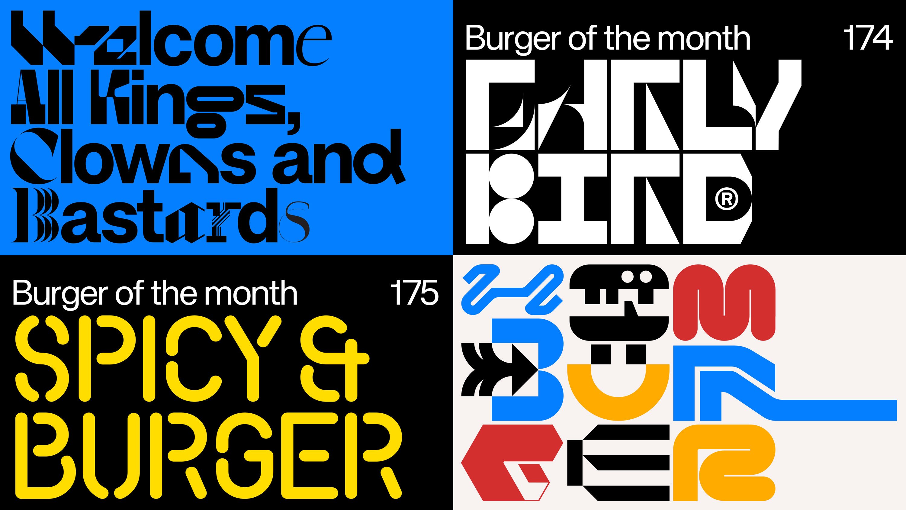
All this type has been custom made for Tugg, with the exception of the body copy sans serif, which is KH Type, designed by Kurppa Hosk’s own foundry. While the overall treatment is adventurous and exciting, the height it reaches (especially in dizzying animations) does raise questions of accessibility – these are addressed by the studio’s primary use of KH Type across menus and web, grounding the font suite in a practical foundation.
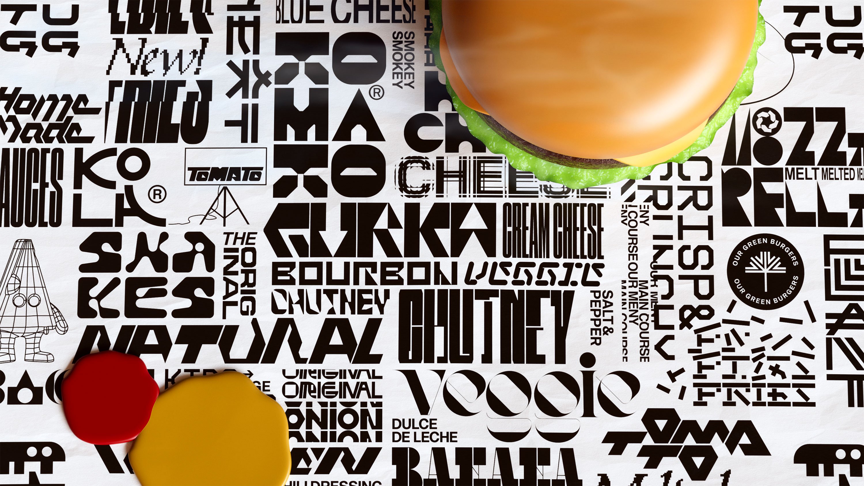
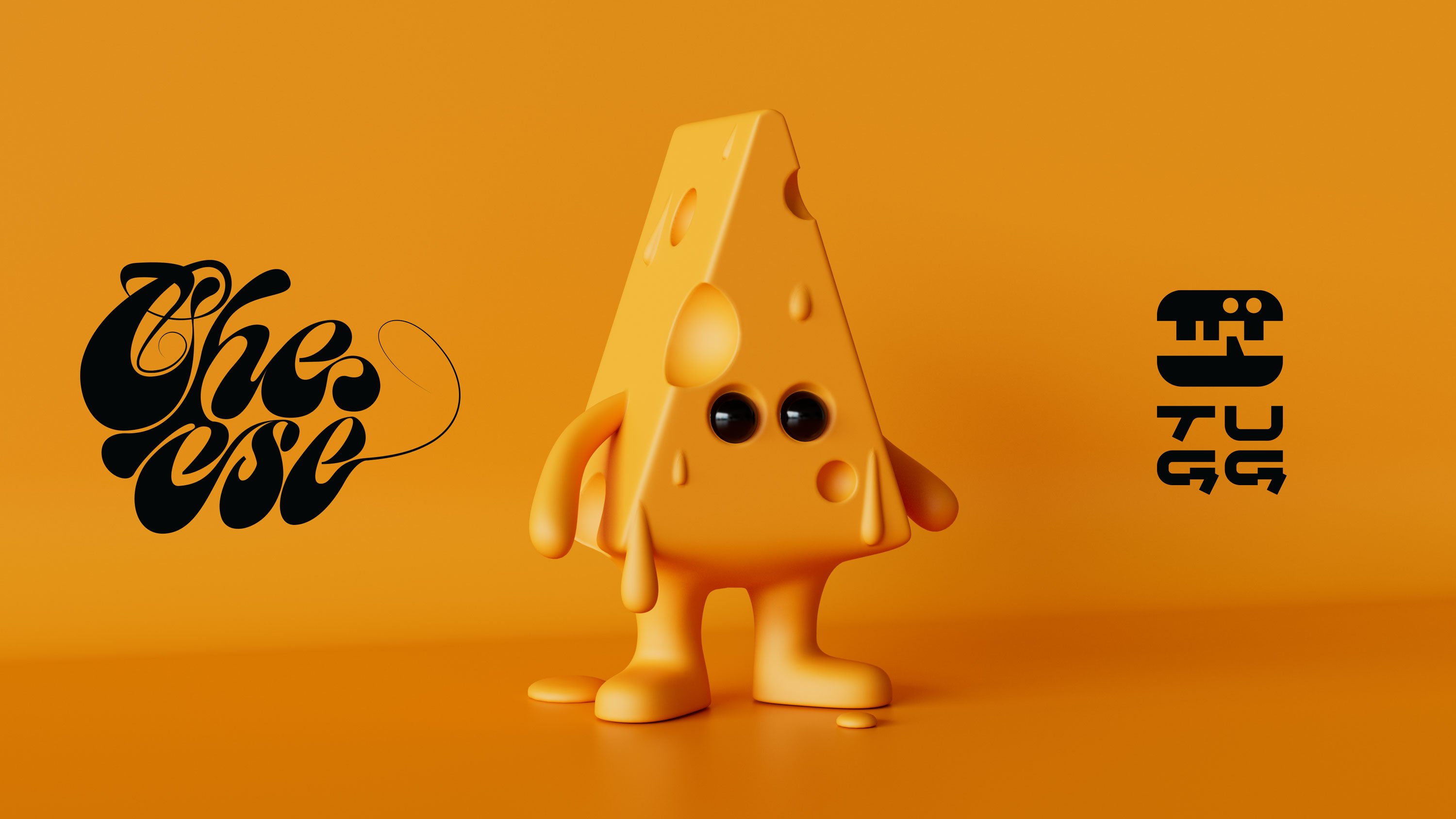
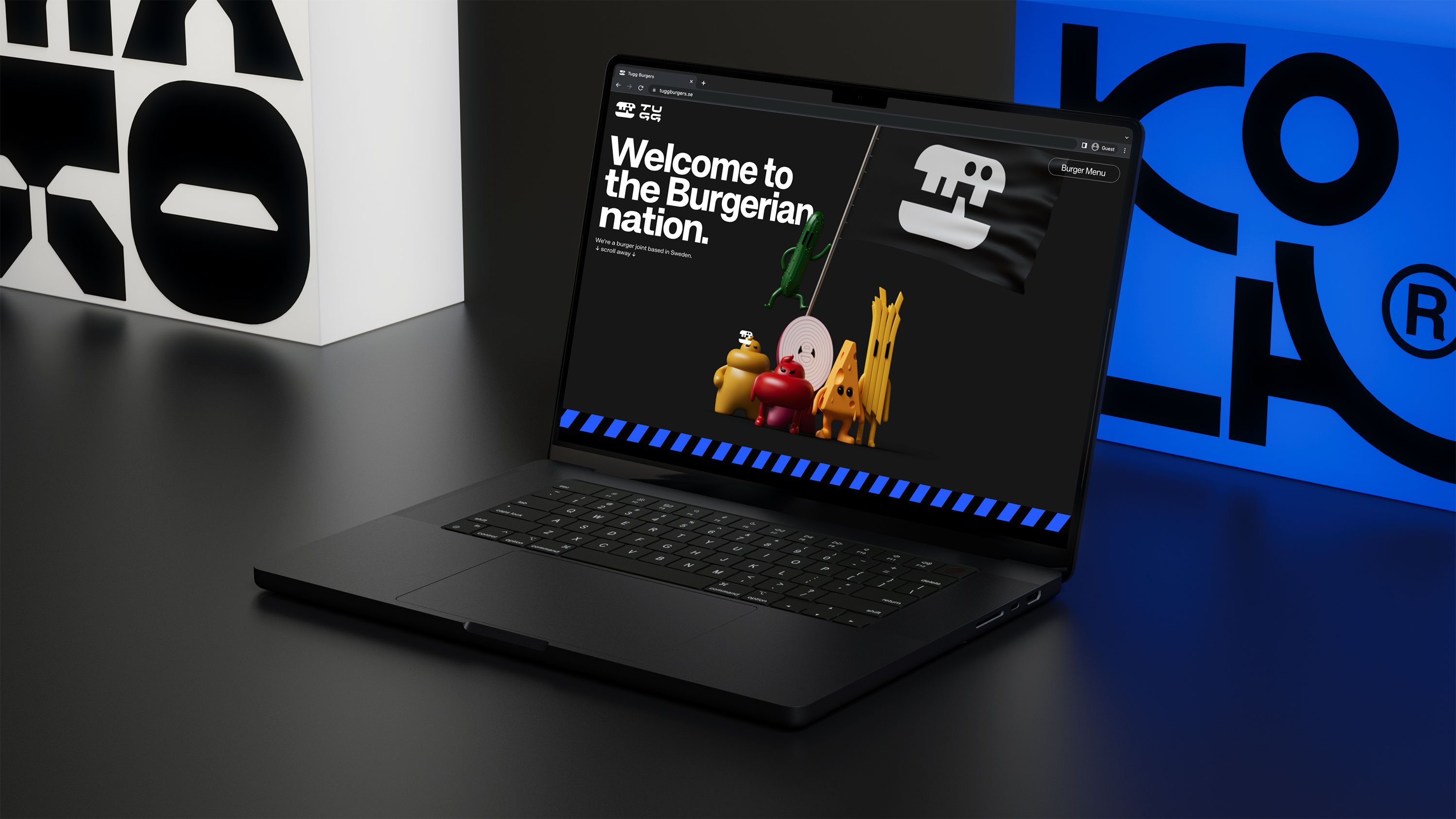
In addition to giving the burger a new brand language (or several), Kurppa Hosk’s visual refresh introduces the theme of diversity with a characterful cast of characters, packed with personality. The Tugg Family consists of Cheesela (cheese), Fritte (fries), Gurra (cucumber), Mustafa (mustard), Shalotte (red onion) and Ketty (tomato).
This suite of ingredients also informs the palette of mustard yellow and ketchup red, alongside a bright blue, and contrasting white and black. It’s refreshing to see fast food represented with so much colour variation, and using blue, rather than simply replying on that all too familiar bright red-yellow combo.
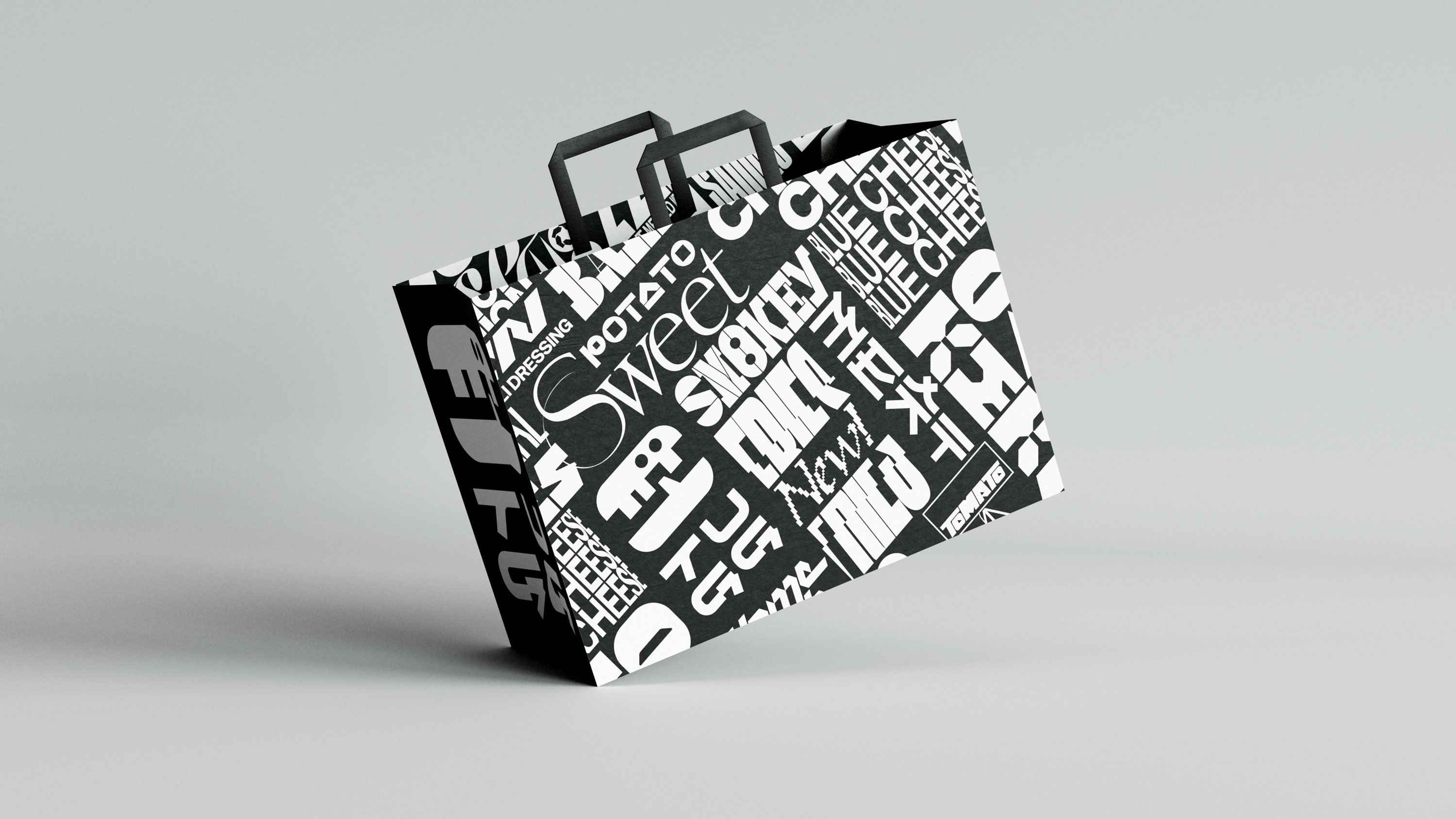
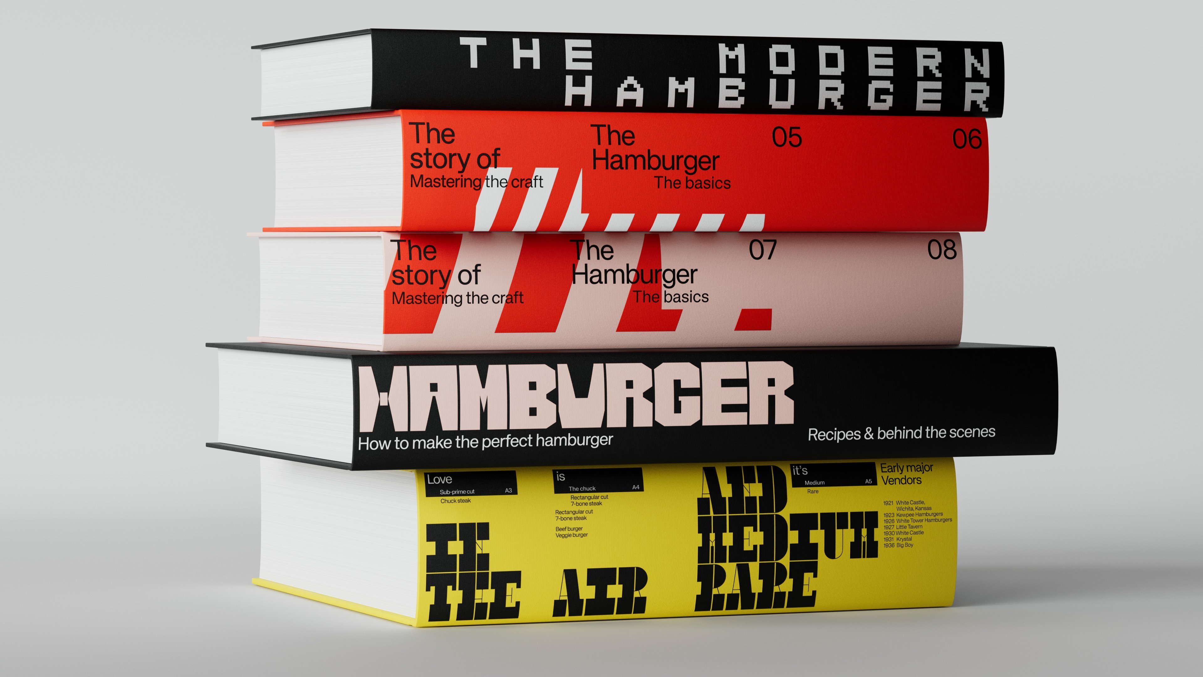
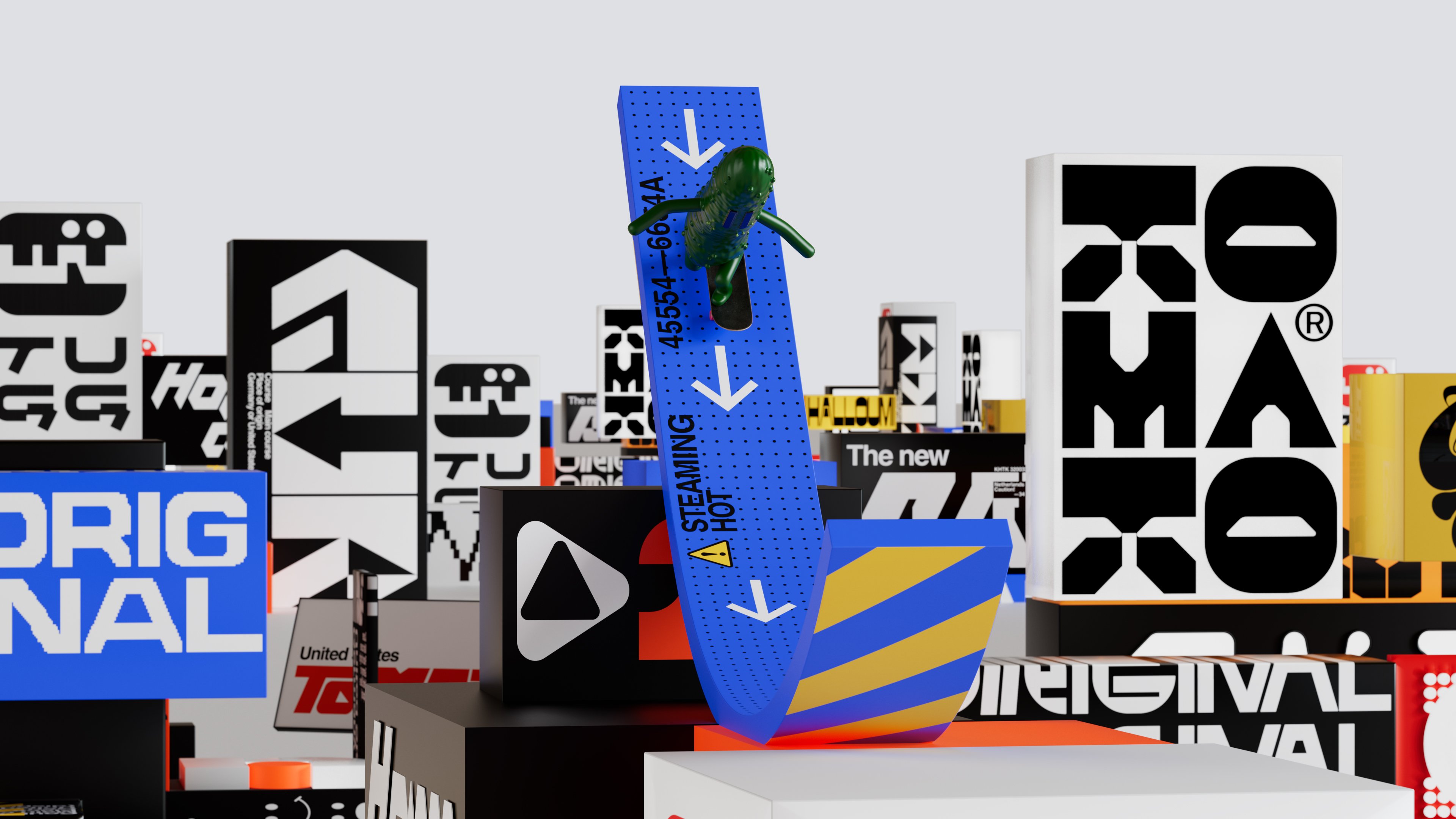
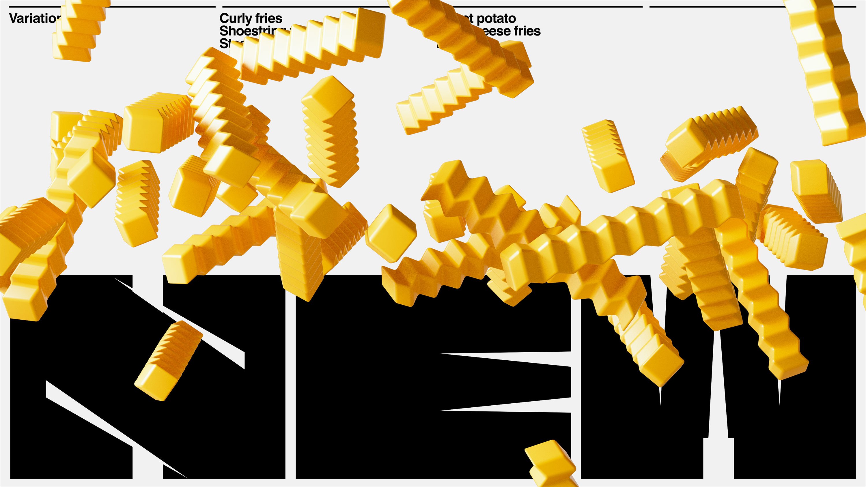
The brand’s spirited nature is further brought to life through the blending of wild typographic landscapes with the 3D characters. Kinetic type provides a busy backdrop for Fritte running across the screen, or Gurra skating off a ramp. Meanwhile Shalotte strides through a make-shift city featuring blocks of type stacked on top of each other. Quick transitions and clashing graphics are welcome in Tugg’s brand animations. 2D and 3D blend in unexpected and varied ways each time, breaking even further from the flat retro graphics of most hamburger chains.
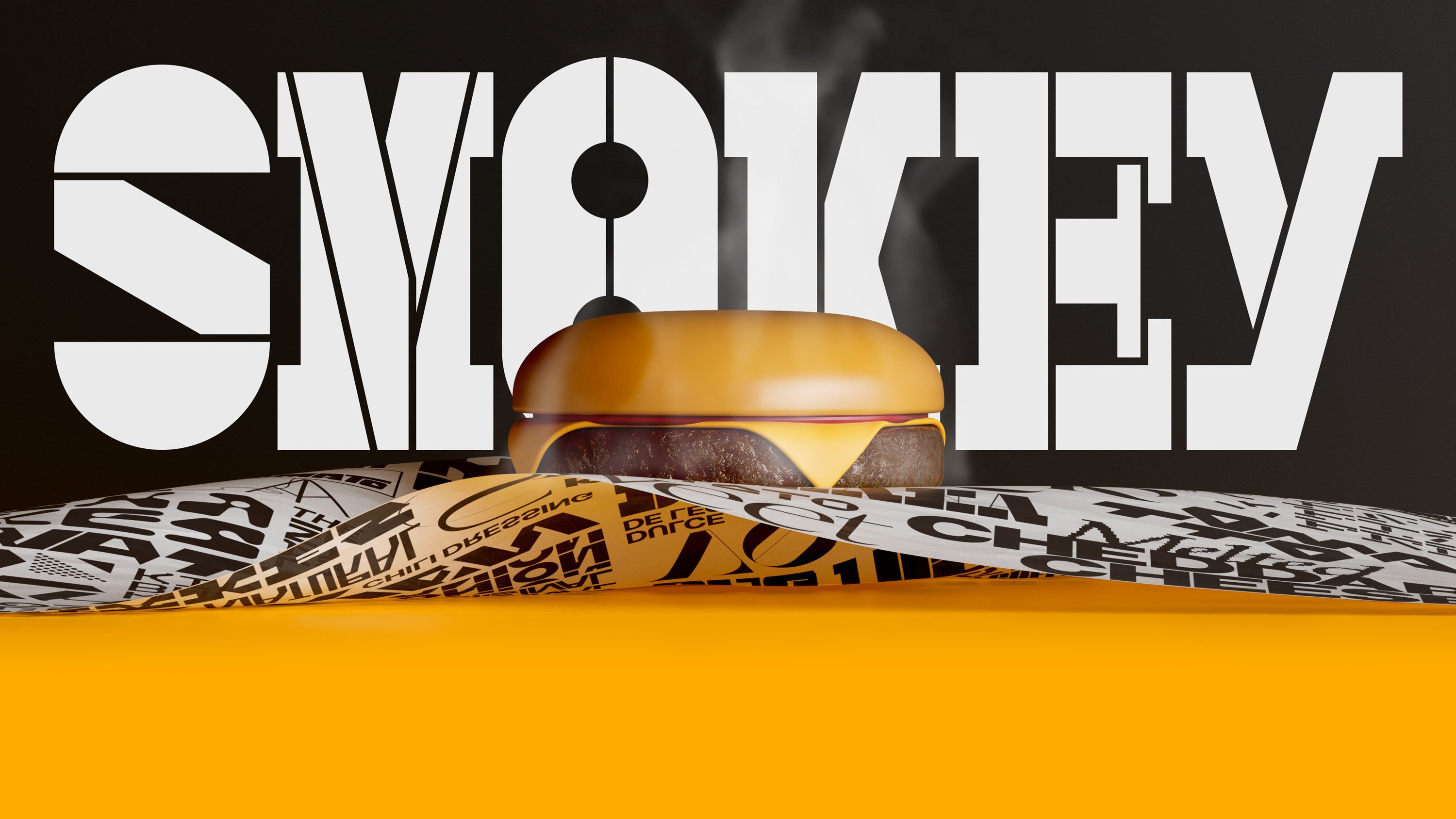
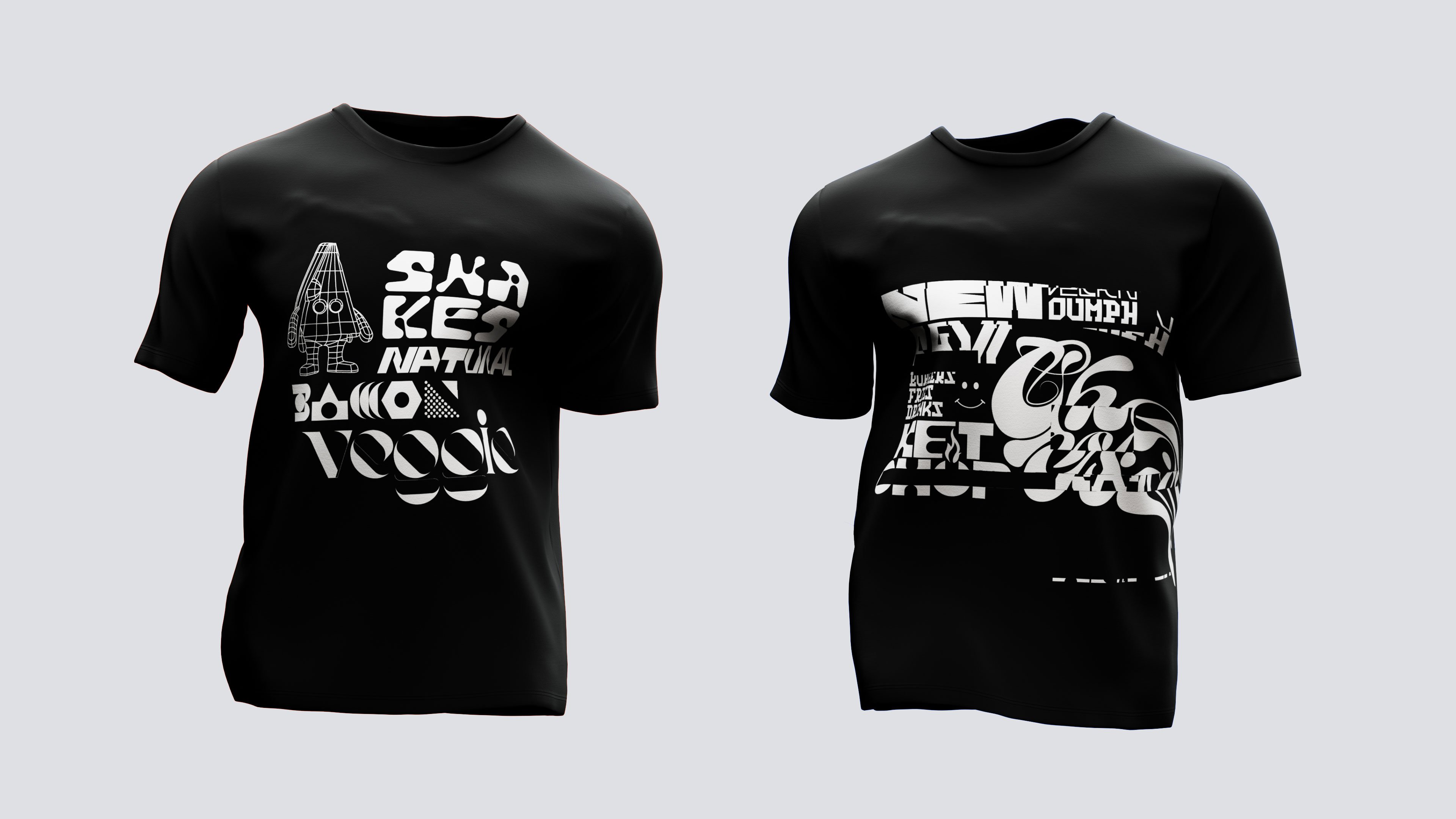
In demonstrating the universality of the humble hamburger, Kurppa Hosk has created a new playground for the burger and friends. The studio has broken long-standing tropes in unexpected and joyful ways. Everything from the varied type to 3D design marks a change from the visuals we associate most with hamburgers and fast food, and brings the focus back to the consumer, wherever they feel at home in the world.
