Logotypes

Gaptooth Soda by Saint Urbain
One person’s imperfection is another’s luck– especially, it turns out, when it comes to teeth. The front-tooth-gap, as exemplified and celebrated by the likes of Madonna (and, it turns out, Chaucer’s famously, unabashedly lustful “gap-toothed” Wife of Bath) is known in more scientific or medical terms as a ‘diastema’. Many see this aesthetic dental quirk as attractive; others not so...
Cute, curious and cuddly
Fitness and health tracking apps are not generally known for their sense of fun. The likes of MyFitnessPal, while great in terms of functionality, for the most part, keep the design stuff resolutely serious, no-nonsense, and perfunctory. Meanwhile the likes of Strava elicit joy through very few things, the main one being when people decide to run in a shape...

Like, so retro, but so the future
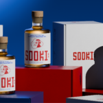
There’s really so little not to love about this branding for Sooki – in fact, I’d go as far as saying there’s nothing not to love. It’s purely, and simply, gorgeous; every goddam inch of it. Kudos, then, to The Collected Works, the New York City- and New Orleans-based independent design studio behind the identity design created to bring Sooki...

Where fallow deer roam
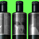
Deer feel like unlikely ambassadors/ mascots/ PosterCreatures for olive oil, but it turns out they work brilliantly – when, that is, in the superlatively capable hands of a studio like SMLXL. Said olive oil is D’arbequina, a name which more broadly simply refers to the sort of plant from which the oil is produced: Arbequina is a widely cultivated olive...
Goofy, playful and knowingly a bit silly
Design systems are often spoken about in terms of those moments of ‘surprise and delight’, but often, there’s little either surprising or delightful to be found. Blurr Bureau’s new brand identity for Yes! Apples, however, is so brimming with surprise and delight that those moments become the entire timeframe here: the Easter Eggs absolutely abound here, for the brand design...

An act of restitution
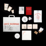
Caffè Nazionale is a historic bar on Piazza Libertà in Arzignano, a small city in Veneto, Italy, which was the social heart of the town – a place for conversation, card games, billiards, and the daily ritual of an espresso at the bar – for generations, before falling into closure and decline. Having first opened in the 1950s, the Caffè...
Gloopy, bubbly, occasionally borderline illegible
It’s always confusing, surprising and slightly disappointing when you come across art or design-focused brands, agencies, platforms, publications or organisations that seem to have a total disregard for what they look like – as though their own central premise and raison d’etre is at odds with their look and feel. I won’t name names, because that feels both mean and...

Feel the heat
Most branding has to give some suggestion of what said brand is, or does, or stands for – it’s usually not ideal if they bear little to no resemblance or representation of their category, audience or ideals. The exceptions are usually things like record covers, or other inherently creative entities like musical instruments, editorial projects; occasionally booze brands, like the...
Diggin’ it
Just when you thought we were approaching a post-pet-parent era, a brand comes along and proves very much otherwise. Thankfully, though, while pet parenting seems to be alive and well; fingers crossed we’ve left behind the whole rather icky “fur baby” days of things like dog bandanas that read, “My Mom is Sooooo Obsessed with Me”; or dog nail varnish;...

Equipped for Life
The protein market has absolutely boomed in recent years – a trend that doesn’t look as though it’s going away any time soon: a 2025 survey from the US-based International Food Information Council (IFIC) revealed that the most common diet that Americans followed in the past year was “high protein”, and that consumers use “good source of protein” as the...
Drizzle and Drama
I’ve never really thought about wedding venues needing a brand; but then again I’ve never really thought much about wedding venues at all – and neither is Chateau Engalin much like most other nuptials-centric sites. Recently bestowed with new brand design courtesy of Pentagram London partner Samar Maakaroun and her team, Chateau Engalin is based in the heart of the...

Gaming Goes Goblin-mode
Remember the heady days of 2022, as we emerged blinking into the light in a cautious post-pandemic haze – confused, slightly heavier, wondering whether we should cancel Disney+ now that going out was sort-of-possible? It was then that The Oxford Languages Word of the Year (well, two words if we’re being pedantic, which is surely an approach the famous dictionary-pedlars...