Nordoff & Robbins by Pentagram
Opinion by Emily Gosling Posted 27 March 2023
For decades, Pentagram has been one of the most famous and renowned design consultancies in the world; but when it comes to the charity sphere, music therapy organisation Nordoff & Robbins is far less starry – it’s not, say an Oxfam, or an RSPCA, or Médecins Sans Frontières. Arguably that’s all the more reason for it to bring in the heavyweights when it came to rebrand, turning to Marina Willer’s team (at Pentagram London) for a new identity.
Nordoff & Robbins began life back in 1959 when American composer and pianist Paul Nordoff and special education teacher Clive Robbins teamed up to explore the potential of collaborative music-making to engage ‘vulnerable and isolated’ children. Through years of research and pilot projects, the pair found that music therapy could help with children’s concentration, self-control and increased social and self-awareness. They created their eponymous training programme in 1974; formally establishing the charity in 1976.
Today, Nordoff & Robbins is still centred on those fundamental beliefs that music can ‘break through barriers, creating space for people to express themselves and find connection in society,’ as Pentagram puts it, helping thousands of people of all ages each year across its centres in the UK, and working in partnership with more than 300 organisations.
As well as offering music therapy directly, it still educates trainee music therapists and conducts research into the field, and into music’s wider social value. ‘Its aim is to create a world where, through music therapy, human potential is recognised regardless of profound disability, illness, or social exclusion,’ Pentagram continues.
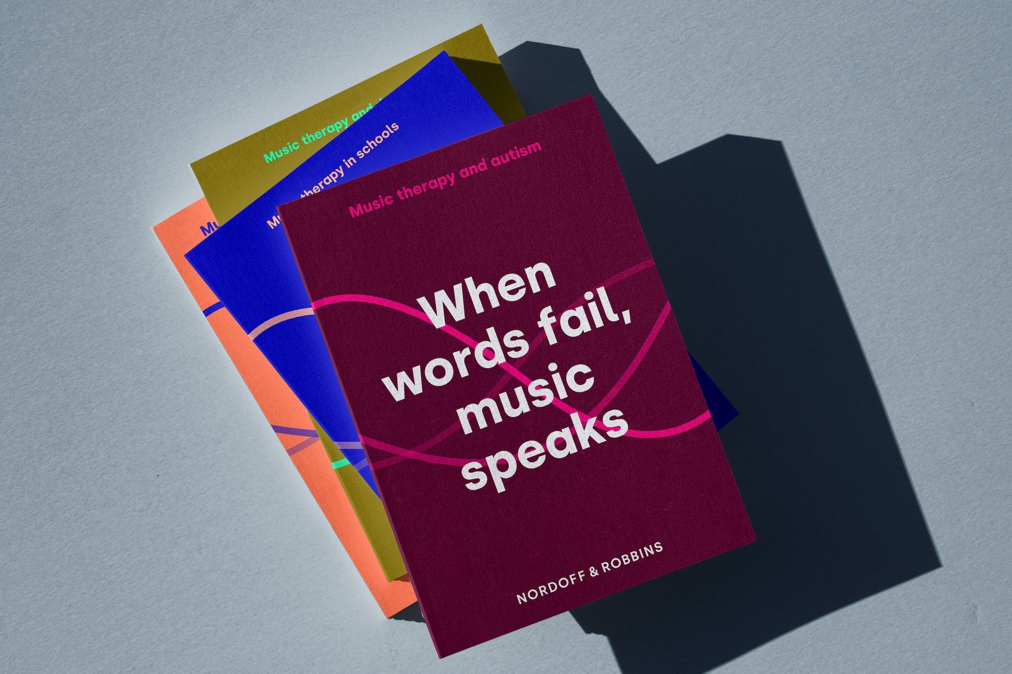
Although Nordoff & Robbins remained the UK’s largest music therapy charity, it was struggling to meet its ambitious fundraising objectives and reach as many people as it would like. Pentagram was brought in to create a new brand that would increase awareness of the charity, and help it engage more closely with the wider music industry. ‘With this new identity, our aim is to turn up the volume,’ says Nordoff & Robbins.
The rebrand had to ‘both reposition the charity as a champion for the social value of music, and raise awareness of music therapy in society overall,’ says Pentagram. Redefining Nordoff & Robbins’ key audiences was at the foundation of the brand, enabling it to become more impactful and build increased awareness – especially among young people.
One of the major changes Pentagram ushered in was a subtle, but significant tweak to the charity’s name: the former Nordoff Robbins became Nordoff & Robbins. But the decision to introduce ‘and’ wasn’t taken lightly: ‘The name ‘Nordoff Robbins’ reflects more than the two founders’ names, it also represents the methodology which they introduced, and which has made their work so important,’ says the design agency. But if anyone should feel confident about an ampersand, it’s Pentagram (just look at the iconic Alan Fletcher 1990 V&A logo if ever proof were needed).
Pentagram landed on ‘Break through with music’ as the central idea which underpins the new brand, saying that it ‘summarises the charity’s unique offer, helping those who might have spent most of their lives in isolation’.
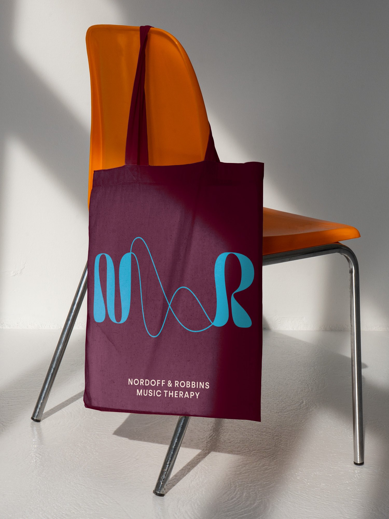
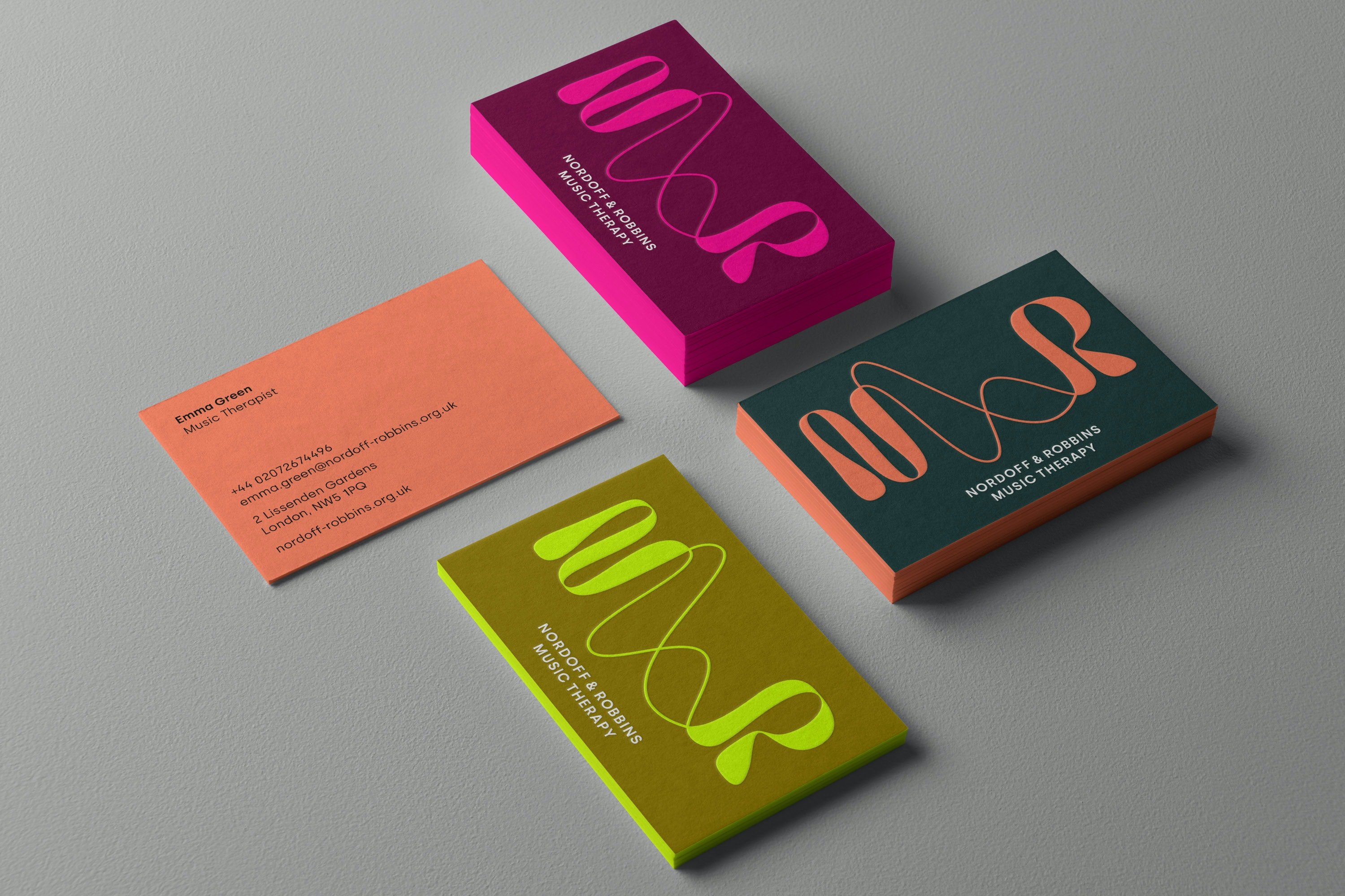
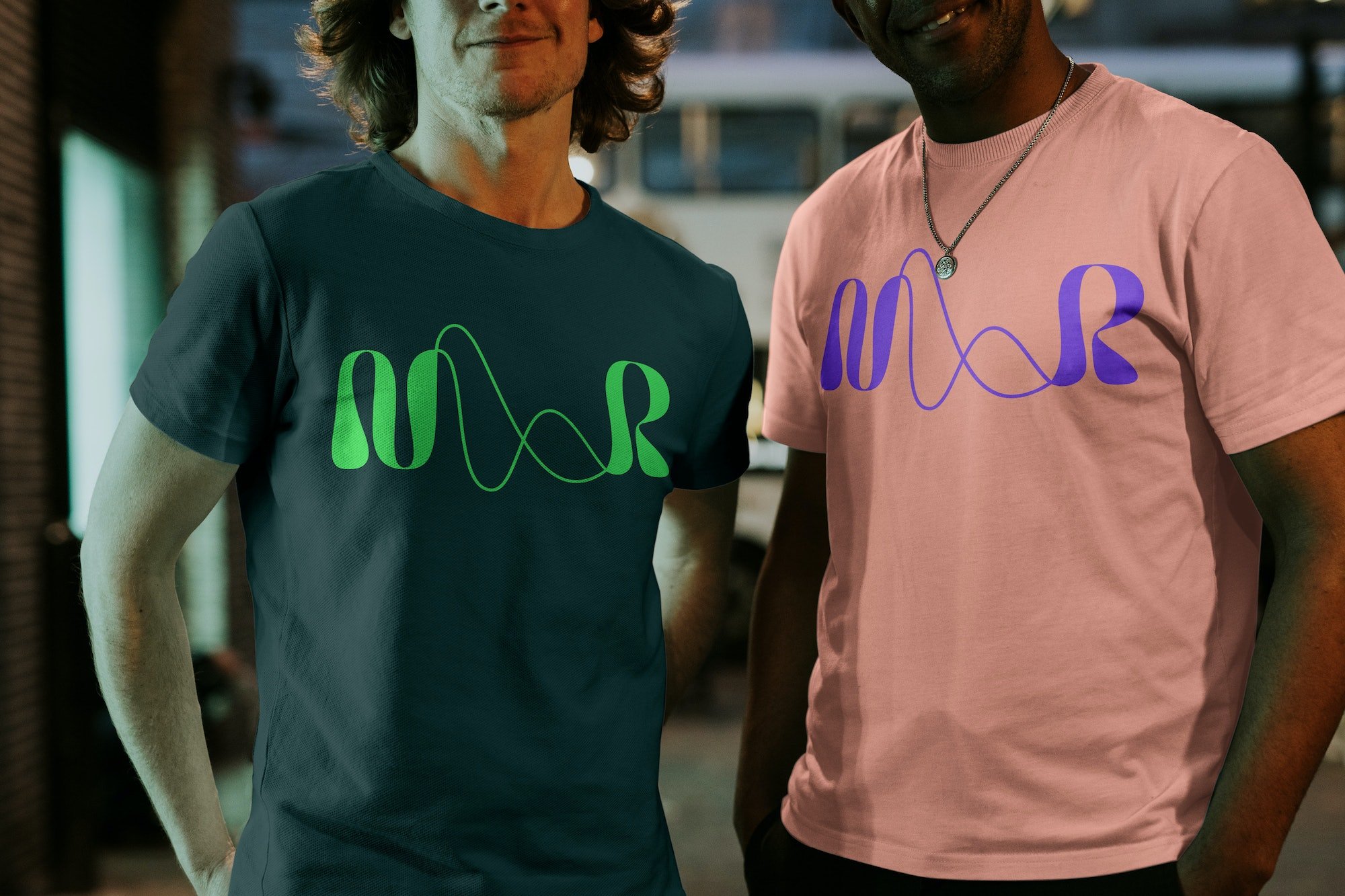
Drawing inspiration from visualisations of soundwaves, the new logo takes two forms: symbol and wordmark. The symbol is formed of the letterforms ‘N’ and ‘R’ conjoined by two undulating lines and looks to reflect ‘both the freedom of expression that music gives and the connections found through music therapy.’ The agency adds that the mark expresses the fact that the charity’s work is ‘a result of the synergy between therapist and client, an experience that explores sound in unusual ways beyond the classic conventions of music’.
The wordmark, meanwhile, aims to be ‘direct and grounded’ to reflect the charity’s heritage and expertise. It uses Nordoff & Robbins’ new primary typeface Silka, a sans serif by Spanish type foundry Atipo that’s fittingly simple and accessible thanks to its low-contrast strokes and modern geometric shapes.
In-keeping with that aforementioned central idea, the revised tone of voice is straightforward, ‘real’, and consistent, conveying honesty and clarity.
There are nods to the logo/symbol in a number of wave-like abstract patterns that can be used across various brand touchpoints. Pentagram also created a suite of bespoke icons that are used to visualise a number of integral aspects of the charity’s work. The colour palette combines vibrant colours with more muted, natural tones in order to offer a variety of aesthetic ‘personalities’ across Nordoff & Robbins communications.
Pentagram also created a new library of brand photography including ‘candid’ shots from therapy sessions and those shot in clients’ own spaces. The imagery aims to communicate the music therapists’ work; as well as illustrating ‘both the progress and connection that music therapy brings and the difference Nordoff & Robbins can make in someone’s life’.
The new identity manages to deftly tread the very fine line between trendy and functional: the new mark can be seen as both ‘design for design-lovers’ and a powerful asset for a charity that needed a newly striking, confident way to appear in the world. It’s only skillful design that can even attempt to straddle all of those things at once – all the while creating a visual system that inherently reflects Nordoff & Robbins’ values around connection, expression transformation and accessibility in its very form.
