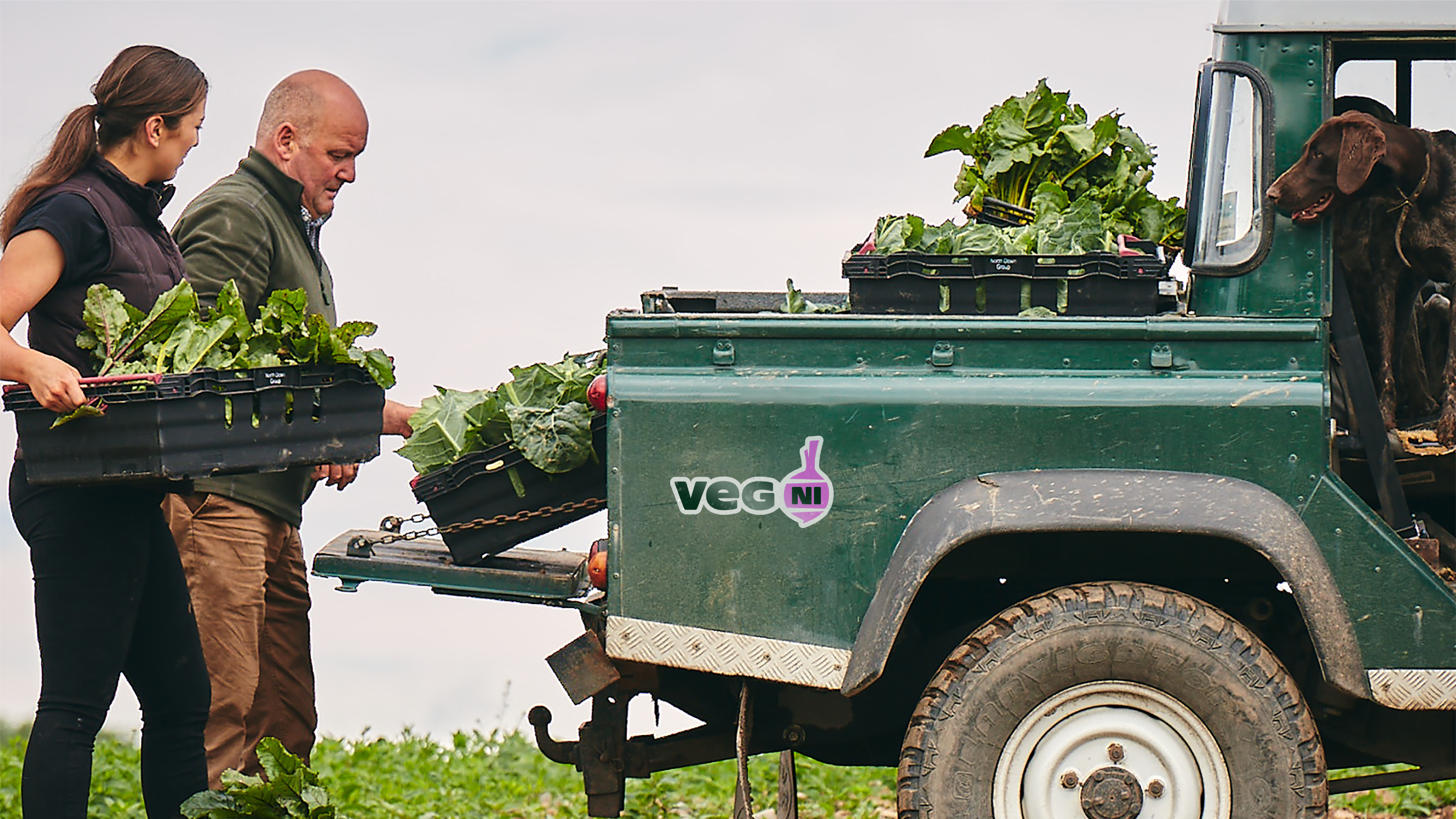
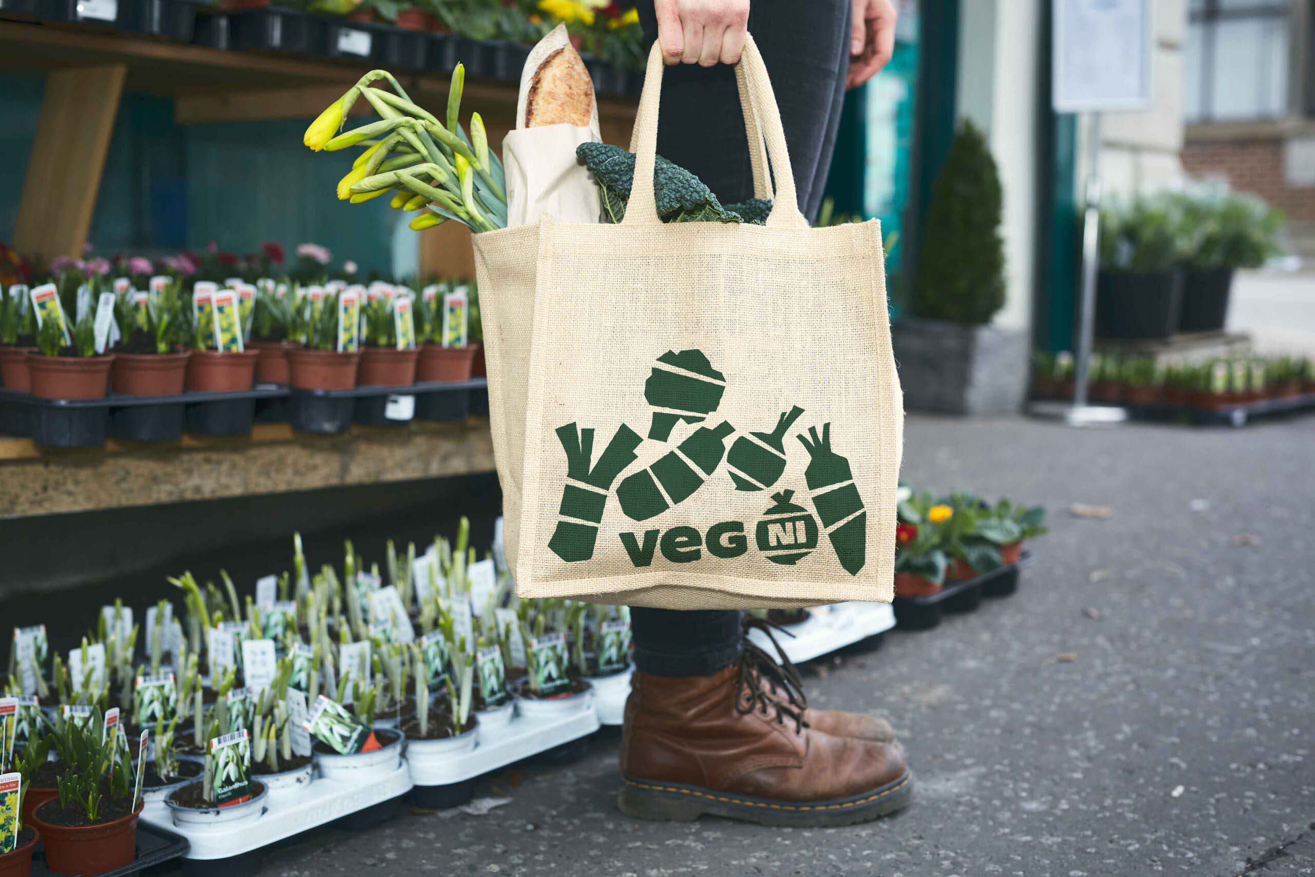
Veg NI by Jack Renwick Studio
Opinion by Richard Baird Posted 20 April 2023
The economics of regional farming, in the face of global market forces, continues to be unfavourable to local producers; narrowing margins and pushing some out of business. Alongside this, unfair and self-defeating politics continue to chip away at a basic message; locally grown food is a good, not just in a regional economic sense, but in terms of the health of the individual, the health of families, and the health of the planet. It’s a powerful message, rarely communicated with coherence and vehemence on a local level, but often co-opted by international chains. Why would it? When margins are squeezed and power is taken from individual producers.
As a cooperative of four farmers in Northern Ireland, Veg NI is seeking to wrestle back a bit of control and build awareness of the nutritional and environmental benefits of local produce, as well as its better taste and value. Farming is politicised, and the fight is on to continue to generate local support using all the available tools available, including design.
Helping Veg NI is London-based Jack Renwick Studio (JRS). Working under similar economic conditions of a tight margin and a tight budget, the studio have wrestled a creative direction out of limited means, functioning as well as farm machinery but with an energy and joy that speaks of a simple and clear proposition ‘veg is bursting with goodness’.
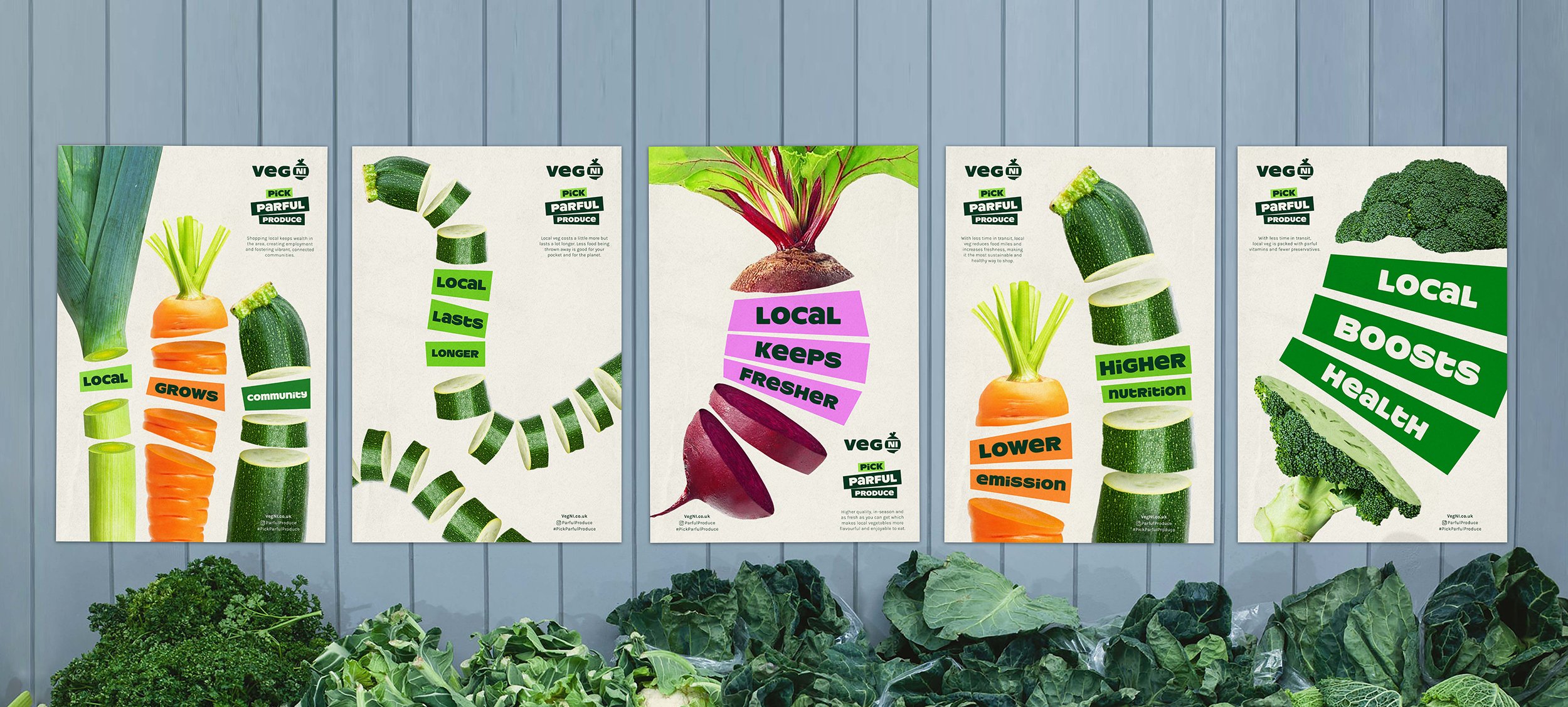
For me, the creativity here lies in the economies of production. And in particular, the character and energy the studio has managed to extract from stock imagery. It’s a hard thing to work with, but by simply slicing it up, and giving it an outward momentum, the studio have managed to draw out something striking, filled with potential energy, just like veg! Further, the notion of ‘it’s what’s inside that makes all the difference’ also resonates. The execution is rough but planned, a collage-like aesthetic that isn’t fussy, it’s fun and spontaneous in creation, and in service of an eye-catching visual message and idea.
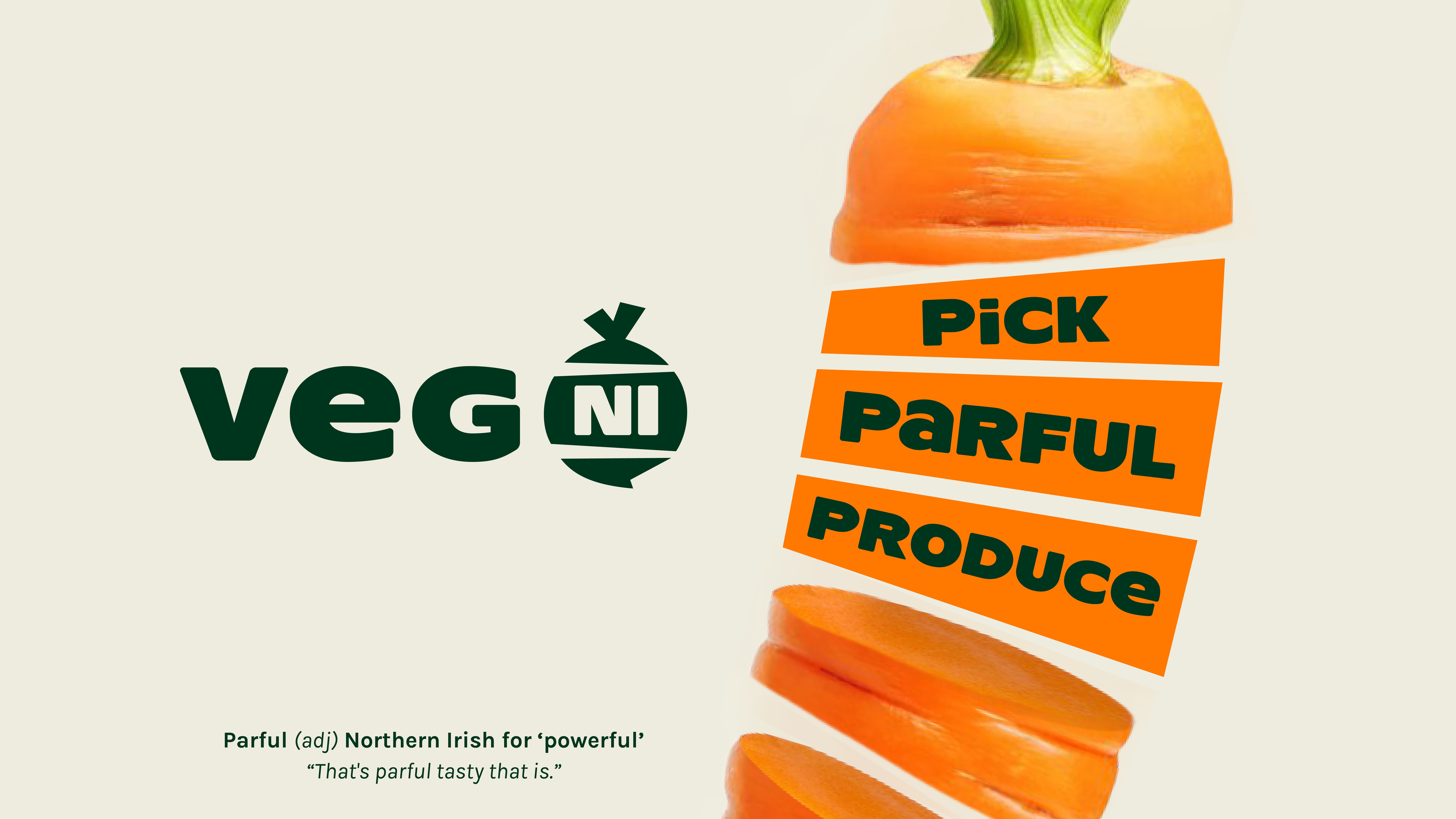
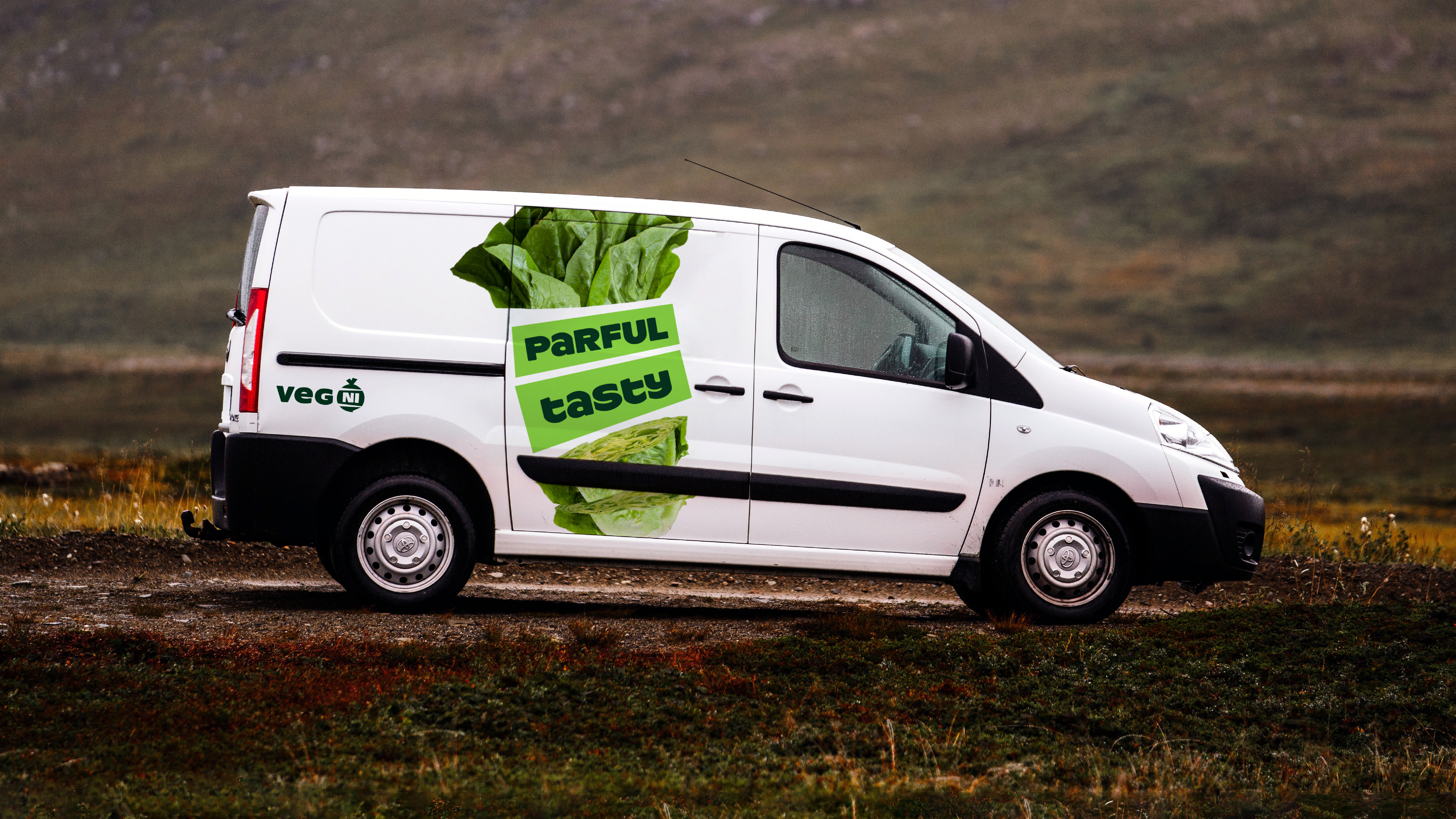
As with much of what JRS do, the work hinges on a simple and smart idea. ‘Powerful’, phonetically spelt in a Northern Irish dialect becomes ‘Parful’, and ‘Parful Produce’ becomes an own-able asset that has been developed into an explosive identity. It speaks of regionality, power (health and community) and ownership over production.
There’s a lot of running room inherent to the idea. There’s a bounty of veg that provides a variety of strong graphic shapes, textures and colour that are identifiable and inviting to all. Sliced and diced these become an ownable and identifiable asset across campaign materials, and supported by the addition of solid irregular shapes, colour blocking and decent copywriting.
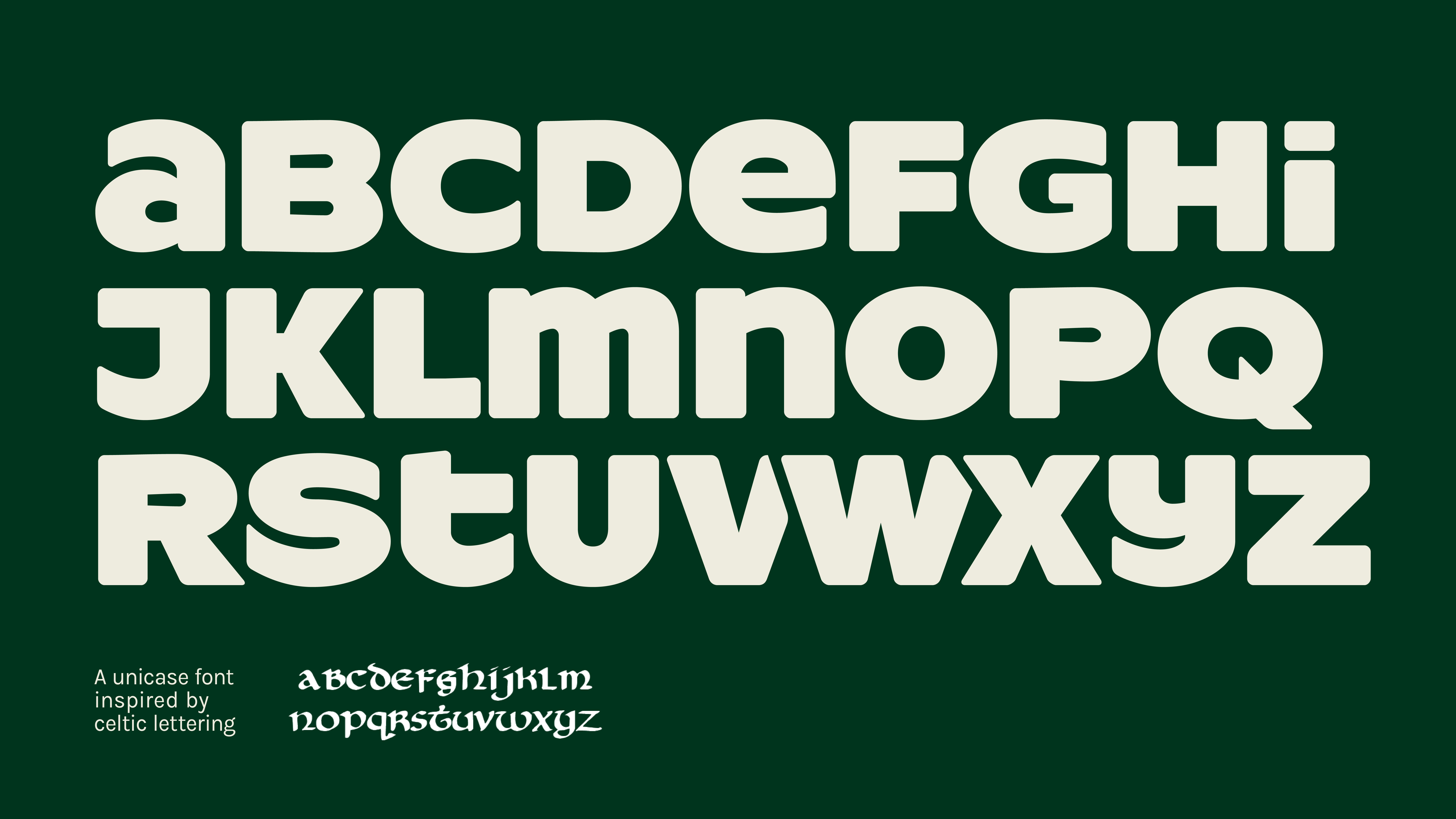
ResotYg, a ‘full-looking’ off-the-shelf typeface, gives off a bit of a wonky veg quality when mixing case (the foundry explicitly IMpLorEs such rule breaking), and is just plain daft in the cuts through the ‘v’, ‘w’ and the ‘x’, but resonate well with the graphic elements. This makes it, unusually, all feel really earthy, odd and the antithesis of those practices of discarding produce because it didn’t fit a particular set of ‘economic conditions’ (or typographical standards!).
Slice and dicing, stacking and packing. It’s a great idea, but what really sells it is the motion. There’s a lot of power in the composition and arrangement of the posts, but motion totally sells it online, bursting outwards, and intersected by copy.
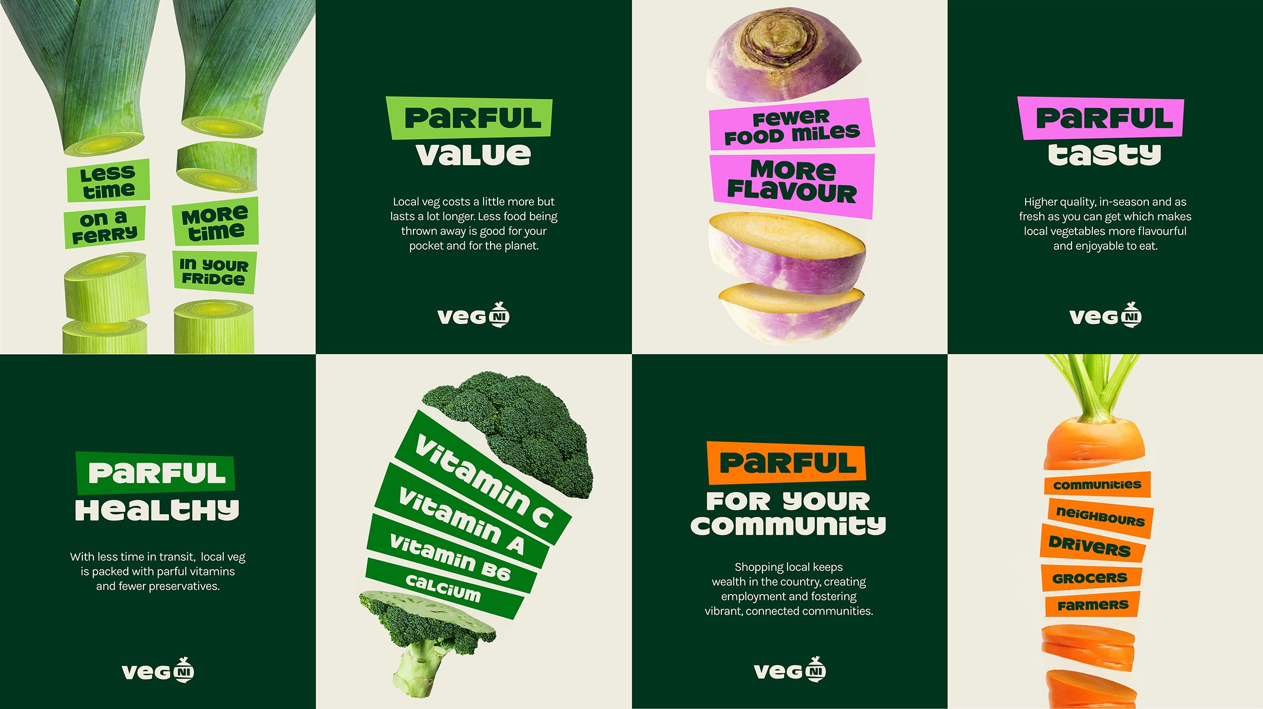
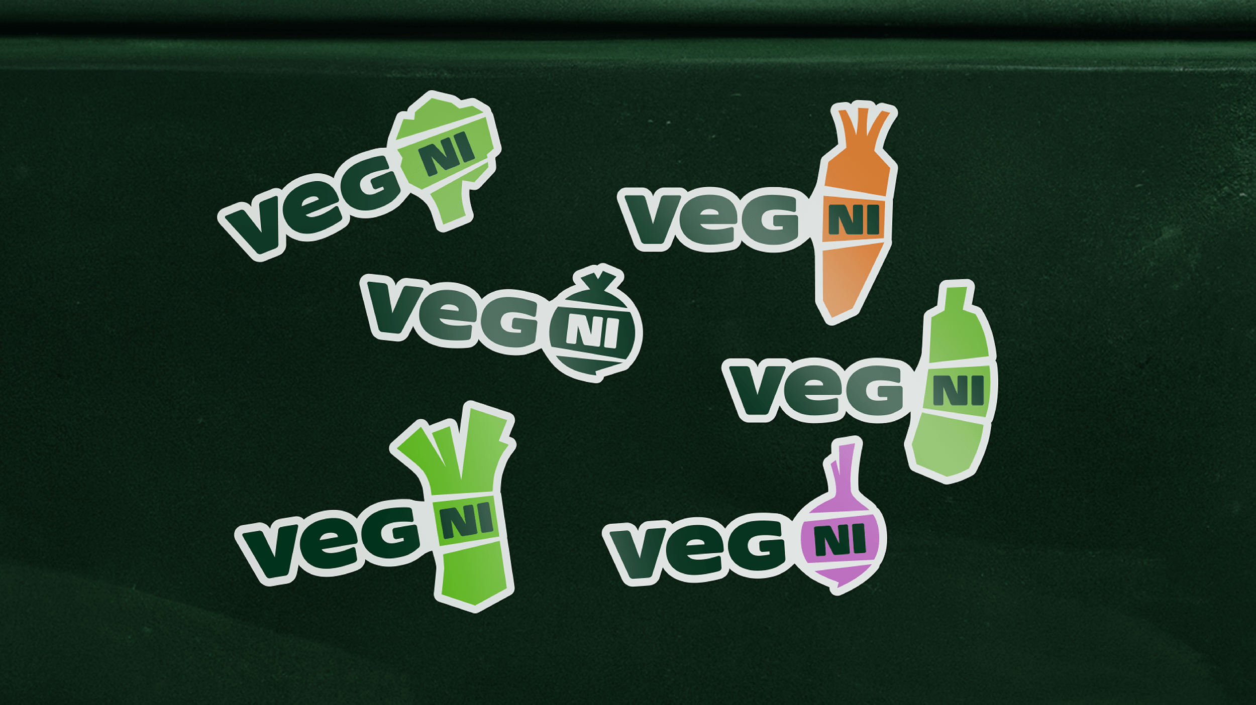
When writing about brand, I try to look to difficult contexts such as social media to see whether it all hangs together, whether there’s enough variety in form, colour and messaging to keep it alive and cohesive over time, and this does. There’s nearly variation in everything, even the logo switches between veg depending on which producer is using it, yet it all holds together well.
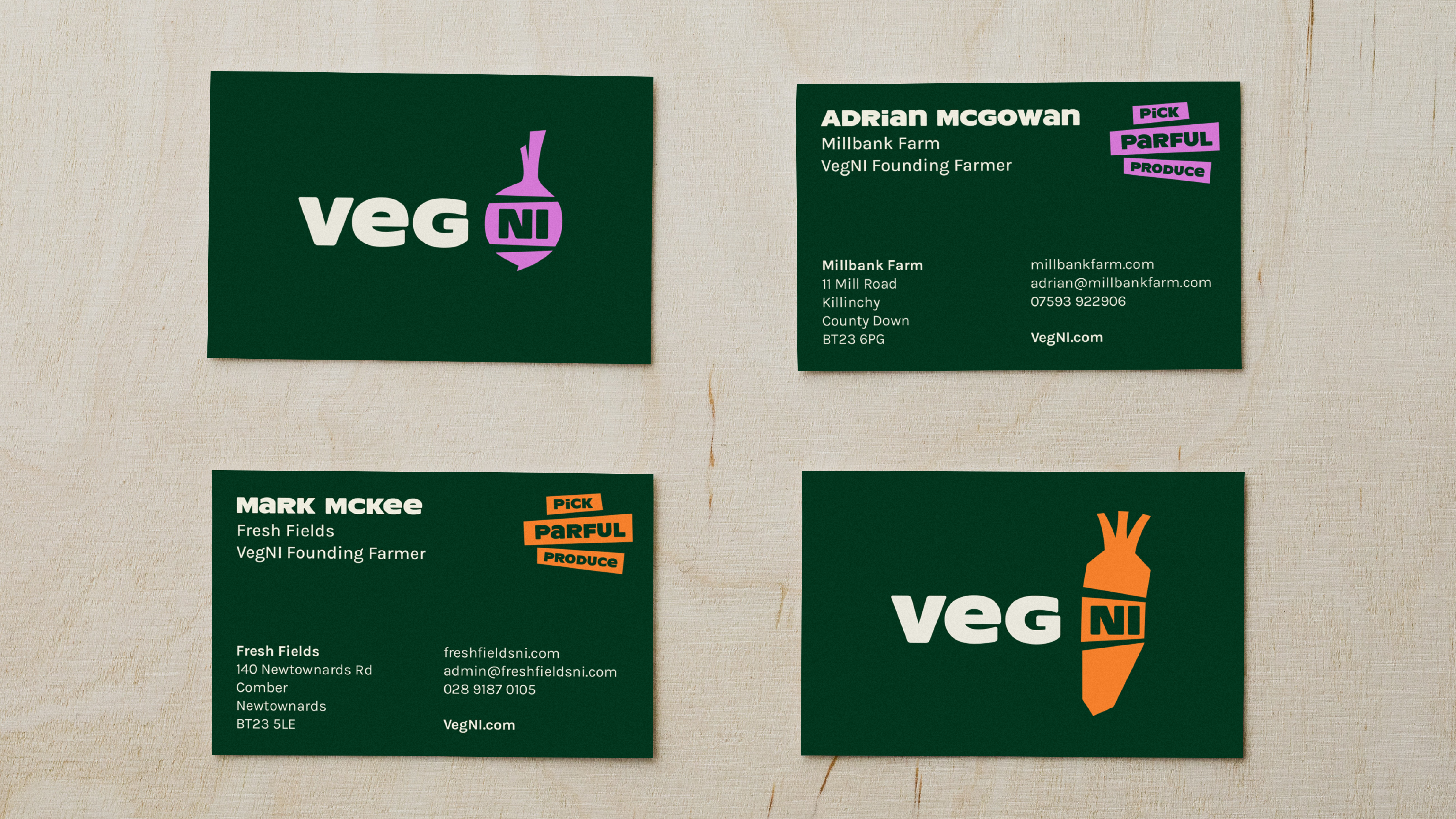
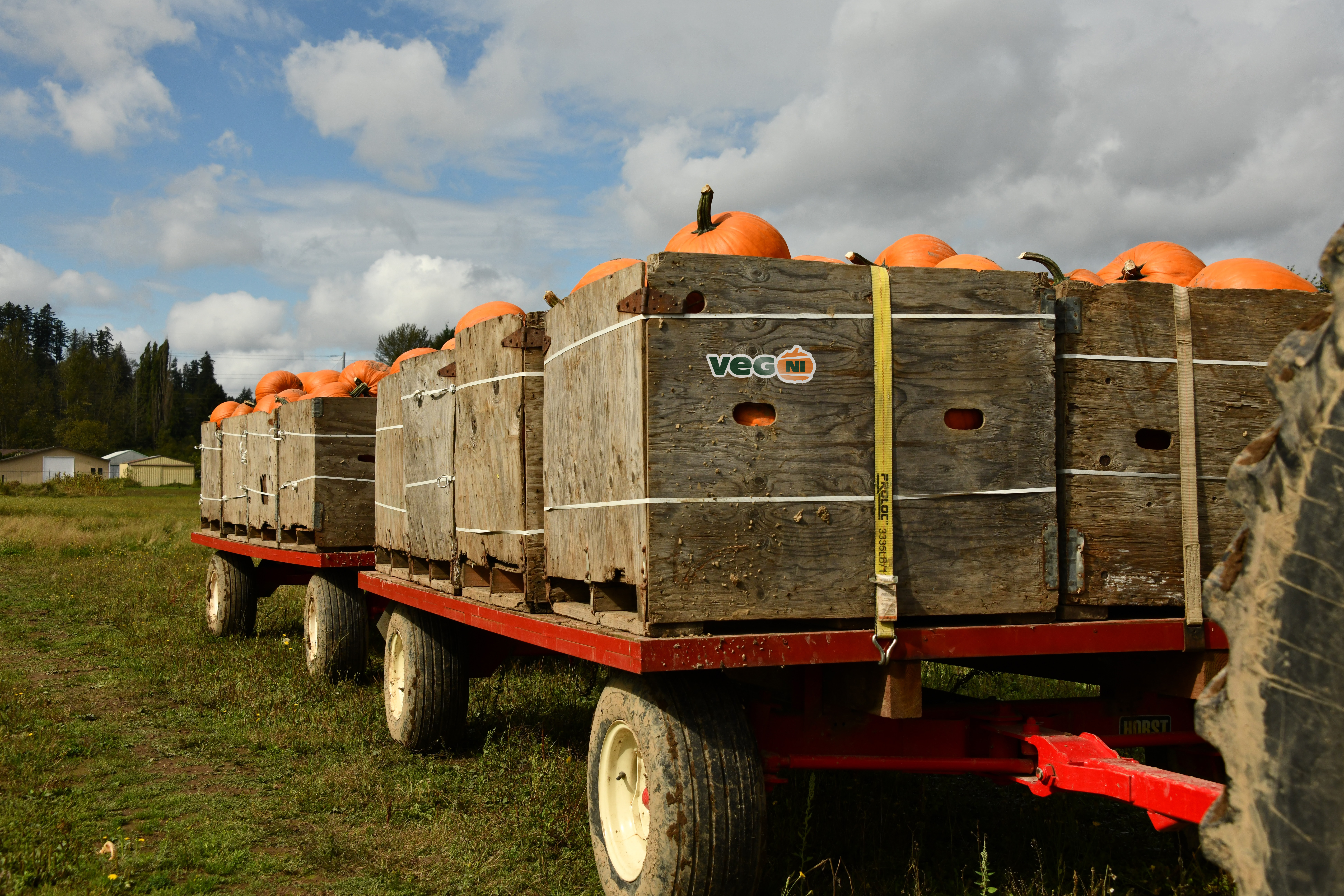
JRS describe the solution as a simple, cost-effective system that intends to give smaller farmers an individualised way to be recognised as part of a bigger collective, helping them fight for their value and their future. When understood in this way, the work becomes more than just an identifier but also a movement that seeks to solidify and collectivise, and direct energy towards making change. Design works in service of this.
Fonts: ResotYg, Proxima Nova & Karla
