Mill by Manual
Opinion by Emily Gosling Posted 7 June 2023
There’s a lot to be said for the Instagram-worthiness of, say, a faux-futuristic beauty brand identity that’s all gloopy, metallic, kinetic typography, ‘terminal green’, and unabashedly Gen Z-baiting ‘y2k’ art direction. It’s easy to assume that projects that allow designers the creative freedom for unabashed experimentation – playing fast and loose with legibility and lofty conceptual thinking – are the most portfolio-worthy and smart. But arguably, it’s the designs for decidedly unsexy products and companies that require the highest levels of creative nous, and which many say are ultimately the most rewarding.
Few things are more unsexy than bins, and food waste. That’s in part why this new work from San Francisco-based brand design agency Manual is so striking: it deftly makes the unpalatable palatable, while not shying away from what the product, Mill, is all about.
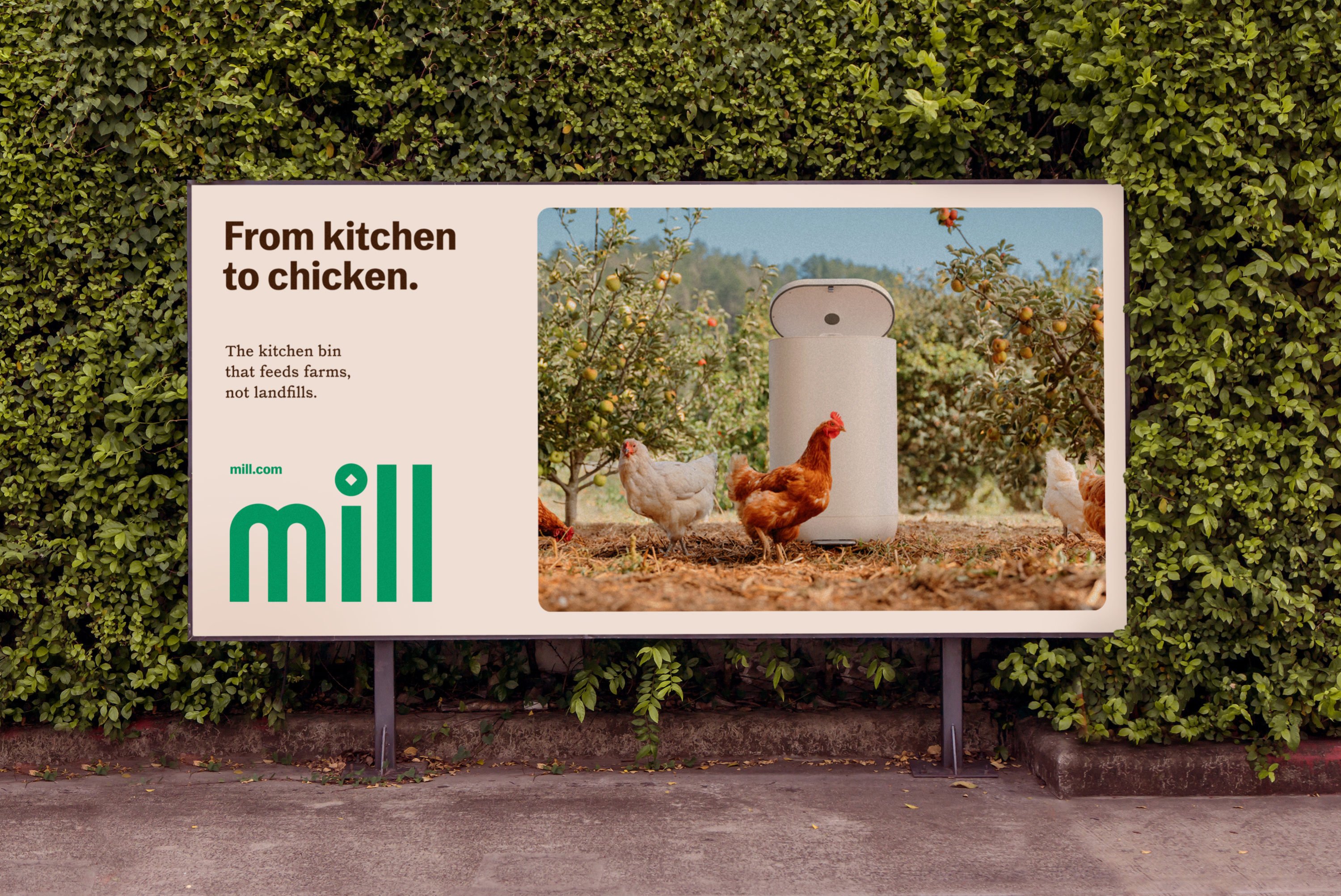
Mill operates a a membership-based model, providing a high-tech kitchen bin that works by drying, grinding and ‘de-stinking’ food scraps. The resulting ‘Food Grounds’ are then shipped back to Mill and turned into chicken feed for farms. The brand’s co-founder Matt Rogers is best known as one of the two people behind smart home device company Nest, which Manual had previously worked with.
The aesthetic of the Mill bin itself makes a lot of sense considering Rogers’ pre-Nest days at Apple: it’s all high-tech functionality hidden behind a thoroughly stripped back, sleek white exterior. Manual’s work both compliments that and goes against it: the Mill bin itself is ultra-minimal, but the brand identity wouldn’t have worked if it had followed that lead. Consumers would have no idea what Mill was for a start; and it would fail to answer a crucial part of the branding brief – to educate people about food waste and inspire behaviour change.
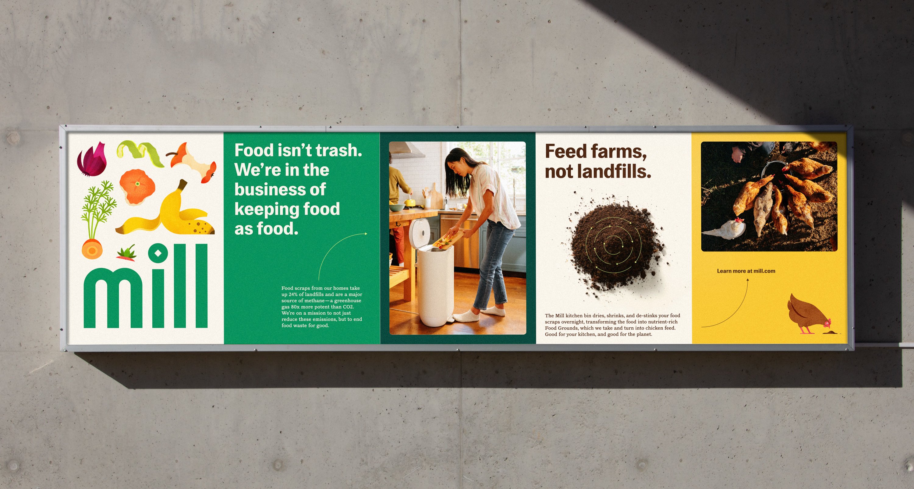
According to Manual, 54 million tons of food are wasted every year in the US, most of which goes to landfill. This has a significant impact on environmentally damaging emissions, since food scraps comprise 24% of landfills which produce methane – a greenhouse gas 80 times more potent than Co2. Mill has a bold ambition: ‘Not just to reduce greenhouse emissions but to end food waste for good.’ While Mill’s waste management system is easy to use, the task at hand wasn’t so simple…
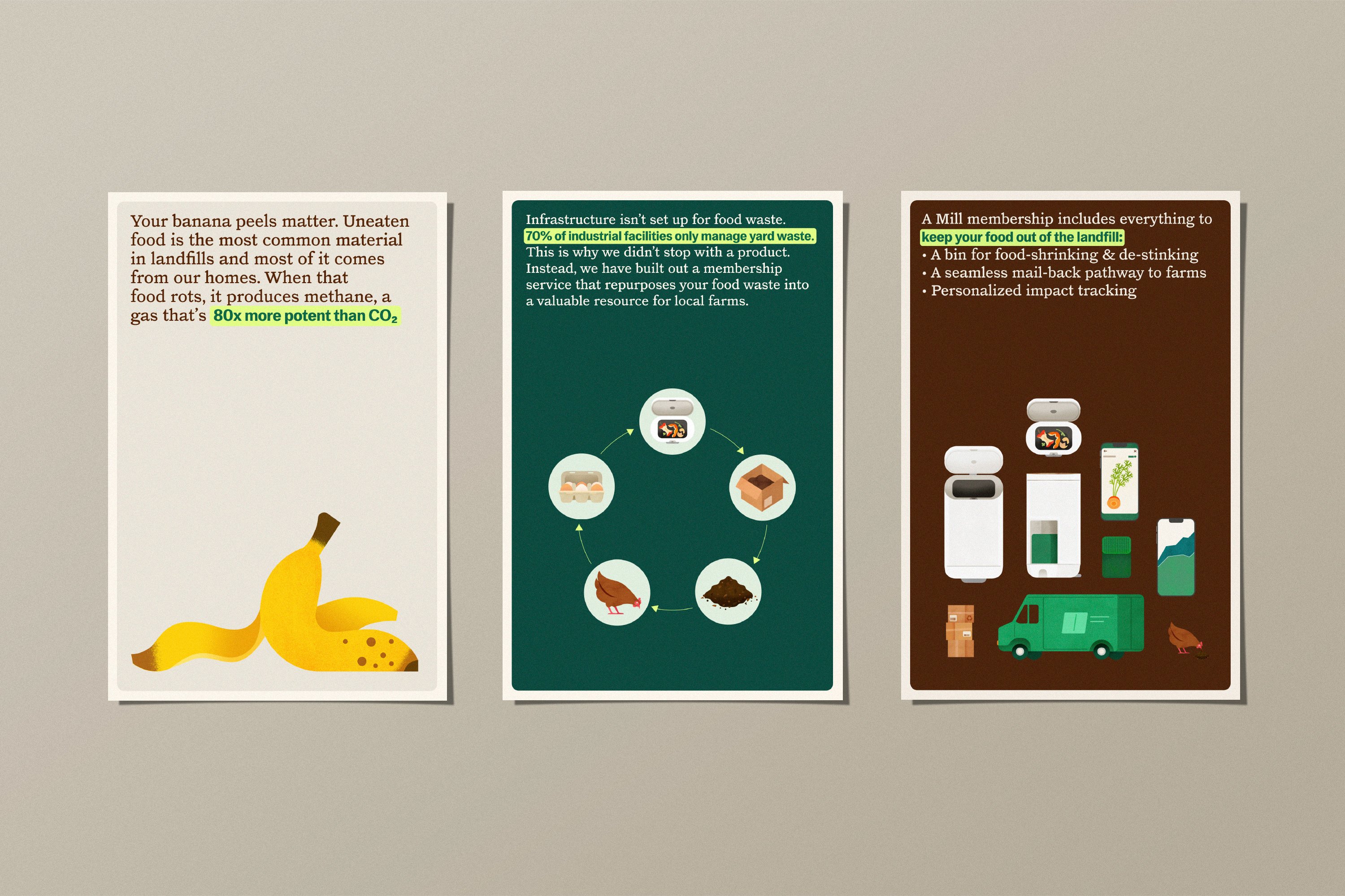
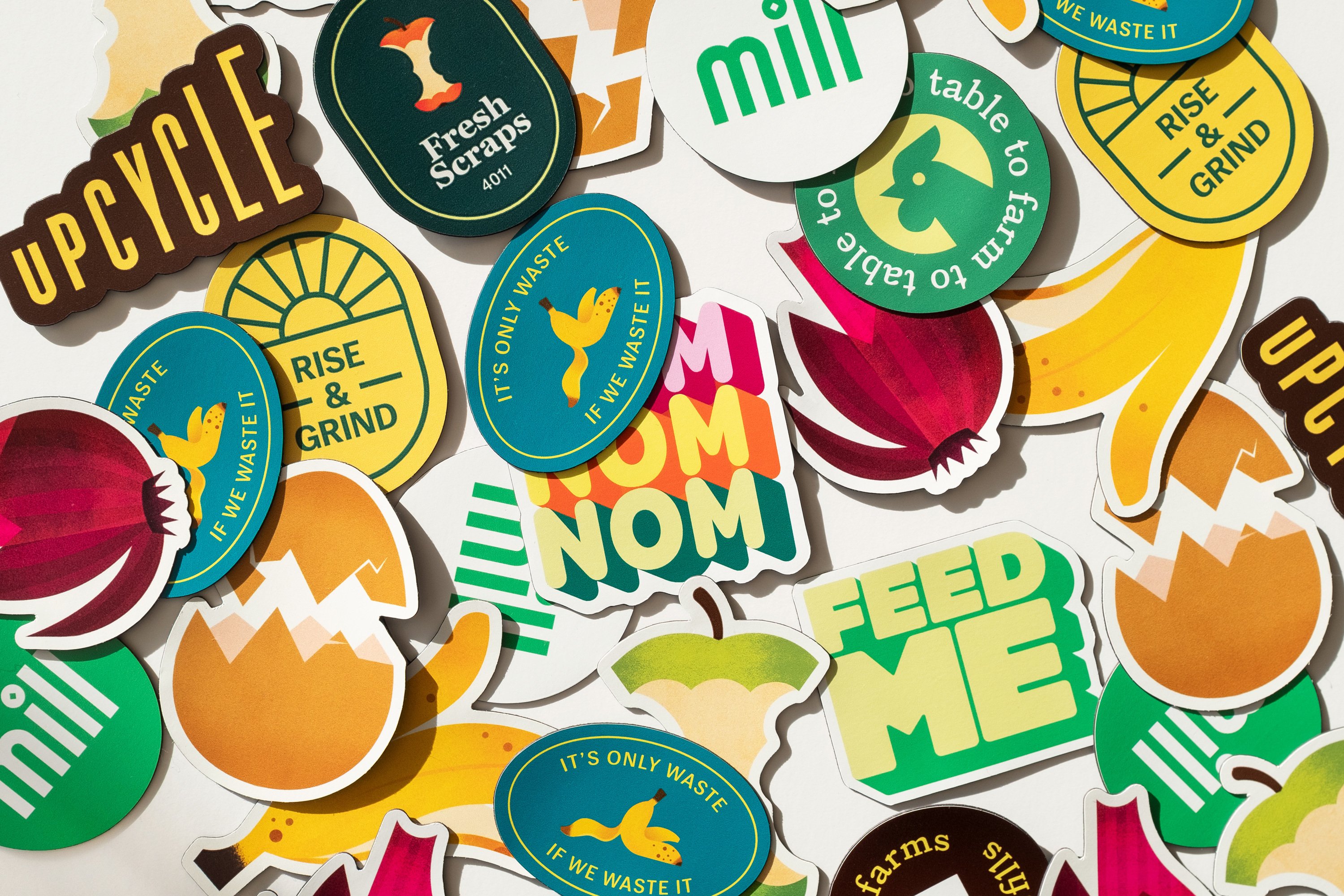
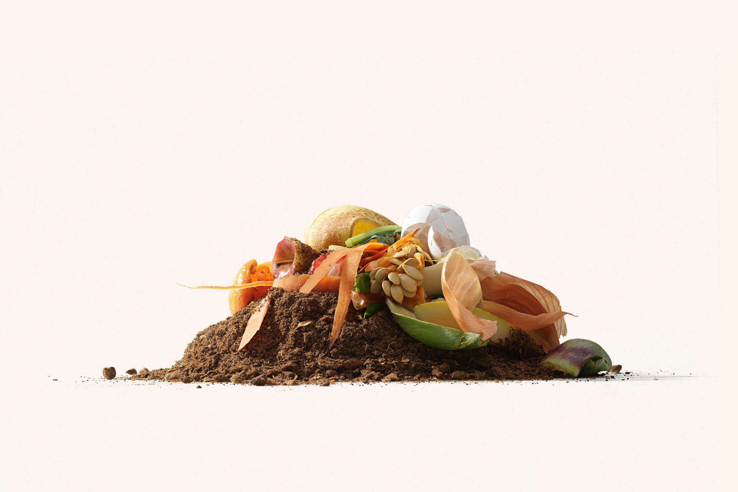
Briefed to create a brand identity and visual storytelling strategy that ‘informs, educates, inspires, and delights people to take action’; Manual’s approach was to ‘celebrate the scraps’ and educate consumers about the fact that eggshells, carrot tops, and other things we usually bin are still nutrient-packed.
At the same time, the identity had to demonstrate the scientific rigour behind the product; differentiating Mill from the ‘greenwashing’ consumer products that overstate their sustainability credentials. The visual and verbal storytelling is therefore peppered with data visualisations, as well as copy that uses facts and figures to clearly communicate Mill’s credibility and instil consumer confidence.
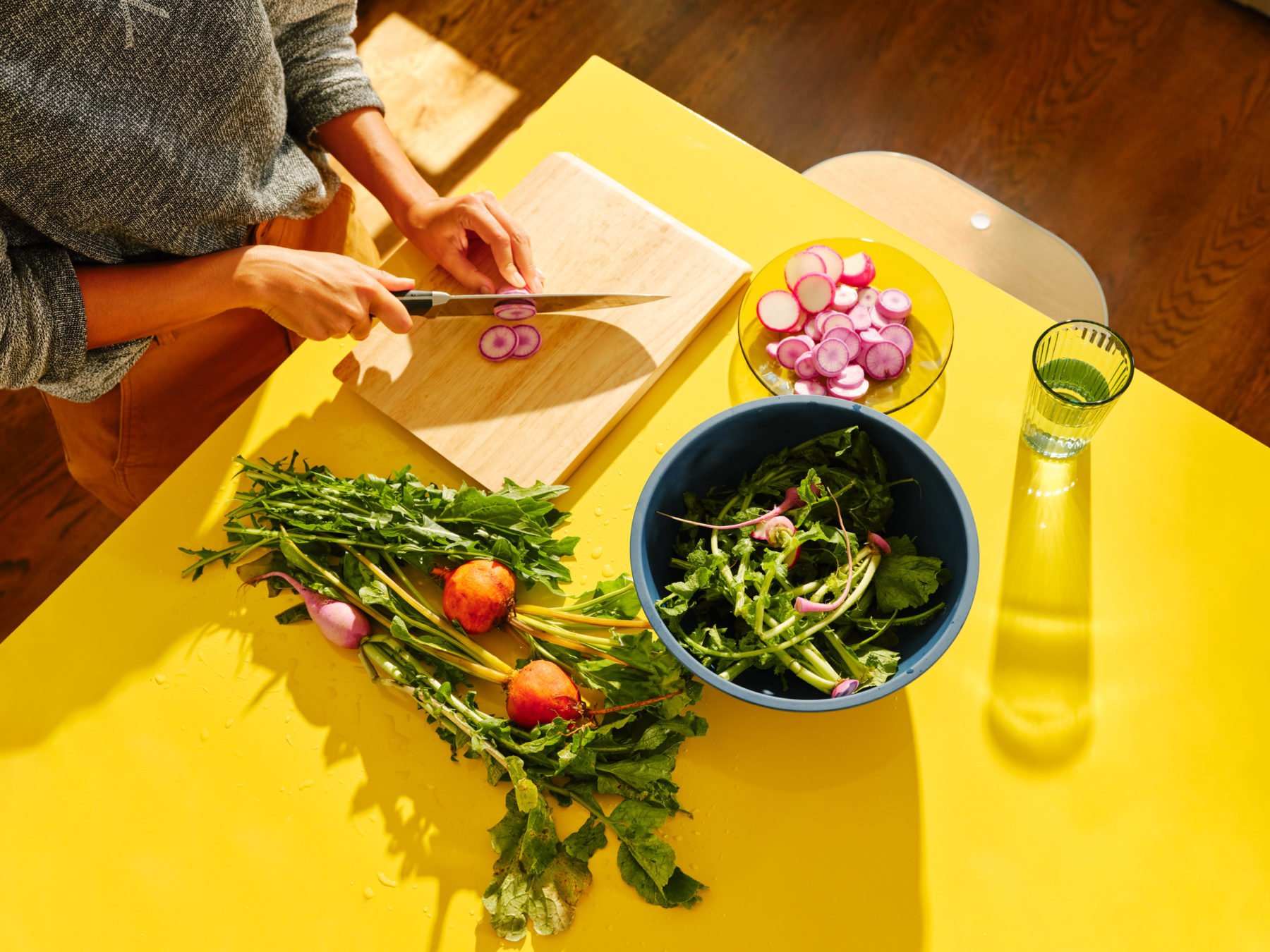
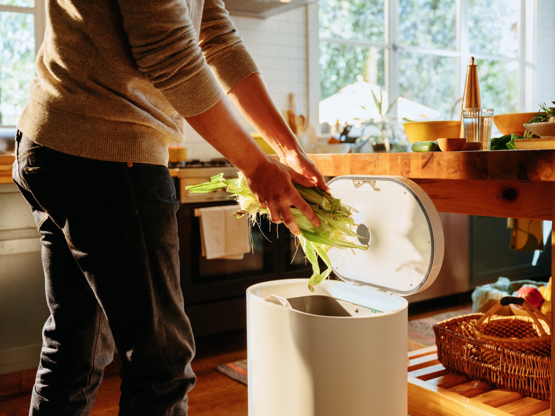
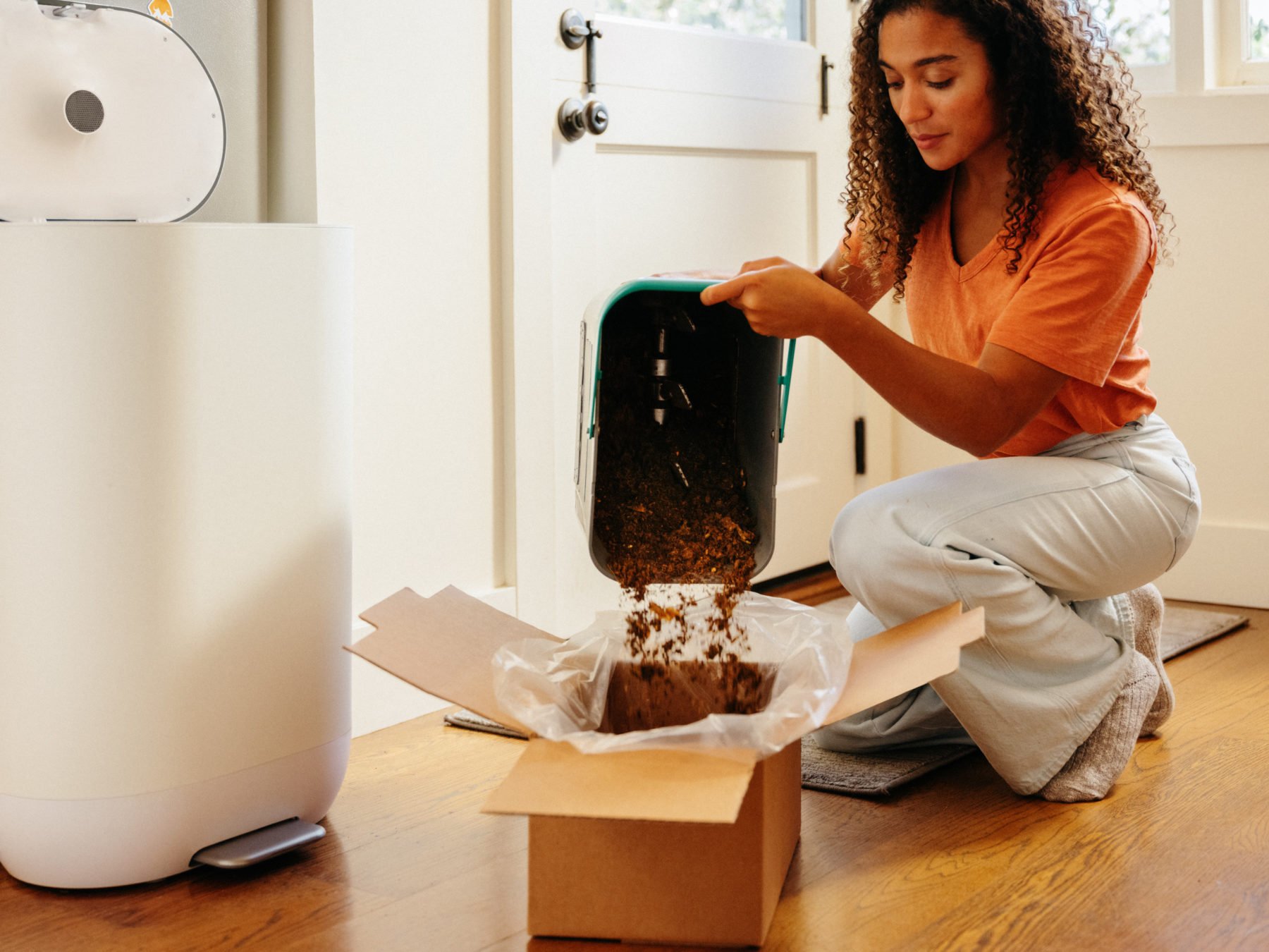

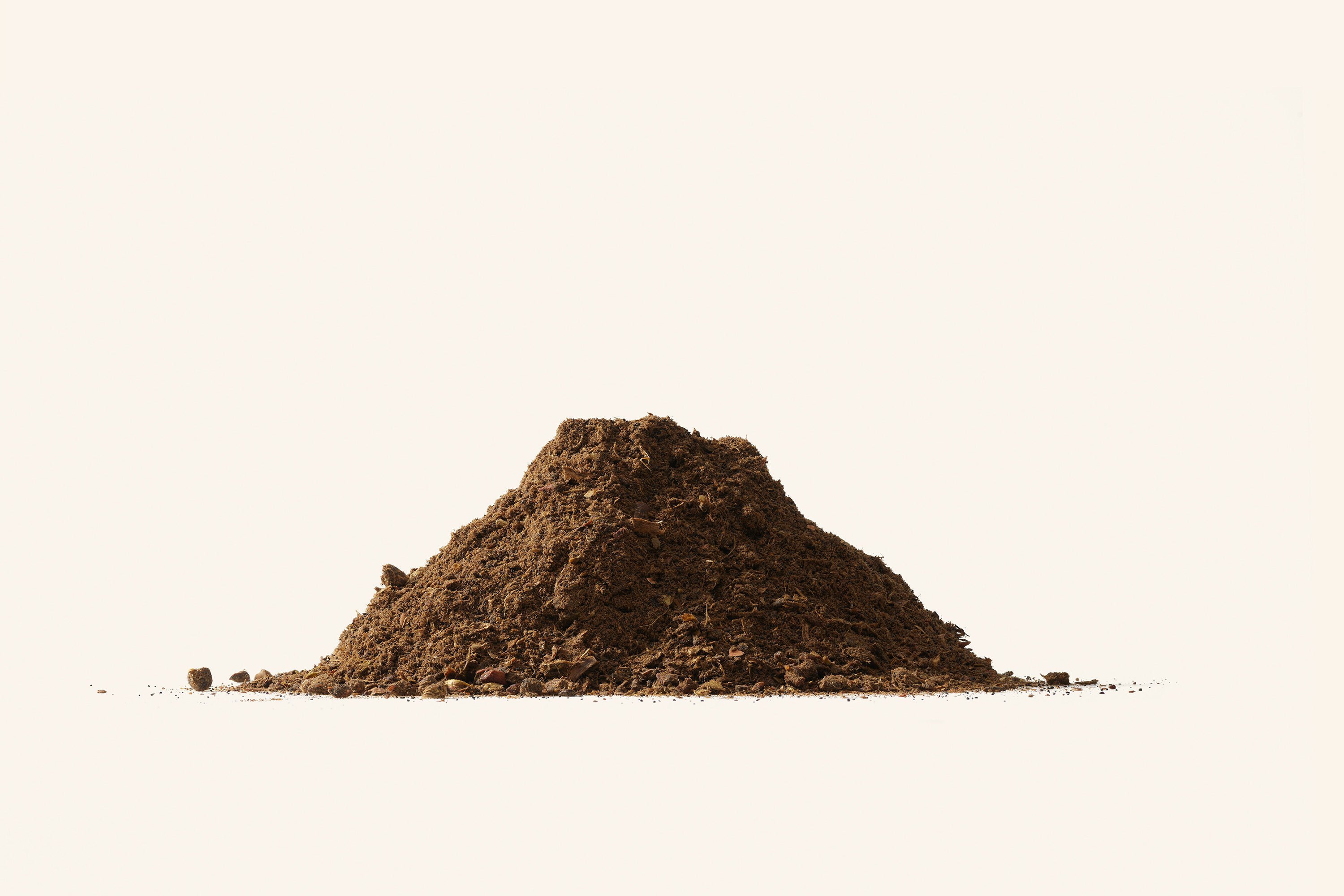
Outside of the brand identity for the product itself, Manual’s creative work extends way beyond the bin. Photography by Jake Stangel and Dwight Eschliman; illustrations; diagrams; videos and more are used to show people ‘the fruits of their labour’, demonstrating how Mill’s Food Grounds are used to redistribute nutrients, and the benefits of food going from farm-to-table and back-to-farm again.

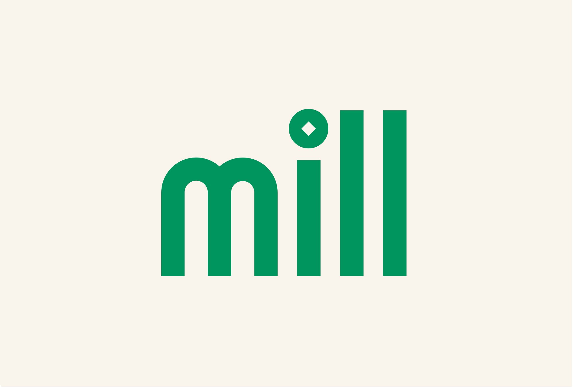
The all-lowercase logotype uses elongated letterforms that are deliberately simple, mixing modernity and a hint of nostalgia. The dot of the ‘i’ in Mill uses a diamond shaped cutout that looks to be an ‘overt’ reference to the principle of grinding up food scraps, according to Manual. ‘Overt’ feels debatable: arguably, unless you’re already familiar with the nuances of a mill’s functionality, there’s not a lot to connect the simple set of shapes with the mechanics of grinding.
Mill’s identity uses two fonts: Monkey Type’s Jane sans serif typeface in regular and semibold weights and italics (chosen for its ‘character’), alongside Lineto’s serifed Catalogue to create a bookish contrast. This pairing gives a sense of dynamism while maintaining legibility and trustworthiness, and means that the brand can easily flex across a wide range of messaging and themes spanning food, science, and agriculture.
The graphic language was inspired by various pieces of vintage food-related print ephemera, such as journals, children’s books and scientific diagrams. Taking things firmly into the 21st century, however, is the vibrant colour palette, which uses hues inspired by fruit, vegetables, and Food Grounds to give a sense of optimism. While the go-to green and brown colours of so much sustainability-related branding are very much present, the shades feel different and unusual enough to steer things away from cliche territory.
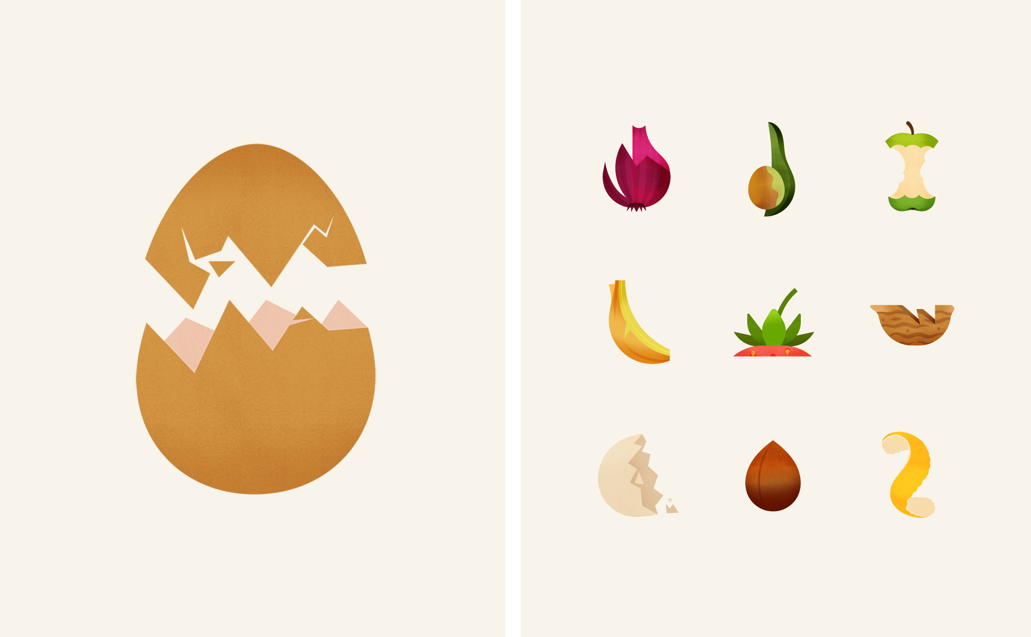
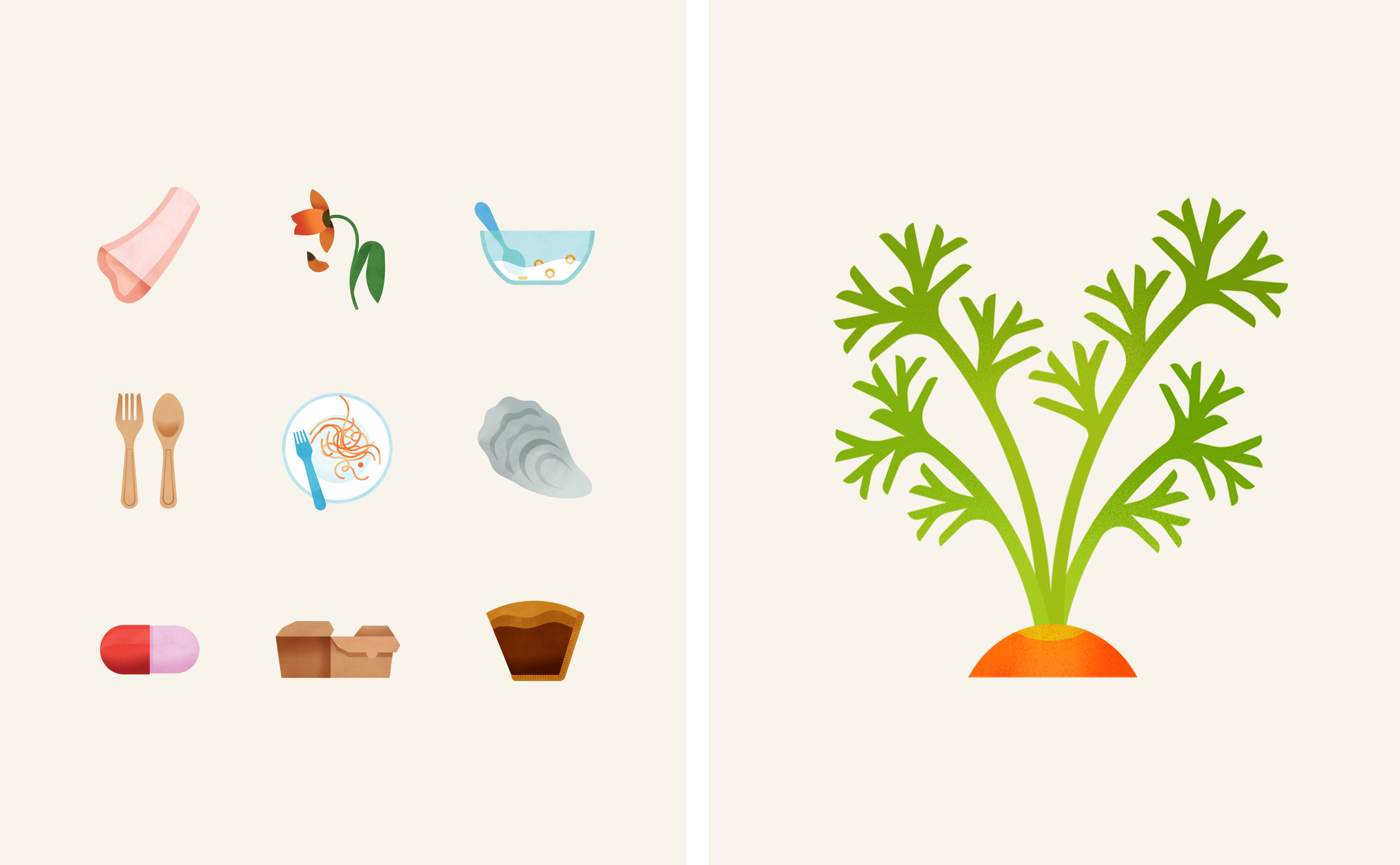
In line with Mill’s bold aim to eliminate food waste, the brand’s stationery and ‘swag’ use waste paper and upcycled fabric. Meanwhile Manual commissioned Amsterdam-based Maya Stepien to create Mill’s graphic illustrations. Rather than being used for decorative purposes, these serve to educate consumers about what they can and can’t put in a Mill bin and add a hint of playfulness to what’s undeniably a rather banal, if very important, aspect of domesticity.
Manual says that the branding looked to ‘elevate the aesthetics of food scraps’ to help people better see and understand their value, and in that, they’ve undoubtedly succeeded.
