Vineyard Theatre by NB Studio
Opinion by Emily Gosling Posted 8 June 2023

Much like identity work for art galleries and publishing houses, master brand design for theatre is often neutral, leaving plenty of space for a programme of diverse productions and eclectic marketing images to ‘take the stage’. When everything is in constant flux, there are typically some constants: a straightforward, recognisable wordmark, a distinctive typographic personality, and a consistently tight grid system. For a few masterclass studies see Bridge Theatre by Koto, Shakespeare’s Globe by Design Bridge and – of course – Paula Scher’s work for New York’s Public Theater.
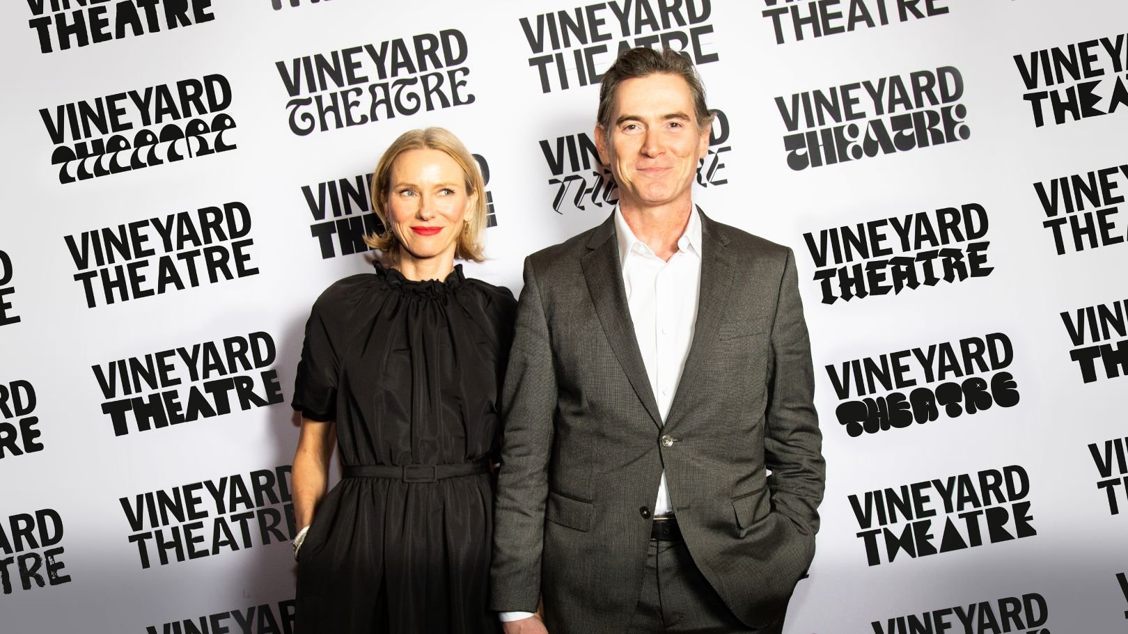
London-based NB Studio is familiar with this full-proof strategy from its adept rebrand of Islington’s Almeida nearly a decade ago. In the six months following the project, the Almeida took three sell-out shows to the West End and was nominated for a hatful of awards. It’s no surprise then, that the artistic director was happy to recommend NB to off-Broadway theatre company Vineyard (best known for Avenue Q and How I Learned To Drive), which was looking for the right team to create a new identity to mark its 40th anniversary.


Moving away from the playbook, however, this time NB delivered an ever-changing logo as part of a new system in which the colour scheme and imagery are never the same twice. According to the studio, ‘With each production, Vineyard strives to change theatre, so the new identity does just that’. While it’s not unique for a performance company to describe itself as ‘fearless’ or ‘boundary pushing’, it is unusual to see this represented in core brand assets rather than campaign. The later can be seen in Andrea Trabucco-Campos’ recent rebrand for New York’s Irvington, for example, in which each play or musical is treated to its own display typeface, in a nod to the visual language of old school wheat paste posters.
In the case of Vineyard, the idea of a distinctly New York sense of community led to NB Studio calling in various NY-based typographers and font foundries to form a bank of logos that change with each production. More than 25 typefaces were eventually used in the brand system, by designers and foundries including Simon Type, XYZ Type, General Type Studio, Tobias Frere-Jones, Brandon Nickerson, Sharp Type, and p22. Further bespoke typefaces were created by members of the Vineyard Theatre team, who collaborated with Pentagram New York partner Eddie Opara. The result is a logo that adapts to personality of each new title – an act not only of endorsement, but of unity with the writers, directors and performers under its roof for the season.
Alongside this, the main brand typeface, HEX Franklin, was created by Nick Sherman of type foundry HEX Projects as an homage to the New York classic Franklin Gothic type family. It was also chosen thanks to the fact it’s a variable font, meaning that designers can customise the weights and widths of letterforms to ensure maximum impact across a variety of different applications. This gives a sense of ‘anti-design’ while introducing necessary rigour to the flexible system.
![]()


Similarly, the ‘logo’ and text is always black – even though Vineyard is now ‘colour agnostic’, meaning that the designers are free to pick any colour: ‘our colour palette is ever-changing and therefore limitless… when we do bring in colour to our brand it comes from the making, the story, the performance and the people – not from us’. This creates cut through in a world of colour and establishes both neutrality and masterbrand authority.

While the new visual system is entirely variable, it is therefore underpinned by a strict, simple set of rules that mean it’s easy to apply to endless different touchpoints and applications and also adheres to a central recognisable brand identity. NB Studio created a set of grids for the branding, but (as expected) kept them flexible so that Vineyard can adapt the layouts to accommodate different pieces of imagery for each production and leaving in room for further work by creatives local to New York City.
NB’s overall strategy was based around the concept ‘Fearlessly Made In New York’. The multifariousness of the identity is certainly fearless, but it is also proudly community led and deftly balanced to ensure that the look and feel will reflect the character and mood of individual pieces while also remaining distinctly ‘Vineyard’.