Unmind by Ragged Edge
Opinion by Emily Gosling Posted 27 June 2023
In recent years, employers have been rushing to offer an increasingly elaborate range of workplace perks, from the WeWork style beer on tap approach to sleep pods (begging the question, if you have to sleep at work, is this really a perk at all?) to Ben & Jerry’s rather busman’s holiday-ish promise that employees can take home three pints of ice cream a day.
But none of these whimsical promises can mask the fact that one of the biggest workplace issues is employee mental health – something that wellbeing platform Unmind is looking to change. According to London-based branding agency Ragged Edge, which recently undertook a global rebrand for Unmind, the platform sets itself apart from the raft of box-ticking mental health apps out there that put the onus on the employee, rather than the employer, describing it as, ‘Giving employers and employees the tools and training needed to approach wellbeing in a new way’ through an online service that unites ‘everyone under the belief that work should be good for your mental health’.
The new look certainly differentiates Unmind from a sea of polite, staid corporate app designs that both dehumanise mental ill-health and aren’t doing a lot to encourage people to use them over and above a ‘sticking plaster’ solution for companies to feel as though they’re actually doing something.
Instead, Unmind’s new look and feel sits squarely outside anything that leans on the tropes we’d associate with all things corporate – and all things healthcare. Instead, it feels lifestyle-led – all trendy type and slick art direction that almost makes you forget it’s anything to do with healthcare, or the workplace, at all.
Ragged Edge says it needed to ‘create a brand that stands up for people on an individual level and challenges perceptions on an institutional level. A brand that can create change you can feel.’
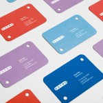
As such, the new identity looks to convey human passion, but still underscore the fact that Unmind is backed up by statistical proof. That passion is conveyed largely through the new colour palette, which is based around a bold yellow that stands for hope. This yellow, which is shown across the wordmark and campaign imagery, is supported by a wide secondary colour palette that looks ‘to represent the full spectrum of human emotion’. It looks nice for sure, but you’d have to dig pretty deep to come to that same conclusion.

For the wordmark, Ragged Edge used a modified version of Commercial Type’s Feature Text as the starting point. As feels befitting for a brand based around mental health, Ragged Edge has duly softened the original font’s sharper serifs to make it all feel more cosy and relatable. While some have described it (perhaps rather fittingly) as ‘post Chobani’ in its quirky-serif-graphic-design-trendiness, it works: it looks good but without being overtly in your face, and certainly further serves to set Unmind apart from more sombre, or dry, workplace mental health initiatives. Plus, it definitely hits the mark in terms of credibility: it’s trustworthy rather than kooky for the sake of it; confident over brash.
Elsewhere the campaign uses Klim Type Foundry’s National 2 Compressed as its primary brand typeface – always in uppercase, and thanks to the yellow colour palette, landing somewhere between an Anthony Burrill poster and a Barbara Kruger confection.
The idea was that the ‘campaign-style typography and tone of voice work together to celebrate mental health instead of apologising for it’. There’s certainly nothing apologetic here, and it all looks cheerful. And while there are certainly countless great things about the rebrand, the copy and tone of voice confuses. At times, the messaging is bizarre: ‘Our mental health doesn’t need to be fixed. It needs to be found’, reads one poster. Another, even more oblique campaign image states, ‘Well beings / rise up’. Huh?
Another less successful aspect of the work is the photography. The idea of the group shots was to underscore the human aspect of Unmind; and the models’ poses certainly work in that they’re not beaming (who, with poor mental health, is?); nor are they playing the ‘stock photography depression person’ with head in hands, crying. But they are all objectively young, and good looking. It doesn’t feel enormously inclusive: it feels more like a D2C, gender-neutral beauty ad on Instagram that’s tapping ‘aspirational’, rather than ‘relatable’.
For those criticisms, however, overall Ragged Edge’s Unmind rebrand is excellent, as shown on the Unmind website where it all comes to life. The agency says the new brand looks to be one ‘that companies and colleagues can rally around to establish a new era of wellbeing at work’, and there’s no doubt it achieves that. Nothing is too shouty, nor too cheery; but neither is it sombre or boring ‘office casual’. It’s legible and – crucially – feels relevant and inviting, doing a great job surely of making employees and employers alike want to actually use the service.
Fonts: National 2 Compressed & Feature Text