Cohere by Pentagram
Opinion by Emily Gosling Posted 29 June 2023
From Wes Anderson to ‘accepting the job’ and distinctly dystopian new romantic relationship models; in recent years, it’s felt like you can’t move for chat about AI – its weirdest uses, its hilarious shortcomings, and a hell of a lot of scare-mongering about it stealing our jobs.
The platform that’s dominated much of the conversation is ChatGPT, an AI chatbot with a conversational tone that’s used to compose written content. Where ChatGPT has a fairly sprawling remit (and in my experience, very poor results); a similar platform, Cohere, recently launched that’s more specific, in that it’s designed especially for use by businesses.
In Cohere’s words, the platform’s ideal uses include law firms that need to find specific information in hundreds of court documents, software providers that need to organise takeaways from thousands of reviews, and online communities that need to quickly find hate speech among millions of posts.
Pentagram London partners Jody Hudson-Powell and Luke Powell were at the helm of Cohere’s recent rebrand, which included creating a custom typeface, new logo, Cohere’s website and ‘playground’ environment, as well as a suite of bespoke digital design tools, which were handed over to Cohere’s inhouse team.
What sets the new designs apart from the usual sparkly turquoise, futuristic purple, silvery ‘futuristic’ look that’s been done to death by similar platforms (and tech brands more generally) is the more expressive feel. It’s not just about cold, hard tech and data; there’s a fluidity here that feels a lot more engaging.
That less rigid, more organic tone is explained by the fact that, according to Pentagram, the new identity is based around the concept of ‘new nature’, ‘introducing the fluidity and imperfections of nature to the rationality and efficiency of computing… [Cohere is] designed to allow people and computers to learn in tandem, ultimately changing the relationship between humans and machines’.
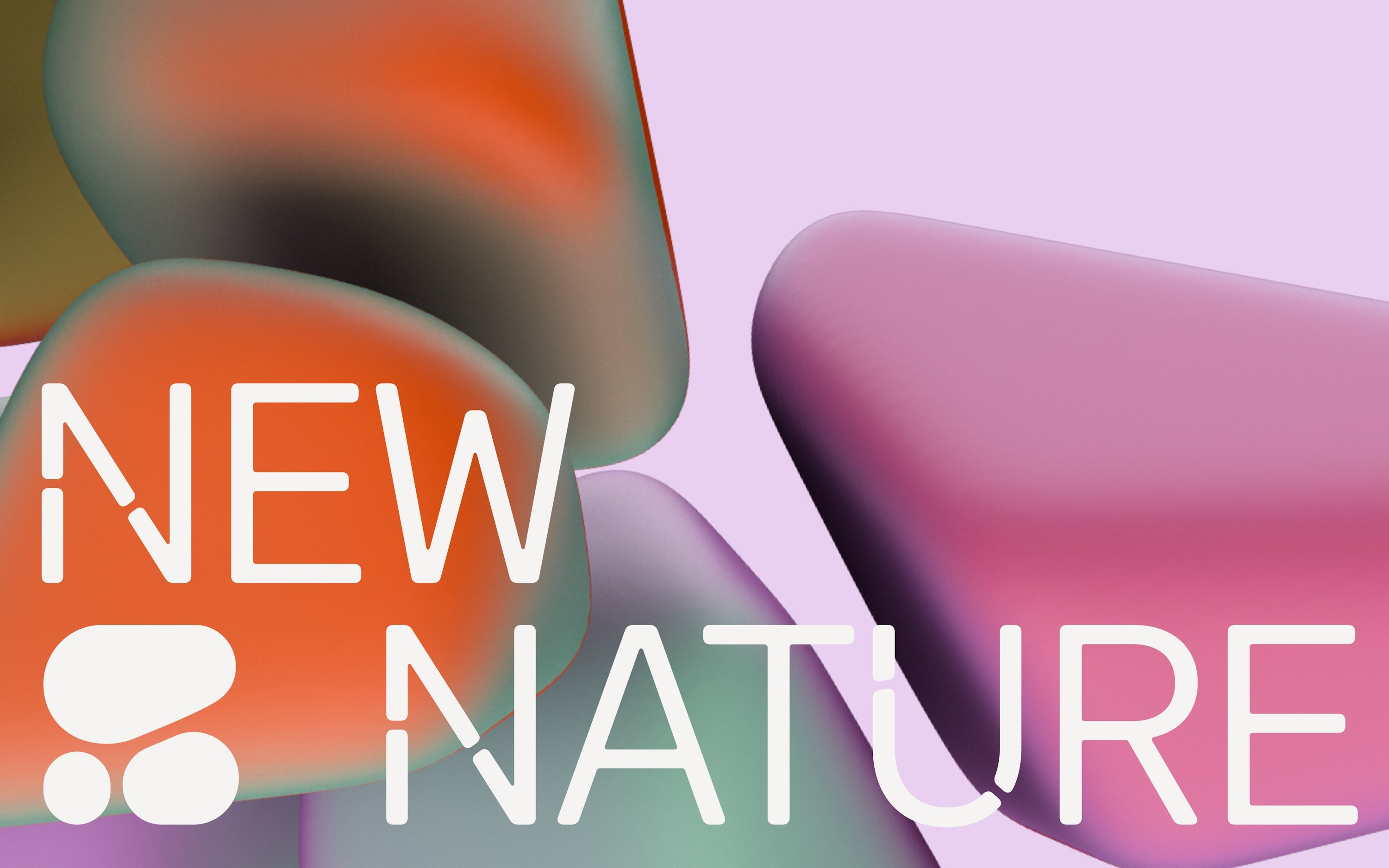
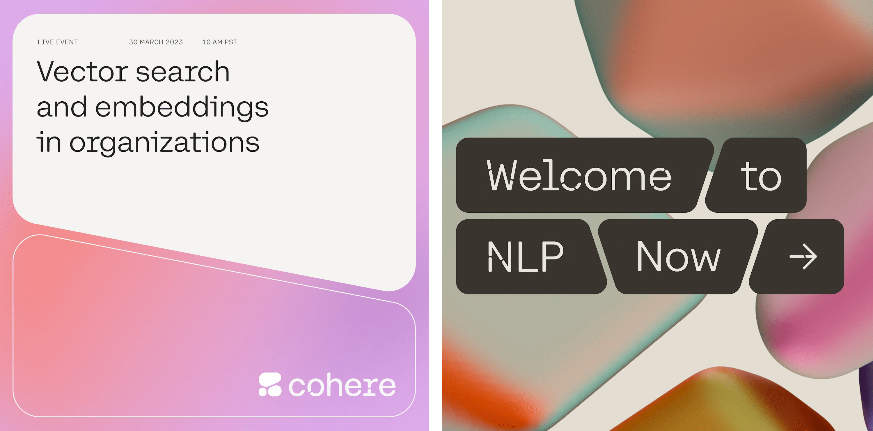
Pentagram adds that the identity is rooted in mathematical Voronoi diagrams – tessellating patterns that are used in science and tech and which also appear in nature, seen on things like giraffes’ coats and dragonfly wings. ‘The patterns create infinite possibilities and feature throughout Cohere’s new visual identity,’ say the Hudson-Powell/Powell brothers.
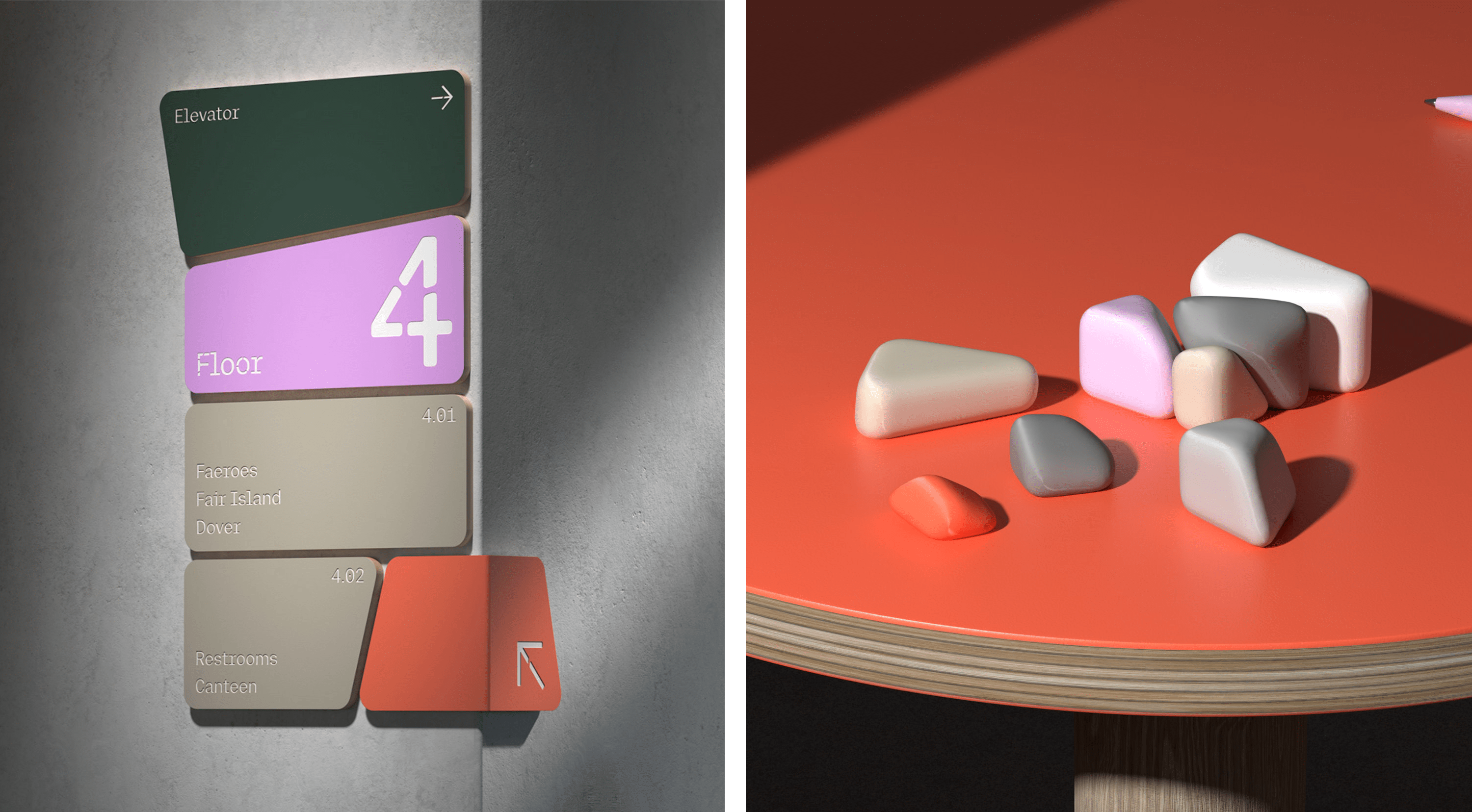
These roots in the idea of the man/machine and tech/nature dichotomies aren’t obvious in the identity – and neither necessarily should they be – but there’s certainly a calming feel to the pebble-like shapes, which have something of an ultra-modern spa feel to them, which was probably not totally intentional.
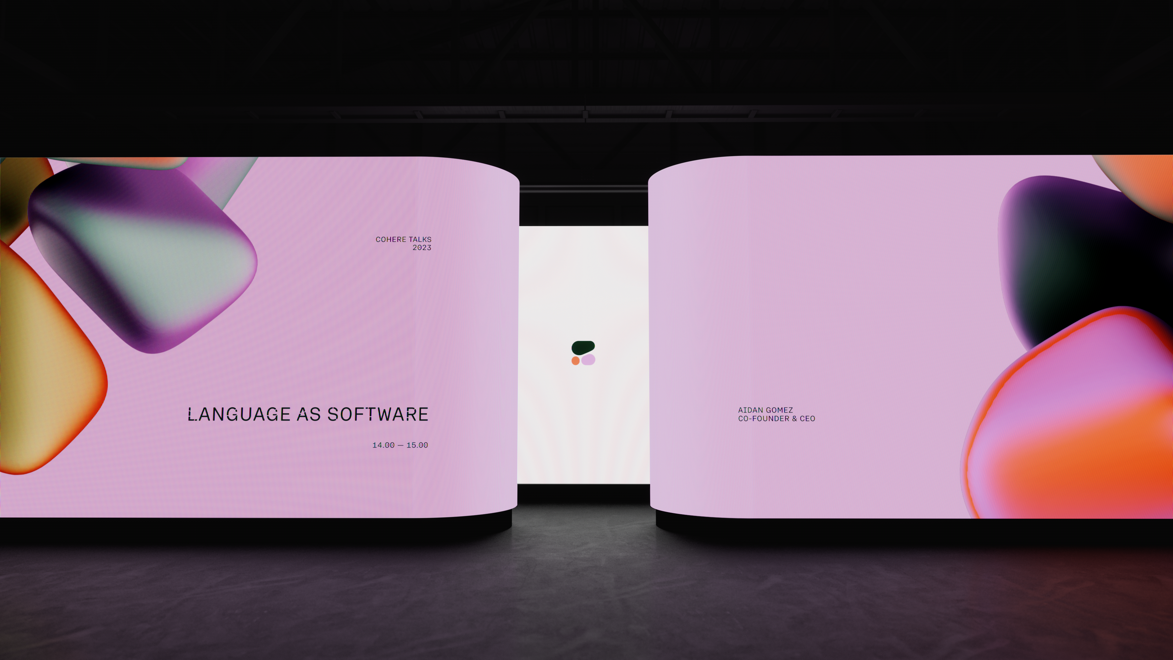
Where the identity becomes very smart is in its coherence (pardon the pun) across every single element. Animations, the digital platform, campaign imagery and even the logo itself are yoked together by their use of visual ‘cells’. The logo is formed of three ‘cells’ that form a ‘c’, playing on tech’s geometric precision and its confluence with organic, natural forms and processes. In short, the ‘new nature’ that Pentagram was striving for.
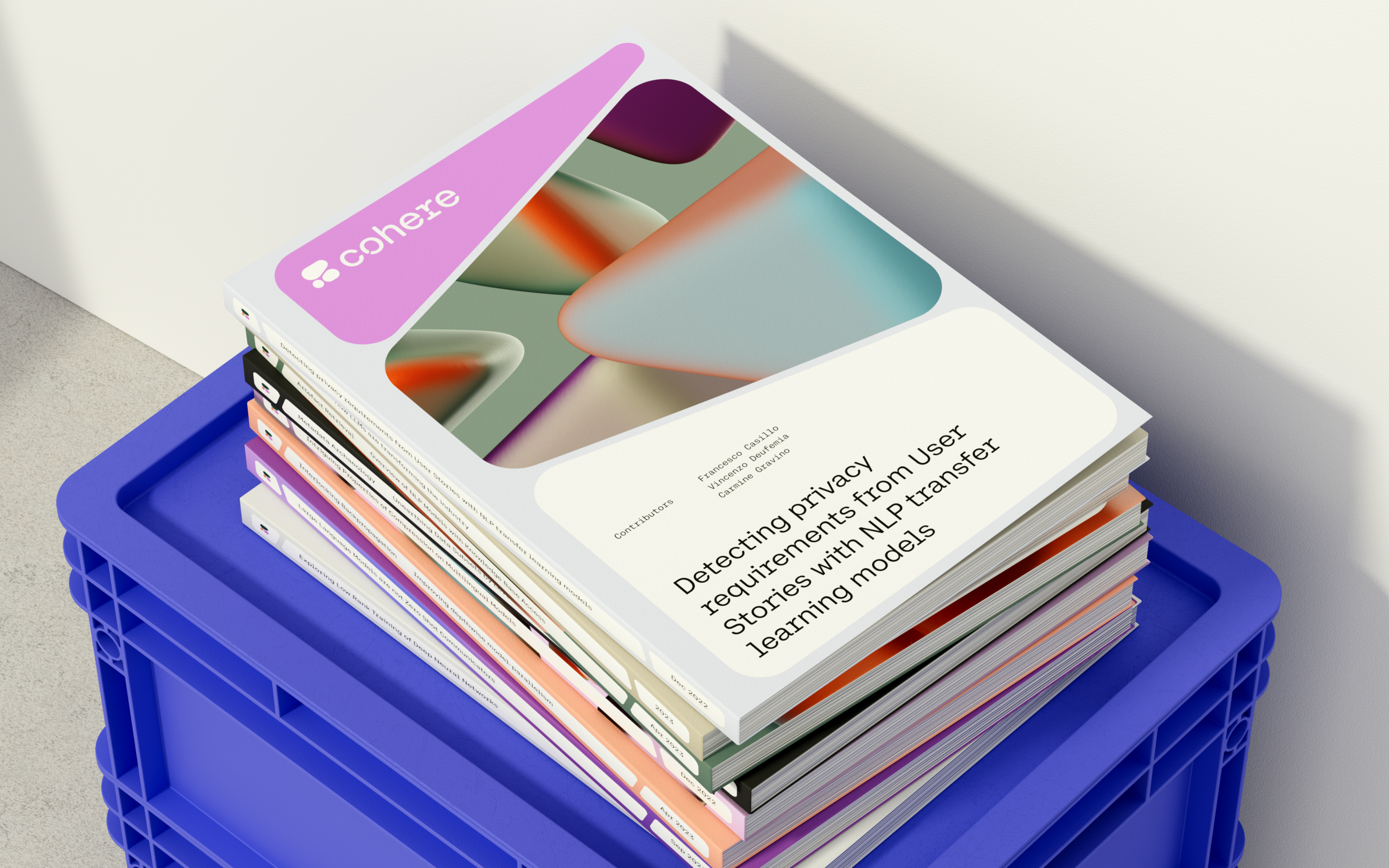
This cell concept also carries into the bespoke brand typefaces: Cohere Text, which was created in three weights (bold, regular, light) plus italics and uses a ‘faux mono style that references our digital, code-centric world’; headline typeface Cohere Outline, which was built specifically for Cohere For AI; and Cohere Mono, which is used for code-based applications.
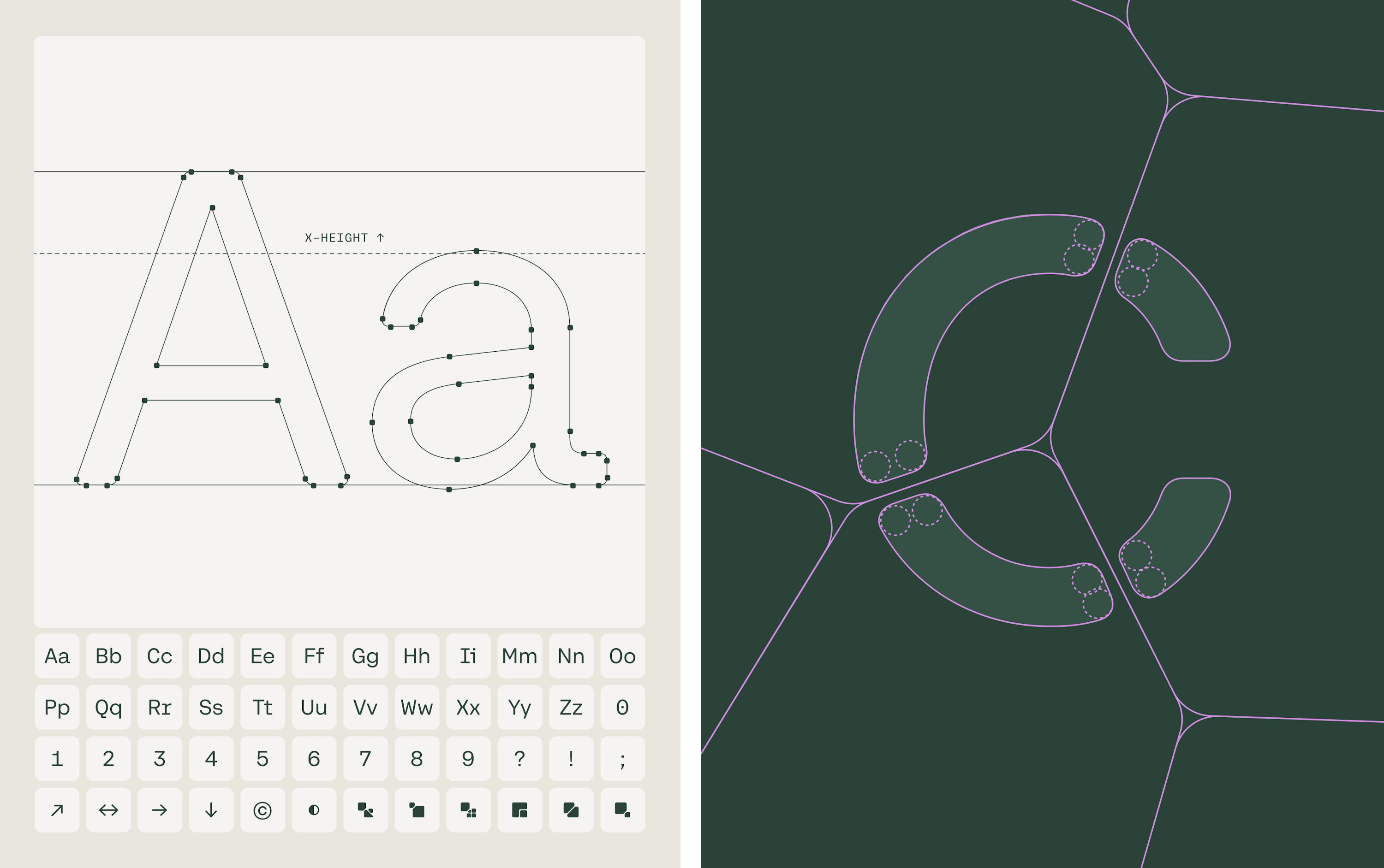
Set in all lower case, in certain applications the main typeface, Cohere Text, can feel a little infantile – like something you’d find on a sticky-hand-proof kindergarten poster or the packaging of an ‘ages 3+’ tech-leaning early learning toy. But it does fit with the overall brand concept and look, in that the openings in the characters create cell-like components, ‘representing language itself and the many components that make up the Cohere platform,’ as Pentagram puts it.
The colour palette intends to further amplify the nature thing, but often feels distinctly synthetic. Arguably, that’s all for the better visually, since the constantly shifting pinks, purples, and neon-tinged oranges look quite cool, and very playful; but it falls a bit short on the conceptual underpinning.
The colourways are one of the strongest brand elements: they cut through the dull, predictable blues and silvers of other tech and AI platforms and feel genuinely engaging, while still not being too out there for the business audiences Cohere caters for.
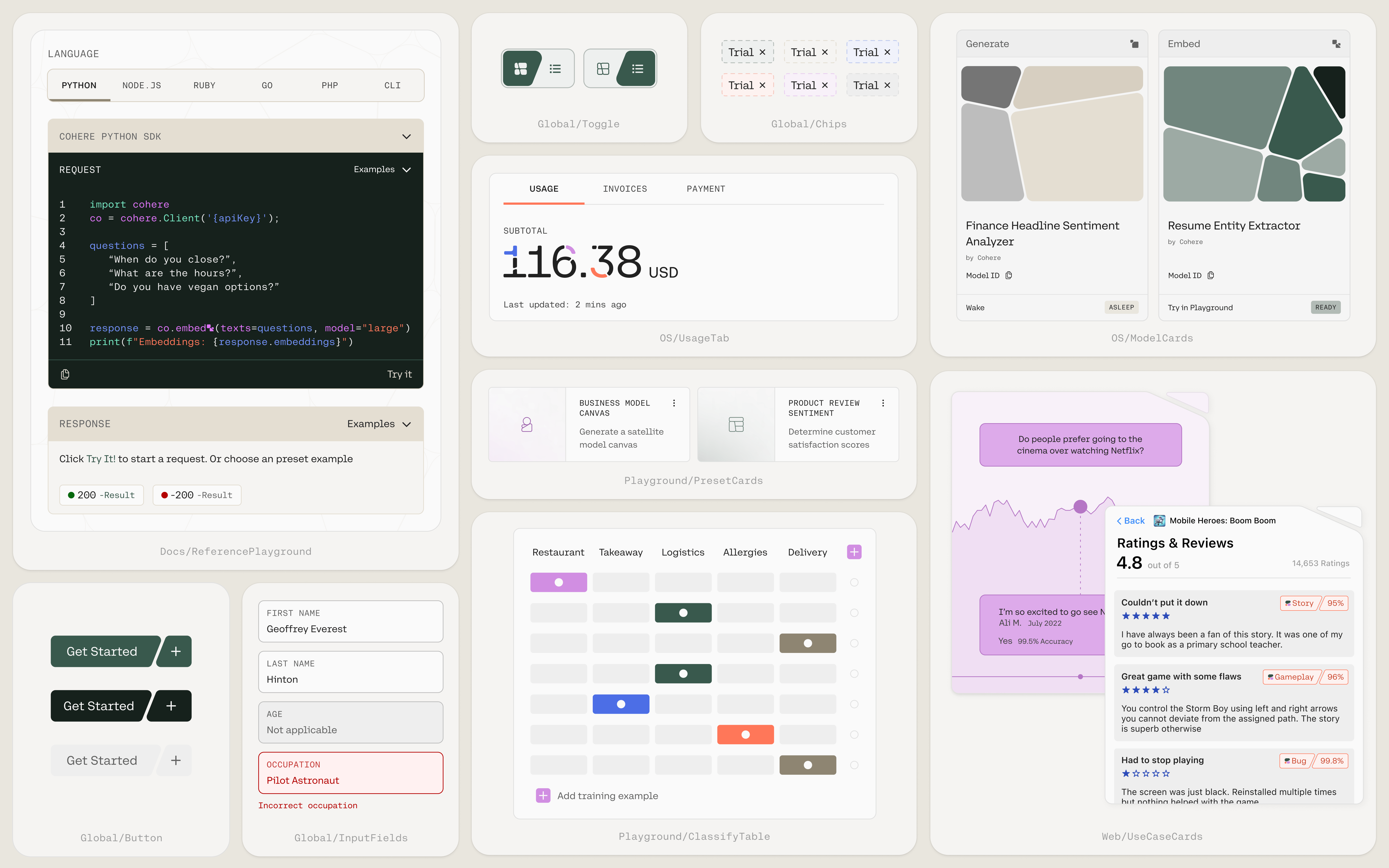
The new branding certainly feels fresh and different amid a sea of rather dated, silvery identities in tech and AI that often feel a little like afterthoughts (and, notably, takes a very different approach to its competitor Chat GPT). With this being such a rapidly changing sector, it’ll be interesting to see how Cohere’s brand ages and adapts to the tech itself.
