Scapegoats by Strategy
Opinion by Richard Baird Posted 10 August 2023
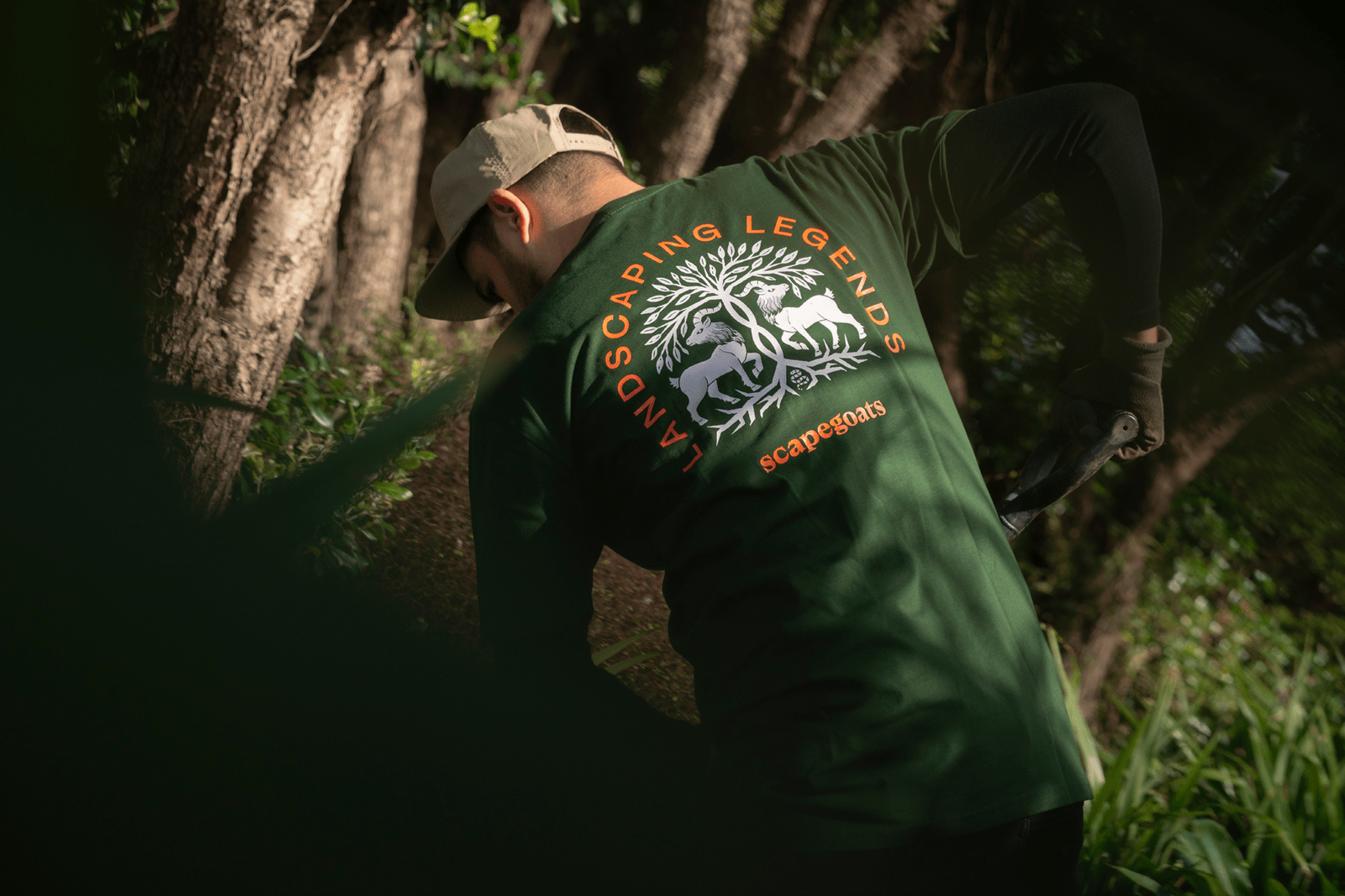
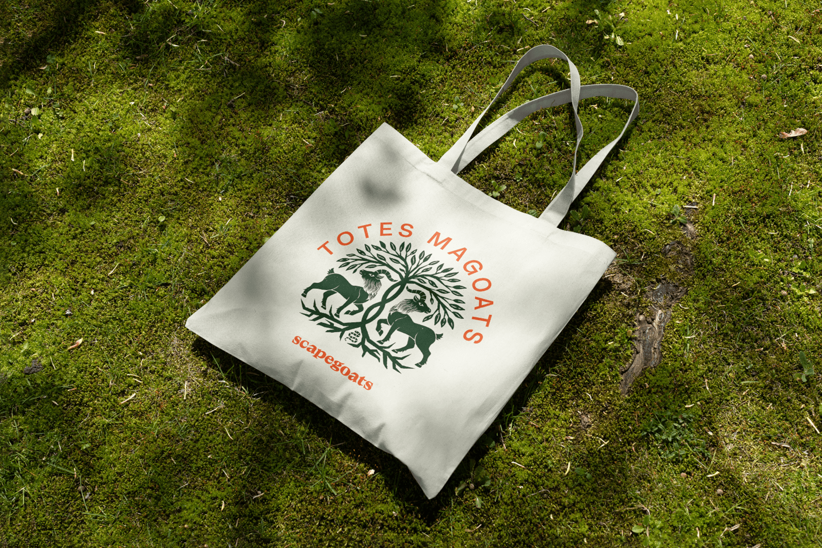
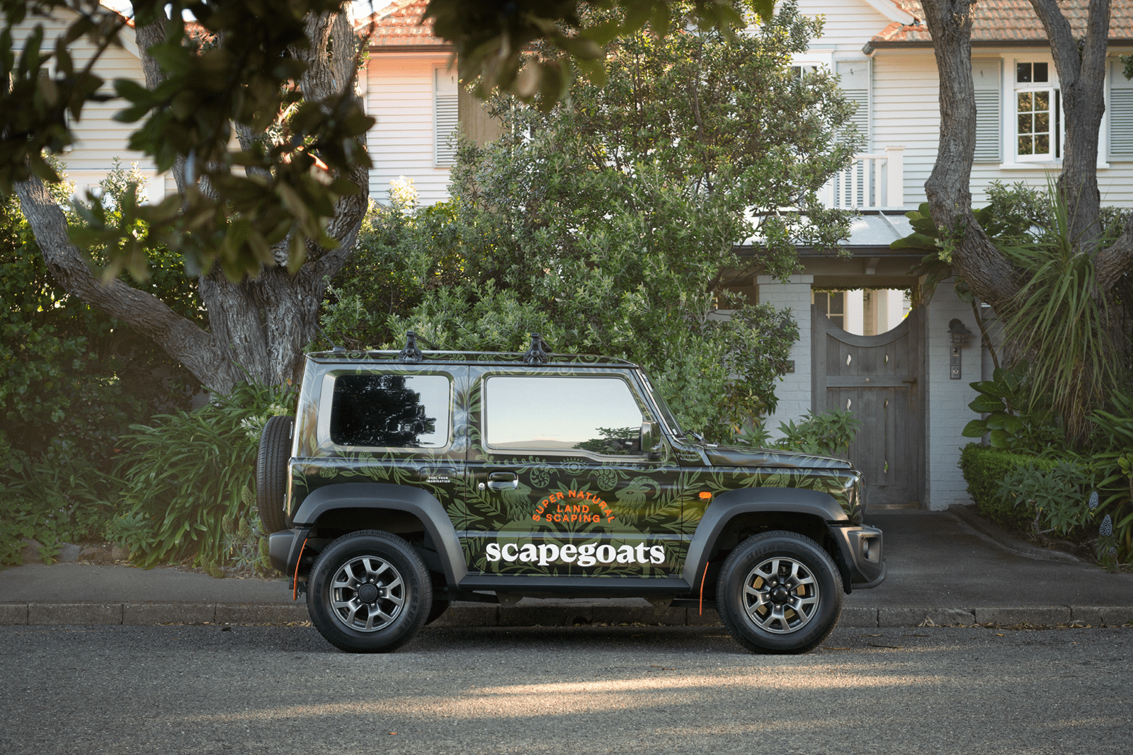
‘Landscaping legends’, what a lovely bit of alliteration and a decent bit of positioning by Strategy for Scapegoats, a New Zealand-based landscaping company. From this, a wonderful tapestry of iconography, illustration and words come to life to construct something of a horticultural mise-en-scène of craft and creativity for Scapegoats duo Kylie and Reuben and their team, which plays out across vehicle livery, brochures, tote bags, branded merchandise and website.
Founded in 2015, Kylie and Reuben set up Scapegoats to raise the standards of landscaping in Wellington, New Zealand. Through this they built a reputation for crafting remarkable landscapes, “transforming the everyday into the super natural”. Despite this ‘super natural’ ability, the company lacked a compelling brand that could match their ambition, share their story and connect with the high expectations of their house-proud audience. As Strategy points out, they needed to create a brand that pushed the boundaries of the imagination, one that would illustrate how Scapegoats use their heads and hands to create outdoor spaces for the mind to wander.
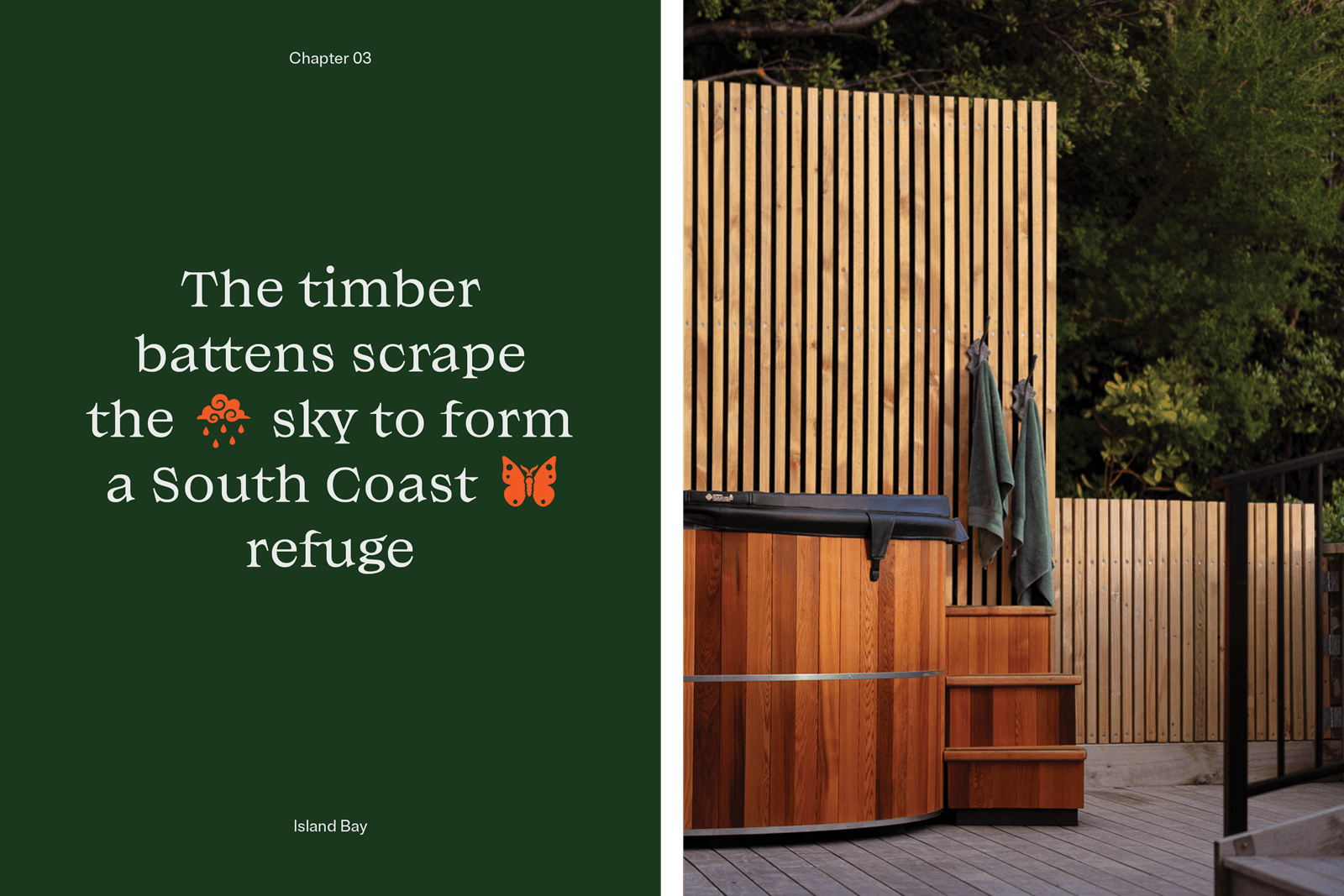
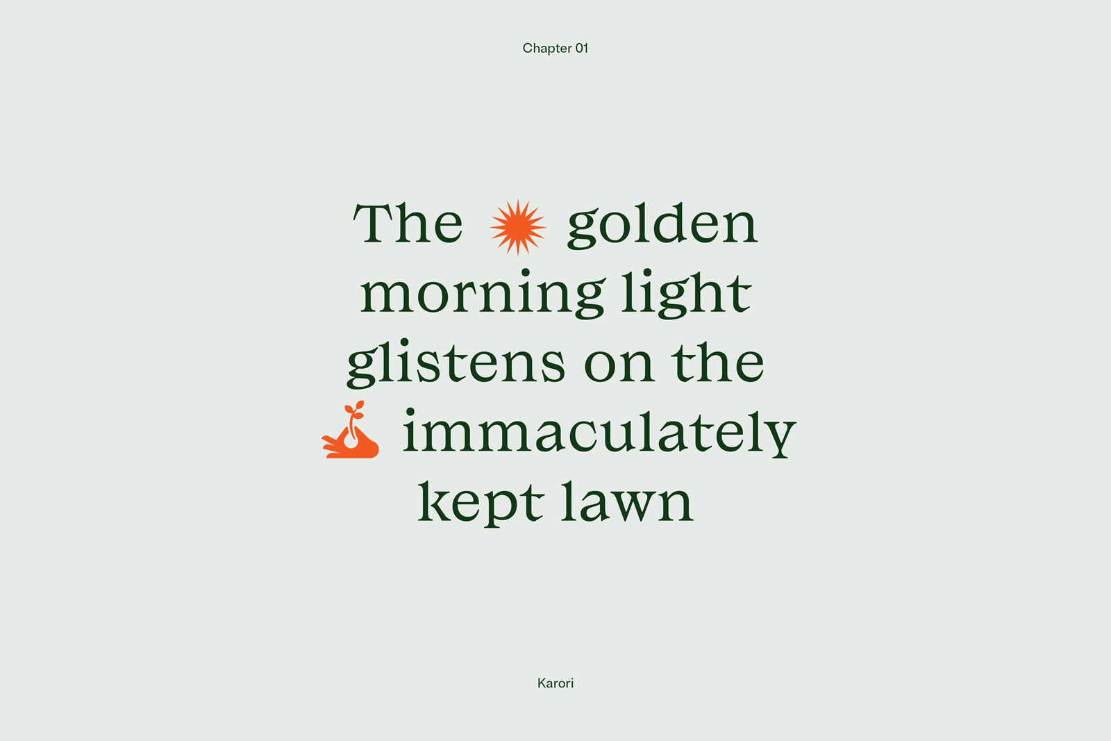
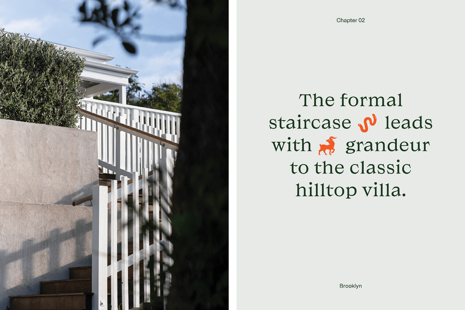
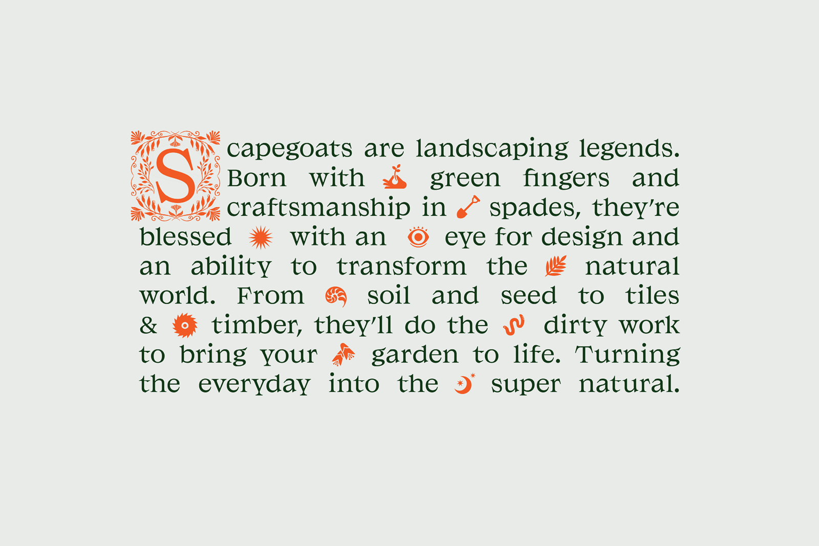
Storytelling is a central part of Strategy’s work for Scapegoats and is developed effectively through some compelling copy. A freshly laid grass lawn becomes expansive grounds that accommodate active kids by day and entertain with elegance by night. A fence is transformed into timber battens that scrape the sky to form a South Coast refuge. And steps become a staggered stairway that weaves through lush bush where woodland creatures hide. Each case study is treated in the same way, pulling out a detail or a sense of place and building a scene in the mind. Together, these passages becomes the driving narrative force behind the Scapegoats brand.
Alongside some tightly cropped detail-focused imagery the passages conjure up far more than the material, something far more magical. You’d be forgiven for expecting something from a Frances Hodgson Burnett novel in the landscapes themselves, perhaps a touch more wild, but it’s in the juxtaposition of wild imagination and a reliable highly crafted landscaping service that this brand is formed.
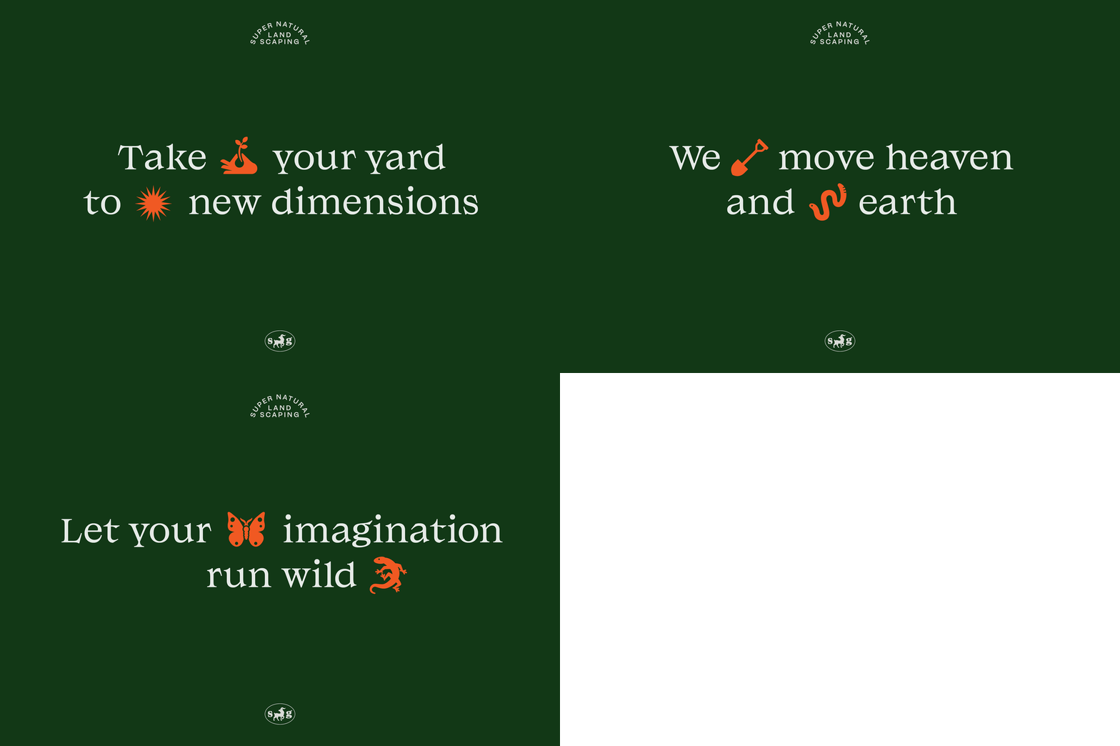
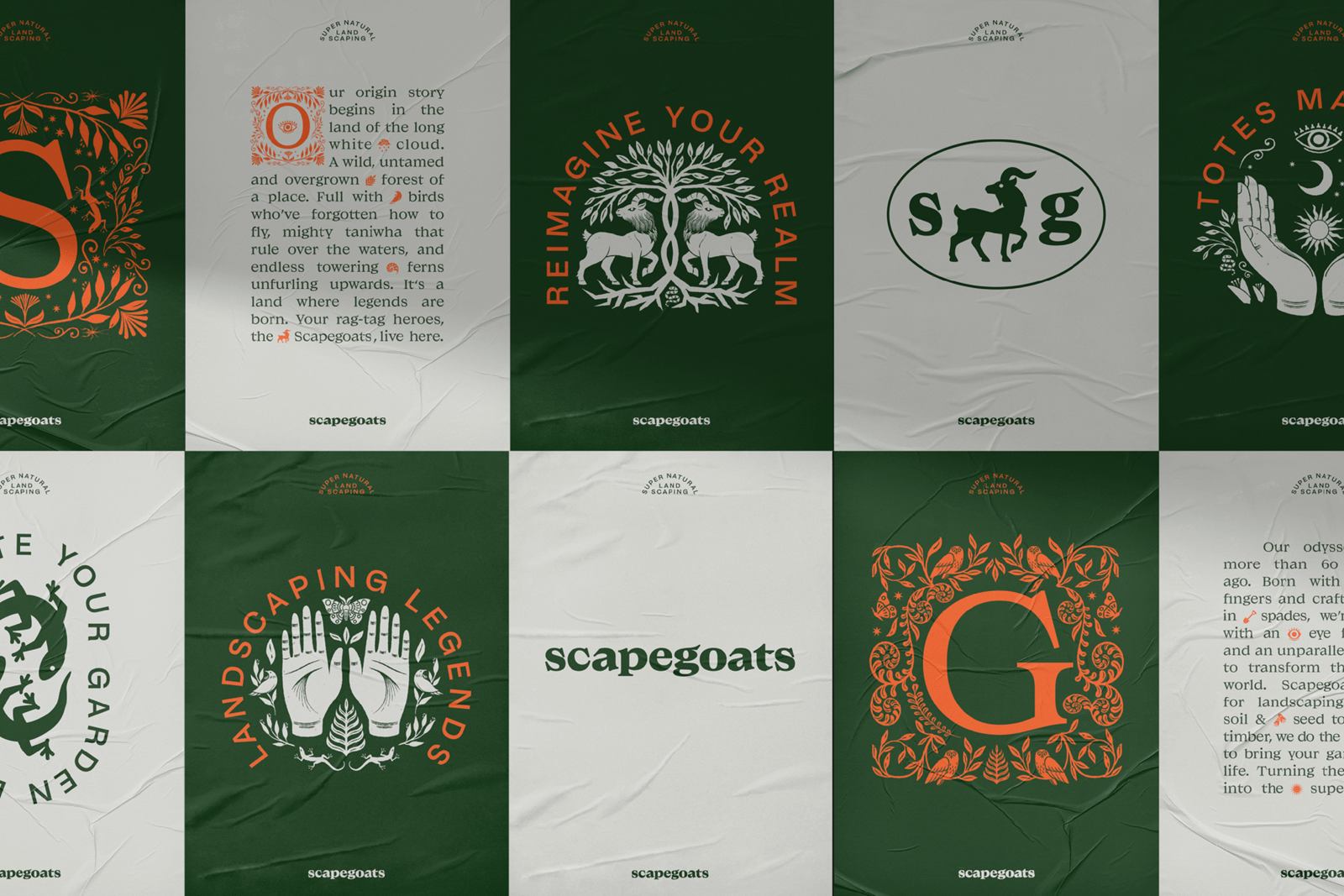
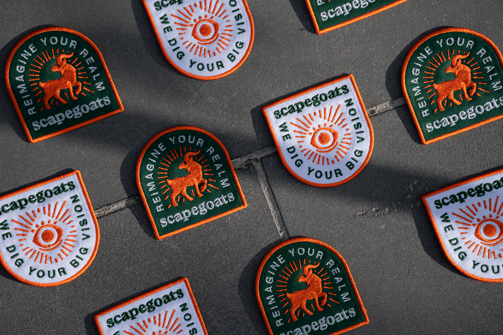
Strategy play with the notion of landscaping legends by conjuring up a narrative of almost folkloric proportions, borrowing and turning runic-like imagery into iconography that intersects copy, with the letterforms of Matorral evoking those carved into stone. The brand identity created by Strategy begins to feel very much ‘of the earth’ despite the precise timber lines, demarcated greenery and planning that clearly goes into each project. The logo and logotype work in a similar way to bring these references into two concise forms that can be applied to all manner of branded items.

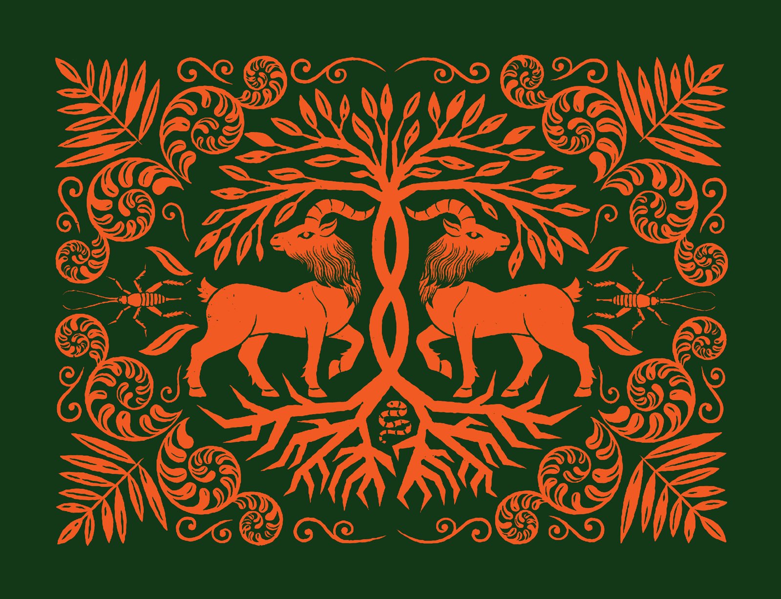
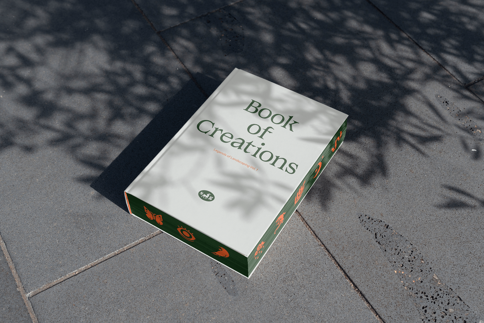
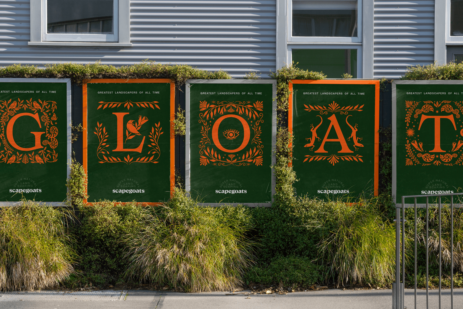
Illustration supports and furthers the world building and narrative forming elements, created with the same care as the landscapes themselves. Forna, flora and the green fingers that shape these into modern urban topiaries are rendered into illustrative panels, which are then used to flood vehicle liveries (really lovely), or decorate a book cover. Whether your attuned to the visual language of botanical documents of antiquity, or something more ambiguous such as the Voynich manuscript, the feeling these images evoke is far more magical than the industrial pragmatics of earth-moving. And that’s the point, to illicit a feeling of potential and to encourage our imaginations.
