Entrée by Saint Urbain
Opinion by Emily Gosling Posted 12 September 2023

More than three years since the outbreak of the Covid pandemic, we’re in a strange situation when it comes to all the things that flourished due to lockdown – grocery delivery services like Getir, et al; streaming services that poured literally billions into what once seemed like a never-ending gold-rush of content-consumption; flashy home-centric lifestyle brands like Peloton.
Indeed, the convenience bubble seems to have burst for many brands, as the cost-of-living crisis and the requisite purse string-tightening are seemingly trumping the luxury of having everything delivered right to us, right now.
But maybe one sector promising a marriage of convenience, a hint of luxury, and often, promises of health credentials that’s quietly continuing to flourish is meal kit brands. Earlier this year, HelloFresh began a trial of six months in which it would deliver its kits direct, with its own fleet of vans and drivers. Plant-based meal kits Planthood were among many brands that launched in recent months specialising in vegan foods (others include Grubby, which partnered with vegan cooking duo Bosh back in February and Mosaic Foods) and proved a perhaps surprising hit on Dragon’s Den.

With so many meal kit brands out there now, it’s more important than ever that they stand out from the competition. The visual identity, tone of voice and brand world must work harder than ever to stake their claim in this neatly packaged, carefully pre-portioned landscape; demonstrating their unique credentials and what makes them so special. Which is probably why Entrée looked to LA- and New York-based creative agency Saint Urbain for a recent rebrand.
![]()

Entrée first launched in 2016 as a fine-dining meal delivery service that delivers chef-crafted meals and drinks. Unlike the likes of HelloFresh, which involve a level of cooking and prep from the recipient, Entrée’s products are ready to be served, with the packs including instructions on plating, heating, recommendations on wines that would pair well, and suggestions of music that would sonically offset the dishes. Earlier this month, the brand even launched a collaboration with The Art Institute of Chicago in the shape of a five-course tasting menu – or, in Entrée’s words, ‘an exclusive dining soirée inspired by the brushstrokes and passions of Vincent van Gogh’.

Clearly, this isn’t a run of the mill delivery brand; and the new look and feel had to reflect that, all the while maintaining its loyal consumer base and attracting new customers. ‘In a highly competitive market, they needed a fresh brand strategy and identity to set them apart and capture a new audience,’ says Saint Urbain. ‘Entrée brings joy, community, flavour, and culture to any home with a few simple meals.’
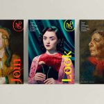
That idea of joy and flavour comes across well in the new identity, which deftly treads the line between functionality and punchy assertiveness. The designs are largely based around the idea of setting the table, with the identity built up from various shapes, frames and borders based on physical table settings. Likewise, the packaging uses a window, again taking its shape from a place-setting, and that simple graphic device carries through the entire look and feel in a way that’s distinctive without being overpowering or gimmicky.


The agency describes the colour palette as ‘muted-yet-expressive’, and it seems to fit the rather classy-leaning vibe (and name) of Entrée. The idea is that the colours, which range from a rich plum to a vibrant orange and chic but earthy shades of green, ‘complement each dish, recipe, and moment without overpowering it,’ according to Saint Urbain, and they’ve definitely succeeded in that.
One aspect of the project which could have worked a little harder is the typography: it certainly does the job, but as yet another impactful, if unremarkable serif font wordmark, there’s definitely room here for something a little more unique. The headline font is paired with a sans serif for supporting copy that feels thoroughly phoned in, a system font that does a great job of sitting there in the background, but which does nothing at all to work as well as it could for Entrée as a distinctive brand.

But saying that, the type really comes to life when it comes to the striking packaging designs. Here, the shapes, typefaces and single colour packs work together beautifully. The simplicity is striking, and the unusual forms of the window showcasing the product makes the whole thing feel a bit strange (in a good way), and a bit special. This is all amplified when the designs are in motion, where the type feels as though it’s working most effectively for the brand.
Likewise, the brand photography – all editorial-style bright lighting, sharp colours, and a general sense of spirited joy and occasion – is totally spot on. So while Entrée’s new look isn’t exactly breaking the mould, it’s doing what it needs to do. Sometimes ‘disruptive’ just isn’t what’s needed: sensitivity has a very important role in rebrands, too.
Fonts: Feature Display & Graphik