Loot by Seachange
Opinion by Richard Baird Posted 8 September 2023

Where have all the simple playful ideas gone? You know the ones, a bit of wit, spun into a multitude of playful expressions across a number of different touch-points? Design craft has gotten so good over the last few years, but I miss the smile-in-the-mind stuff. Paul Belford’s New Chapter, Seachange’s Think Packaging and Mucho’s Art Walk. They’re not strategic marvels, rather, establish the necessary character to function as they should, as simple distinct brands that ask, no, demand attention. Coffee roasters and coffee shops are the perfect space and canvas for this kind of thing. These are fundamentally made up of roughly the same elements; coffee (of course), menus, sandwich boards, signage, loyalty cards, a bit of packaging, nothing too taxing. But they lend themselves well to a bit of creative play. It’s needed, who needs another coffee shop? Let’s get to Loot. Loot joins the long, continually growing and competitive landscape of coffee roasters in Australia. ‘There’s a new blend in town’ sets the tone for a showdown, and the nugget of a good idea.


The name sets things up well. ‘Loot’ part of the common language of Spaghetti Westerns, brought out graphically with type from vernacular signage of the frontier; the saloons, the bandits, on the brink of lawlessness. This presents the brand as something to be taken note of. Hollywood has done the hard work here, and implanted into the mind a rich mythology, the name taps into this and is perfectly amplified through lettering. The rest flows from there.

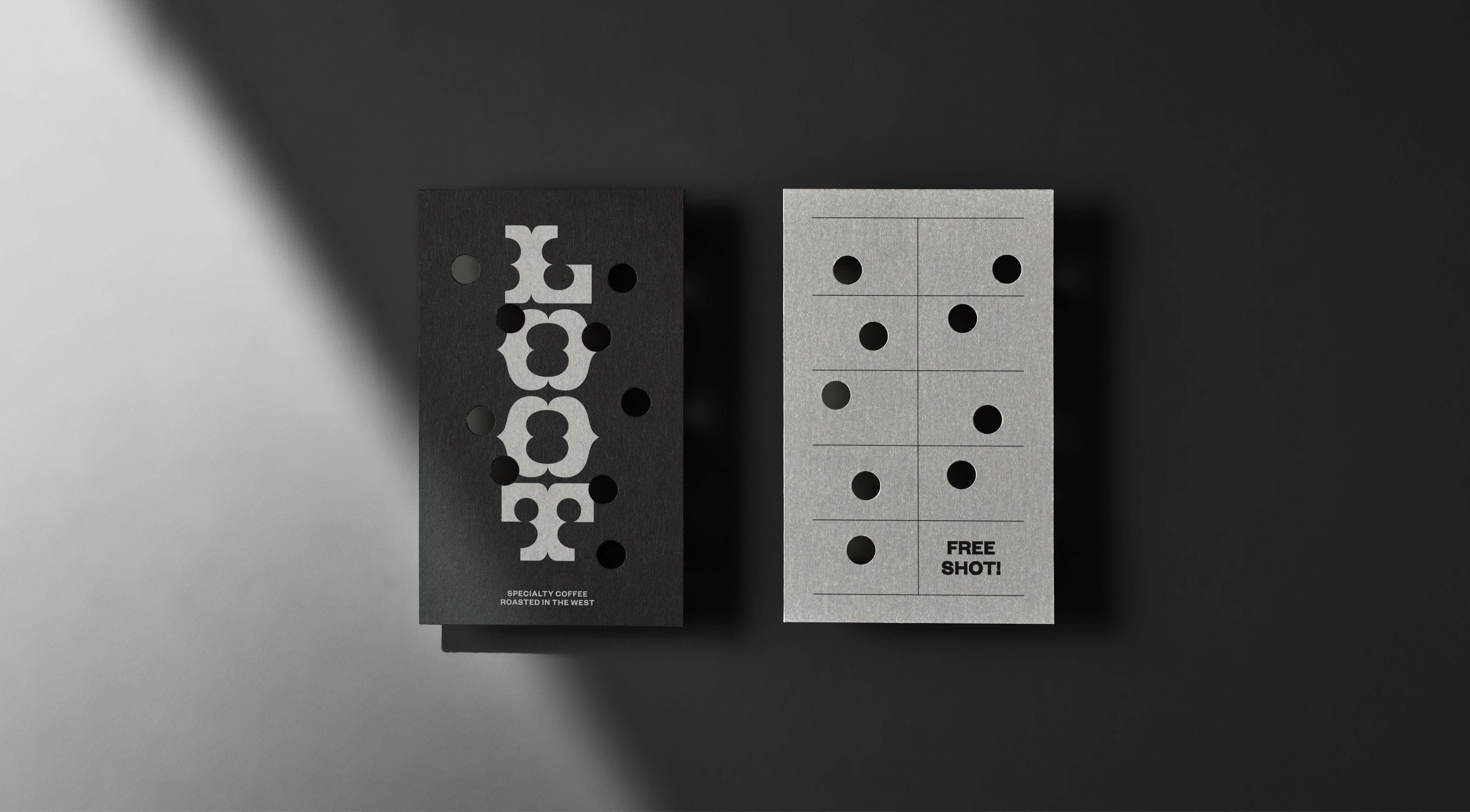
It could have stopped at the logotype, but hey, it’s on BP&O, so they must have done a bit more with it. What sold it initially is two things, first, the signage. What a wonderful thing a few irregular holes can do to something familiar. Bang bang bang. Done. That this also looks like a white flag is just another layer, no surrender! They take this a bit further with the punching of a loyalty card. That’s always been irregular, be it a stamp or a punch. Seachange made the most of that. On the flip the logo is shot through. Lovely.
![]()


This little visual trick could have gone on for ages, and like any good bit of smile-in-the-mind brand work, I’m sure there’s more legs in this if Loot wanted to produce more items, think holes in t-shirts and totes etc. The website also plays with the idea as well. Hanging around too long will see you shot up. There’s some easy pickings here, but instead, Seachange have leant fully into a killer logotype rather than over do the bullet holes. There’s a horizontal and a stacked vertical version of the logotype affording Loot some room to brand various bits of merch (or loot!). For the coffee outsider, those living on the periphery, at the edges of civil society, those that are willing to step out of line (and go to another coffee shop), these items are neat.


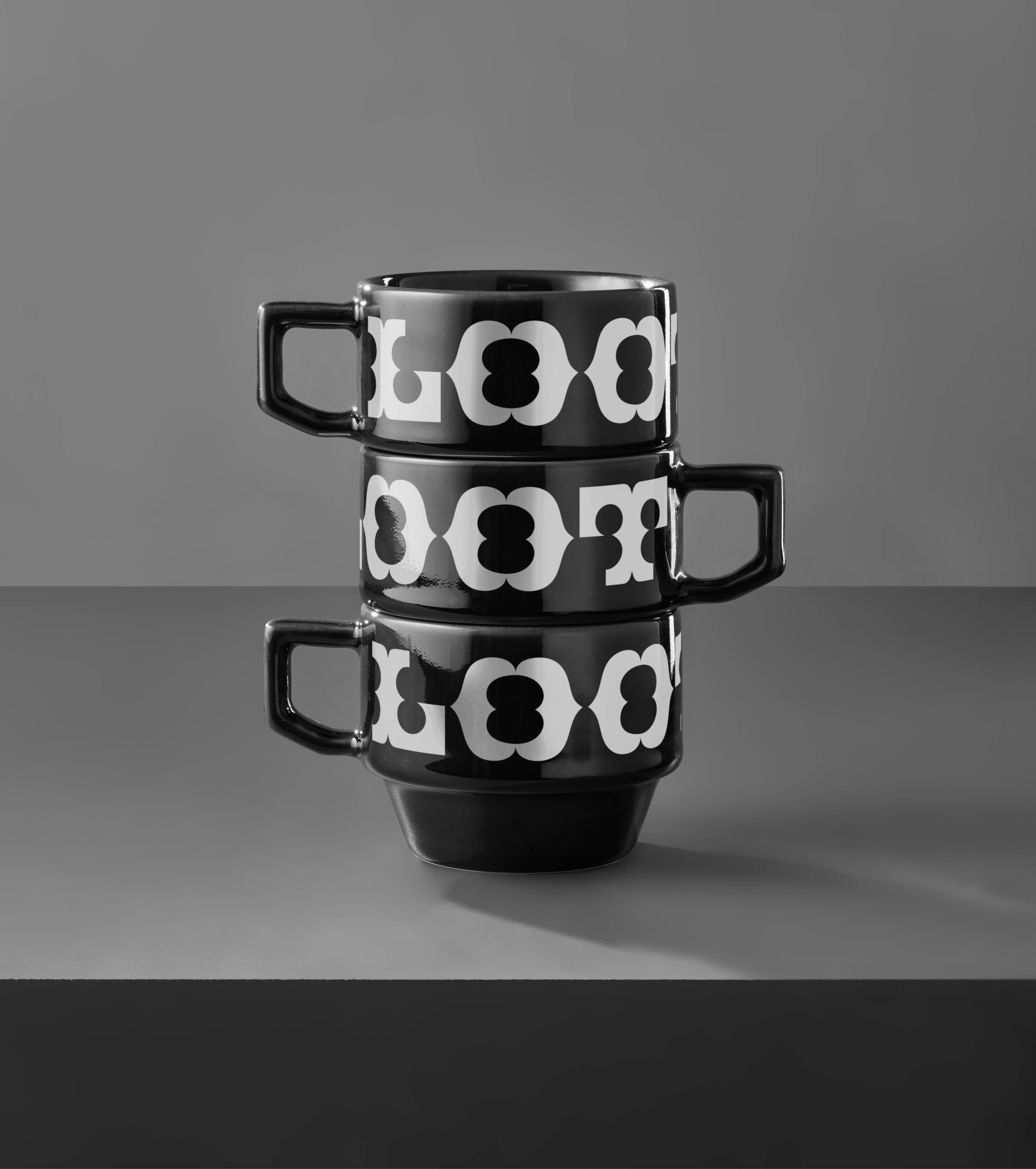
Seachange didn’t have to, but they even get playful in the art-direction of their case study with a triangular stack of cold ones, black gold is a nice twist on coffee, as is ‘Fresh bounty, roasted in the West. There’s plenty more bit of snappy copy writing to be found throughout the site and on social, even on the inside of the mug. Damn that logotype looks tight across those stacked coffee mugs. I’ll take a gamble and say I’m seeing a fruit machine in those stacked coffee cups, and a bit of a Western credit crawl in some of the typesetting. The studio clearly had fun with this one, it’s not overthought, but a line is drawn, never pushing the idea too far but far enough.