AGIP by Unimark International
Written by Richard Baird Posted 28 September 2023
The following is a guest article from Logo Histories, a weekly Substack newsletter from the team behind BP&O. Each week, Logo Histories shares the context, concepts and considerations behind some of the most interesting logos and corporate identity design programmes of the past. Read about PAOS’ work for Bridgestone, Lippincott & Margulies’ 1969 brand identity for Coca-cola and Armin Vogt and Jean Reiwald’s 1968 logo for Fiat. Discover these and a 100+ more here.
Towards the end of the 1960s Italian oil company Azienda Generale Italiana Petroli (AGIP) had secured the largest market share in the country and its filling stations were considered to be the best equipped and offering the widest range of services.
Buoyed by this success, AGIP embarked on the development of a new corporate identity. This intended to better reflect the quality of its service, help with its expansion into products beyond fuel, present itself as a major Italian business with a ‘strong social and cultural sensibility’ and support its mission to ‘provide a wide range of services’.
The Milan office of Unimark International, headed by Dutch-born designer Bob Noorda, was commissioned to review and develop a new image for the corporation. This would be vast in scope, encompassing design for service stations, fuel pumps, packaging, signage, stationery, uniforms and the interiors of motel restaurants.
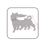
All aspects of the existing AGIP corporate identity were open to redesign, including the six-legged fire breathing dog. This had been created by Italian sculptor Luigi Broggini in 1952 and was the outcome of an open competition to design two roadside billboards, two product logos and a petrol pump. The six-legged dog was seen as a ‘synthesis’ of the strength, energy and optimism driving Italy’s ‘economic miracle’ and also called to mind images from Greek antiquity.
The six-legged dog had been well-received and had become familiar to the majority of Italian people. With this in mind, it was felt that the logo required only a small refinement and that the existing corporate image be formalised and augmented. The goal was to, not only modernise the AGIP image and reinforce its recognisability but to also use colour and shape to make it easier to use across advertising and packaging as it became increasingly diversified.
To achieve this goal, the length of the dog was reduced, placed on a yellow background and within a curved corner and outlined square. This improved its visibility and recognition when viewed from the highway, from a distance and at speed. Further, a clearer continuity was then formed between the logo and its application as signage.
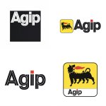
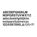
To develop the corporate identity beyond the logo, Salvatore Gregorietti created an inline logotype and Franco Gaffuri developed this further into a corporate display typeface (with Helvetica as the ‘dominant’ secondary typeface). This new typeface would allow AGIP to infuse aspects of its visual identity throughout an increasing number of packaging requirements, typesetting product names in this new face.
The logo and logotype were developed into a range of variations and lock-ups for different use-cases. This afforded AGIP a new found flexibility that could adapt to growing needs and use-cases.
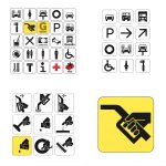
The coordinated system also involved the creation of a family of pictograms. At the time, it was uncommon for corporations to develop these in a proprietary style. These extended to pictograms to identify services for vehicles and those for drivers such as refreshments, toilets, food and tourist information. These were set within a square outline with curved corners, just like the logo.
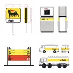
The use of colour intended to ‘banish’ the apprehensions people might have about the use of fuels and lubricants and the pollution caused by petrol. White played a key role in giving the impression of cleanness. This was used alongside a thin yellow band to form a clear visual link between tankers, vans, company vehicles, pumps and signage.
The red, previously just used for the flame in the logo was given further use, delineating between pieces of information and establishing a visual hierarchy across signage. It also made its way into the the logotype, colouring the tittle over the ‘i’ and linking it to the logo.
Following the initial stages of the roll out, conducted between 1971 and 1974, the ENI group which held AGIP faced difficulties, including a change in president. This saw the roll out of the new corporate image staggered: the first stage in 1971-1972, the second in 1974-1978, and the third in 1979-1980. The the corporate identity manual was redone in 1982.
Noorda would later return to the project in the mid-1990s as ENI was listed on the New York sock exchange. Seen as a rebirth, Noorda embarked on a ‘progressive abstraction’, leaving just the elements that were seen as strong and evocative. This saw the six-legged dog first designed by Luigi Broggini and modified by Noorda in 1972 retained, however, the background and box was removed, and a new variation of the inline typeface was developed. This continues to be used today.
Logo Histories is a weekly Substack newsletter. To instantly access an archive of over 100 Logo Histories, just like this one, and receive weekly stories straight to your inbox, subscribe here.

