Miles by Buddy Buddy
Opinion by Emily Gosling Posted 31 October 2023
Deodorant isn’t traditionally a hotbed of innovation: for the most part, ‘women’s’ products don an unremarkable raft of white packaging (freshness!); blue, pragmatic type; and vague, rarely-kept promises about lasting for 72-hours. For the men, packs are sombre shades of black, dark blue, or grey (manly!) and just as drearily practical as the women’s. Deodorant, for the most part, has sold on efficacy claims, scent, and a sort of vague brand loyalty – not on stand-out brand design.
That’s why it’s so refreshing to see something like Miles come along, with truly brilliant, beautiful, standout packaging design that’s genuinely doing something original and innovative in a very staid category indeed. Phew – it was about time. Miles’ designs are not ‘gendered’ in the ‘pink for girls, blue for boys’ way that still doggedly pervades many brands; which is very much befitting of its target market – teens and adolescents.
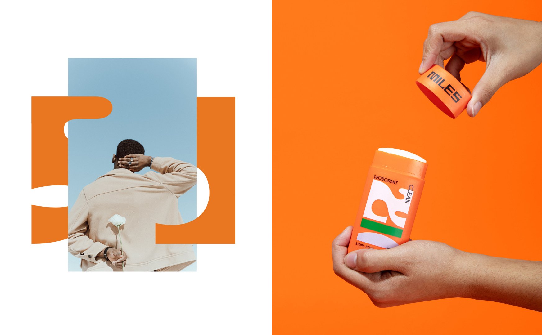
According to Miles’ founder and former Target exec, Carly Broderick, the idea for the brand came about when she started searching for a deodorant brand for her own kids to use: ‘I didn’t find a solid option for teenagers,’ she says. Broderick found herself stuck between the legacy brands (pushing old-school masculinity or dainty floral scents), and chic high-end natural products with high-end price tags – none of them really hit the mark. So, there was only one thing to do: create her own.
Broderick’s vision was to create something that was inclusive and modern, and which focused on individuality rather than enforcing gender roles and expectations. For the all-important visual identity and packaging design, Miles tapped Minneapolis-based branding and packaging design studio Buddy-Buddy, who also worked across creative direction, brand applications, art direction, and digital collateral.
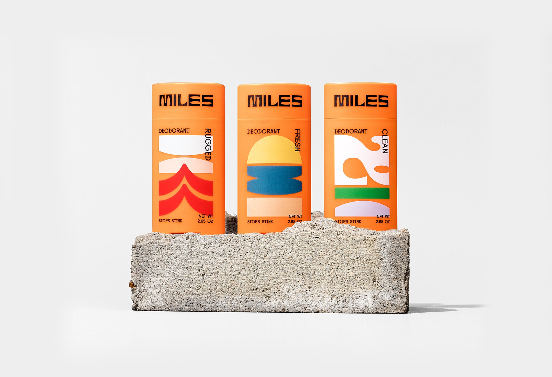
Miles is currently sold online and in select Target stores in the US this year. In-store retail brought about a tricky proposition: while the brand itself is gender-neutral, store shelves are not, and so it would have to be ‘merchandised in the saturated men’s deodorant category,’ as Buddy-Buddy puts it. The challenge was to differentiate from conventional legacy brands and brash young-adult products alike, while resonating with two key audiences: users (teenagers) and buyers (parents of teenagers).
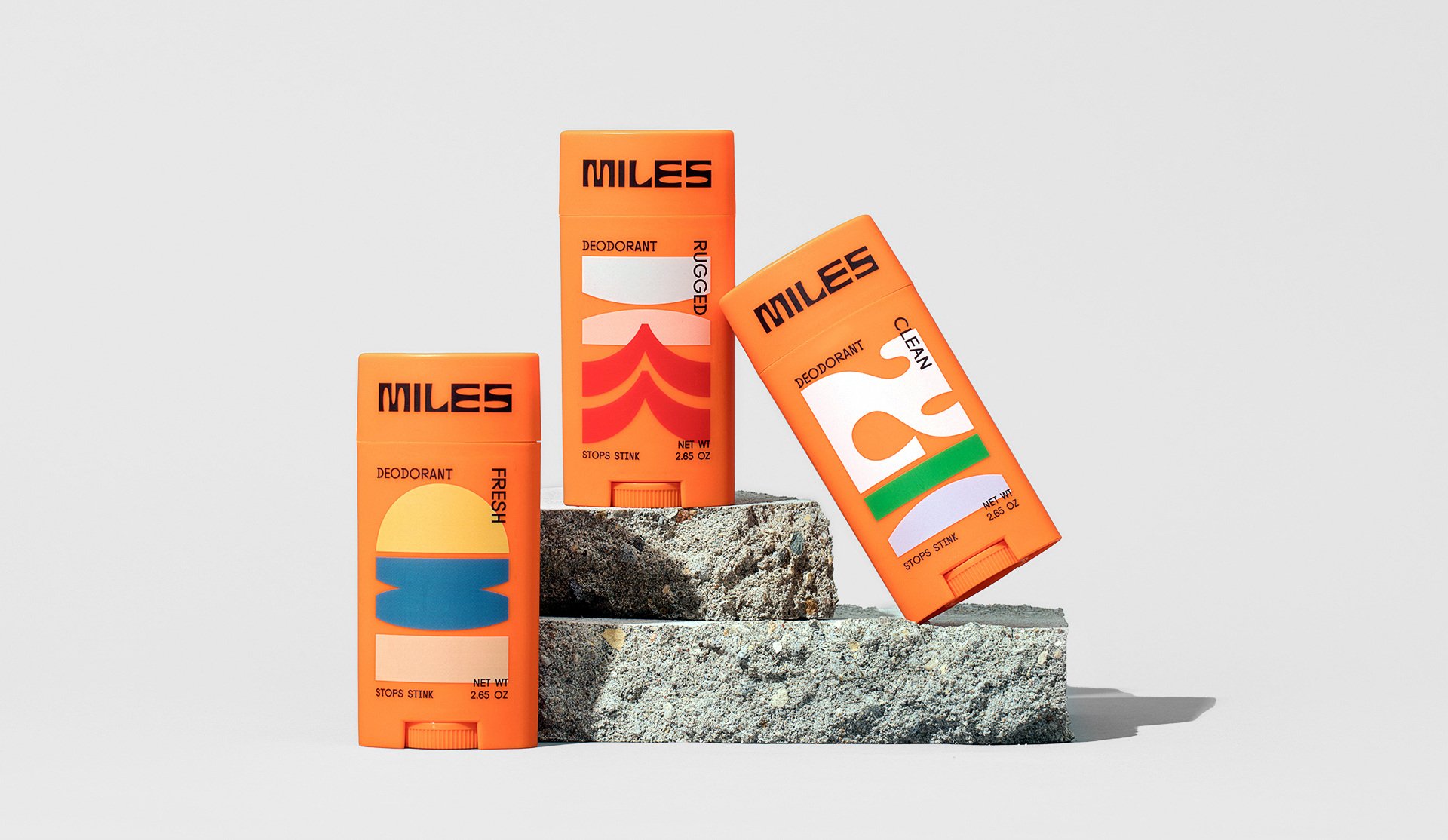
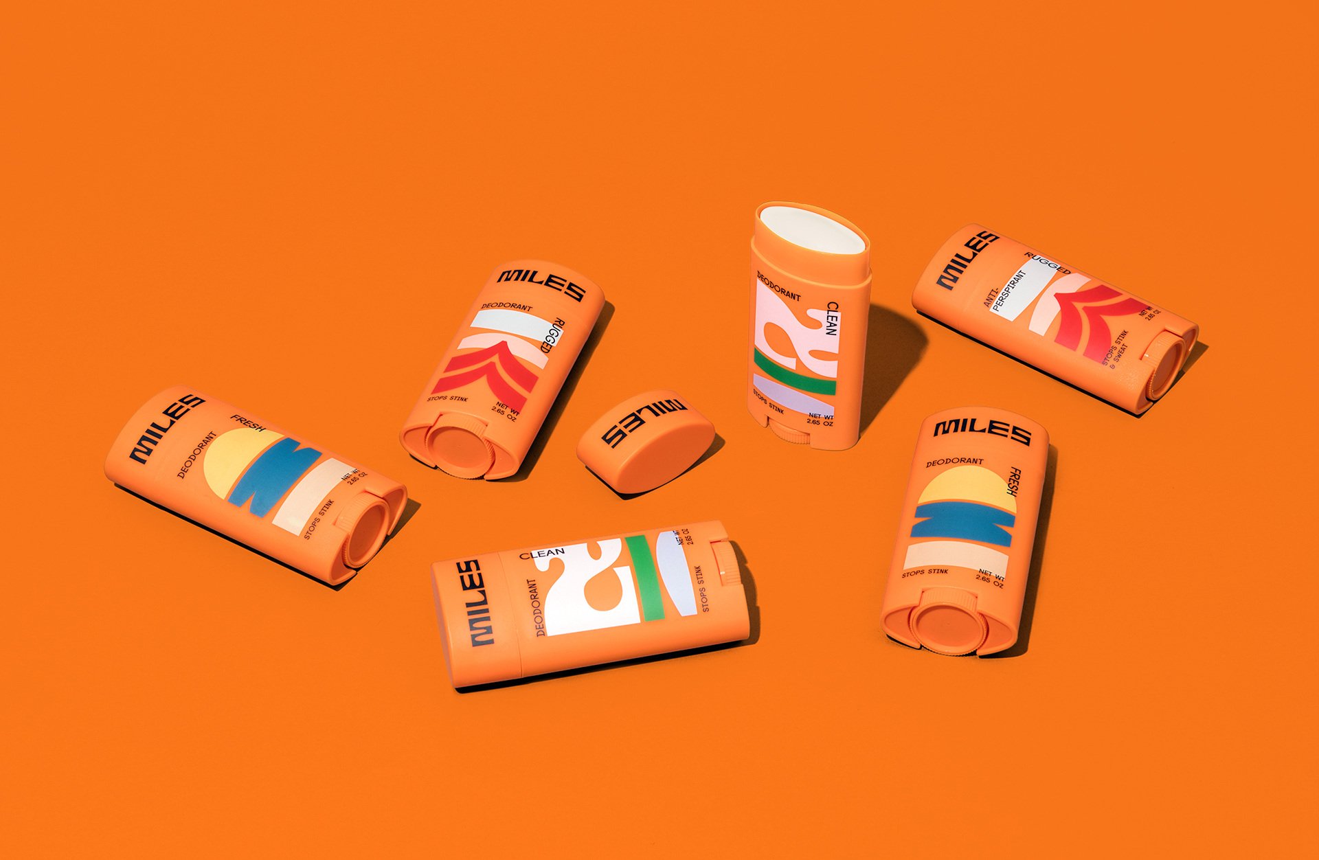
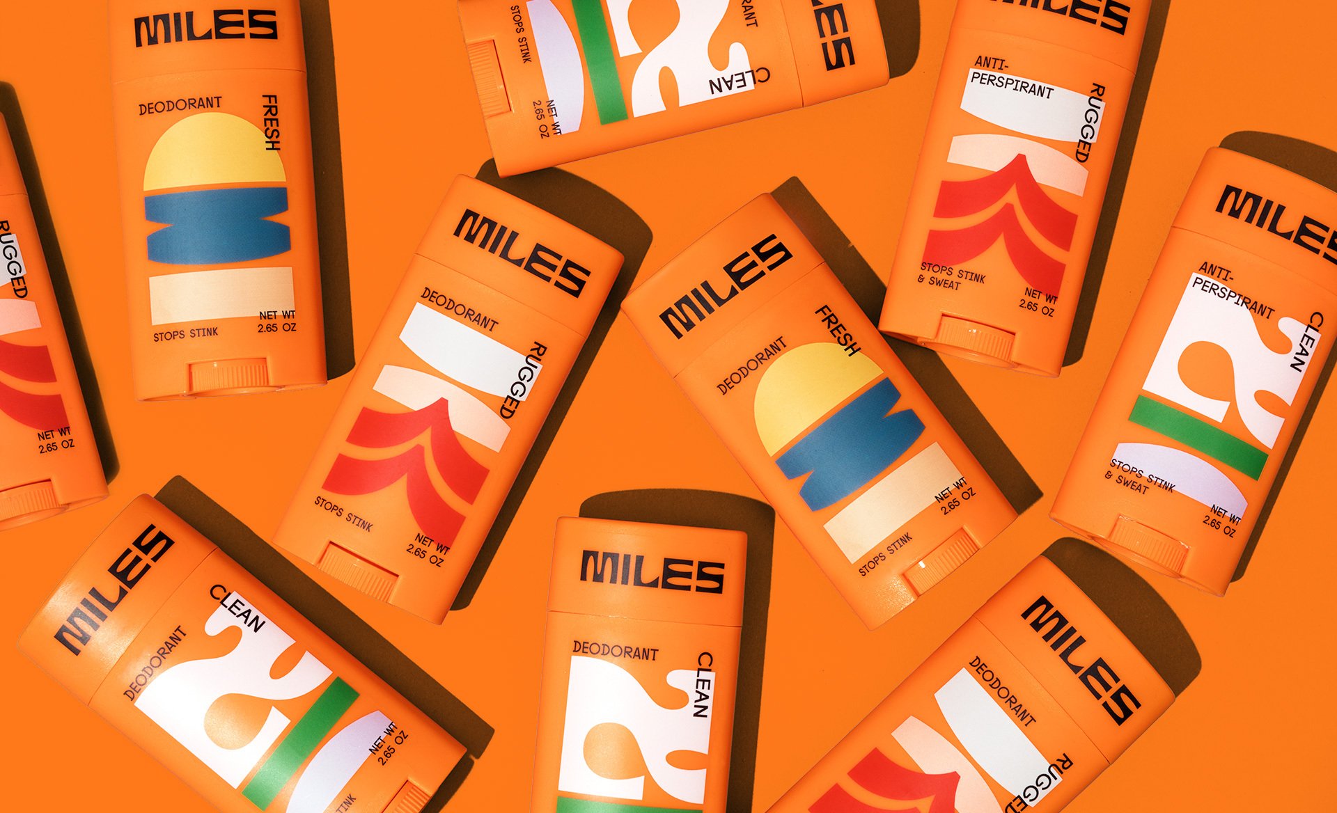
The packs use a vibrant, predominantly orange colour palette that stands out on-shelf, and offers a refreshing antidote to category clichés. Buddy-Buddy has said that Broderick stated she was keen to use orange as a differentiator early on in the process, and that having this laid out meant they could focus more on the concept’s typography, artwork, and layouts. It is true that sometimes design restraints can lead to greater creativity.
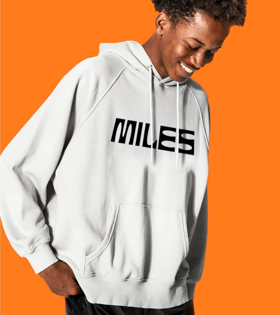
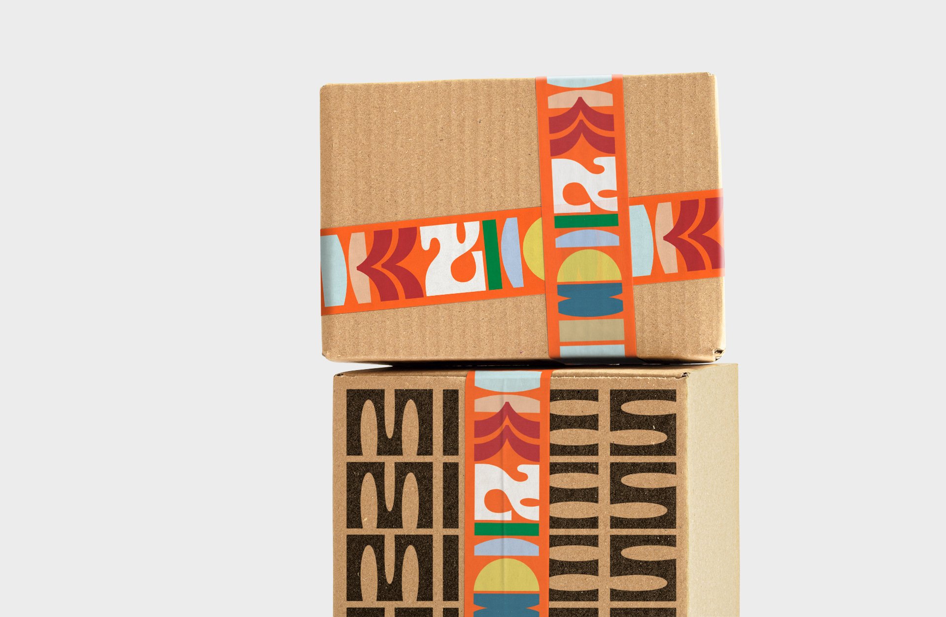
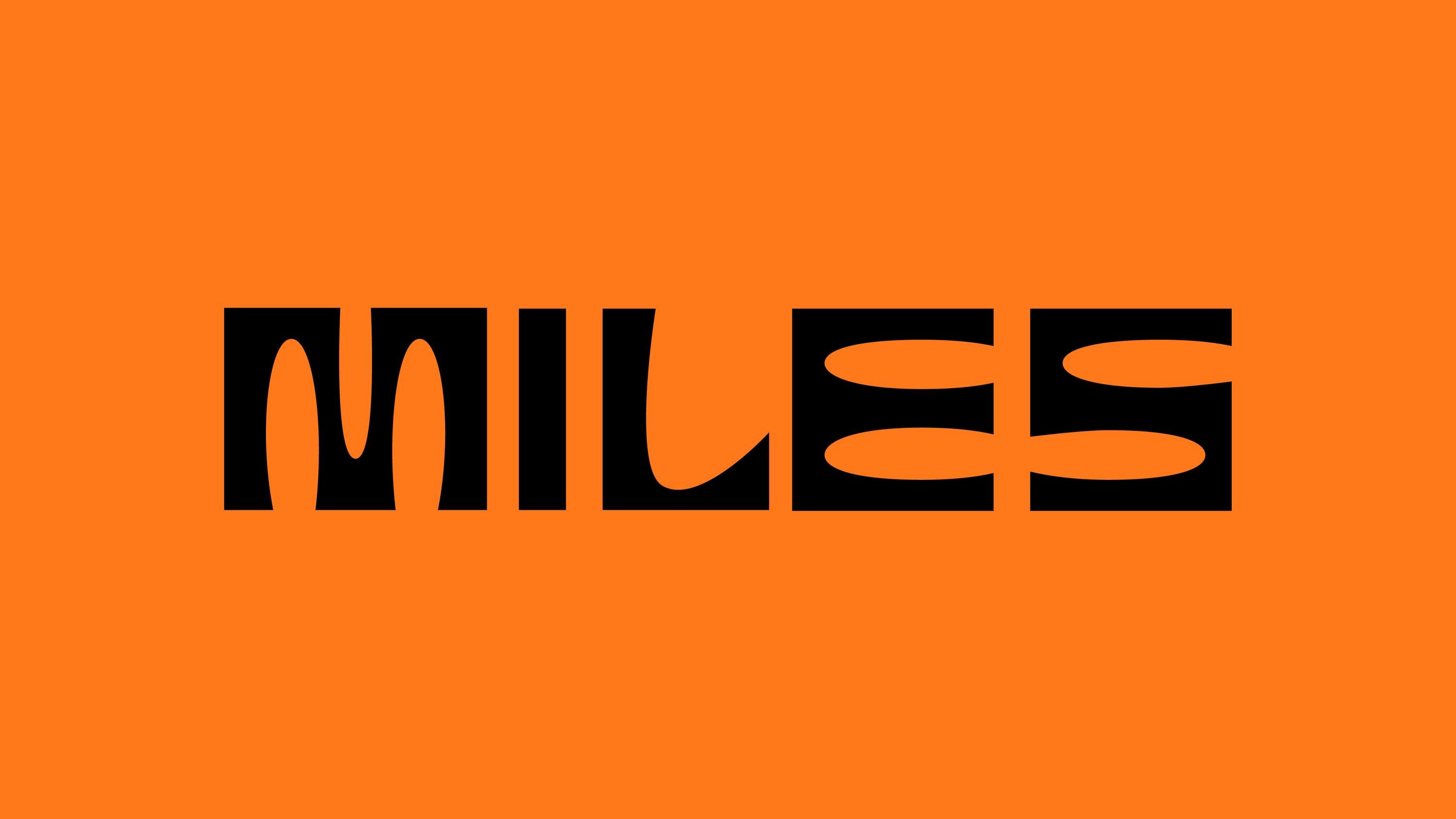
One of the most impressive touches is the brand typography: it’s effortlessly hip, without ever looking like it’s trying too hard to be cool. The all-caps word mark uses type with a thoroughly beguiling mix of oval-shaped cutouts and rigid, sharp-edged geometry – we’re not sure what the exact typeface is (it looks custom), but it’s a masterstroke of a choice here. The chiselled letterforms work beautifully alongside the abstracted shapes that indicate different scents, while the overall look and feel is all about simplicity to ‘resonate with the target user segment, instilling self-respect and confidence’.
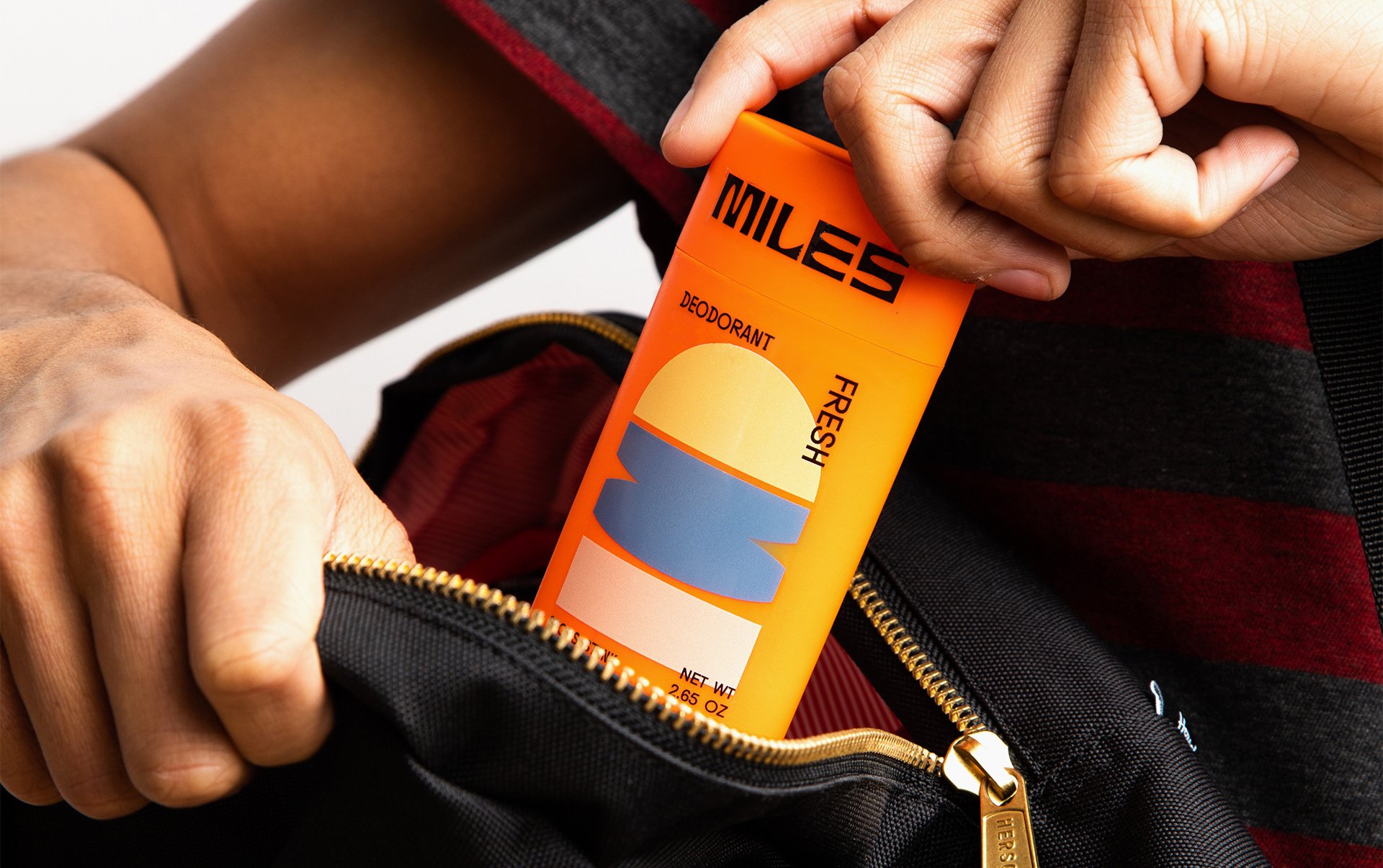
Crucially, though, the designs had to also resonate with the people that hold the purse strings: parents or guardians who are shopping for deodorant for their teens. That meant that they had to use clarity in their messaging as well as standing out in stores (both online and physical retail spaces). The latter was easily achieved with the unconventional layout of the designs, as well as the colour palette; while the messaging was achieved, again, through means unusual to the category.
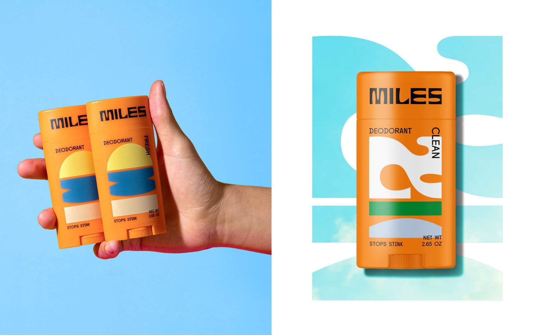
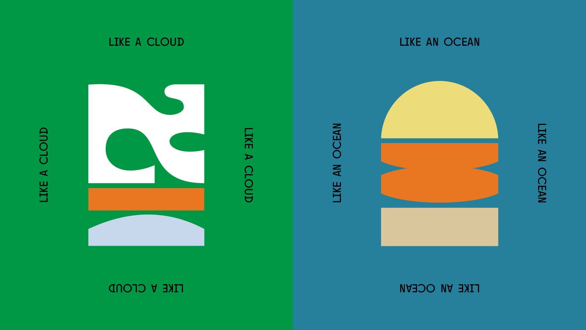
The different products and intended audiences are denoted using symbolic shapes on packs that hint at their scents while also underscoring the natural ingredients used in Miles. The symbol used on the Clean variant, for instance, looks to evoke clouds, skies, and wind; while Fresh is more like a sun over the sea. They’re subtle, but gently suggestive of optimistic natural scenes within an otherwise very bold, contemporary design framework.
What’s so great about the Miles identity is that not only does it not talk down to teens, it doesn’t look to talk to them at all: no lame visual gags, no bum-clenching copywriting – it just does what it does, and does it brilliantly.
