Paws Off! by Seachange
Opinion by Emily Gosling Posted 24 October 2023

Anyone who’s ever had a dog, or just interacted with one, has likely spotted that over and above pretty much anything, food is the centre of their universe. Unfortunately for us, though, it’s not just dog-safe food that they’ll do whatever it takes to get their paws on: human food, it seems, often has the most appeal.
But just as we probably shouldn’t be nibbling on Schmackos, dogs really shouldn’t eat everything people do. And while most people are aware that chocolate is toxic for dogs, many foods that might seem unremarkable (bread, leeks, nuts, grapes, the list is long) are poison for pooches.
One in three pet owners in New Zealand are ‘in the dark about the everyday foods and drinks which can be harmful – or even fatal – to their beloved furry friends,’ according to recent research from Southern Cross Pet Insurance, which recently launched the clearly much needed Paws Off! initiative.
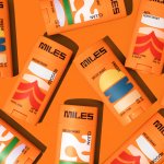
Billed as ‘the world’s first freely available warning symbol alerting pet owners to toxic ingredients in human food and drink’ and supported by the New Zealand Veterinary Association (NZVA), Paws Off! is working to ‘change the face of pet food safety forever’ by rallying brands and marketers to protect cats and dogs from human foods that can make them ill through using the labelling system on product packaging.


The initiative and campaign was developed by ad agency TBWA\NZ, and the visual identity – including the cat face mark that forms the crux of the campaign – were created by Auckland-based brand and design agency Seachange.
It’s an unusual kind of brand project, and one that carries a lot of weight: it’s surely no mean feat to create a mark that aims to become a global standard, and there must be a certain amount of trepidation around creating something that has to be both a warming that a product could make an animal ill (or worse).
![]()

Seachange opted to go cutesy character over stern warning. ‘It’s a charming icon that says “YUCK, not nice for me” in a memorable and playful way – encouraging food brands to adopt it,’ says Seachange. On the one hand, the slightly daft, vaguely hipsterish animal face is certainly appealing: the simple lines in black and white, the cheeky little tongue. But somehow, it doesn’t carry perhaps the gravitas you’d expect from a warning mark that its creators ostensibly want to be taken up worldwide.
It’s hard (for me at least) to see the creature as anything but a cat – which seems odd, since the campaign seems primarily useful for dog owners. However, Seachange describes it as a ‘species fluid character that represents both cats and dogs’. I’ve looked and looked, but ‘species fluid’ still feels like a stretch. There’s not a lot of dog to be found.

Where it is smart, however, is in its simplicity. Seachange seems to have treated it like a typographic special character rather than a logomark or mascot; pointing out its consistent lineweight and chiselled corners as if it were any other letterform.
Whatever it is, the creature works beautifully alongside the brand typeface, Work Sans by Wei Huang. Seachange modified various weights of the font to use across the wordmark and all other supporting copy text, and it works well: it’s striking but legible, simple but a touch off-kilter, contemporary and neutral.


The black and white starkness of the colour palette is likewise no-nonsense and striking, and feels fitting for the idea of a warning label that could work across everything from branded packaging to posters, food bags, signage, billboards and more.
The creature’s main application is as part of what Seachange calls the ‘donut logo’: a central cat, circled with the Paws Off! name and its main tagline, ‘not nice for pets’. It certainly sums up what Paws Off! is all about, and it’s this form that is hoped to become the warning symbol used on packaging where no other information about the initiative is present, to build brand awareness and educate people.


Seachange also created a speech bubble device that can be used independently to house short pieces of text, such as a link to the Paws Off! website, and affiliate logos, such as that of NZVA or Southern Cross Pet Insurance. Alongside the central tongue-out creature, Seachange developed a suite of additional character expressions that can be used in brand communications ‘to support additional messages to do with pet wellbeing’.


There’s no doubt they’re adorable; but as with the main mark itself, it’s not always easy to read what they’re all about. ‘Begging eyes’ and ‘quizzical’, for instance, feel the wrong way round; ‘sad/sick’ could well be mistaken for begging; while the ‘x’ eyes of ‘very sick’ imply, well, so sick that the pet is dead.
Overall, the identity is strong, beguiling, and adorable – there’s no doubt that it’s appealing and checks off the raising awareness side of the campaign. How successful it would be as a warning mark is yet to be seen, since the playfulness could potentially feel a little too flippant, but we can only hope that Paws Off! can, well, take off.