GUT by &Walsh
Opinion by Emily Gosling Posted 7 November 2023
Guts aren’t exactly glamorous. And the connotations of the word ‘gut’ are multifarious: there’s the gory (‘blood and guts’); the Germanic ‘good’; the straightforwardly corporeal; or for those with an interest in newer psychological findings, it’s a wondrous ‘second brain’.
Ad agency folk, however, have long taken the word ‘guts’ far outside of the bodily. For many of them, ‘guts’ is an aspirational word: ‘gutsy’ work, ‘trusting their gut’, a staunchly ‘no guts no glory’ approach. Hence the name of ad agency GUT, which was founded in Buenos Aires and Miami in 2018 by Anselmo Ramos and Gaston Bigio, former execs at WPP’s DAVID.
GUT, which was named agency and independent network of the year at the 2023 Cannes awards, now has offices in Argentina, Brazil, Canada, Mexico, and The Netherlands; and has racked up a client list including Google, Headspace, Philadelphia Cream Cheese, and Lyft.
GUT’s distinctive, motion-heavy logo was created by Jessica Walsh’s New York-based agency &Walsh in 2019, and still very much packs a punch. Walsh made her name through a combination of highly skilful, innovative approaches to typography; frequently bombastic uses of patterning and colour; and a focus on motion design and 3D across branding projects. Her agency’s work for GUT showcases those talents brilliantly.
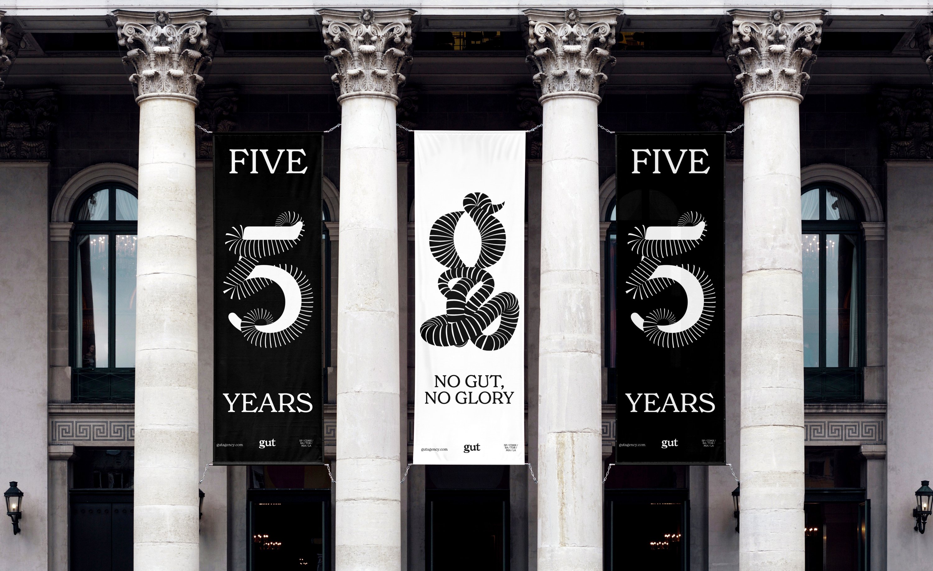
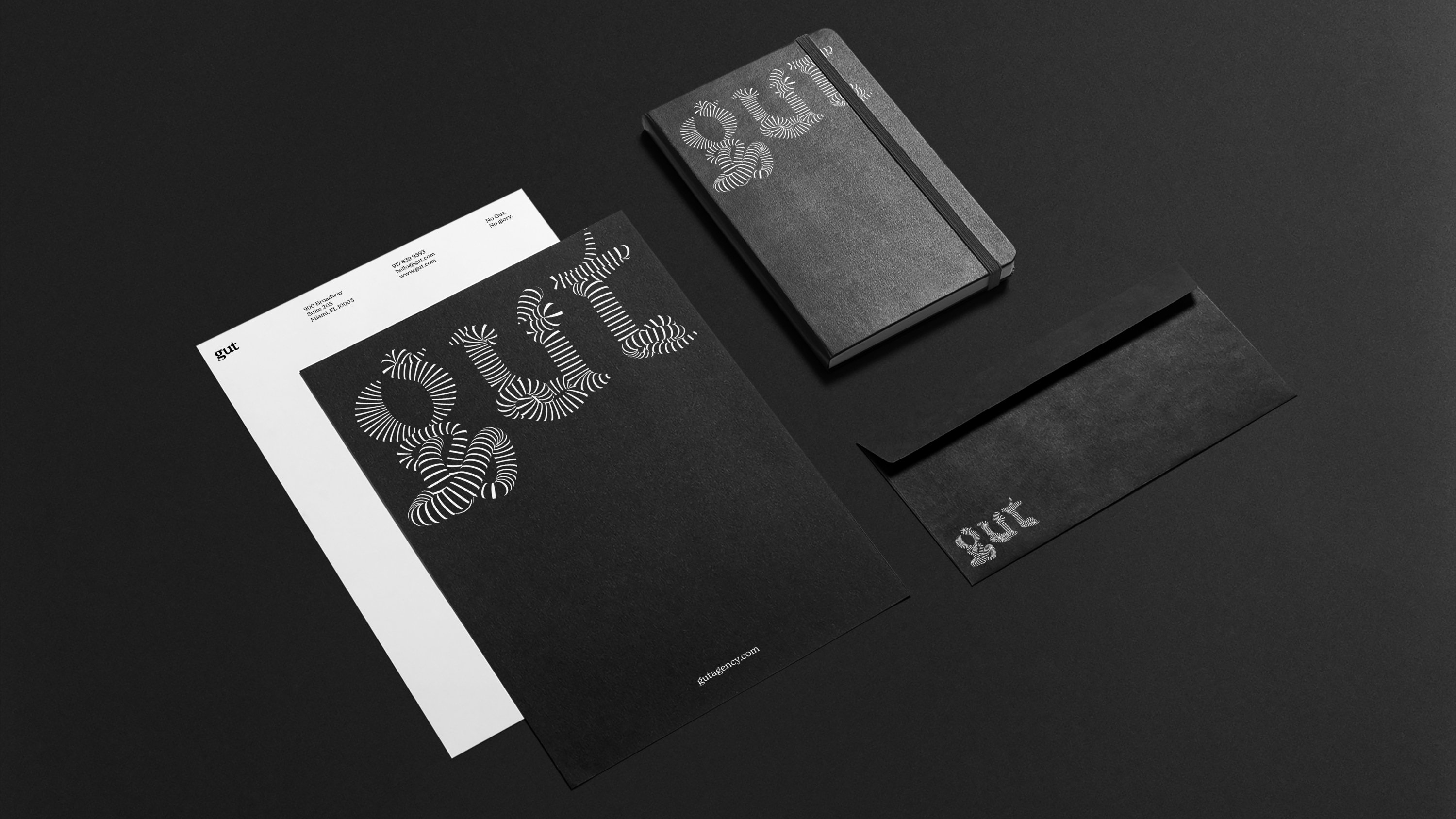
The GUT logo doesn’t shy away from the intestinal connotations of the agency’s moniker: in fact, it thoroughly leans into them. It uses striking, undulating, black and white 3D tube-like typography – oddly all in lowercase, when seemingly GUT is styled in upper – that endlessly twists and turns in and around itself in a conflation that’s both impossible, were it to be rendered physically, and totally beguiling.
The logo, then, wasn’t the problem when it came to why GUT once again turned to &Walsh. The brief for this new project was to create a more holistic brand: not just a logo, but a comprehensive system of assets and guidelines. ‘Since the initial work, GUT has expanded to over 500 people in over seven countries across the world,’ Walsh explains. ‘We needed to solve inconsistencies in how the brand was being implemented in each of their different locations in regards to typography, social media, photography, awards, company events, announcements, internal presentations and printed materials.’
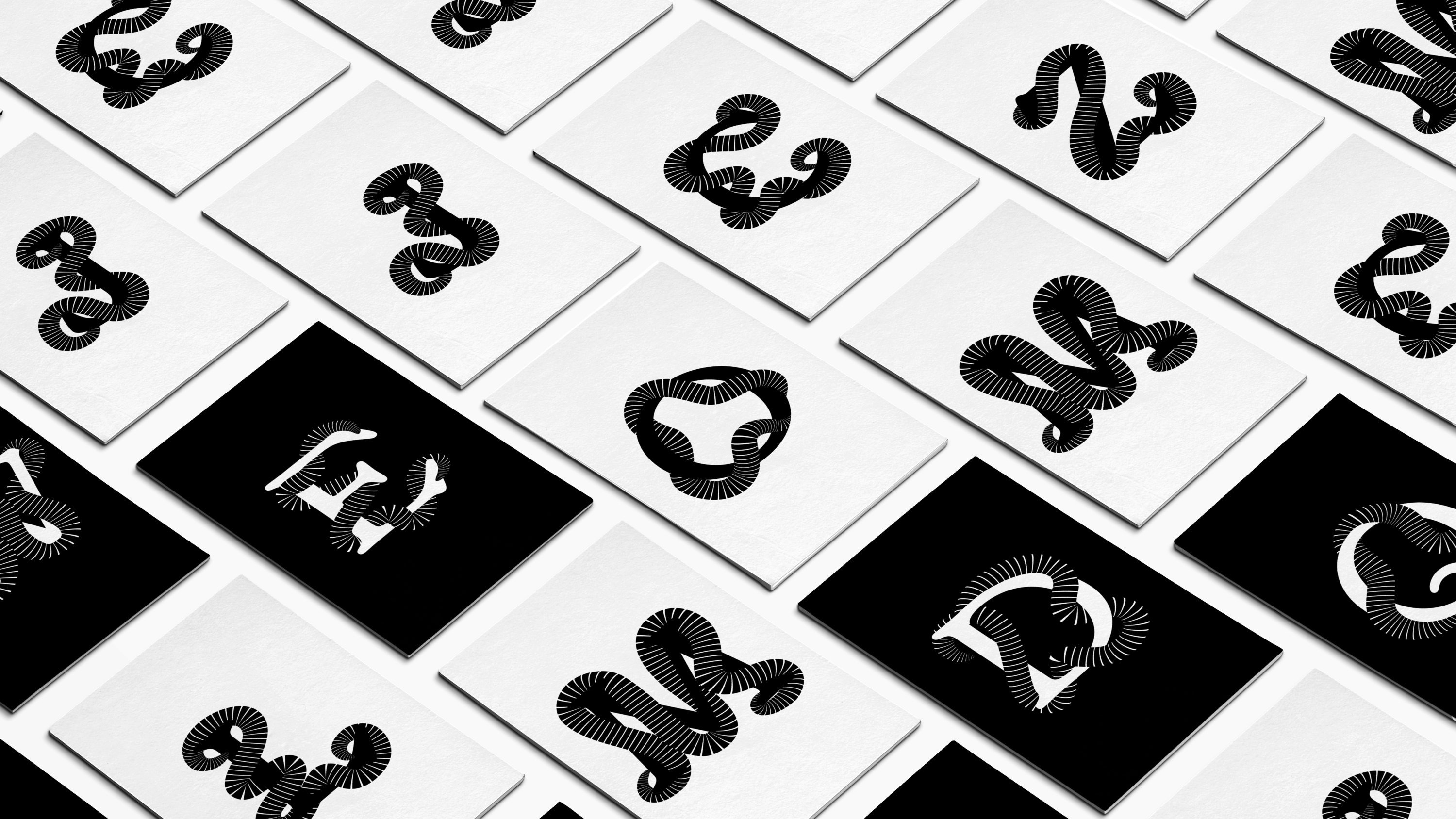
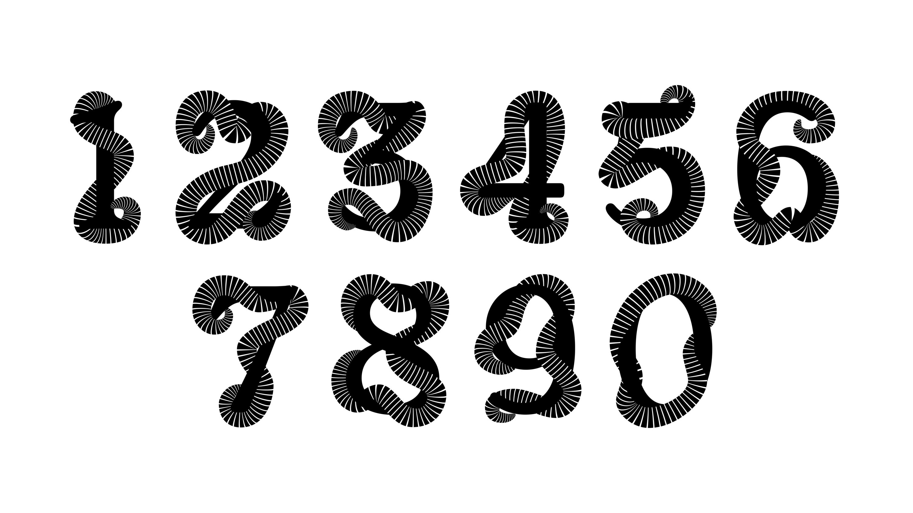
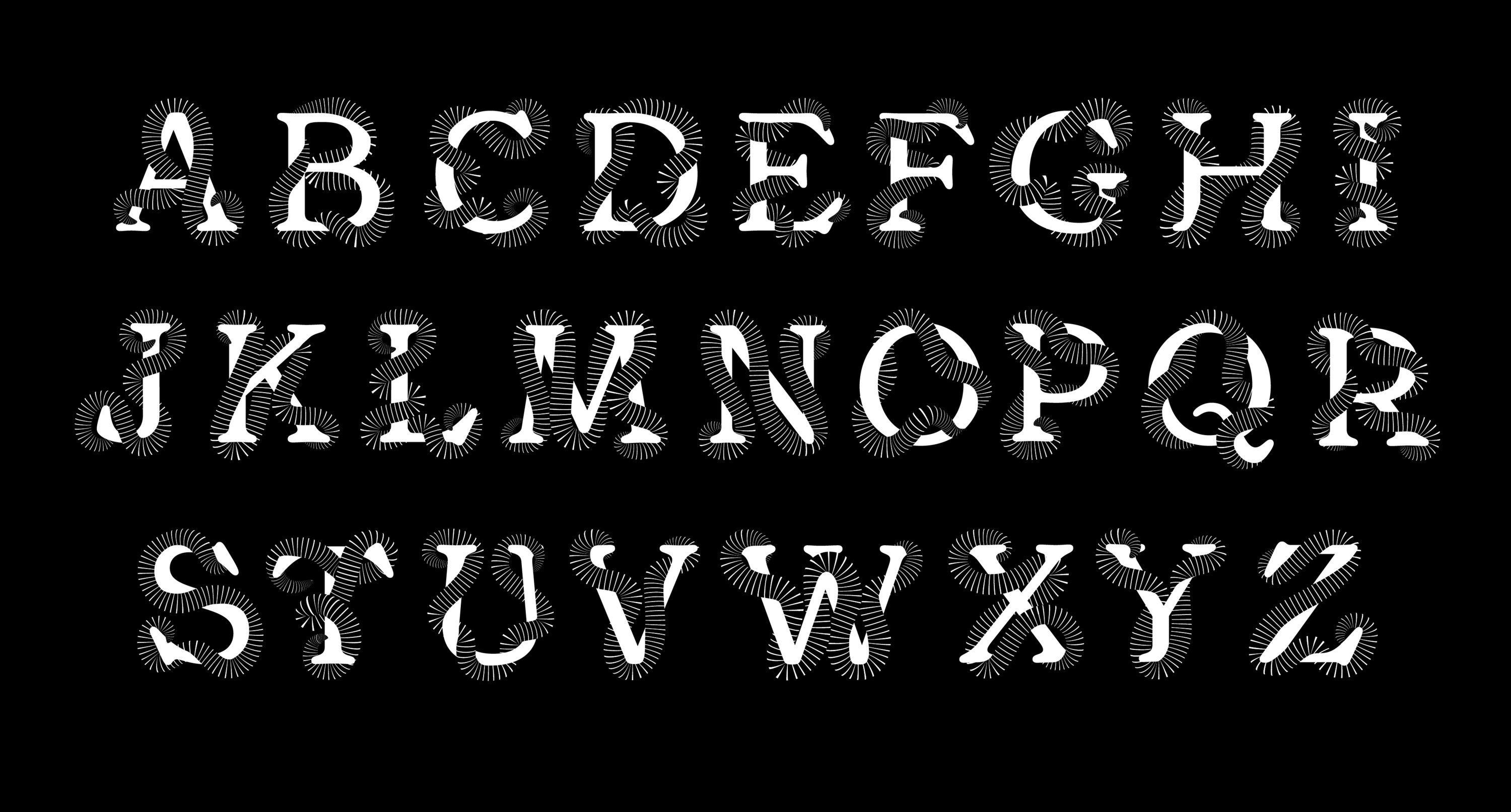
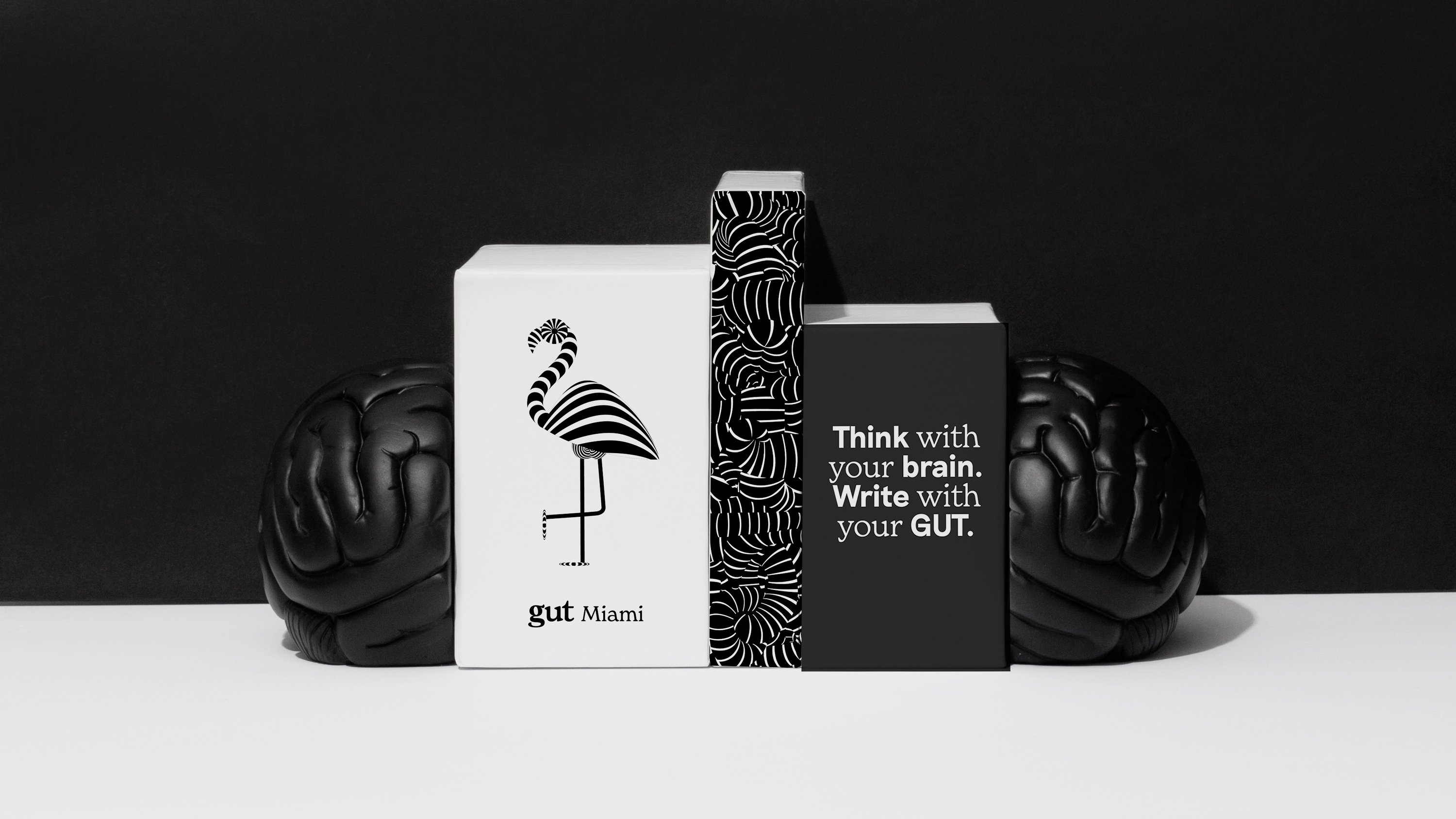
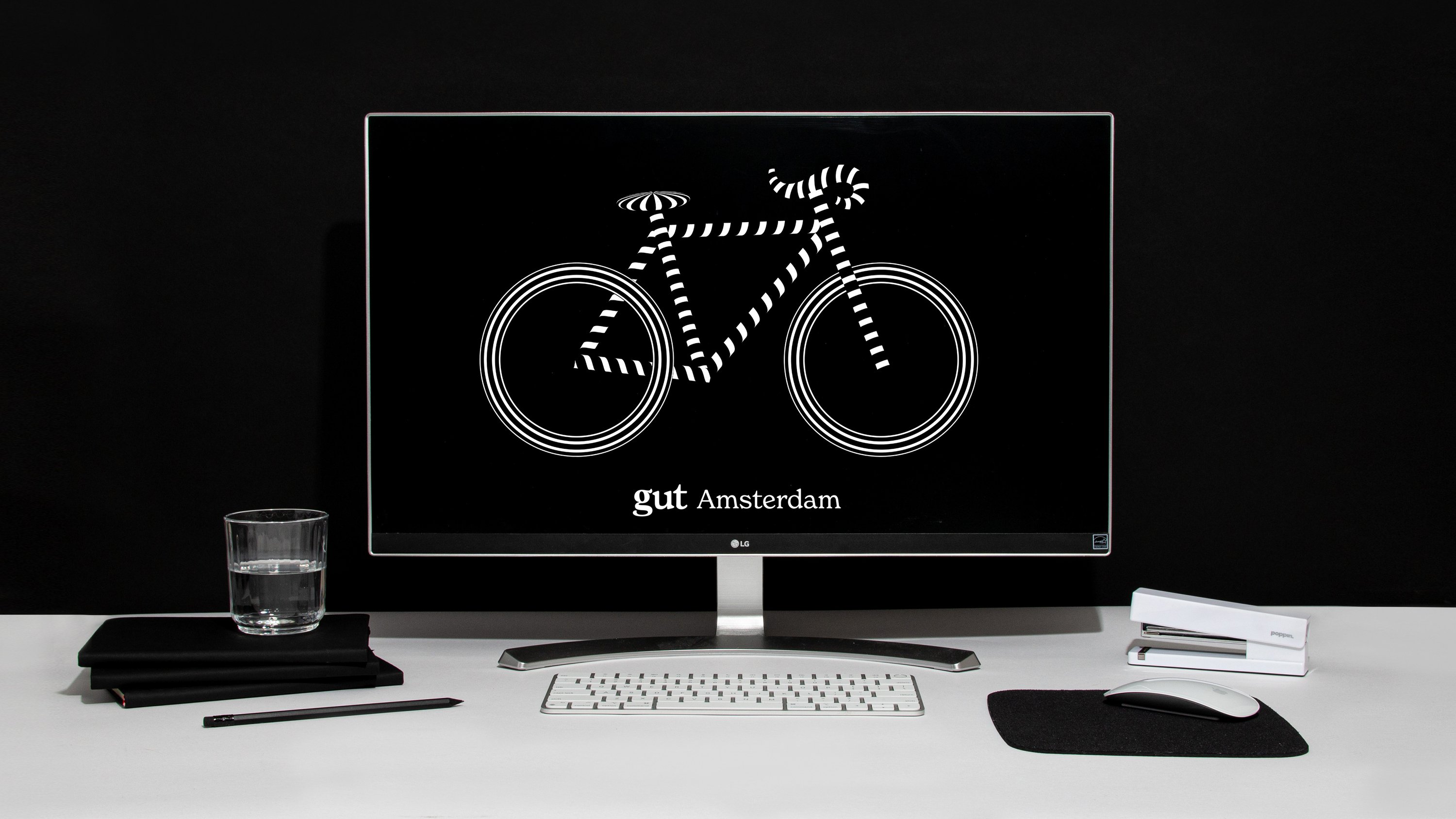
For the new work, &Walsh developed a customised gut intestine typographic and numerical system, as well as sophisticated brand guidelines that mean the identity can easily be scaled and implemented across GUT’s different agency locations and creative departments around the world. To underscore the now truly global reach of GUT, &Walsh created a series of city icons that represent its various sites, which use an illustration style that chimes with the overall brand identity: black, white, linework, simplicity, and playfulness. Overall, they’re very charming.
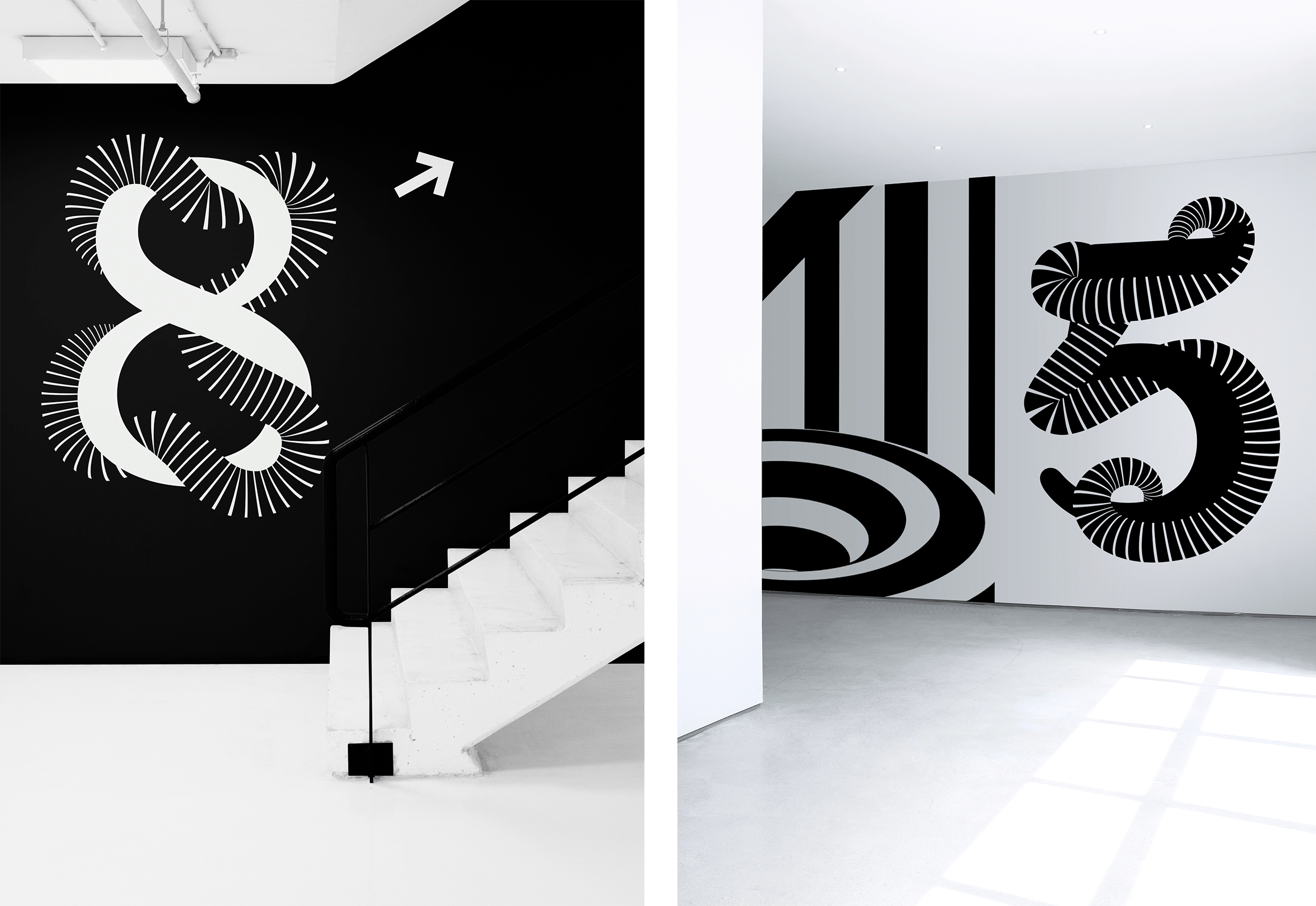
The designs for the numerical and typographic system naturally extend from the incumbent GUT logo. The GUT alphabet is used when more expressive, playful branding applications are required, such as countdowns, stationery, and interior or environmental spaces.
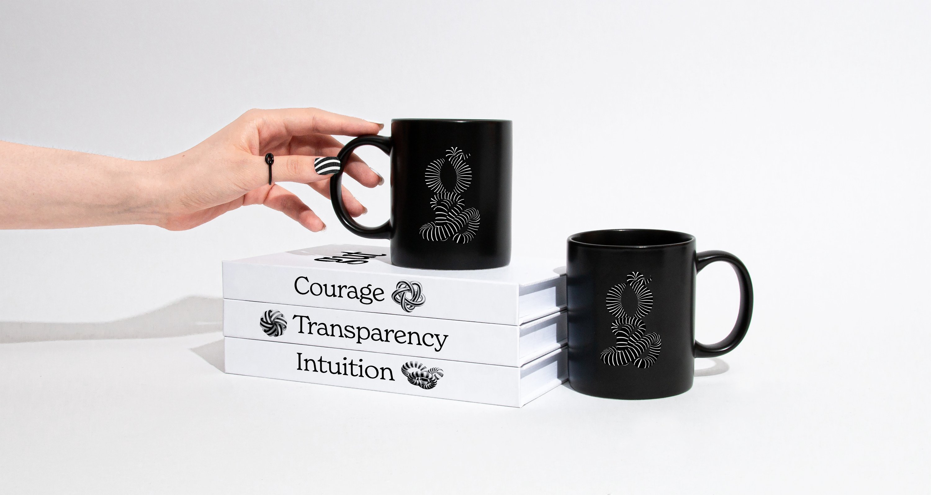
These and the numbers use a modified version of the font New Spirit, from type foundry Newlyn. It’s an interesting choice: New Spirit is a modernised version of Windsor, a font that’s a near-cousin to the ubiquitous Cooper Black when used in its Bold or Heavy weights. Its use (modified to make the forms 3D by encircling them with the ‘GUT signature spiral’) gives the branding system a timeless sensibility that coalesces with its modernity.
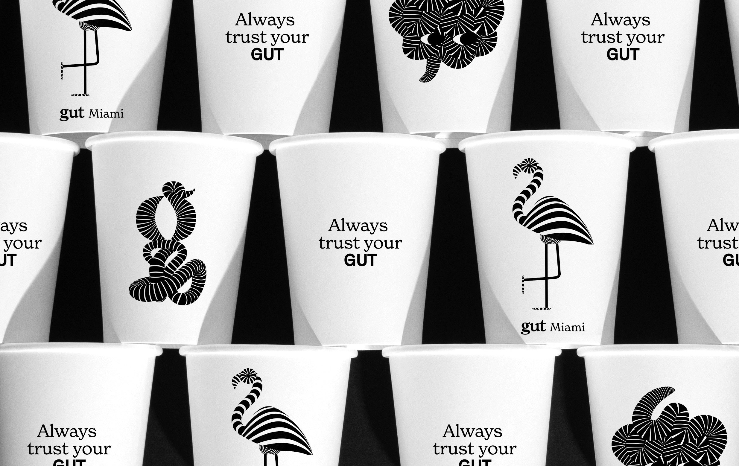
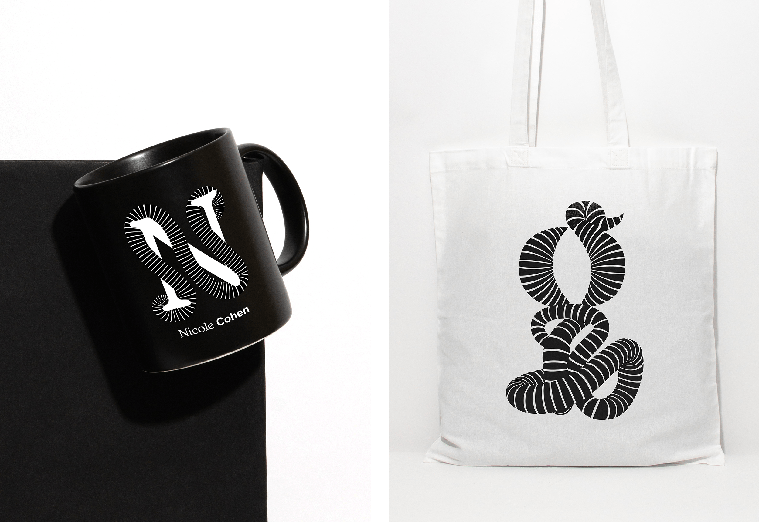
The new suite of assets includes sub-brand logos, illustrations, patterns and the custom alphabet to allow for more brand consistency across GUT’s now-numerous touchpoints, including products like mugs, t-shirts and tote bags; posters and banners; the website, mobile site, and other digital applications; trophies for the agency’s awards; and interior signage and wall decorations.
The system works beautifully for the latter: in a larger scale, the letterforms, numerals, and pattern elements really show their best selves. The black and white palette combined with the mixture of dynamic and sensitive linework come to life beautifully when shown on walls, stairwells and the like – it’s surely a great look for any agency to have its brand, its ‘self’ – so distinctively embedded in a workspace.
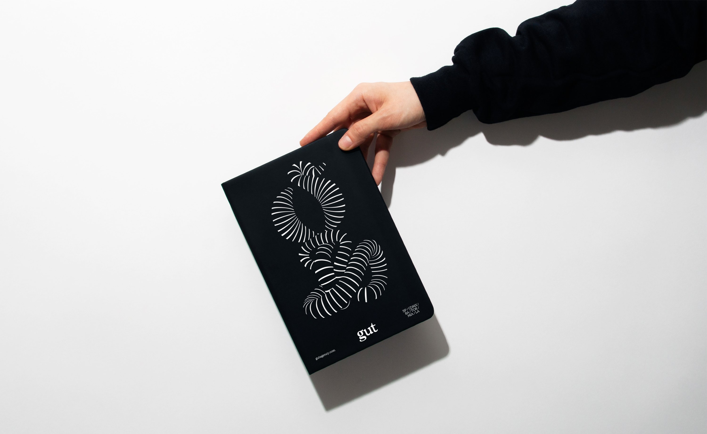
Where the branding falters slightly is when it’s very small: on the GUT website, for instance, the wordmark in the top left hand corner fades into the background slightly, and isn’t as legible as it could be – the same goes for more subtle stationery applications, like on the GUT-branded envelopes.
But that’s a very small criticism. Overall, the new system is superb: it feels truly original, and among a sea of many either overly corporate-looking ad agency identities, or those that feel like an afterthought, or those that seem way too desperate to show us just how hip they are, it’s a very refreshing approach.
